


Mia entered a menstrual care market dominated by legacy brands whose visual language was crowded and designs that reinforced shame rather than pride. The challenge extended beyond product differentiation. Mia needed to disrupt entrenched purchasing behaviors in a category where brand loyalty runs deep, switching costs feel high, and shelf presence is cluttered with similar-looking competitors. Our mandate was to create a visual identity that would justify a price premium over conventional options while remaining accessible enough to convert first-time organic buyers.
Insight:
Our research revealed a fundamental shift in how younger women approach menstrual care. Rather than viewing it as something to hide or manage discreetly, this demographic seeks products that align with their broader wellness philosophies. The same consumers buying organic food and clean beauty now expect identical standards from intimate care products.
However, existing “natural” menstrual care brands employed similar design philosophies to their existing portfolios or felt medicinal. Women wanted to feel good about their choice and products that delivered quality and aesthetics.
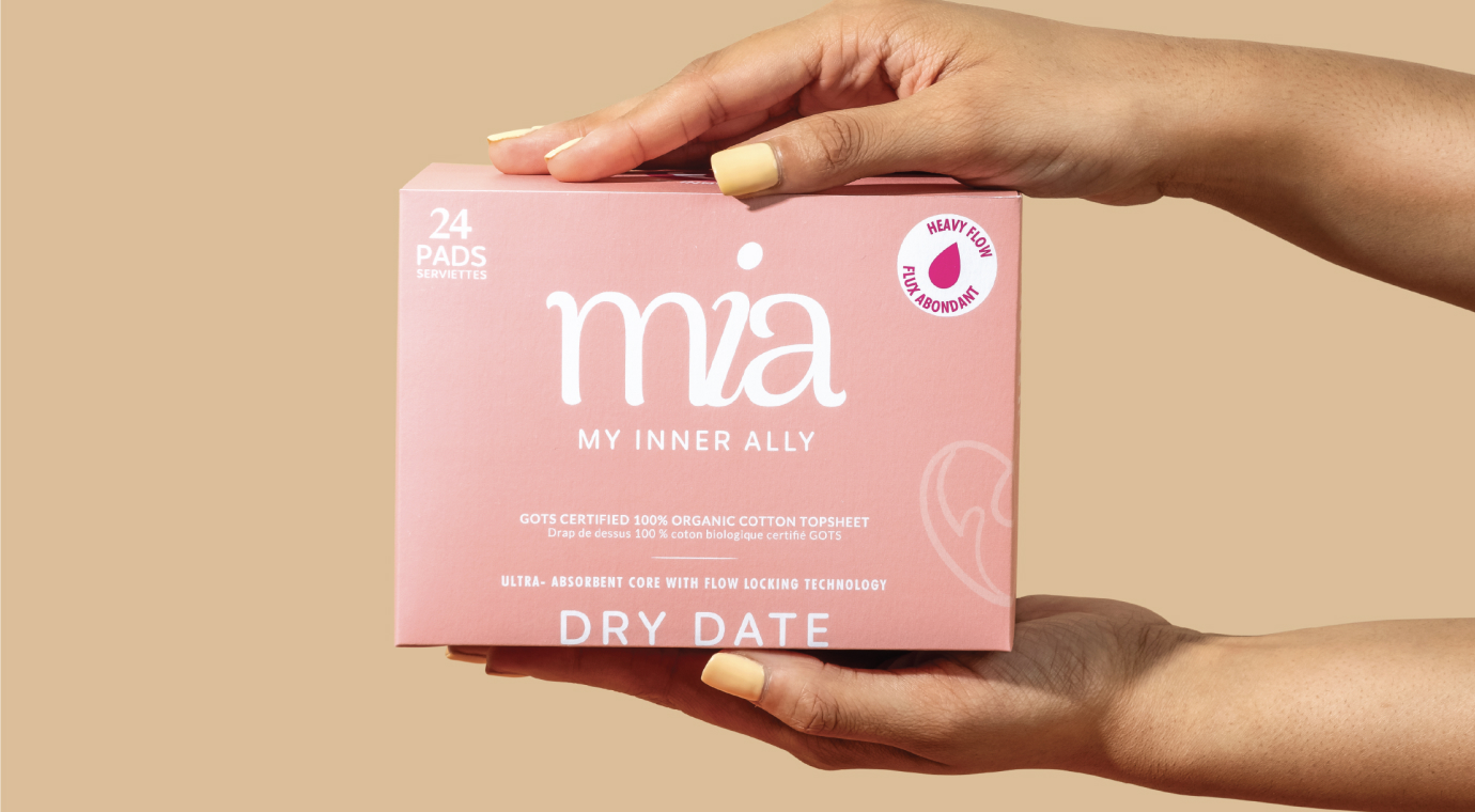
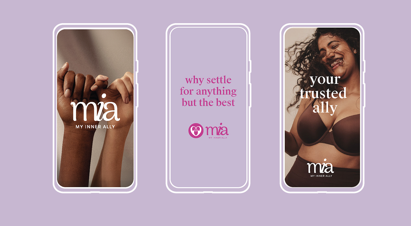
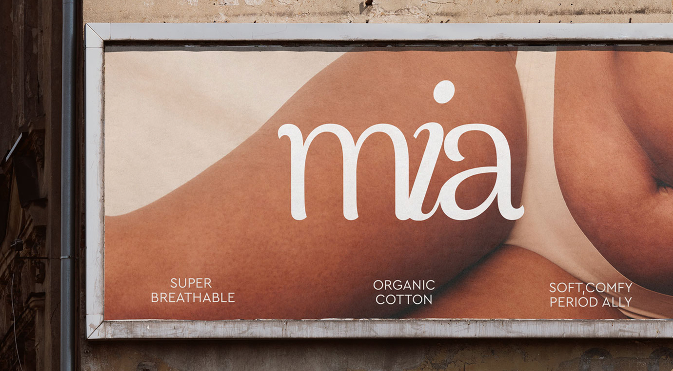
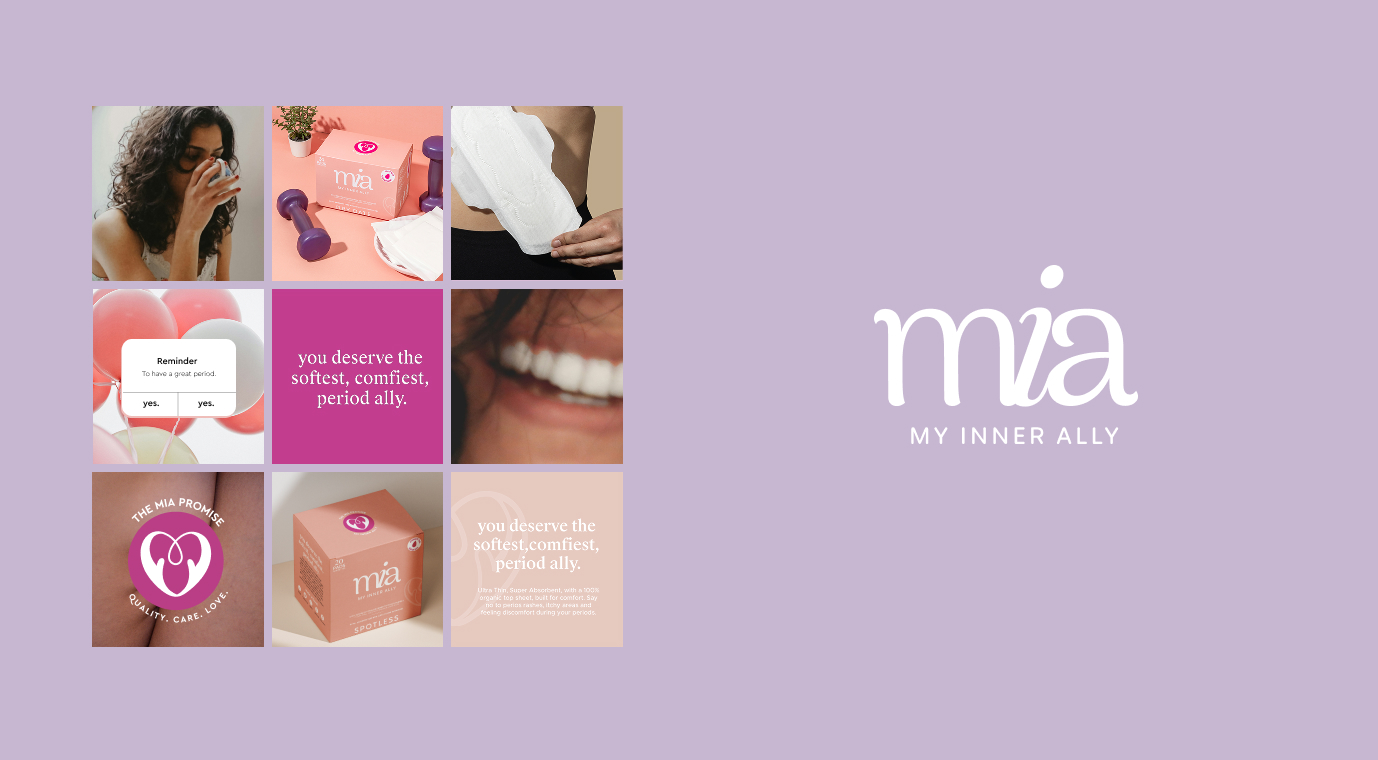
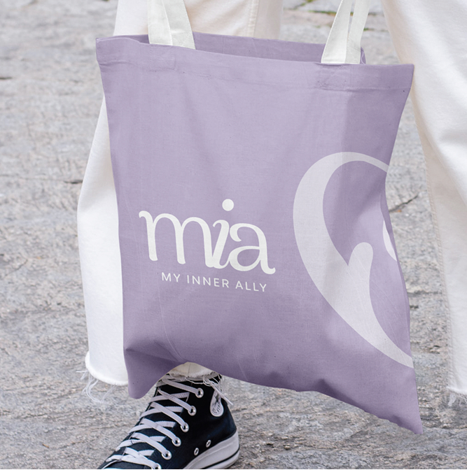
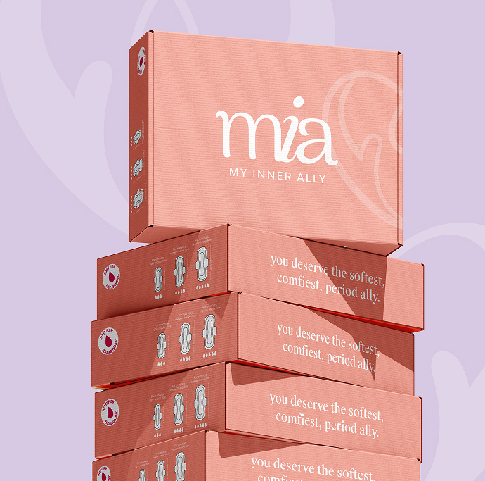
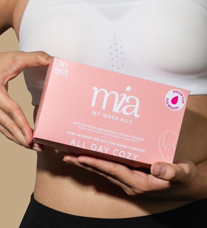
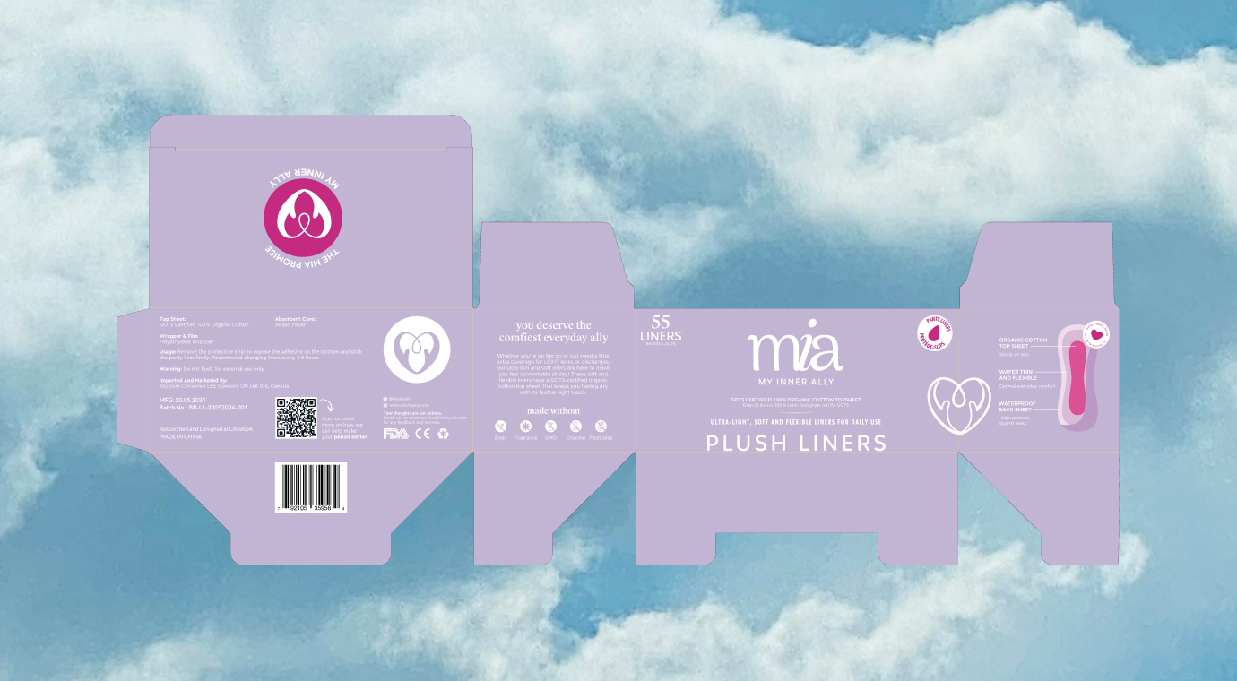
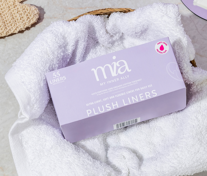
We developed a design system anchored in restraint and clarity. The clean, neutral aesthetic serves multiple strategic purposes. First, it positions Mia within the broader clean living movement rather than confining it to traditional menstrual care conventions. By adopting design principles associated with premium wellness brands like generous white space, refined typography, and minimal compositional elements, we aimed to elevate the perceived value and justify the product’s premium pricing. The neutral palette of lilac, peach, and strategic pink accents was deliberately chosen to feel fresh. Lilac conveys calm and care without clinical coldness; peach introduces warmth and approachability; the accent pink provides just enough category recognition.
Packaging:
We designed Mia’s packaging to perform in three critical ways: create immediate visual differentiation in cluttered retail environments, communicate product benefits and brand values within seconds, and feel substantial enough to justify premium positioning while maintaining approachable warmth. The clean visual system also provided strategic flexibility for line extensions and channel expansion. The design architecture scales seamlessly from direct-to-consumer digital channels to retail environments, maintaining consistency while adapting to different touch points.
The Impact: By understanding the gap between how the category marketed to women and how women actually wanted to be addressed, we created a visual identity that feels simultaneously progressive and timeless. The clean, neutral, fresh aesthetic helped attract and speak to an audience that was looking for an emotional connect rather than just a product.
CREDIT
- Agency/Creative: Studi Take Two
- Article Title: Studi Take Two Positions Mia as a Premium Wellness Brand in Menstrual Care
- Organisation/Entity: Agency
- Project Type: Identity
- Project Status: Published
- Agency/Creative Country: India
- Agency/Creative City: Mumbai
- Market Region: North America
- Project Deliverables: Brand Identity, Packaging Design
- Industry: Health Care
- Keywords: Personal Care Brand, Packaging Design, Brand Design, Identity Design,
-
Credits:
Creative Director & Founder:: Urvi Shah


