


Daughter or mother? That is the question…
When a business has multiple units, a common question for entrepreneurs is whether they should create a separate brand for each one, or a single brand that covers all operations. There is no golden rule for this decision. It requires looking at the level of investment, the nature of each business, positioning opportunities, and the perception one wants to build.
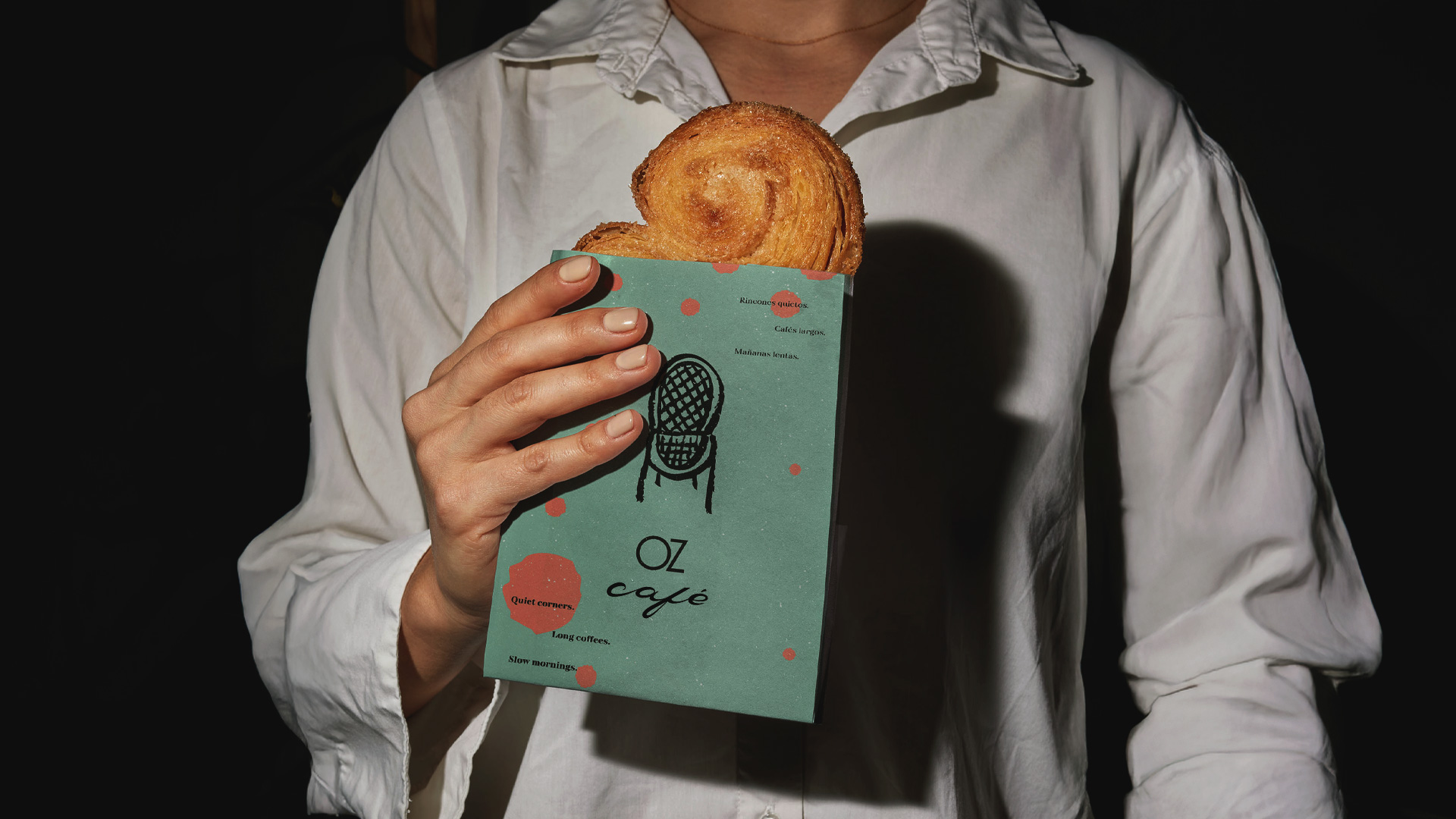
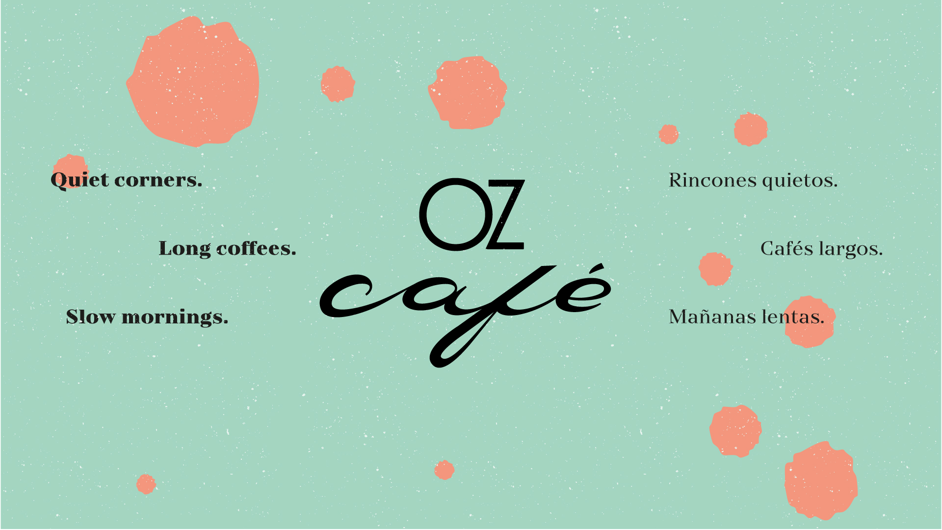
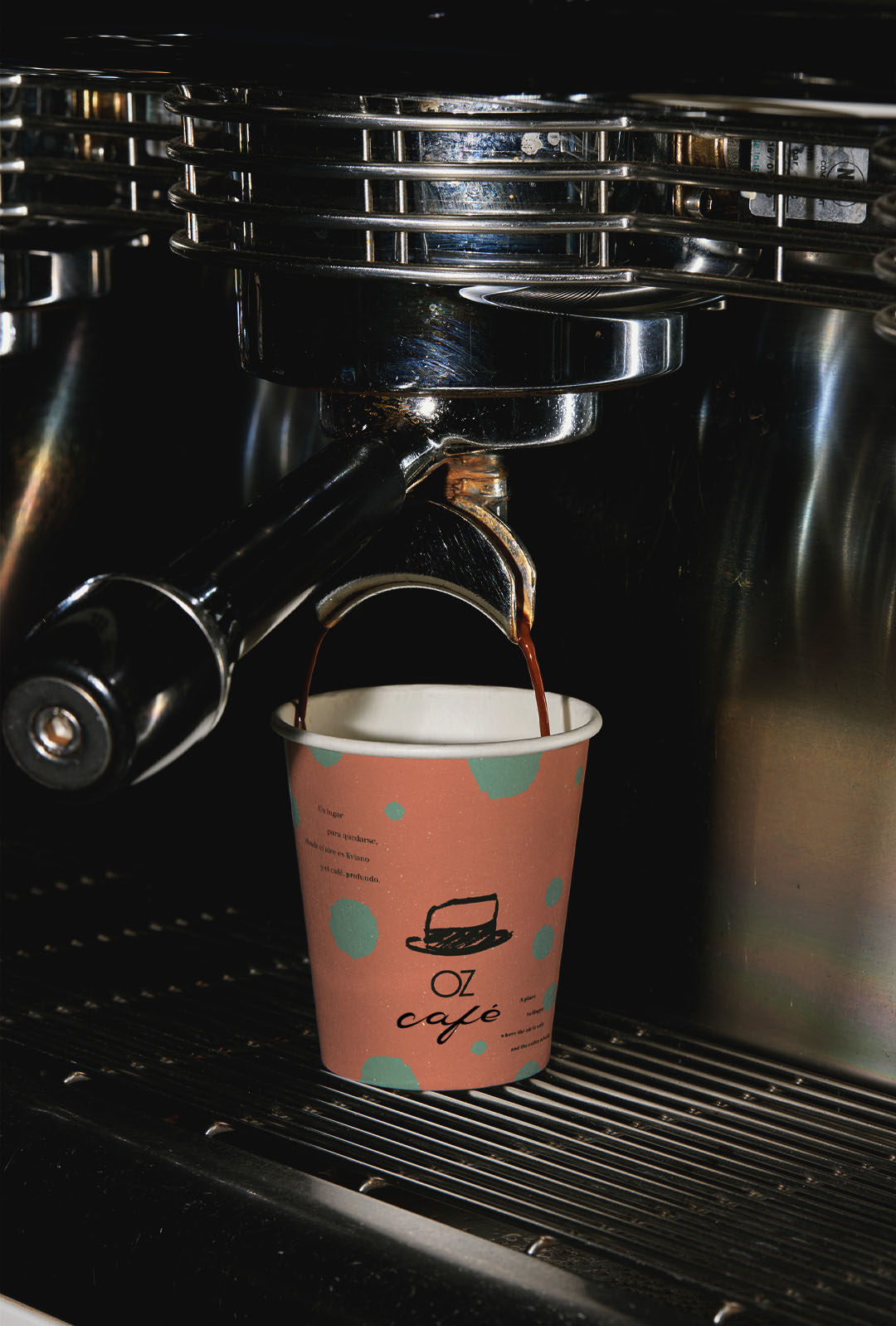
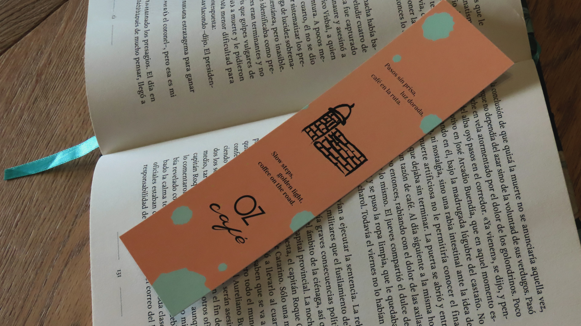
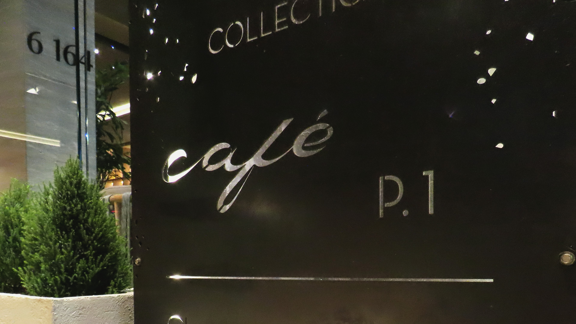
That was the starting point of our consultancy for Oz Café. The strategic decision we reached was to make the café a sub-brand of Oz Collection. Rather than functioning as an independent brand, this business unit would reinforce—through a more playful lens—the core value of OZ: “The beauty of traveling,” bringing in the sense of play, improvisation, and the relaxed spirit of a journey through its aesthetic.
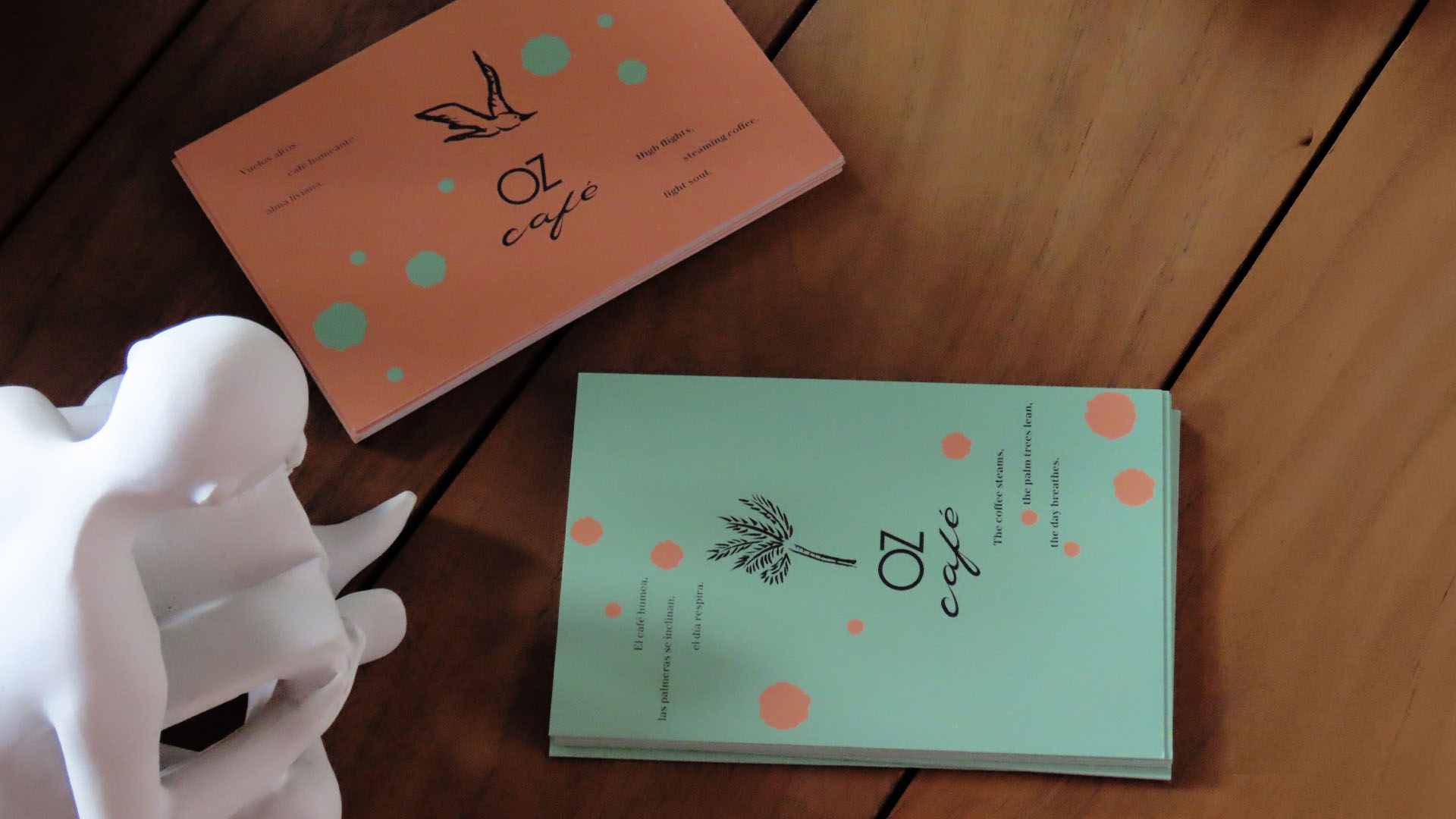
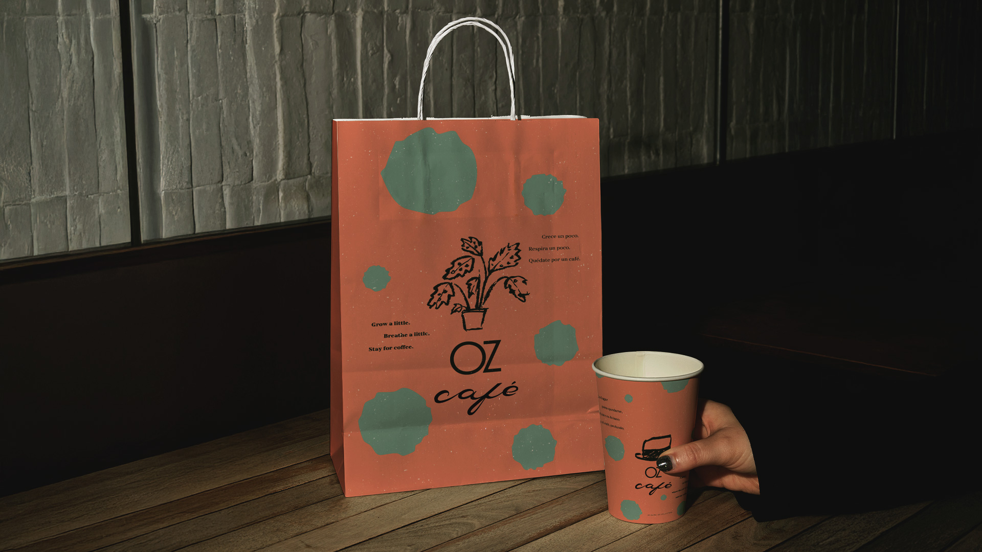
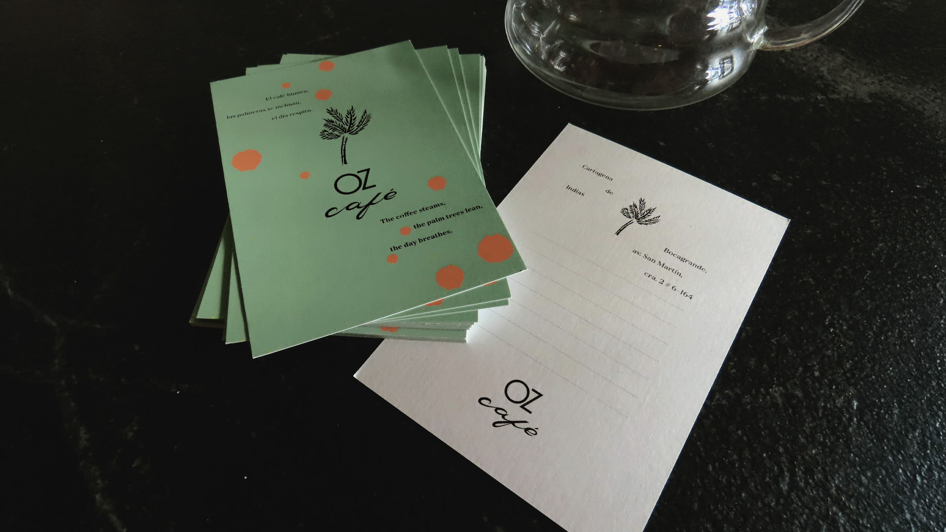
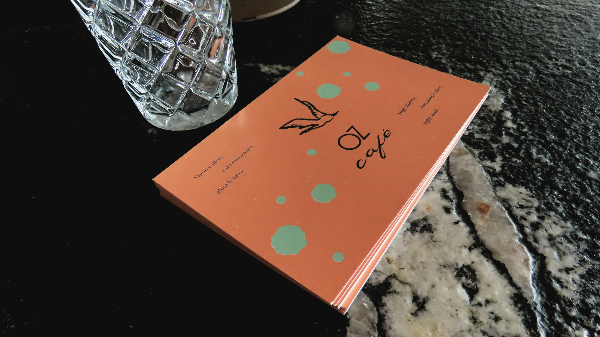
Hand-drawn illustrations (yes, with brush and ink on a sheet of paper!) in a contemporary doodle style are responsible, within the system, for opening up those unsettling yet beautiful feelings of improvisation and uncertainty that we experience when we travel.
The word café, also hand-drawn, started from a calligraphic exploration (using the same brush as the illustrations) to understand the rhythm and shapes of the word. Later, in Illustrator, I developed the letters using a digital technique I learned in Marta Cerdà’s Domestika course, where modular structures are built digitally from the original stroke.
And what else did we use from the mother brand’s visual code? Color and type. In other words… we took a lot from the main brand! What we did was give it different styles. In OZ Café, color is purer and occupies larger areas, while in OZ Collection, color tends to blend and merge, creating new hues.
The type in the café forms haikus and is always written in rhythmic lines, without rigid justification, and always in black. This color is one of the distinctive elements of the sub-brand—something that belongs exclusively to it.

CREDIT
- Agency/Creative: arutza estudio
- Article Title: Arutza Estudio Defines Oz Café as a Playful Sub Brand Within the Oz Collection Universe
- Organisation/Entity: Freelance
- Project Type: Identity
- Project Status: Published
- Agency/Creative Country: Colombia
- Agency/Creative City: Bogotá
- Market Region: South America
- Project Deliverables: Brand Guidelines
- Industry: Food/Beverage
- Keywords: café, coffee, branding
-
Credits:
Creative director / designer: Arutza Rico Onzaga
Client: Oz Café / Oz Collection


