


Sri Krishna Sweets — A Legacy, Packaged
For over seven decades, Sri Krishna Sweets has been part of South India’s cultural fabric — a name tied to devotion, celebration, and the unmistakable taste of ghee.
As the range expanded, the packaging started speaking in many voices. And in a market full of “Krishna Sweets,” the bigger need was clarity: how do you spot the original Sri Krishna Sweets instantly?
That’s where we began — building a packaging system that protects legacy, sharpens shelf presence, and scales across Kaaras, Sweets, and Gifting.
The Idea — Tradition, Illustrated
We drew from Pattachitra, known for devotion-filled storytelling, and reinterpreted it into a modern packaging language — rooted, yet clean and contemporary.
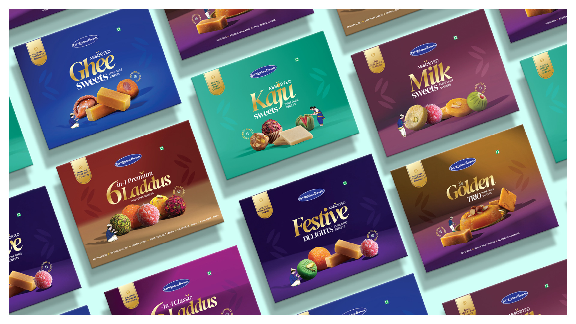
The Packaging Language
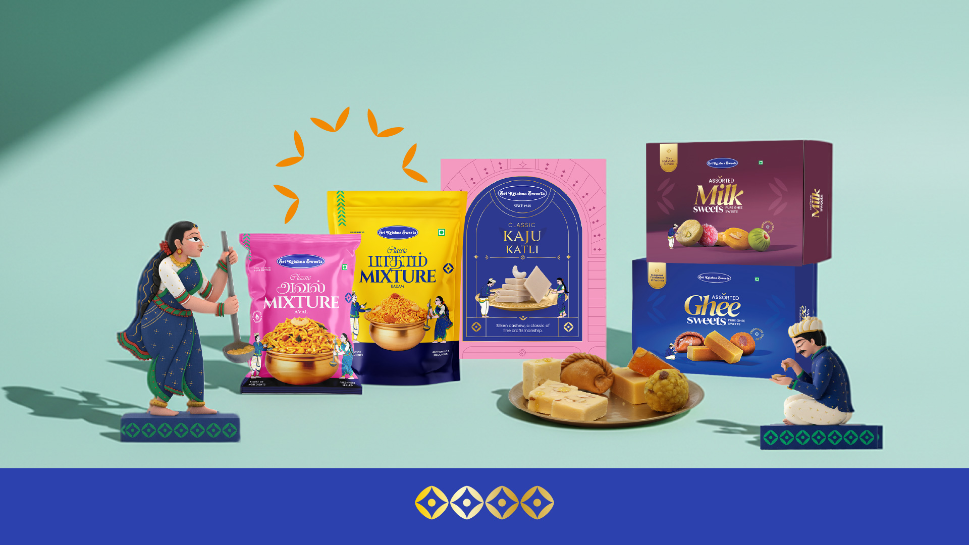
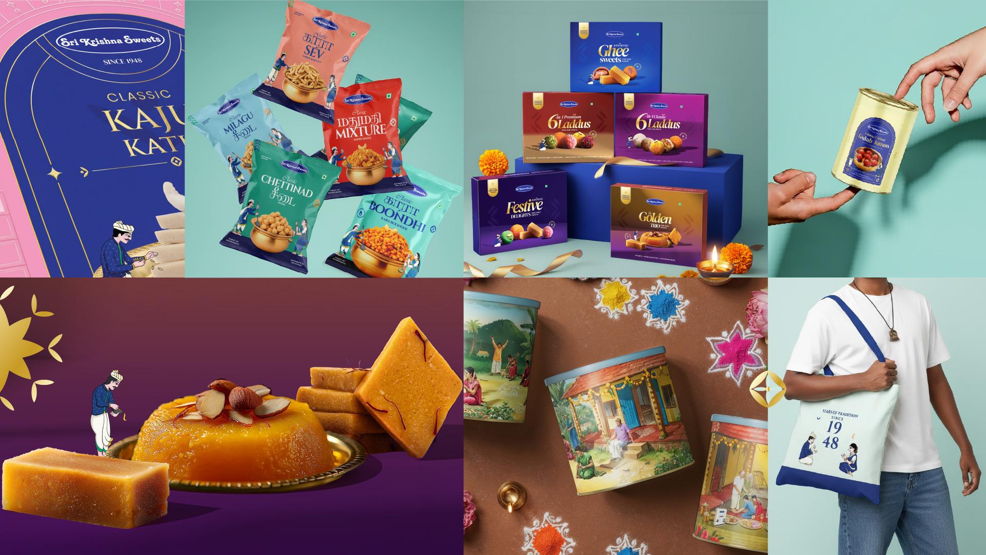
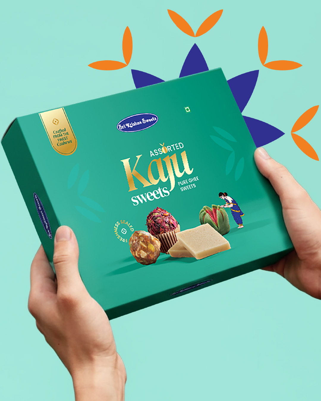
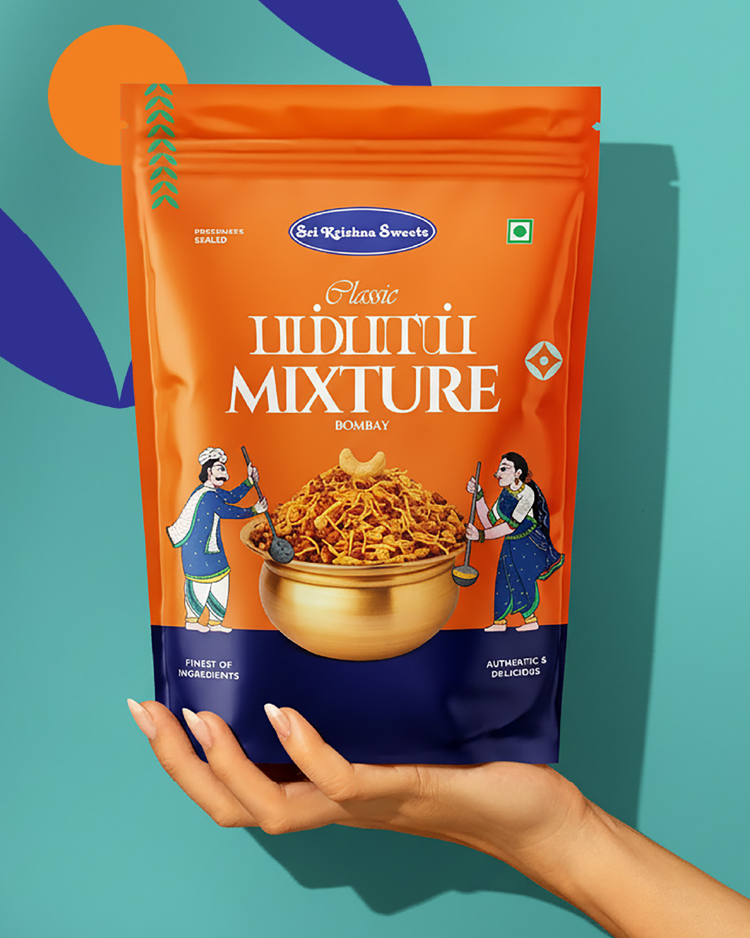
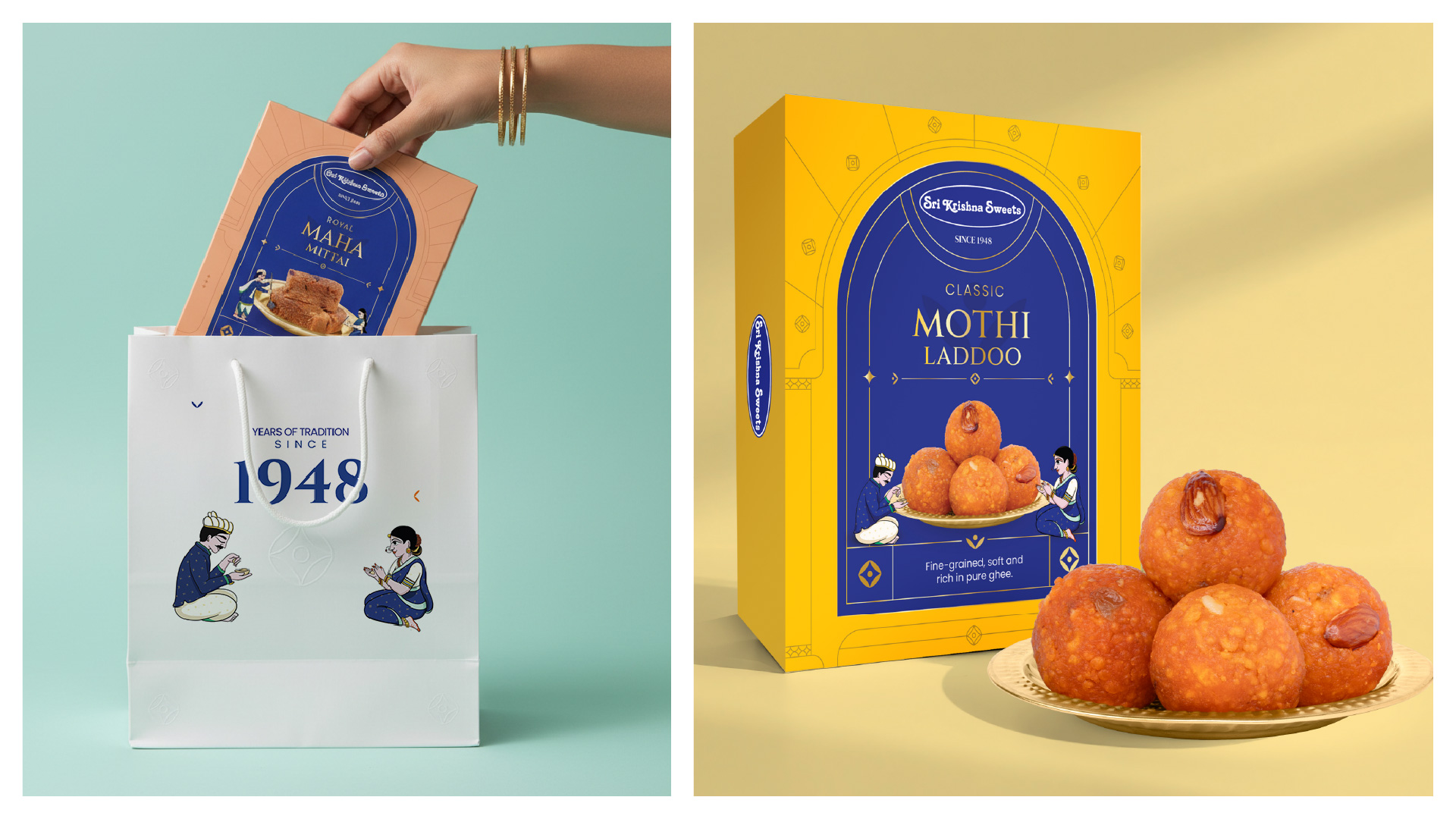
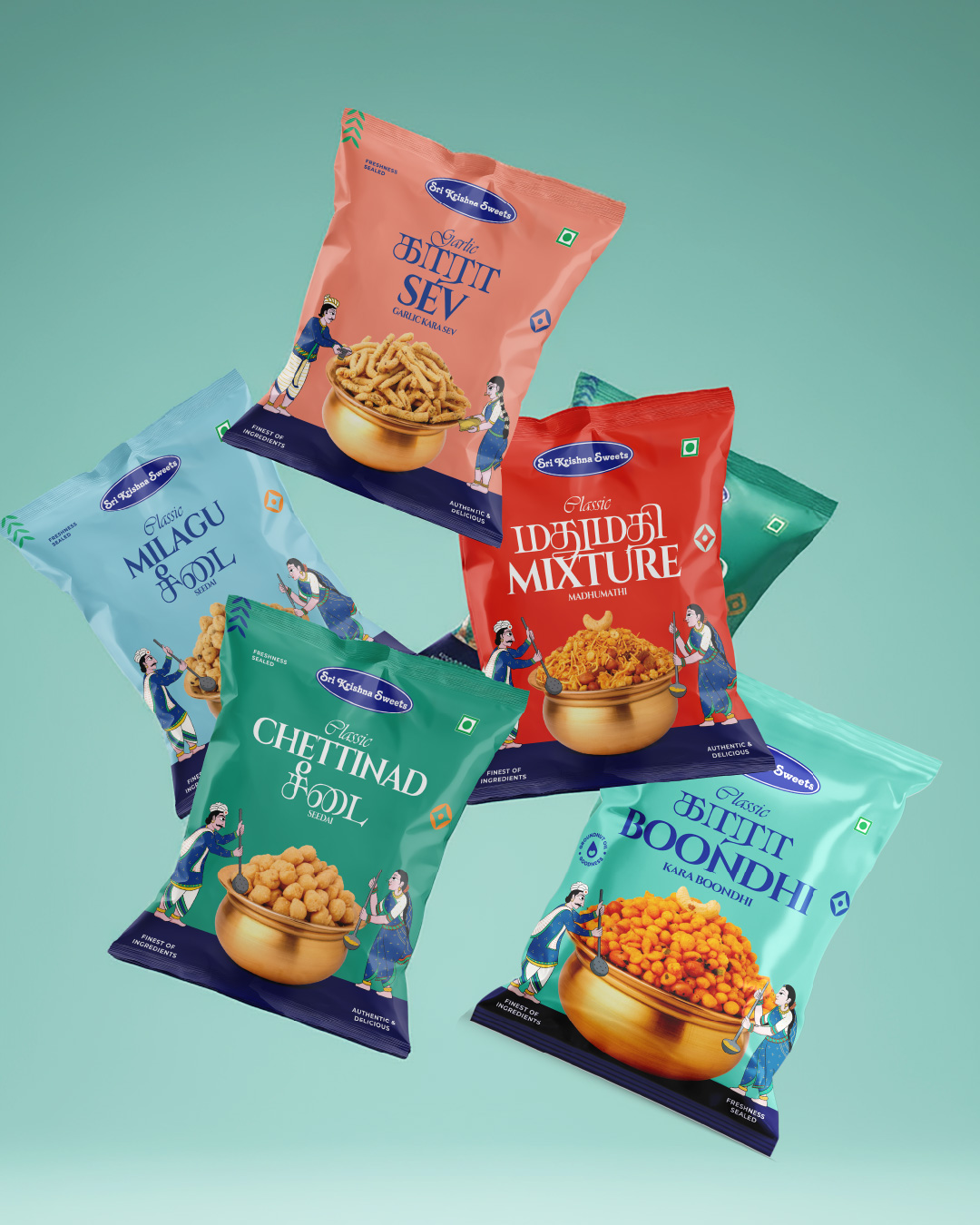
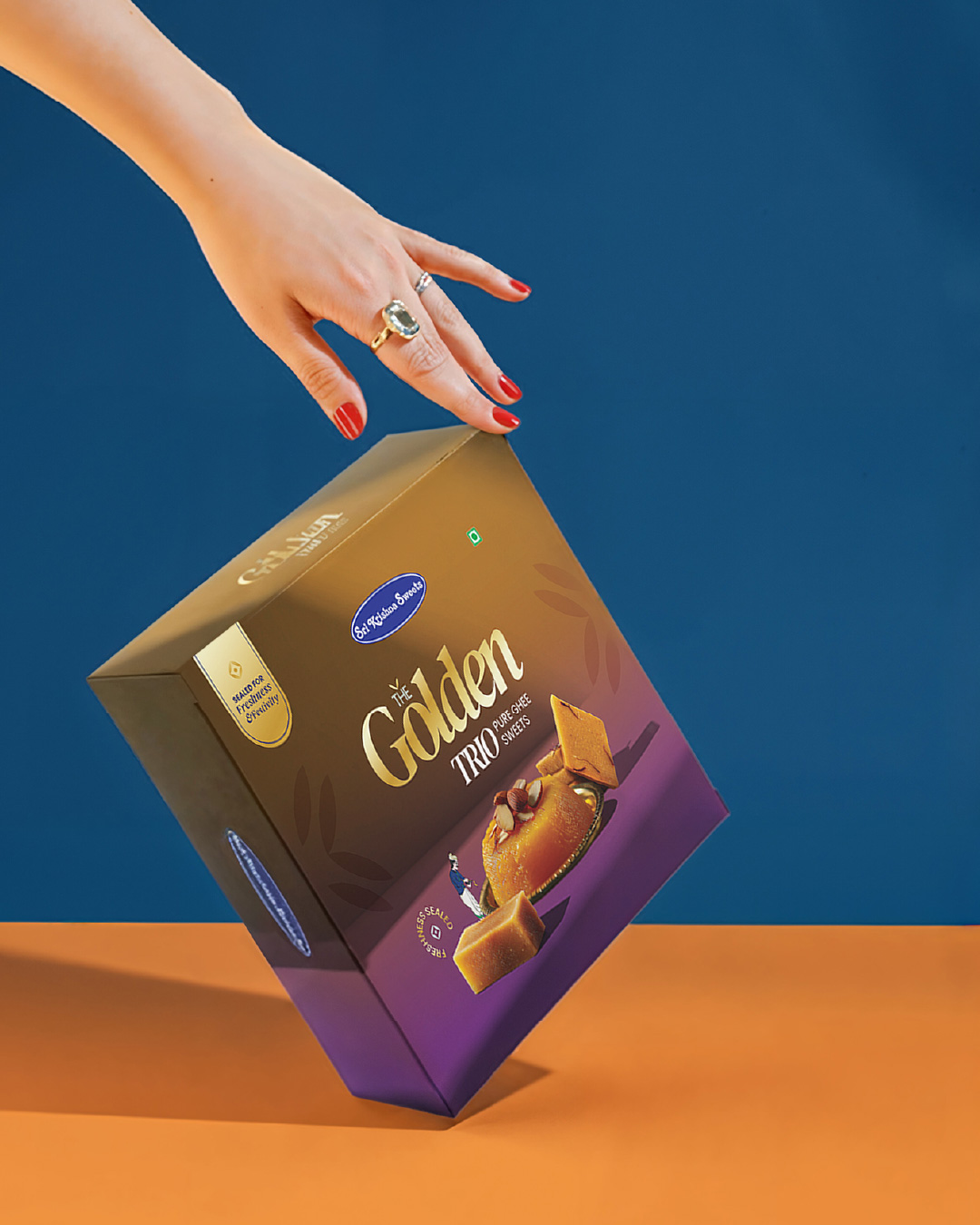
1) The Window Frame
A signature arched window for sweet packs — inspired by heritage architecture, built for recognition, and used as a neat product-view window where needed.
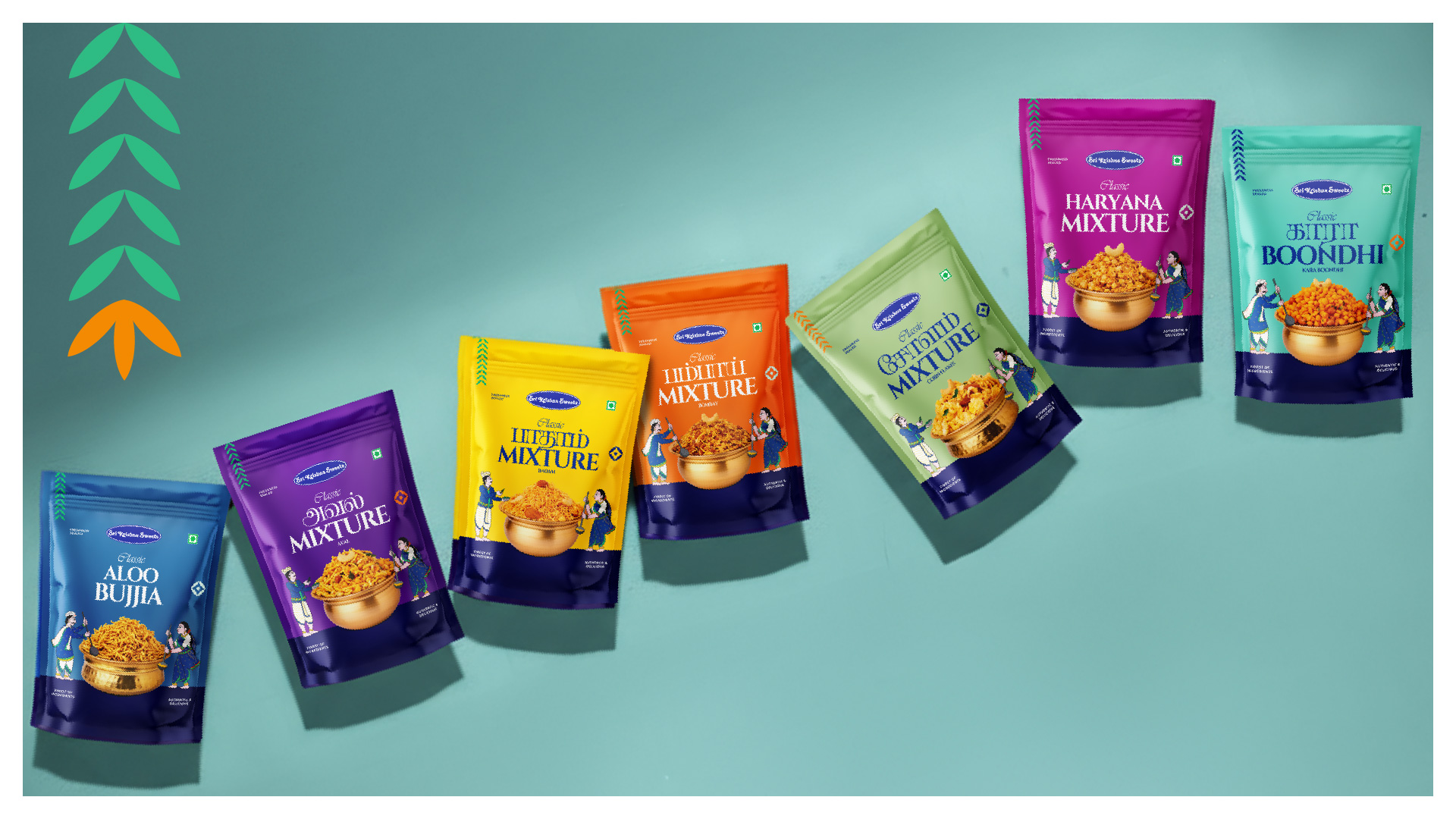
2) Characters that Interact
Pattachitra-inspired sevakas engage with the product — holding, serving, presenting — making the packs feel warm, alive, and distinctly SKS.
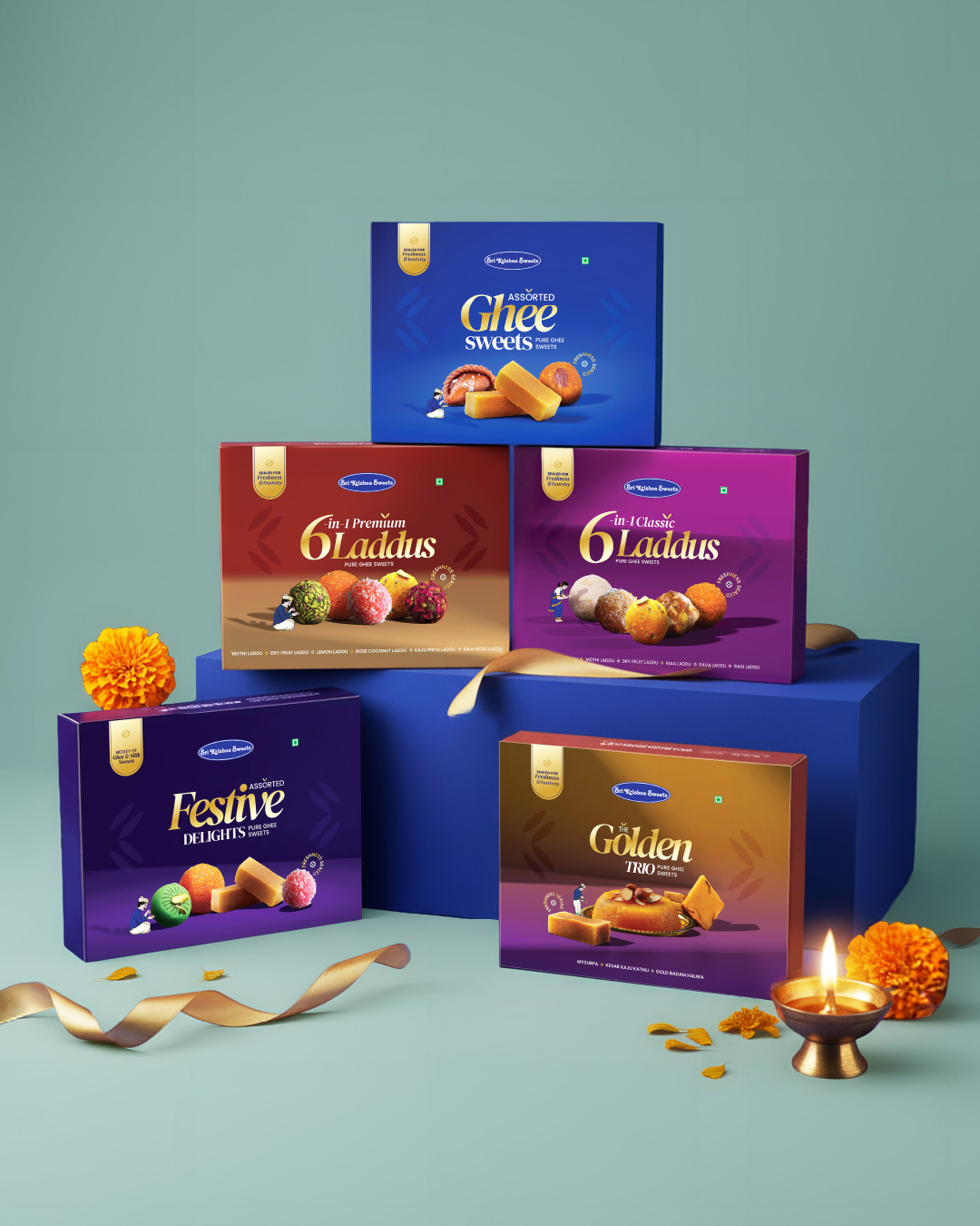
3) Premium Craft & Finish
Controlled metallic-foil detailing across select borders, titles, and accents — designed to catch light like real metal.
Anchored by Royal Blue, supported by festive hues and a consistent structure, the system stays unified across formats.
The Outcome
A packaging family with stronger recall, shelf interaction, and clearer ownership. In a cluttered market, it helps people instantly recognise the original Sri Krishna Sweets.
One recognisable SKS world — timeless, scalable, proudly OG.
CREDIT
- Agency/Creative: Kirukal
- Article Title: Kirukal Unifies Sri Krishna Sweets With a Scalable Packaging System Rooted in Tradition
- Organisation/Entity: Agency
- Project Type: Packaging
- Project Status: Published
- Agency/Creative Country: India
- Agency/Creative City: Chennai
- Market Region: Asia
- Project Deliverables: Brand Design, Brand Guidelines, Brand Strategy, Packaging Design, Packaging Guidelines
- Format: Pouch, Sleeve, Wrap
- Industry: Food/Beverage
- Keywords: Sri Krishna Sweets, Kirukal, Studio Kirukal, Packaging Redesign, Tamil Nadu, Chennai, South India, Tamil Brand
-
Credits:
Creative Director: Surendar M
Illustration / Art Direction: Buvan Kumar


