


Overview
Established in 2018, Sunday Basic has become one of the most loved and best-selling milk tea brands. The brand does not only sell drinks, we spread deliciousness and joy every day! The name “Sunday Basic” comes from the spirit of a gentle, fresh and inspiring Sunday.
Challenges
Entrusting Ampersand for rebranding, Sunday Basic needed a graphic style with a distinct personality to convey a strong brand message. Therefore, the goal of the rebranding strategy was to create a design language that reflected the quality of the product, was delicious, beautiful and exactly what customers expected – providing positive inspiration and a real connection with young people.
Our Approach
Sunday Basic has long depended on its name for recognition, while inconsistent communication has limited its overall brand presence. As competition intensifies, the brand clearly recognizes the need to evolve and create a more distinctive impression. Challenging conventional trends, we understand that Sunday Basic’s design language must embody clarity and credibility to earn the trust of a young, trend-savvy audience.
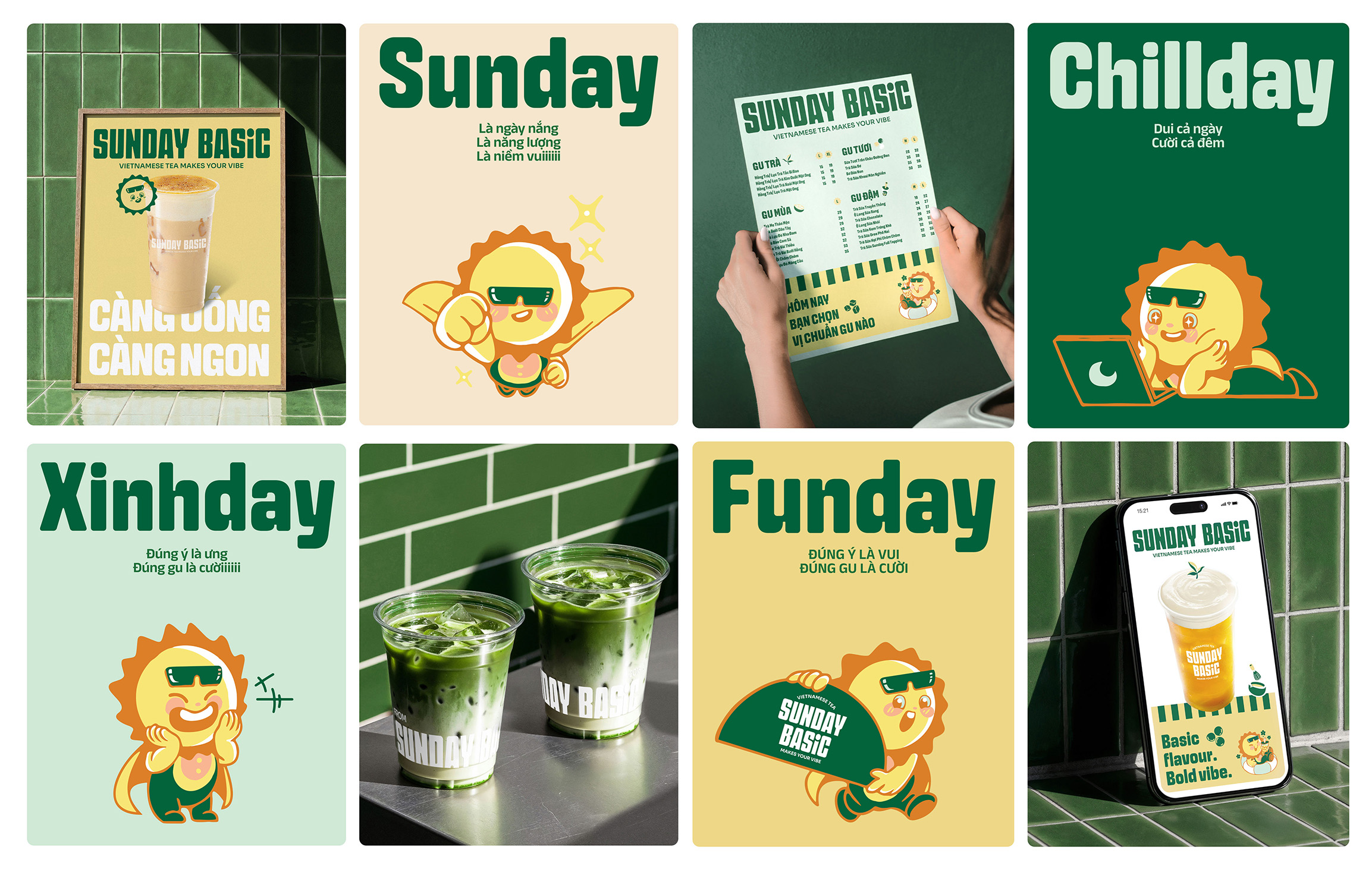
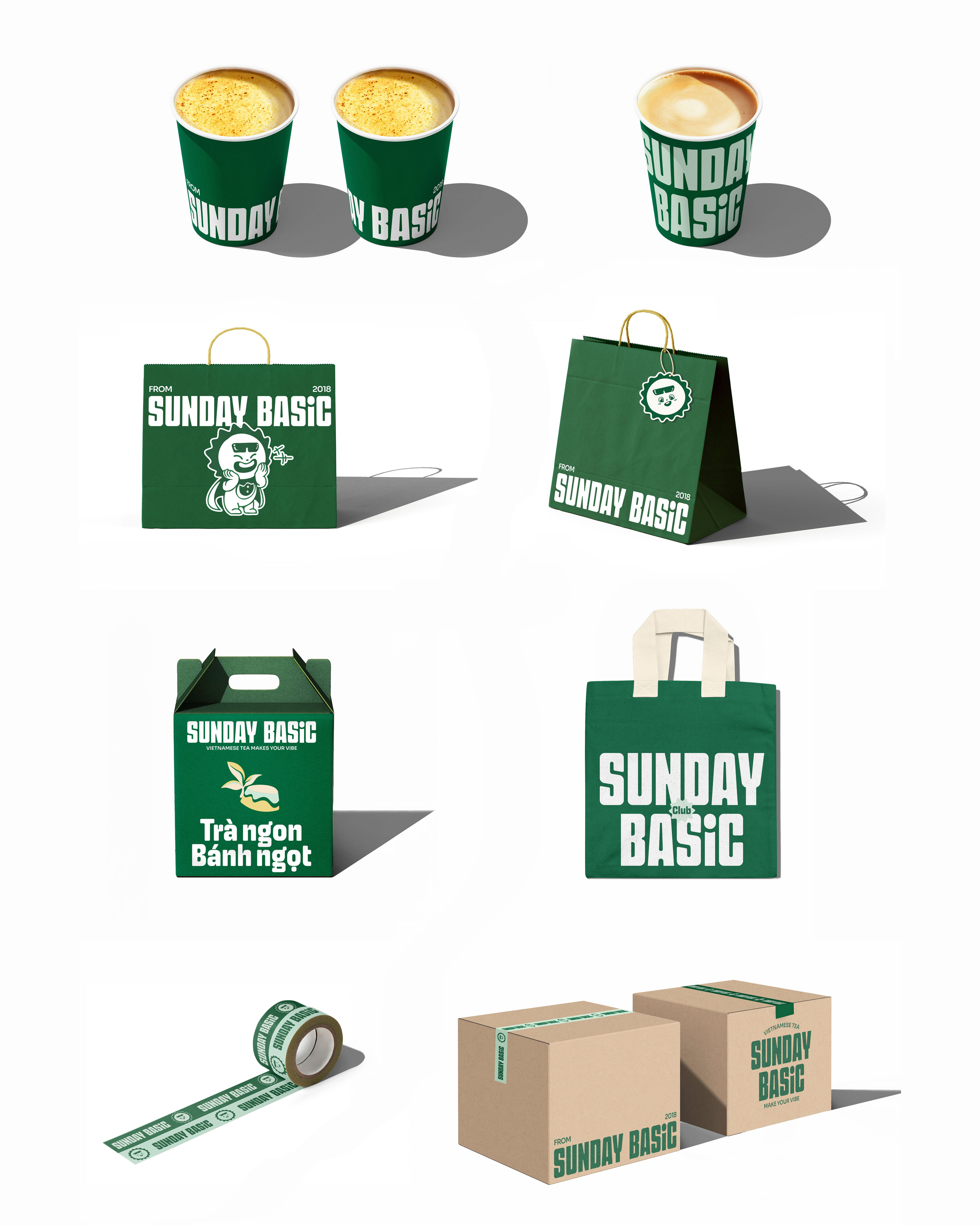
As a growing brand, Sunday Basic requires a scalable identity system that performs effectively across multiple channels and formats. With online sales being its primary revenue stream, we refreshed the brand identity with bolder colors, clearer typography, and a more structured layout system—ensuring flexibility and strong performance in digital environments.
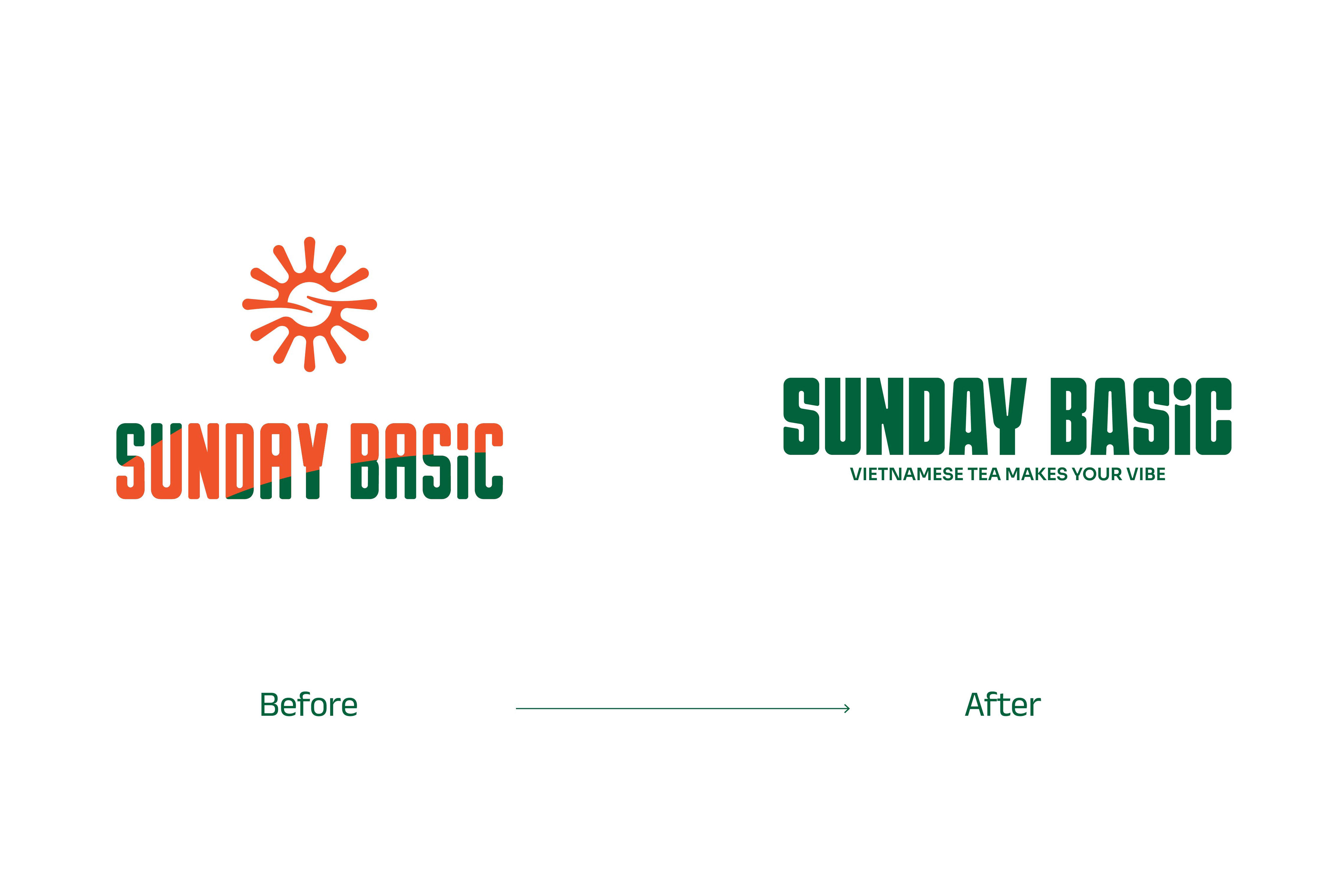
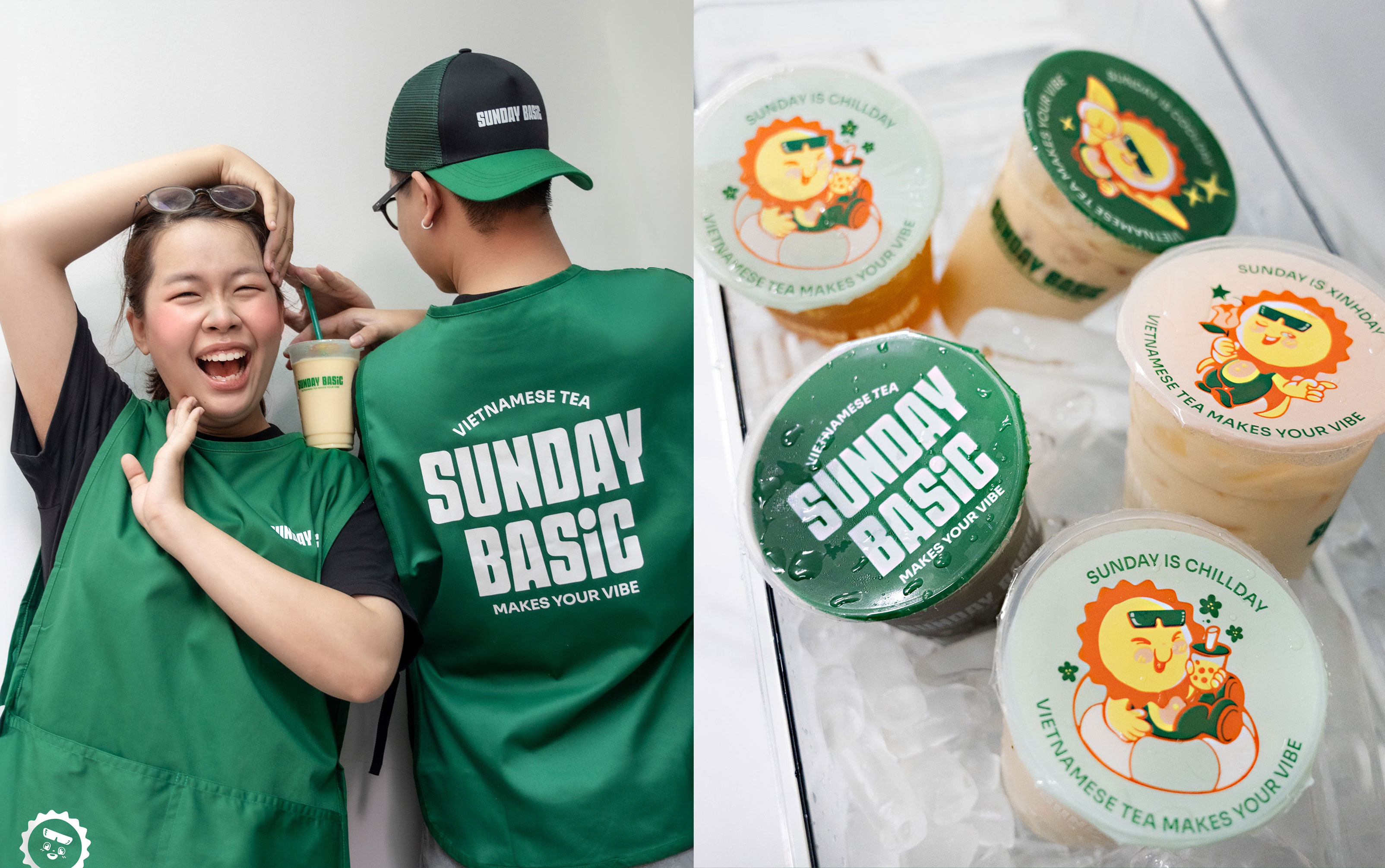
Streamlining the bulky symbol into a pure logotype becomes the most optimal solution for engaging younger consumers. However, this major transformation also introduces new challenges for the brand’s upcoming transition and implementation.
The Updated Logo
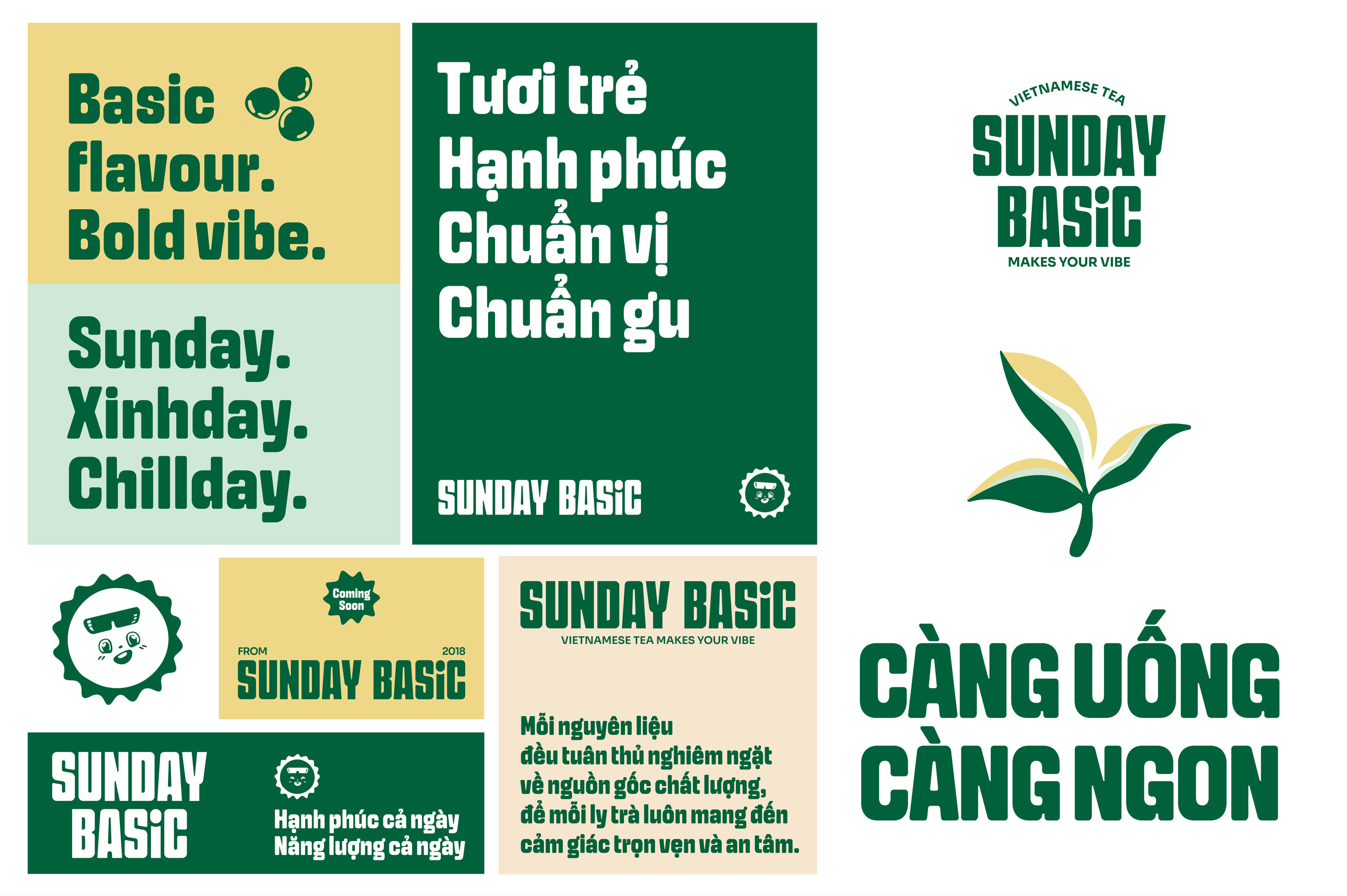
Sunday Basic has refreshed its logo as part of a new brand identity system, while maintaining its core design values. The new logo eliminates the old symbol and focuses on a modern, clean typography. Subtle changes in color, shape, and spacing make the logo more dynamic, balanced, and easily recognizable.
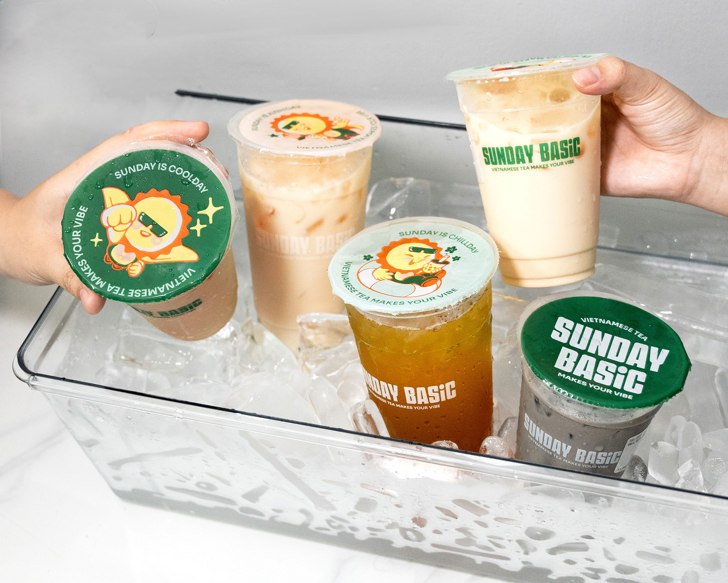
In the new identity system, the Sunday Basic logo is a mandatory element. It appears on most products with the same size and position for each product type, ensuring consistency across the brand. Readability is improved with greater letter consistency. The dot on the “i” is playfully shaped like a smile, while the “A” has a teardrop detail.
The main color palette uses a pure blue for the logo, natural, creating a sense of solidity and reliability. The secondary color palette features diverse background colors and mascots to add more color to the brand.
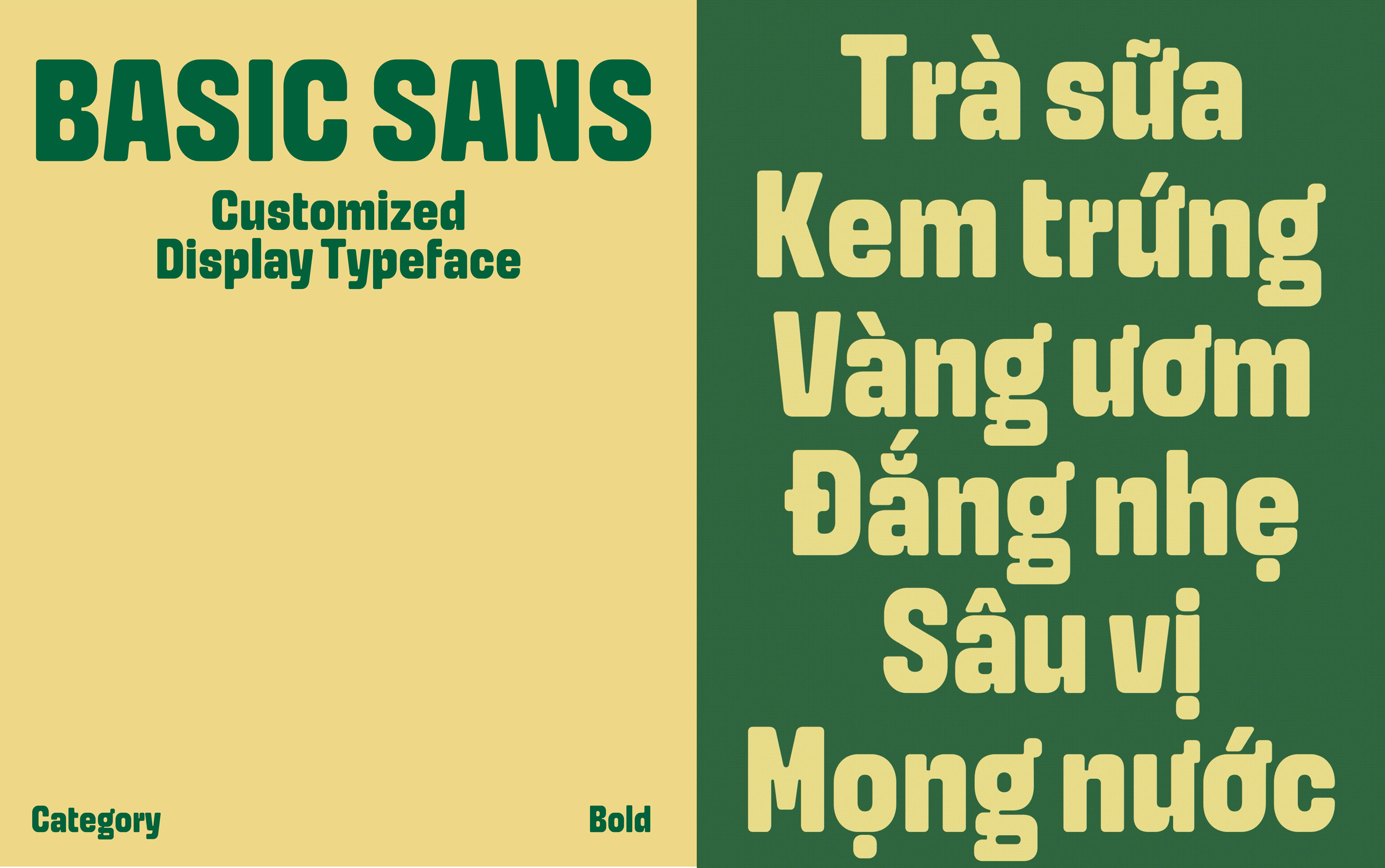
What’s New?
A custom typeface developed exclusively for the brand. In this rebranding phase, the identity centers entirely around typography. Drawing from street culture, everyday stories, and the lifestyle of enjoying and expressing individuality, language becomes the core inspiration for crafting a typeface with a distinctive personality.
The Basic Sans – Display font – was created under the philosophy of “same same but different” – familiar in form, yet uniquely tailored to embody the brand’s spirit.
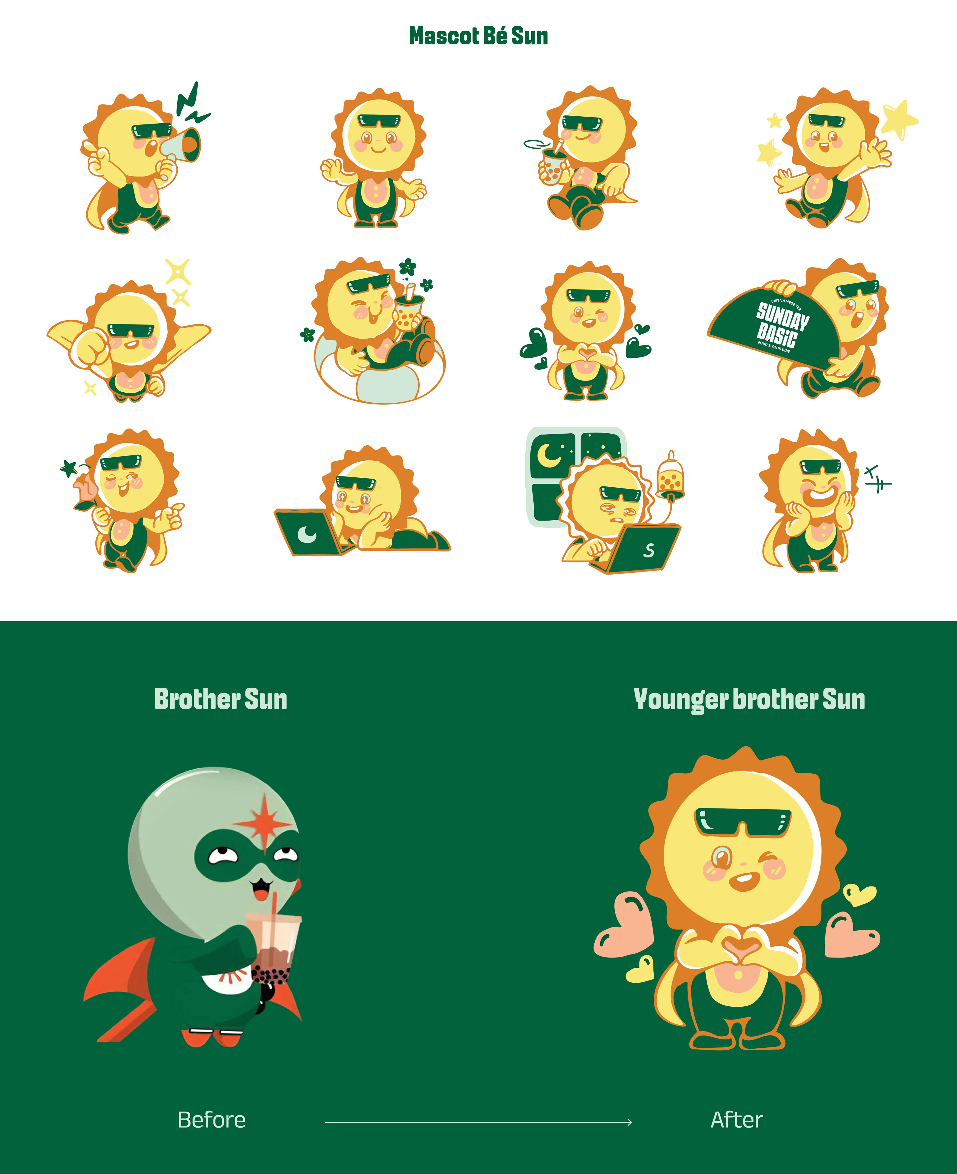
Mascot Re-design
From brother Sun to little brother Sun.
We rejuvenated the character to narrow the generation gap and better connect with our core audience. The younger brother, Sun, is redesigned to appear cuter and more relatable to students, office workers, and young adults. He shares common habits with them, such as enjoying relaxation, working on deadlines, and occasionally staying up late to watch movies,…
CREDIT
- Agency/Creative: Ampersand Creative
- Article Title: Ampersand Creative Refreshes Sunday Basic With a Scalable Brand Identity for a New Generation
- Organisation/Entity: Agency
- Project Type: Identity
- Project Status: Published
- Agency/Creative Country: Vietnam
- Agency/Creative City: Ho Chi Minh
- Market Region: Asia, Europe
- Project Deliverables: 2D Design, Animation, Brand Guidelines, Brand Identity, Brand Redesign, Packaging Design
- Industry: Food/Beverage
- Keywords: Rebranding, Identity, Mascot
-
Credits:
Creative Director: Nana Nguyen


