


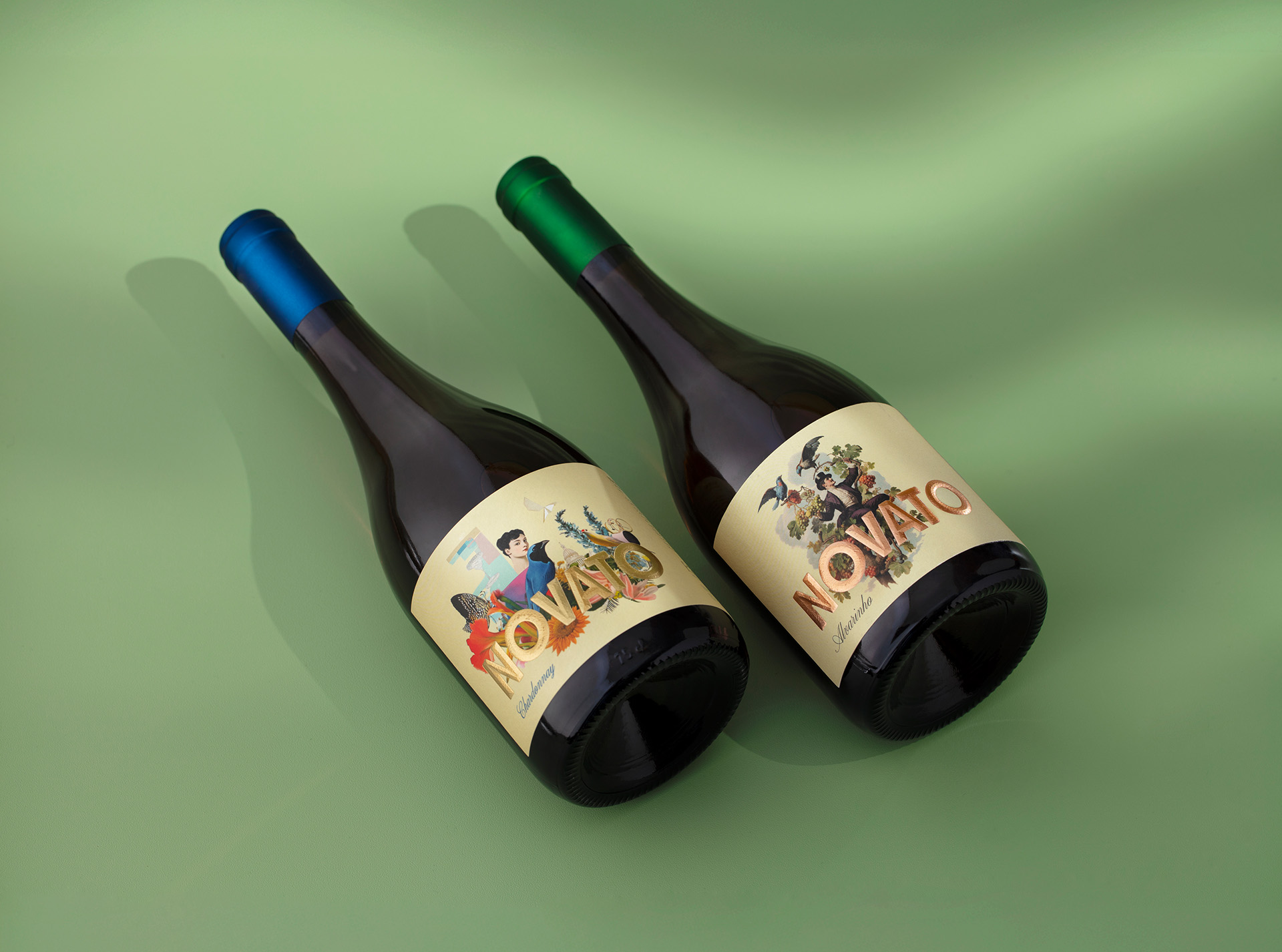
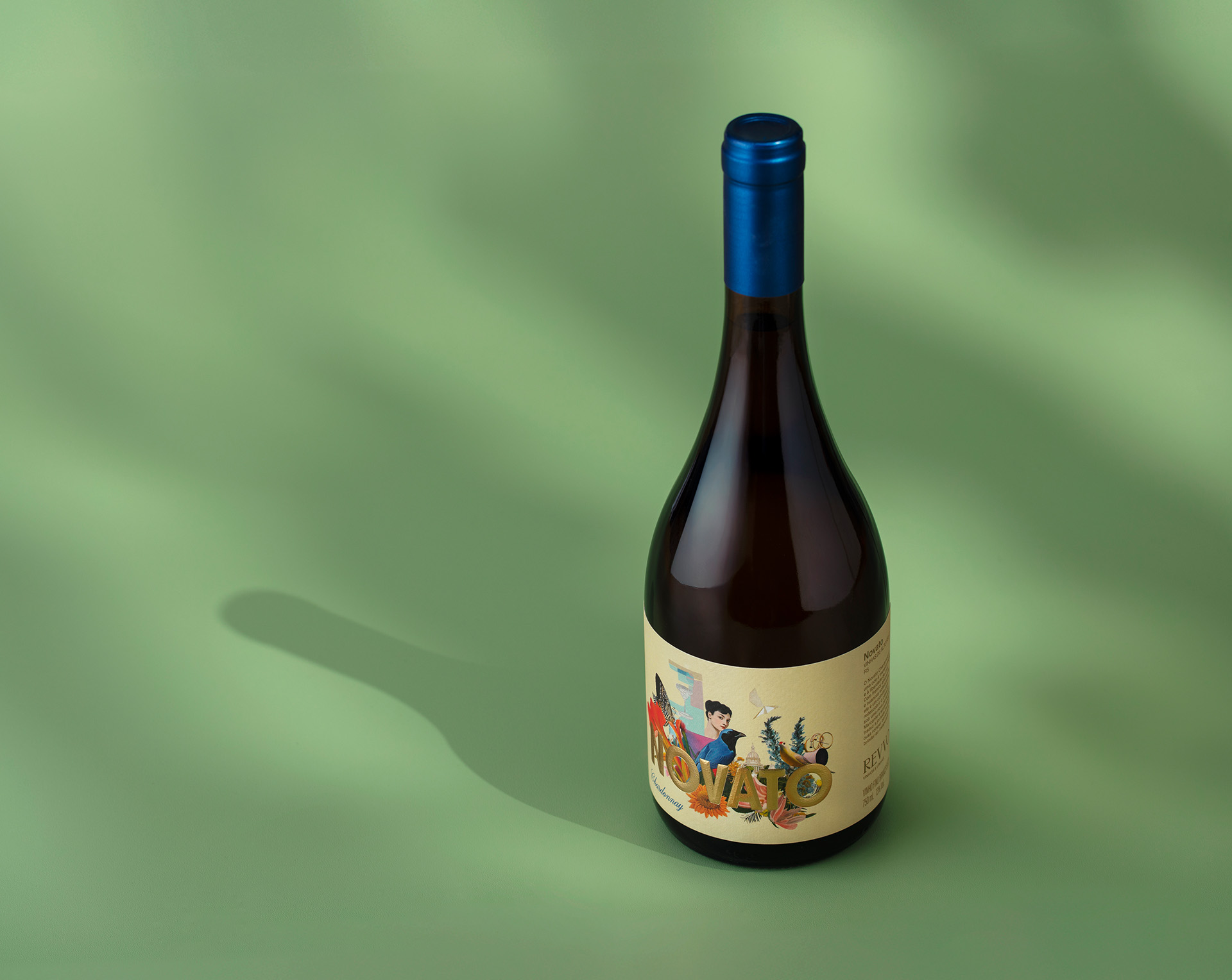
Novato was conceived from the very beginning as a complete creative system, where concept, name, and label were developed together to express a single idea. Meaning “beginner” in Portuguese, the name was intentionally created to embrace irony as a positioning tool, inspired by those who do not fully know the rules and therefore feel free to question them. At Revvo Vinhos & Vinhas, this approach reflects the founders’ own journey and their decision to turn the absence of a long established wine background into a source of freedom rather than limitation. Novato assumes inexperience as a creative state, shaped by curiosity, intuition, and openness to experimentation.
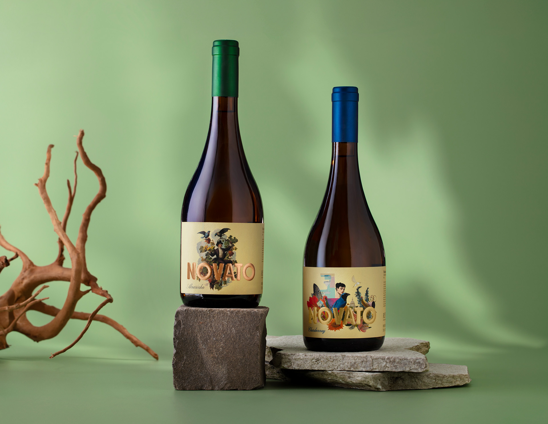
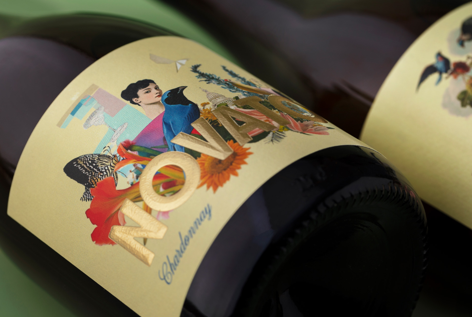
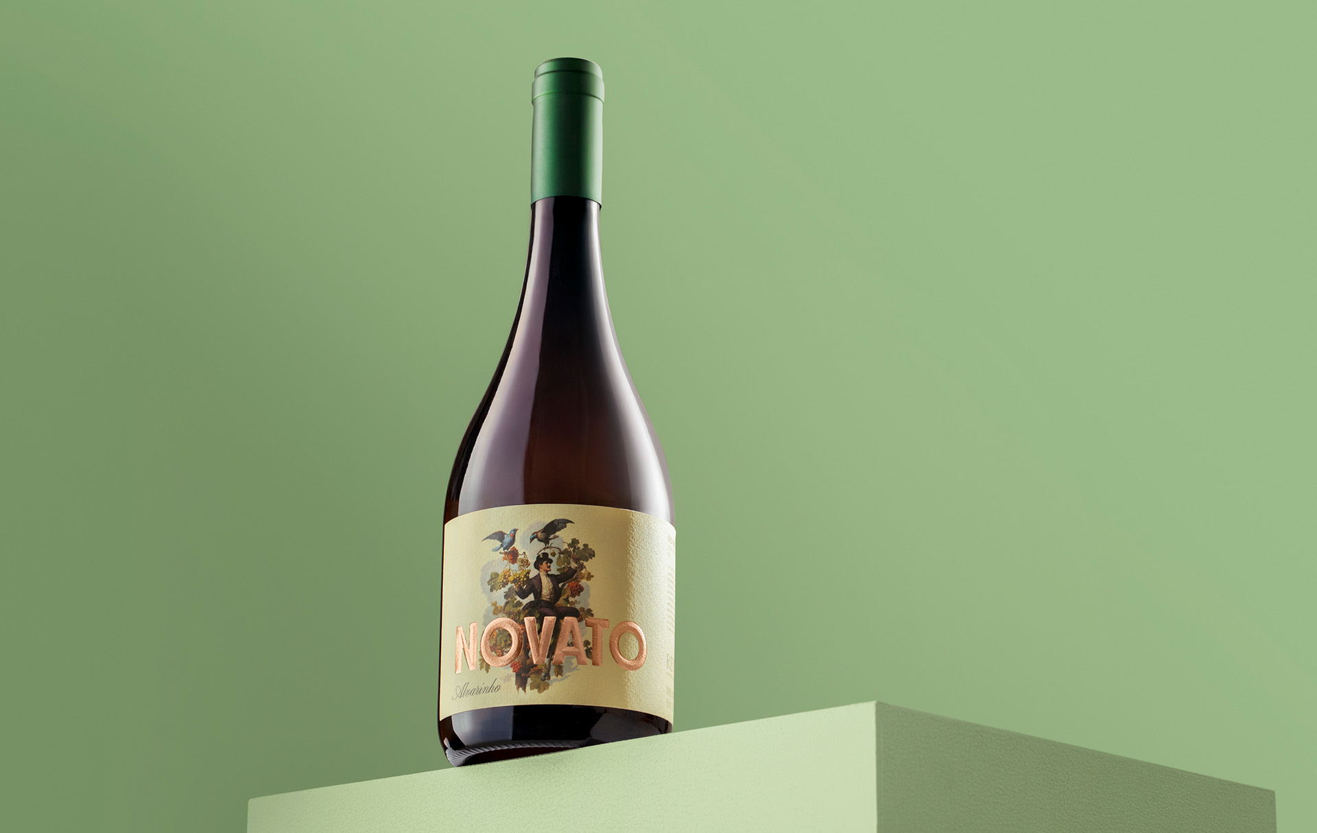
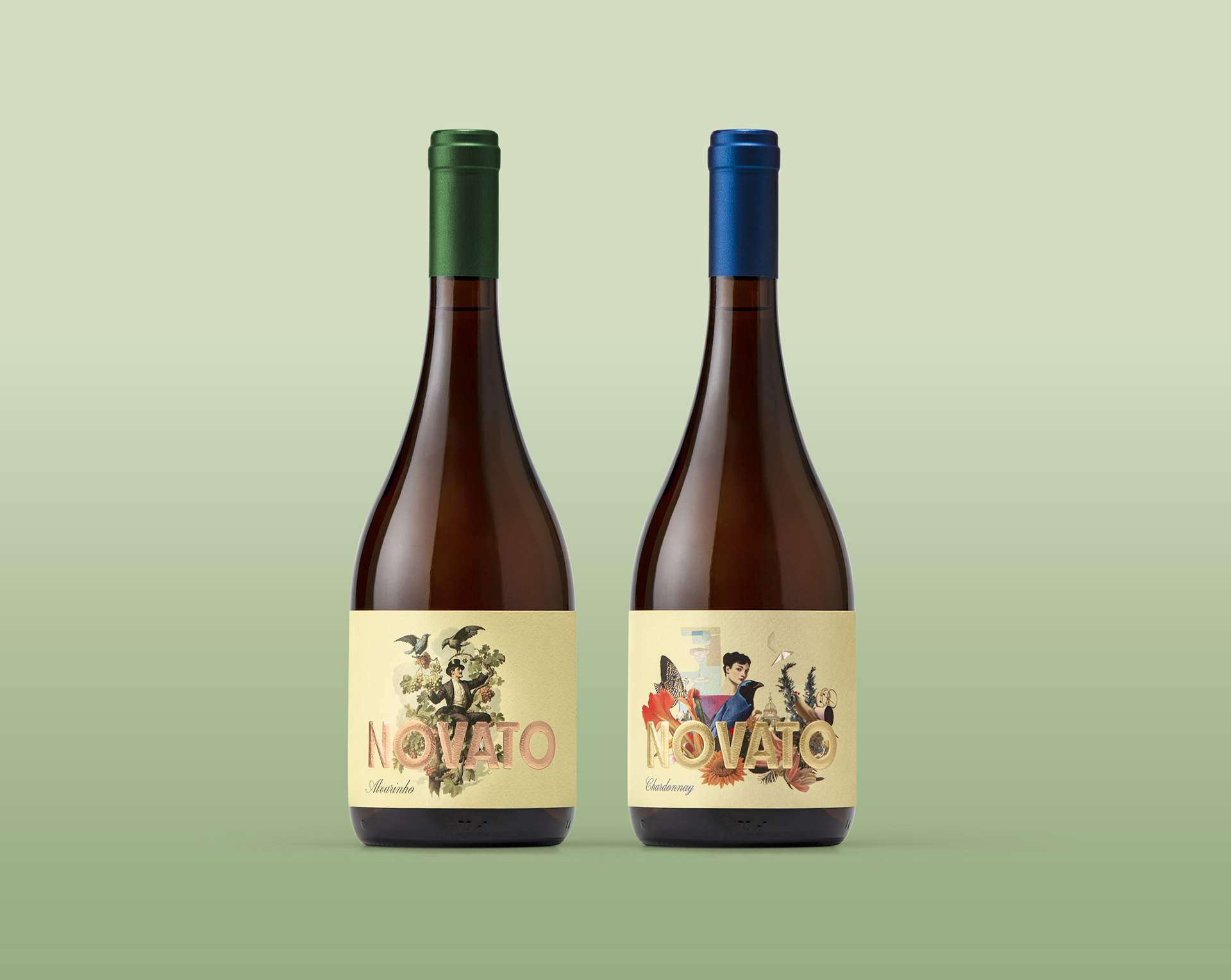
The line was inaugurated with an Alvarinho that translates this philosophy into a fresh, floral, and vibrant expression, guided by instinct rather than convention and shaped by the absence of rigid expectations often associated with traditional wine narratives. The Chardonnay extends this same logic into a lighter and more urban interpretation, connected to everyday moments and spontaneous rituals while preserving the intuitive and fearless spirit that defines Novato. Together, these wines establish a flexible foundation designed to expand naturally into future lines, allowing the concept to evolve while remaining coherent and recognizable.
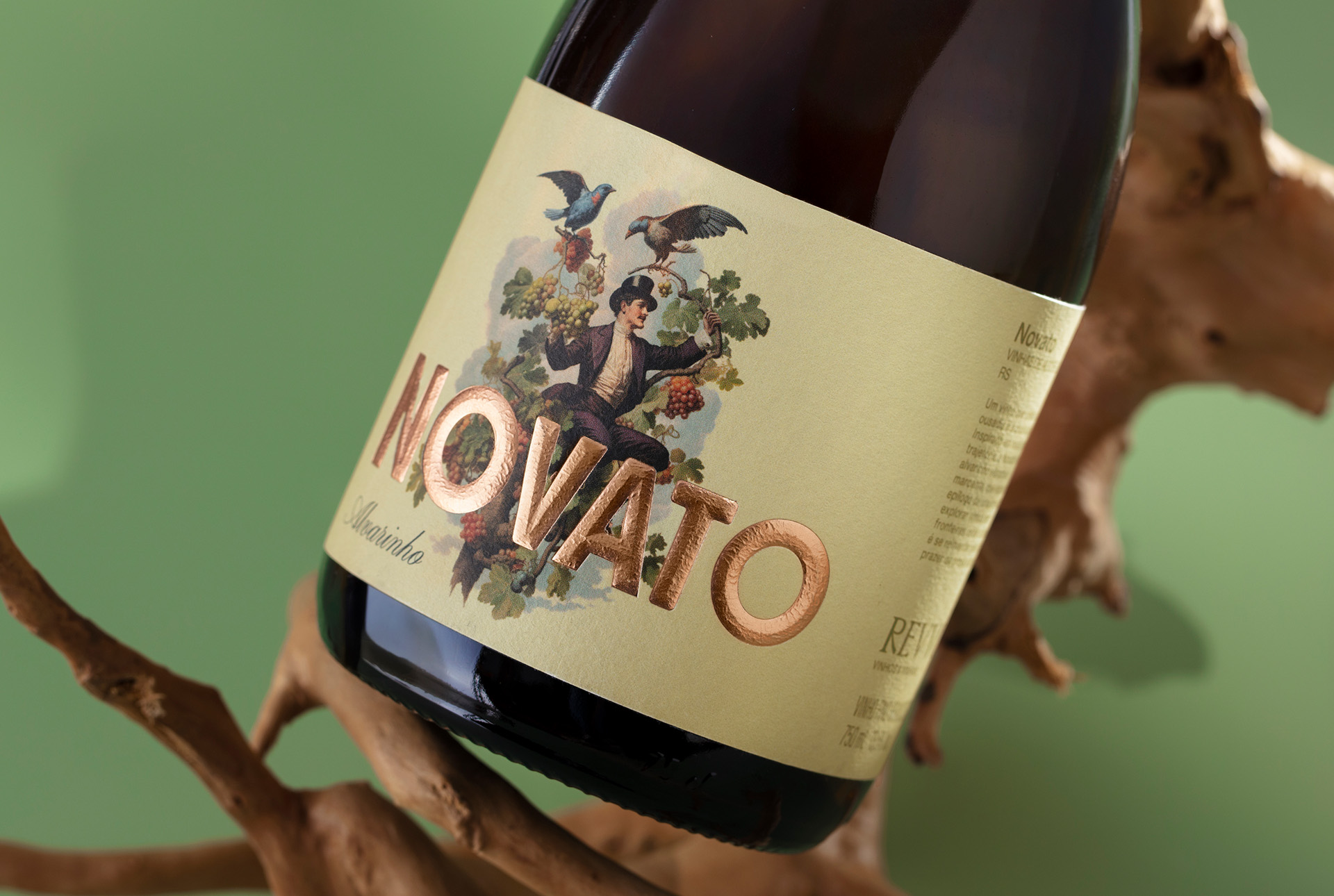
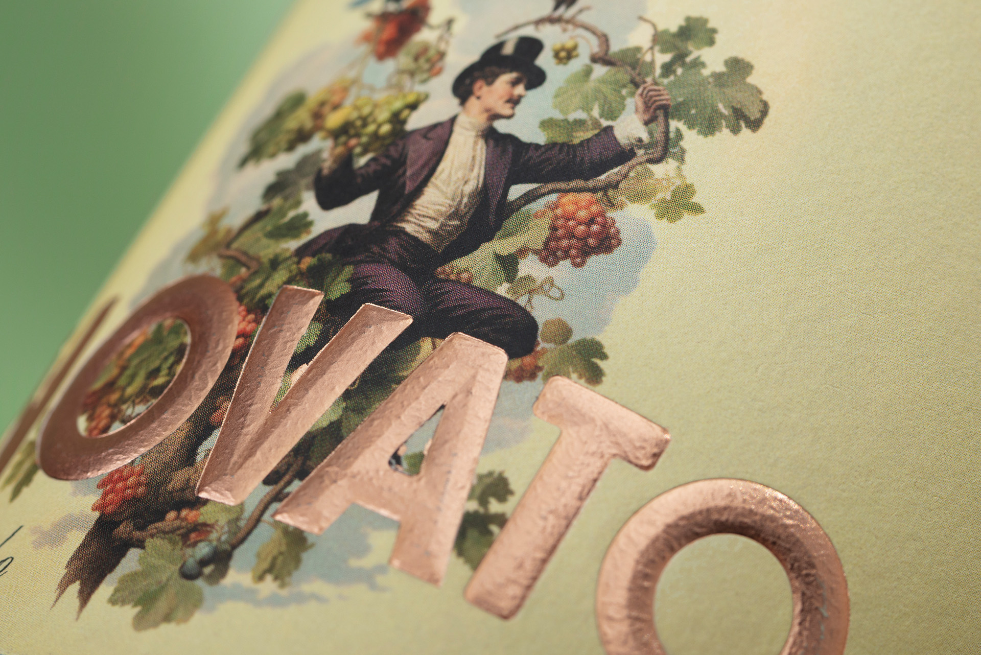
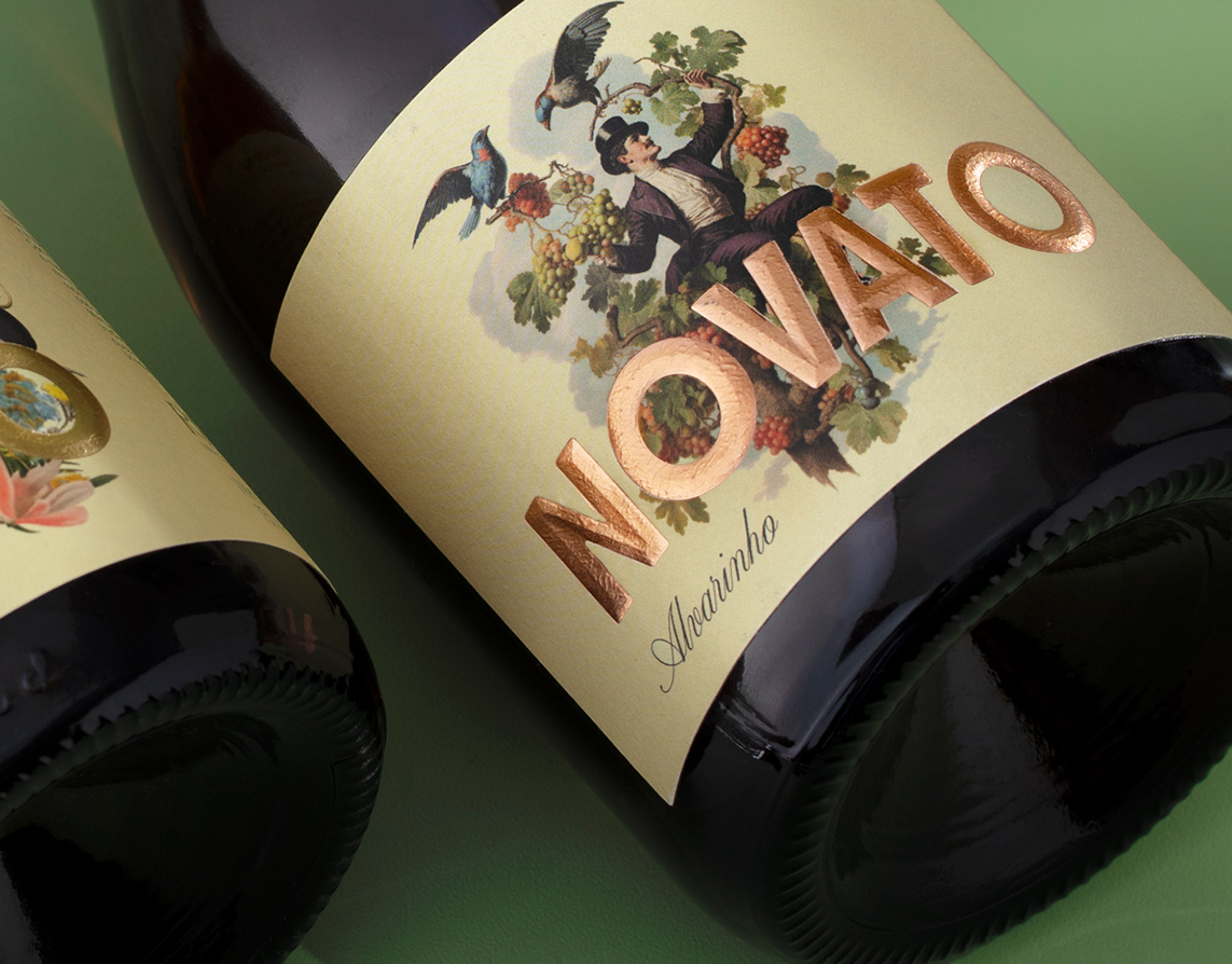
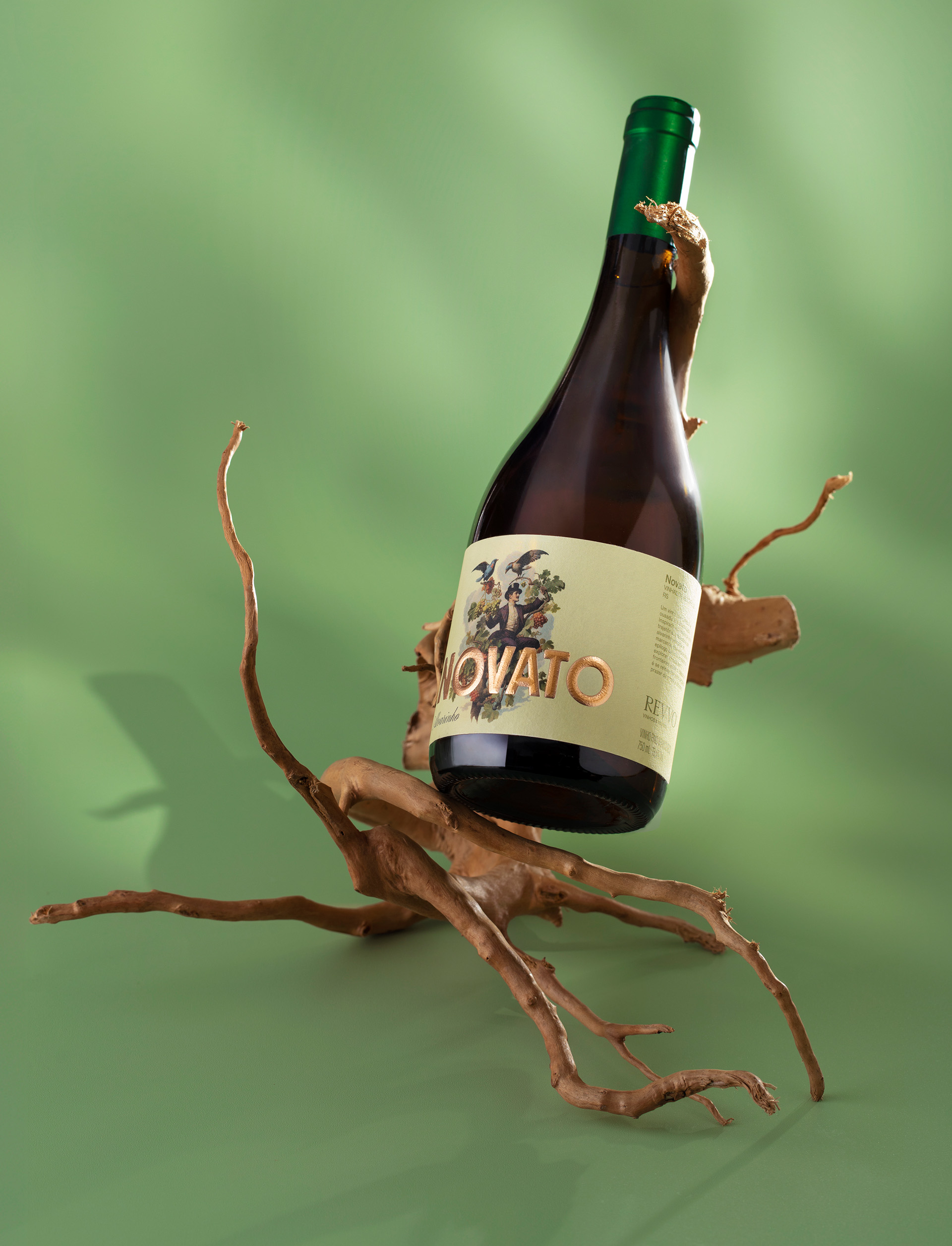
The visual identity and label were created to translate this mindset into imagery. The illustration evokes a sense of wonder that feels almost magical, portraying a character rooted in classic wine culture and Old World references, yet reinterpreted through a contemporary and irreverent lens. Tradition is present, but gently displaced, creating a visual dialogue where heritage and modernity coexist without hierarchy. This tension reflects the essence of Novato, where respect for the past does not limit reinterpretation.
Designed as an open platform, Novato invites continuous exploration and new expressions guided by the same creative intuition. Floral notes, lightness, and subtle urban references shape wines meant for conversation, laughter, and shared experiences, where reinvention unfolds naturally through human connection. Novato celebrates beginnings, creative courage, and the freedom found in uncertainty, allowing each new release to expand the narrative while remaining true to its original spirit.
CREDIT
- Agency/Creative: Holy Design Studio
- Article Title: Holy Design Studio Introduces Novato Wine With an Intuitive and Playful Label Design
- Organisation/Entity: Agency
- Project Type: Packaging
- Project Status: Published
- Agency/Creative Country: Brazil
- Agency/Creative City: Porto Alegre
- Market Region: South America
- Project Deliverables: Brand Design, Brand Identity, Brand Naming, Branding, Design, Graphic Design, Illustration, Label Design, Logo Design, Packaging Design
- Format: Bottle
- Industry: Food/Beverage
- Keywords: bottle; wine; packaging; label; wine label; packaging design; alcohol; beverage; drink
-
Credits:
Creative Direction & design:: Erik Marchetti
Creative Direction & design:: Luís Felippe Cavalcanti
Creative Direction & design:: José Luiz De Lazzari
Printing Production: CCL brasil
Photography: Moropolo Studio
Photography Retouch: Patricia Thiesen


