


Tres Torres, a gin born at the meeting point of man and nature.
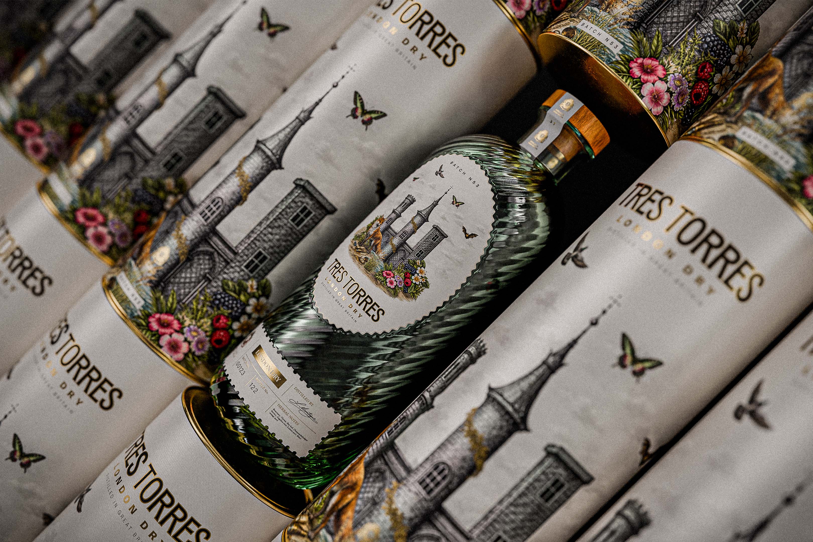
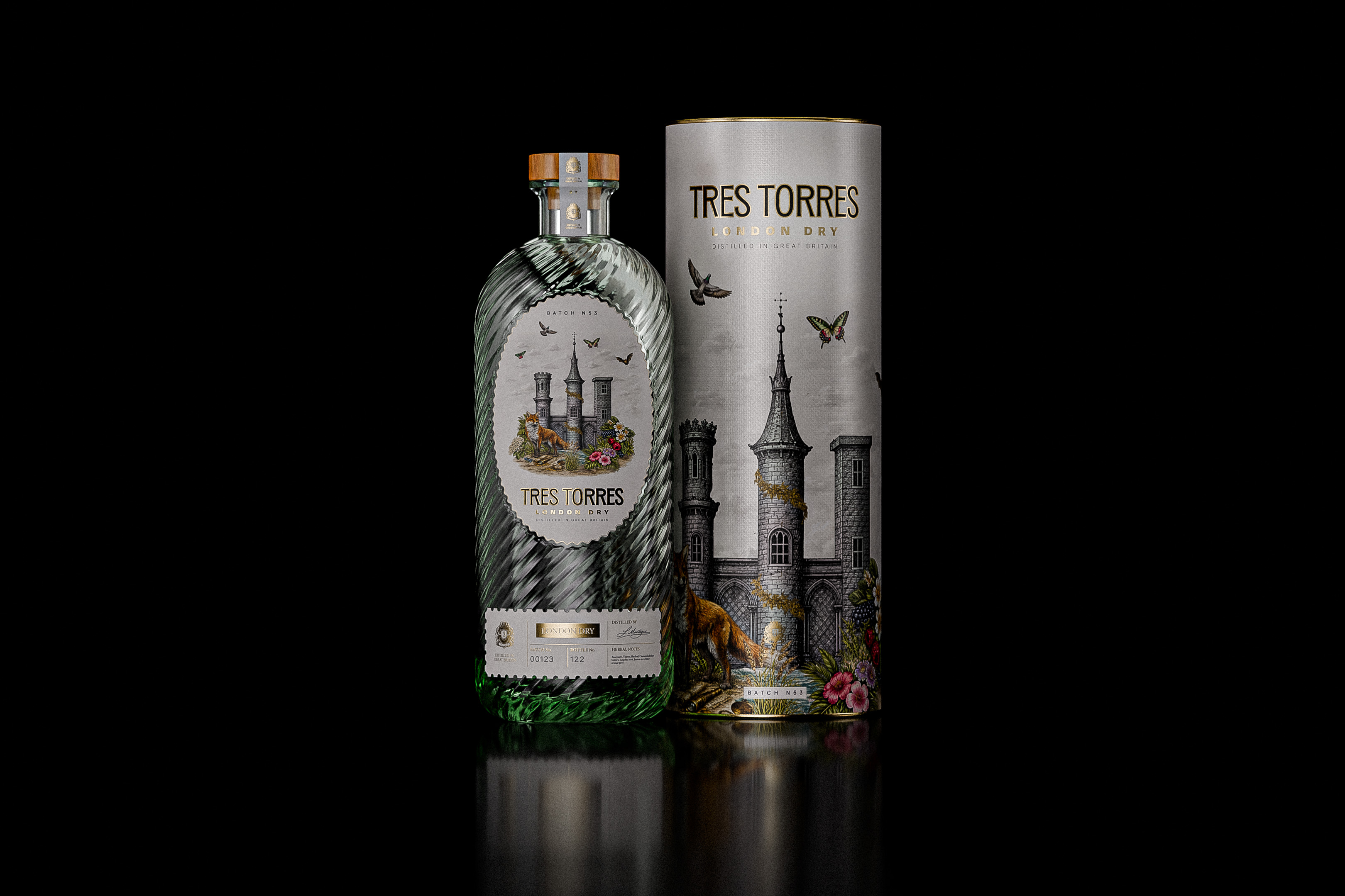
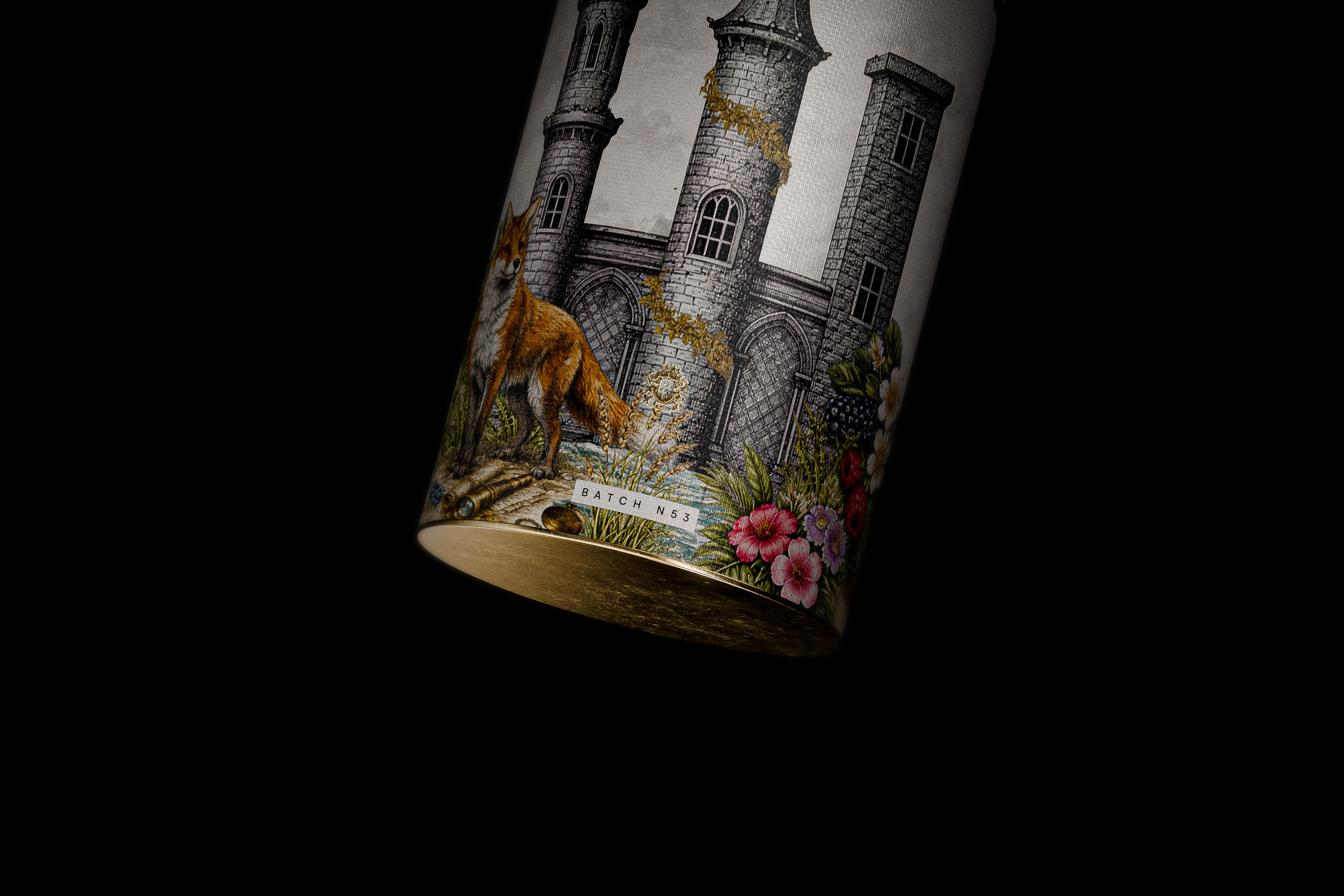
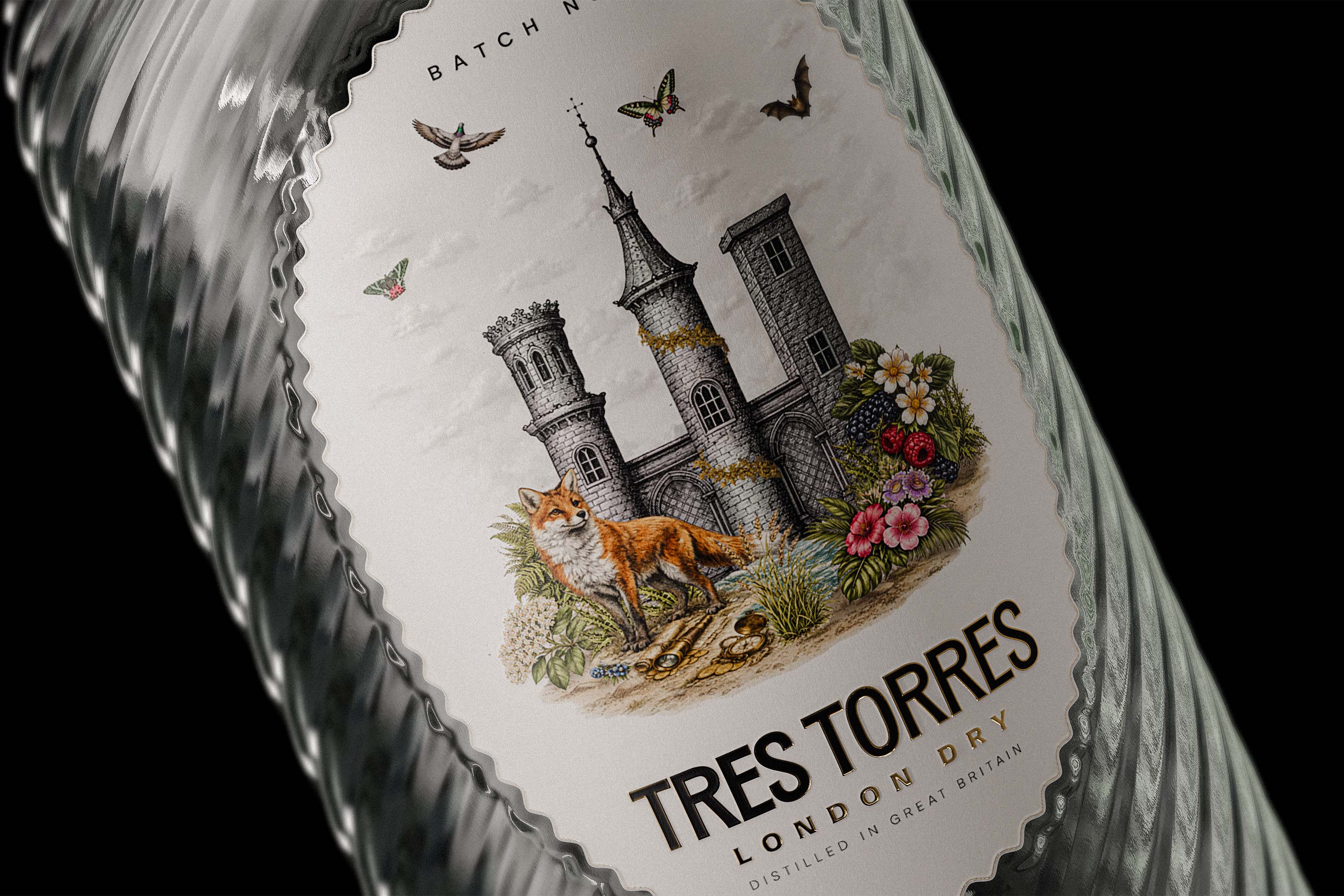
Tres Torres (Three Towers) is a conceptual London Dry Gin project built around the symbolism of three historic towers. Each tower represents time, tradition, and protection, standing as quiet guardians of nature. Together, they form the conceptual backbone of the brand, offering a clear yet flexible framework for storytelling.
The visual identity brings together two worlds, the human-made and the natural, merging them to express the balance at the heart of gin making. This duality reflects the spirit itself: a product defined by human precision and knowledge, yet deeply dependent on the botanicals and raw materials provided by nature. Rather than treating these elements as opposites, the project explores how they can coexist and complement one another.
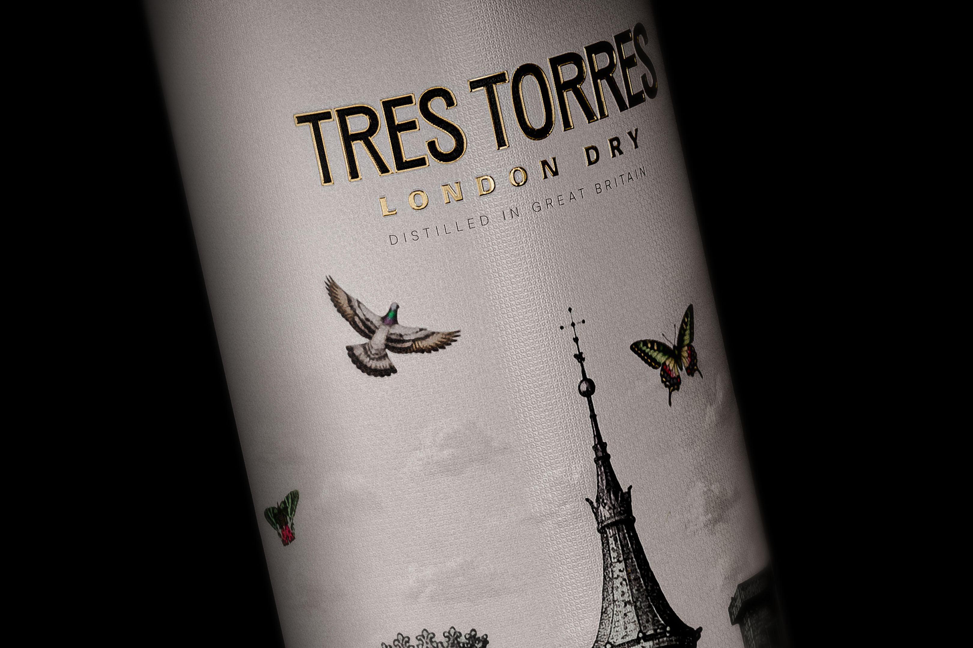
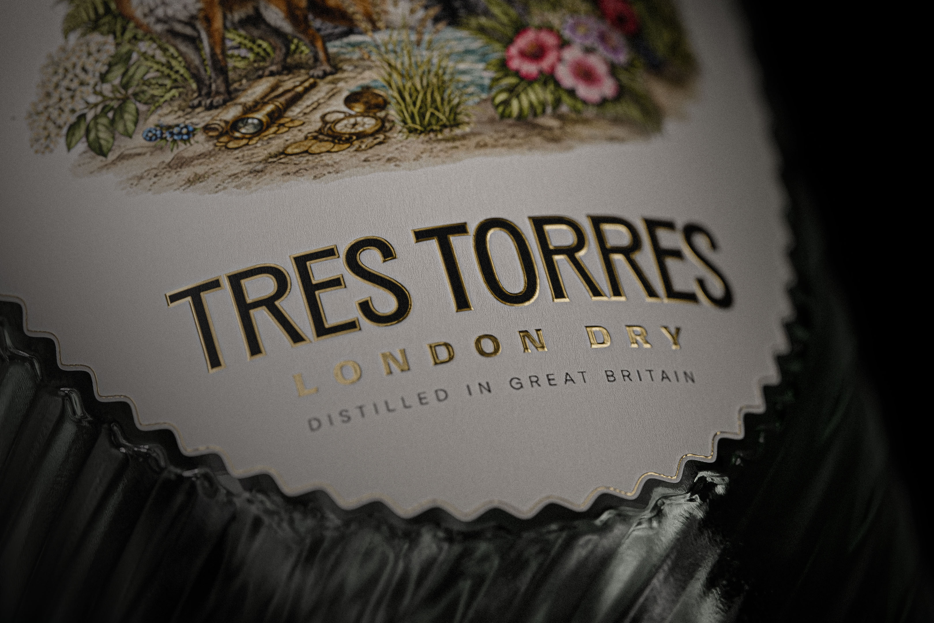
A key design decision was to place the illustrated towers at the centre of the visual language, allowing them to act as a strong symbolic anchor. Their architectural presence introduces structure, rhythm, and stability to the label, creating a sense of permanence and heritage. Surrounding natural elements are integrated more fluidly, softening the composition and adding warmth, depth, and narrative. This contrast reinforces the idea of a spirit shaped through collaboration between human intention and the natural environment.
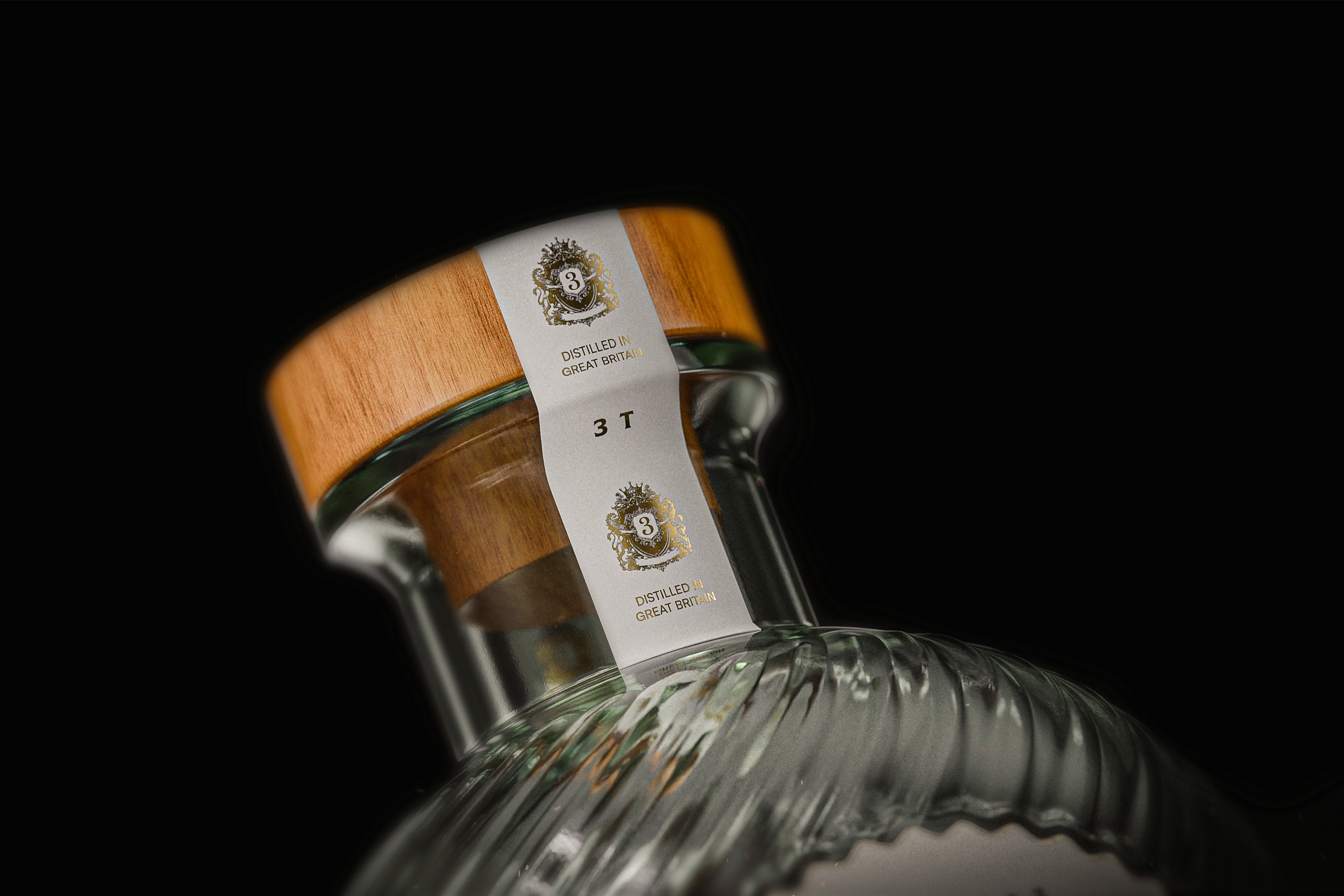
Typography was approached with the same sense of restraint and balance. Elegant, understated type choices leave space for the illustration to breathe while conveying quiet confidence and timelessness. The hierarchy is clear and deliberate, ensuring legibility while supporting the overall atmosphere of the brand rather than competing with it.
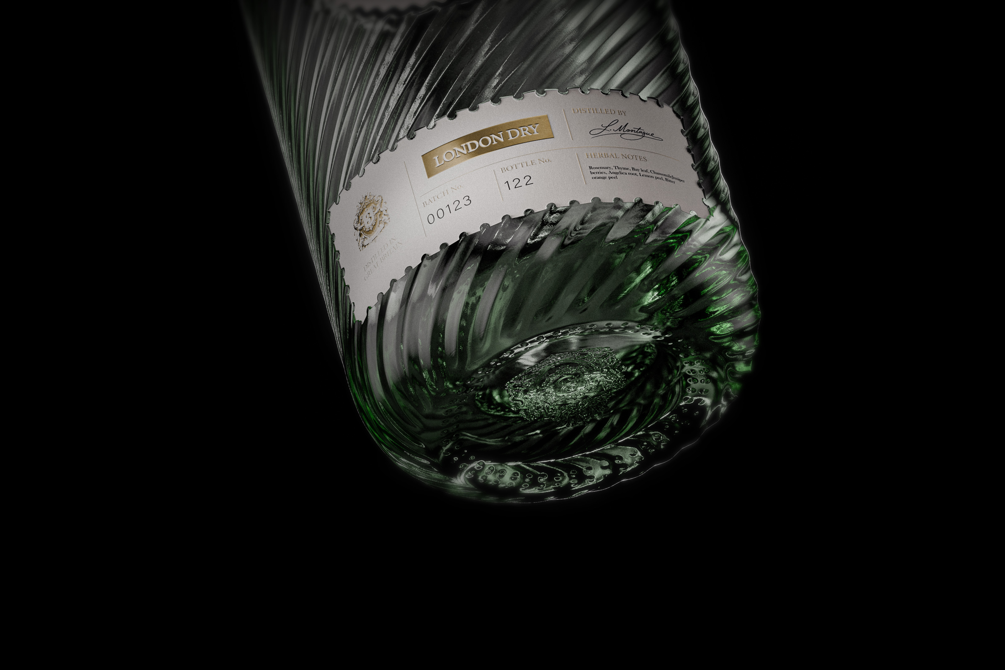
Materiality and detail play an important supporting role throughout the project. Subtle textures, finishes, and graphic details were carefully considered to enhance tactility and elevate the perceived quality of the product. These elements were used sparingly, reinforcing a premium feel without relying on excess decoration or visual noise.
CREDIT
- Agency/Creative: Alliron Studio
- Article Title: Alliron Studio Designs Tres Torres London Dry Gin Through Symbolism and Balance
- Organisation/Entity: Freelance
- Project Type: Packaging
- Project Status: Non Published
- Agency/Creative Country: Spain
- Agency/Creative City: Getxo
- Market Region: Europe
- Project Deliverables: 3D Modelling, Brand Design, Label Design, Packaging Design
- Format: Bottle
- Industry: Food/Beverage
- Keywords: Alcohol, Gin, Packaging, Label, Spirit-Packaging, Beverage Brand
-
Credits:
Graphic Designer: Alex Winterbottom Ezkurra


