


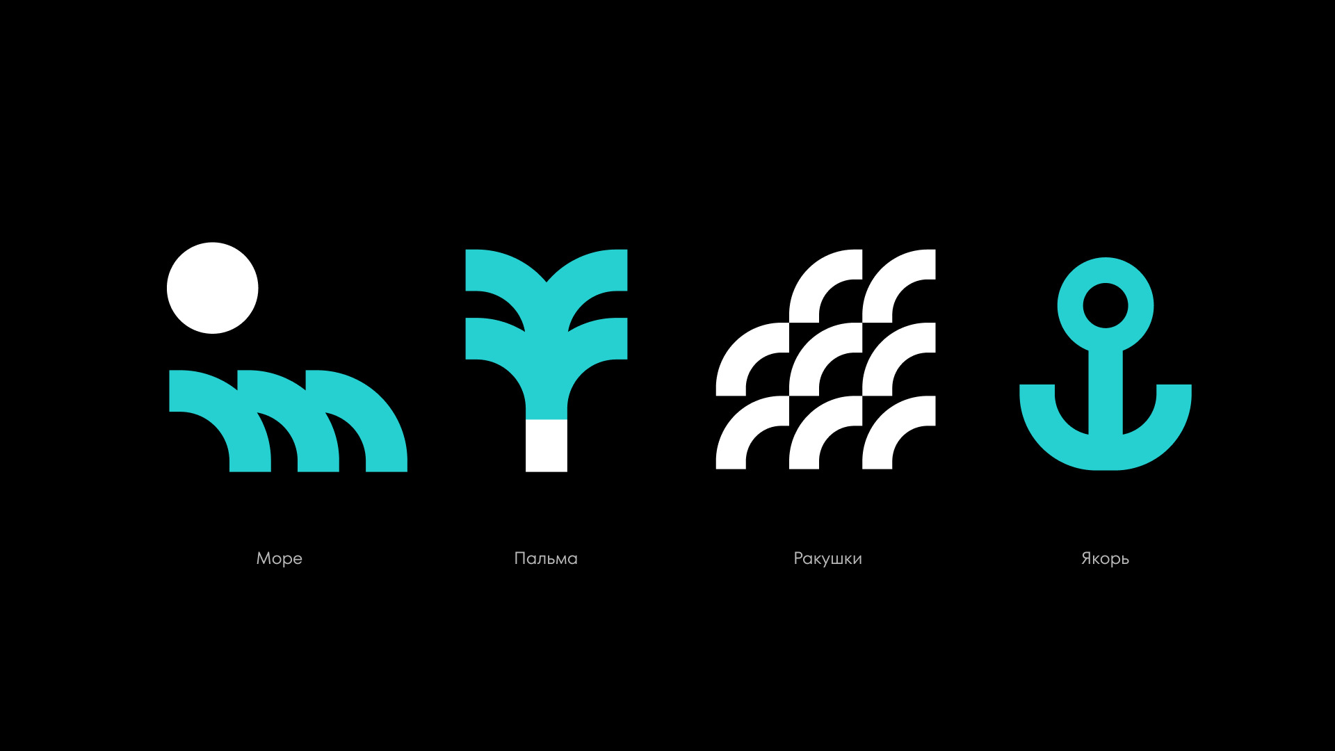
The project began with an extensive and rigorous design study of the global market competitors, utilizing Moloko Agency’s proprietary “Evidence-Based Design” methodology. This analytical approach allowed us to move beyond surface-level aesthetics and understand the psychological triggers of the target audience. Initially, our creative team explored various visual metaphors tied to traditional beach aesthetics and vacation relaxation. However, a deep dive into the data revealed a crucial insight: Fasttour is, first and foremost, a high-performance IT service designed for the modern era. To truly emphasize speed, kinetic energy, and relentless innovation in the travel search sector, we made a strategic decision to pivot away from traditional “resort” clichés and sunny postcards toward a sophisticated, tech-driven approach.
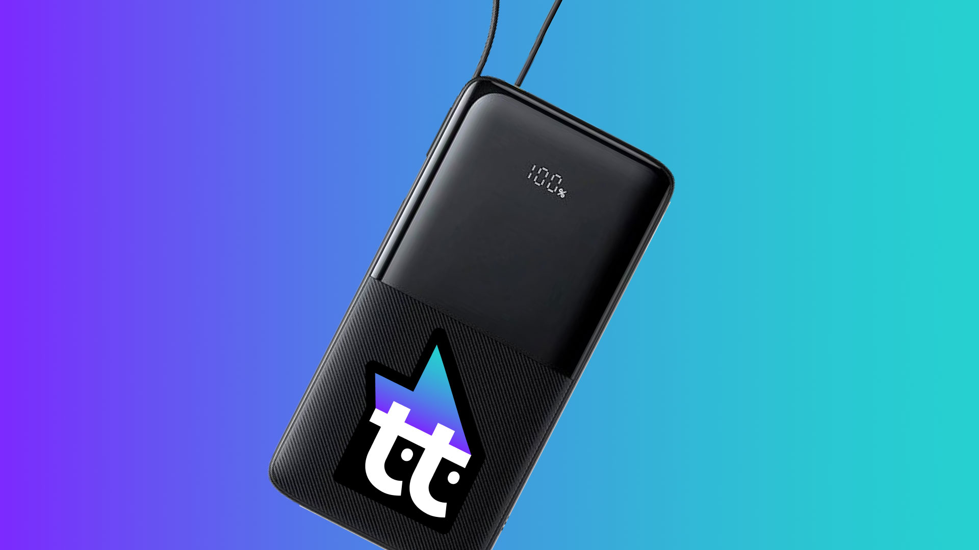
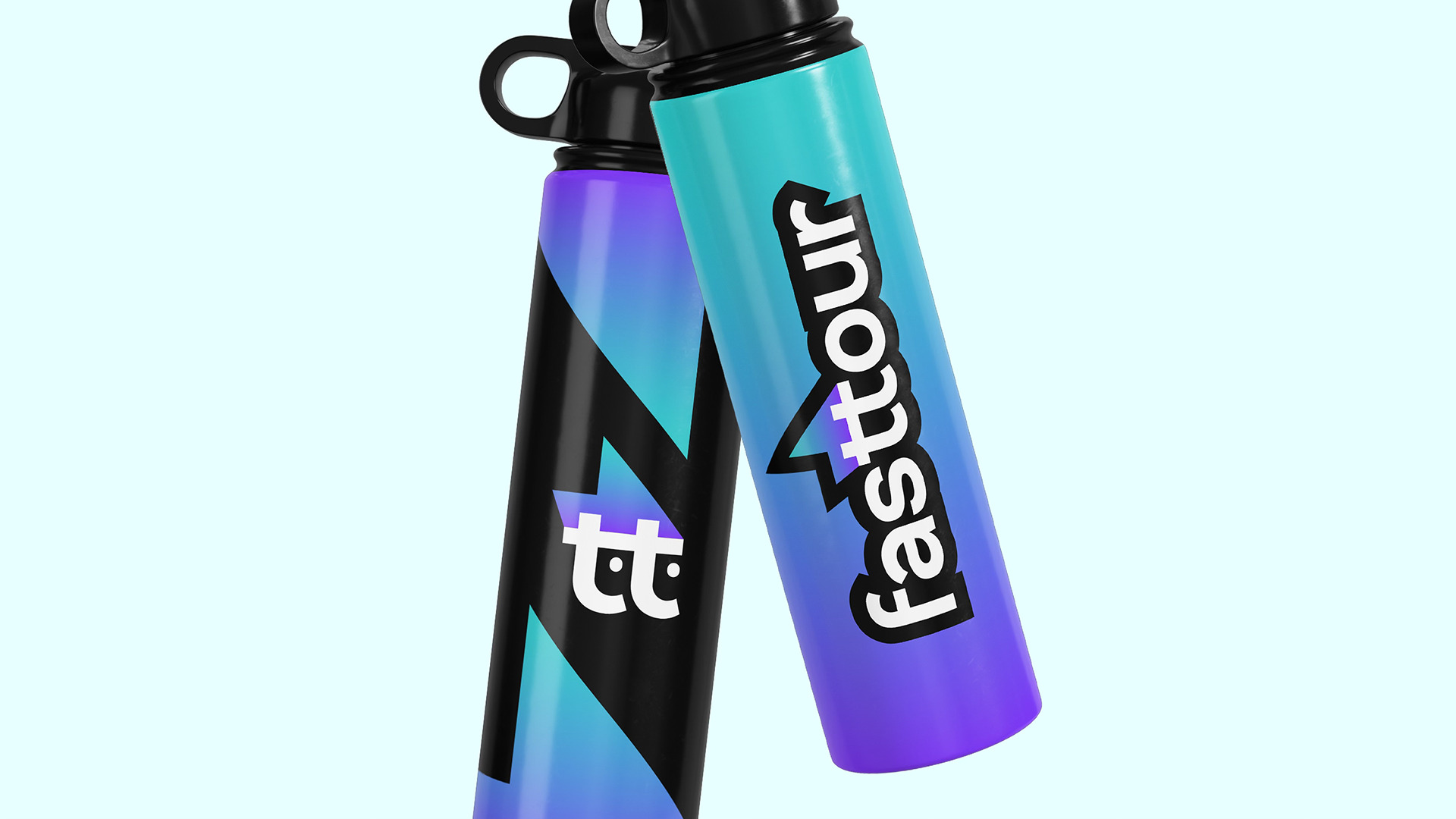
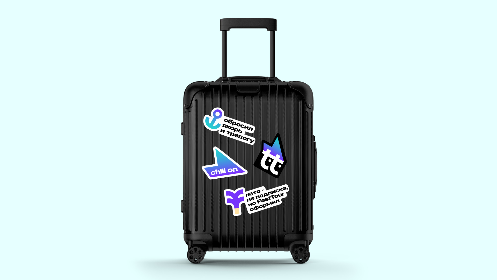
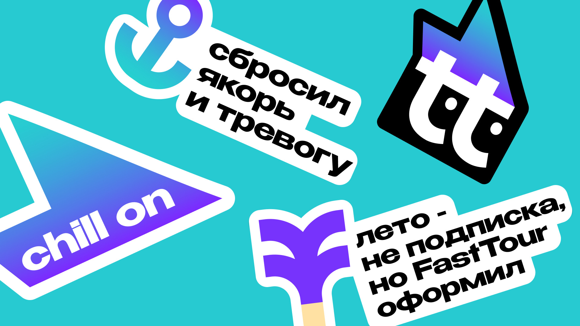
Among numerous creative concepts developed during our brainstorming sessions, the definitive “one” turned out to be the logo featuring a stylized flame positioned over the double “tt”. During a pivotal internal meeting, it suddenly “clicked” for the entire team; we realized that this specific symbol perfectly captures the brand’s internal drive and its promise of rapid results. We transformed the fire concept from a simple element into a powerful symbol of search speed, completely shifting the project’s visual direction.
Instead of adopting a classic marine palette of blues and yellows, we chose a bold, high-contrast violet-to-turquoise gradient. This vibrant color scheme adds a sense of digital polish and futuristic freshness to the project. This strategic choice allowed the brand’s forms to resonate in a completely new way, making Fasttour stand out instantly against its more conservative competitors.
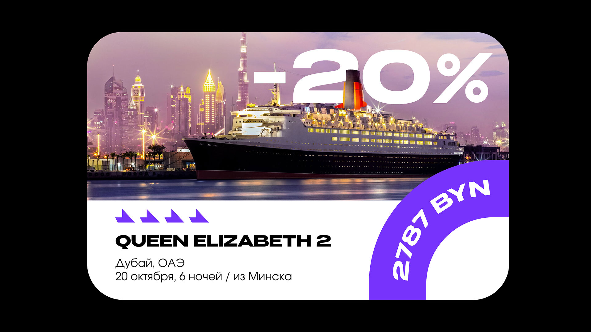
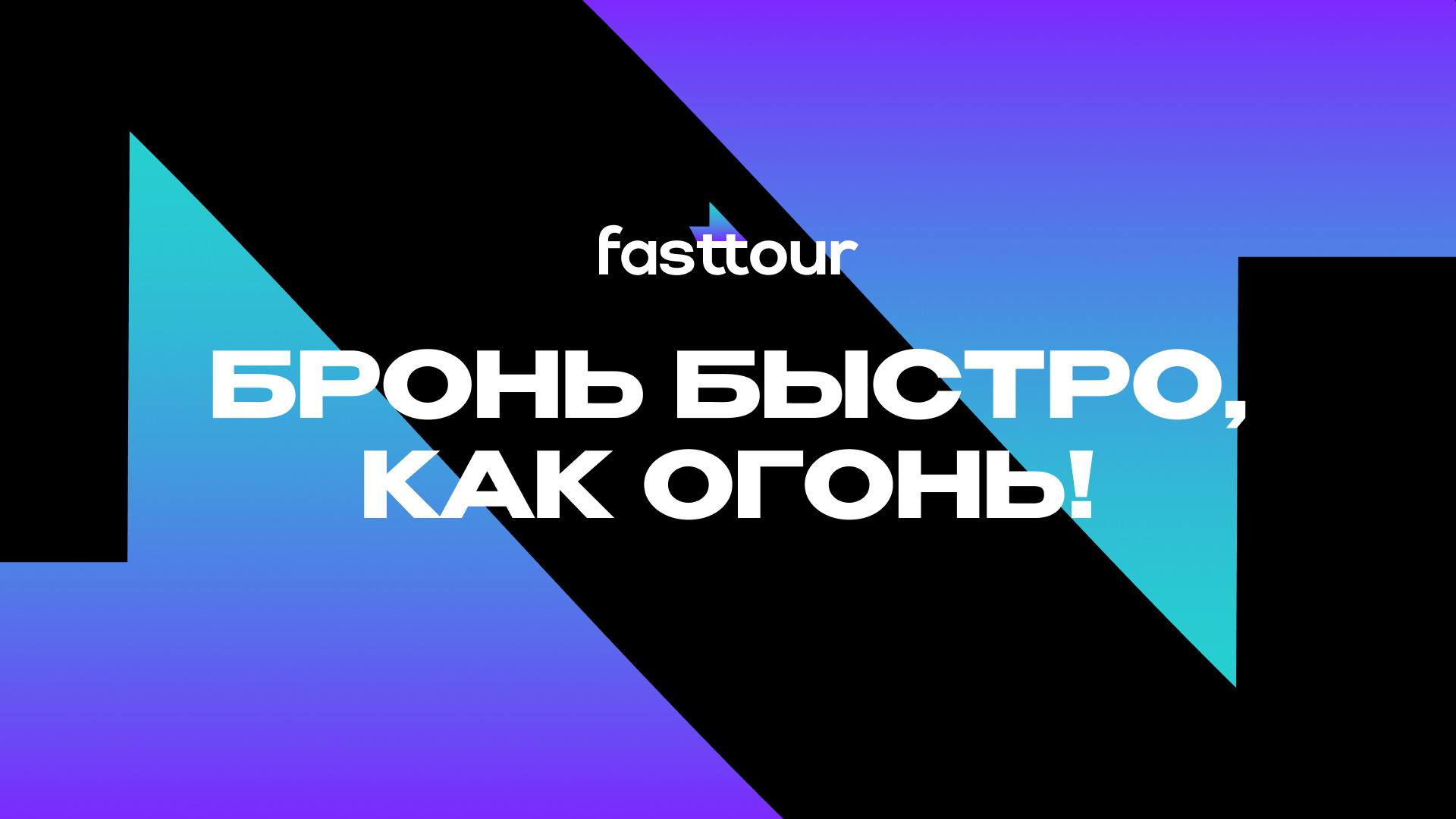
In the final implementation stage, we scaled the identity across multiple touchpoints. We created a unique, charismatic mascot derived from a condensed version of the logo, designed a library of custom icons, and implemented bold, authoritative typography. The accent fonts used on banners and digital interfaces now not only communicate complex tour information instantly but also ensure the brand sticks firmly in the user’s memory. The final result is a vibrant, innovative, and disruptive product that successfully breaks industry stereotypes, positioning Fasttour as a leader in the next generation of travel technology.


CREDIT
- Agency/Creative: Moloko. Branding Sidekicks
- Article Title: Moloko Translates Speed and Technology Into a Distinctive Brand System for Fasttour
- Organisation/Entity: Agency
- Project Type: Identity
- Project Status: Published
- Agency/Creative Country: Lithuania
- Agency/Creative City: Vilnius
- Market Region: Europe
- Project Deliverables: Brand Design
- Industry: Information
- Keywords: Branding, tourism, logo, identity
-
Credits:
Creative Director: Denis Misyulya
Brand Designer: Liubou Korzan
Senoir Brand Designer: Alina Kozhbakova
Account Manager: Mary Boiko
Business Director: Olga Kaziaba


