


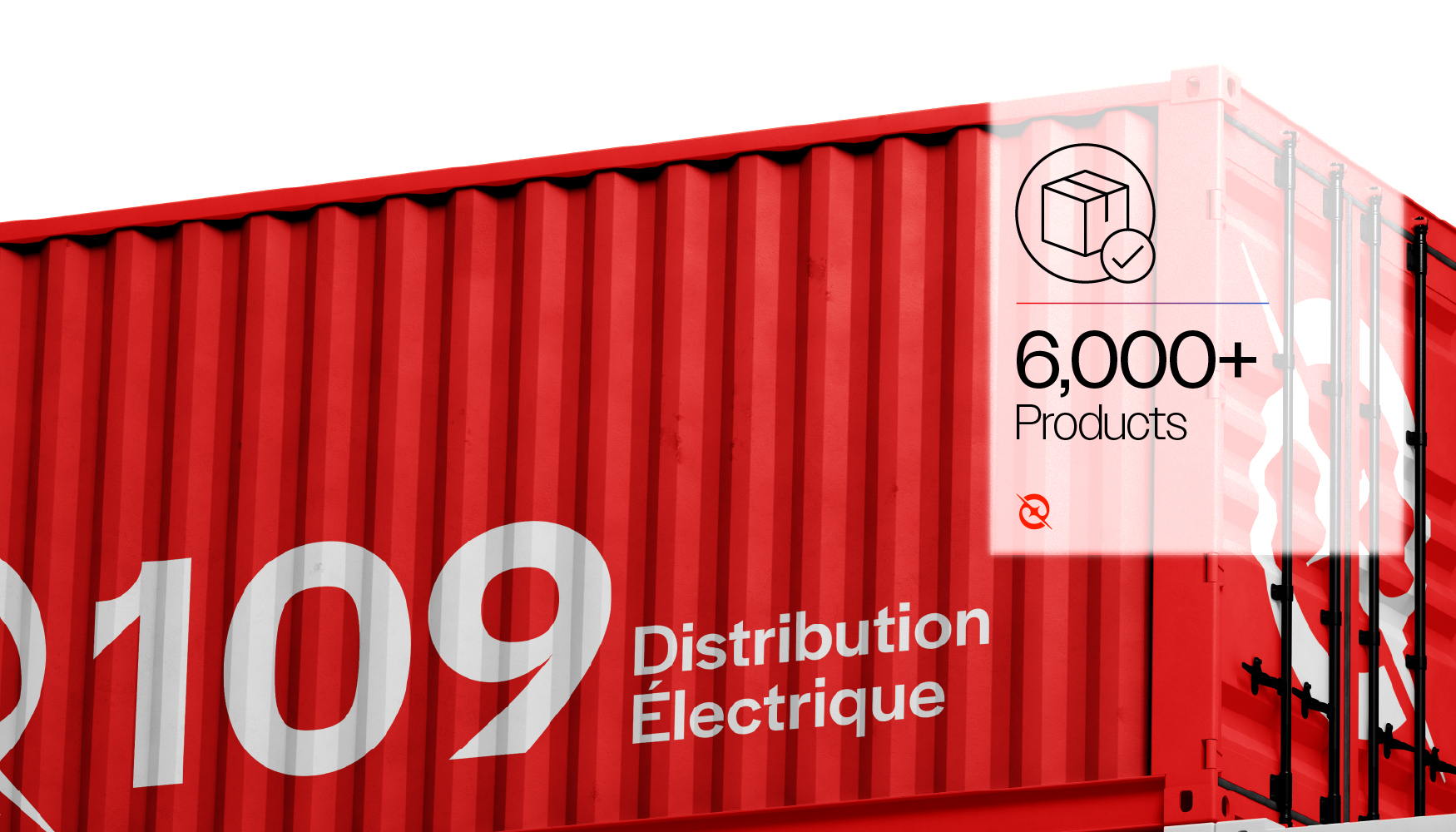
109 Distribution Électrique is a well-established electrical distributor based in Réunion Island, operating through four major branches strategically spread across the island and offering more than 6,000 products in inventory. Despite its strong market presence and operational scale, the brand lacked a unified and expressive visual system capable of translating its expertise, reliability, and forward-looking vision into a coherent identity across both physical and digital touchpoints.
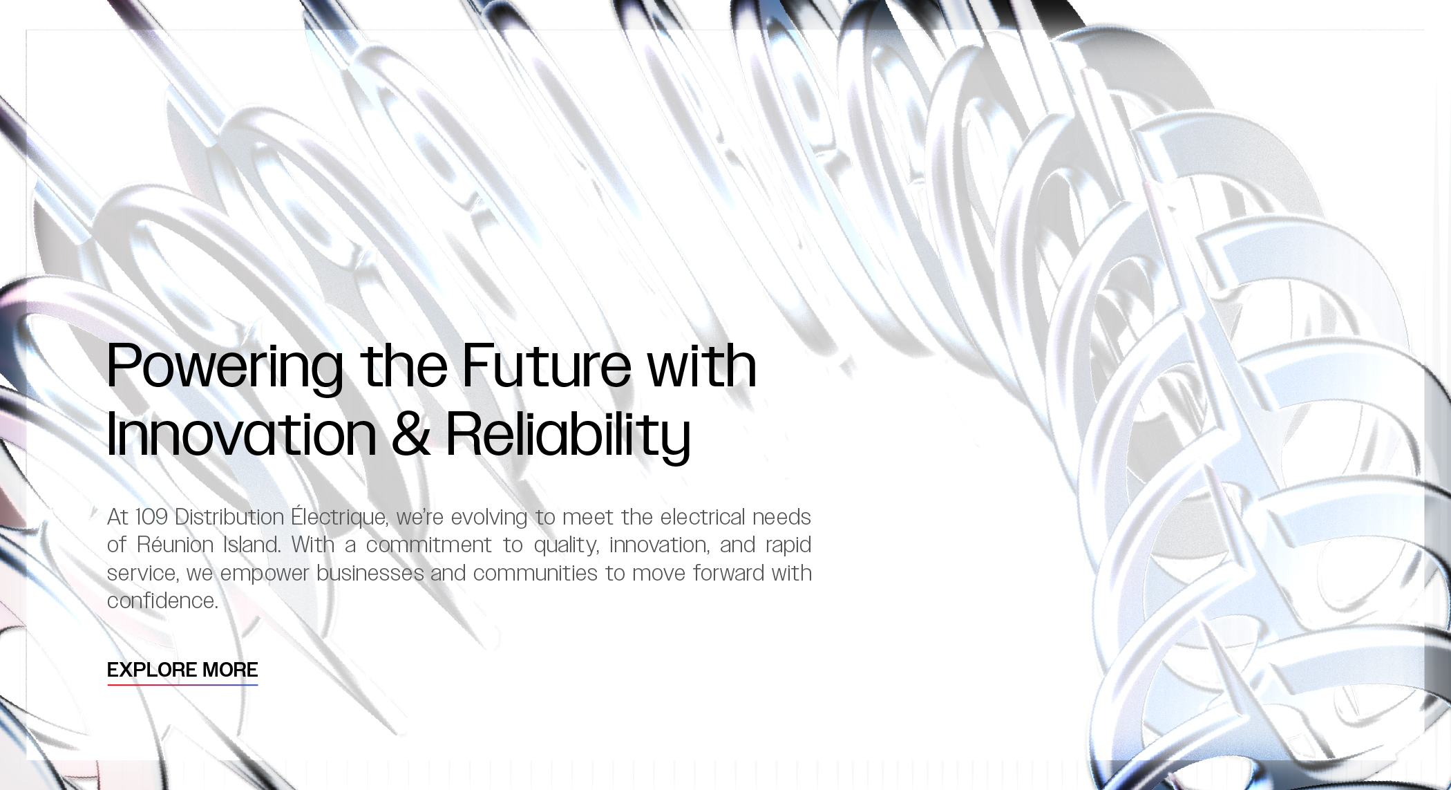
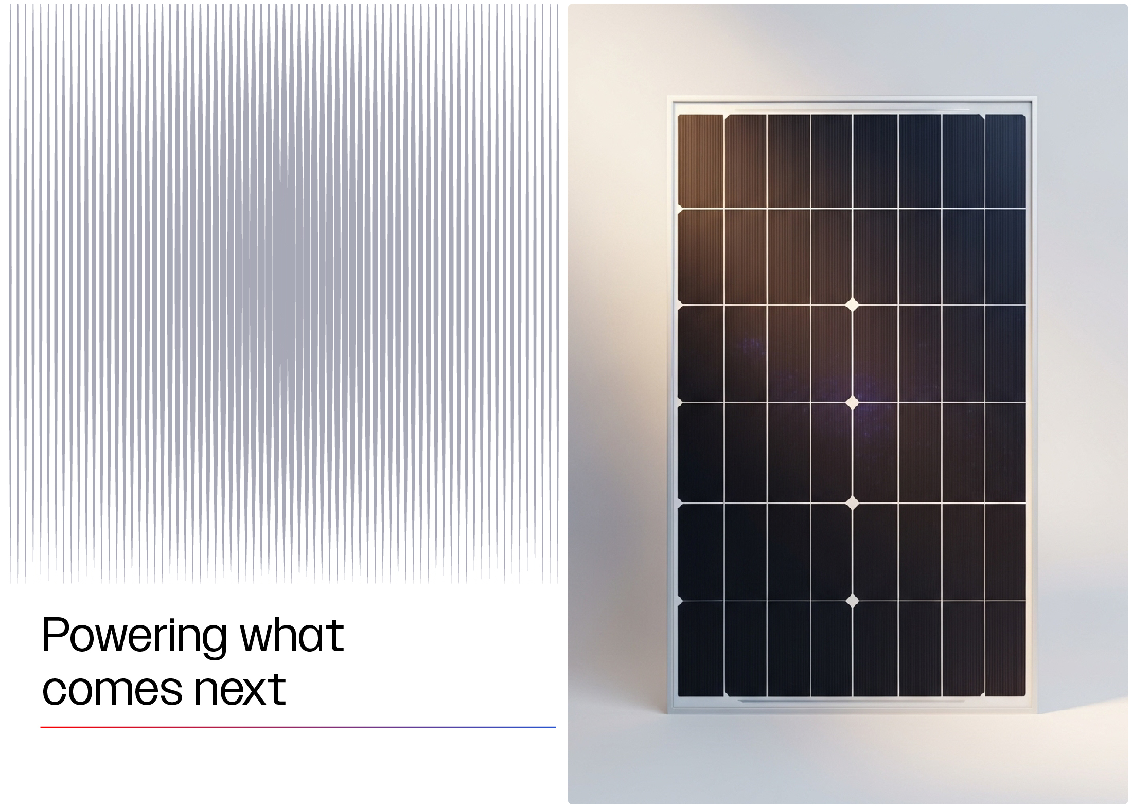
The objective of the rebranding was to create a distinctive, scalable, and future-ready visual identity that reflects the energy of the industry while remaining grounded in professionalism and trust. The process began by defining a clear big idea that could act as the backbone of the entire system: Flow Forward. This concept represents continuous movement, progress, and readiness—mirroring the way energy itself flows, transforms, and powers everyday life. It also reflects 109’s role as a reliable partner that keeps projects moving without interruption.
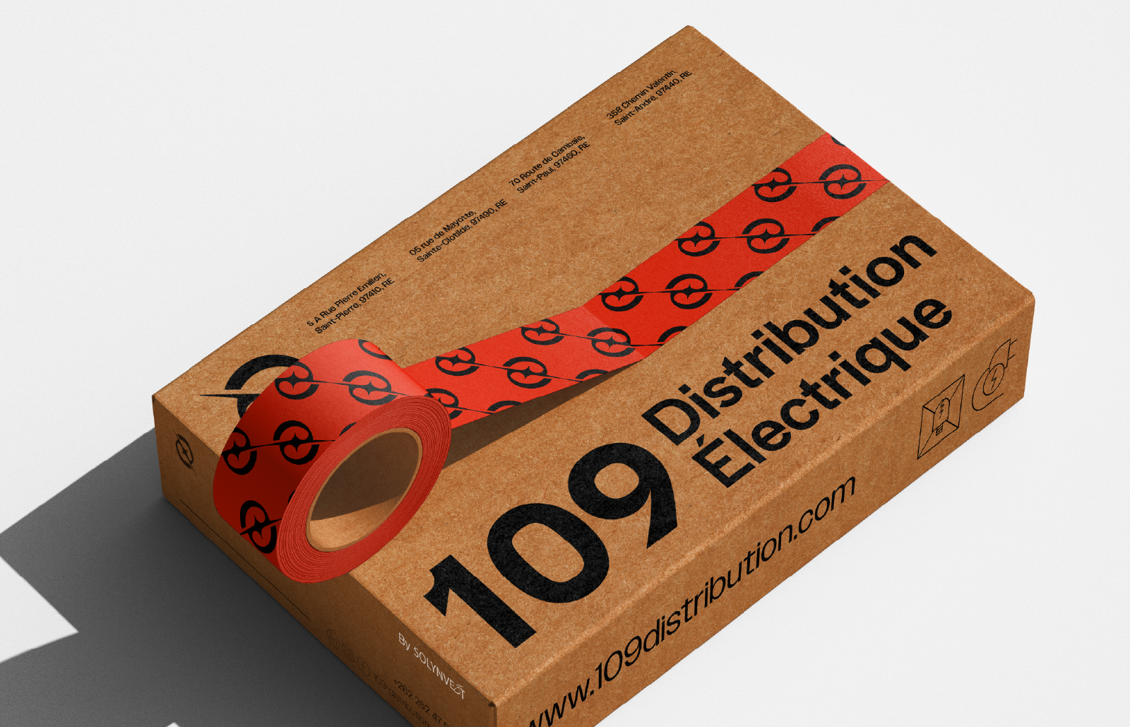
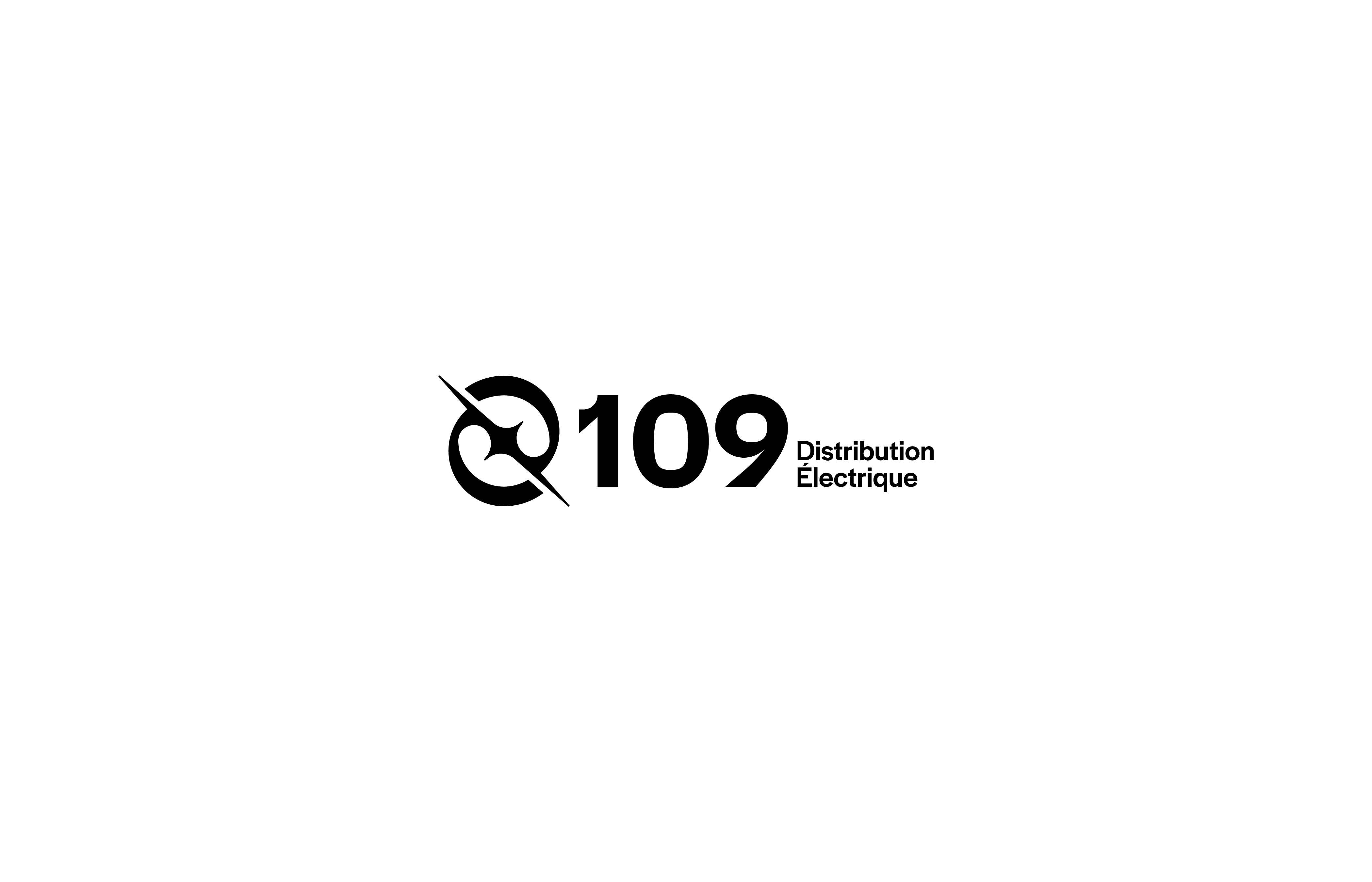
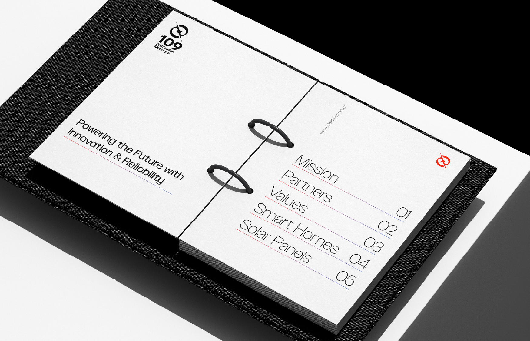
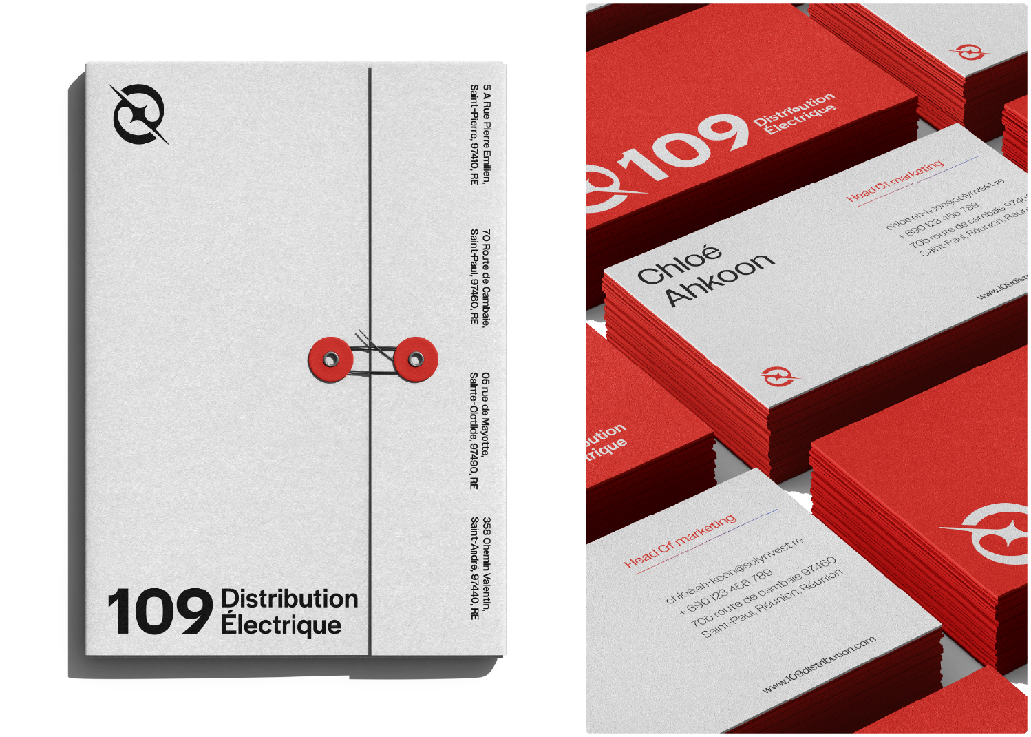
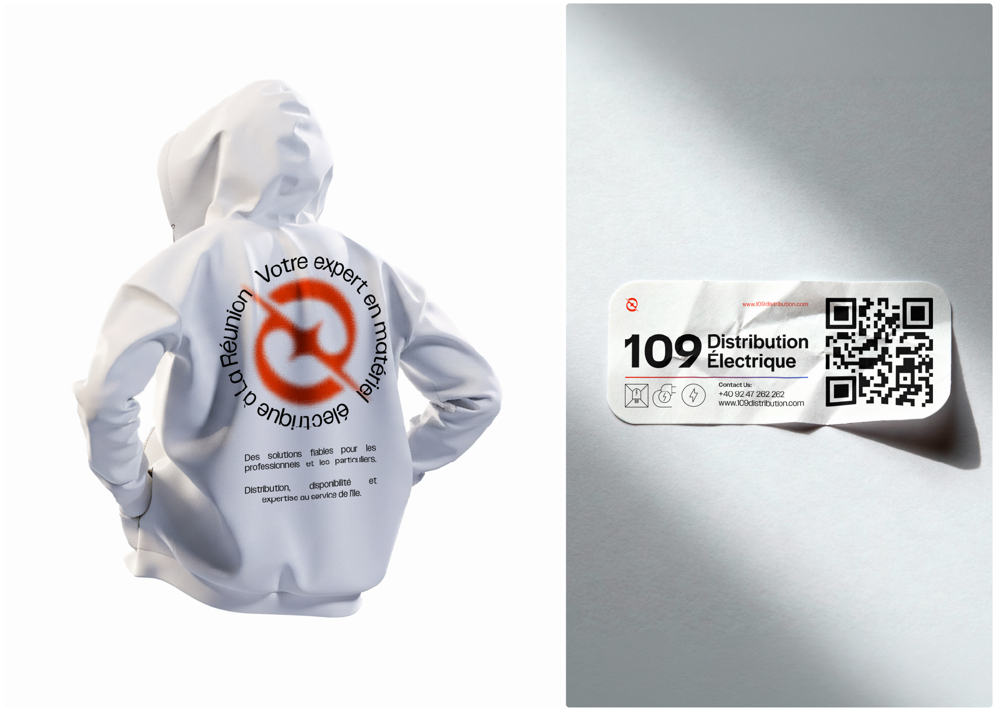
The creative direction embraces a minimal, industrial, and contemporary aesthetic. A custom logomark was developed, inspired by the formation of energy through the interaction of electrons, resulting in a dynamic yet controlled symbol that conveys both power and precision. The logotype was designed to work independently or alongside the mark, ensuring flexibility across applications.
The color system builds on the brand’s existing red, refined to feel more energetic and impactful, and paired with blue through gradients to symbolically express the transition toward cleaner and smarter energy solutions. These gradients, along with the signature “flow” graphic elements, became core assets within the visual language, reinforcing the brand narrative without relying on literal representations.
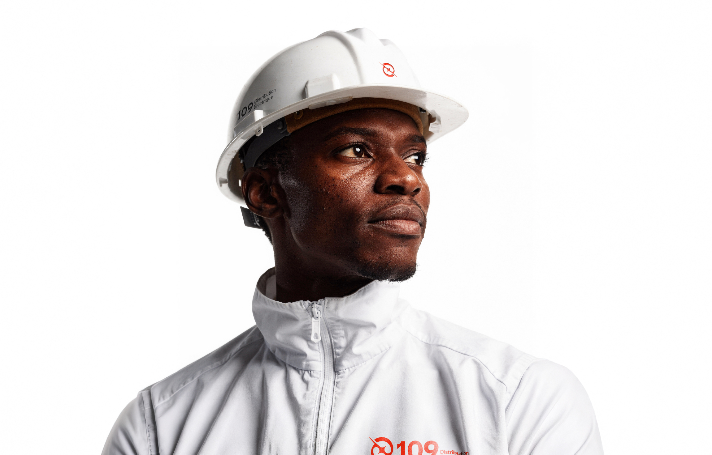
To ensure consistency and usability, a comprehensive design system was created, including iconography, illustration style, patterns, photography direction, and digital layouts. The icon set was designed to cover both customer-facing communication and internal applications such as wayfinding and interfaces, while the illustration system adds warmth and accessibility without compromising clarity or professionalism.
The result is a cohesive brand identity that strengthens 109 Distribution Électrique’s positioning as a modern, reliable, and forward-driven distributor—deeply rooted in Réunion Island and ready to power the future of electrical solutions across the region.
CREDIT
- Agency/Creative: Ahmed Hazem
- Article Title: Ahmed Hazem Develops a Scalable Visual Identity for 109 Distribution Électrique
- Organisation/Entity: Freelance
- Project Type: Identity
- Project Status: Published
- Agency/Creative Country: Egypt
- Agency/Creative City: Tanta
- Market Region: Africa
- Project Deliverables: Brand Design, Brand Guidelines, Brand Identity, Icon Design, Logo Design, Packaging Design, Rebranding
- Industry: Energy
- Keywords: Rebranding Electric Distribution Clean Visual identity Logo design 109
-
Credits:
Brand Designer: Ahmed Hazem


