


Looply was created as a fictional brand to rethink how modern collaboration should feel. In a landscape crowded with rigid productivity tools and noisy teamwork platforms, Looply set out to offer something different — a softer, more human approach to working together.
Rather than positioning collaboration as a system to manage, Looply reframes it as a shared experience. One where connection, creativity, and flow take priority. The brand identity needed to support this vision across multiple touchpoints, creating a cohesive system that feels friendly, modern, and emotionally resonant.
Brief
The brief was to design a brand identity that made collaboration feel effortless, joyful, and human. Looply needed to balance playfulness with professionalism — approachable without being childish, modern without feeling cold.
The identity had to clearly communicate three core ideas:
Connection.
Creativity.
Flow.
Every visual decision needed to reinforce the idea that teamwork does not have to feel chaotic or mechanical — it can feel natural and intuitive.
Strategy
An audit of existing collaboration and productivity brands revealed a common pattern: overly technical visuals, sharp edges, muted palettes, and complex systems that prioritize function over feeling.
Looply’s strategy was to move in the opposite direction.
Instead of rigid grids and harsh geometry, the brand would embrace softness, motion, and warmth. Instead of positioning tools as the hero, people and shared energy would take center stage.
The goal was to design an identity that feels like an invitation — not an instruction.
Design Process
The identity system was developed through focused exploration and refinement, built around clarity and flow.
Key elements included:
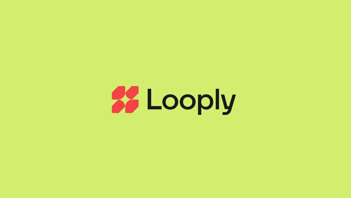
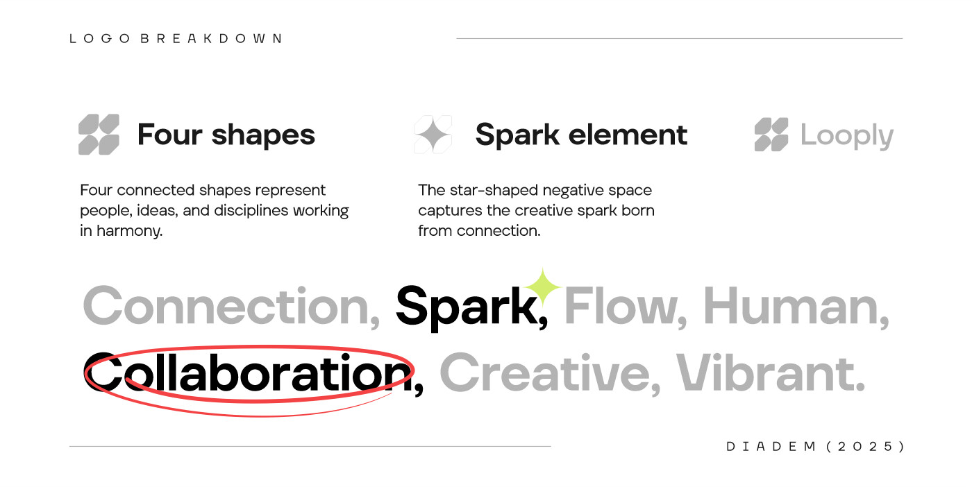
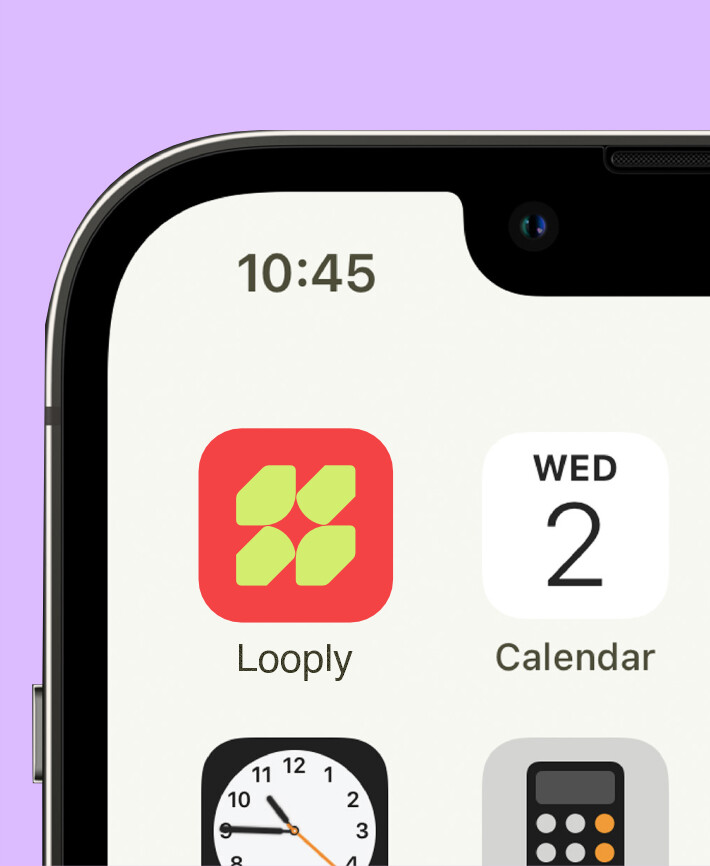
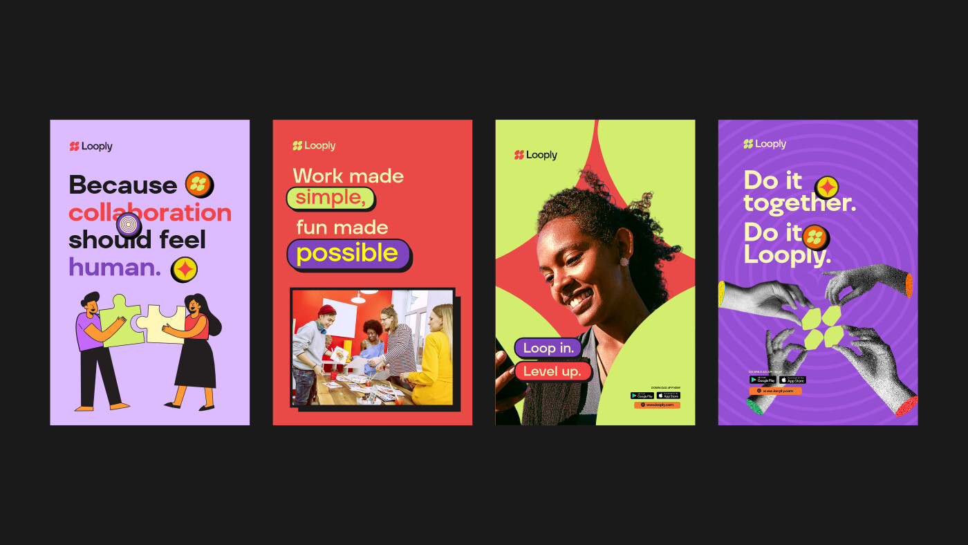
Logo System
The mark is formed from four geometric shapes converging to create a spark at the center. The negative-space star represents the moment when collaboration clicks — when people and ideas align to create something greater.
Typography
TT Firs Neue Var was chosen for headings to convey confidence, structure, and modernity, while maintaining warmth. Poppins was selected for body text to ensure approachability and readability across digital environments.
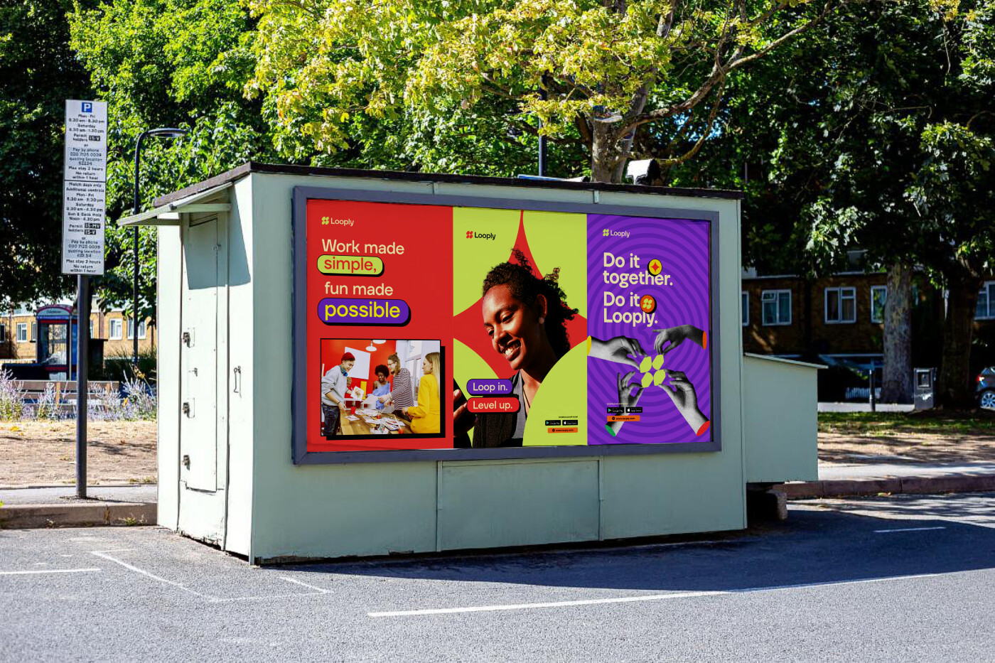
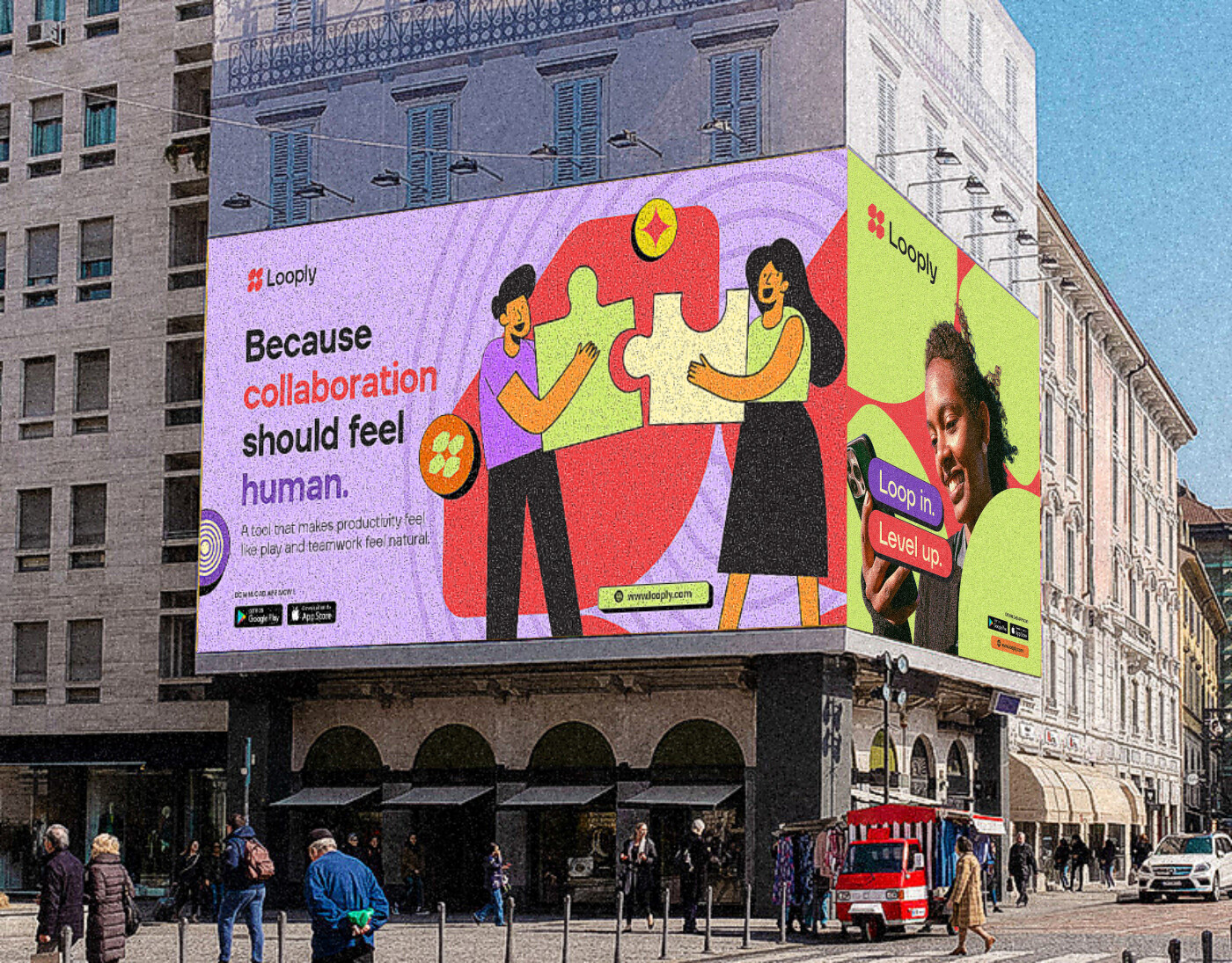
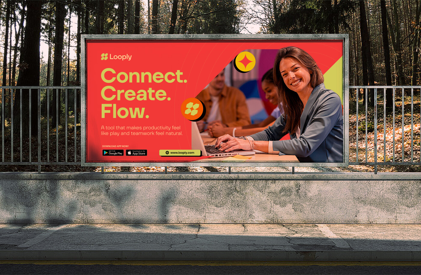
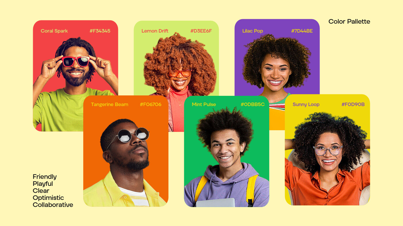
Colour Palette
A vibrant, expressive palette was developed to reflect optimism, creativity, and human connection. Each colour was chosen to energize the interface while maintaining balance and harmony.
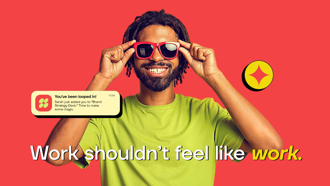
Illustration and Imagery
Soft geometric illustrations were paired with real human photography. This combination allowed the brand to feel playful yet grounded — expressive without losing authenticity.
Every element was designed to support rhythm, motion, and emotional clarity.
Result / Impact
The outcome is a cohesive brand identity that redefines how collaboration is visually expressed. Looply stands apart from conventional productivity brands by offering a calm, human alternative — one that feels inviting rather than overwhelming.
The identity successfully communicates Looply’s core belief:
that productivity can be kind, teamwork can be beautiful, and collaboration can flow naturally.
As a fictional concept project, Looply demonstrates how thoughtful branding can transform complex digital tools into meaningful human experiences.

CREDIT
- Agency/Creative: Ephraim Goodness
- Article Title: Looply Brand Identity Redefines Collaboration Through a Human Centered Creative System by Ephraim Goodness
- Organisation/Entity: Freelance
- Project Type: Service
- Project Status: Published
- Agency/Creative Country: Nigeria
- Agency/Creative City: Lagos
- Market Region: Africa, Asia, Europe, South America, Global
- Project Deliverables: 2D Design, Advertising, Animation, Art Direction, Brand Architecture, Brand Creation, Brand Design, Brand Experience, Brand Guidelines, Brand Identity, Brand Mark, Brand Naming, Brand Strategy, Brand Tone of Voice, Branding, Creative Direction, Design, Graphic Design, Icon Design, Illustration, Tone of Voice
- Industry: Technology
- Keywords: Brand Identity, Collaboration, Connection, Creative Tech, Logo Design, Visual System, Human-Centered Design
-
Credits:
Creative Direction, Brand Identity, Logo Design, UI/UX, Illustrations, Motion & Concept Development: Ephraim Goodness: Ephraim Goodness


