


The project is dedicated to the universe of Karl Lagerfeld — a designer whose philosophy was built on absolute control, intellectual discipline, and uncompromising clarity. His world is one of architecture, where every gesture is deliberate, and elegance emerges from rigor and strength.
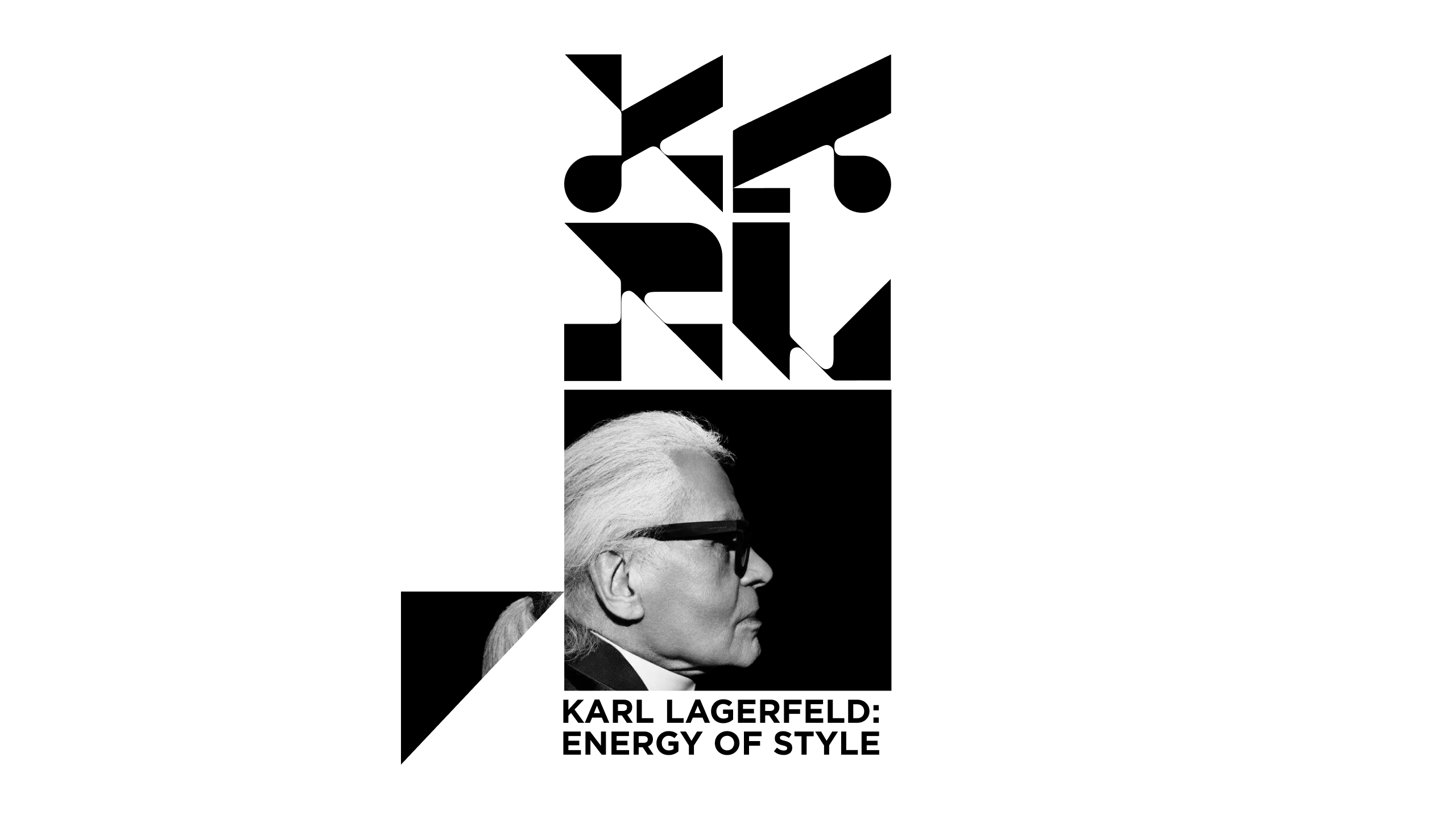
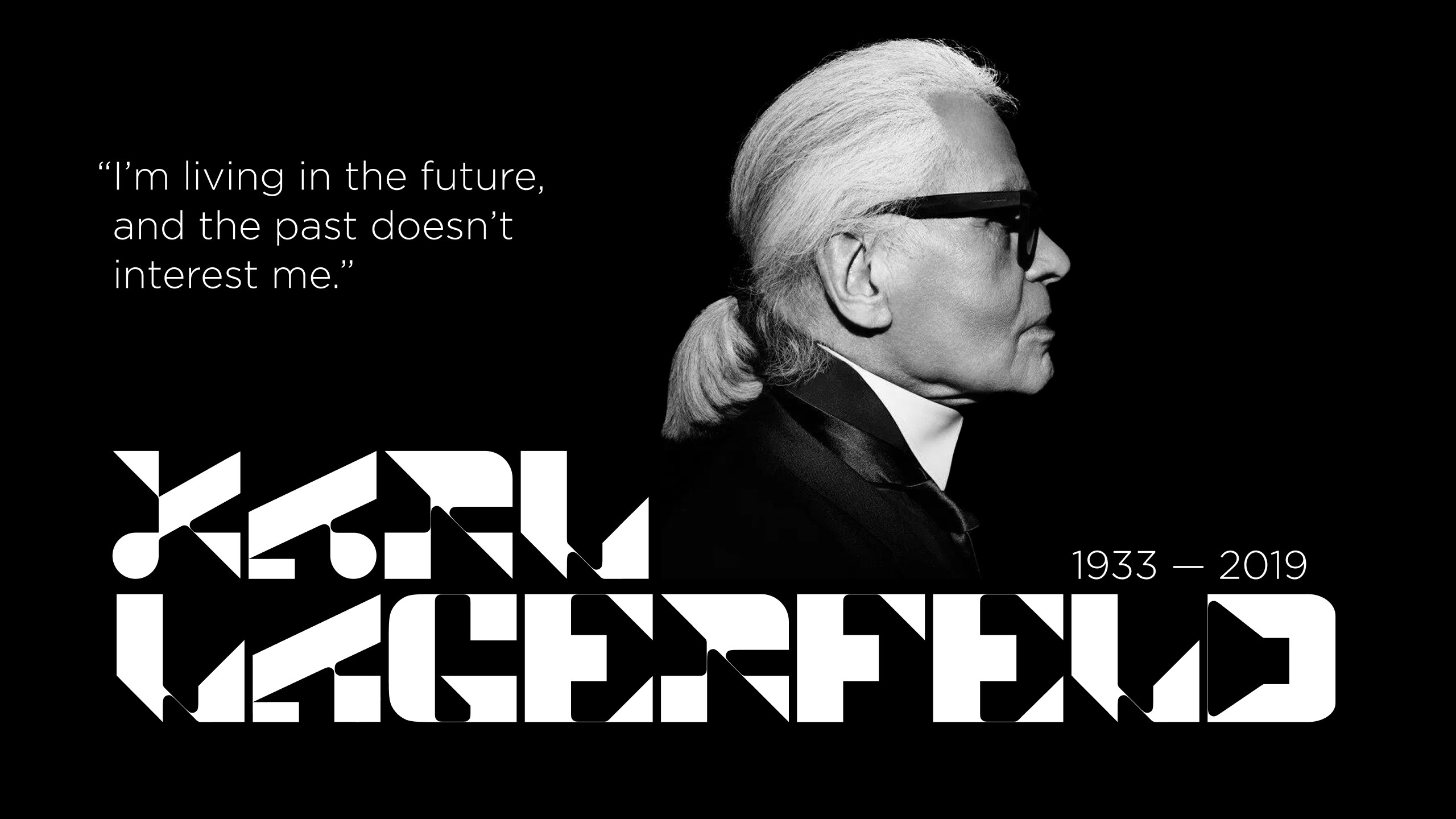
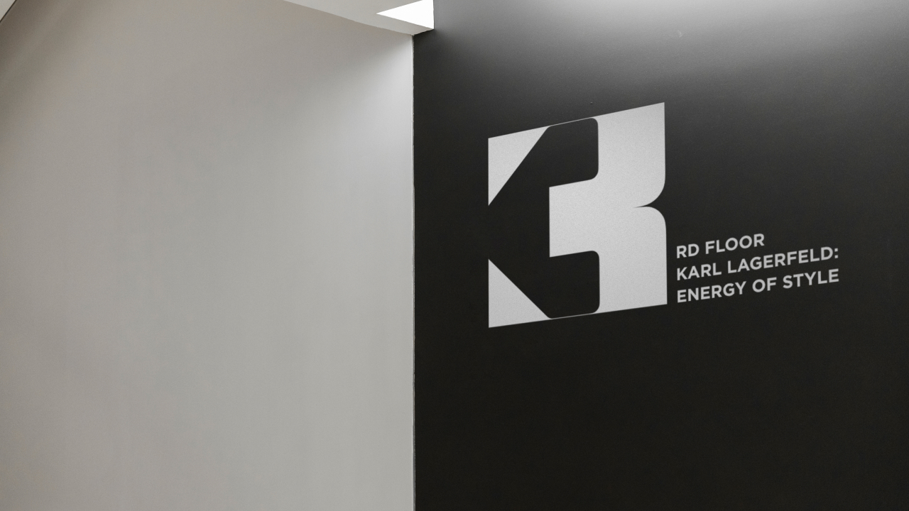
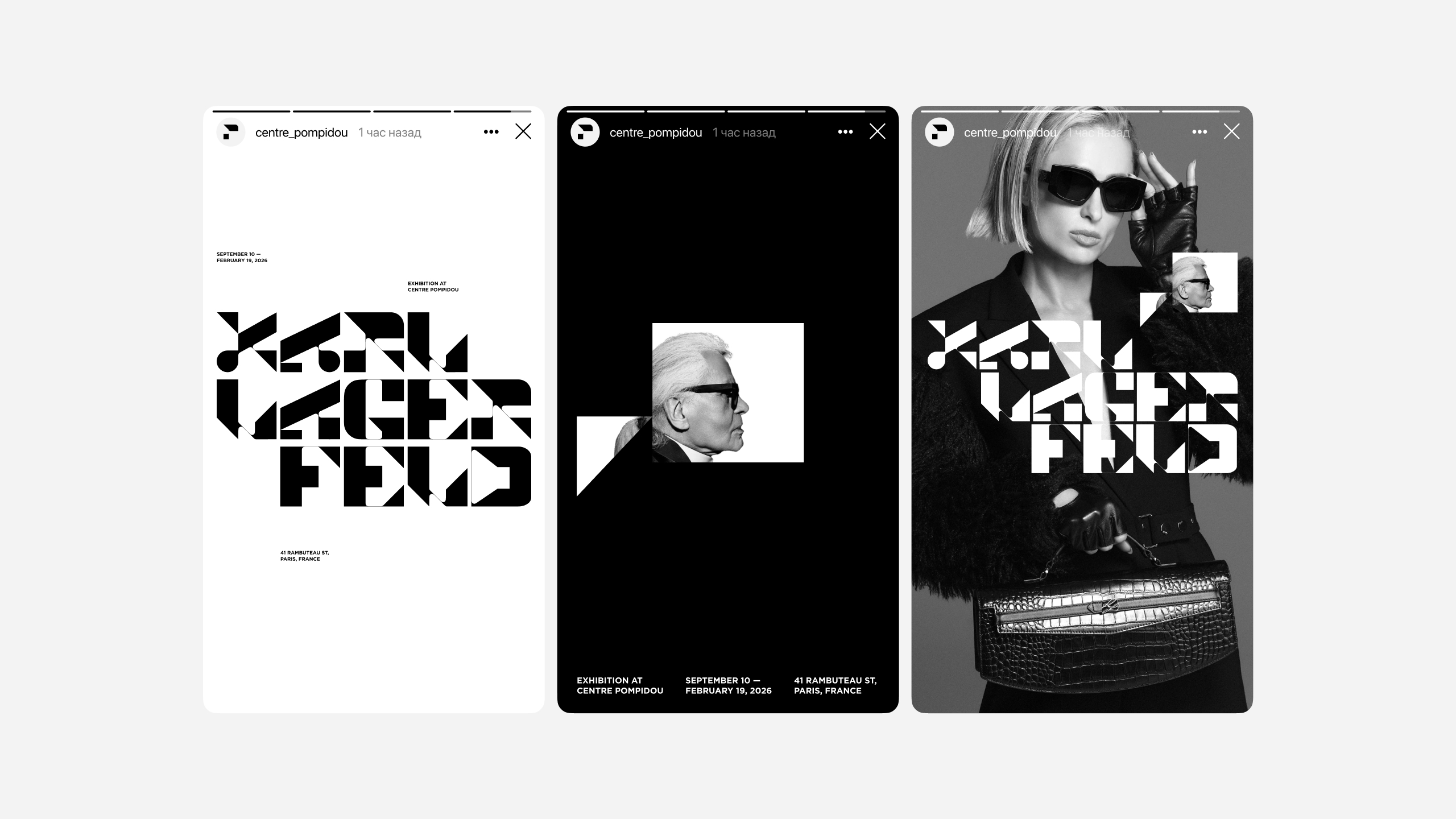
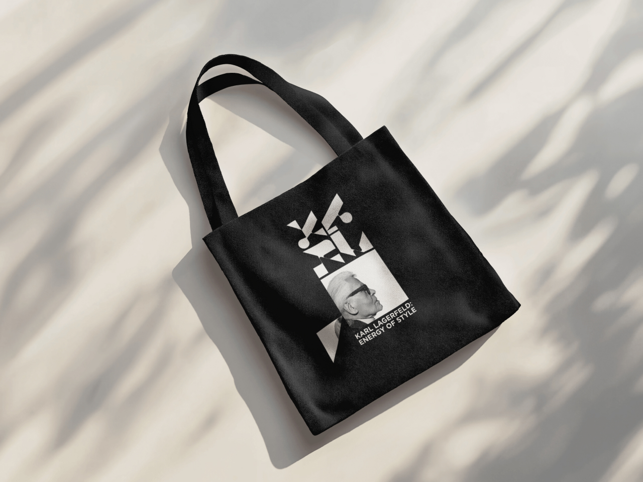
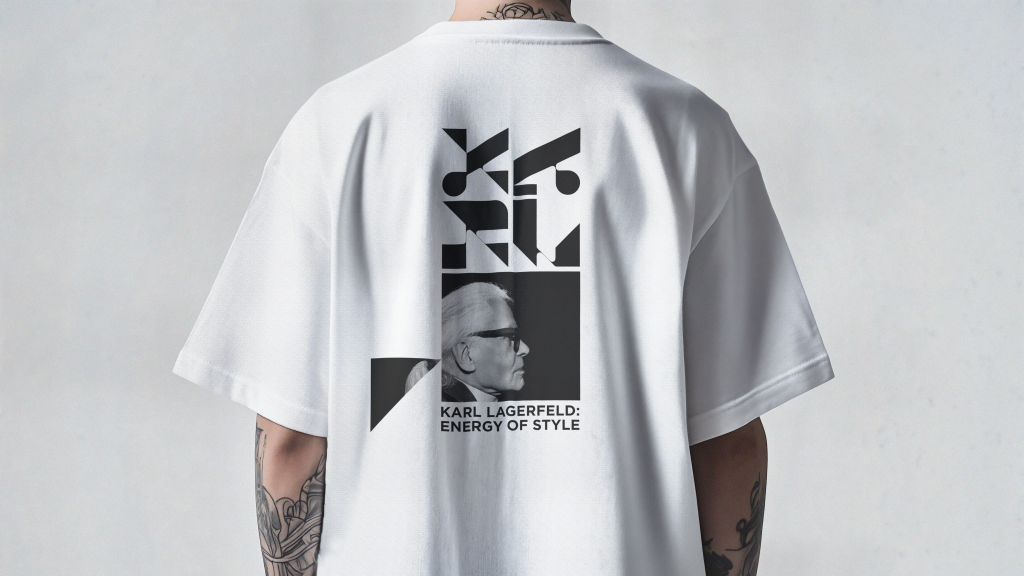
The visual manifesto of the exhibition is a custom typeface that directly translates Lagerfeld’s aesthetic code. Its foundation is **high contrast**: the radical clash of an ultra-bold vertical stroke with a razor-thin horizontal one. This dramatic shift visualizes the core of the couturier’s method — maximum tension achieved through minimal means.
The typeface possesses a **clear, recognizable silhouette**, built upon sharp angles and strong verticals. Its forms are ascetic and devoid of decoration — pure architecture, where beauty lies in the confidence of lines and the rigidity of construction. This approach crystallizes the central paradox of Lagerfeld’s style — **brutal elegance**, where strength and intellect replace ornament.
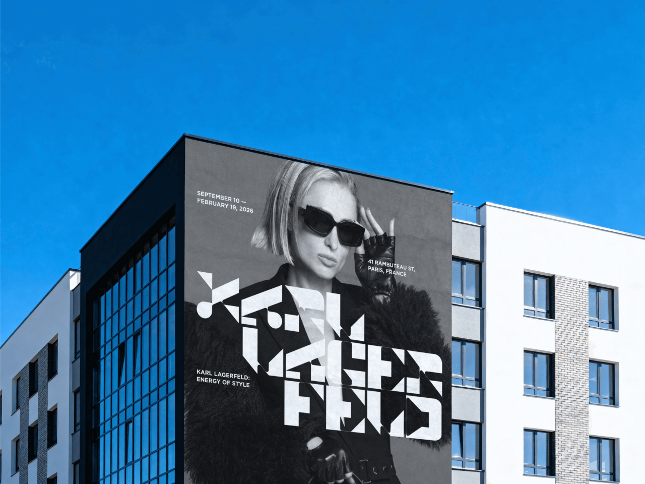
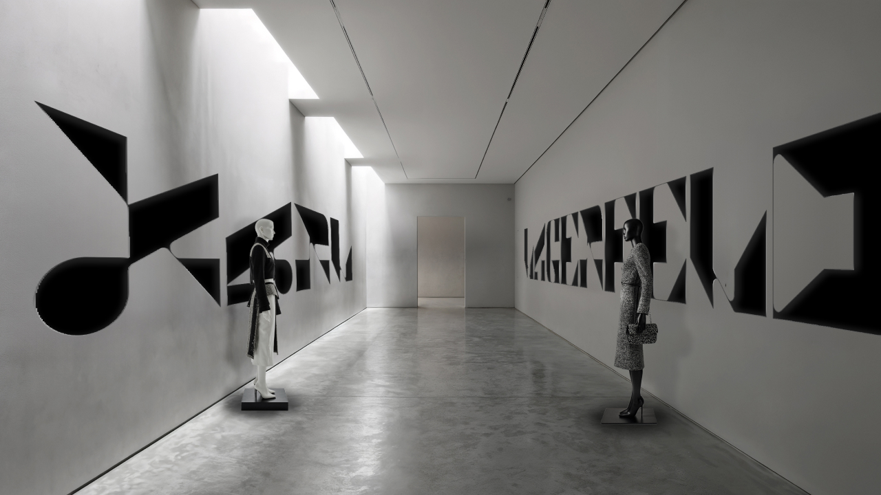
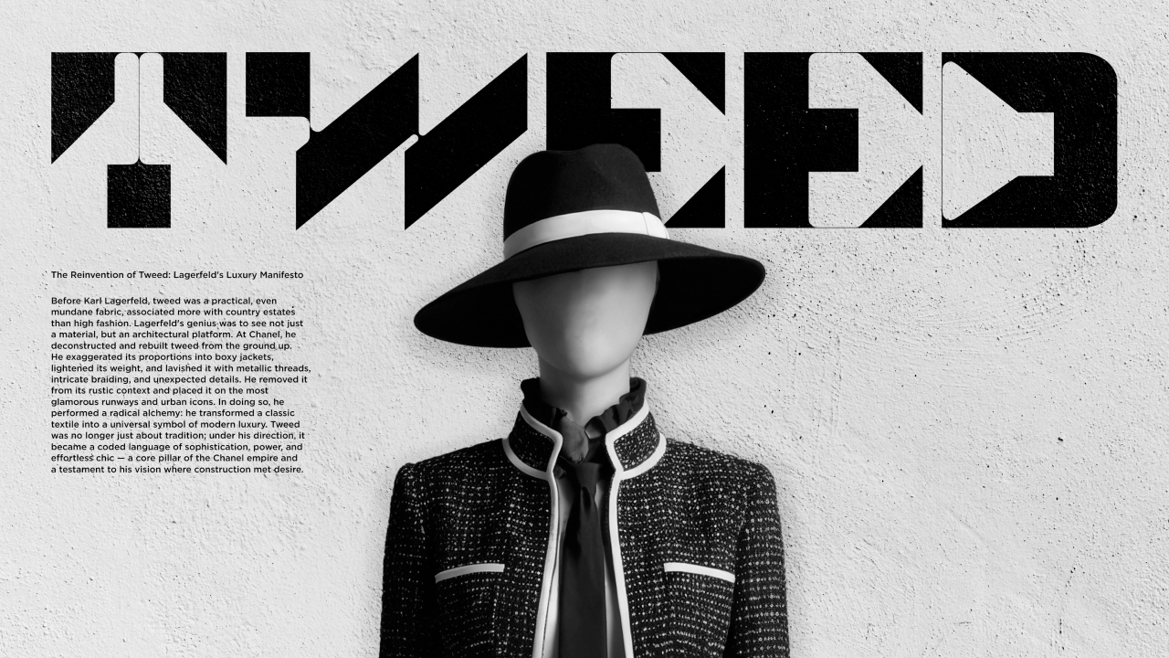
The typeface’s expression is **monochromatic**, echoing the absolute dichotomy of black and white — the unchanging foundation of the maestro’s visual language. It reveals its true nature at **large scale**: on posters and in environmental graphics, the letters cease to be mere text and become independent graphic statements, sculptural objects that establish the rhythm of the exhibition space.
The typography here is not a tool for communication — it is the communication itself. The typeface becomes the environment, the rigor, and the voice, transforming the exhibition into a spatial experience. Through rhythm and the power of form, it directly conveys the energy of discipline, radical clarity, and the unwavering authority of form that defined the legacy of Karl Lagerfeld.
CREDIT
- Agency/Creative: Vladislav Samokhin
- Article Title: Vladislav Samokhin Channels Karl Lagerfeld’s Brut Energy Into a Bold Exhibition Identity
- Organisation/Entity: Student
- Project Type: Identity
- Project Status: Published
- Agency/Creative Country: Russia
- Agency/Creative City: HSE
- Market Region: Europe
- Project Deliverables: Art Direction, Editorial Design
- Industry: Fashion
- Keywords: Karl Lagerfeld
-
Credits:
Art director / Graphic Designer: Vladislav Samokhin


