


Brand Overview
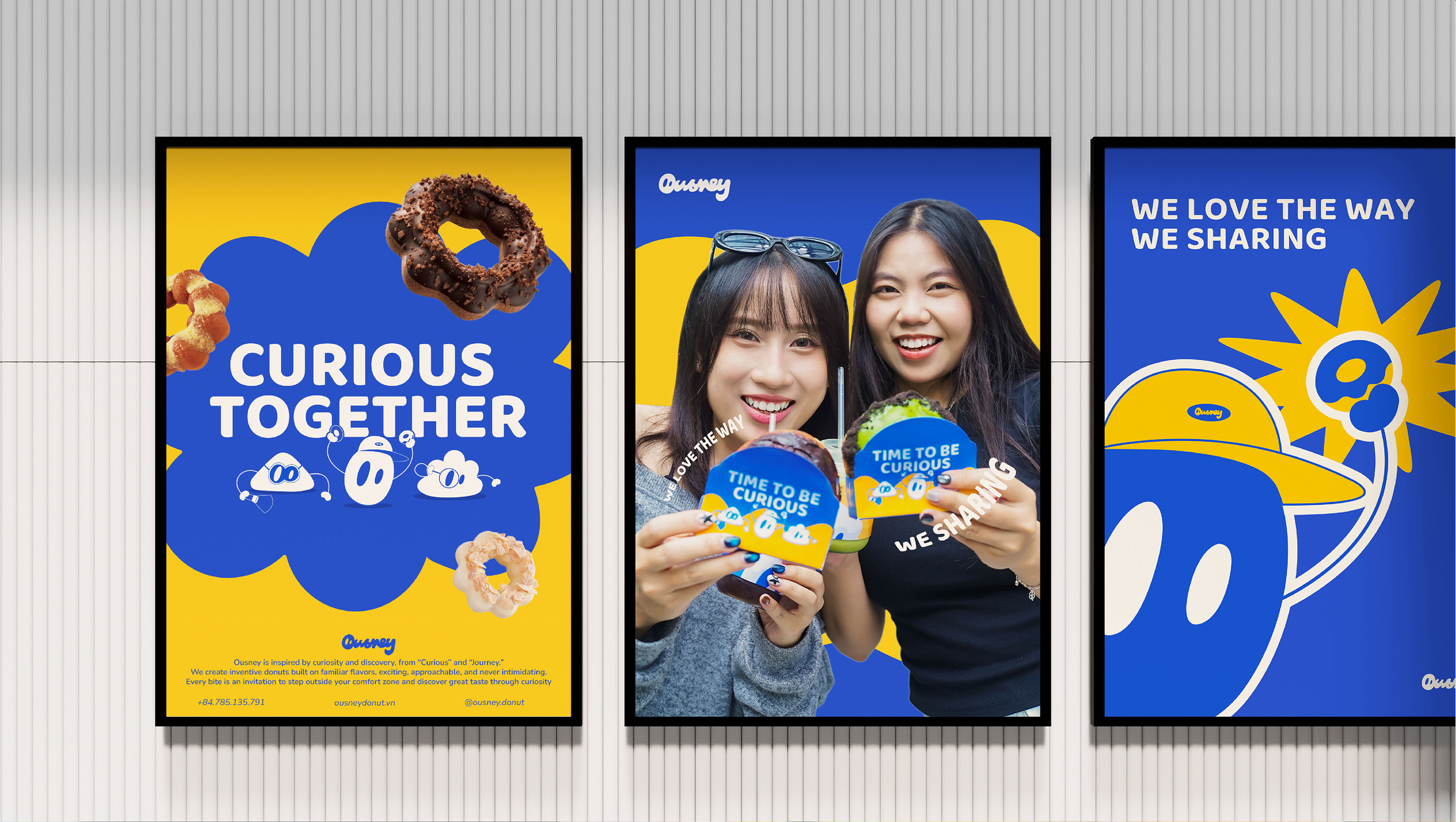
Ousney is a donut brand built on a key consumer insight: people are always curious about something new, yet often hesitate to try because they fear that “if it’s unusual, it might not taste good.”
Our approach is to create donuts that feel fresh and surprising while being rooted in familiar flavors — intriguing enough to spark curiosity, yet comforting and easy to enjoy.
Ousney embodies a modern, joyful, and energetic spirit, encouraging people to step out of their comfort zone and enjoy an exciting journey of taste.
Brand Name
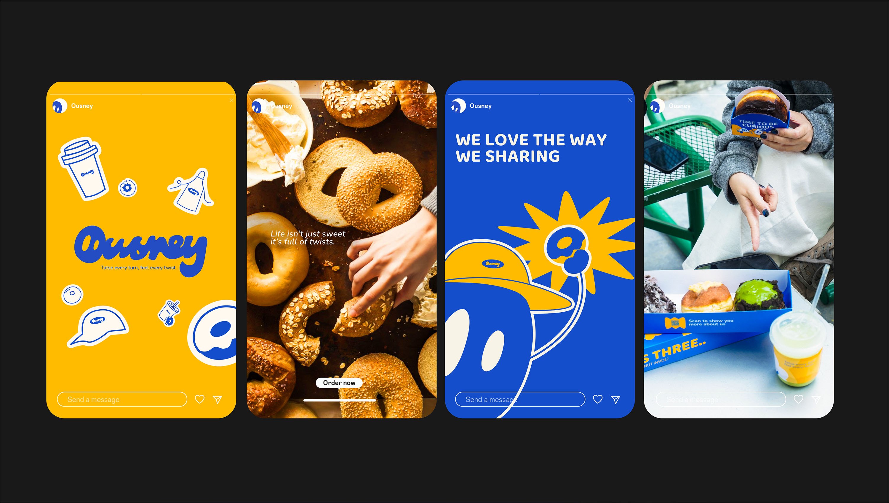
Ousney is a name inspired by the ideas of Curious and Journey, representing customers’ curiosity and their journey of discovering new flavors.
The name feels open, youthful, and playful, perfectly reflecting the brand spirit: each donut is a delightful stop along a flavorful journey.
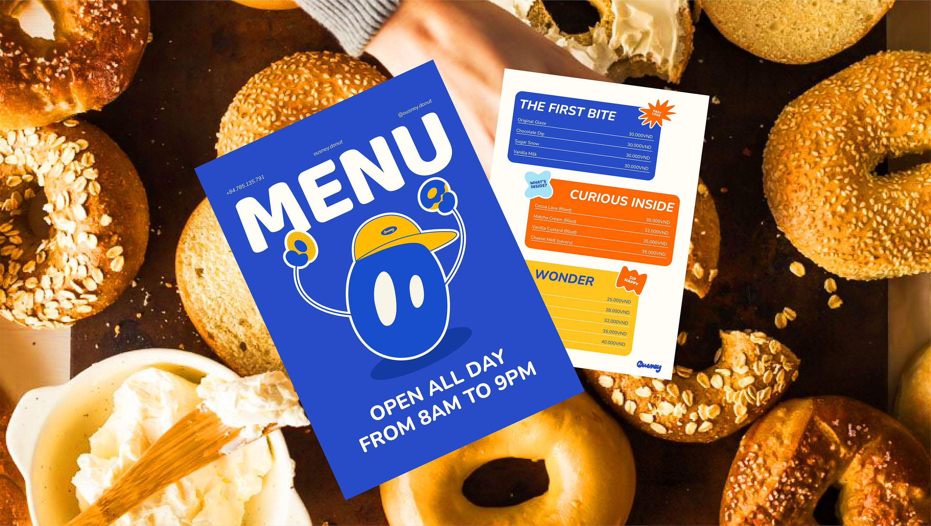
Logo Concept
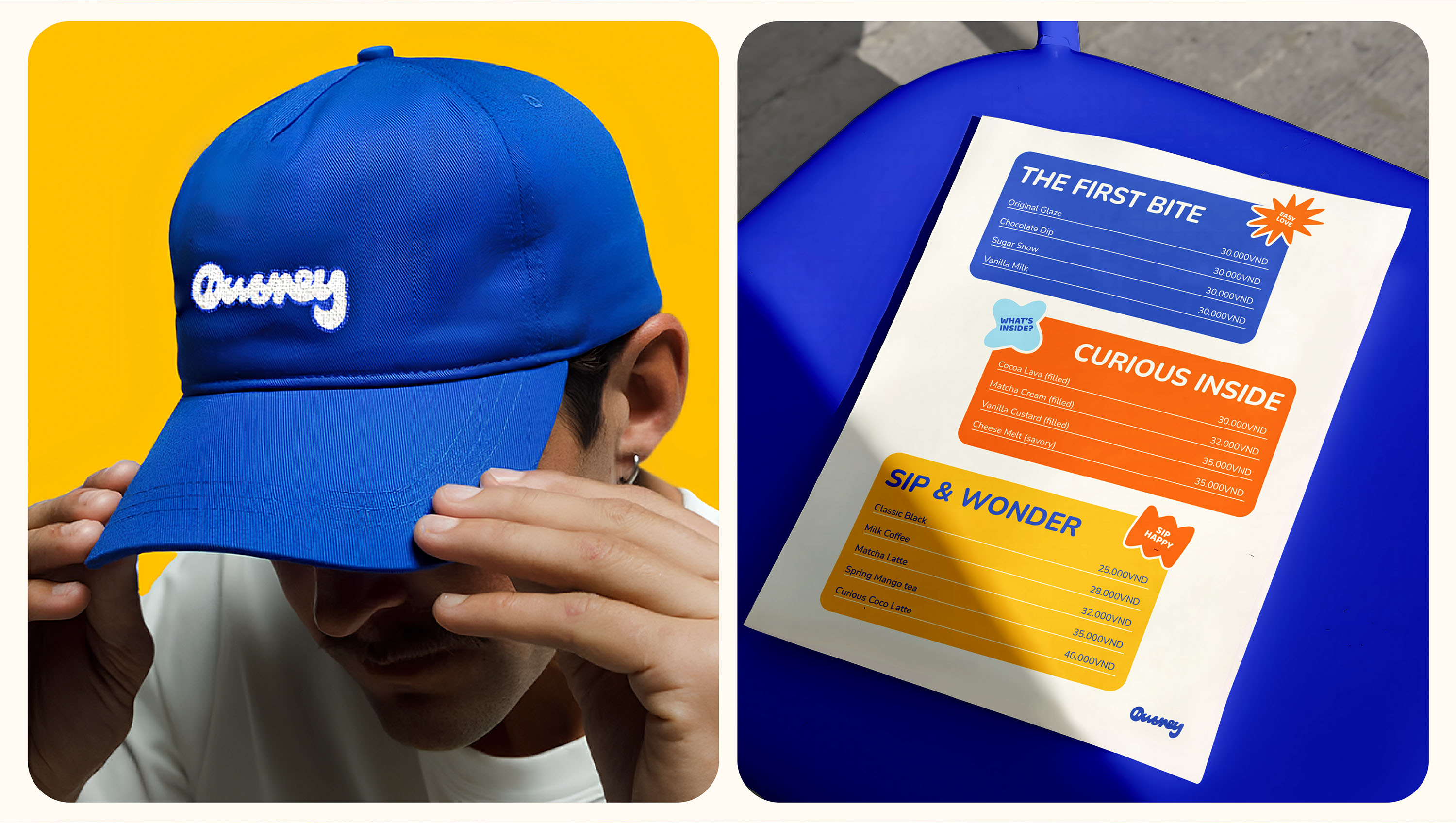
The Ousney logo features a continuous, rounded handwritten typeface, inspired by the soft shape of donuts and the sense of movement in a journey.
The two negative spaces inside the letter “O” are designed like eyes, symbolizing curiosity and excitement when exploring new flavors.
Overall, the logo conveys a modern, friendly, and energetic impression.
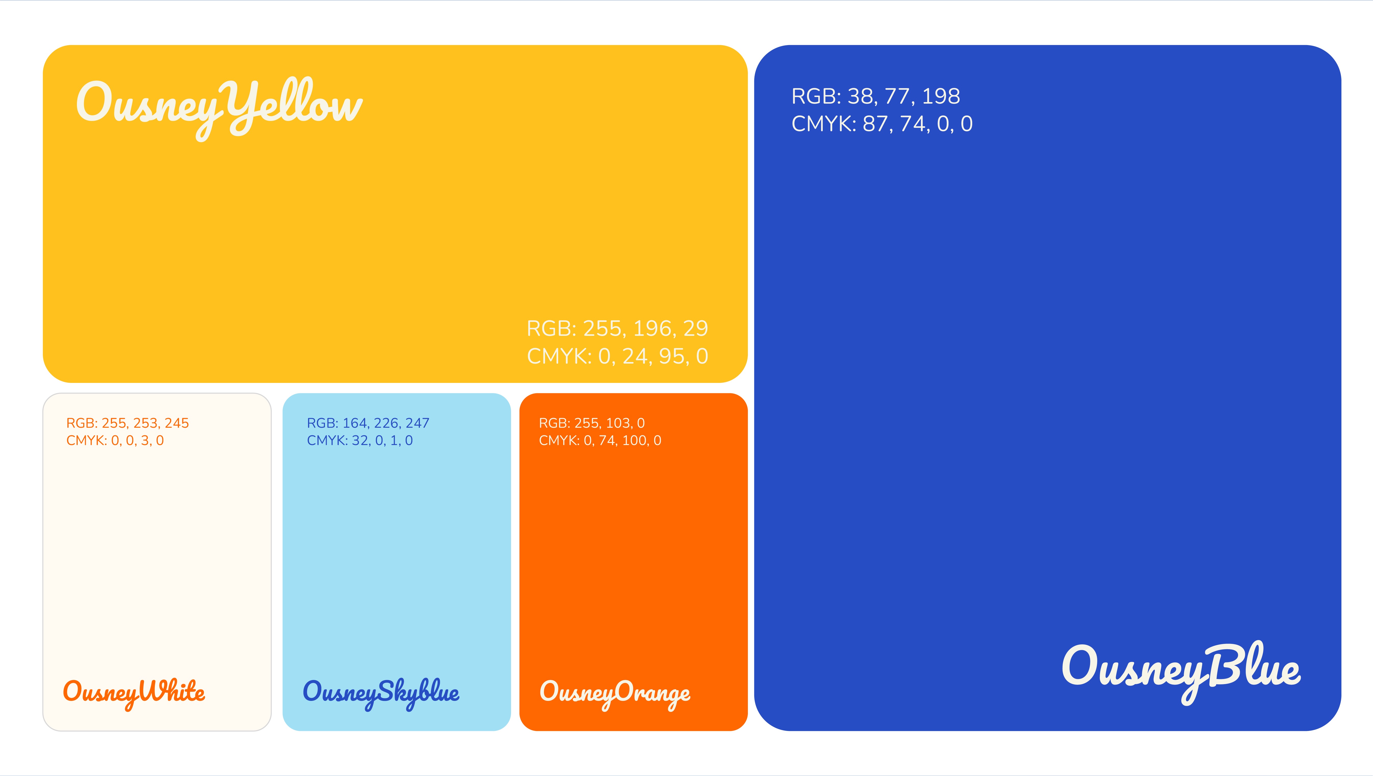
Color Palette
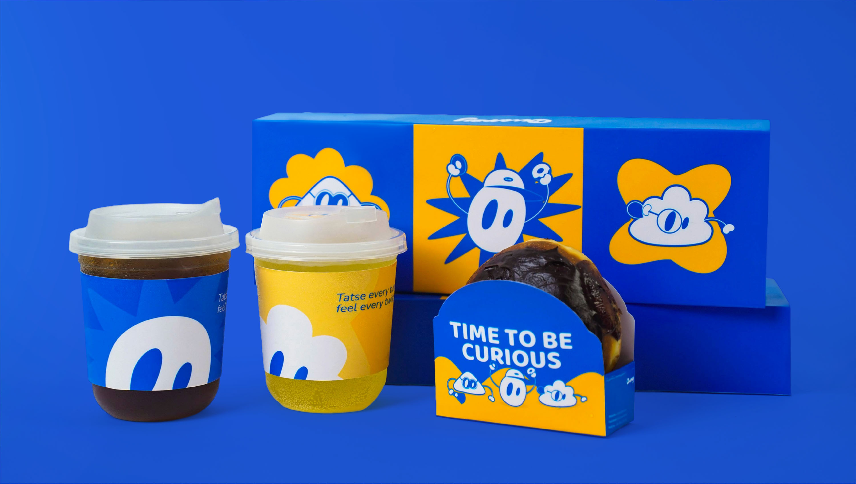
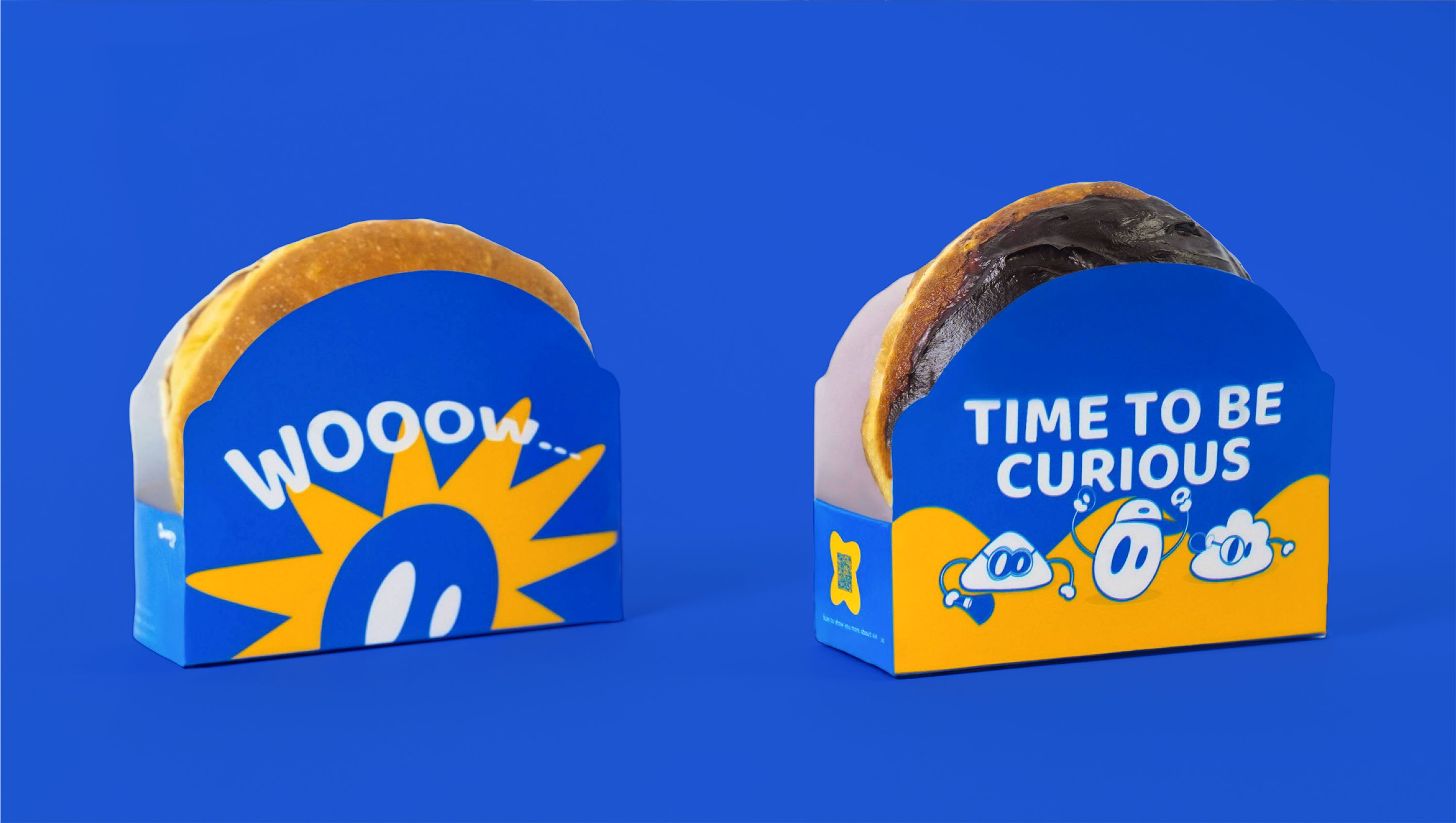
Ousney’s primary colors are blue and yellow.
Blue brings a fresh, youthful feel to the F&B category and evokes curiosity, while yellow represents energy, sweetness, and indulgence — helping the brand stand out and stimulate appetite.
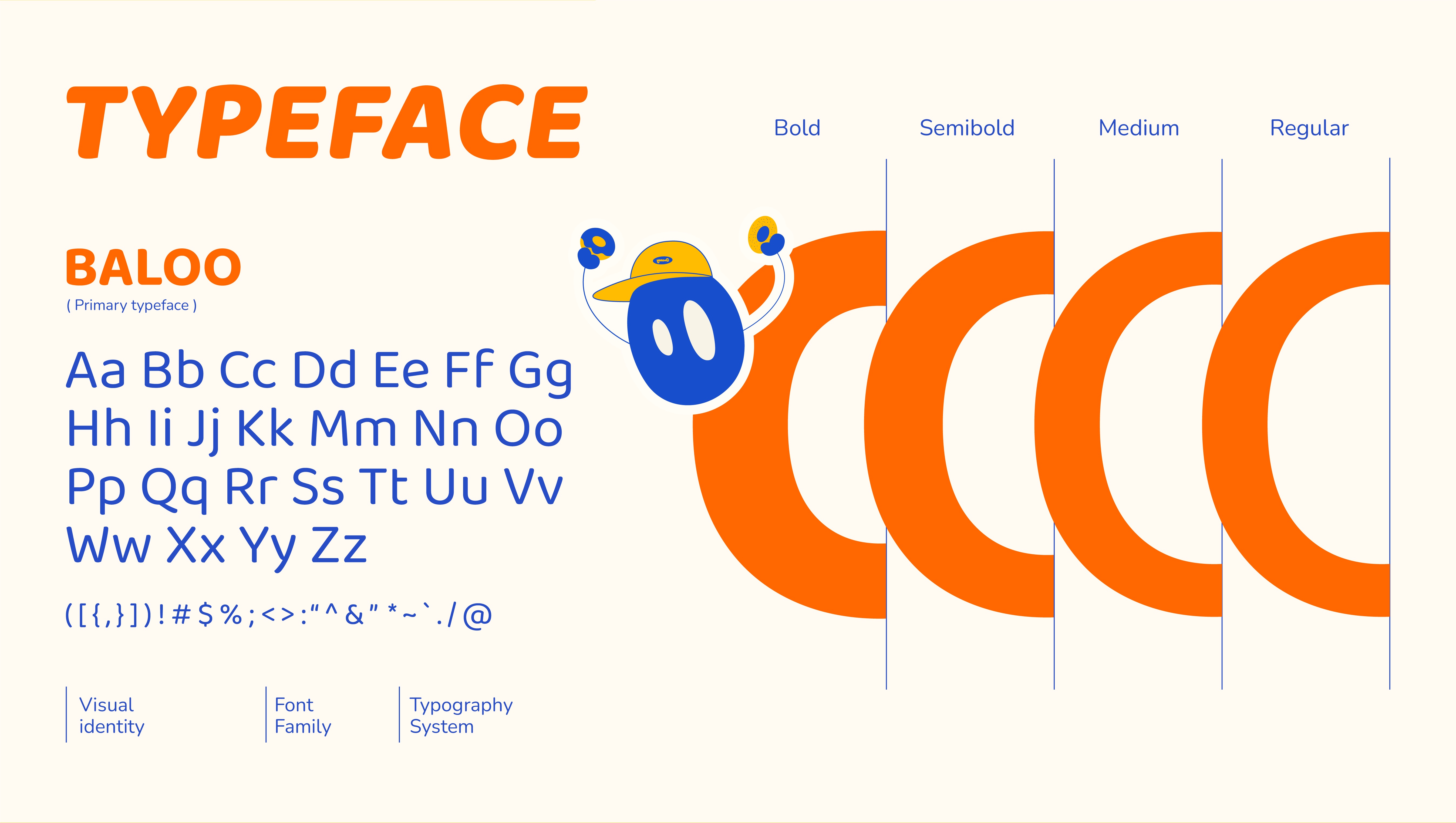
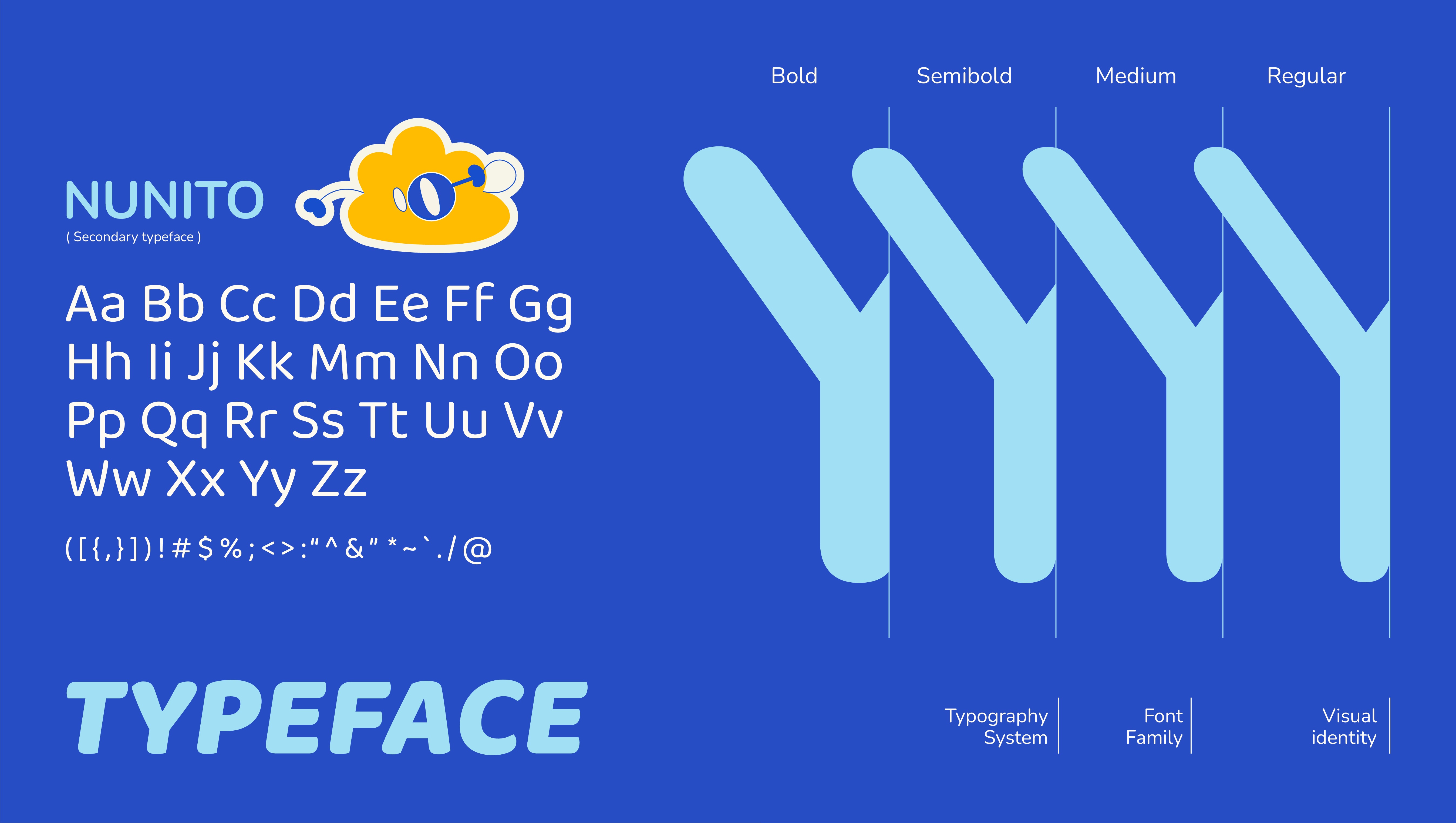
Visual System
Ousney’s visual system is built around soft, flowing lines with continuously changing shapes and thickness, symbolizing the emotional ups and downs throughout the flavor journey.
From the initial curiosity to the moment of delight upon tasting, all visual elements come together to tell a lively, dynamic story of Ousney’s joyful exploration of taste.
CREDIT
- Agency/Creative: Horus Academy
- Article Title: Horus Academy Designs a Curious and Playful Donut Brand for Ousney
- Organisation/Entity: Student
- Project Type: Identity
- Project Status: Published
- Agency/Creative Country: Vietnam
- Agency/Creative City: Da Nang
- Market Region: Asia
- Project Deliverables: Brand Identity, Packaging Design
- Industry: Food/Beverage
- Keywords: Horus Academy, Brand Identity, Packaging, Food
-
Credits:
Client: Horus Academy
Designers: Minh Vien, Bao Tran, Van Anh, Hong Tin
Motion: Minh Vien, Hong Tin
Media/Retouch: Minh Vien
Content: Van Anh
Showcase: Bao Tran
Instructor: Phuoc Thien


