


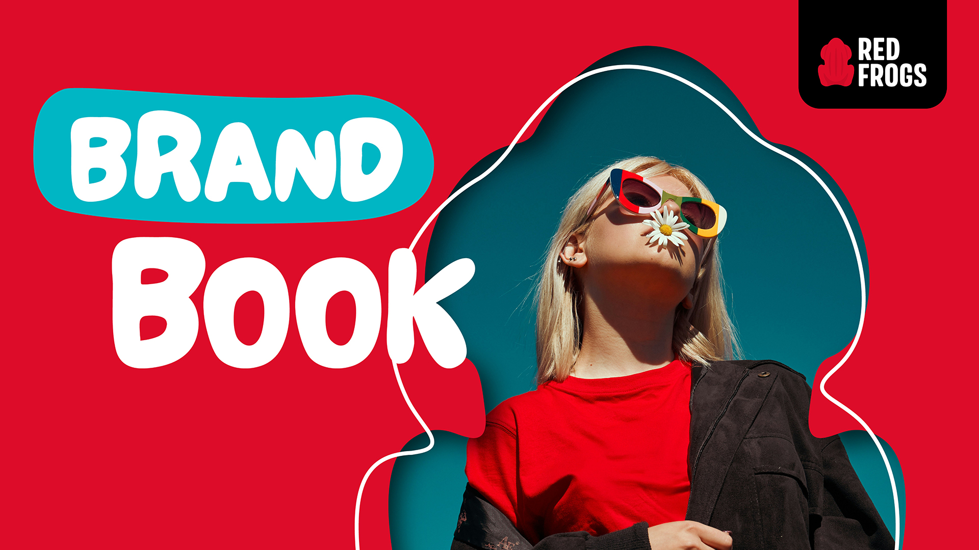
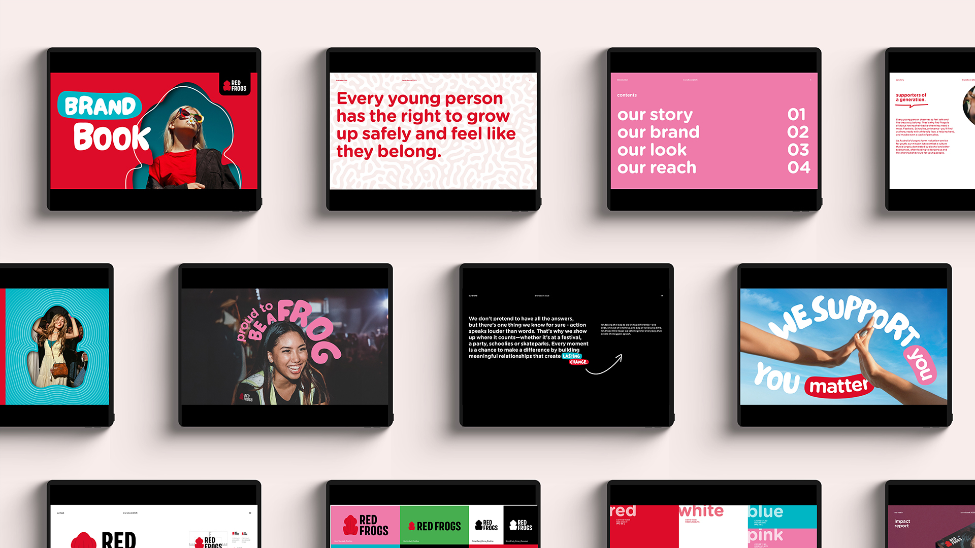
Red Frogs: A Little Leap Can Make a Big Splash
A Little Leap, A Big Splash.
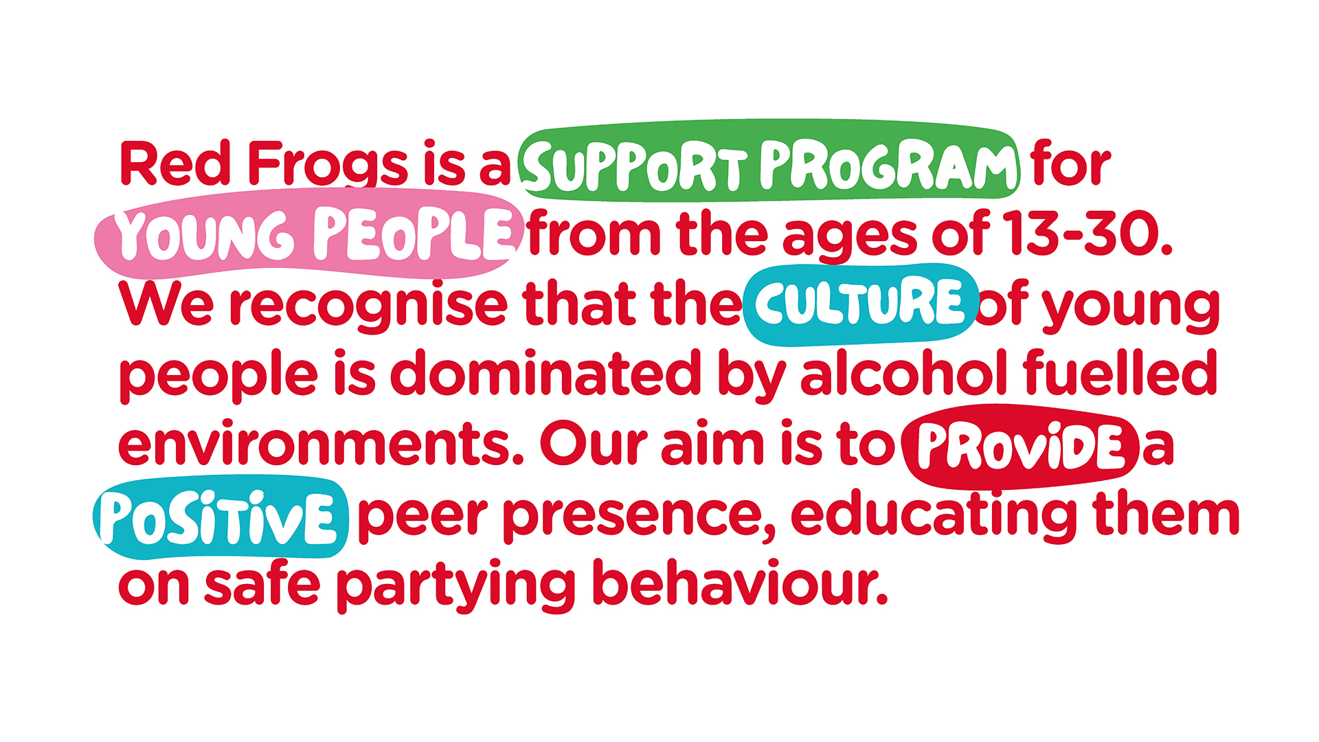
Red Frogs’ story is rooted in small, meaningful actions—one chat, one pancake, one bag of lollies at a time—that collectively create a lasting, nationwide impact. Our design solution embraces this ethos, celebrating the idea that a little leap can make a big splash. By taking the leap to reimagine the brand, we’ve created a bold, fresh, and slightly cheeky identity that channels the energy, momentum, and legacy of Red Frogs.
Harnessing Momentum.
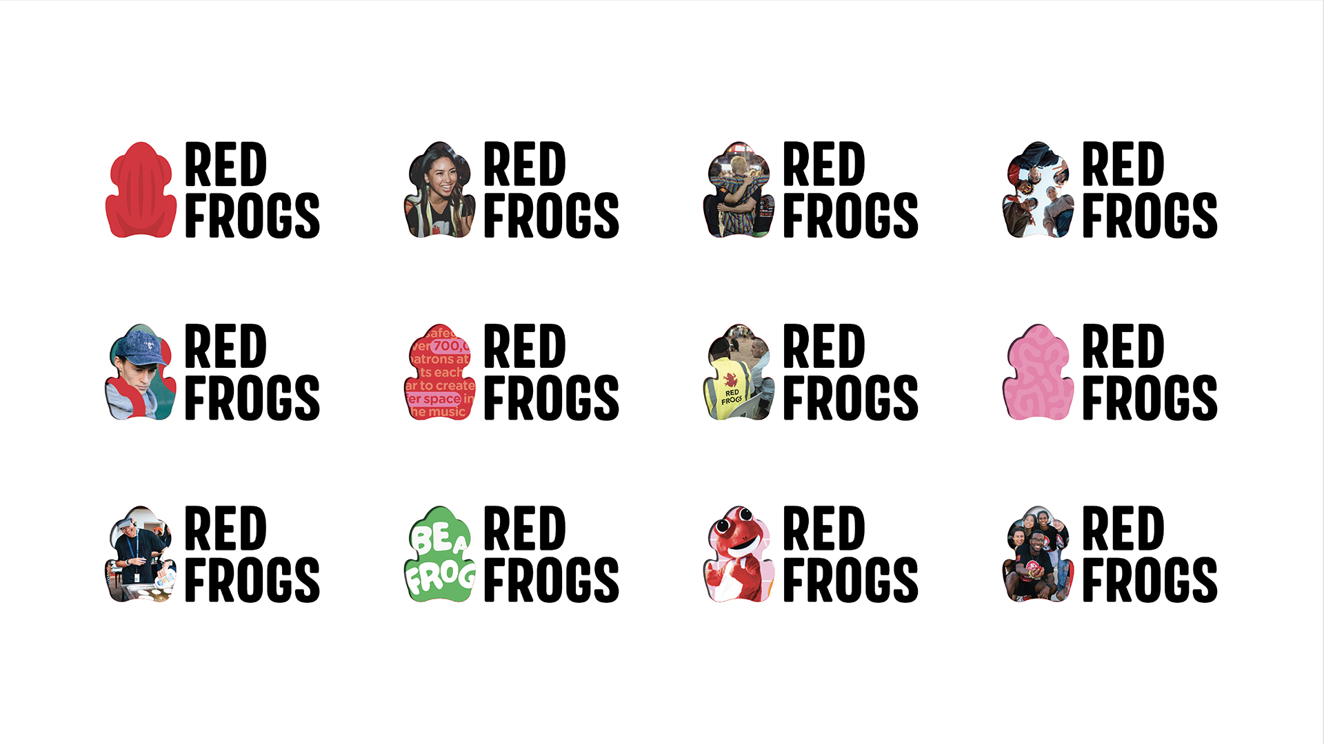
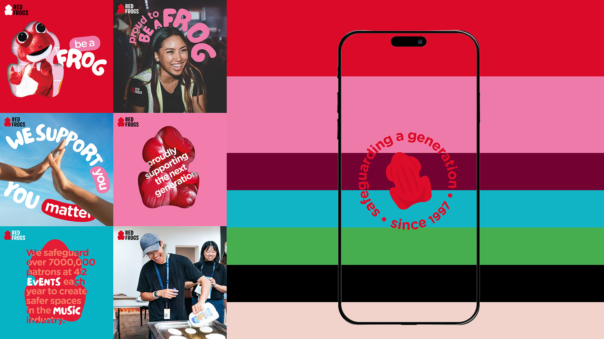
Recognising the rapid growth and varied audiences of Red Frogs, we developed a design system that is dynamic yet consistent, ensuring a unified presence across all touchpoints—volunteers, high schools, universities, and sponsors. The system is built to minimise the need for frequent asset updates while maintaining flexibility for diverse applications, allowing Red Frogs to focus on their mission without being bogged down by constant redesigns.
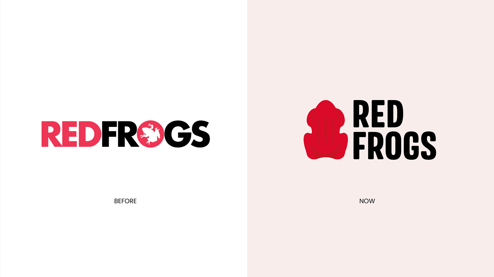
Honouring the Founding Story.
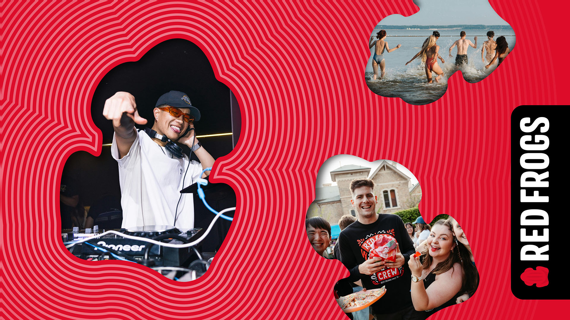
Central to the new design is the reinvention of the iconic red frog lolly, the humble treat that inspired a movement. The red frog becomes a visual and symbolic anchor, paying homage to the origins of Red Frogs while embodying its modern identity. This reinvention ensures the brand remains grounded in its story while resonating with today’s audiences.
Bold and Cheeky.
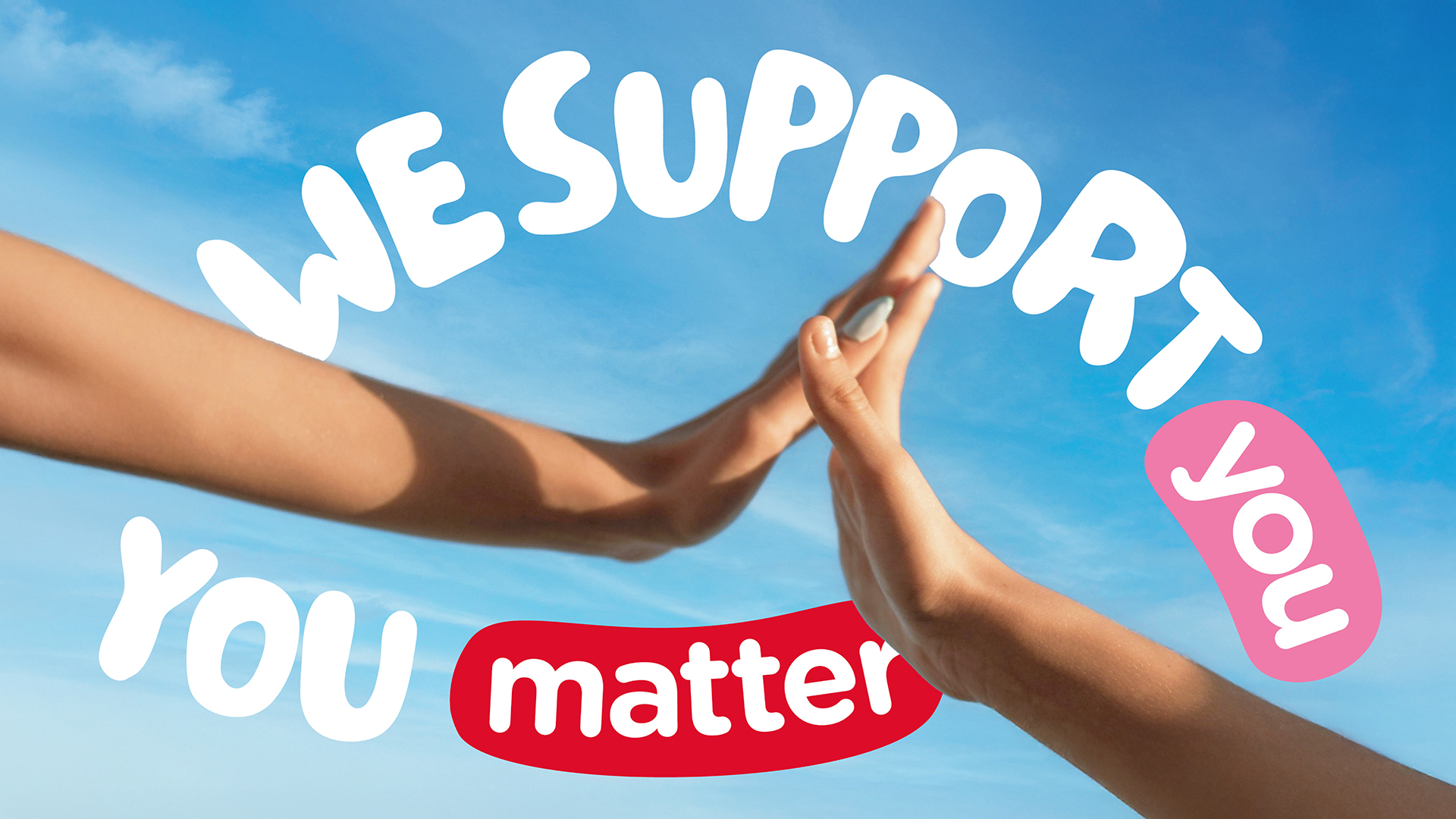
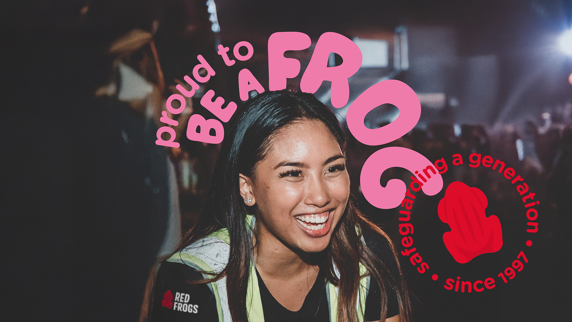
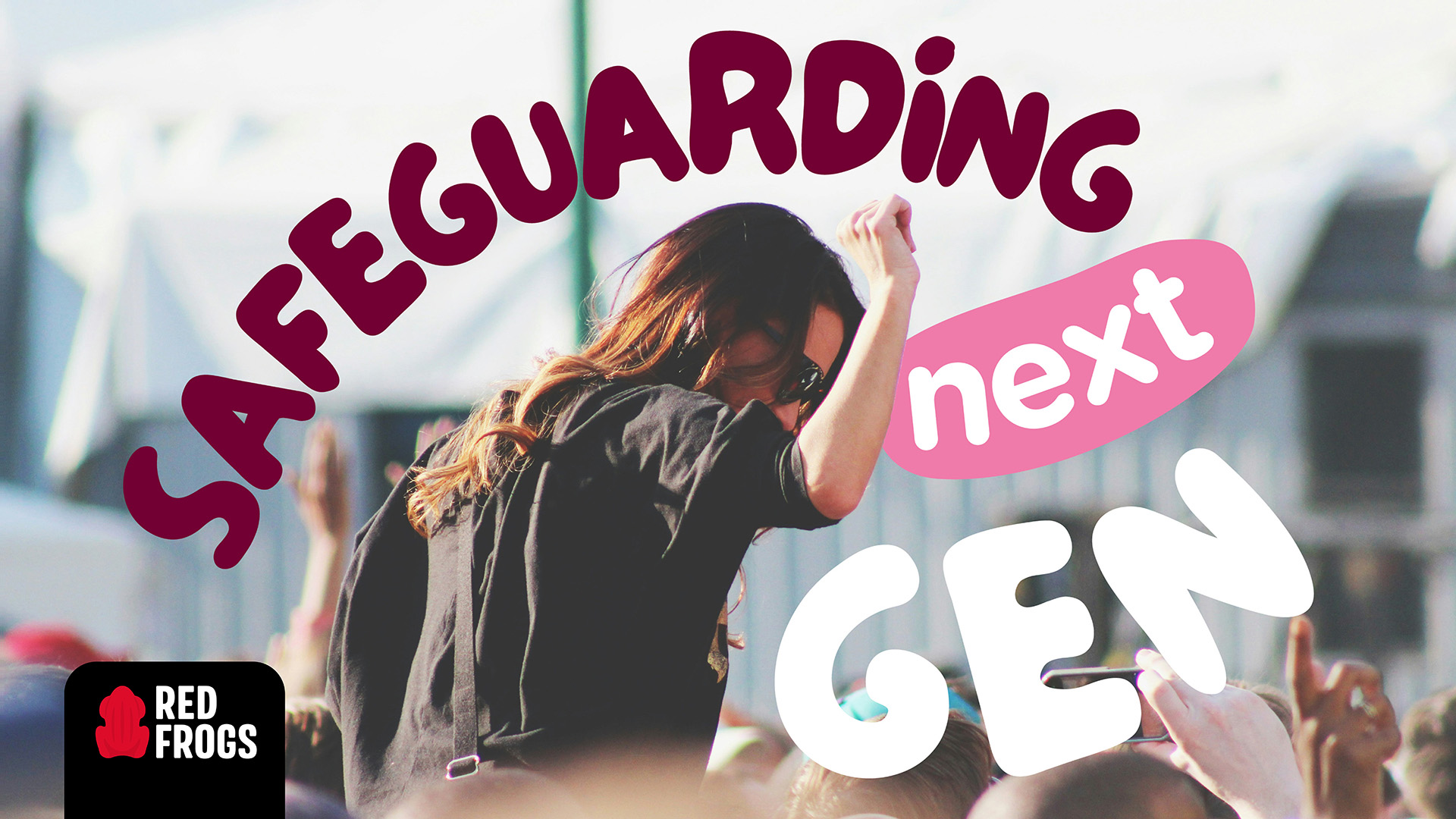
The refreshed visual identity captures the brand’s spirited and approachable personality, balancing boldness with a playful edge. The design system harnesses vibrant colours, energetic typography, and the red frog motif to convey a sense of fun, action, and optimism—qualities that reflect the everyday acts of kindness that define Red Frogs.
A Design That Inspires Action.
This rebrand is not just about visuals; it’s about enabling Red Frogs to continue making a big splash with small leaps. By creating a cohesive and enduring brand identity, we’ve empowered Red Frogs to amplify their impact, strengthen connections with their audiences, and honour the legacy of a movement born from simple, compassionate acts.
CREDIT
- Agency/Creative: The Edison Agency
- Article Title: The Edison Agency Designs a Dynamic Identity System for Red Frogs
- Organisation/Entity: Agency
- Project Type: Identity
- Project Status: Published
- Agency/Creative Country: Australia
- Agency/Creative City: Melbourne
- Market Region: Oceania
- Project Deliverables: 2D Design, Brand Design, Brand Guidelines, Brand Identity, Brand Mark, Brand Redesign, Brand Rejuvenation, Brand Strategy, Brand Tone of Voice, Branding, Design, Graphic Design, Identity System, Logo Design, Rebranding, Tone of Voice
- Industry: Non-Profit
- Keywords: Brand Identity, Nonprofit
-
Credits:
Creative Director & Founder: Amber Bonney
Designer: Gabrielle Versace
Strategist: Calin Barker
Client Services: Niki Beeston


