


This project explores the creative direction and packaging system for a conceptual tea brand built around illustrated cat characters and a playful reinterpretation of royal heritage. The aim was to create a distinctive visual identity that feels premium yet approachable, balancing elegance, clarity, and personality. The brand is designed to stand out through character-driven storytelling while maintaining a structured, high-quality system suitable for a contemporary tea market.
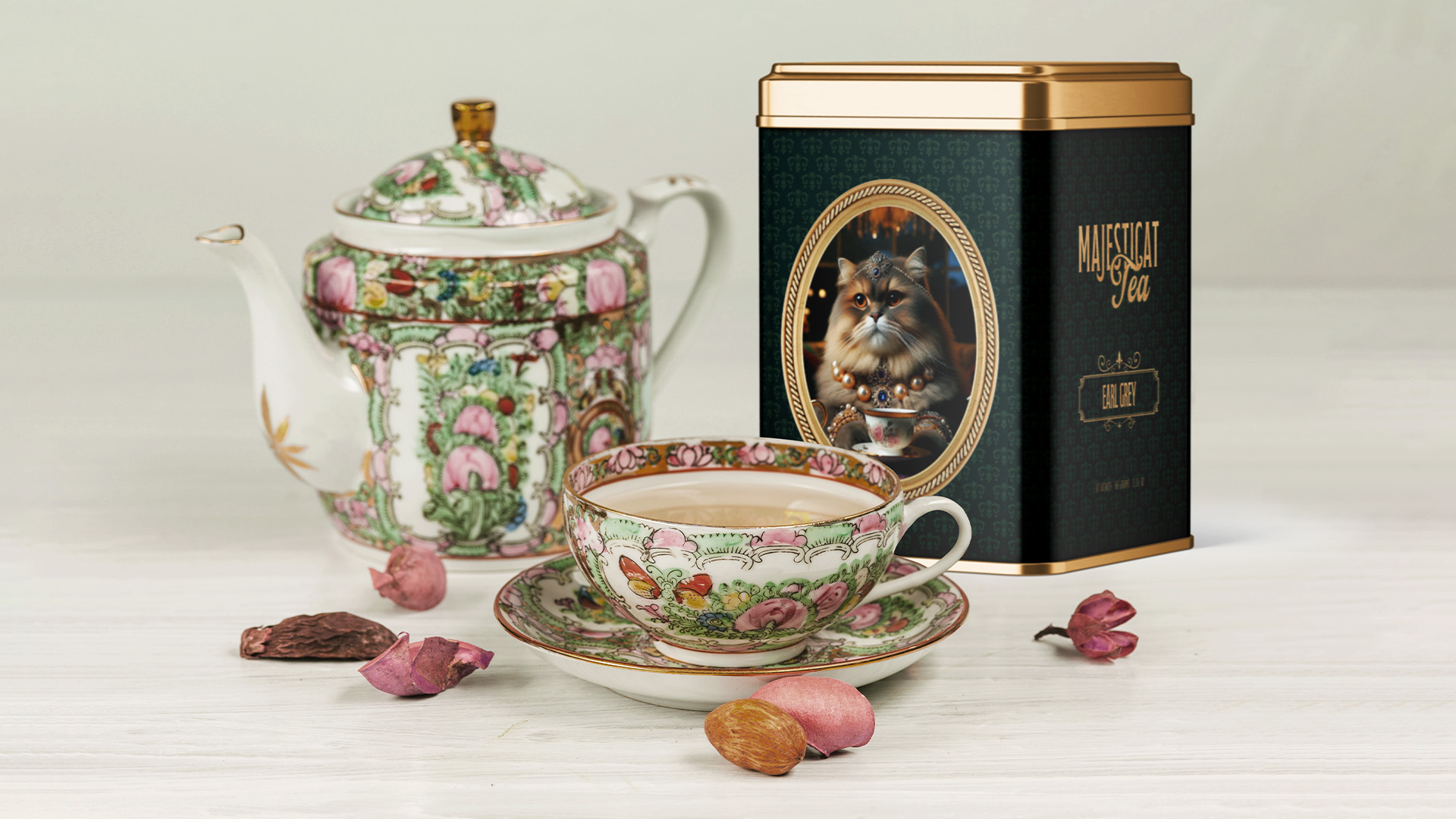
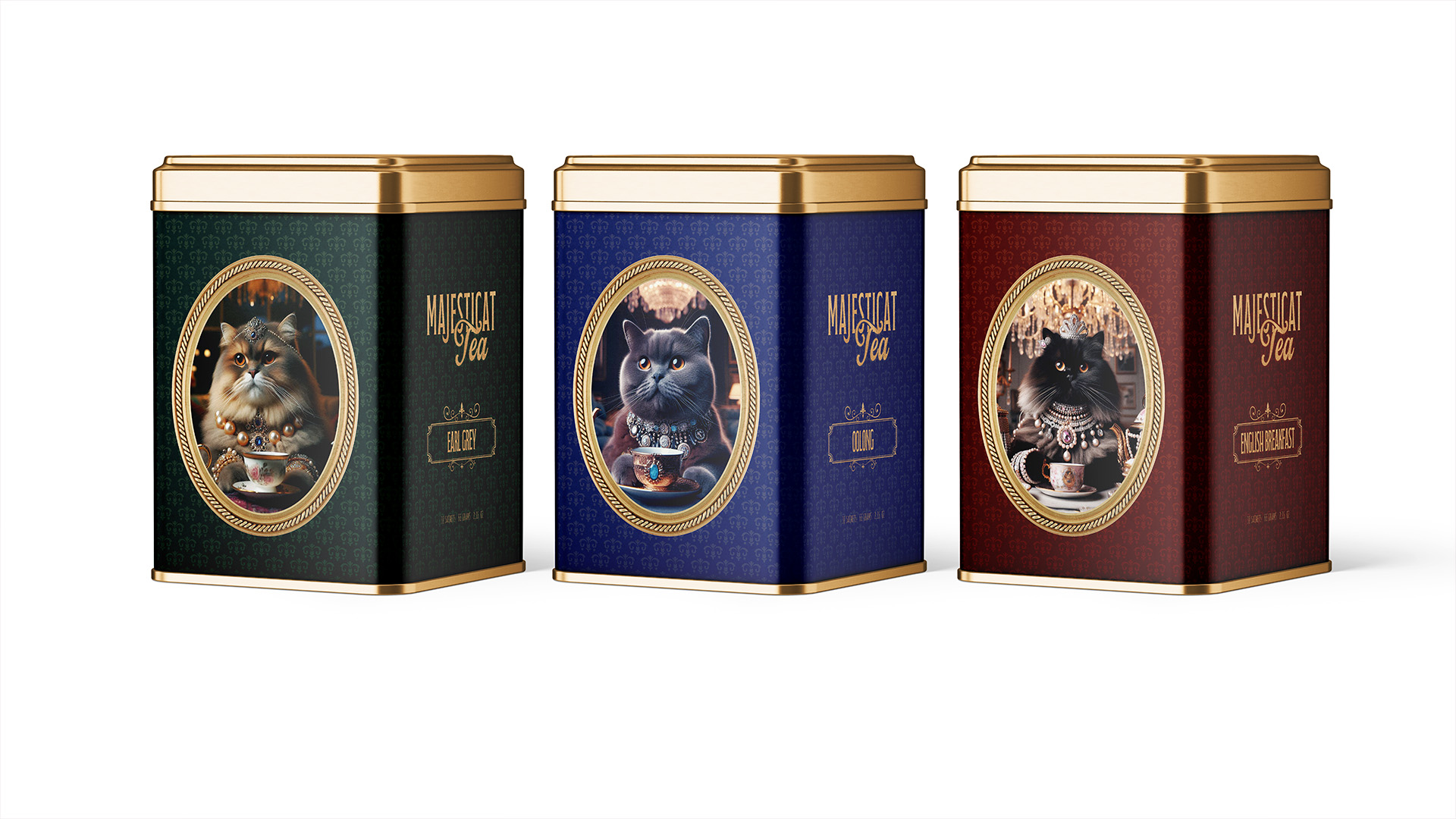
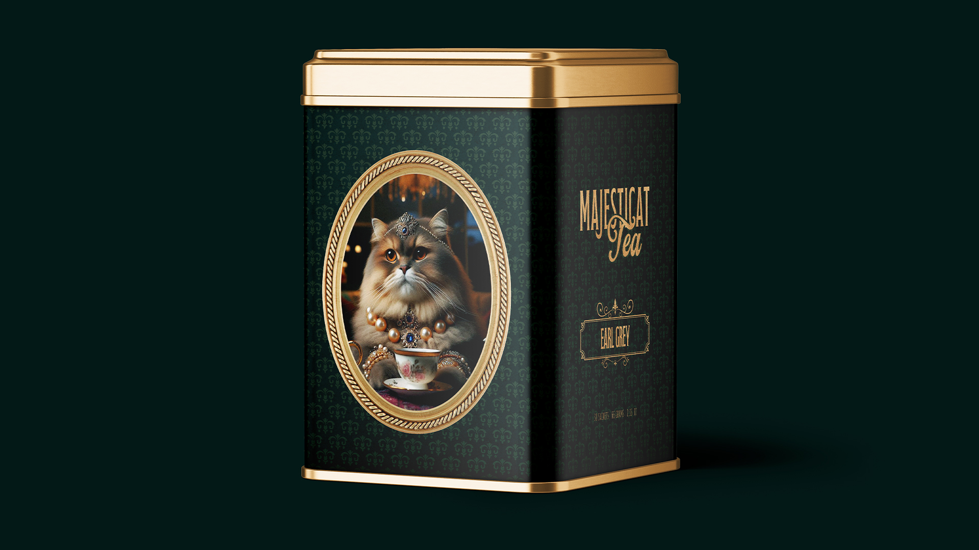
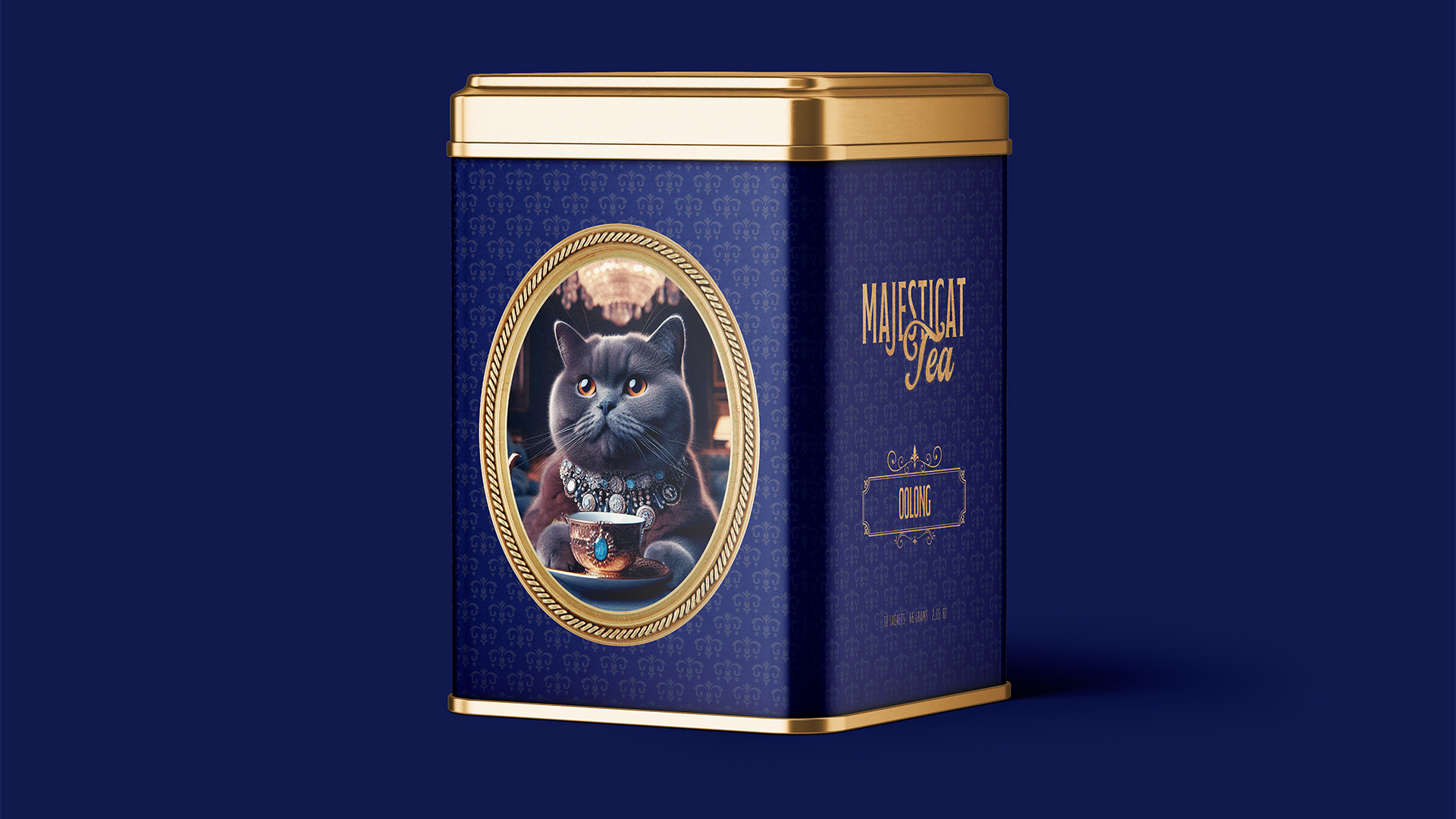
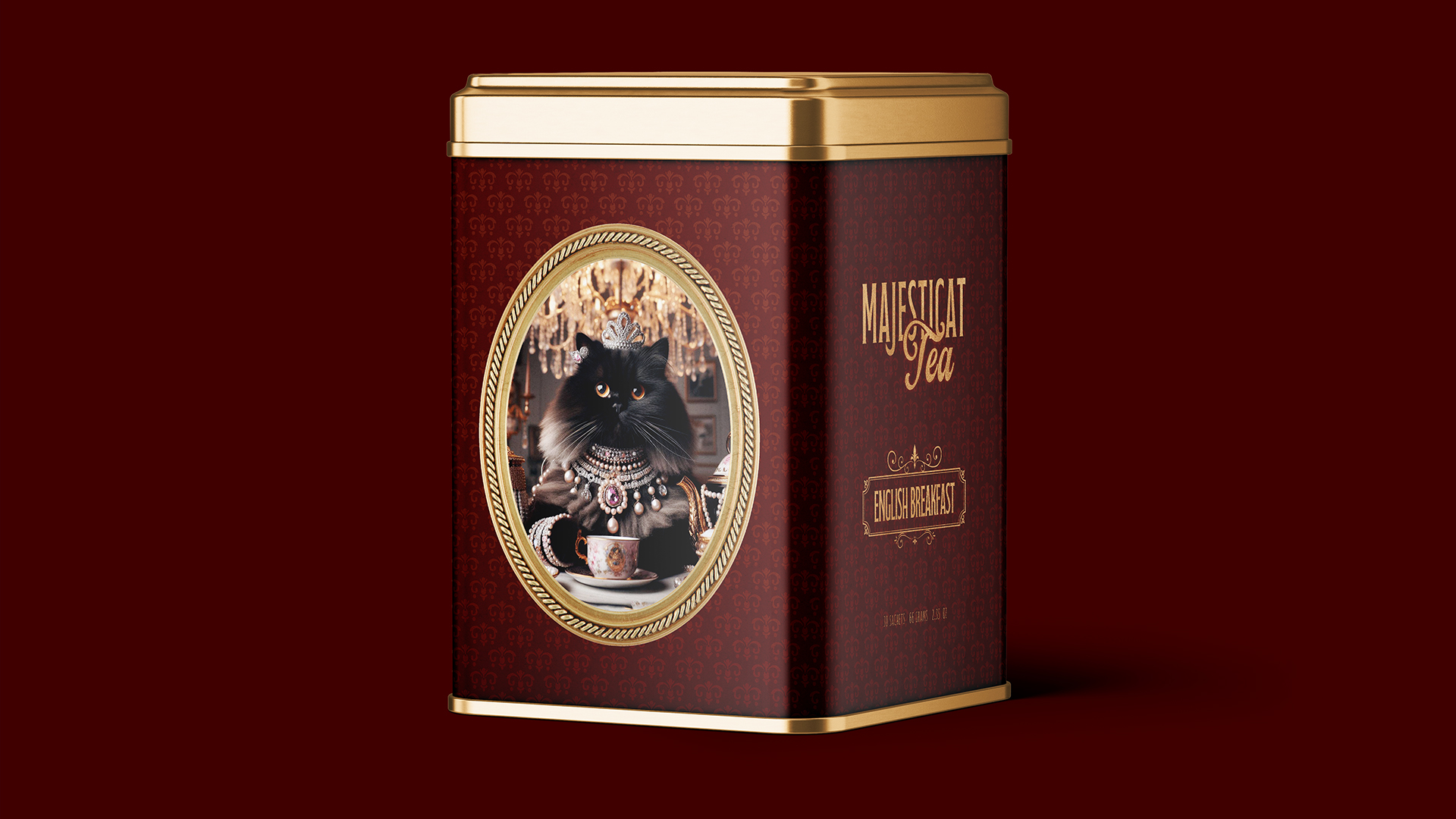
The concept is inspired by the idea of a “royal tea court,” where each cat character represents a different tea variety and personality. Cats were chosen as a symbolic reference to refinement, independence, and ritual—qualities closely associated with tea culture. Subtle royal cues, such as crowns, collars, and poised expressions, reference heritage and tradition without feeling heavy or outdated. This approach allows the brand to reinterpret classic tea aesthetics through a light, modern lens.
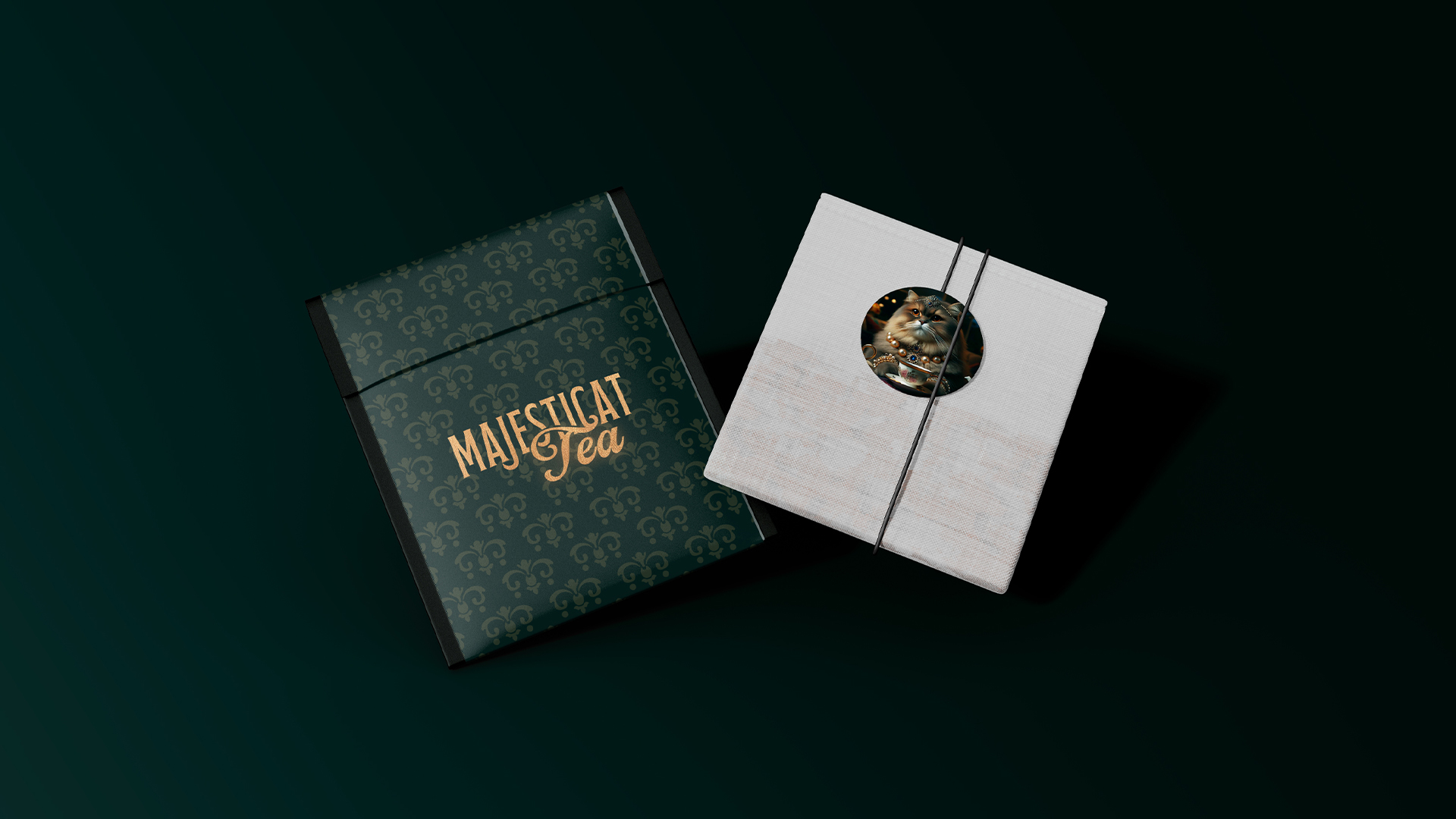
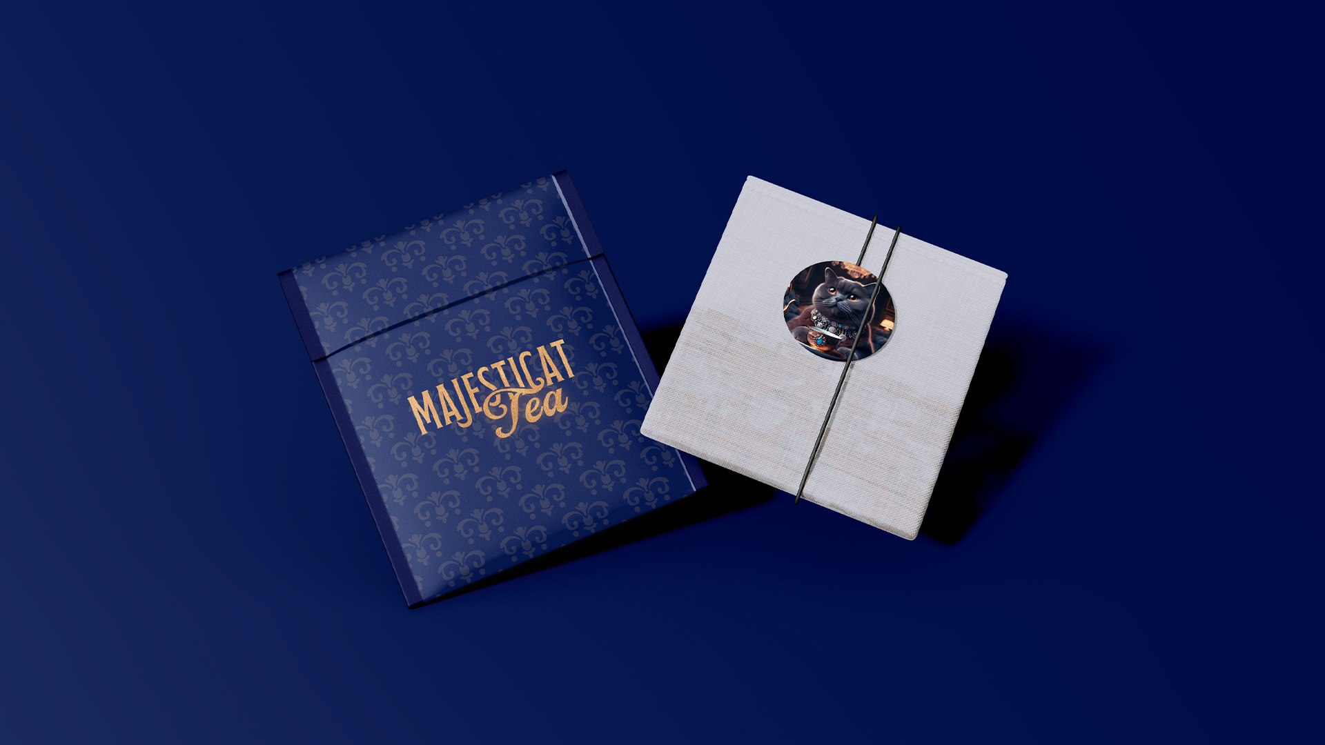
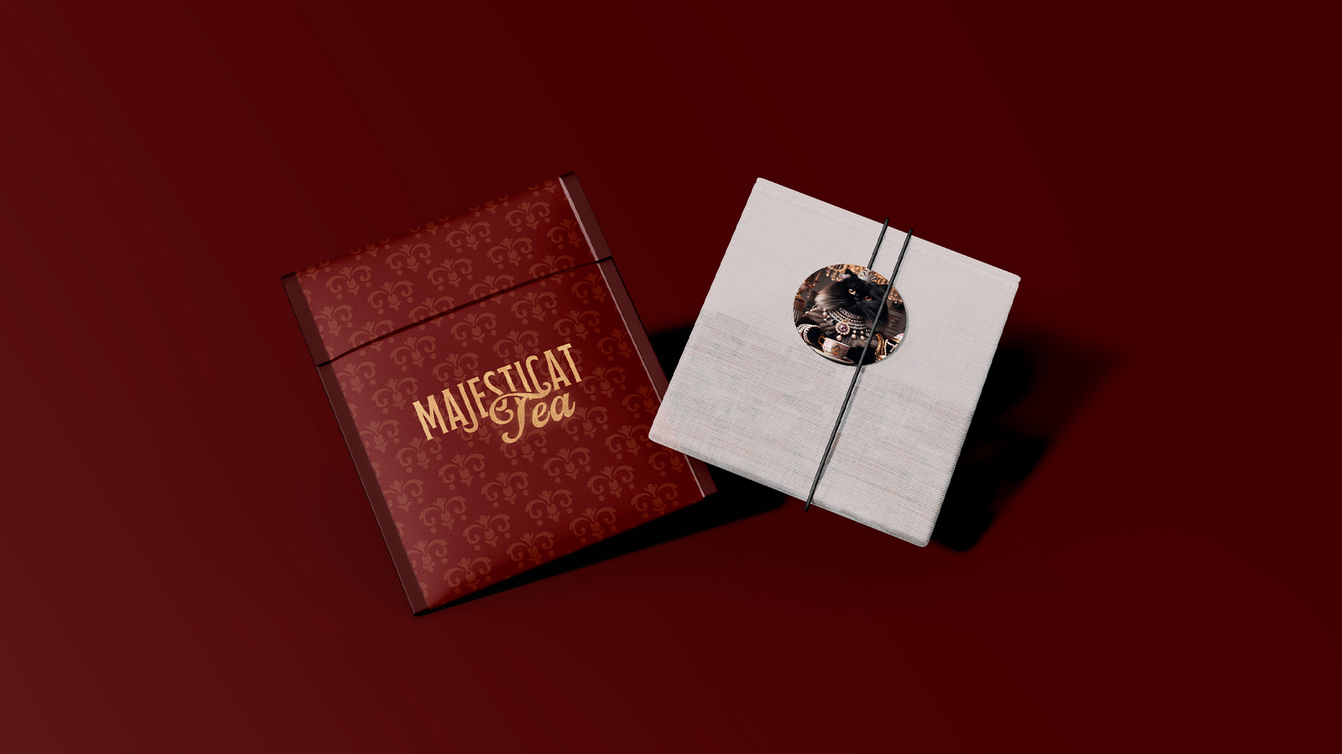
A bold, color-coded system forms the foundation of the packaging architecture, enabling clear differentiation between tea varieties while preserving a cohesive brand language. Each color is carefully selected to support both shelf impact and intuitive navigation. The system is applied consistently across box and bag formats using a refined grid and balanced hierarchy, ensuring clarity, legibility, and visual control.
Illustration plays a key role in adding warmth and character to the identity. The cat illustrations are intentionally minimal and graphic, integrated seamlessly into the layout so they enhance the composition rather than dominate it. This balance allows the packaging to feel expressive and engaging while retaining a premium tone. Typography and spacing are used deliberately to support the illustrations, reinforcing a sense of order and quality.
Overall, the project demonstrates how storytelling, illustration, color, and structure can work together to form a flexible and scalable packaging system. The result is a distinctive brand identity that merges tradition with playfulness, creating an engaging tea experience that feels both refined and approachable.
CREDIT
- Agency/Creative: Nada
- Article Title: Nada Elevates Conceptual Tea Brand With Character-Driven Packaging for Royal Cats
- Organisation/Entity: Freelance
- Project Type: Packaging
- Project Status: Non Published
- Agency/Creative Country: United Arab Emirates
- Agency/Creative City: Dubai
- Market Region: Middle East
- Project Deliverables: Packaging Design
- Format: Box
- Industry: Food/Beverage
- Keywords: Packaging Design - Tea - Royal
-
Credits:
Art Direction, Brand Strategy, Designer: Nada Alsafadi


