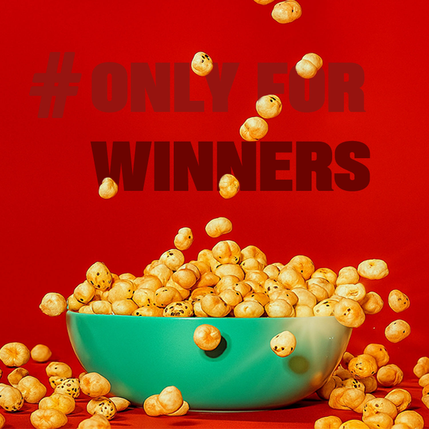
Wlue’s is a new-age makhana brand created to change how fox nuts are perceived by young, urban consumers. Traditionally positioned as a functional or healthy snack, makhana lacked relevance for Gen Z and lifestyle-driven audiences. The objective behind Wlue’s was to reframe the product as a bold, fun, and contemporary snack brand that feels closer to pop culture than health food.
DN Designs developed the complete visual identity and packaging system with the aim of giving Wlue’s strong shelf presence and instant recognisability. The brand was built around a playful yet confident personality, allowing it to stand apart from the muted and ingredient-led aesthetics common in the category.
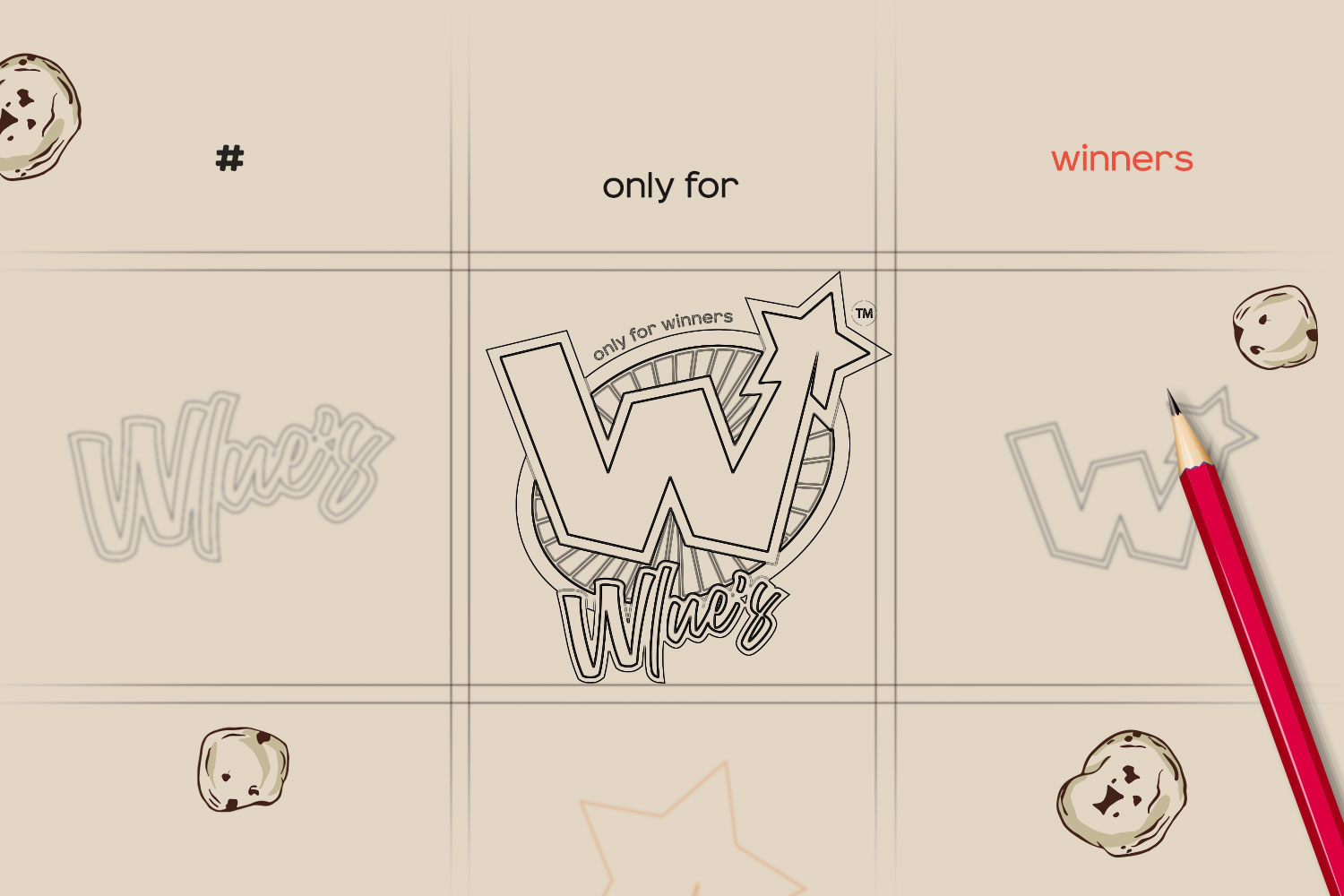
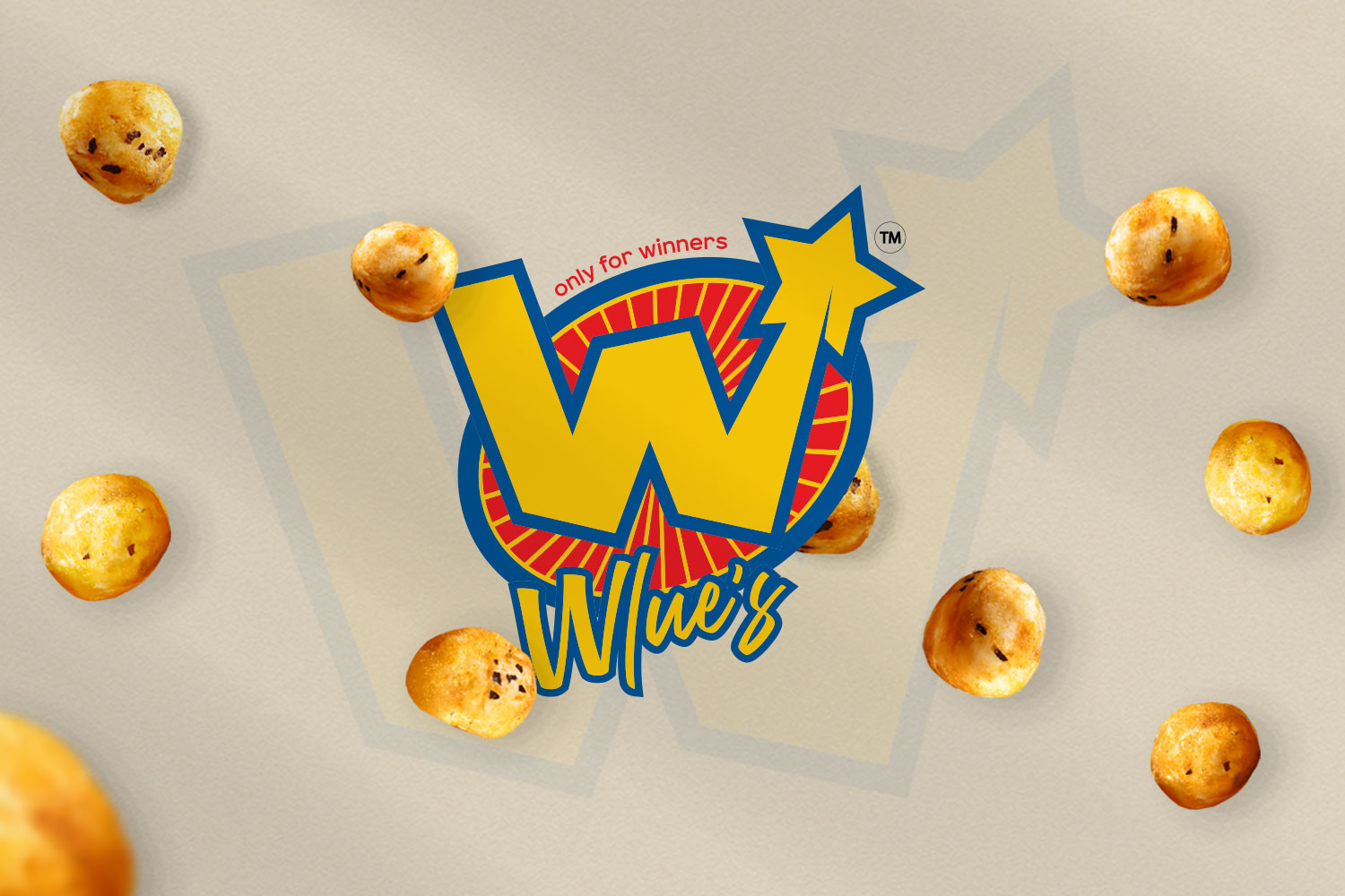
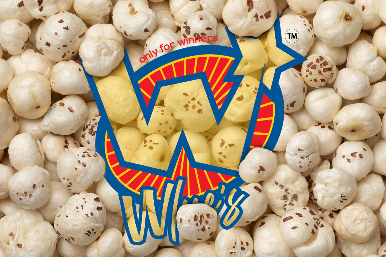
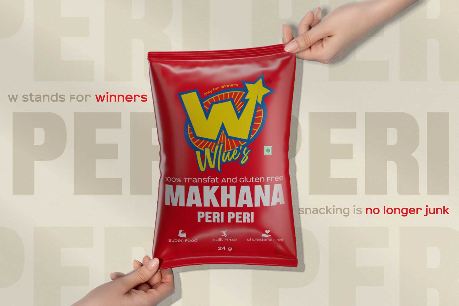
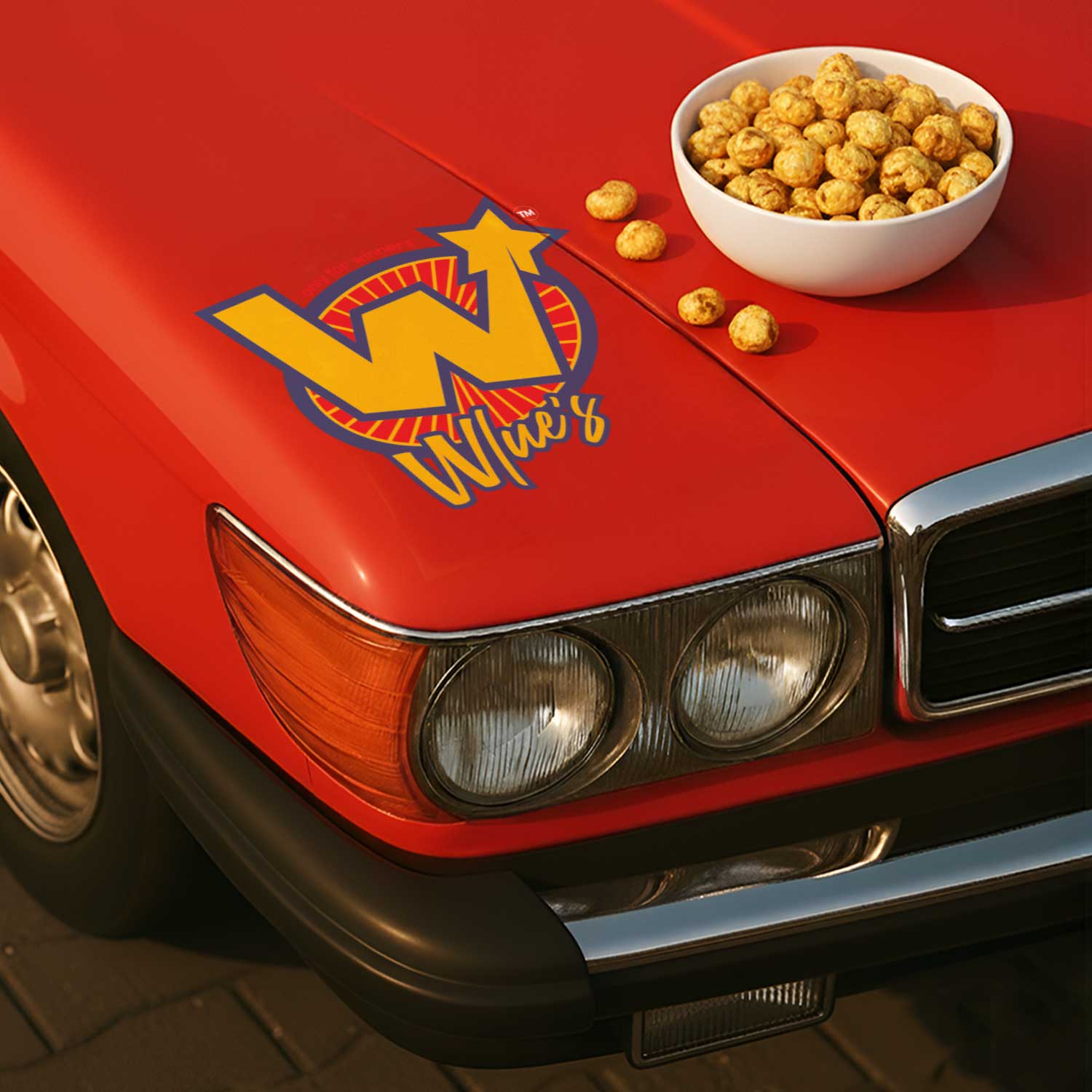
The logo is designed as a striking emblem, combining a retro-inspired star with bold, expressive typography. This creates a sense of energy, confidence, and motion, aligning with the brand’s positioning as a snack for winners. The visual language is deliberately loud and graphic, helping the brand command attention in crowded retail environments.
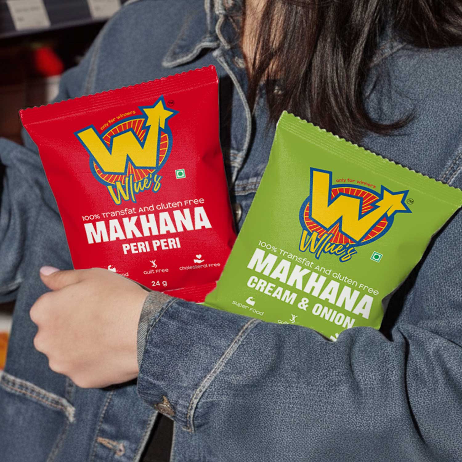
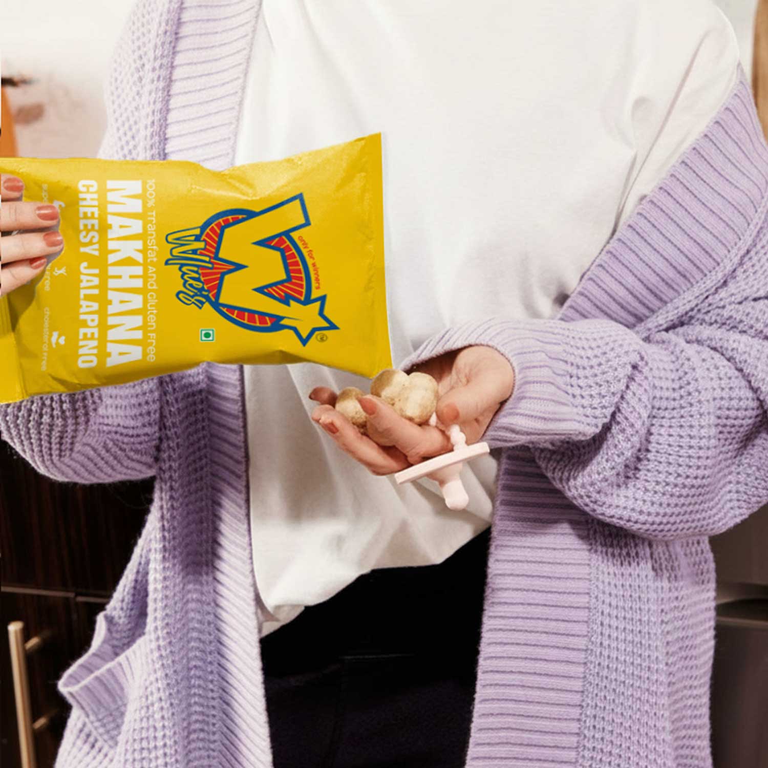
Packaging plays a central role in the Wlue’s identity. Each flavour variant is distinguished through vibrant colour palettes and dynamic layouts, while maintaining a consistent structure that unifies the range. This balance allows the product to be easily scalable across new flavours and formats without losing brand coherence.
The pouch designs use strong contrast, clear hierarchy, and minimal clutter, making the branding immediately readable from a distance. Instead of leaning on health cues, the design celebrates flavour, attitude, and personality, giving makhana a completely new visual expression.
Beyond packaging, the identity system extends across digital and social platforms, ensuring Wlue’s remains visually consistent and recognisable wherever the brand appears. Typography, colour, and graphic elements were all designed to work seamlessly across physical and digital touchpoints.
The result is a contemporary snack brand that transforms makhana into a lifestyle product, appealing to a new generation of consumers through bold design, strong branding, and modern visual storytelling.


CREDIT
- Agency/Creative: DN Designs
- Article Title: Wlue’s Makhana Branding and Packaging Design by DN Designs
- Organisation/Entity: Agency
- Project Type: Identity
- Project Status: Published
- Agency/Creative Country: India
- Agency/Creative City: Noida
- Market Region: Asia
- Project Deliverables: Animation, Brand Design, Brand Identity, Brand Strategy, Brand Tone of Voice, Branding, Packaging Design
- Industry: Food/Beverage
- Keywords: makhana branding, snack packaging design, modern snack identity, Gen Z snack brand, playful packaging, bold logo design, Wlue’s branding, DN Designs packaging, fox nuts packaging design


