


Mien Dong Innovative Technology University
Introduction
The industrial heartland of Vietnam is shifting from manufacturing to high-tech logistics. Mien Dong Innovative Technology University (MIT Uni.) needed a brand infrastructure capable of shedding its regional label and positioning itself as a primary source for the country’s future workforce.
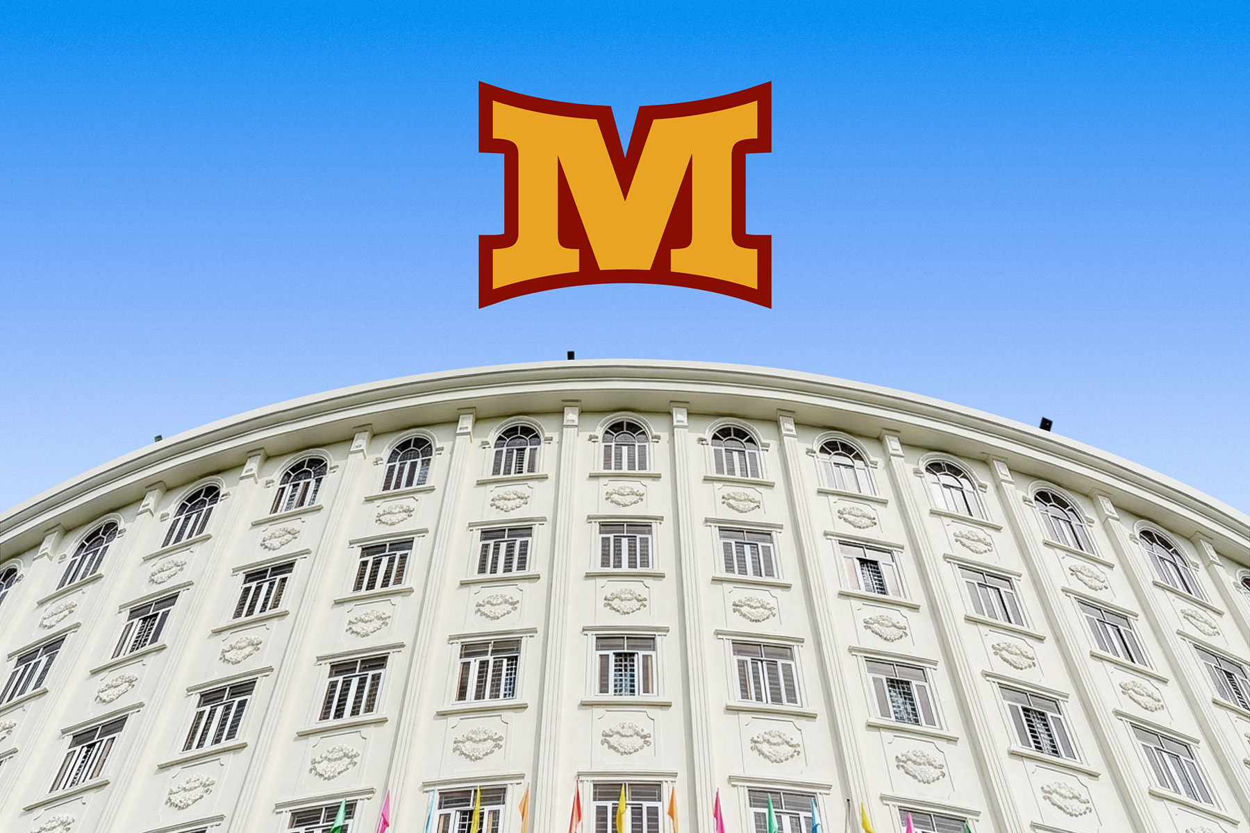
Dong Nai is evolving. The province is rapidly pivoting from traditional factory floors to high-tech innovation and logistics. This shift is driven by the massive Long Thanh International Airport project. MIT Uni. stood at the center of this transition with a 24-hectare expansion plan and a vision for a Smart Campus. However, the brand lagged behind the infrastructure. The existing identity anchored the institution to its past as a local provincial school. It relied on a traditional circular mark featuring a static flower and book motif. This felt passive and decorative rather than energetic and modern. To capture the value of the coming economic boom, the university needed to pivot. It had to look less like a local school and more like a national destination.
Amplifying the Vision
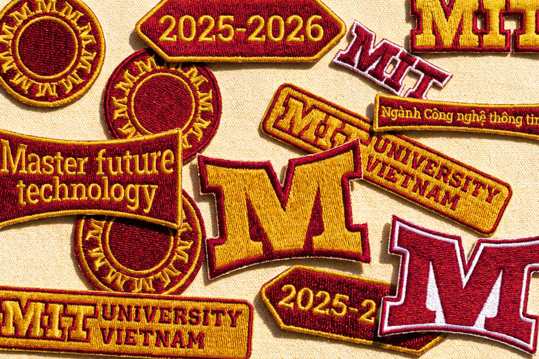
The university already possessed the necessary ambition in its name and its tagline, “Master Future Technology,” but the visual presentation diluted this power. We focused on amplifying these existing assets through a sharper execution. We polished the MIT Uni. shorthand to ensure it functioned as a modern, active identifier alongside the full institutional name. Simultaneously, we elevated the tagline from a passive description into a central visual anchor. This approach ensured the brand communicated its high-tech mandate with immediate clarity and allowed the institution to own its narrative without needing to invent a new one.
The Gear and The Sunflower
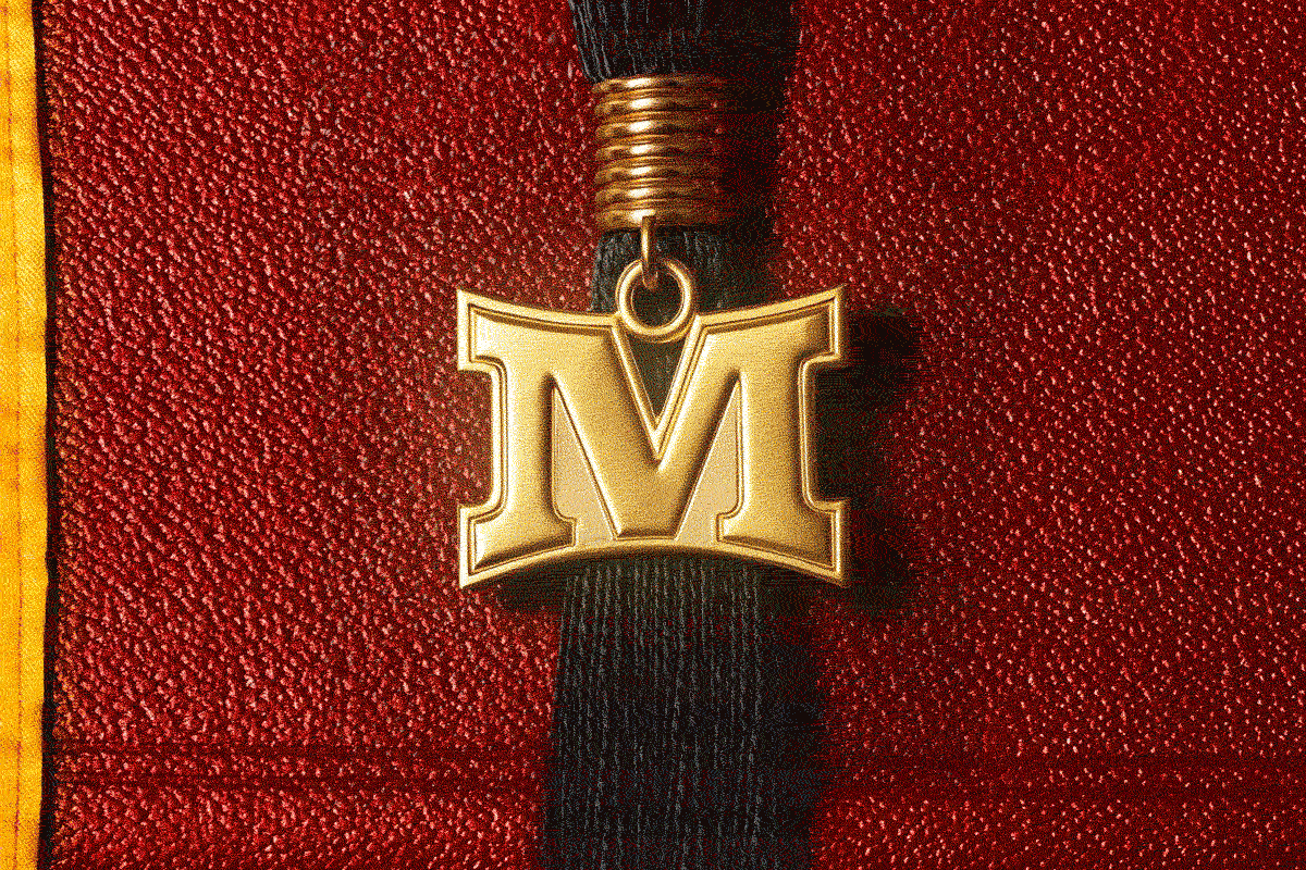
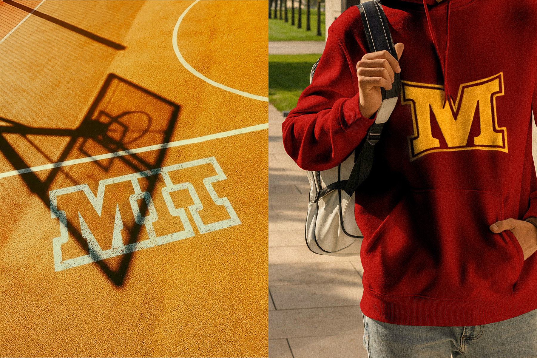
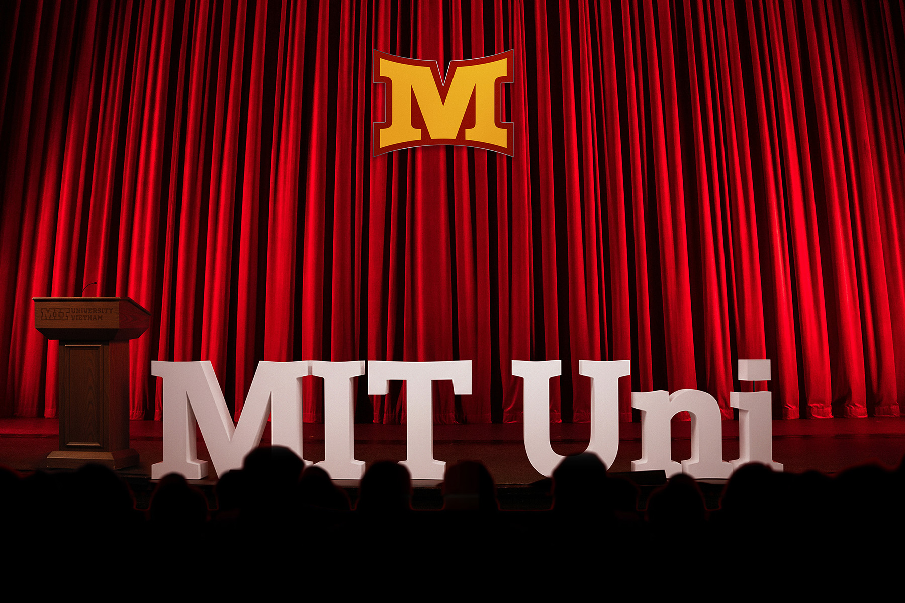
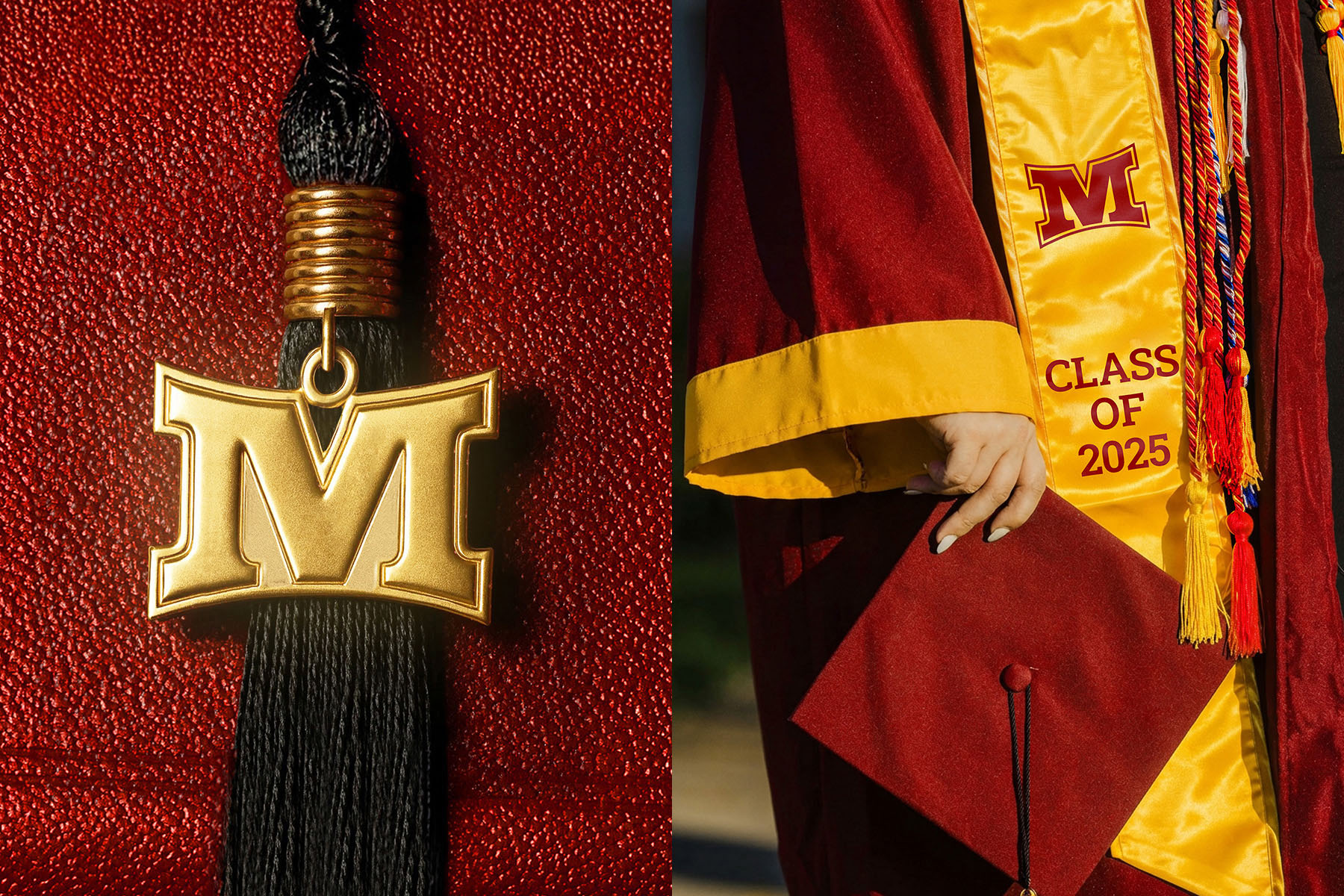
With the strategic narrative clarified, the visual identity needed to match this new intensity. The previous logo was a literal illustration that failed to capture the complexity of a modern university. We replaced it with a symbol designed to resolve the tension between technical and humanistic faculties. The radial arrangement of the ‘M’ shapes suggests mechanical precision and forward motion for the engineering side. Yet, the same shape reads as a blooming sunflower for the arts and humanities, representing the “Eastern Sun” (Miền Đông). This visual duality allows MIT Uni. to speak to distinct audiences without fracturing its brand, turning a static logo into a dynamic storytelling device.
Breaking the Academic Blue Mold
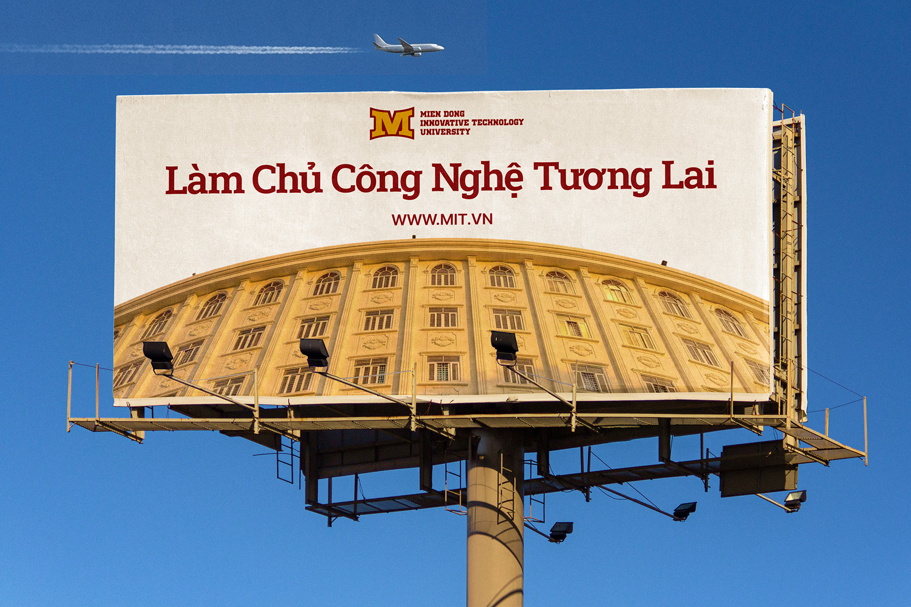
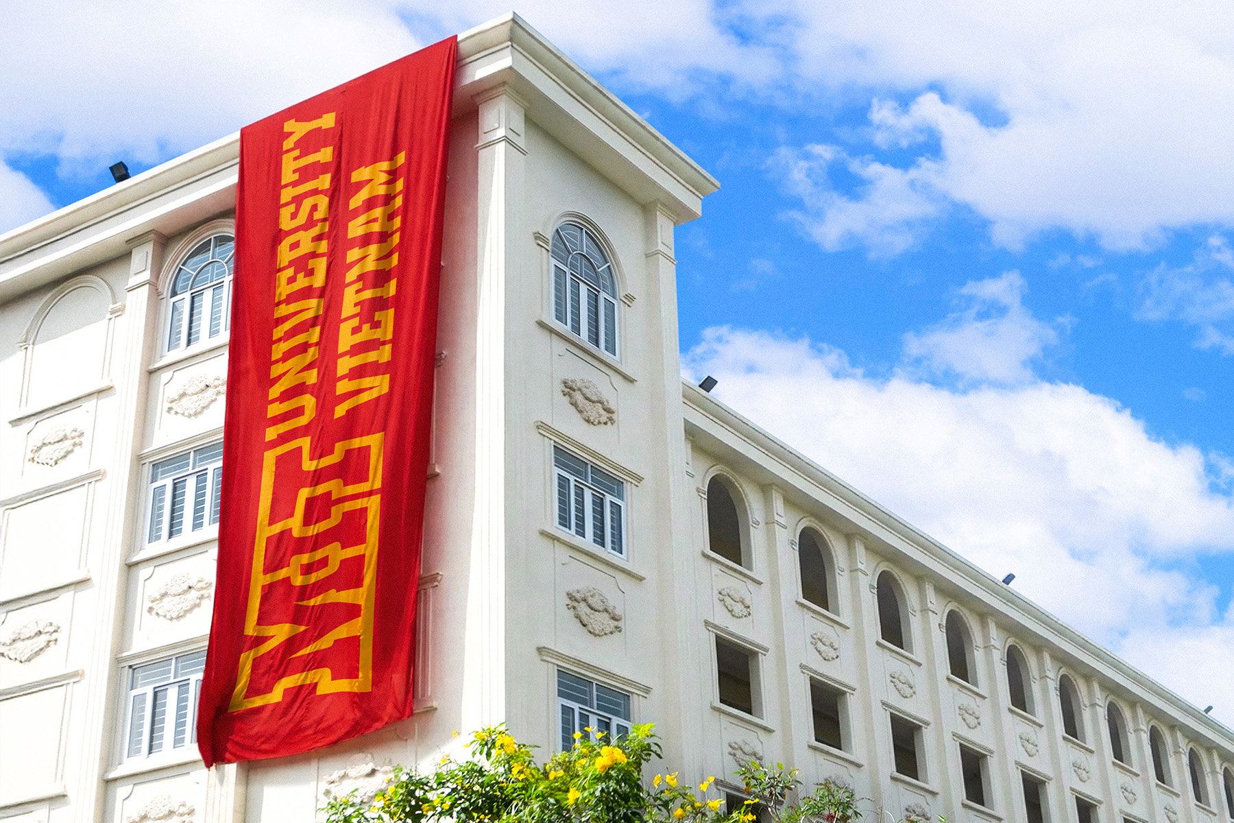
This new visual dynamism required a palette that could match its energy. Vietnamese educational branding is saturated with safe and trustworthy blues, so we developed a scheme anchored in Crimson and Amber. Crimson signals courage and the heat of academic passion, while Amber captures the optimism of the region. This combination ensures the university commands attention on digital screens and outdoor billboards, effectively separating it visually from the sea of blue competitors.
To ensure this distinctiveness extended to every written word, xolve developed a custom typeface called MIT Uni Serif. The design features curved serifs that subtly mirror the petals of the new symbol, creating a subconscious link between the institution’s name and its mark. This bespoke asset provides a consistent visual thread across the expanding campus network that standard retail fonts simply cannot match.
The Impact: From Provincial to Pivotal
This cohesive system has equipped MIT Uni. to step beyond its regional origins. With the 24-hectare Smart Campus coming online, the university now possesses a visual infrastructure that matches the scale of its physical expansion. The refreshed identity does not just look different; it signals a shift in stature. It provides a credible backdrop for the institution’s evolving curriculum and international partnerships, such as those with Siemens and QTS Australia. Ultimately, the rebrand has aligned the university’s external image with its internal reality, ensuring that as MIT Uni. grows, its story remains clear, consistent, and ready for the national stage.

CREDIT
- Agency/Creative: xolve branding
- Article Title: xolve branding Builds a Scalable Identity System for Mien Dong Innovative Technology University
- Organisation/Entity: Agency
- Project Type: Identity
- Project Status: Published
- Agency/Creative Country: Vietnam
- Agency/Creative City: Ho Chi Minh City
- Market Region: Asia, Global
- Project Deliverables: Art Direction, Brand Design, Brand Experience, Brand Guidelines, Brand Identity, Brand Mark, Brand Redesign, Brand Strategy, Branding, Graphic Design, Icon Design, Logo Design, Rebranding, Type Design, Typography
- Industry: Education
- Keywords: xolve branding
-
Credits:
Creative Director: Khoa Huynh
Brand Designer: Thao Nguyen
Brand Designer: Cong Vo
Brand Designer: Xuan Cuong
Brand Designer: Thanh Binh
Brand Designer: Thong Nguyen
Brand Designer: Vu Hoang
Project Manager: Anh Chu


