


Fidelity is an established financial giant with decades of brand equity and a reputation built on trust, stability, and long-term guidance. However, as the financial landscape continues to evolve, and as customers increasingly expect clarity, accessibility, and modern design, the need arose for a refreshed brand system that could carry Fidelity confidently into the future. The goal of this rebrand was not to reinvent Fidelity’s identity from the ground up, but to refine it: preserving recognizable elements while reshaping the visual language to reflect simplicity, transparency, and forward-thinking innovation.
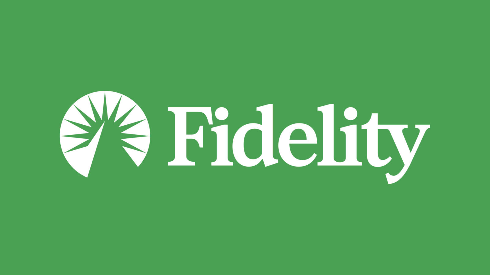
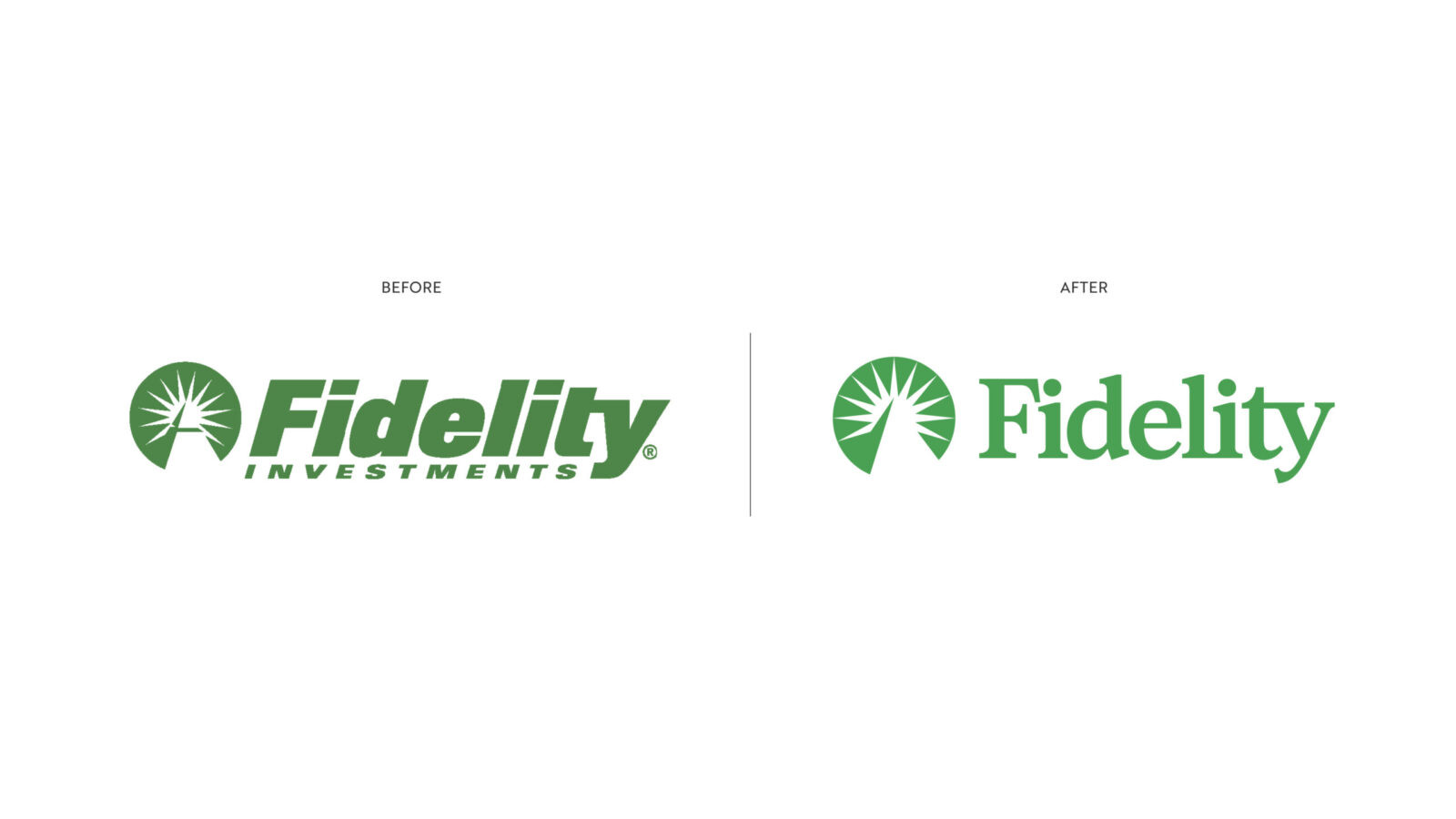
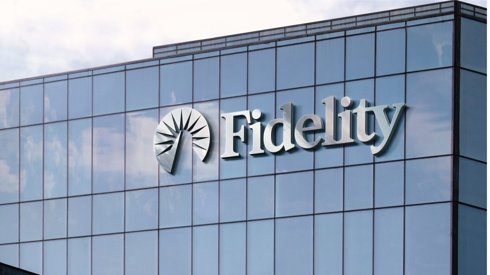
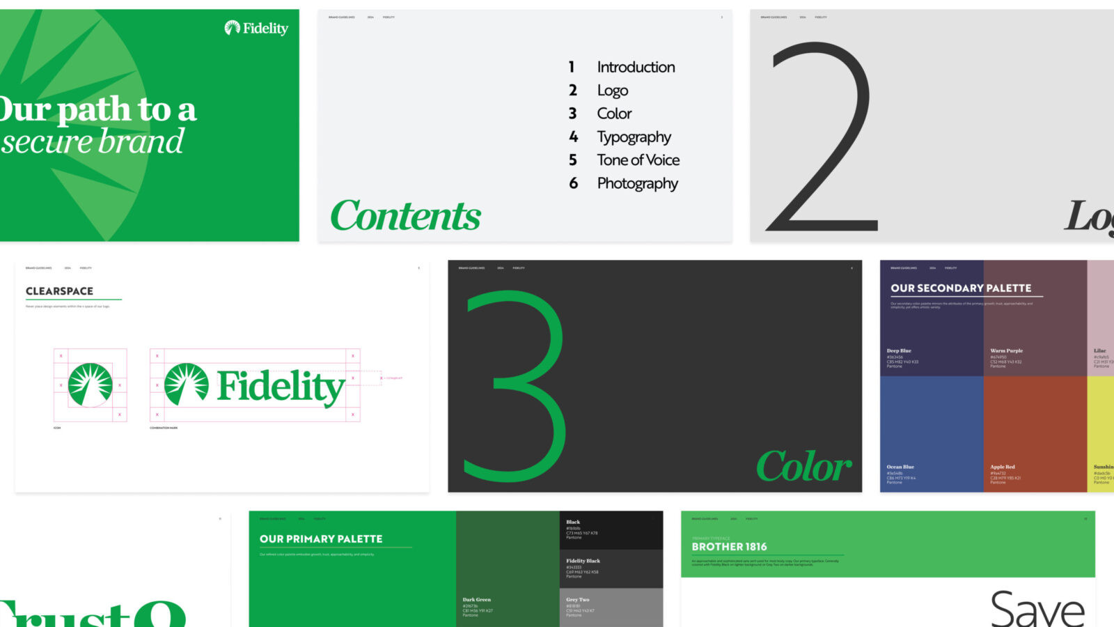
The redesign begins with the logo, one of the strongest carriers of Fidelity’s history. By simplifying the iconic symbol and pairing it with a modern serif word mark, the new logo creates a balance between legacy and progress. The updated mark feels more intuitive and contemporary, yet still rooted in the trustworthiness and stability that customers associate with the brand.
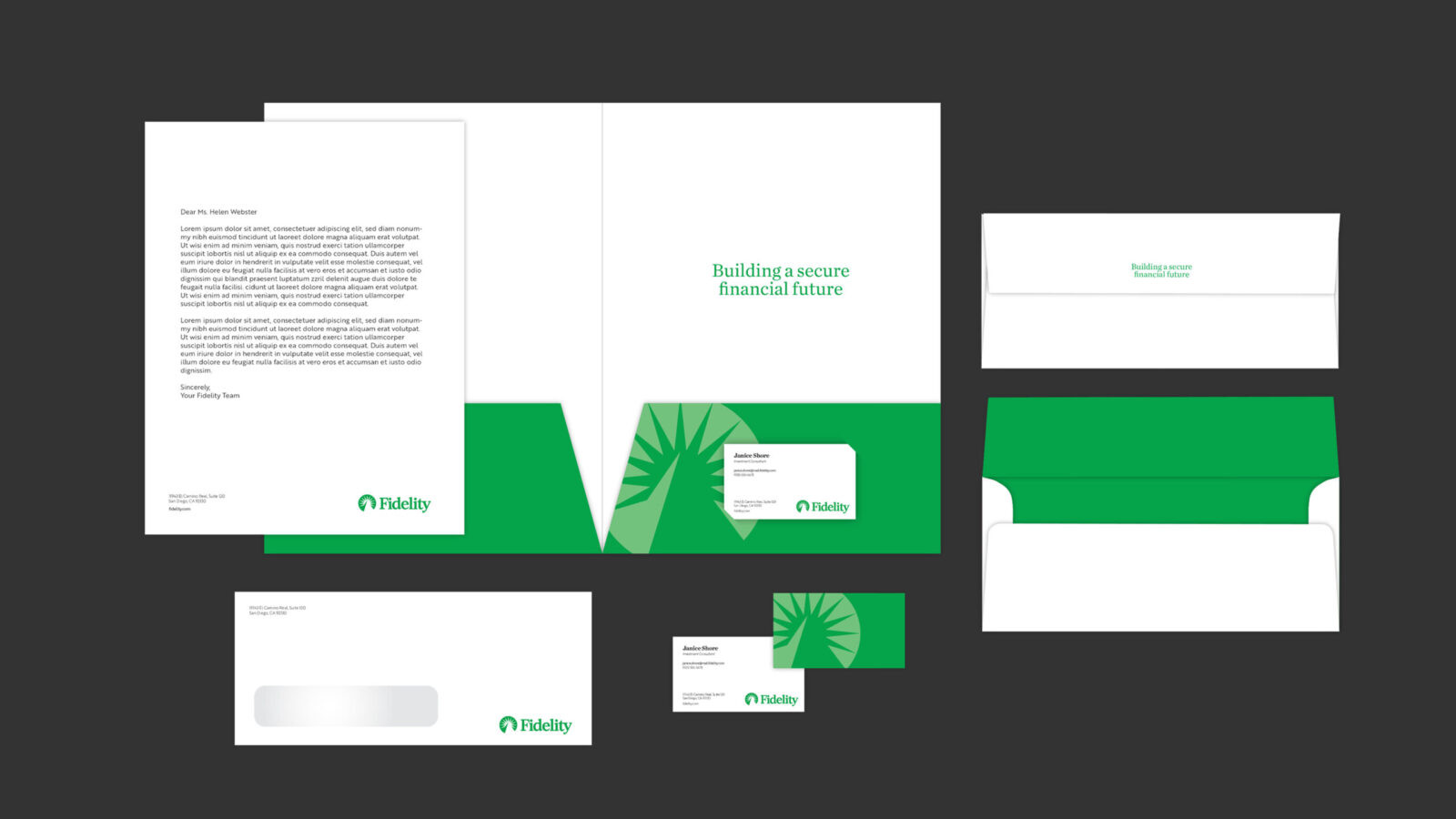
To support this foundation, the typographic system underwent a complete transformation. The previous secondary typefaces were replaced with clean, dynamic, and highly legible typography (Brother 1816 and Chronicle) that introduces clearer hierarchy across all written communication. This shift not only improves readability but also reinforces Fidelity’s commitment to accessibility and customer-focused clarity.
Color also plays a crucial role in the rebrand. While maintaining recognizable greens (instilled with a bit more vibrancy) to honor the original identity, the palette is expanded with hues that feel more flexible and lively. These added colors introduce warmth and variety, allowing the brand to adapt more fluidly across digital platforms, marketing touchpoints, and printed materials.
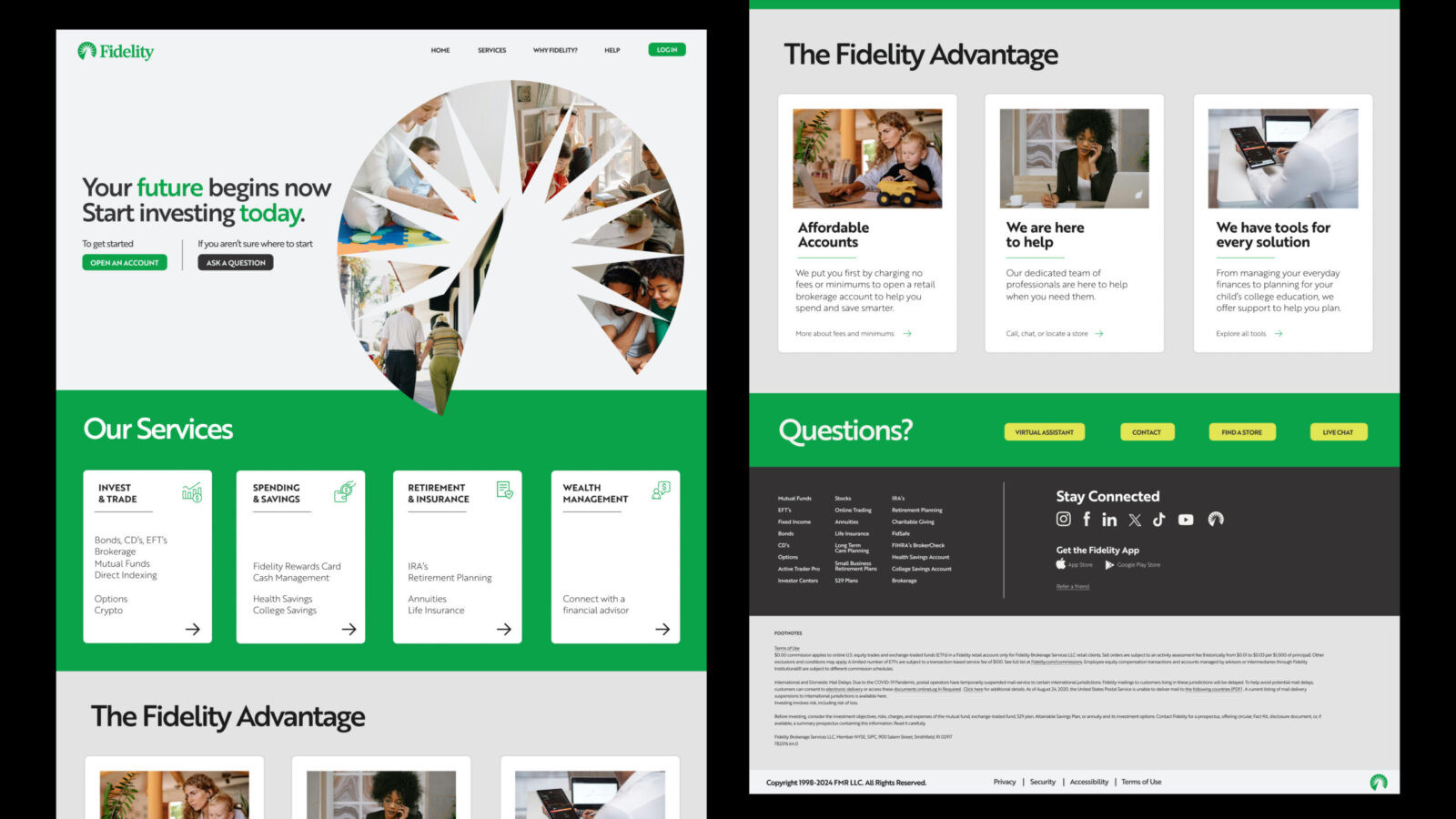
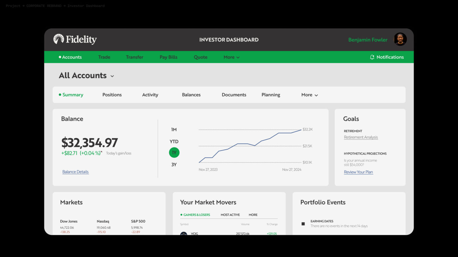
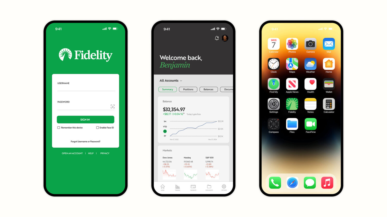
Altogether, these elements form a cohesive visual system that is approachable, trustworthy, and distinctly modern. The reimagined Fidelity identity respects the company’s heritage while positioning it for relevance and resonance in a rapidly shifting financial world. A timeless brand met with a timeless redesign.

CREDIT
- Agency/Creative: Tess Jordahl
- Article Title: Student Tess Jordahl Reworks Fidelity Into a Simpler and More Accessible Financial Brand
- Organisation/Entity: Student
- Project Status: Non Published
- Agency/Creative Country: United States of America
- Agency/Creative City: San Diego
- Market Region: United States
- Project Deliverables: 2D Design, Brand Design, Brand Guidelines, Brand Mark, Brand Redesign, Brand Refinement, Brand Rejuvenation, Branding, Design, Graphic Design, Logo Design, Rebranding, Typography, Web Design
- Industry: Financial
- Keywords: WBDS Student Design Awards 2025/26 , Financial, Rebrand, Corporate, Logo, Brand Guidelines, Web Design


