


The new visual identity for COSIAM was conceived as a direct translation of the company’s core values into a clear, structured, and architectural visual language.
COSIAM operates in the field of large-scale construction, urban transformation, and infrastructure development. Starting from this context, the identity system is built on principles of **structure, precision, and modularity**, drawing inspiration from the logic of construction itself.
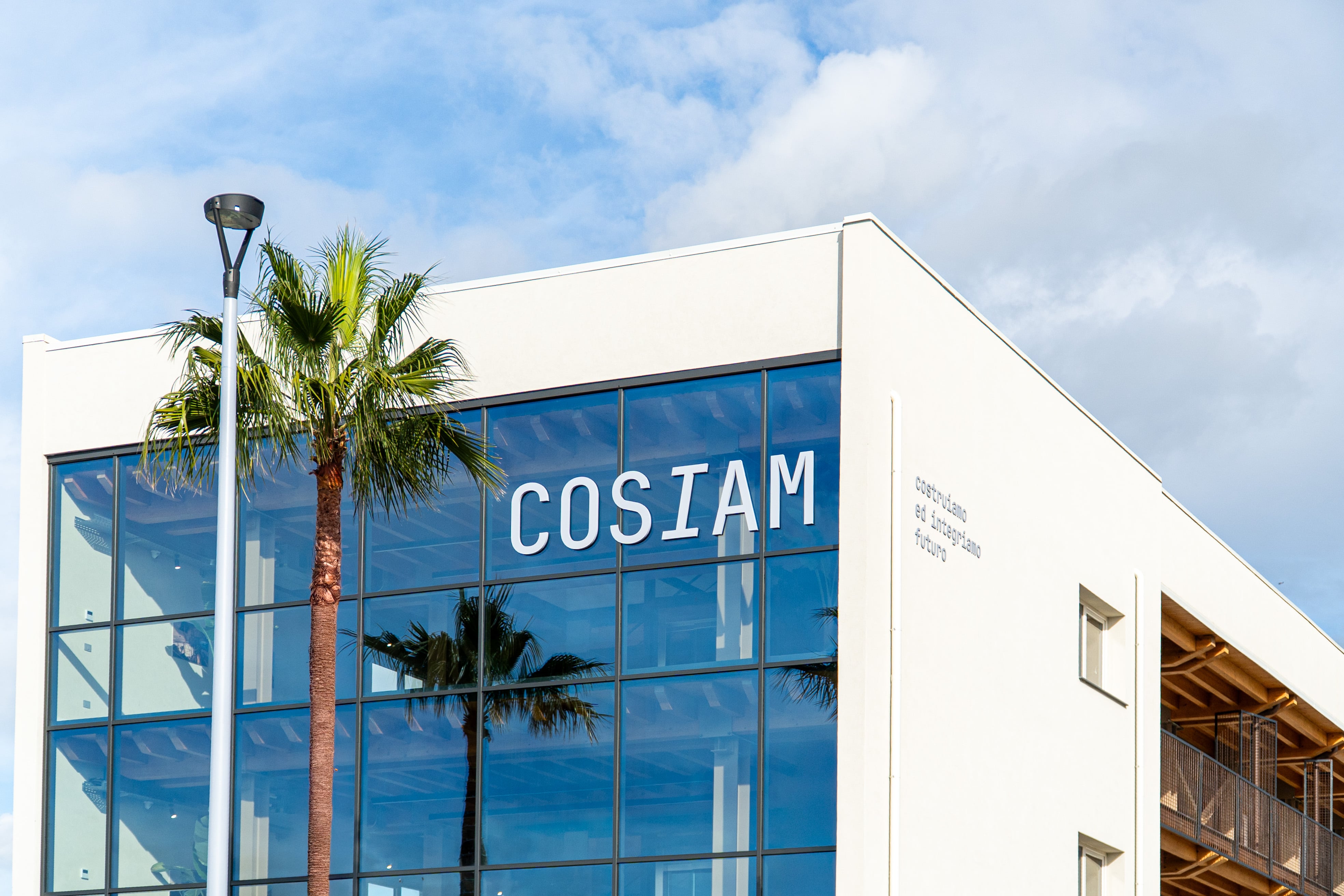
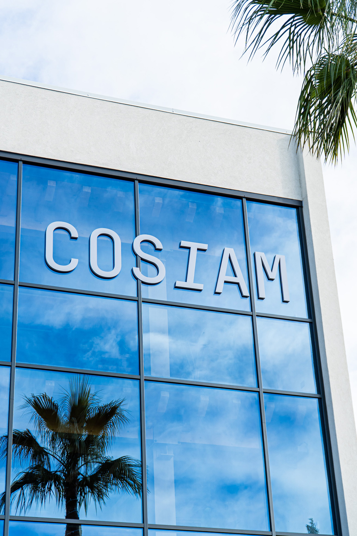
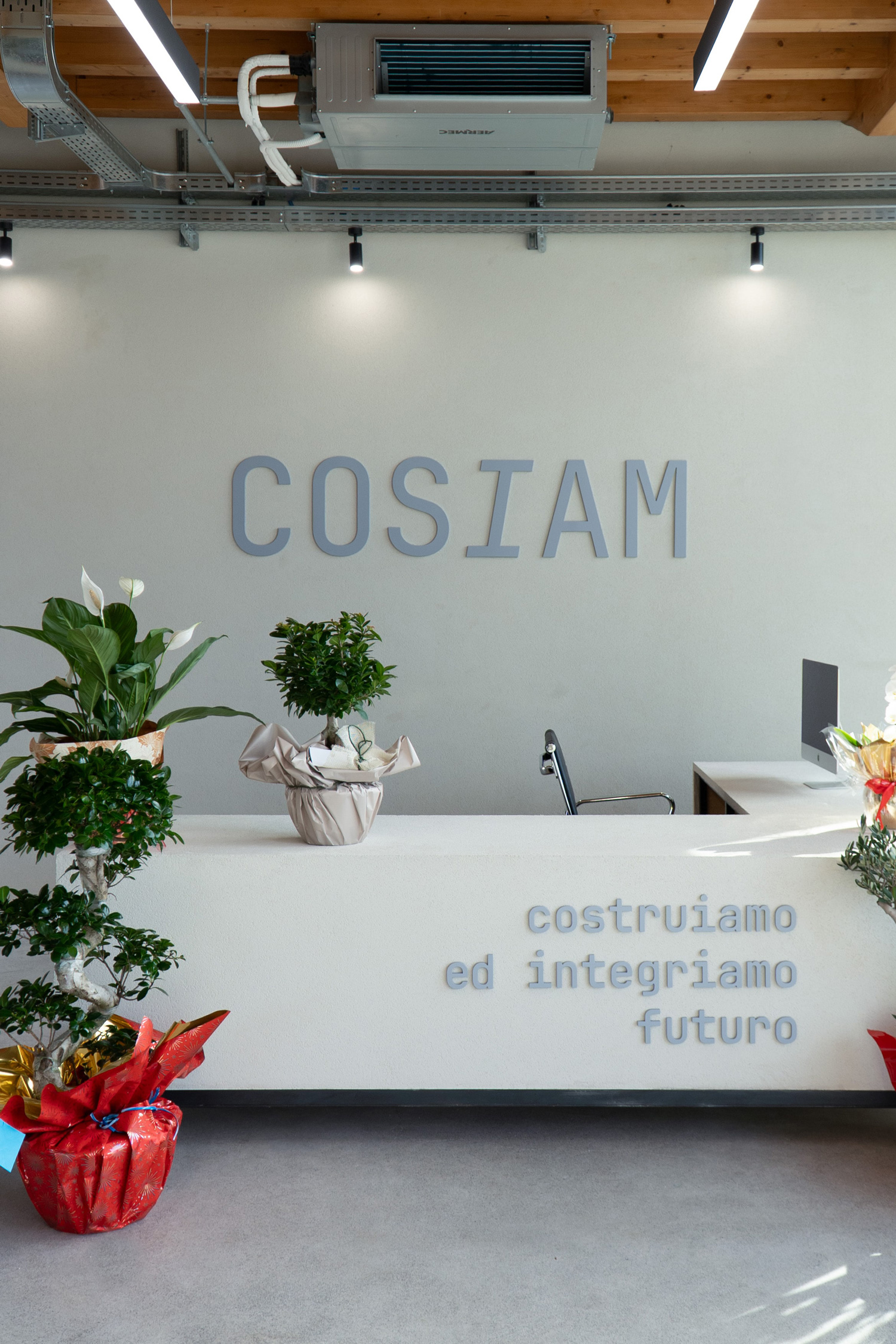
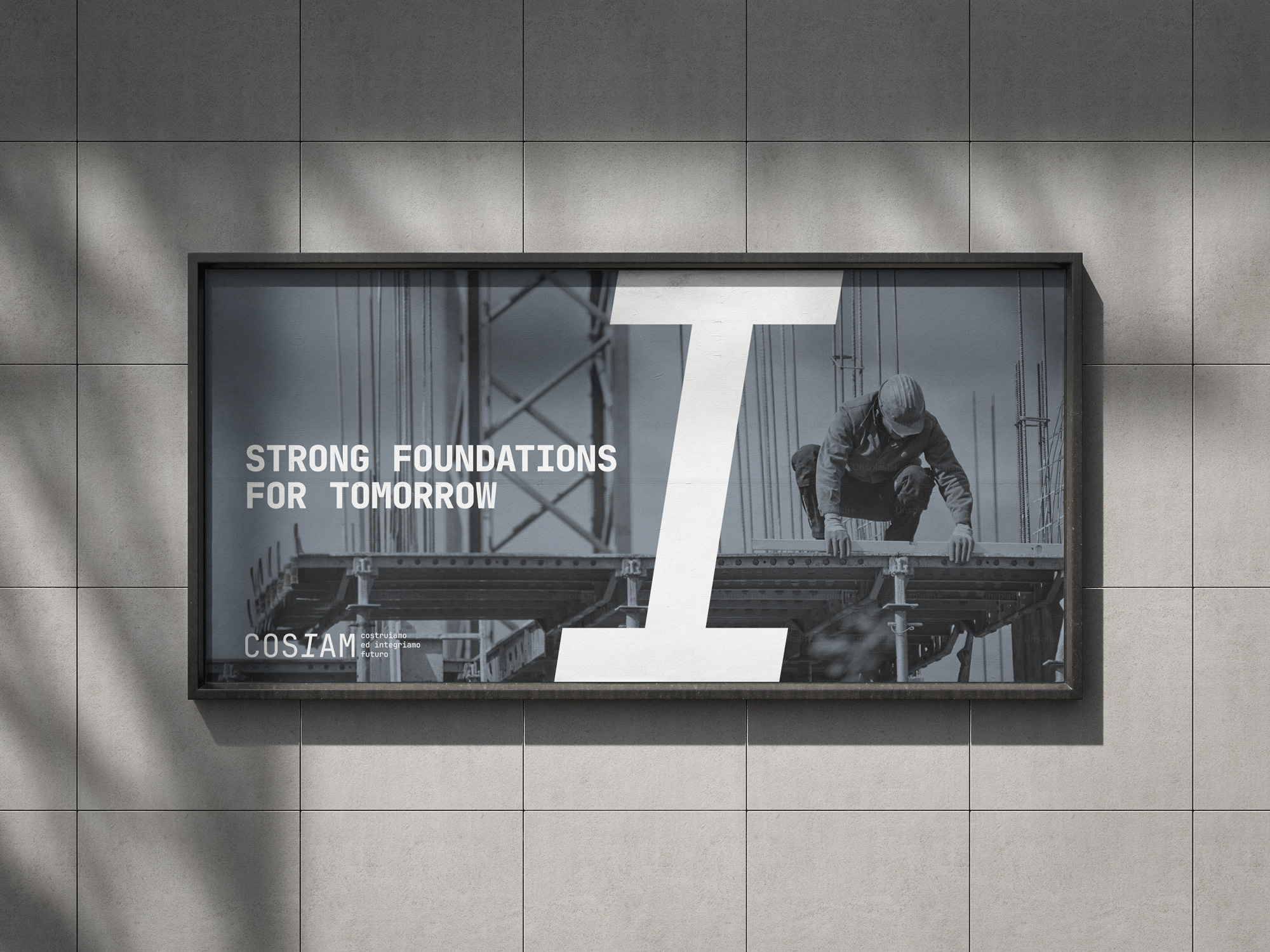
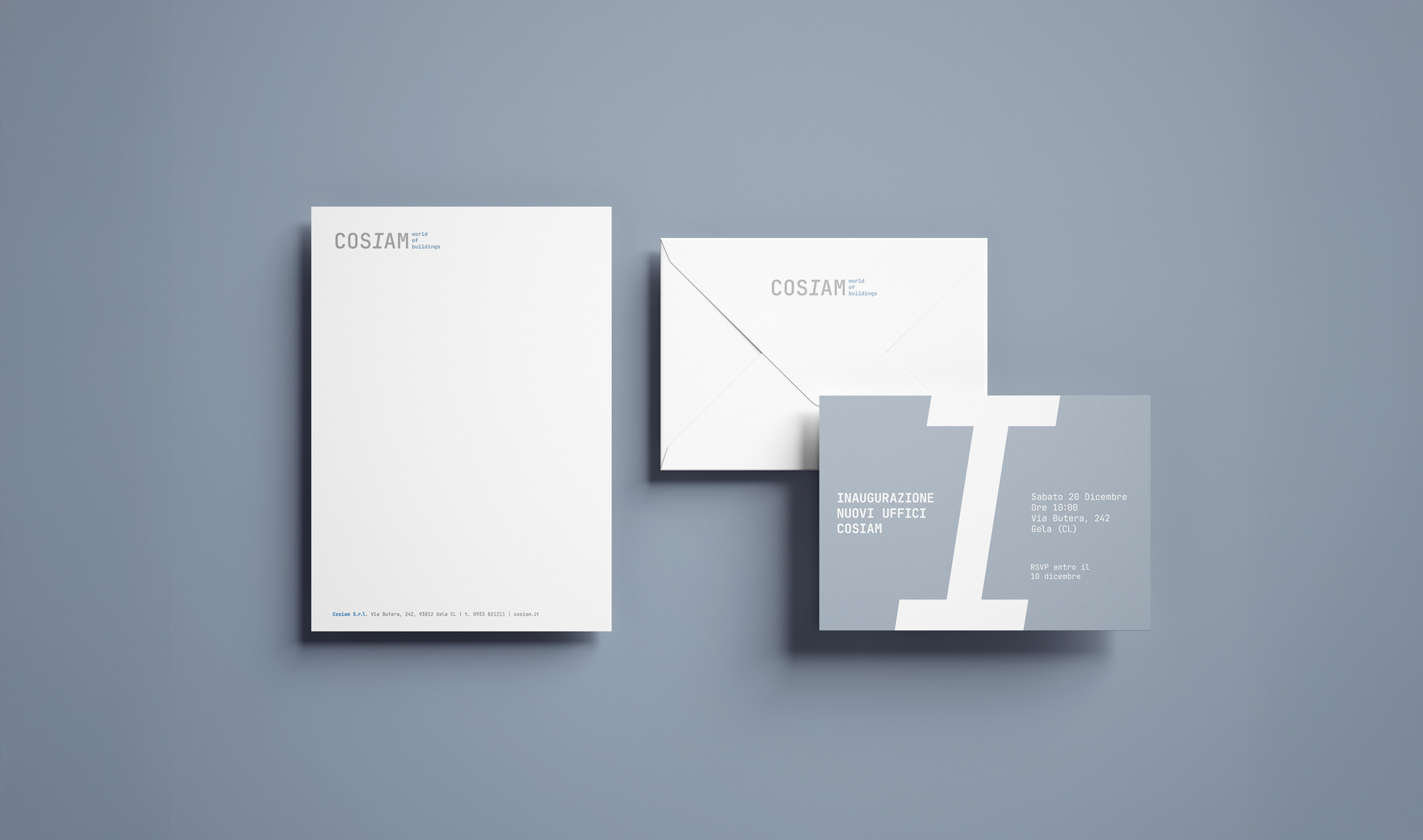
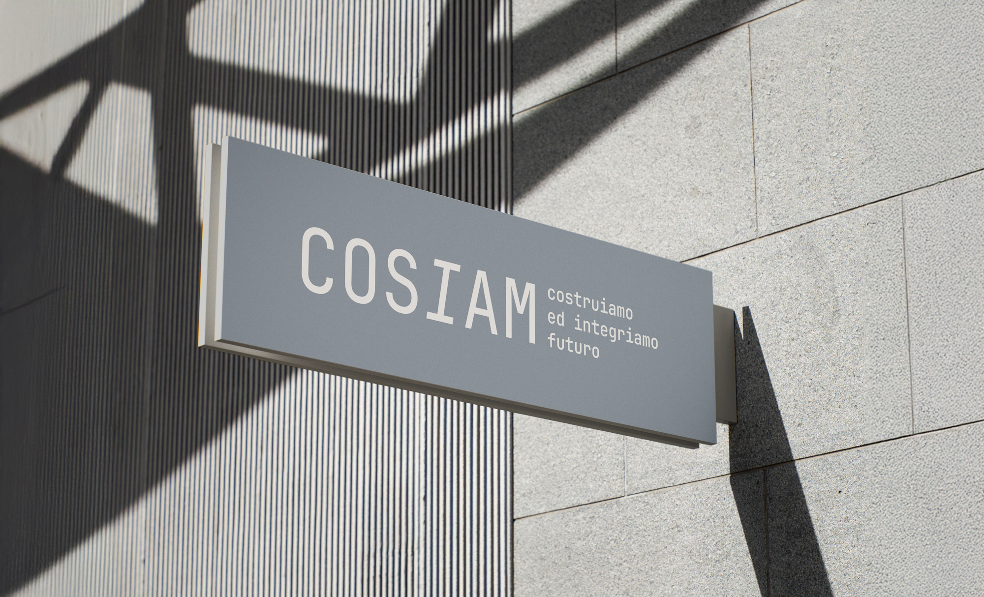
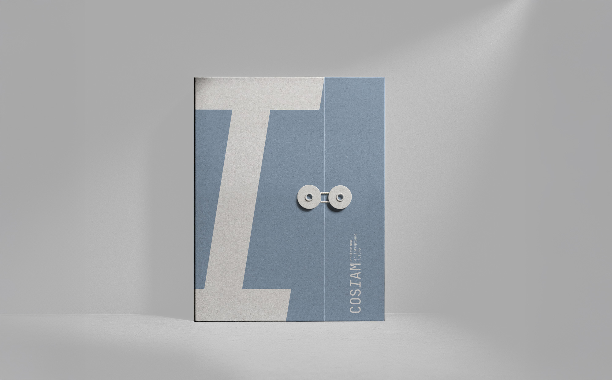
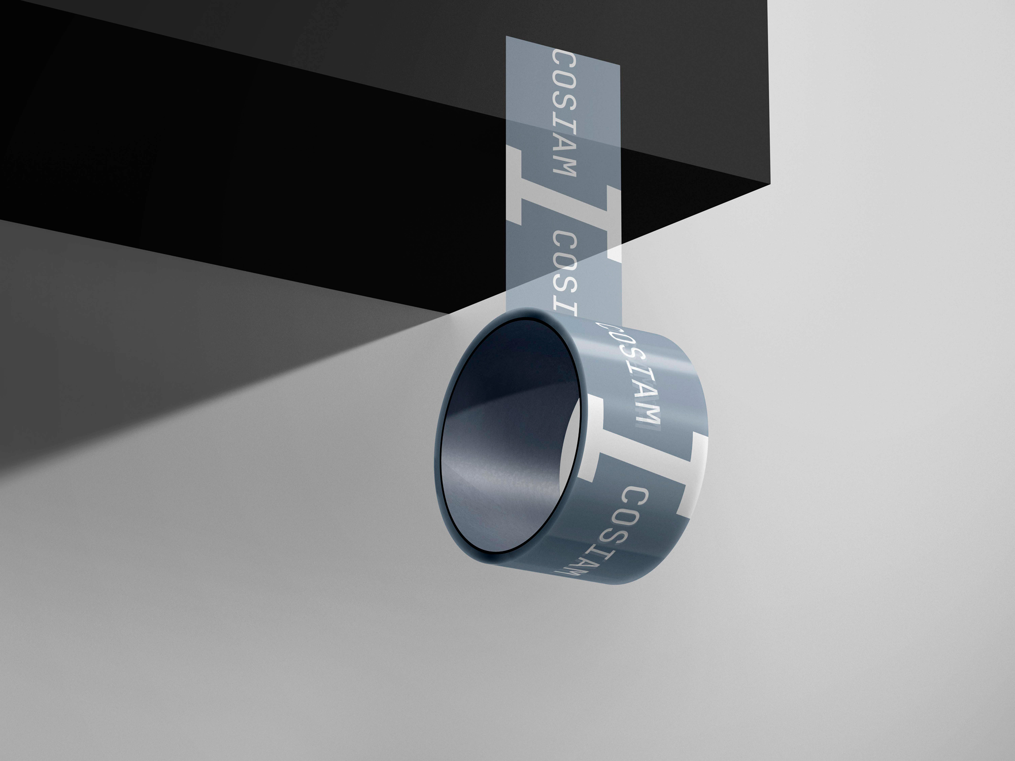
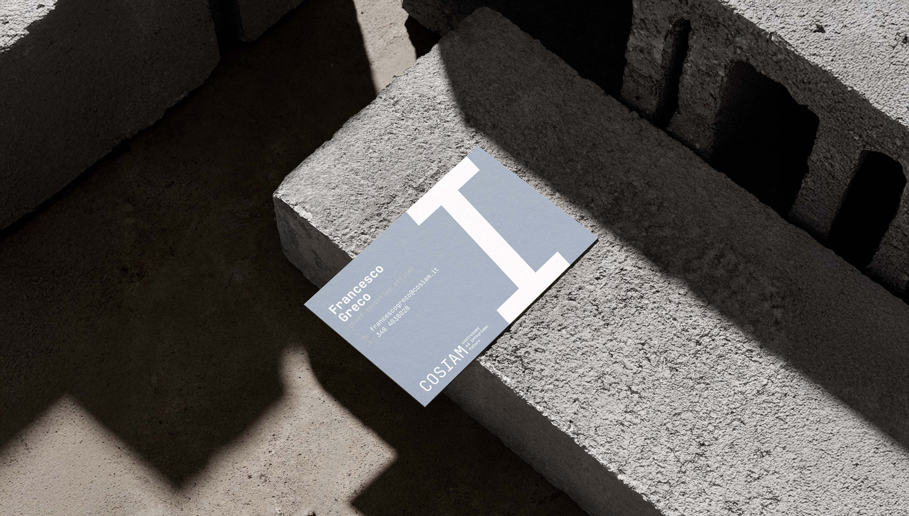
At the heart of the project lies a geometric and technical typographic choice. **JetBrains Mono**, a monospaced typeface, was selected for its inherent rigor and engineered character. Its equal spacing recalls technical drawings, measurements, and construction grids. Within the logotype and the wider system, the italic “I”becomes a defining element: reinterpreted as a **structural beam or pillar**, it visually supports the identity and acts as a recurring architectural sign.
This typographic element expands into a modular pattern, repeated horizontally and vertically to create textured surfaces. The resulting pattern references the visual rhythm of raw masonry blocks, reinforcing the connection between graphic system and built environment.
The color palette is intentionally restrained, dominated by **neutral, mineral tones** inspired by concrete, stone, and construction materials. These muted colors enhance the technical character of the brand while allowing the typographic system to remain the primary expressive element.
The identity was developed as a **flexible and scalable system**, capable of adapting across corporate materials, signage, printed matter, and large-format applications. From business cards to billboards, the visual language maintains consistency while responding to different contexts and scales.
The project was developed alongside the inauguration of COSIAM’s new headquarters, within a shared design approach that connects architecture and visual identity as complementary expressions of the same vision.
The result is an identity that does not decorate, but builds: a visual system grounded in structure, clarity, and permanence.

CREDIT
- Agency/Creative: Rosario Lo Iacono design
- Article Title: Rosario Lo Iacono Design Introduces a Rigorous Architectural Identity System for COSIAM
- Organisation/Entity: Agency
- Project Type: Identity
- Project Status: Published
- Agency/Creative Country: Italy
- Agency/Creative City: Rosario Lo Iacono design
- Market Region: Europe
- Project Deliverables: Brand Identity
- Industry: Construction
- Keywords: construcions, buildings, visual identity, brand identity
-
Credits:
Brand designer: Rosario Lo Iacono


