


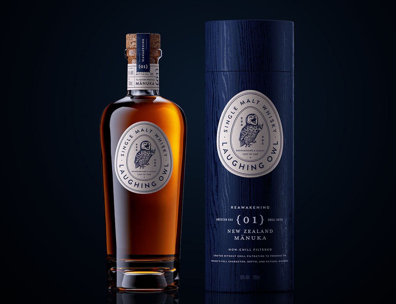
Laughing Owl Whisky brings new life to a spirit inspired by the long lost Laughing Owl of Aotearoa. Once known for its bold presence and slightly cheeky character, the bird disappeared in the early 1900s. Today, the only physical traces that remain are seventeen preserved eggs held in museum collections across New Zealand. One of the owl’s last recorded sightings took place in the Ōpihi River region of South Canterbury, close to where this whisky is now made. The brand becomes a quiet homecoming, reconnecting a lost native with the landscape it once inhabited.
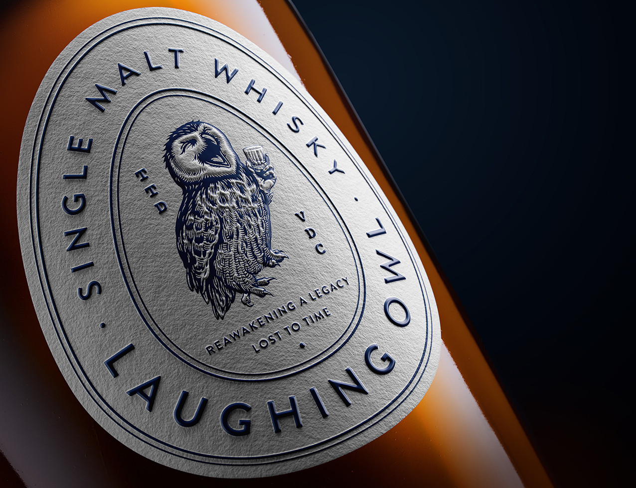
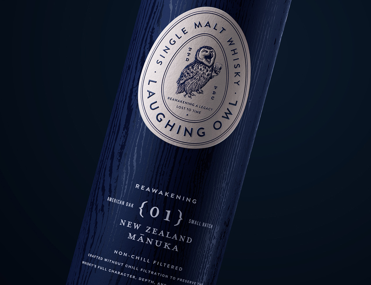
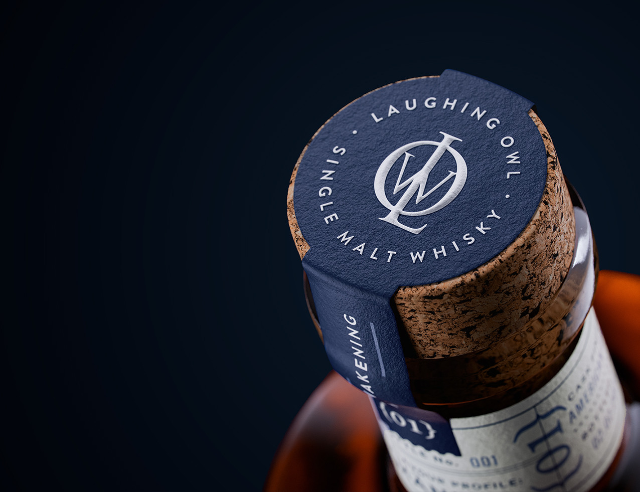
The egg sits at the centre of the idea. With the species long gone, these seventeen eggs form the last tangible link to its existence. This makes the egg form more than a symbol. It is evidence. The label adopts this silhouette as its defining device, framing the owl and key brand elements within a simple and memorable shape. Within the system sits a bespoke monogram formed from the initials of the brand, which together spell the word OWL. This alignment felt natural and immediate, offering a design fit that delivers effortless recognition while deepening the connection between name, symbol and story. The monogram introduces a subtle geometric counterpoint to the engraving style illustration and strengthens cohesion across the pack.
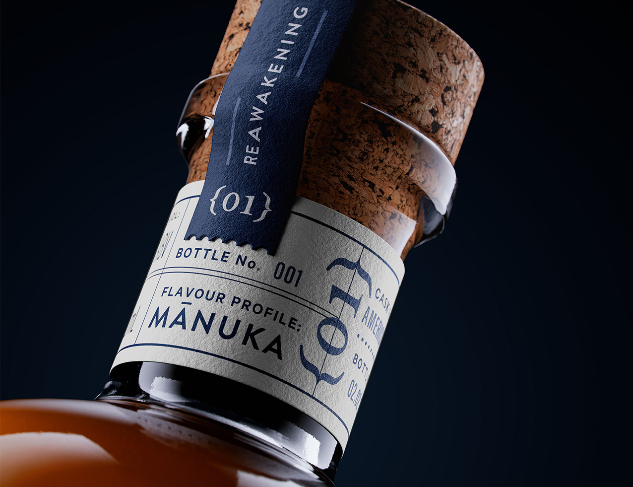
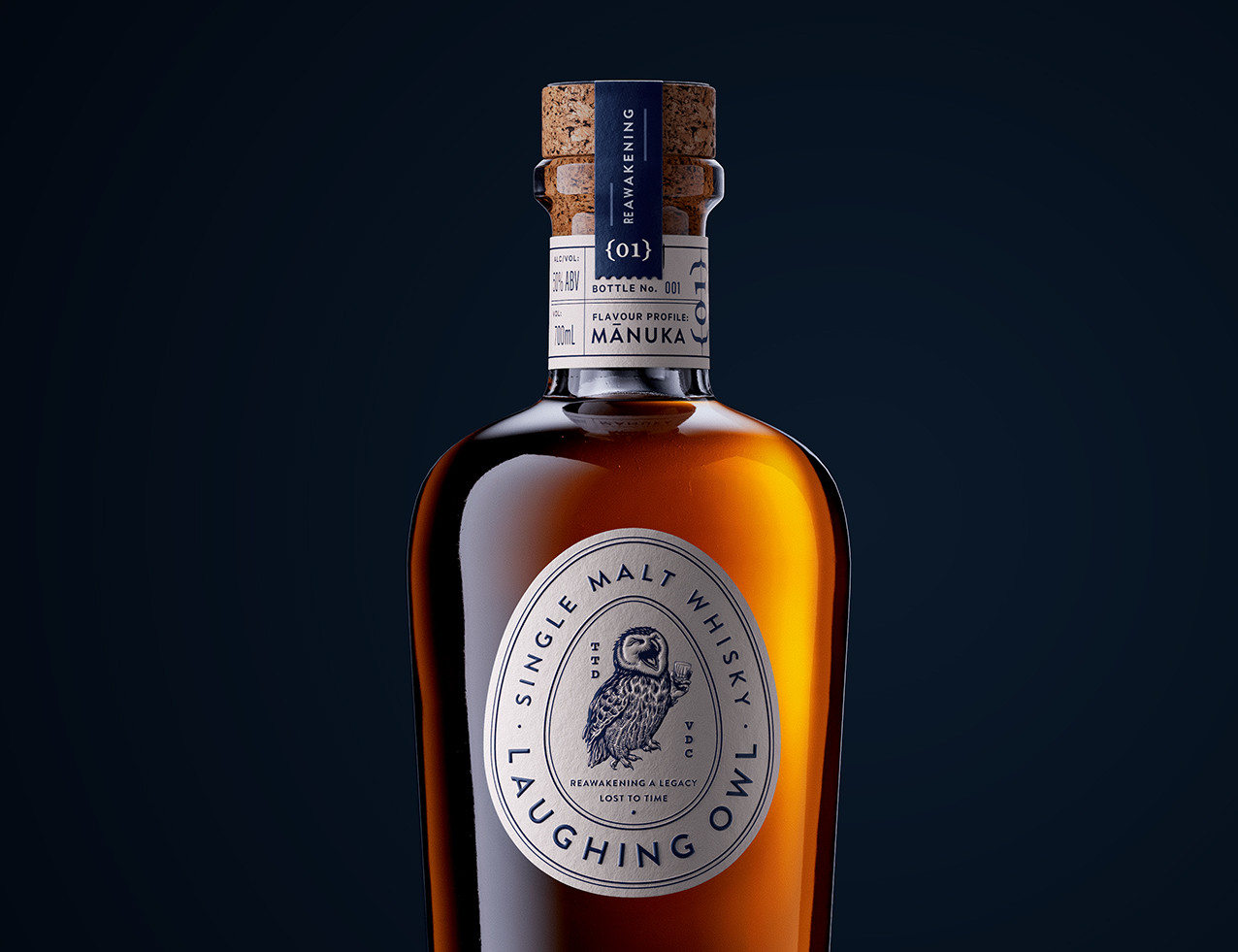
Within the egg form, the owl illustration brings personality into focus. Rendered in an engraving style, it delivers a slightly knowing expression that reflects the bird’s once recorded character and brings a sense of quiet confidence to the design. A sculpted emboss gives the owl dimensionality, encouraging tactile engagement. A separate fine emboss lifts the typography, while multiple print screens create a refined, letterpress like texture. The neck label continues the sense of care and collectability, carrying individual bottle numbers that mark this first release. As a collective noun for owls is parliament, the first 1500 owners become founding members of the Parliament, forming the initial community for the revived Laughing Owl.
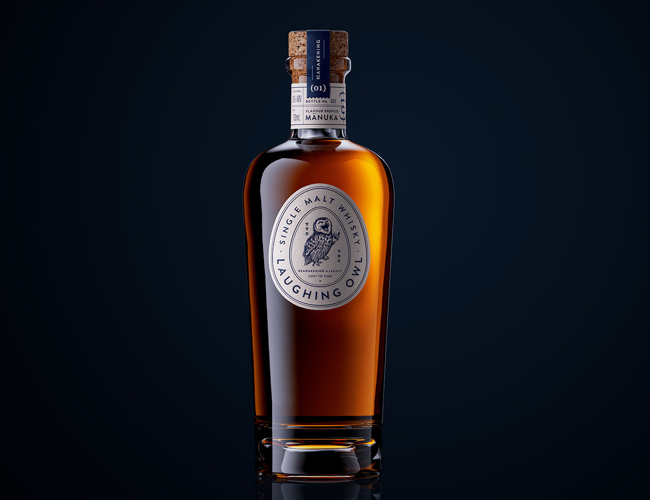
Materiality grounds the design in place. The natural cork closure carries an earthy minerality that ties back to the New Zealand landscape and complements the deep blue tones of the pack. The bottle itself has a generous, luxurious profile that signals the premium nature of the whisky while remaining understated and contemporary.
Gifting extends the narrative with restraint. Wrapped in deep blue, the box features a clear foil wood grain texture inspired by the tree trunks the Laughing Owl once nested in. The effect is subtle and atmospheric, adding depth without competing with the clarity of the main label.
Laughing Owl Whisky brings together story, form and material craft to create a clear and meaningful identity. The egg device anchors the brand in the only physical traces that remain of the species, while the illustration, monogram and tactile finishes provide depth without excess. Every element is considered and connected, resulting in a whisky that presents a confident interpretation of a lost native and a distinctive presence on shelf.
CREDIT
- Agency/Creative: Clay Andrews
- Article Title: Clay Andrews Creates Laughing Owl Whisky as a Refined Tribute to a Lost Native Species
- Organisation/Entity: Creative
- Project Status: Published
- Agency/Creative Country: Australia
- Agency/Creative City: Sydney
- Market Region: Australia
- Project Deliverables: Packaging Design
- Industry: Food/Beverage
- Keywords: WBDS Creative Design Awards 2025/26 , Laughing Owl, Whisky, Drinks Design, NPD, Spirits Packaging, Brand Identity


