Cococart is a homegrown chocolate retailer from that brings some of the finest international chocolates to India. What began as a single retail format soon grew into cafés and combined spaces, giving people more ways to discover and enjoy chocolate. With shops across the country, Cococart quickly became a much loved name for chocolate lovers in India. But as the brand expanded, its identity began to scatter. Cococart stood for retail, Cococart and Café for combined spaces, and Cococafé for standalone cafés. Each format had its own look and feel, and apart from the logo there was little to hold them together. Without a unified message across India, the brand lacked the recall and resonance it needed. Cococart was ready for an identity that could tie its formats under one story and still capture the joy of chocolate.
We reimagined Cococart as a whimsical traveller, a curator who brings joy and indulgence from around the world. The brand shifted from being just a retailer of chocolates to becoming a creator of magical moments. Every bite, every visit, every package became a discovery, carrying the same sense of wonder. We did not change the Cococart logo completely. The typographic logo remained the same to retain familiarity, but we introduced an emblem, a logo mark that could grow into the next symbol of brand recall. The emblem captured this new spirit with a magician’s hat placed on a cart, a playful nod to both the name and Cococart’s role as a bringer of indulgence and delight.
Colours built on this foundation. Coral, the brand’s existing primary colour, stayed at the centre – a shade they were deeply connected to and wanted customers to instantly recognise. Chosen for its sense of playful indulgence rather than a gourmet feel, coral remained the anchor while maroon, soft pinks, and browns added warmth and depth around it. Inspired by the logo, the illustration style is built on clean, simple lines paired with joyful details. Each visual works like a little portal into Cococart’s world of magic, sweetness, and wonder.
We introduced a playful blend of stripes and checks to bring structure and rhythm to Cococart’s visual world. Soft stripes, inspired by vintage candy carts, add charm and movement without distracting from the main elements. Balanced checks provide a sense of order while keeping the overall mood light and joyful.
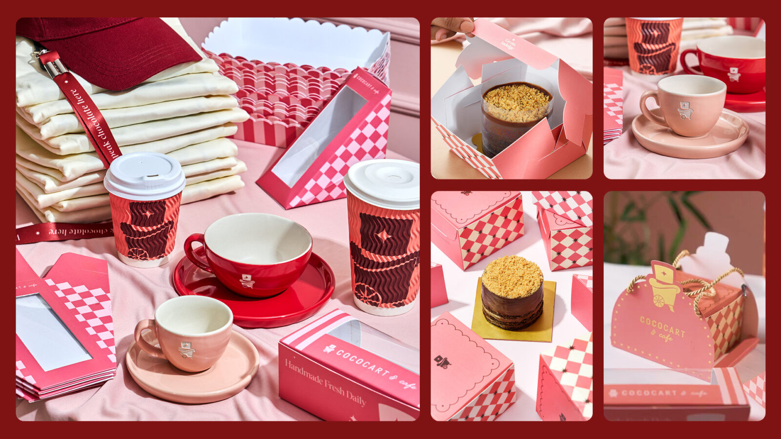
Packaging became a canvas for this new identity. Coffee cups, sleeves, cake boxes, bags, and wrapping paper were all redesigned to carry the same charm. The emblem, colours, and illustrations worked seamlessly across every item, making the entire range feel like one family. Whether someone picked up a hot chocolate in a café or a gift box in store, the experience was instantly recognisable as Cococart.
The star symbolizes celebration and joy, marking every indulgence as a special moment. It appears across packaging and touchpoints, adding sparkle and delight.
The voice is warm and elegant, speaking with the grace of a luxury brand while remaining inviting and approachable. It evokes texture and feeling, drawing people into moments of pause, celebration and sweetness. Above all, it is joyful and indulgent, embracing pleasure without guilt and celebrating life’s simple joys with optimism.


CREDIT
- Agency/Creative: Thursday
- Article Title: Thursday Unifies Cococart Into a Playful and Cohesive Chocolate Brand Experience
- Organisation/Entity: Agency
- Project Status: Published
- Agency/Creative Country: India
- Agency/Creative City: Mumbai
- Project Deliverables: Brand Design, Brand Experience, Brand Guidelines, Brand Identity, Brand Mark, Brand Strategy, Brand Tone of Voice, Branding, Creative Direction, Identity System, Logo Design, Packaging Design, Rebranding
- Industry: Food/Beverage
- Keywords: WBDS Agency Design Awards 2025/26 , Chocolate Retailer, Dessert, Cafe, Chain of Cafes
-
Credits:
Creative Direction: Divika Mehta
Project Management: Vaishali Gotecha
Brand Design: Deepanshi Dhammani
Brand Design: Prinesh Vichare
Communication Design: Sanskruti Palav
Brand Design: Neha Nachankar
Content Strategist: Palak Tongya
Brand Strategy: Ritika Lakhotia
Client Relations: Niklesh Karnani
Photography: Ashish Kumar
Photo Editing: Ankit Gupta
Videography: Rohit Jhangiani
Video Editing: Rohit Jhangiani, Dhruv Shah
Product Styling: Divya Jain, Kamakshi Jain


