


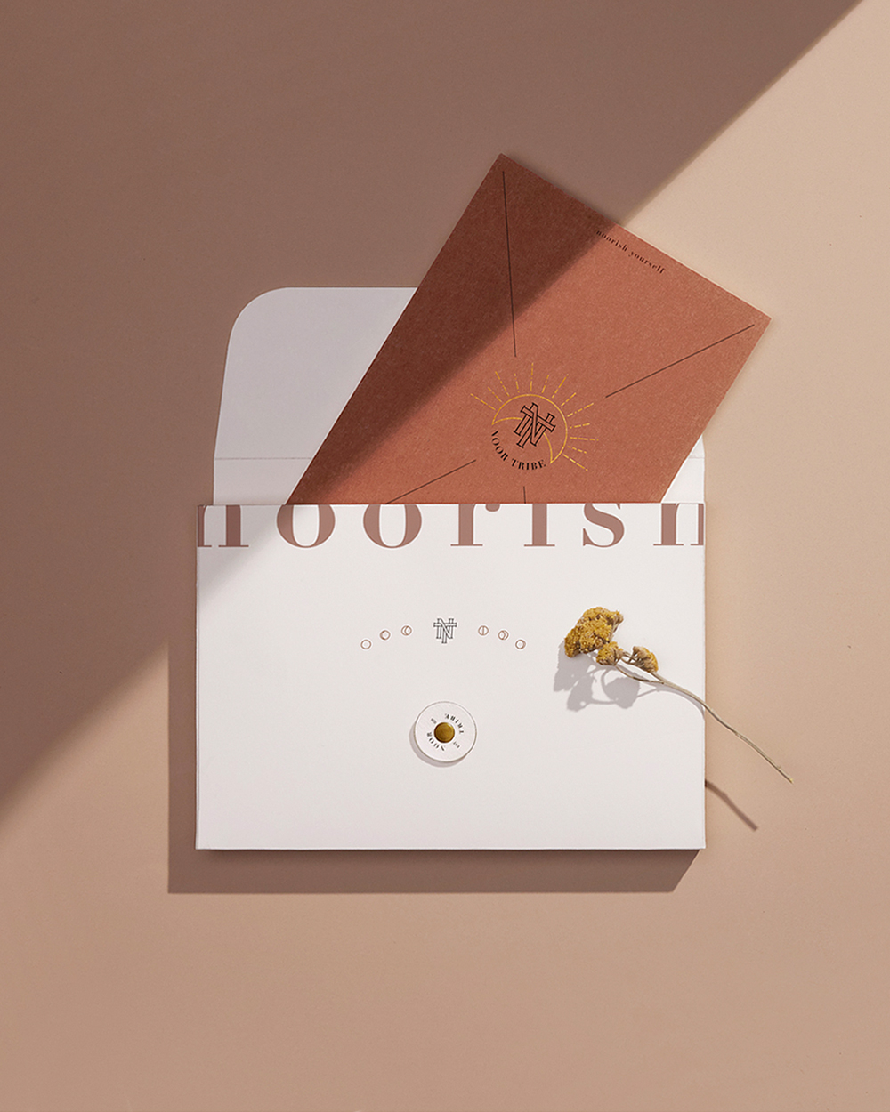
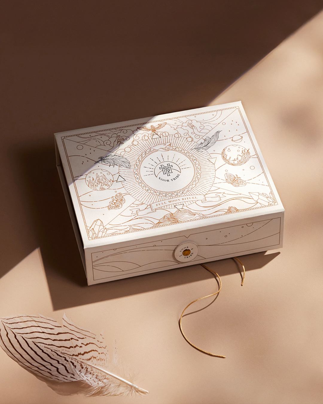
The NoorTribe logo is built around the symbolic forms of the sun and the moon found within the ritual itself. During the brand identity development process, these symbols were custom illustrated to create a unique and distinctive visual language for the brand.
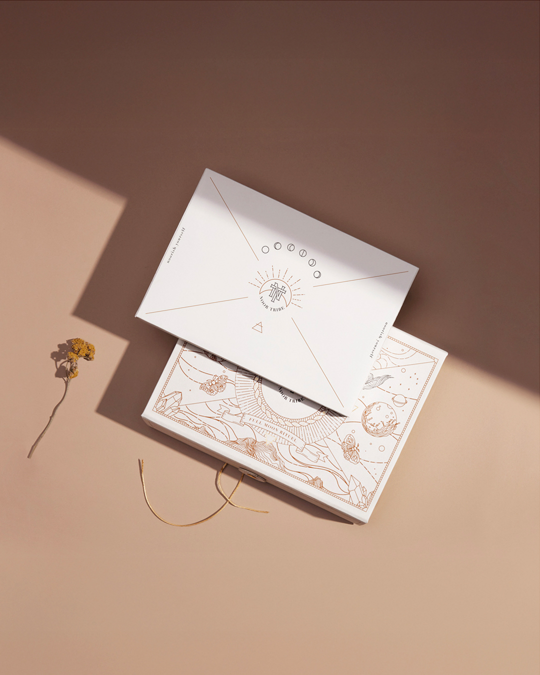
The NoorTribe logo is inspired by the symbolic presence of the sun and the moon at the core of the ritual. These celestial elements represent balance, transformation, and the cyclical nature of life — values that lie at the heart of the NoorTribe philosophy. The logo was designed as a modern interpretation of these ancient symbols, avoiding generic forms in favor of a more intentional visual language.
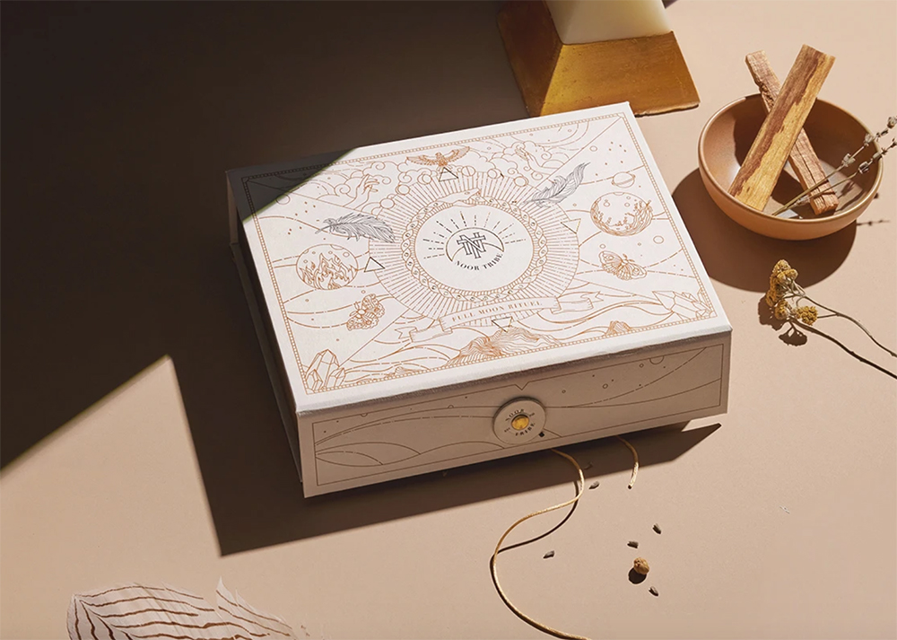
During the brand identity development process, the sun and moon were custom illustrated exclusively for NoorTribe. Special attention was given to the moon and its phases, which symbolize renewal, intention, and personal transformation. These lunar illustrations appear throughout the branding and packaging, strengthening the ritual’s connection to time and natural cycles.
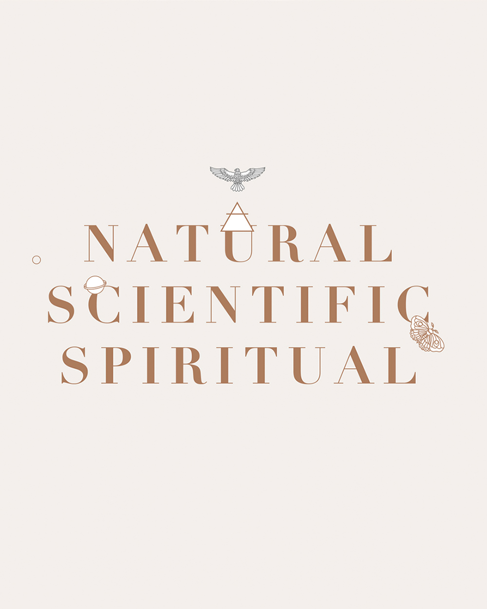
The sun was illustrated as a symbol of energy and vitality, designed to visually balance the lunar elements. Alongside the celestial symbols, the four natural elements — earth, water, air, and fire — were each represented through unique illustrations created specifically for the ritual kit. These elements were integrated into the packaging system, creating a cohesive and immersive visual experience.
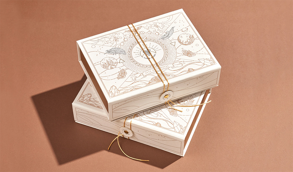
By combining celestial and elemental symbolism, the NoorTribe brand identity forms a unified storytelling system that bridges ancient ritual traditions with a contemporary, minimal aesthetic.The packaging was designed as a container that brings together all ritual materials in a single, cohesive form. Produced using natural paper, the box reflects the brand’s respect for nature and its connection to ancient ceremonial practices. The choice of material enhances the tactile experience, reinforcing the sense of authenticity and ritual value.
The illustrations featured on the packaging are inspired by symbols drawn from ancient rituals and represent the four natural elements present within the ritual kit. These symbolic illustrations transform the packaging into more than a functional object, turning it into an integral part of the ritual experience itself.
CREDIT
- Agency/Creative: Studio Brimm
- Article Title: Studio Brimm Designs NoorTribe as a Contemporary Ritual Brand Identity Rooted in Symbolism
- Organisation/Entity: Agency
- Project Type: Packaging
- Project Status: Published
- Agency/Creative Country: Turkey
- Agency/Creative City: Sarıyer
- Market Region: Europe
- Project Deliverables: Brand Design, Brand World, Packaging Design
- Format: Box
- Industry: Entertainment
- Keywords: Ritual kit, kit, 4 elements, four elements, shaman, shamanic kit, packaging design, shaman symbols, south american symbols, ancient symbols
-
Credits:
Creative Director: Polat Gülkaş
Account Director: Sezen Aksoy Çakır
Photographer: Fırat Eryılmaz


