


Task
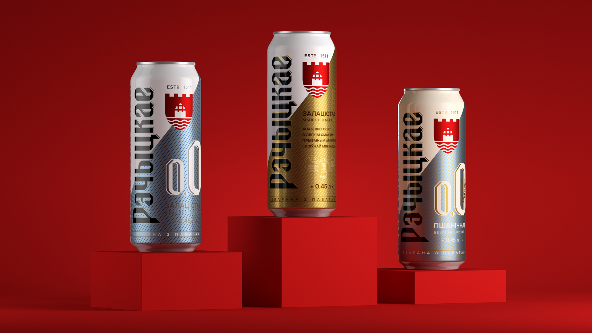
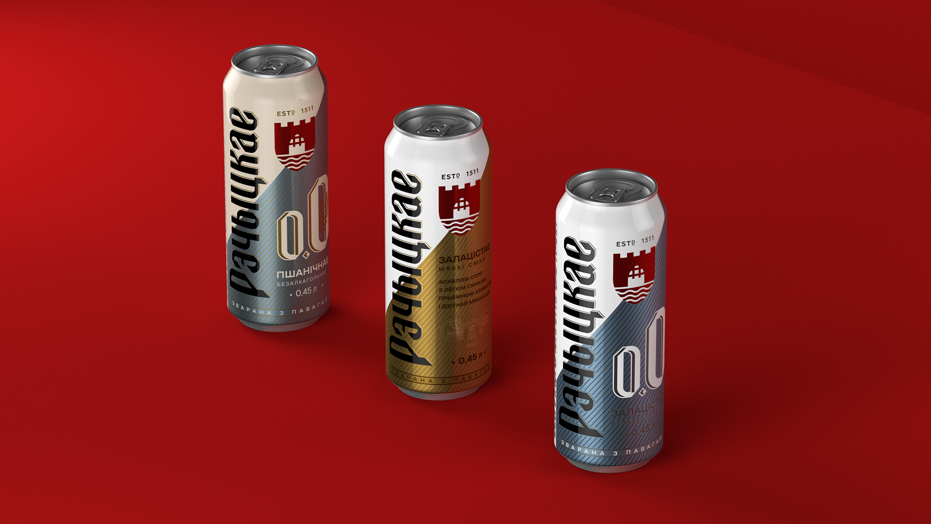
The redesign of Rechitskoe Zolotistoe beer packaging was approached as a strategic step in the brand’s development. The goal was to preserve and strengthen the equity already built—brand recognition, trust, and the feeling of a beer that’s “one of our own”—while bringing the visual identity in line with today’s market expectations. On an increasingly crowded beer shelf, the packaging needed to become more contemporary and structured without losing the brand’s character. In addition, the range had to be extended with two non-alcoholic variants: Classic and Wheat.
Solution
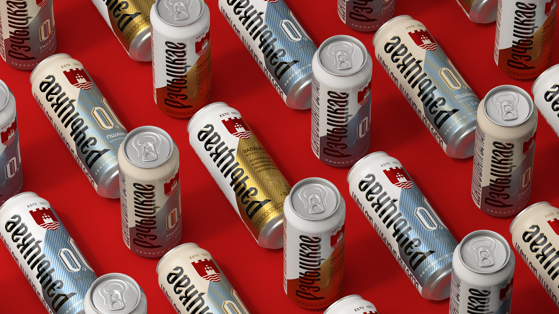
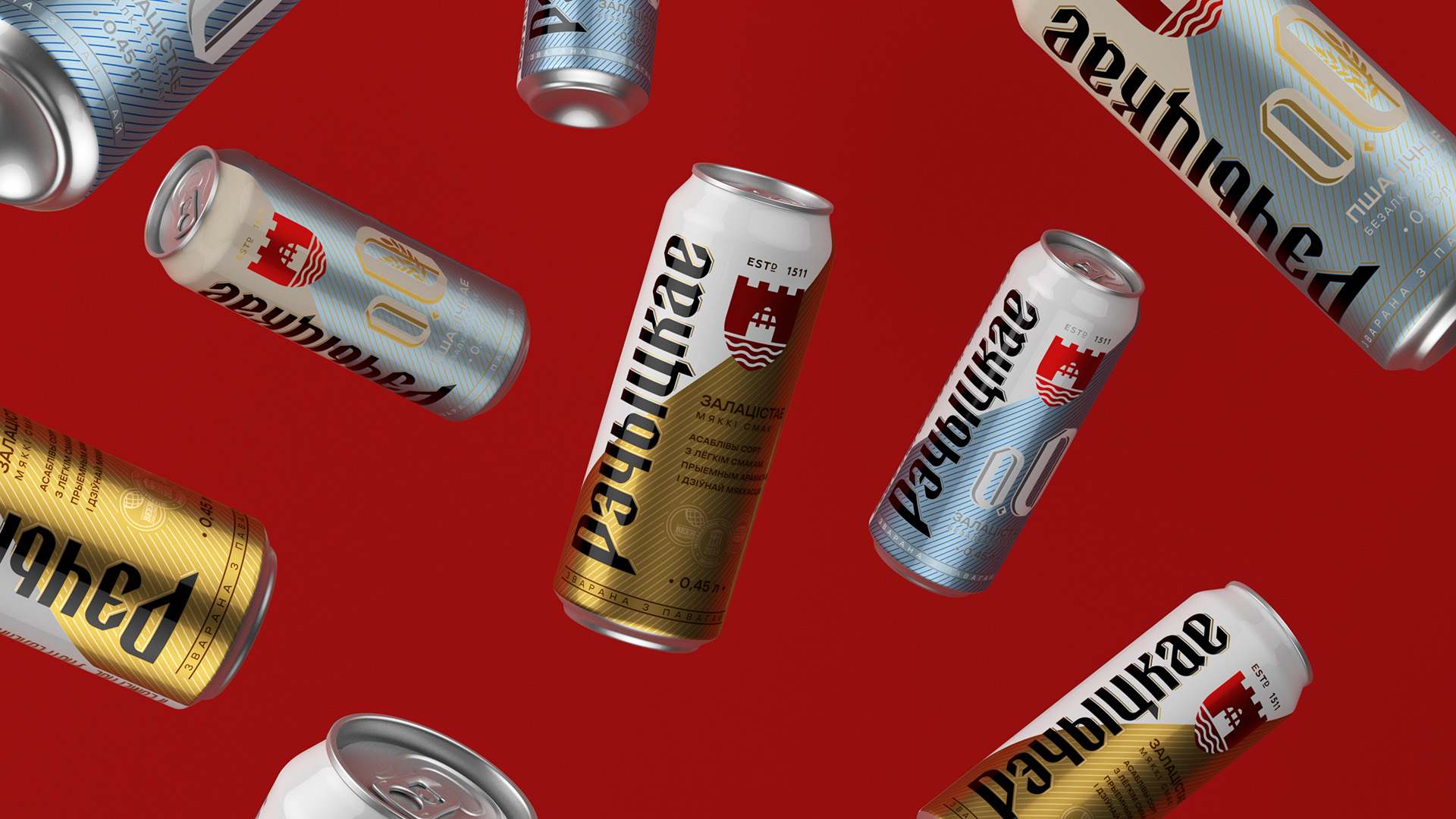
The concept is built around simplification and visual order. Elements were given a clear hierarchy, and the key assets—the brand name and signature mark—were made bolder and more prominent. By setting “Rechitskoe” vertically, the can looks sleeker and more modern, and the brand becomes easier to spot among competitors.
At the same time, all core recognition cues were retained. The signature mark, color coding for each variety, and the overall brand mood remain in place—now refined, aligned, and brought into one cohesive system. New graphic devices, including the brand’s diagonal motif and light geometric patterns, add a contemporary feel without stripping away familiarity. The result is packaging that looks fresher and more technical, yet remains instantly recognizable.
The updated Rechitskoe design strengthens the brand’s shelf presence and improves visibility in a competitive environment. Importantly, the redesign doesn’t disrupt what consumers already know—it carefully amplifies the brand’s strongest associations: origin, quality, and consistency.
CREDIT
- Agency/Creative: PinotAgency
- Article Title: PinotAgency Develops a Streamlined Packaging Update for Rechitskoe Zolotistoe Beer
- Organisation/Entity: Agency
- Project Type: Packaging
- Project Status: Published
- Agency/Creative Country: Russia
- Agency/Creative City: Санкт-Петербург
- Market Region: Global
- Project Deliverables: Brand Design, Brand Identity, Brand Redesign, Branding, Packaging Design, Visualisation
- Format: Can
- Industry: Food/Beverage
- Keywords: beer packaging redesign belarus pinotagency
-
Credits:
Creative Director: Dmitrii V Ivancenko


