


Finnish care meets Greek taste: the new Viola yogurt line
Design for the new line of lactose‑free Greek yogurts Viola.
With the growing trend of “healthonism” and interest in tasty products for a healthy lifestyle, consumers have become more guided by rationality and mindfulness. In search of new combinations and experiences, buyers aim to eat healthy and delicious food, which drives the development of new flavors and categories.
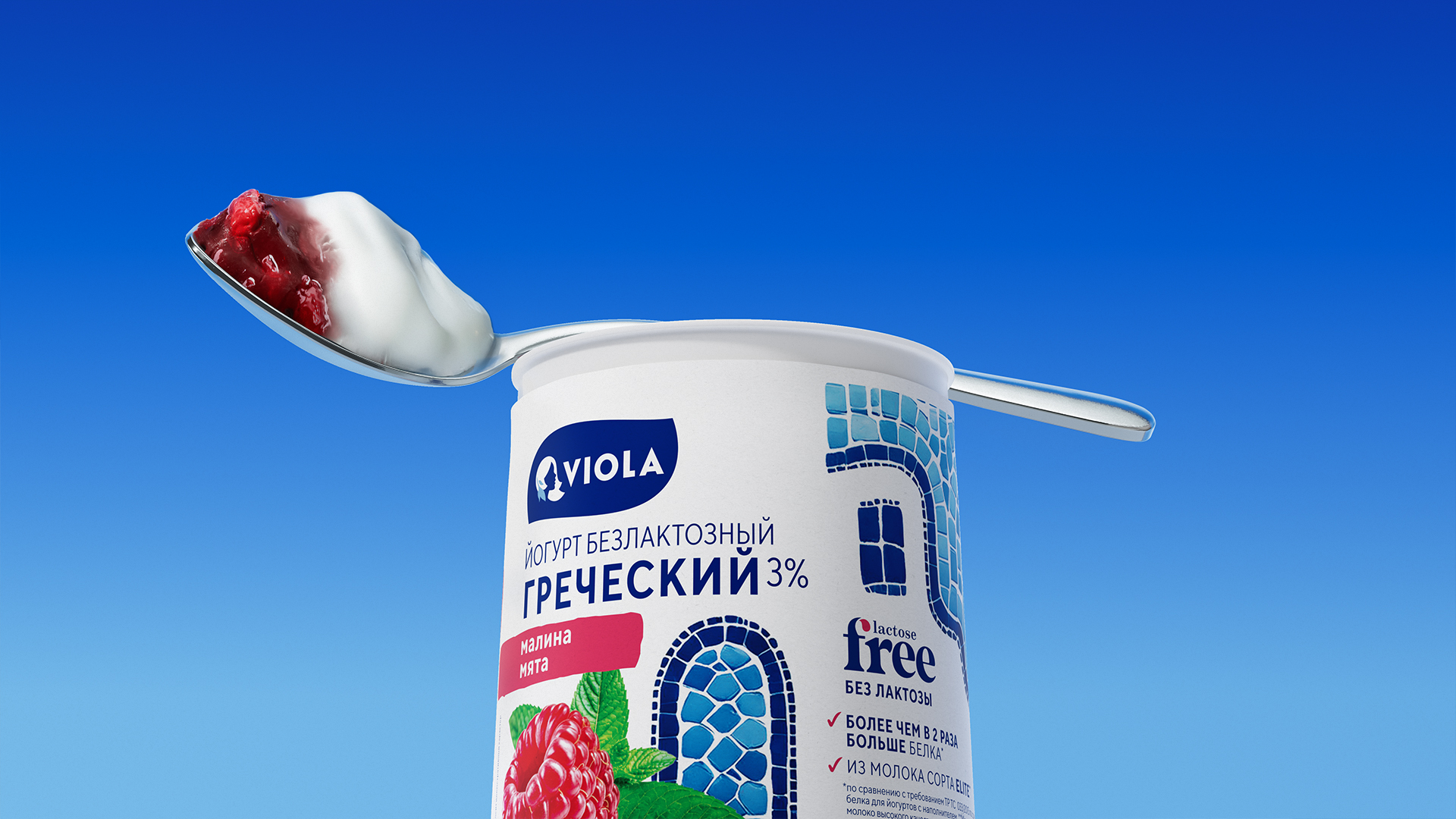
By merging trends with the lactose‑free product range, Viola introduced lactose‑free Greek yogurts in 2025. The creamy high protein yogurt has a mild taste and a clean ingredient list.
The task for Ohmybrand was to create the design for the new yogurt line. It was important to use a bold food‑zone focus and find a non‑classic solution with Greek motifs.
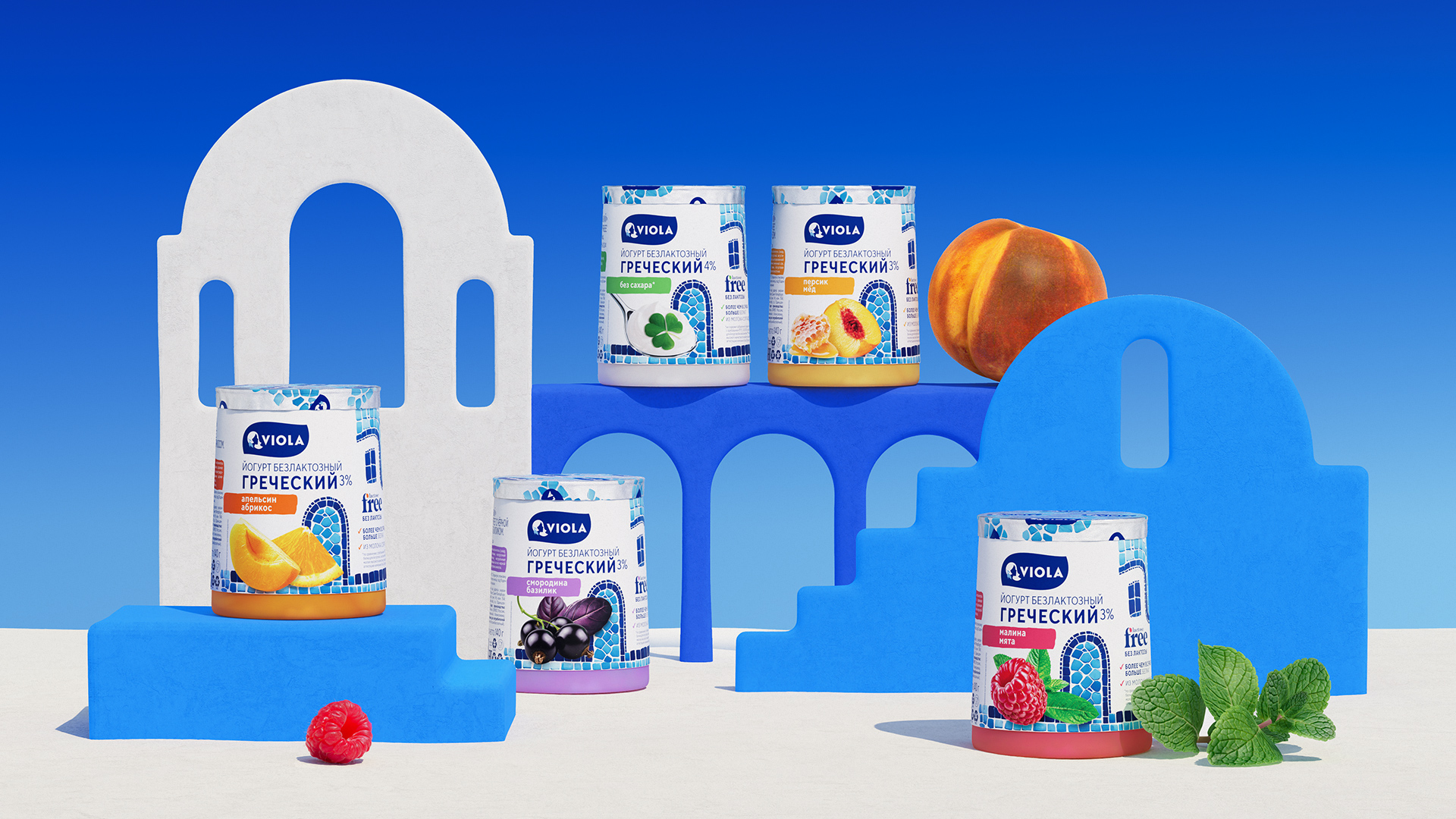
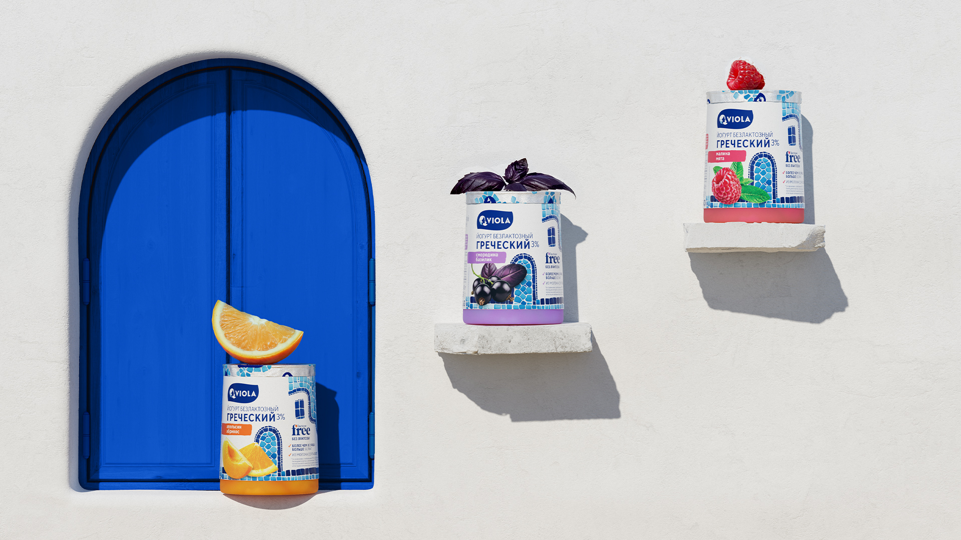
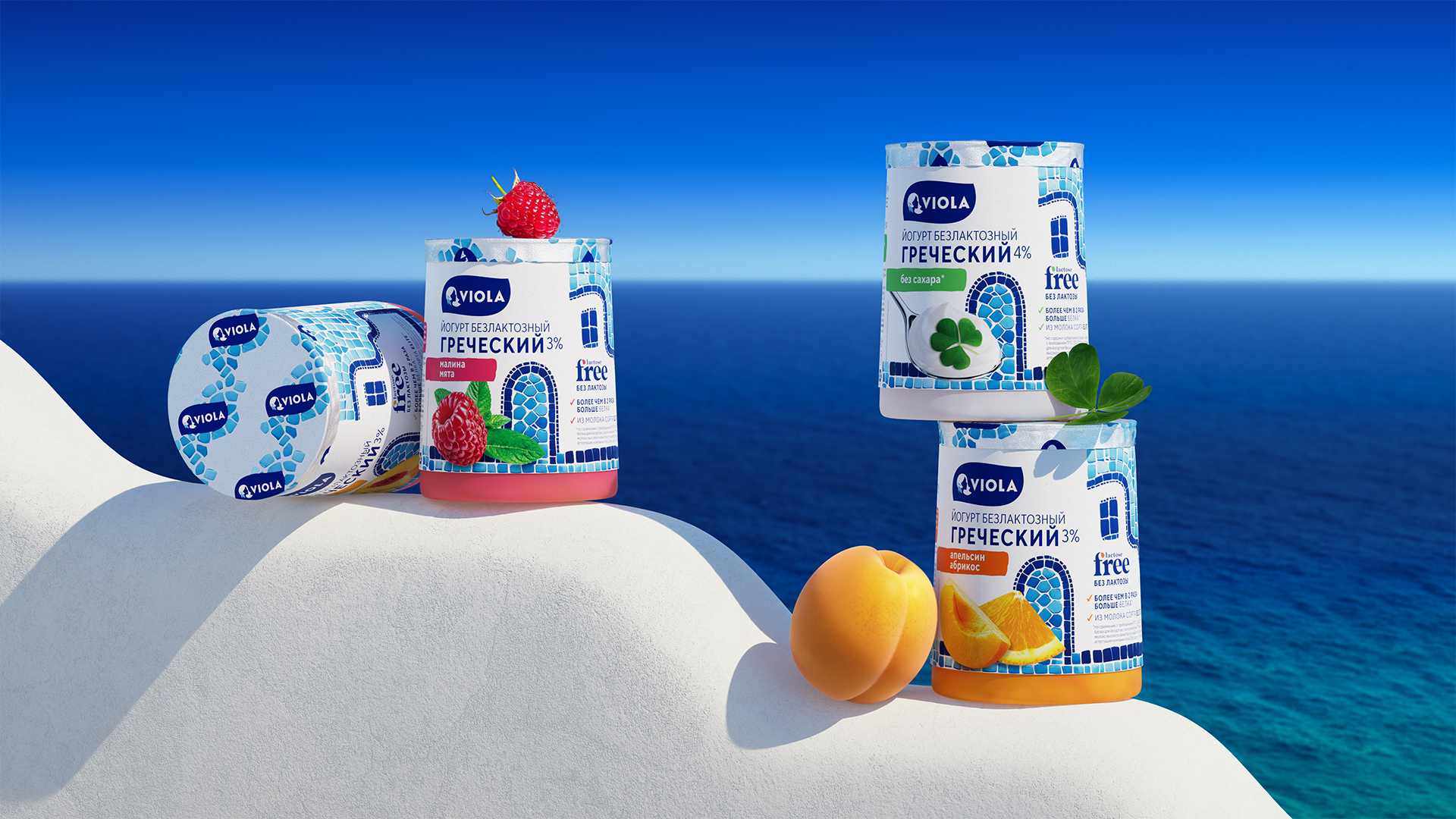
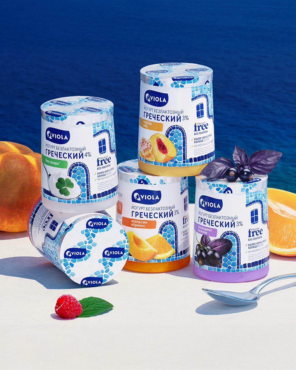
Ohmybrand developed the “Greek town” concept, where a whole story comes to life: somewhere nearby there is the sea, narrow streets, azure shutters and doors, blue‑turquoise mosaics… The atmosphere of a Greek town, filled with the scents of clean air and fresh citrus, is reflected in the new Viola yogurt flavors.
And at the heart of the town is the snow‑white Viola house, decorated with mosaics. This is a nod to traditional Greek architecture somewhere in Santorini – just as iconic for Greece as thick yogurt. The yogurt packaging design, like the town’s appearance, features smooth lines, vibrant blue‑turquoise shades and an appetizing food zone.
The new line has been launched and is already popular with customers.
Nadezhda Parshina, founder and creative director of Ohmybrand: “We faced an interesting challenge: to create a design for a new product line aimed at an audience that watches their diet. The key idea was to embody in the design the feeling of lightness traditionally associated with yogurt. Together with the Viola team, we succeeded!”
Ksenia Panina, senior brand manager at Viola:
“This is not our first collaboration with Ohmybrand, and we were delighted to entrust them again with a crucial task – creating the design for a key launch, the new Greek yogurt line. The result exceeded expectations: the design turned out to be truly emotional, conveying the mood of a sunny holiday in Greece, while emphasizing the product’s naturalness and authenticity. It is both modern and deeply canonical – respectful of Greek traditions, yet free of outdated clichés.”


CREDIT
- Agency/Creative: Ohmybrand
- Article Title: Viola Greek Yogurt Packaging Brings Santorini-Inspired Storytelling by Ohmybrand
- Organisation/Entity: Agency
- Project Type: Packaging
- Project Status: Published
- Agency/Creative Country: Russia
- Agency/Creative City: Moscow
- Market Region: Global
- Project Deliverables: Branding, Packaging Design
- Format: Bucket
- Industry: Food/Beverage
- Keywords: packaging, design
-
Credits:
Creative Director: Nadezhda Parshina
Art Director: Julia Zhdanova
Designers: Ekaterina Vorobeva, Bella Bazikova
Project Manager: Anton Nazarov
Senior Designer: Maria Egorova
3D Artist: Maxim Kadashov


