


Mirabell Mozartkugeln – A Regal Reinvention of an Austrian Icon
Mirabell Mozartkugeln (Mozart Round) is more than just a confection – it’s a symbol of Austria’s cultural and culinary heritage. Originally created 100 years after the death of Wolfgang Amadeus Mozart, the product has long been celebrated as a harmonious blend of chocolate, marzipan, pistachio and nougat. Its distinctive round shape and richly layered recipe have made it an unmistakable gift and keepsake, transporting consumers to the golden age of imperial Austria. Every bite evokes the opulence of Vienna’s grand concert halls, the elegance of its aristocratic salons, and, of course, the timeless brilliance of Mozart’s music.
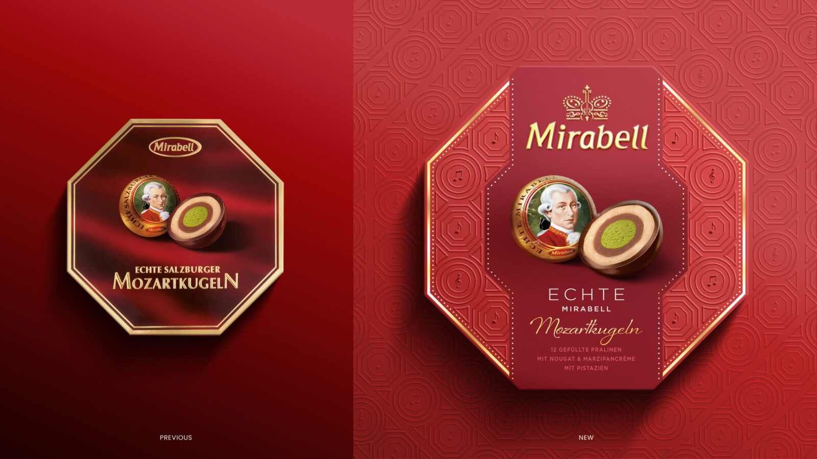
Yet even icons need to evolve. As the chocolate gifting market grew more saturated, Mirabell faced increased imitation and a decline in shelf standout. Where it once held a clear position as a symbol of Austrian craftsmanship, it now risked blending into a crowd of lookalikes. For a brand rooted in authenticity and prestige, this wasn’t just a commercial challenge, it was a moment to reassert its identity.
We partnered with Mirabell to lead a strategic and creative brand transformation, one that would preserve its legacy while making it unmistakably relevant to today’s consumer. The goal was to restore Mirabell’s status as the ORIGINAL Mozartkugel.
A Design Rooted in Culture and Emotion
The new identity draws directly from the cultural richness of Vienna, particularly the ornate interiors of its historic concert halls and imperial landmarks. We studied the intricate ceilings, gilded mouldings, and painted frescoes of venues like the Musikverein and Wiener Staatsoper. These references became the foundation for a visual language that feels rooted yet refined, a homage to tradition with a modern point of view.
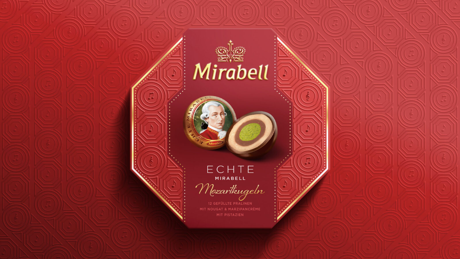
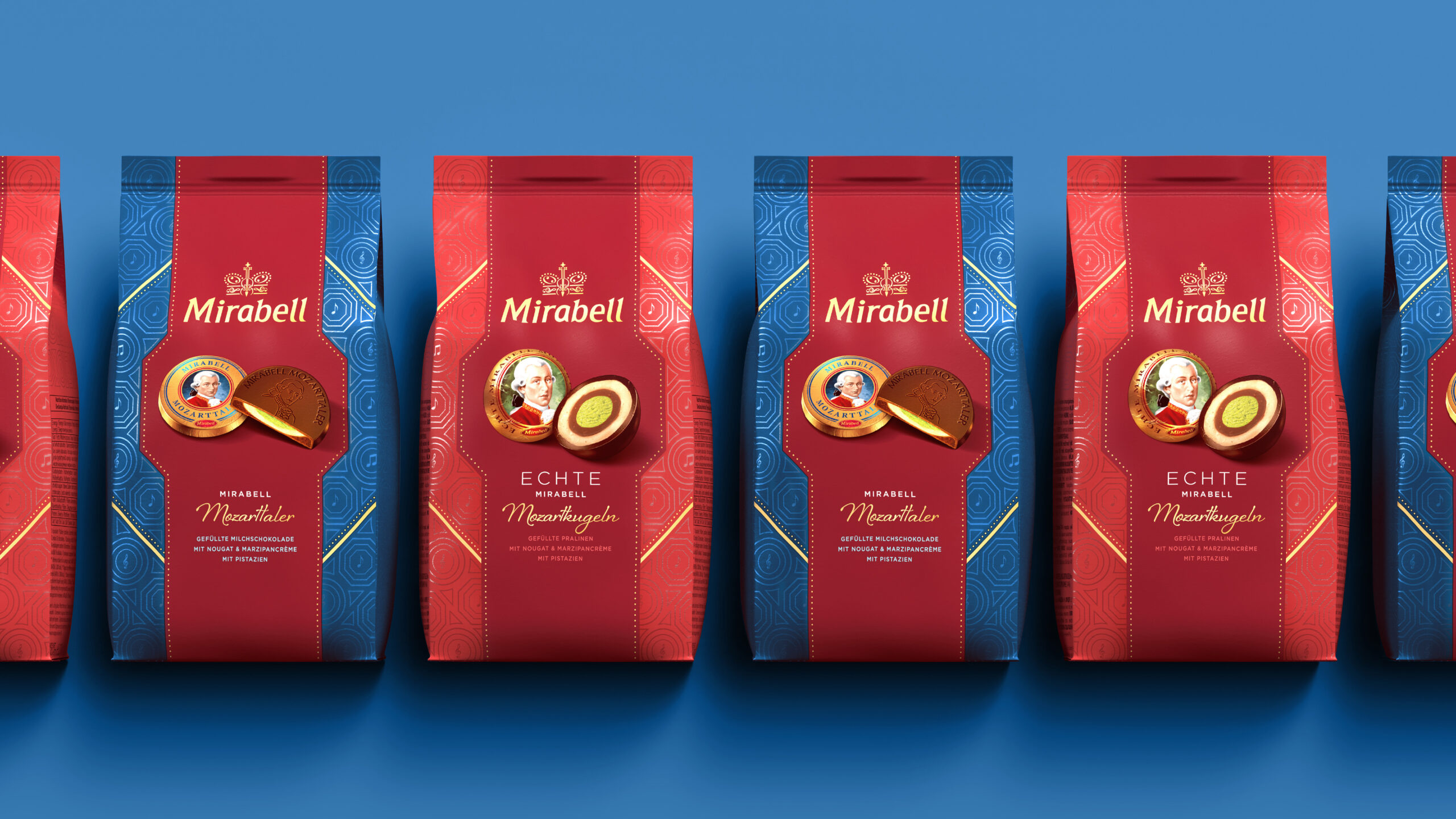
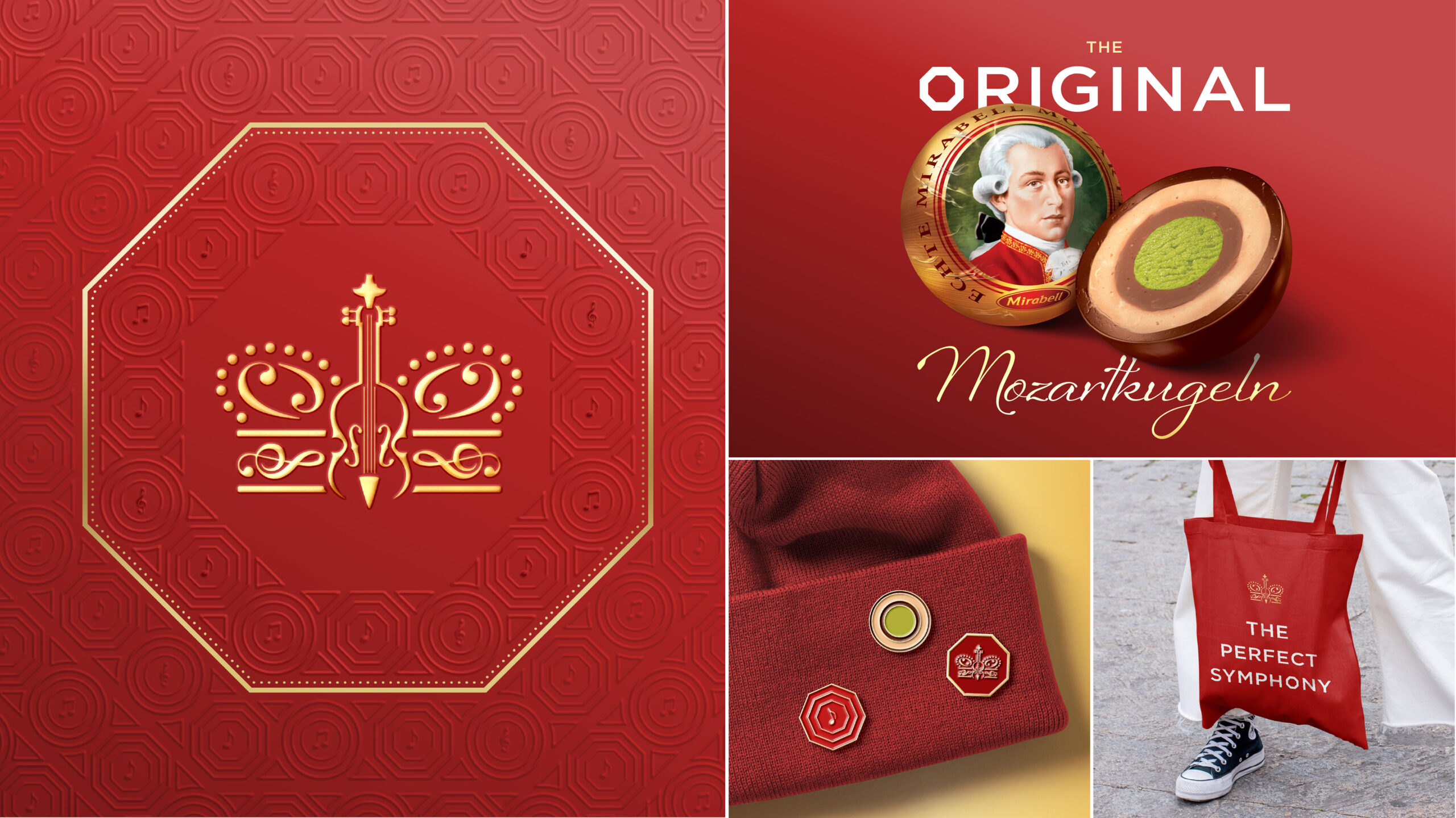
We approached these elements with a light touch. Decorative motifs were distilled into elegant patterns, highlighting both the signature round shape of the product and the unique hexagonal structure of Mirabell’s hero box format. The hexagon, unlike anything in the competitive landscape, is echoed across the range, forming the basis of a custom embossed pattern that wraps each pack in a distinctive, tactile geometry. This repetition of form reinforces the brand’s physical and visual identity, making it instantly recognisable both in hand and on-shelf.
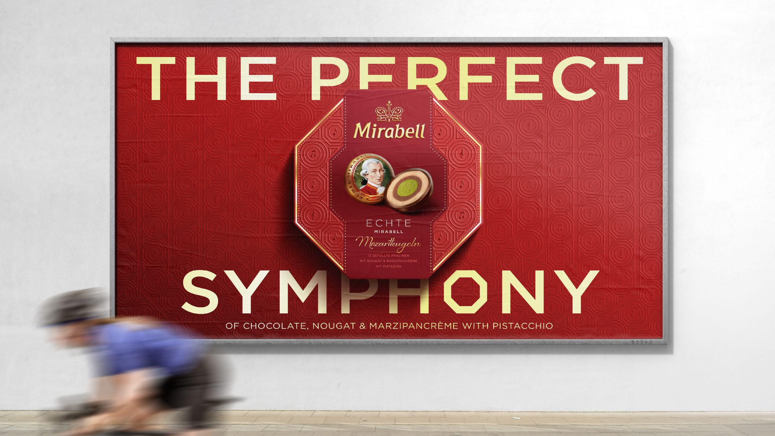
A custom crown was introduced above the brand mark, it serves as both a literal and symbolic gesture, reflecting not just Austria’s imperial heritage, but Mirabell’s status as the originator of the Mozartkugel.
The colour palette of reds and golds was refined to improve contrast and shelf standout, while retaining the visual cues consumers instinctively associate with the brand. The result is packaging that feels luxurious, confident, and unmistakably Austrian.
To reinforce Mirabell’s status as the original, the word “ECHTE” (meaning “authentic” or “original”) was given greater prominence on pack. Set in clean, confident typography and positioned proudly within the layout, it acts as both a label and a statement, directly asserting Mirabell’s authority in a market crowded with imitators.
Packaging with Purpose and Prestige
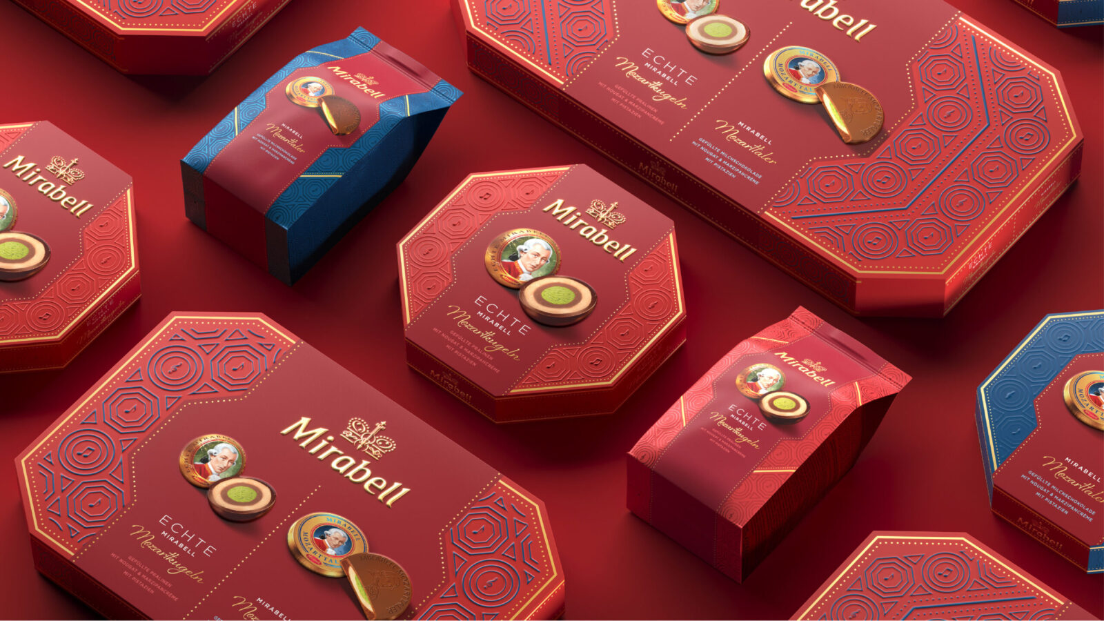
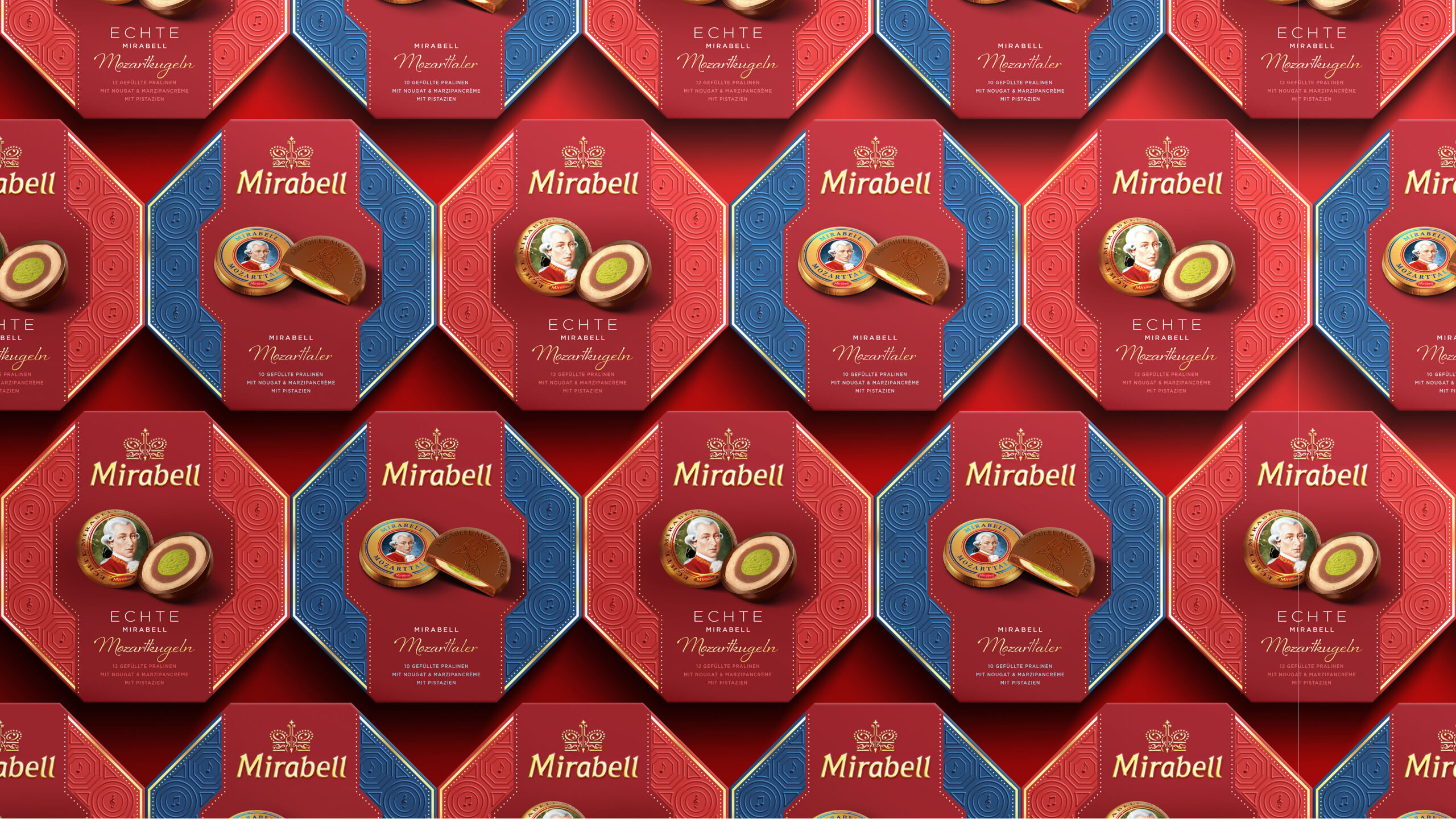
A key challenge in the redesign was creating consistency across a broad and diverse range of 20 product formats, from souvenir bags to statement gift boxes, including Mirabell’s signature octagonal pack. The design system needed to flex across structure and scale, while maintaining brand cohesion.
We developed a flexible design framework that allowed visual elements to adapt in scale and complexity depending on pack size, while anchoring everything around a core set of recognisable assets: the crowned wordmark, Mozart’s portrait, the hexagonal structural form and the iconic round confection.
Tactile finishes elevate the experience further. Embossing and spot-varnished details create a sense of refinement that invites interaction and signals quality. These touches aren’t just surface-level, they enhance the gifting moment, creating a sense of ceremony and care.
Smarter Choices, Same Impact
Alongside the visual transformation, we worked to make tangible improvements to material sustainability. Without compromising on feel or finish, the team replaced plastic windows and metallic hot foils with more recyclable and environmentally responsible solutions. These changes reduce environmental impact while preserving the richness and tactility that define the brand.
The result is a packaging system that looks and feels premium, just smarter and more future-fit.
Relevance, Built from Legacy
This wasn’t a revolutionary redesign, it was a considered evolution. We built on what Mirabell already represented: cultural depth, artisanal craft, and emotional significance. The new identity amplifies those qualities with a sharper, more distinctive brand voice, that cuts through the clutter and confidently reclaims the brand’s leadership – staying relevant while respecting where the brand came from.
The crowned brandmark is now a central asset, recognisable, ownable, and loaded with meaning. The decorative elements reference classical Vienna, but they’re applied with restraint, clarity, and modern precision.
This sense of harmony between structure, detail, and identity is captured across the entire range, where every pack, surface, and embossed line works in concert to express the brand’s elevated new voice.

CREDIT
- Agency/Creative: The Otherly
- Article Title: The Otherly Restores Mirabell Mozartkugeln as the Definitive Austrian Chocolate Icon
- Organisation/Entity: Agency
- Project Status: Published
- Agency/Creative Country: United Kingdom
- Agency/Creative City: London
- Market Region: Austria
- Project Deliverables: Brand Architecture, Brand Design, Brand Guidelines, Brand Identity, Brand Mark, Brand Redesign, Brand Rejuvenation, Branding, Design, Identity System, Packaging Guidelines, Rebranding
- Industry: Food/Beverage
- Keywords: WBDS Agency Design Awards 2025/26 , Packaging / Redesign / Chocolate / Mozart / Austria / Gifting
-
Credits:
Managing Director - The Otherly: Amy Steinmetz
Creative Director - The Otherly: Chris Walsh
Associate Creative Director - The Otherly: James Roast
Design Director - The Otherly: Lekha Nanavati
Senior Designer - The Otherly: James Bell
Senior Designer: Mark Whyte
Brand Director - The Otherly: Julien Desgarceaux
Design Adaptation Director - The Otherly: Matt Thomas
Visualisation / Motion: Ryan Schuman
Brand Manager - Mondelez International: Merle Kasperek
Head of Marketing - Mondelez International: Nina Mahnik


