


Smirnoff is one of the world’s most recognisable vodka brands, celebrated for its bold personality, street-smart confidence, and vibrant design energy, all driven by a structured global system. As India’s young adult audience evolved—globally minded yet deeply rooted in culture—Smirnoff saw an opportunity to broaden its relevance. Seamlessly integrating its global identity with the vibrancy of Indian culture, this range redefined what it means to be a global brand in a local market.
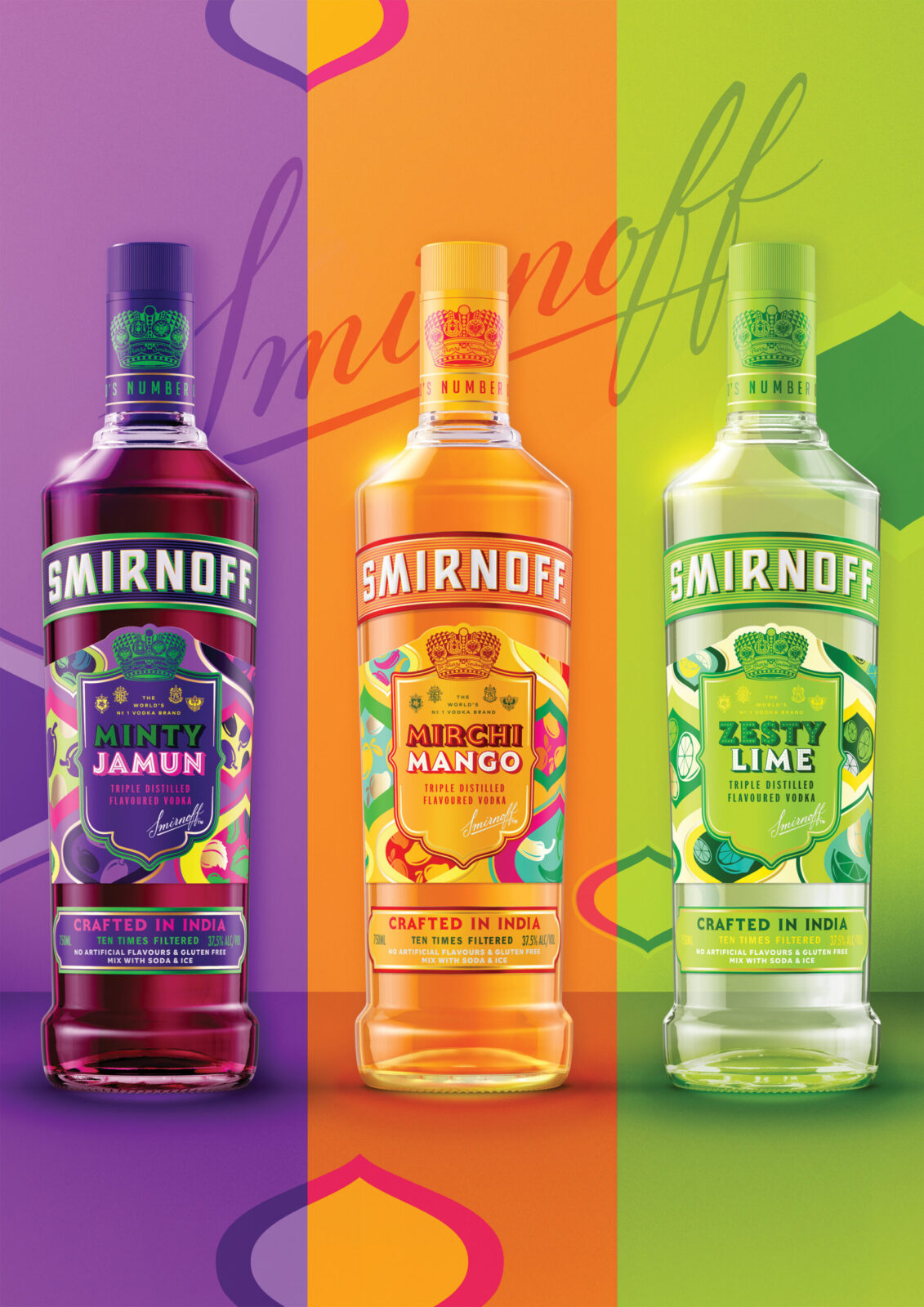
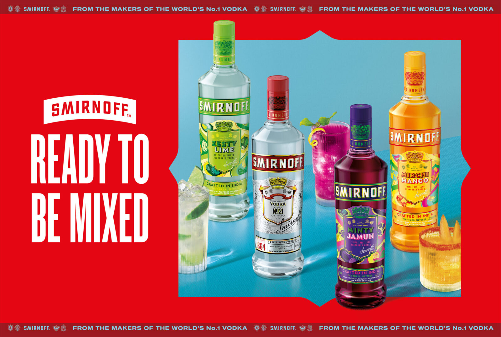
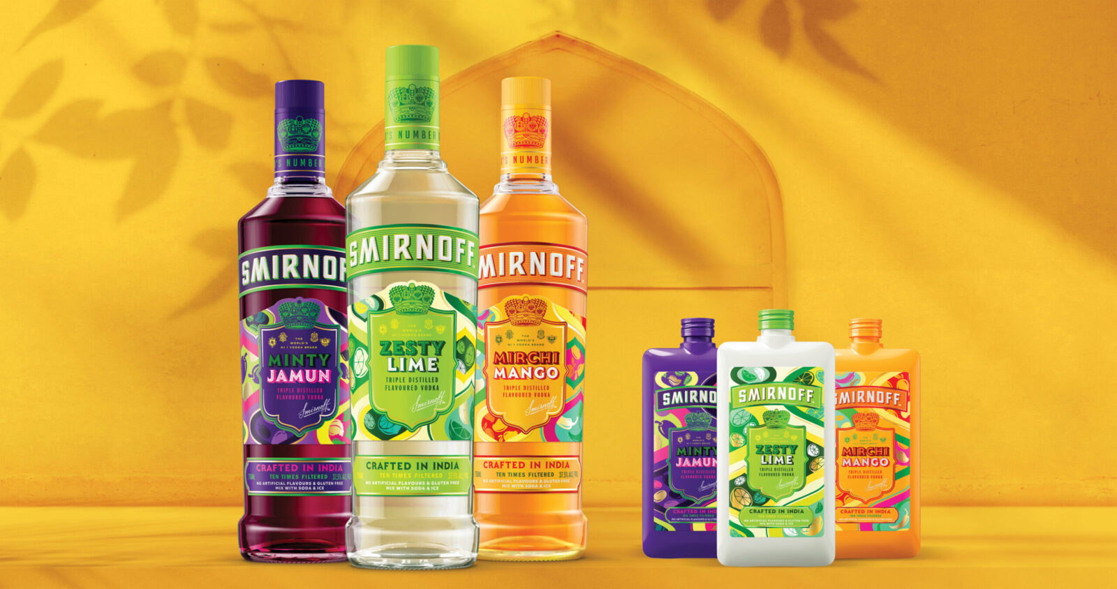
The challenge was to extend the Smirnoff flavour portfolio in India in a way that felt bold, modern, and unapologetically Indian, yet still unmistakably Smirnoff. This wasn’t just a product extension; it was a chance to reimagine how the brand could look and feel in a new cultural context. It marked an identity shift. The launch of three India-exclusive variants—Minty Jamun, Mirchi Mango, and Zesty Lime—was guided by one ambition: to flavour Smirnoff with Indian identity.
At the heart of our strategy was the idea of packaging as a bridge, connecting global brand codes with local cultural nuance. We believed design could do more than simply dress a product: it could tell a story, stir emotion, and build lasting relevance.
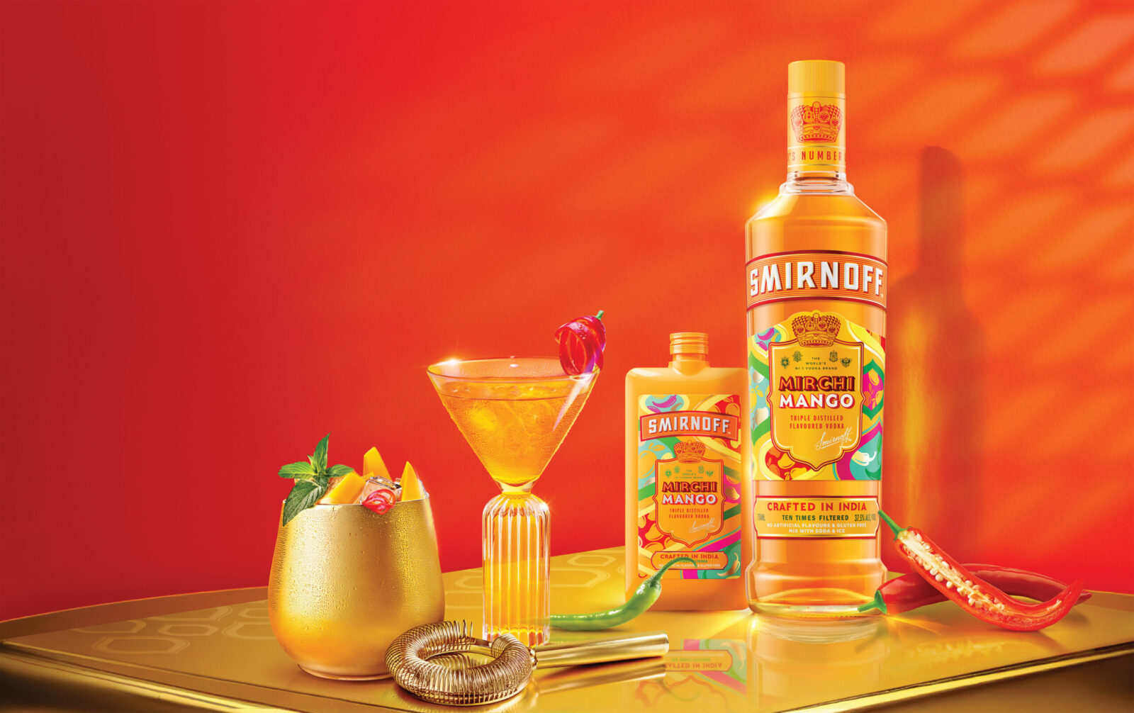
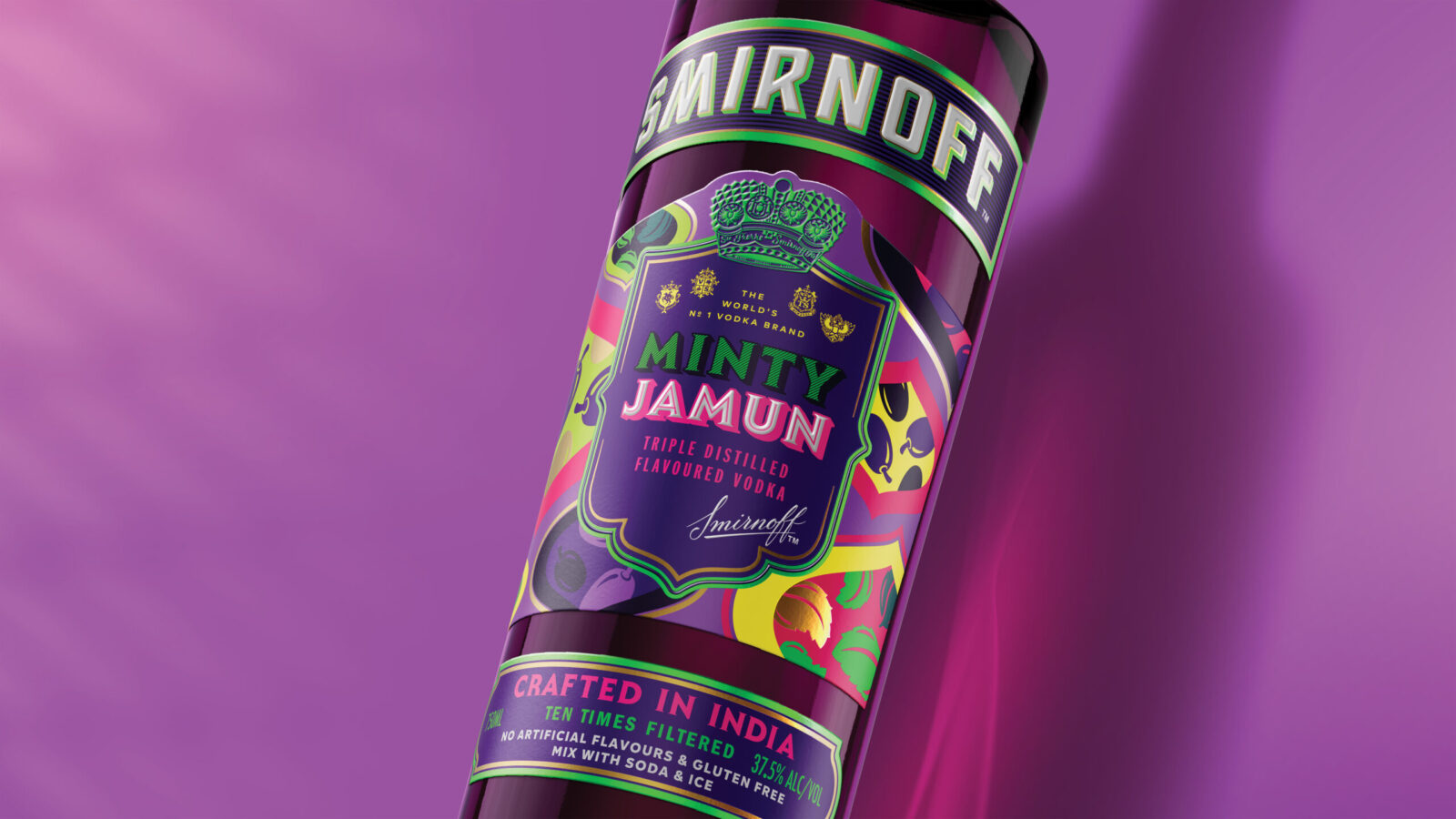
We retained key Smirnoff equities, such as the shield, structured layouts, and confident typography, while reimagining the design language through Indian textures, colours, and symbolism. The result was a system that remained globally recognisable while expressing rich local character.
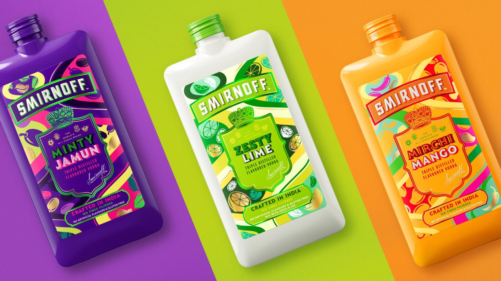
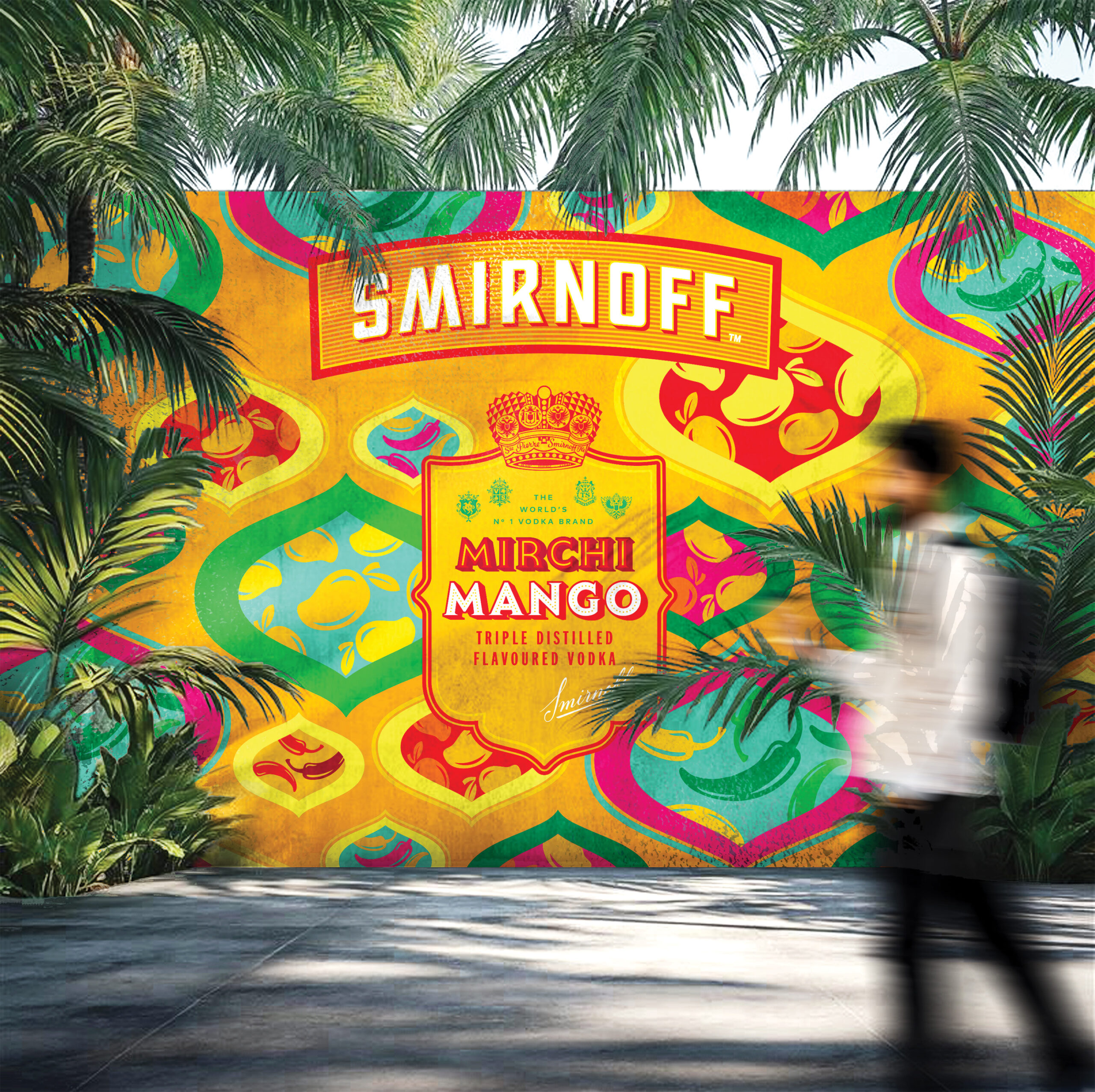
The hero of the design was a pattern system inspired by Indian textiles, Mughal architecture, jali screens, and traditional crafts. Hand-drawn motifs were adapted into layered compositions that created cohesive yet distinct narratives for each flavour.
Each label centred the Smirnoff shield, transforming it into a storytelling frame. Ingredients were illustrated with care—jamun swirls and mint leaves, sliced mango and red chilli, zesty limes—woven into paisley-inspired shapes and architectural grids. These compositions blended whimsy with structure.
Originally envisioned as full-bottle sleeves, the design evolved into more sustainable label formats, prompting us to maximise clarity, hierarchy, and visual impact within reduced space. The result was packaging that balanced richness with efficiency.
Colour was used purposefully, with bold tones and vibrant finishes selected for key illustrations to reflect flavour cues and create standout. Typography was fine-tuned to express both heritage and modernity, reinforcing Smirnoff’s global DNA while inviting local relevance.
Smirnoff Flavours launched to resounding success, both within Diageo and across the Indian market. It is now regarded as a global benchmark for culturally adaptive innovation. Consumers described the packaging as “beautifully Indian” and “unlike any other vodka design”.
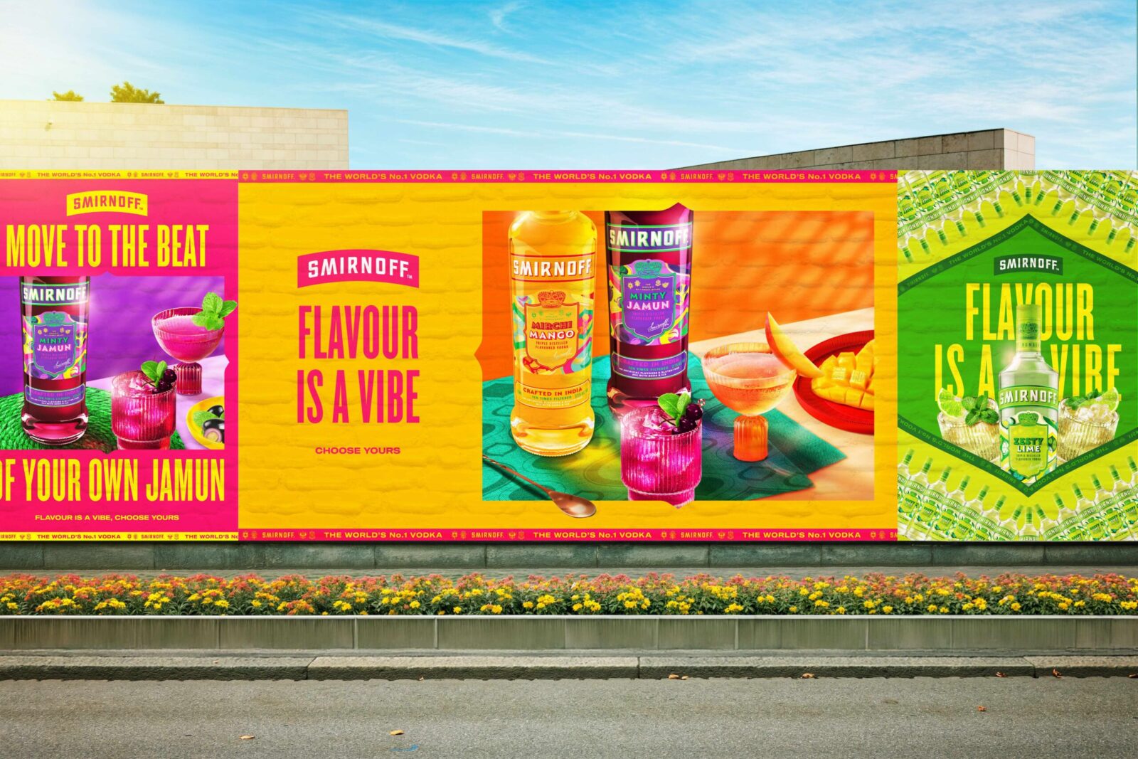
The designs unlocked storytelling opportunities across retail and social channels, driving visibility, engagement, and demand. They gave Smirnoff renewed relevance with a new generation, supported by a flexible visual system built to scale.
The packaging quickly became a talking point. Diageo India’s Head of Design received unprecedented LinkedIn engagement on the launch post, with consumers from across the country asking where they could purchase it. Internally, the range is now referenced as a case study in extending brand equity with cultural sensitivity and strong visual assets.
This was more than a new product line; it marked a creative shift. Smirnoff Flavours demonstrated that packaging can be both cohesive and expressive, global and local. Through design, the range didn’t just extend the portfolio—it extended the brand’s meaning, connecting global heritage with Indian hearts and homes.
CREDIT
- Agency/Creative: Bulletproof
- Article Title: Bulletproof Connects Global Identity and Local Culture with Smirnoff Flavours
- Organisation/Entity: Agency
- Project Status: Published
- Agency/Creative Country: Singapore
- Agency/Creative City: Singapore
- Market Region: India
- Project Deliverables: 2D Design, Brand Identity, Branding, Design, Graphic Design, Packaging Design
- Industry: Food/Beverage
- Keywords: WBDS Agency Design Awards 2025/26 , Packaging Design, India, Smirnoff, Flavours, Production Extension
-
Credits:
Creative Agency: Bulletproof
Executive Creative Director: Mark Armstrong
Creative Director: David Solzbacher
Creative Director: Fiona Lim
Design Director: Hieu Trieu
Senior Designer: Dominic Tan
Senior Account Director: Katie Osler
Account Director: Jiayi Ng
Account Manager: Hannah Ganesh
Production Manager: Jesse Moran
Strategy Director: Kaavya Krishnan


