


The Museo Stefano Bardini is a unique museum near the Arno and shaped by the vision of an important Florentine art dealer named Stefano Bardini. It was originally constructed in 1880 to house Bardini’s vast art collection. The interiors were organized and designed, with large sources of natural light in each room to create distinct atmospheres.
The walls were painted in a distinctive shade of blue, later named “Bardini Blue,” a color believed to have been inspired by the antique. Stefano Bardini’s display method was driven more by aesthetic harmony and symmetry than by historical accuracy, often grouping objects: sculptures, tapestries, stone fragments, and archaeological pieces from different periods and styles together. This eclectic and ever-evolving arrangement was intended to inspire visitors and potential buyers alike, offering them a vision of how such works might appear in their own homes. Today, the museum honors Bardini’s artistic legacy, maintaining his emphasis on visual balance and the evocative power of space.
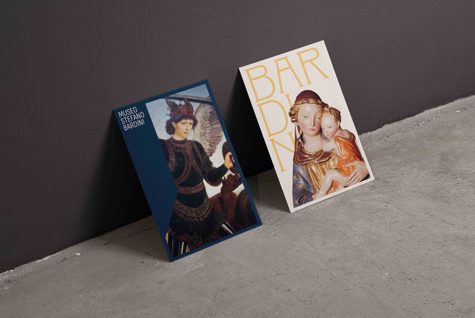
Bardini’s display method prioritized aesthetic harmony and symmetry over historical accuracy. Bardini had an affinity for frames as he thought of them as an art form. In the museum, there is a room dedicated to showing off his elaborate and varied frame collection. He also cut frames to fit artworks. In addition, Bardini has his collection in print. The design drew inspiration from the typography from his book collection to reflect the historical context of the period.
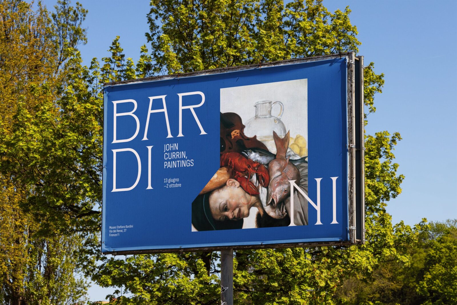
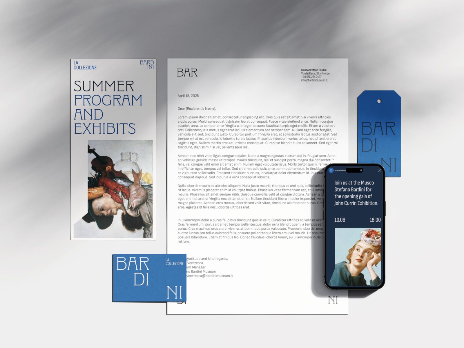
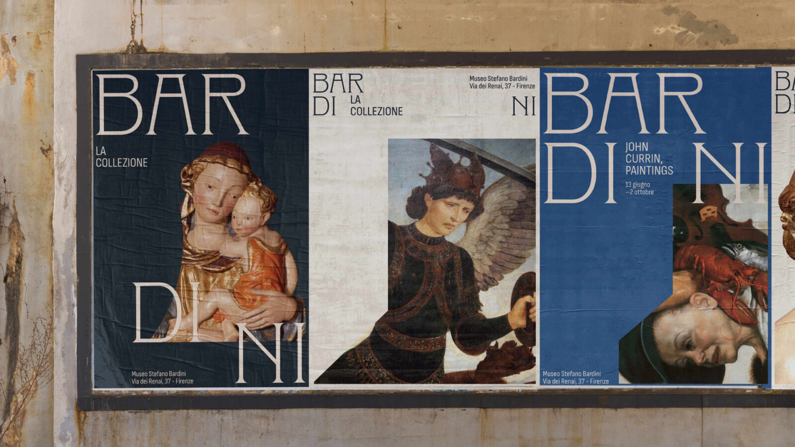
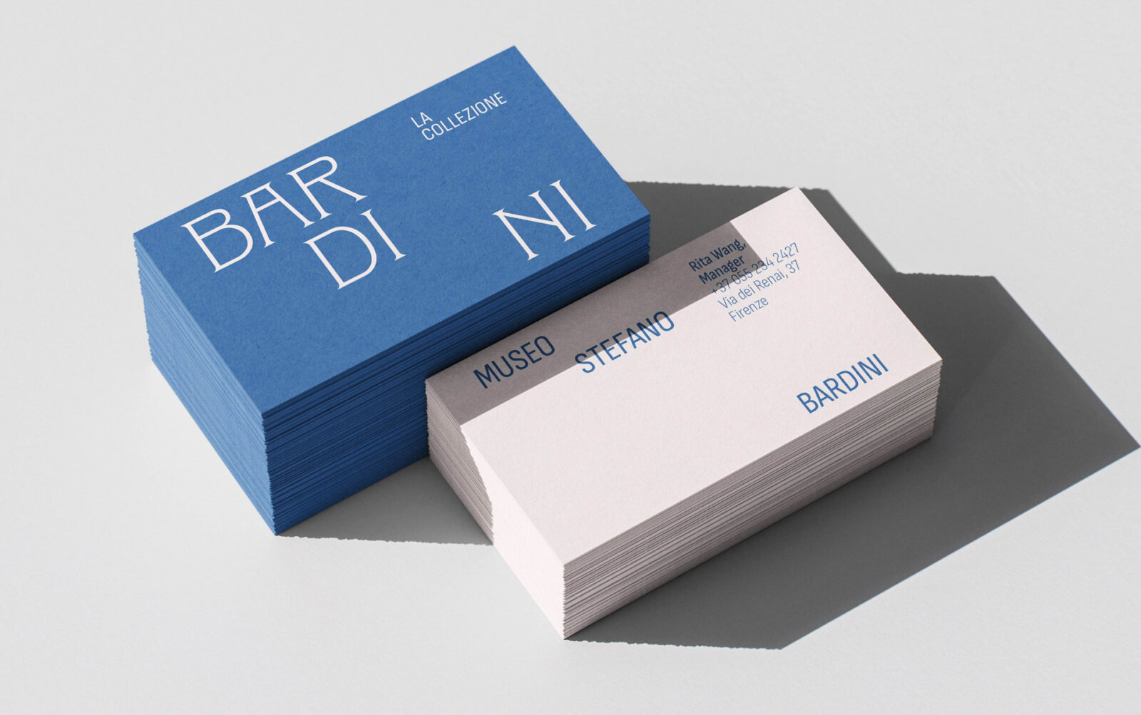
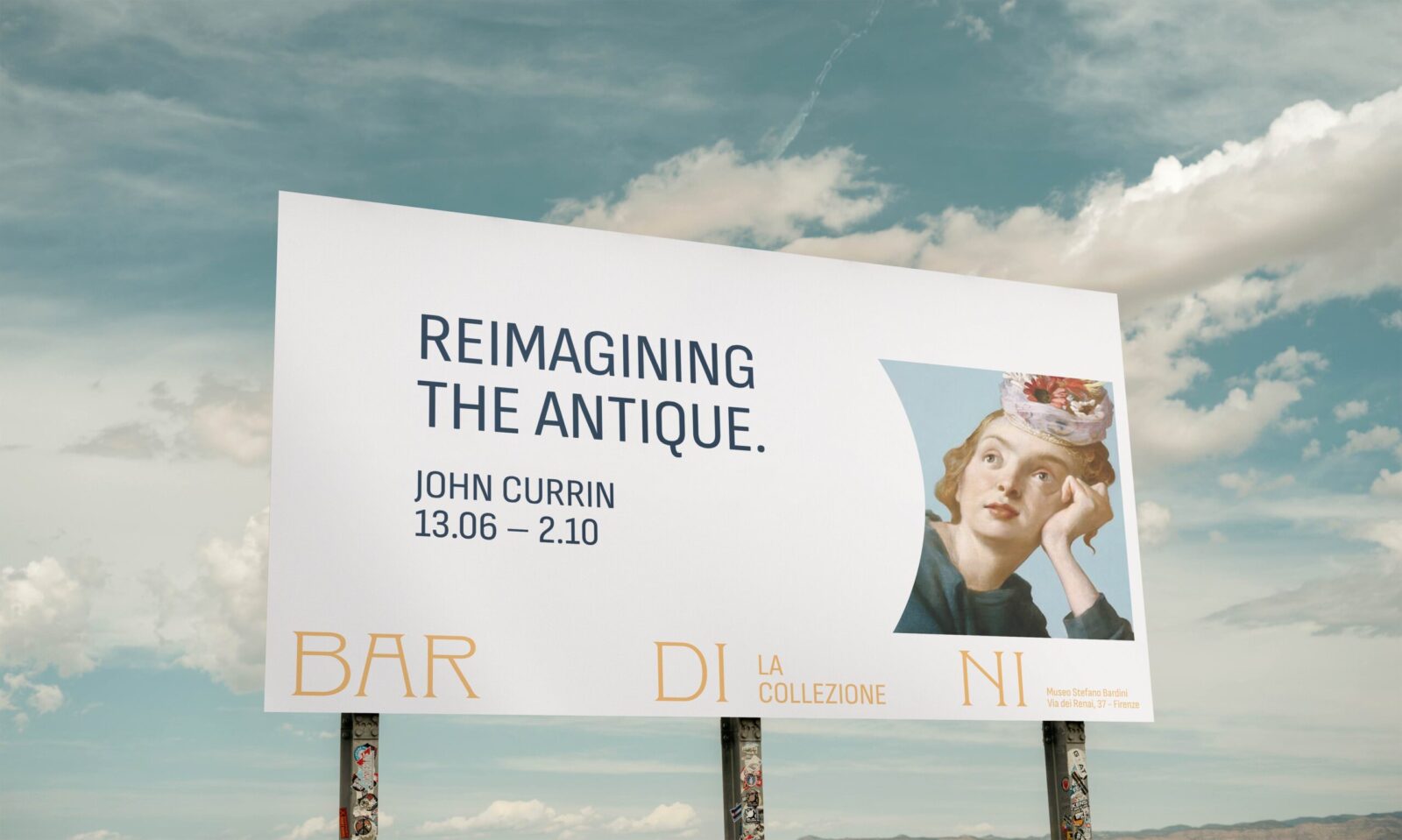
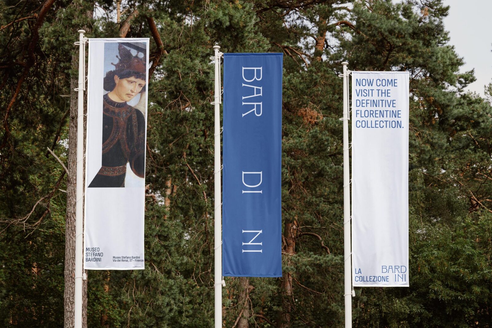
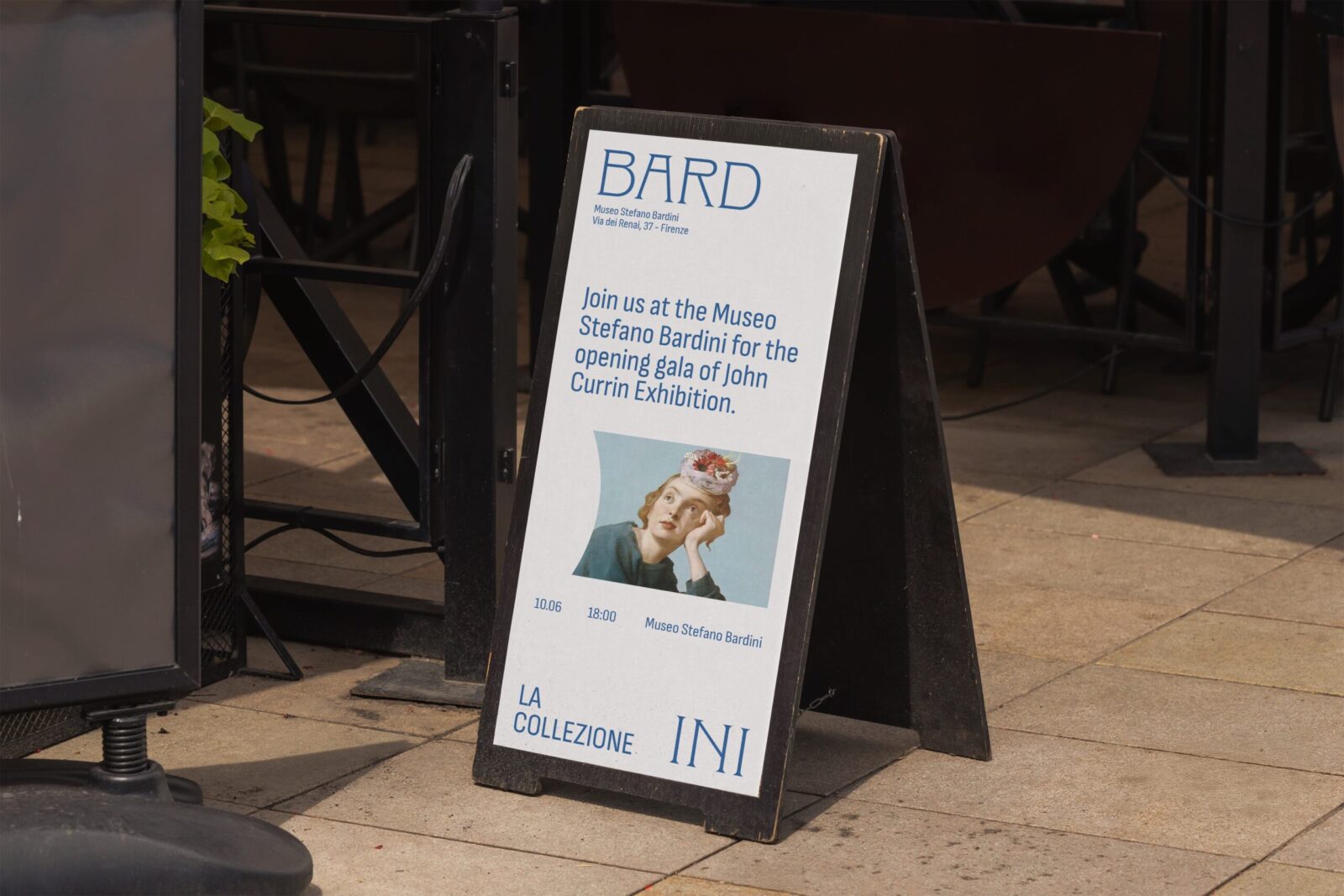
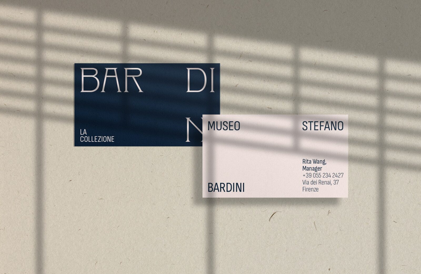
First, let’s discuss typography. In my visit to the museum, I discovered a collection of published books on Bardini’s collection. One of the books had a distinct Art Nouveau era typeface for its title. Since this font was a clear reflection of the time period in which Bardini was most active, I used a modernized version of the typeface named Clockmaker by Sudtipos, which was inspired by Art Nouveau era typeface Elandkay. For the secondary typeface, I used Sofia Sans Condensed by Lettersoup because it was inspired by early-twentieth-century san serif with technical and humanist elements, also bringing a modern twist to the time period. For the logo, I decided to forgo the full museum name and focused on one word: Bardini. In order to emphasize the uniqueness of the museum as a personal collection, I decided to add the secondary text of “La Collezione” which means “the collection” in Italian.
The most important distinction of the logo design is the system of a varied logo. I created a varied logo system that could fit any dimension. While there is a horizontal and vertical version of the logo, that is not the limit of its usage. The limit is defined by the boundaries of the media which the system is applied to. There are expanded, square, and stacked versions of the logo. The word “Bardini” can be broken up in a variety of ways. This breaking of the logo reflects Stefano Bardini’s act of slicing frames to fit a piece of artwork.
I used frames as a form of cut out image treatment. I created guidelines and rules for any media for image treatment, being especially specific with sculpture and painting pieces. I created a five color palette that included a new shade of Bardini blue and distinguished unique color usage for advertising about the permanent collection vs. temporary exhibits.
Through this redesigned branding system, the design successfully bridge Stefano Bardini’s 19th-century vision with modern visual communication. The changing logo system that breaks apart like Bardini’s modified frames, the curated typography that reflects the Art Nouveau period, and the specific use of color and imagery all work together to highlight the museum’s unique identity as a personal collection rather than a traditional institutional space. This design sought to translate Bardini’s emphasis on aesthetic harmony and his innovative display methods into design languages that fit modern design principles. I sought to capture the spirit of a place where art goes beyond historical categorization in favor of visual aestheticism. The result is an identity system that invites modern audiences to experience the same sense of wonder and possibility that Bardini intended for his original visitors and become a space where aesthetics are independent of chronology or convention.
CREDIT
- Agency/Creative: Rita WAng
- Article Title: Rita Wang Delivers a Curated Visual Identity for Museo Stefano Bardini
- Organisation/Entity: Student
- Project Status: Non Published
- Agency/Creative Country: United States of America
- Agency/Creative City: Greenwood Village
- Market Region: Museum and Cultural Entertainment
- Project Deliverables: 2D Design, Advertising, Art Direction, Brand Creation, Brand Design, Brand Experience, Brand Guidelines, Brand Identity, Brand Mark, Brand Naming, Brand Redesign, Brand Refinement, Brand Strategy, Branding, Copywriting, Creative Direction, Design, Graphic Design, Identity System, Logo Design, Poster Design, Rebranding, Research, Typography
- Industry: Non-Profit
- Keywords: WBDS Student Design Awards 2025/26 branding, museum branding, cultural institution, italian, renaissance, art museum, museum rebrand


