


Kettle Chips; The Art of Slow. The Power of Storytelling
Background
Kettle has long been recognised as Australia’s original premium chip, trusted for its quality and taste. However, in a market where their competitors had surged ahead on design and cultural relevance, Kettle risked losing ground. The Edison Agency was engaged not to reinvent the brand, but to refine it, modernising the packaging system, sharpening its premium cues, and restoring leadership while protecting the crafted essence that had built decades of loyalty.
Brief
The task was to reframe Kettle for today’s consumers by modernising its visual identity and storytelling, amplifying the artisan-crafted narrative, and creating a cohesive and future-proof portfolio system. The objective was to subtly but powerfully refresh the packaging design so that it reinforced Kettle’s crafted DNA while elevating consumer perceptions of premium quality.
Strategy
Central to the strategy was redefining what “craft” means in a contemporary context. What once looked artisanal risked appearing dated, so Edison explored craft cues across categories such as wine, spirits, cured meats, and boutique FMCG to identify the semiotics of authenticity and quality for today’s consumer. The direction became clear: position Kettle as premium yet approachable, confident without being loud, and timeless rather than trend-driven. This approach allowed the brand to distance itself from the intensity and drama of competitors while instead leaning into quiet confidence and modern authenticity.
Design Process
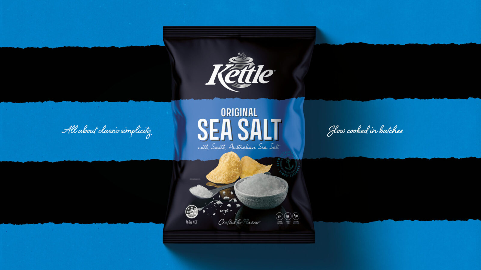
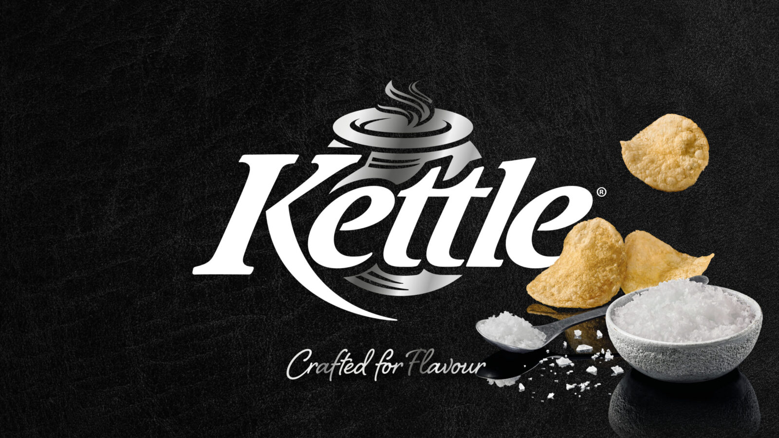
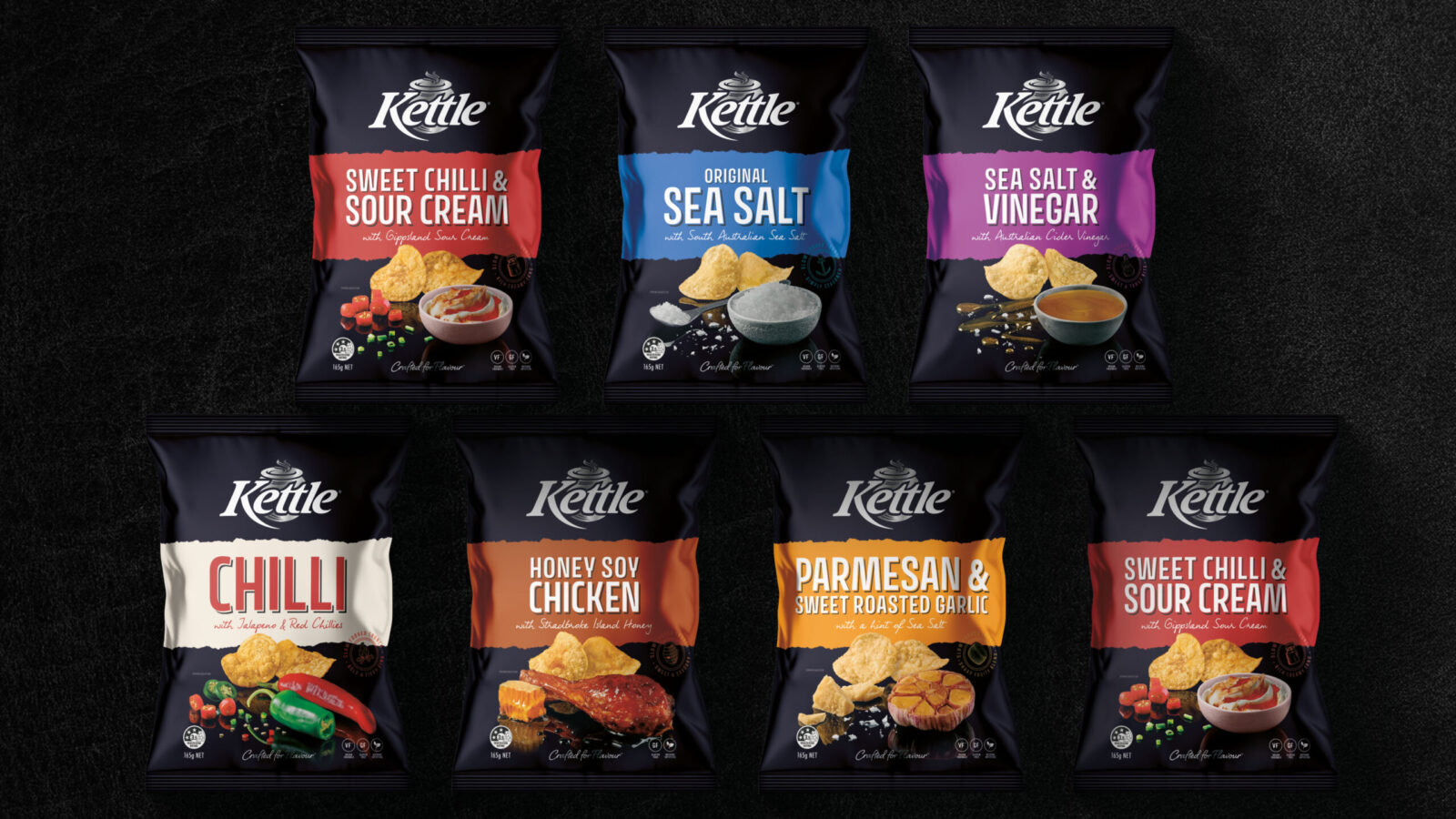
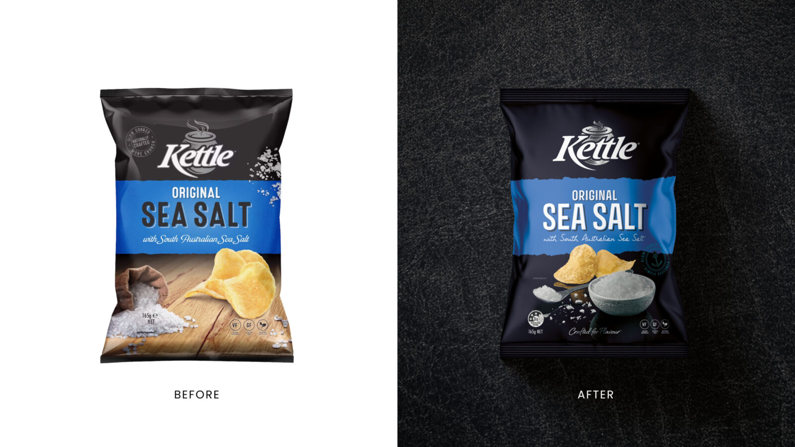
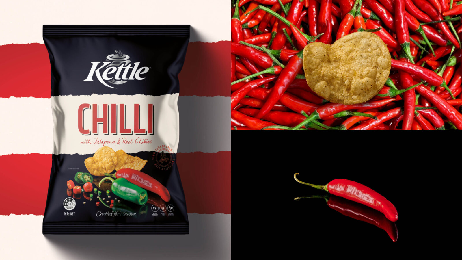
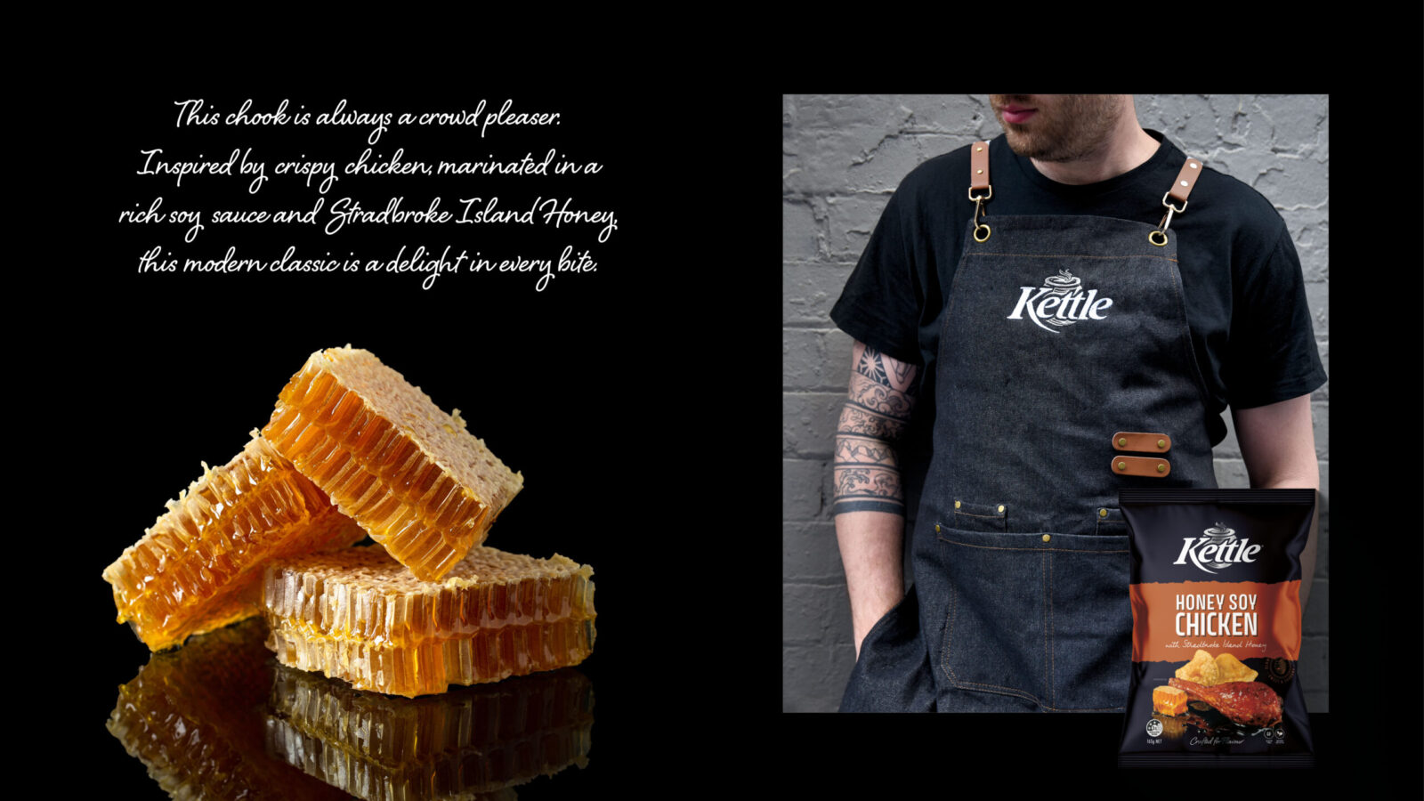
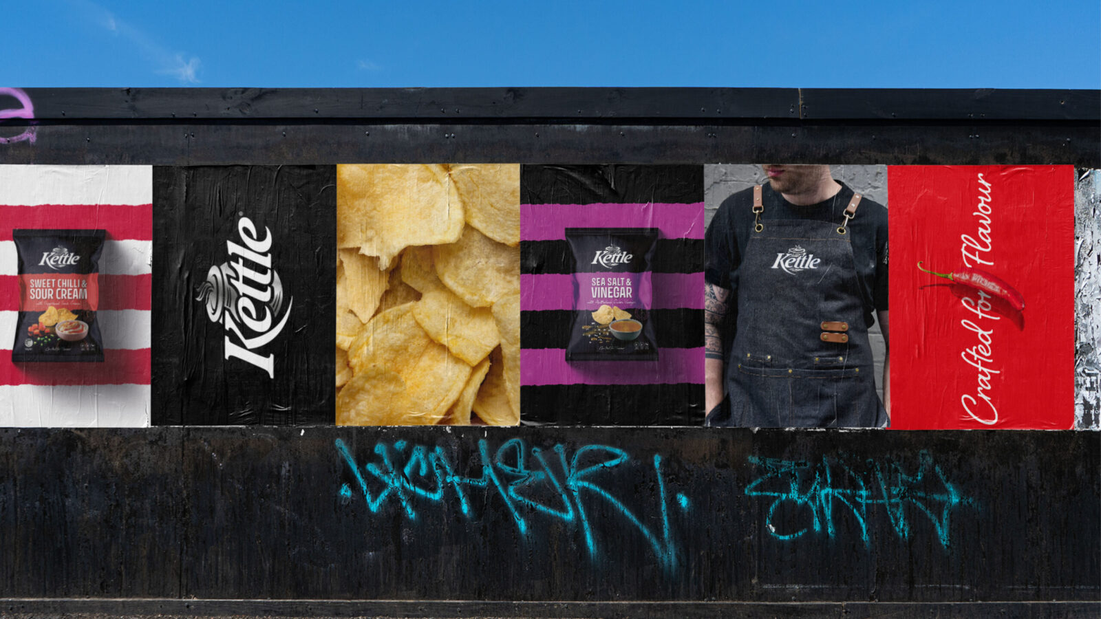
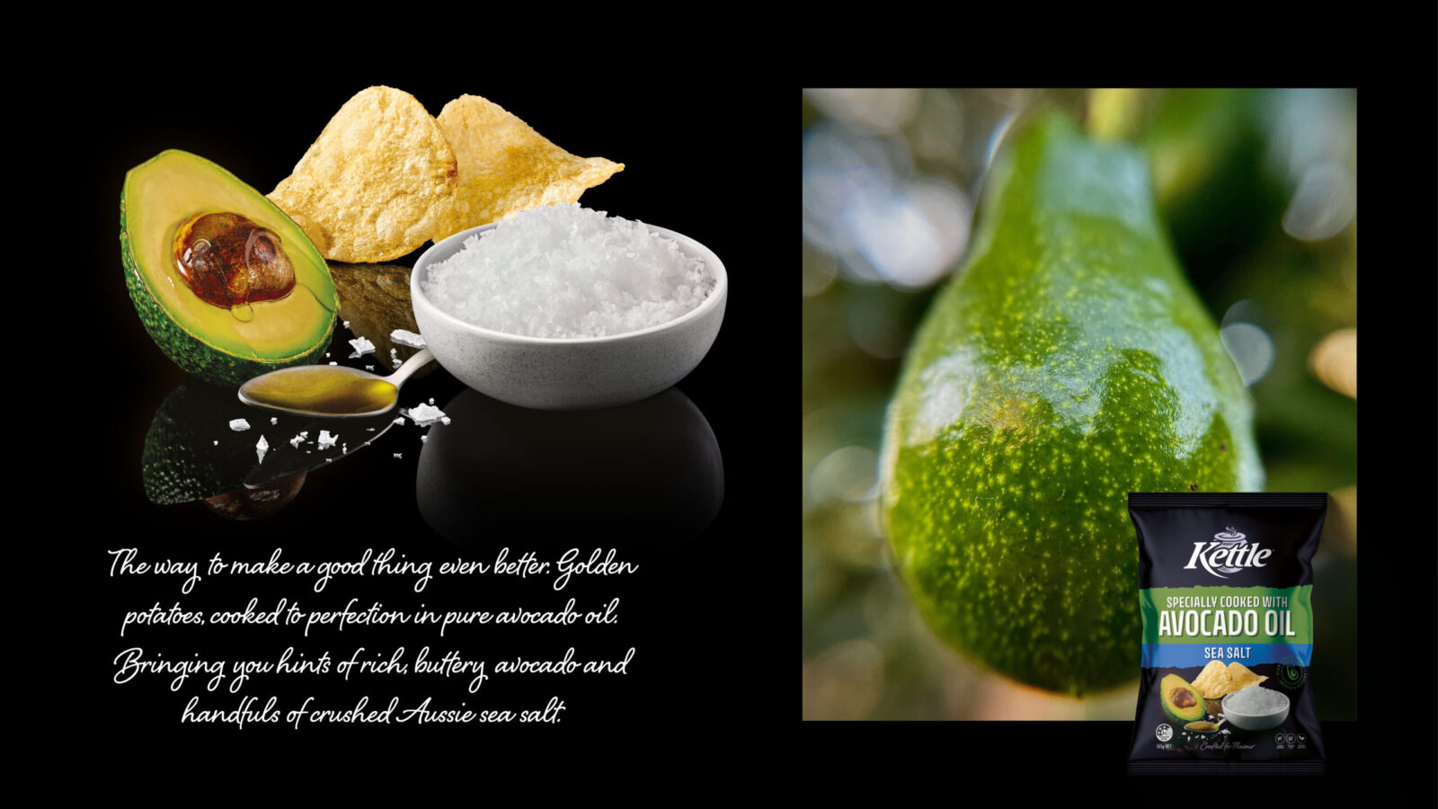
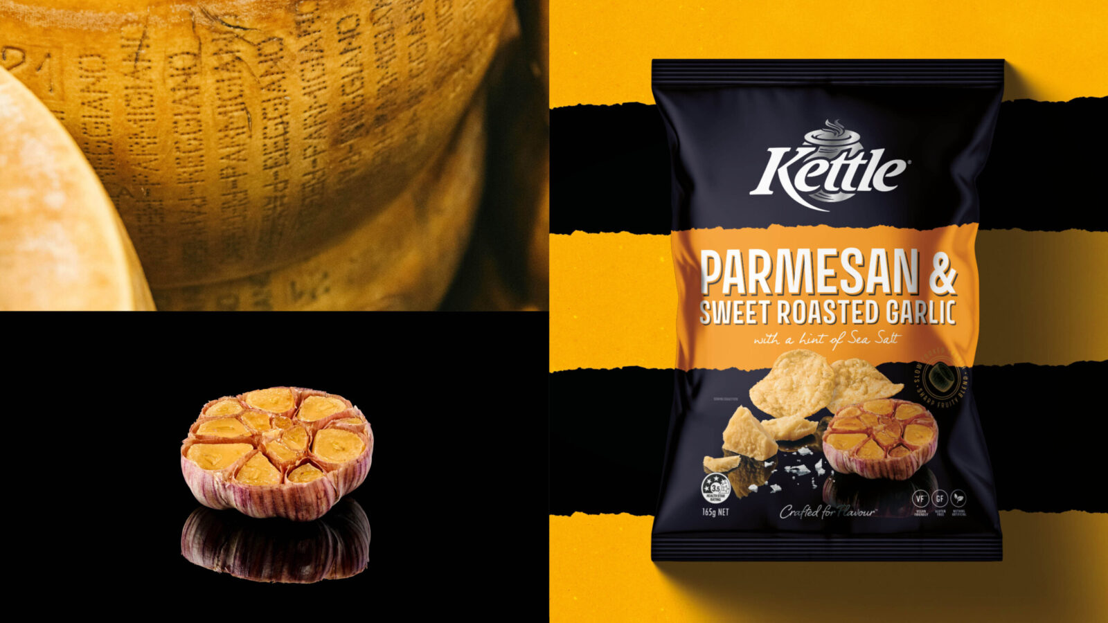
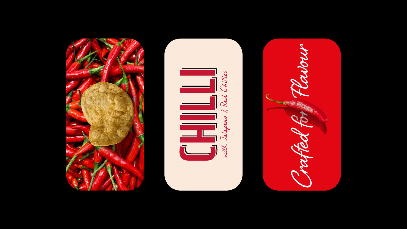
The refinement process focused on evolving existing assets rather than replacing them. The Kettle stripe was retained but simplified as a crafted design cue. The brandmark was carefully strengthened to deliver greater shelf standout and recognition. Typography was softened and refined to convey warmth and understated premium quality. Hero ingredient photography replaced over-stylised product visuals, building stronger flavour appeal and authenticity. A subdued yet premium colour palette signalled warmth and clarity, while a new layout structure created consistency across the core and sub-ranges, strengthening brand blocking and navigation on shelf. Each change represented a subtle yet deliberate evolution, modernising the brand without alienating loyal consumers.
Results & Impact
The refined packaging delivered tangible improvements. Consumer testing confirmed stronger taste cues, clearer navigation, and a heightened sense of premium quality compared with the old design. Packaging appeal lifted against competitors, closing the gap where Kettle had previously underperformed. Internally, the new system brought clarity and focus to portfolio management, ensuring consistency across SKUs and empowering teams to roll out with confidence. Externally, the brand restored its relevance and reasserted its place as a crafted leader in premium snacking. The project demonstrated that through careful refinement and evolution, rather than radical change, Kettle could once again speak volumes as a brand crafted for flavour.

CREDIT
- Agency/Creative: The Edison Agency
- Article Title: The Edison Agency Refines Kettle Chips Packaging to Restore Premium Leadership
- Organisation/Entity: Agency
- Project Status: Published
- Agency/Creative Country: Australia
- Agency/Creative City: Melbourne
- Market Region: Australia
- Project Deliverables: 2D Design, Art Direction, Brand Architecture, Brand Refinement, Brand Strategy, Creative Direction, Design, Food Photography, Food Styling, Graphic Design, Packaging Design, Packaging Guidelines, Retouching
- Industry: Food/Beverage
- Keywords: WBDS Agency Design Awards 2025/26 Packaging Design, FMCG, Chips, Kettle, Crafted, Flavour, Artisan, Premium, Slow, Snacking, Innovation, Refresh, Crisps, Heritage, Taste, Modern, Gourmet, Storytelling
-
Credits:
Founder, Principle Creative Director: Amber Bonney
Group Account Director: Niki Beeston
Designer: Steph Ehrlich
Designer: Caitlin Preyser
Senior Finished Artist: Matt O'Connor
Photographer: Pete Dillon
Food Stylist: Vicki Valsamis
Strategist: Calin Barker


