


Numi Tea Identity and Packaging Redesign
This project reimagines the identity system and packaging design of Numi Tea, an organic tea brand founded in Oakland, California in 1999. Known for its commitment to quality, sustainability, and natural ingredients, Numi has earned recognition in the organic tea market. However, its existing visual system lacked cohesion, resulting in a fragmented brand image that made it difficult for consumers to instantly recognize and differentiate products on store shelves.
The goal of this project was to modernize Numi Tea’s visual identity and packaging while preserving its core values of authenticity, sustainability, and wellbeing. The redesign process began with extensive brand research, including the creation of word lists, mind maps, and mood boards centered on concepts such as health, balance, and organic wellbeing. These explorations guided intuitive sketching that explored the use of icons, symbols, rhetorical figures, and action verbs to communicate brand values.
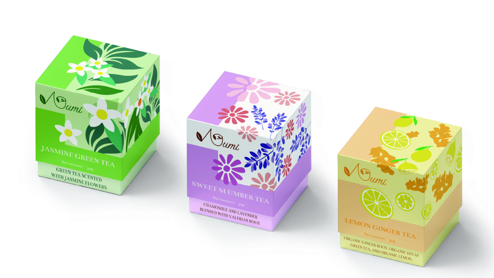
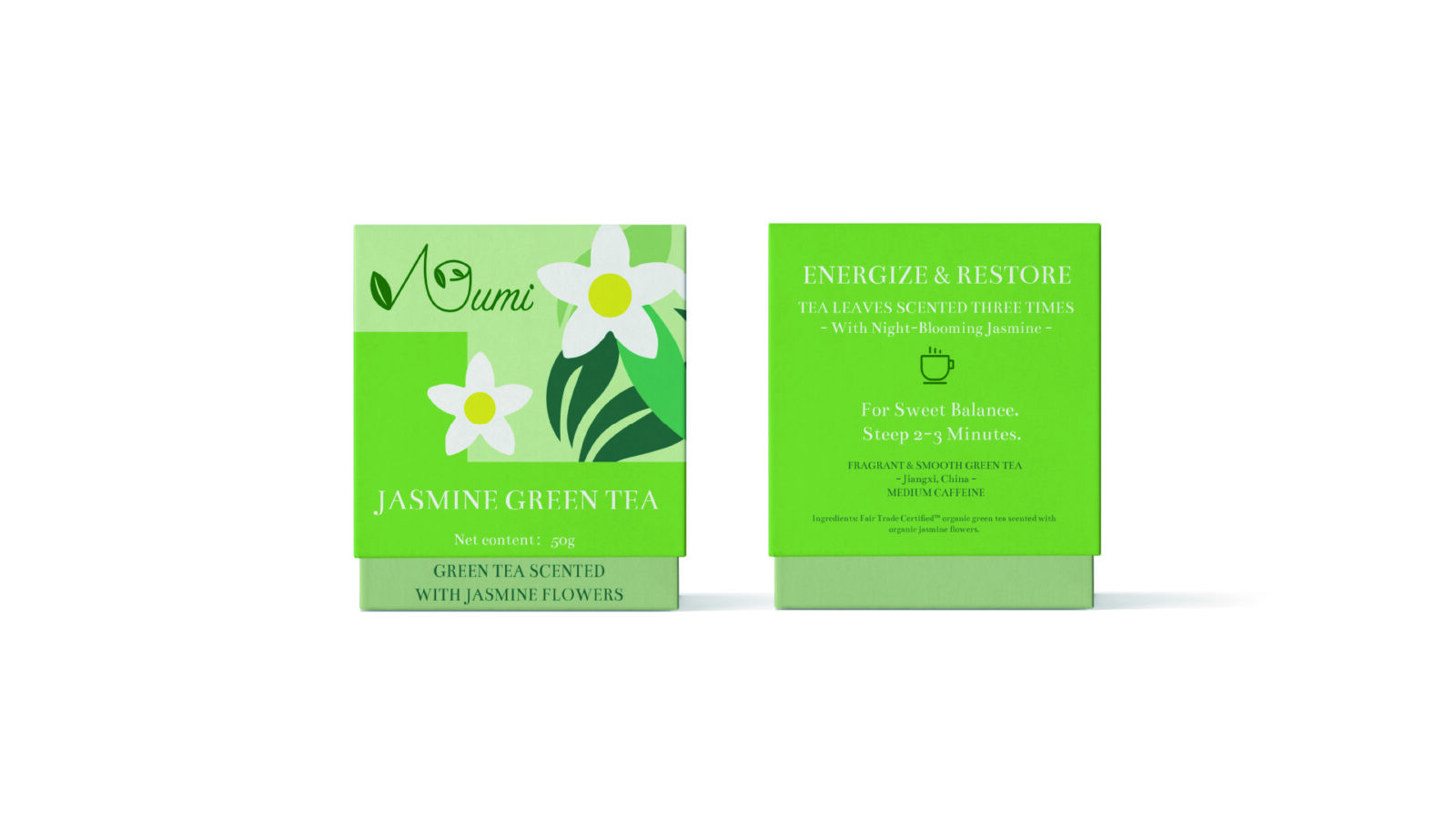
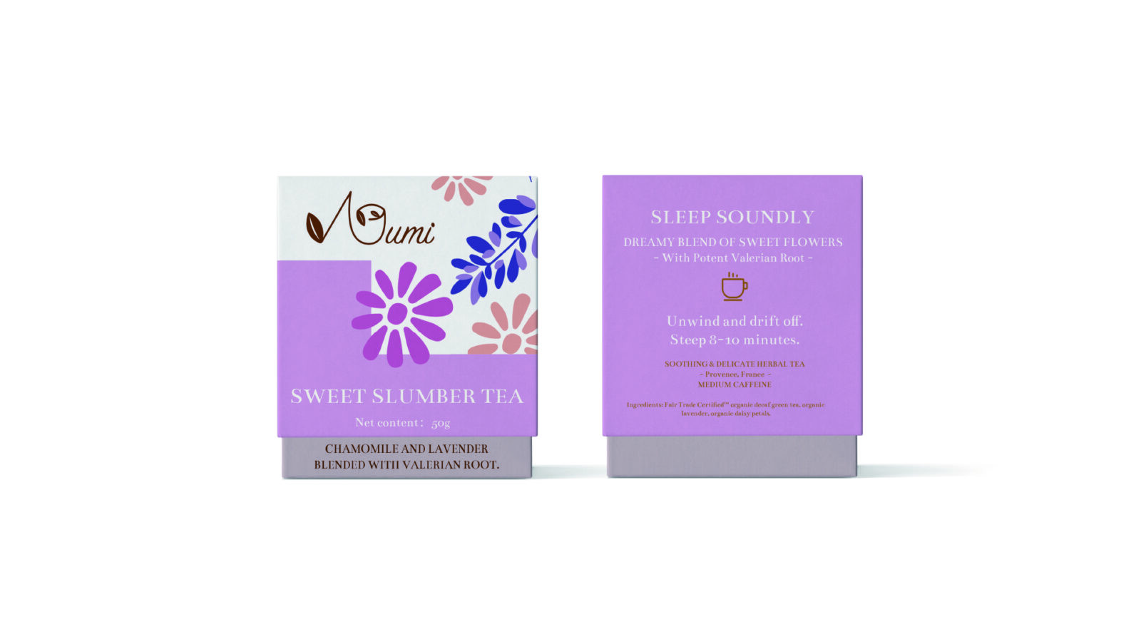
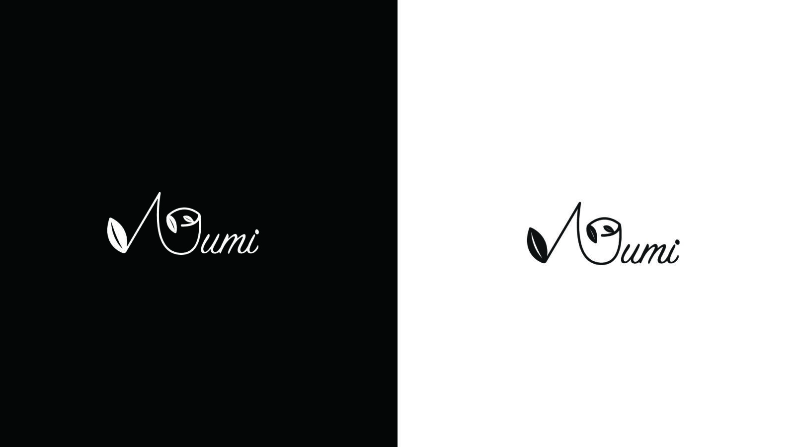
The new logo was developed as a fluid, organic script that gracefully spells out “Numi.” A subtle leaf motif was integrated into the lettering, symbolizing growth and natural origins. This design emphasizes simplicity and elegance, embodying Numi’s dedication to natural ingredients and environmental consciousness. The typography choice, Bentham, complemented the organic aesthetic with its refined curves and readability, helping anchor the new identity in both tradition and modernity.
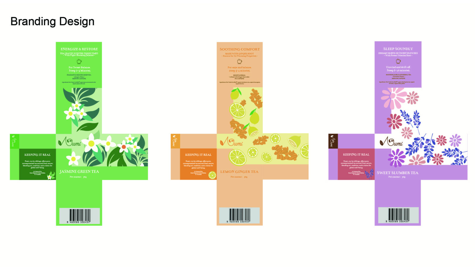
The primary challenge in redesigning Numi Tea’s packaging was to balance the need for distinctiveness across flavors with the necessity of a unified brand look. Each flavor had to be easily recognizable while clearly belonging to the Numi family. Another challenge was how to communicate the organic nature and high quality of the teas without overwhelming consumers with text-heavy or overly complex graphics.
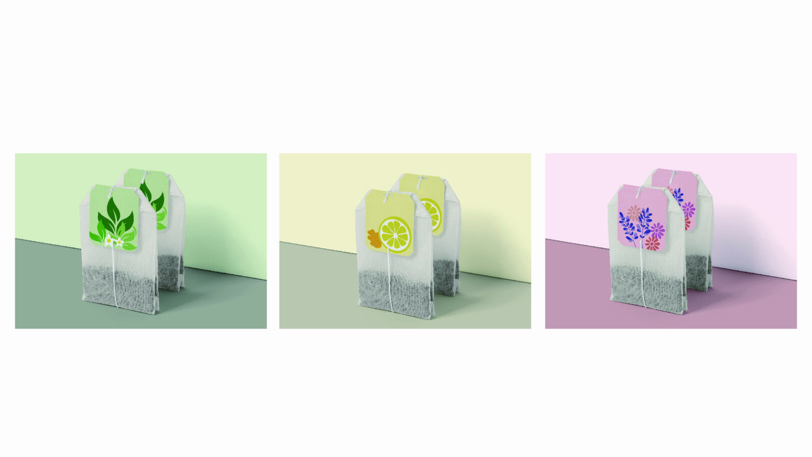
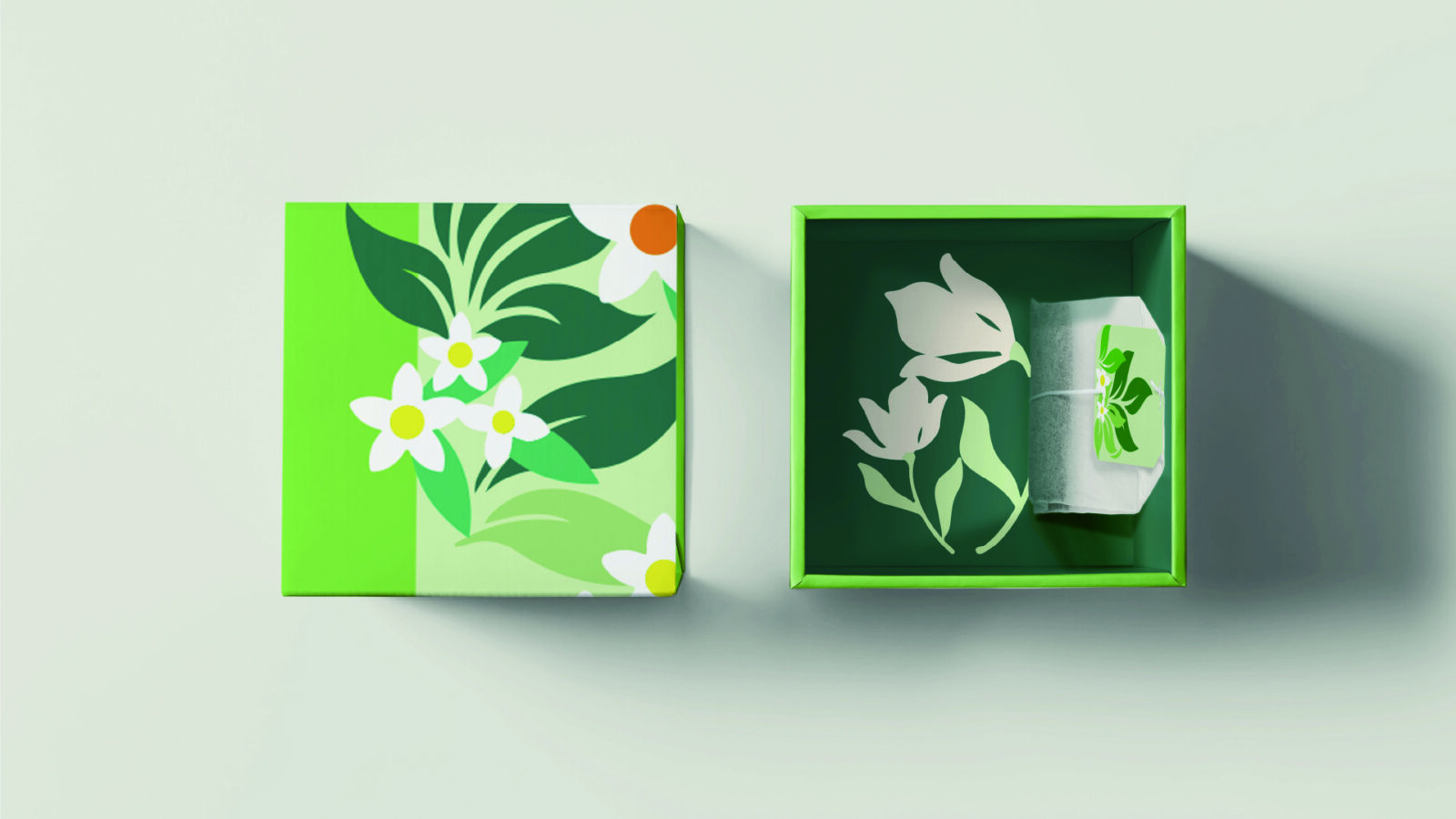
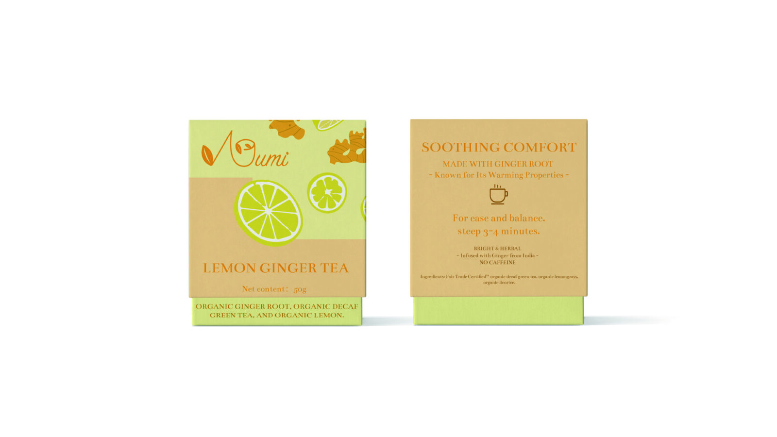
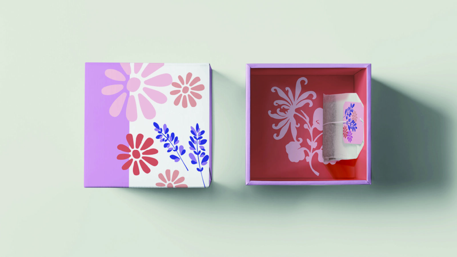
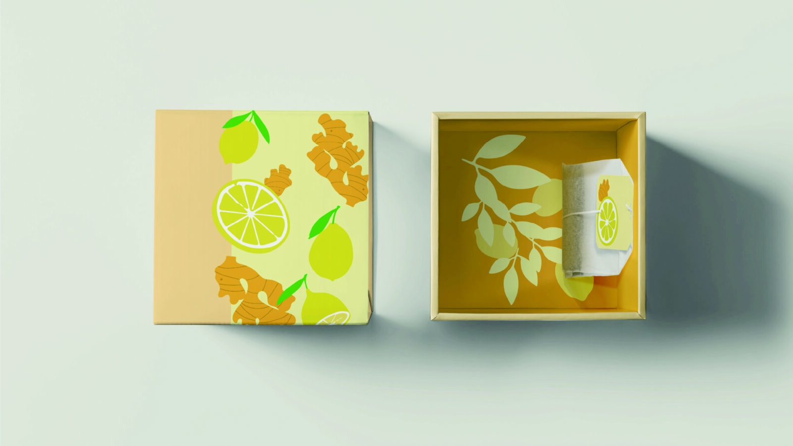
The solution was a clean and minimalistic design system that relied on color and illustration as key communicative tools. A cohesive yet varied color palette was established, with unique shades assigned to each flavor. Elegant botanical illustrations were introduced to symbolize individual varieties—for example, chamomile flowers for Sweet Slumber Tea and citrus motifs for Lemon Ginger Tea. These illustrations offered a direct, intuitive visual cue for consumers, reinforcing the natural essence of each product. Icons were also employed as simple, straightforward markers of flavor and quality, ensuring accessibility and clarity.
This minimalistic approach avoided clutter, highlighting the purity of the teas while ensuring the packaging stood out on crowded shelves. By simplifying the design language and focusing on natural imagery, the redesign improved shelf impact, consumer recognition, and overall brand cohesion.
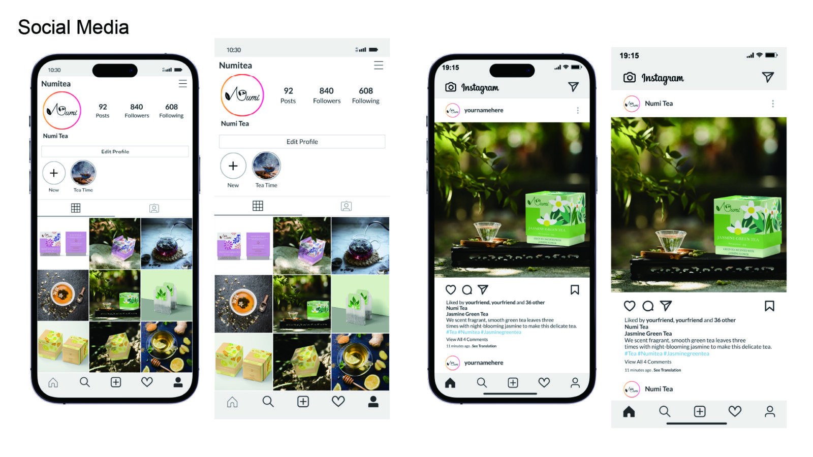
In addition to packaging, the redesigned identity was extended into Numi Tea’s social media presence. Templates and guidelines were created to bring consistency across digital platforms, strengthen brand storytelling, and connect with younger, design-conscious audiences. This extension demonstrated how cohesive branding across physical and digital touchpoints could build stronger consumer engagement and trust.
Overall, the Numi Tea redesign project demonstrates the integration of brand strategy, visual communication, and packaging design. By addressing inconsistencies and emphasizing clarity, sustainability, and emotional resonance, the new system strengthens Numi’s brand presence and creates a holistic experience that appeals to health-conscious and socially engaged consumers while positioning the company for continued growth in a competitive market.

CREDIT
- Agency/Creative: Lingxin Sun
- Article Title: Numi Tea Visual Identity Refresh by Lingxin Sun
- Organisation/Entity: Student
- Project Status: Non Published
- Agency/Creative Country: United States of America
- Agency/Creative City: West Henrietta
- Project Deliverables: 2D Design, Art Direction, Brand Design, Brand Identity, Brand Redesign, Graphic Design, Pattern Design
- Industry: Food/Beverage
- Keywords: WBDS Student Design Awards 2025/26 Brand Redesign, Packaging Design, Graphic Design, Visual Identity, Food and Beverage, Tea, Sustainability, Minimalism, User Experience, Color System, Typography, Shelf Impact, Modern Aesthetics, Branding, Product Communication


