


Shyly Sheep: Sweetly in the Meadow – Brunch, Coffee & Wine
SHYLY SHEEP is a service-brand system designed to make shy, solo-friendly guests feel welcome without performance or pressure. The project purpose was to translate “gentle belonging” into a coherent identity across physical and digital touchpoints. Its relevance stems from a common urban insight: many visitors value quiet ritual and psychological safety as much as menu variety. Success was defined by recognisability, legibility, and an atmosphere that encourages longer dwell time and repeat visits.
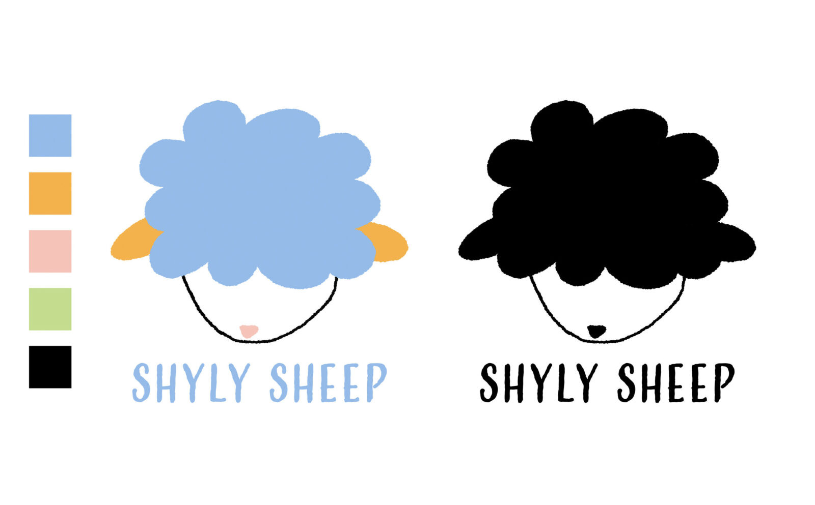
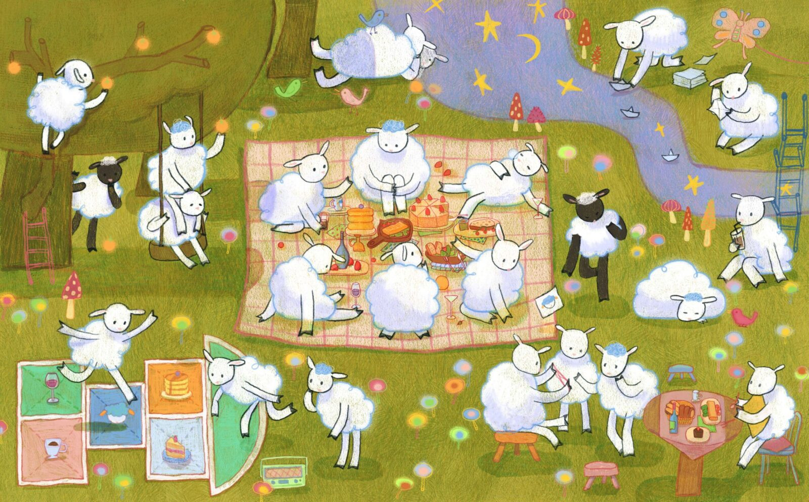
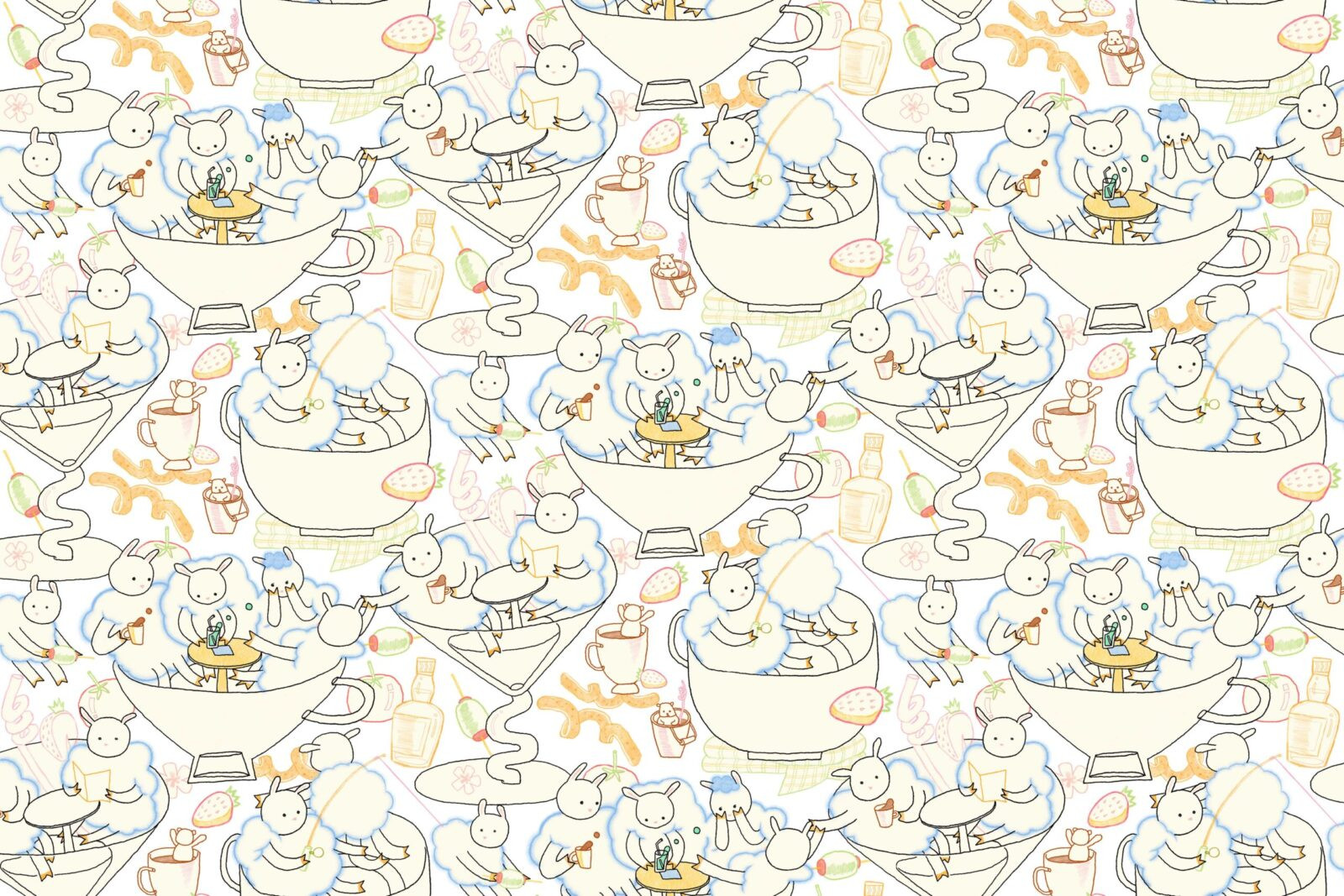
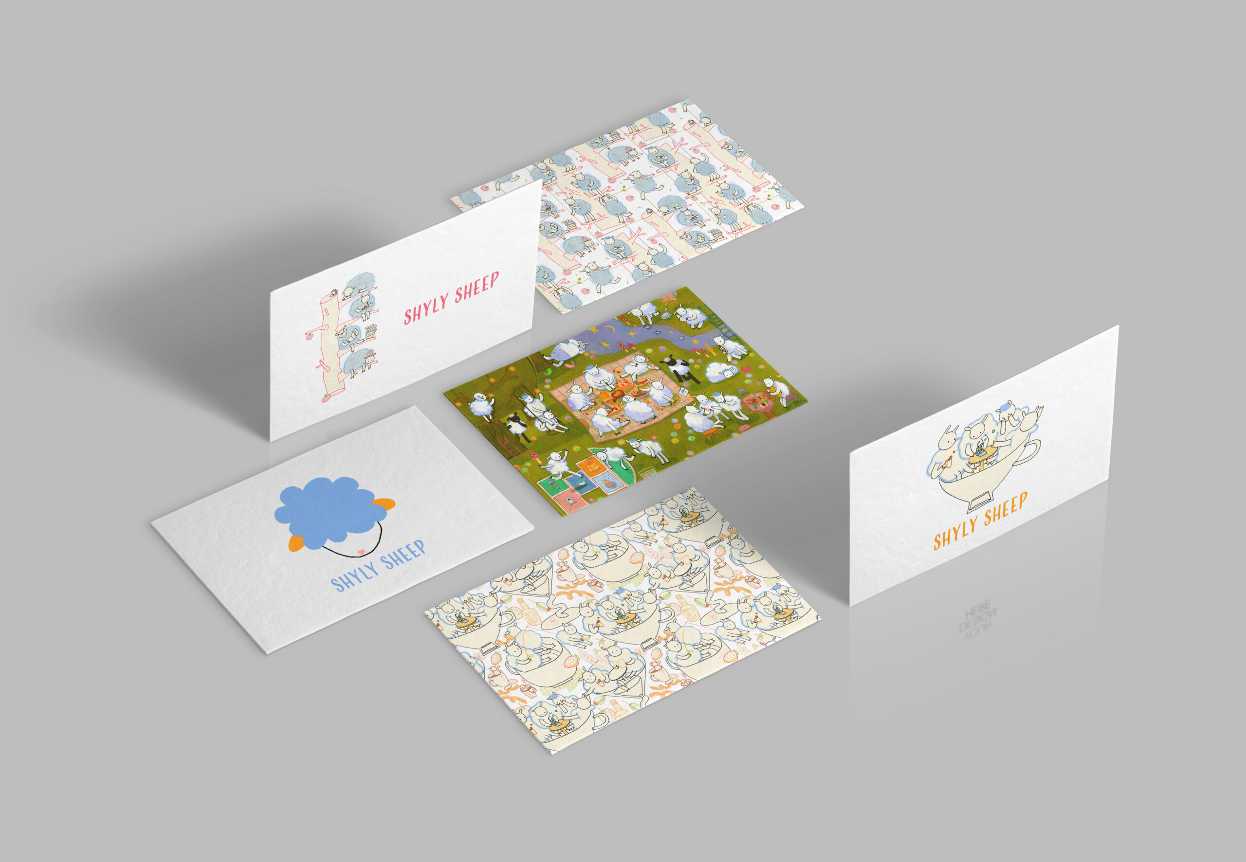
The creative strategy embraces a wabi-sabi, “show, not tell” approach—finding beauty in imperfection, impermanence, and the unfinished—so the brand speaks softly through detail rather than slogans. Visual language balances geometry and disorder (geometry as the skeleton, disorder as the breath). The shy sheep mascot, with a fluffy forelock and averted gaze, signals warm reserve. Two modular patterns incorporate intentional white gaps that let the eye rest, while a sun-warmed, low-saturation palette lowers arousal and reinforces calm.
Innovation lies in embodying “social shyness” as a brand posture. Negative space, pauses, and small deviations are treated as first-class design tools, not errors. This reframes character from overt cheer to nuanced care, making the identity distinctive yet gentle. Rather than rely on copy-heavy explanation, meaning is embedded in line quality, pacing, and the choreography of illustrated moments—inviting viewers to look rather than be told.
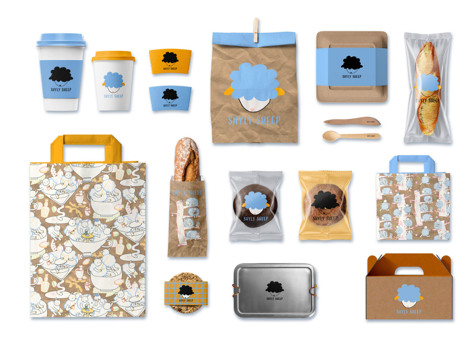
Delivery followed a clear process from pencil studies to grid-based vectors to motion-ready assets. Linework and negative space establish order; erasure, fracture, and overlap introduce gentle rupture. The system scales across signage, menus, table talkers, cups and sleeves, pastry bags, loyalty cards, and a social media grid that alternates illustration vignettes with spacious information posts to maintain rhythm and legibility. Assets were built for easy seasonal extension without fragmenting the core system.
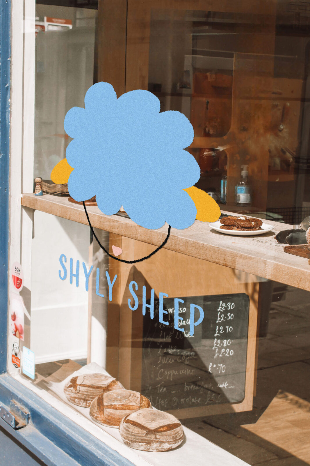
Presentation favours material truth over over-styled mockups. A small number of high-quality renders are paired with real-world photography to communicate tactility, colour accuracy, and proportion. This approach improves immediate comprehension for jurors and stakeholders, showing how the identity performs under real café lighting and in hand.
Outcomes include stronger visual coherence across channels and early qualitative feedback describing the brand as “welcoming even when alone,” aligning with the original brief. Societal and environmental considerations are built in: uncoated, recyclable paper stocks; typography with generous x-height for readability; colour contrast tuned for comfort in print and on screens. The illustration system supports low-effort updates—seasonal sheep scenes (swinging, daydreaming, watching ripples)—keeping communications fresh without increasing cognitive load.
In sum, Shyly Sheep converts an emotional insight—permission to slow down—into a distinctive, scalable identity that is culturally resonant, operationally practical, and considerate of both attention and environment.


CREDIT
- Agency/Creative: Wenwen Zhu
- Article Title: Wenwen Zhu Creates Shyly Sheep as a Service Brand Focused on Comfort and Ease
- Organisation/Entity: Creative
- Project Status: Published
- Agency/Creative Country: United States of America
- Agency/Creative City: CHICAGO
- Market Region: IL
- Project Deliverables: 2D Design, Art, Brand Creation, Brand Design, Brand Identity, Branding, Design, Illustration
- Industry: Food/Beverage
- Keywords: WBDS Creative Design Awards 2025/26 Café brand identity, Wabi-sabi, Slow living, Mascot design, Pastel palette, Negative space, Geometry and disorder, Modular patterns, Linework illustration, Solo-friendly hospitality, Quiet storytelling, Visual identity system
-
Credits:
Designer: Wenwen Zhu


