When you’ve been shaping a town’s drinking culture since 1833, you don’t just relaunch quietly; you make a comeback with a bang (and a splash of copper foil). Eldridge Pope & Co., once the powerhouse brewery of Dorset, wanted to transform its historic name into a premium spirits player, starting with a knockout range of gins and liqueurs. They set out to fuse 150+ years of brewing heritage with the sleek confidence of today’s craft spirits market. CuCo Creative had to bottle that story. Literally.
The Challenge
How do you reinvent a heritage brand without losing its soul? Eldridge Pope & Co. wasn’t chasing nostalgia; they wanted relevance. They asked us to design packaging that could balance heritage with modern flair, appeal to discerning 35-60-year-old premium spirits lovers, and lay the foundation for more future launches across gin, liqueurs, wine and even a return to beer. No pressure then.
The Concept
We became brand archaeologists, digging through Dorchester’s Edwardian architecture, rediscovering the legendary Huntsman trademark of 1921, and studying historic gothic typefaces that once shouted from brewery walls. Then we blended those treasures with bold typography, Roman-inspired details, and contemporary craft. From this came a brand identity that’s as smooth as the gin itself, rooted in Dorset, but designed for the world.
The Solution
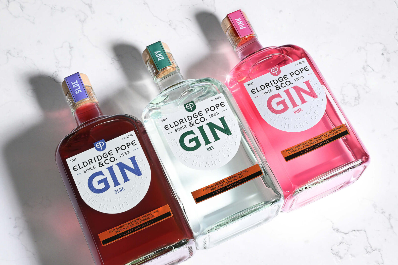
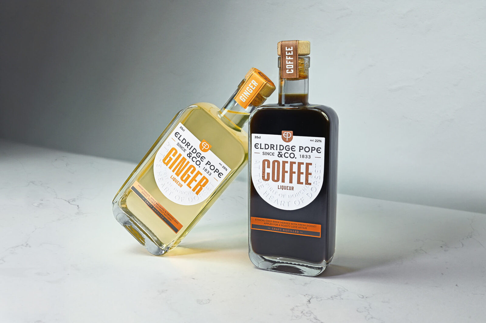
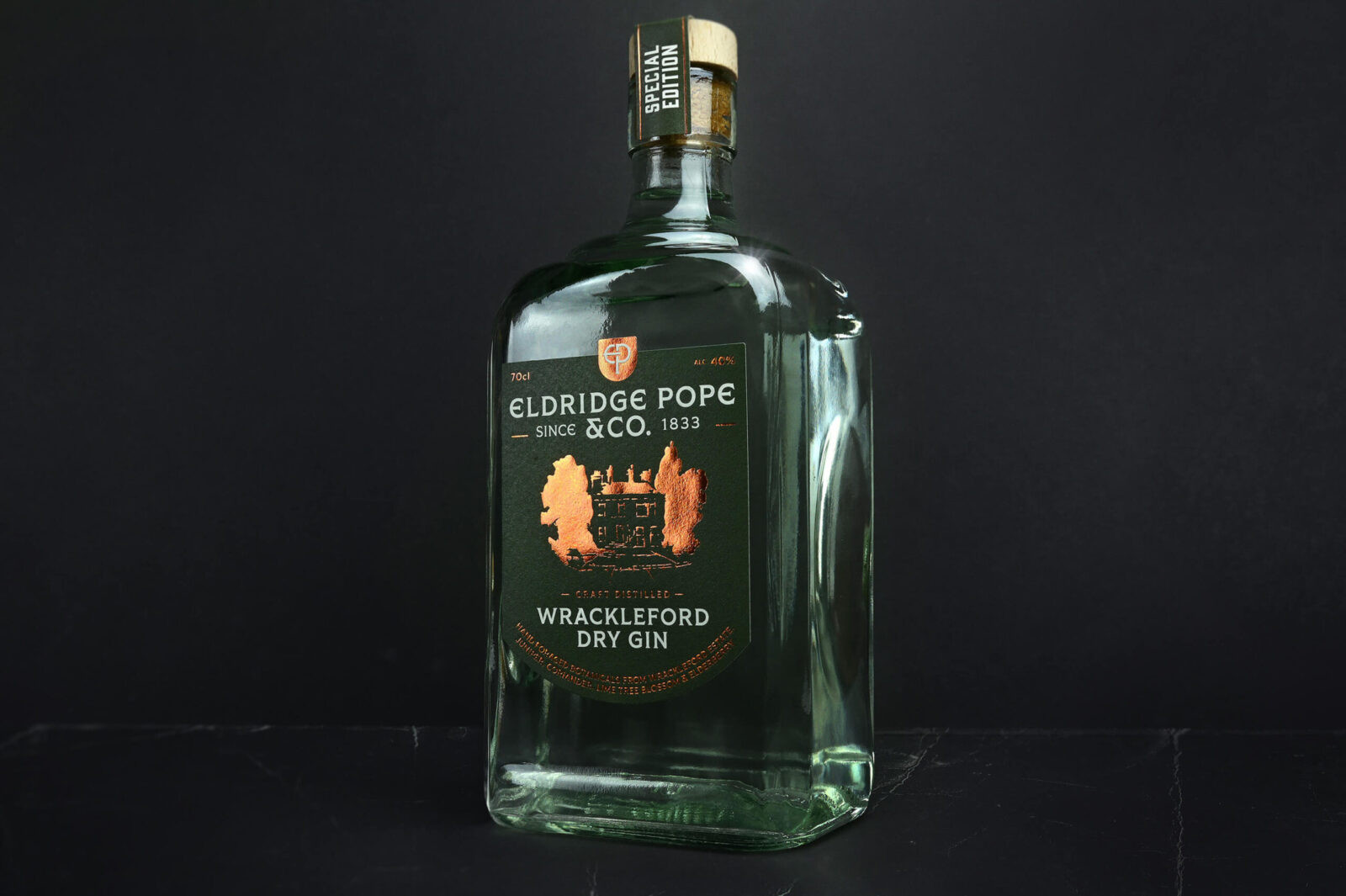
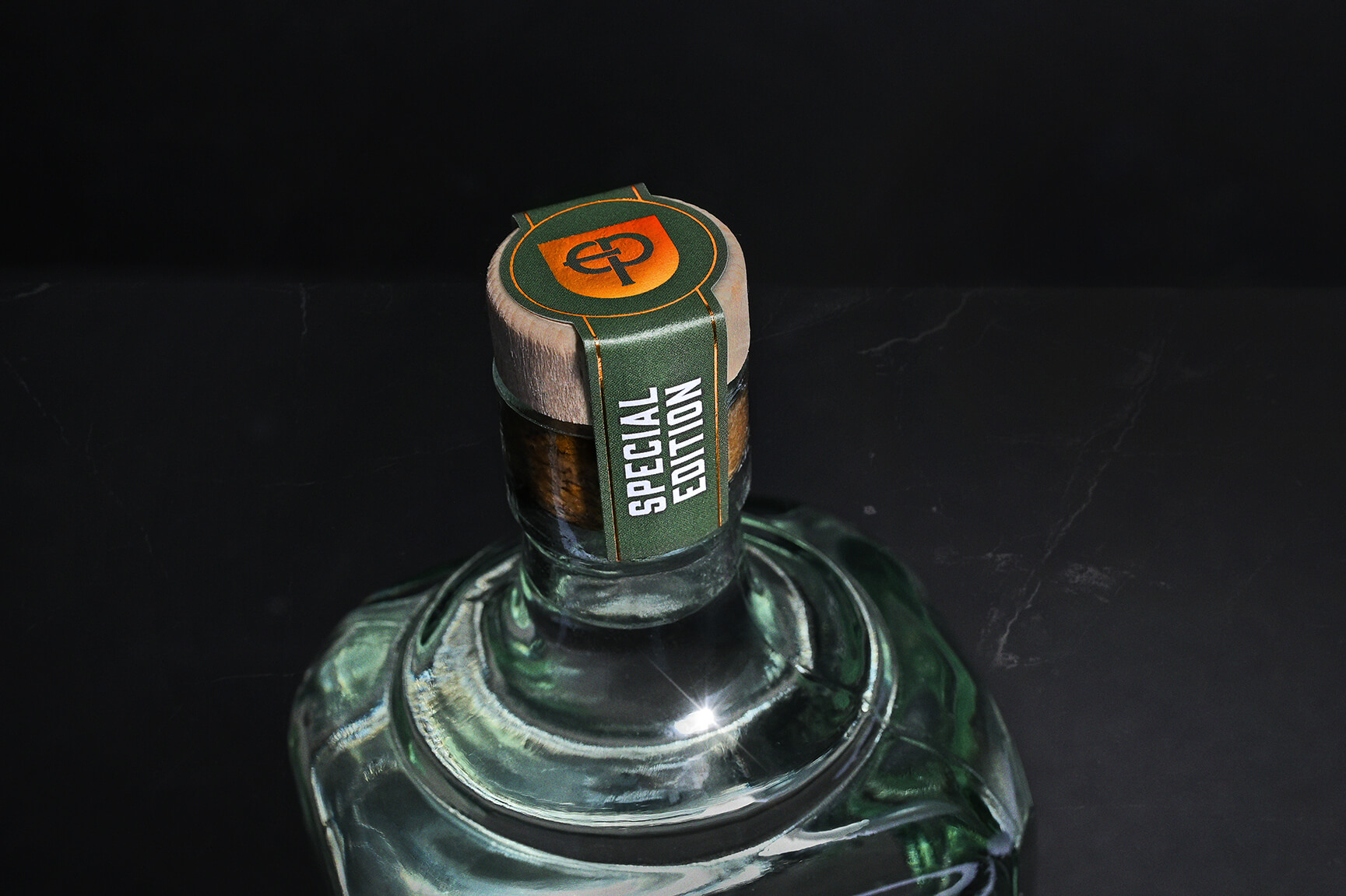
The packaging design rolled out across a full spirits range of three gins, two liqueurs (ginger and coffee), one special edition gin, and a 0% gin, with each label unified under a bold umbrella identity but with enough individuality to stand proud on the shelf.
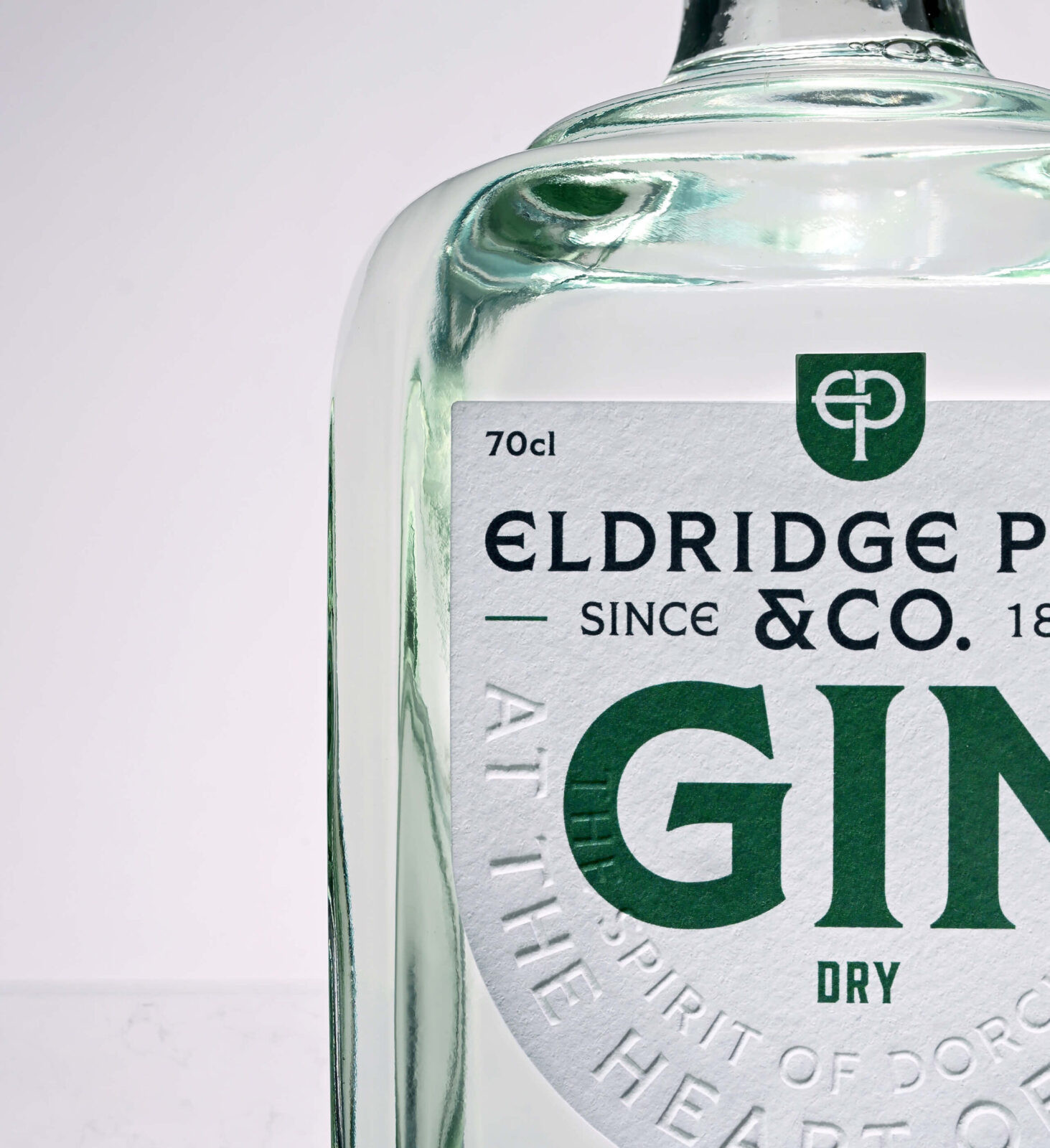
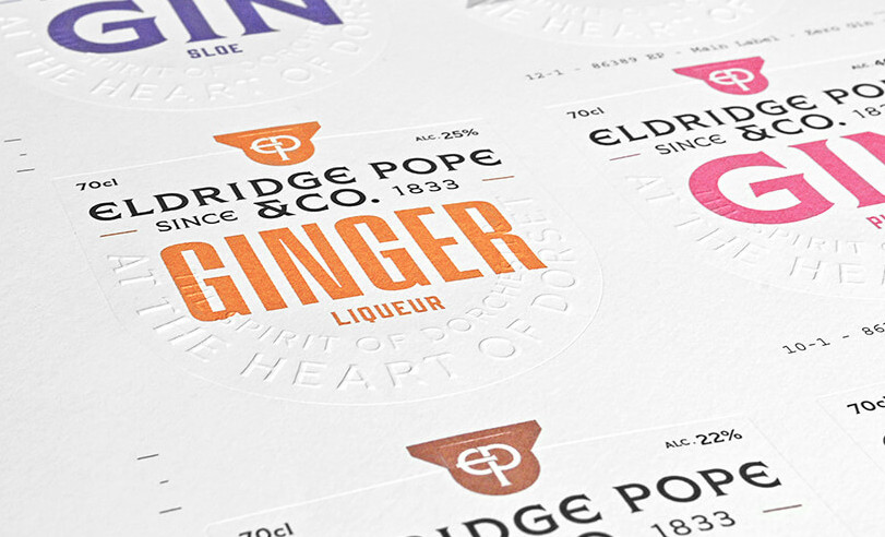
Premium print techniques brought the bottles to life: copper foiling glints as a nod to the brewery’s historic copper fermentation tanks, while embossed straplines practically beg to be touched.
The logo itself was carefully remastered, softening the crest into elegant curves inspired by Dorchester’s Edwardian arches and drawing out the smoothness of the liquid inside. Even the typography was reimagined: remastered gothic serifs paired with contemporary Romanesque forms to deliver both clarity and character.
At the heart of the project was brand storytelling: we built the Eldridge Pope & Co. narrative, weaving together its rich history, Dorset heritage, and forward-looking ambition. From this foundation, we crafted the words that brought the labels to life, writing every strapline, label narrative, and supporting copy, all guided by a comprehensive brand language document that arms the Eldridge Pope & Co. team with a confident, distinctive voice for the future. This wasn’t just a facelift; it was a full brand system designed to last, grounded in history yet ambitious in its outlook.
What Makes it Unique
Every detail nods to the past without being trapped in it. The Huntsman returns in a re-imagined red, the copper foiling catches the light like a Dorset sunset, and the neck labels tell stories while protecting the liquid gold inside. This isn’t just packaging, it’s a sensory brand experience, from the embossed words under your fingers to the heritage-rich typography that leads your eyes across the bottle.
Results and Impact
Eldridge Pope & Co. is no longer a ghost on Dorchester’s old buildings; it’s back on the shelves, ready to reclaim its status as Dorset’s flagship name in drinks. The unified packaging line gives them instant recognition, shelf appeal, and a premium positioning. More than that, it future-proofs the brand for beer and wine rollouts, ensuring a cohesive brand identity across every touchpoint.
Heritage safeguarded. Future unlocked. Glasses raised. Eldridge Pope & Co. once built a town around its brews; now, it’s ready to inspire a new generation of spirit lovers.
CREDIT
- Agency/Creative: CuCo Creative
- Article Title: Pouring History: The Eldridge Pope & Co. Revival by CuCo Creative
- Organisation/Entity: Agency
- Project Status: Published
- Agency/Creative Country: United Kingdom
- Agency/Creative City: Bournemouth
- Project Deliverables: Art Direction, Brand Design, Brand Identity, Brand Mark, Brand Redesign, Brand Rejuvenation, Brand Tone of Voice, Branding, Copywriting, Creative Direction, Graphic Design, Label Design, Logo Design, Packaging Design, Rebranding, Tone of Voice
- Industry: Food/Beverage
- Keywords: WBDS Agency Design Awards 2025/26 , Packaging Design, Branding, Graphic Design, Copywriting, Brand Redesign, Gin Bottle Design, Alcohol Branding and Packaging, Gin Packaging, Alcohol Packaging Design, Spirits Packaging, Gin Brand Design, Heritage Branding, Alcohol Label Design
-
Credits:
Creative Director: Christian Cutler
Creative Director: Tony Cook
Senior Designer: Adam Smith
Designer: Tommy Carter
Head of Client Services: Summer Sutton
Marketing Communications Assistant: Ines Gari


