


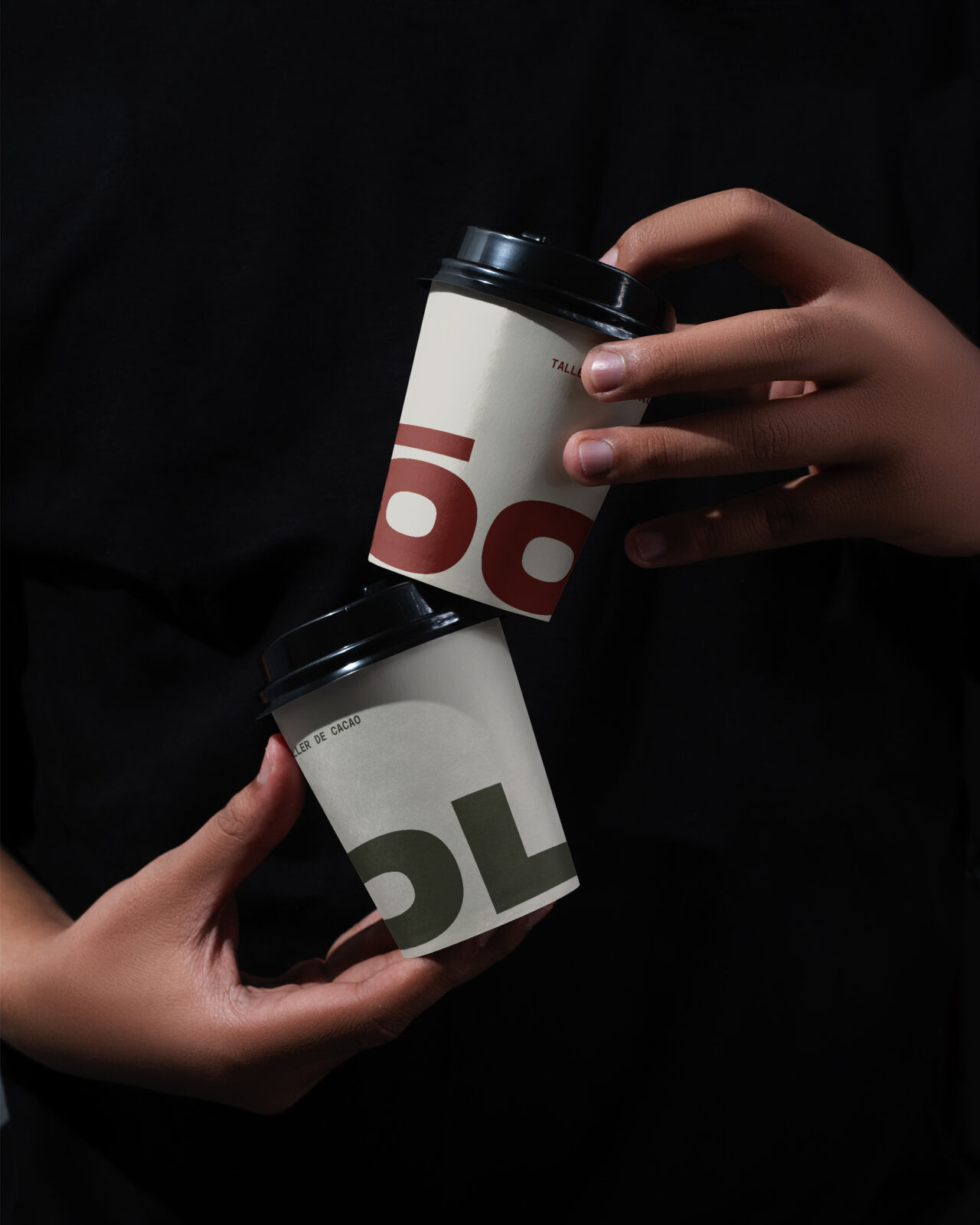
ÓOL is a design project that transforms the experience of cacao into a contemporary cultural and architectural space in SoHo, NYC. Conceived as a sanctuary in the heart of the city, the project repositions cacao not only as a drink, but as a ritual of presence, community, and heritage.
The design approach is rooted in contrast: an oasis of warmth and stillness within the speed and density of New York. Architecture, interiors, and graphic identity work in unison to create a multisensory environment shaped by aroma, taste, and atmosphere. Minimalist lines and natural textures recall Mesoamerican origins while resonating with the sophistication of SoHo. Earth-colored surfaces, tactile materials, and subtle lighting invite calm, while the scent of cacao envelops visitors in an immersive narrative.
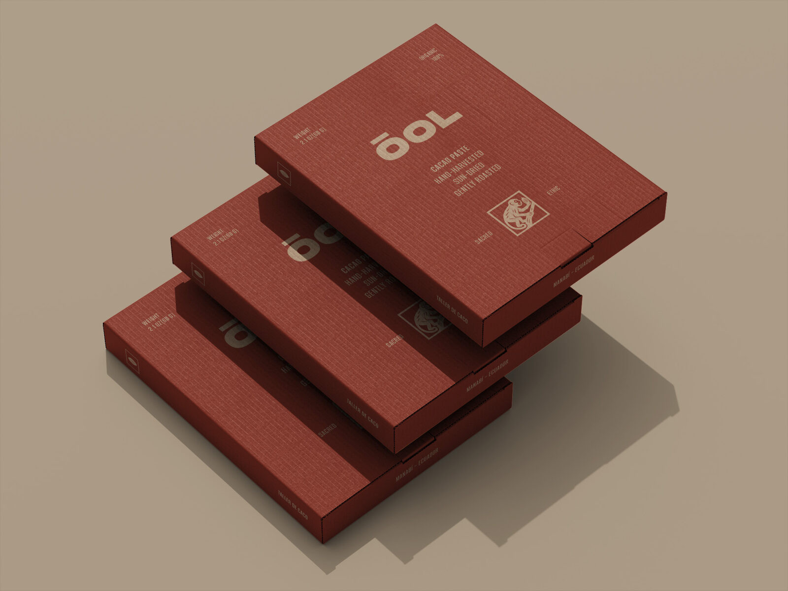
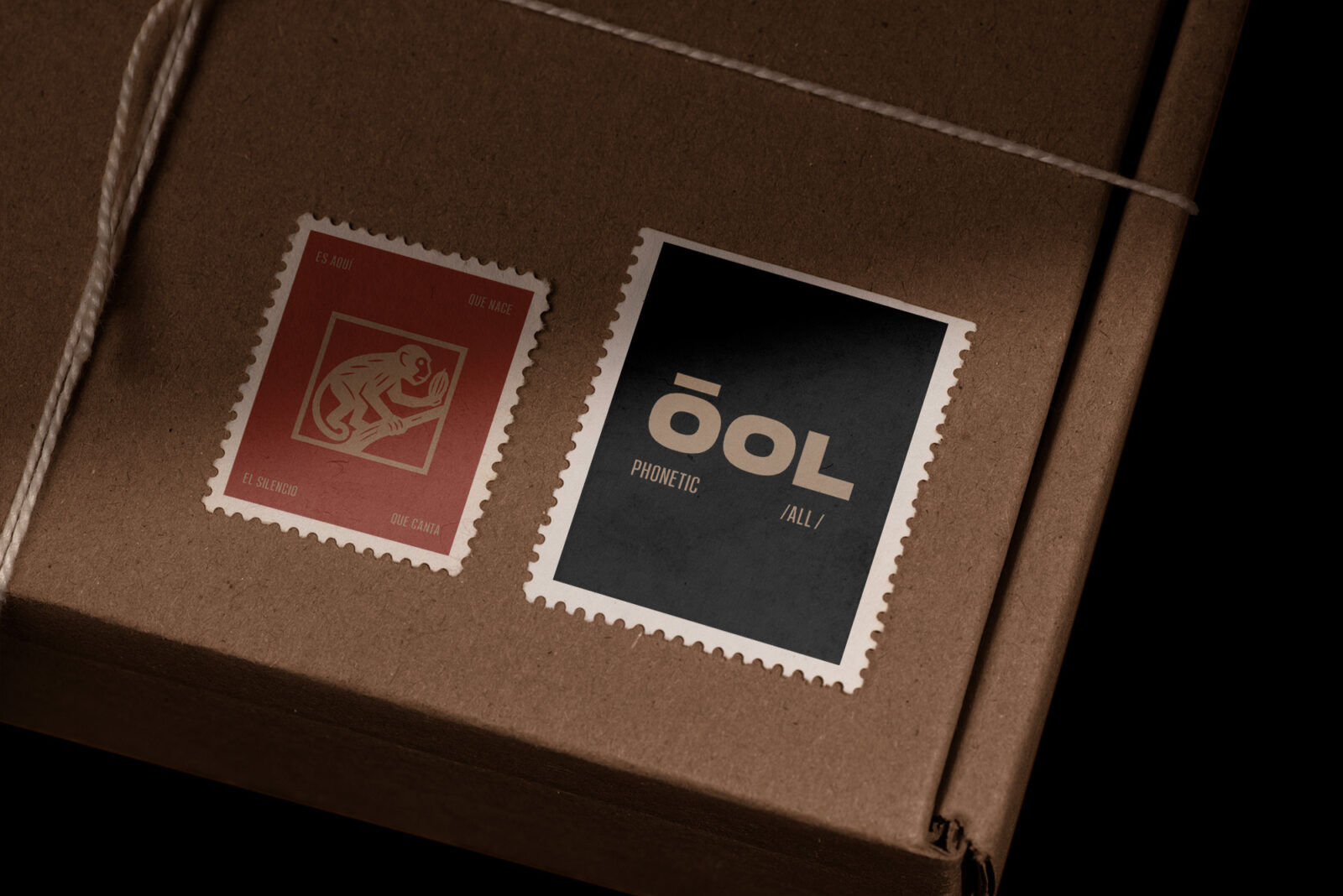
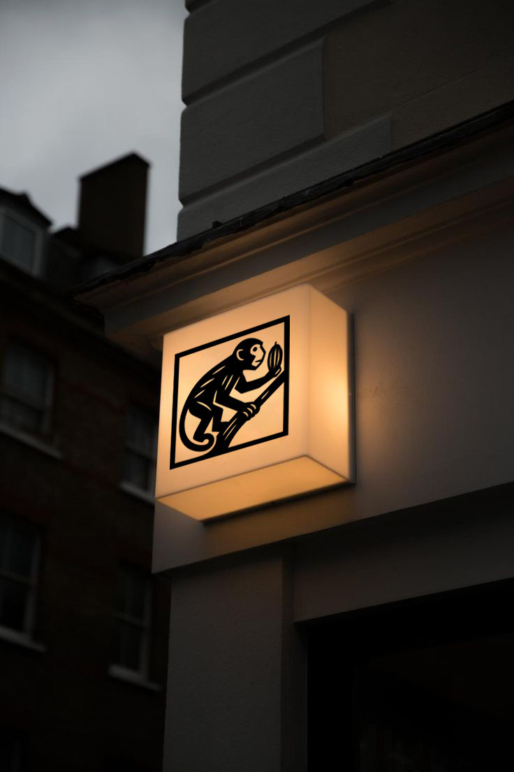
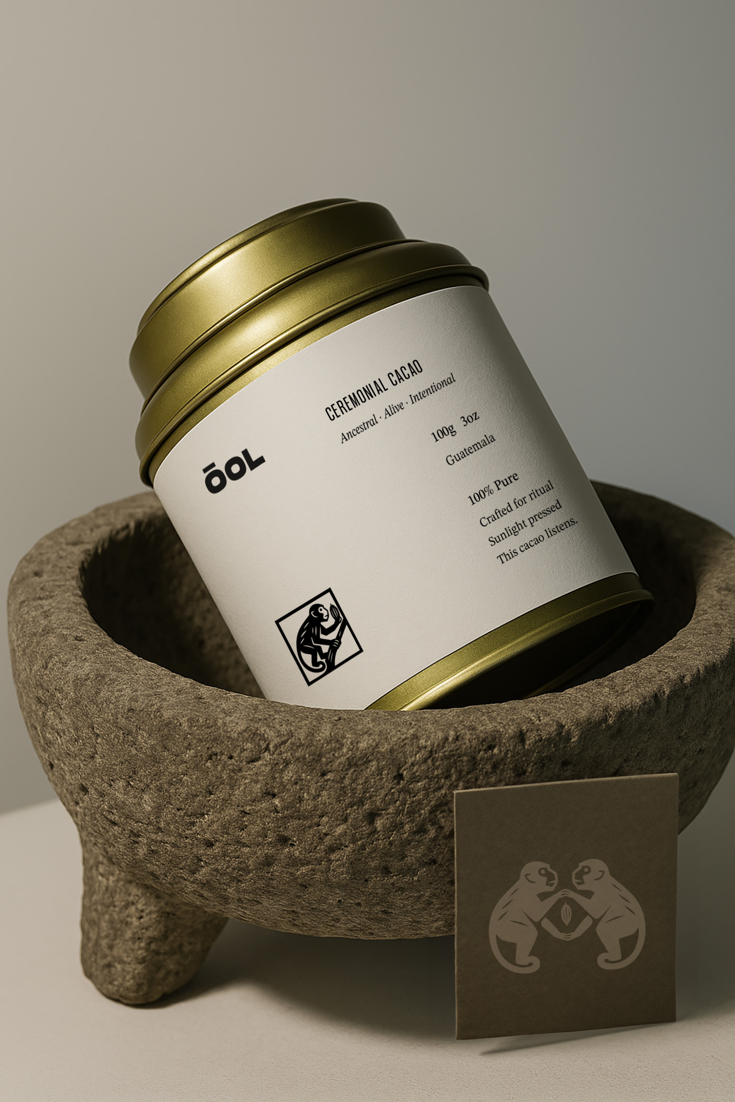
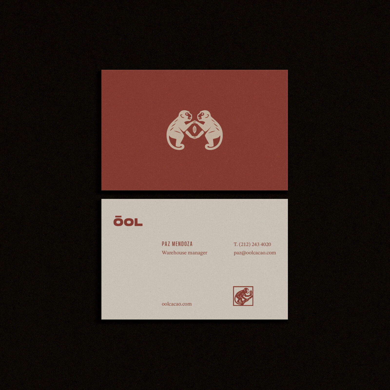
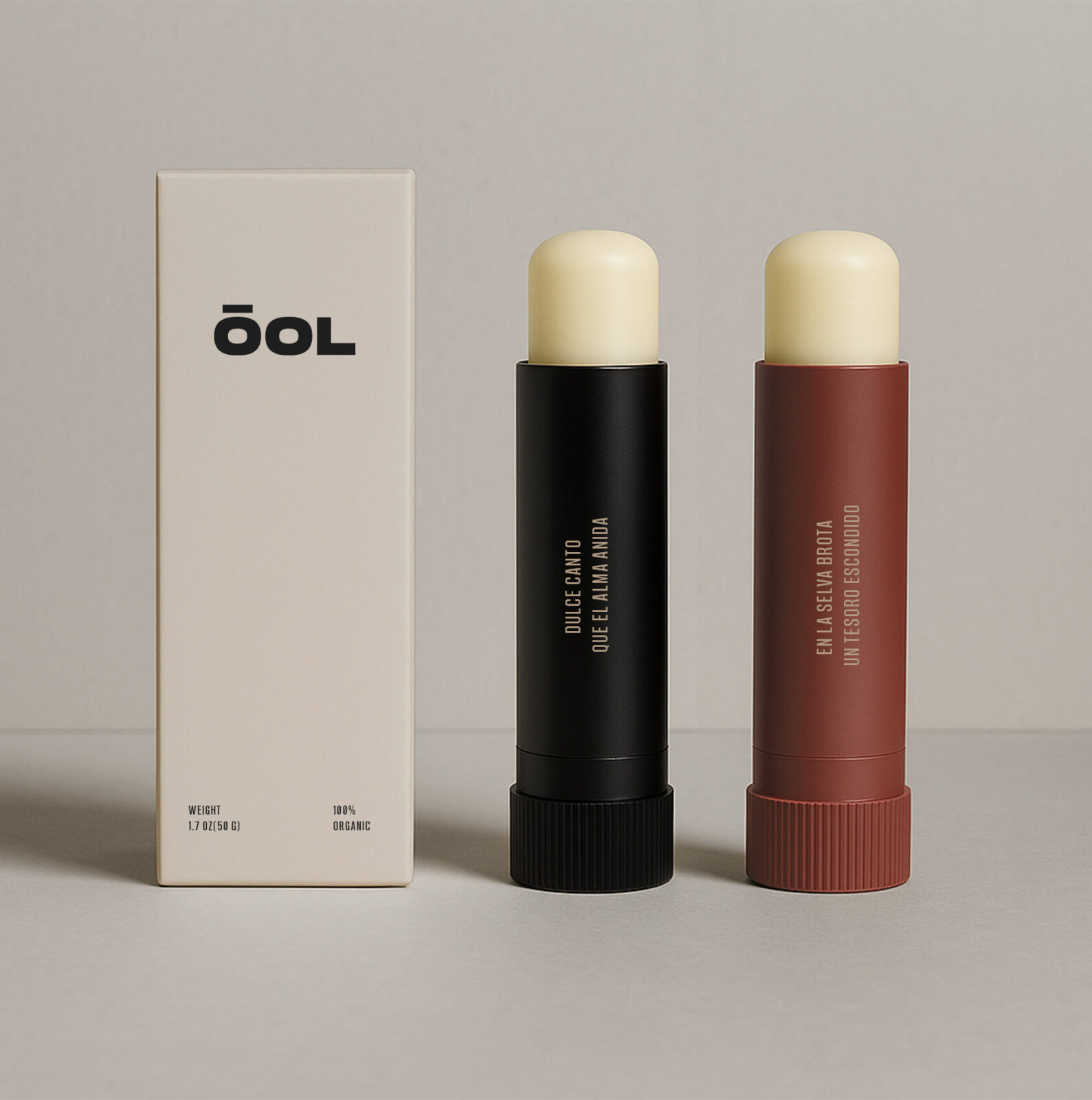
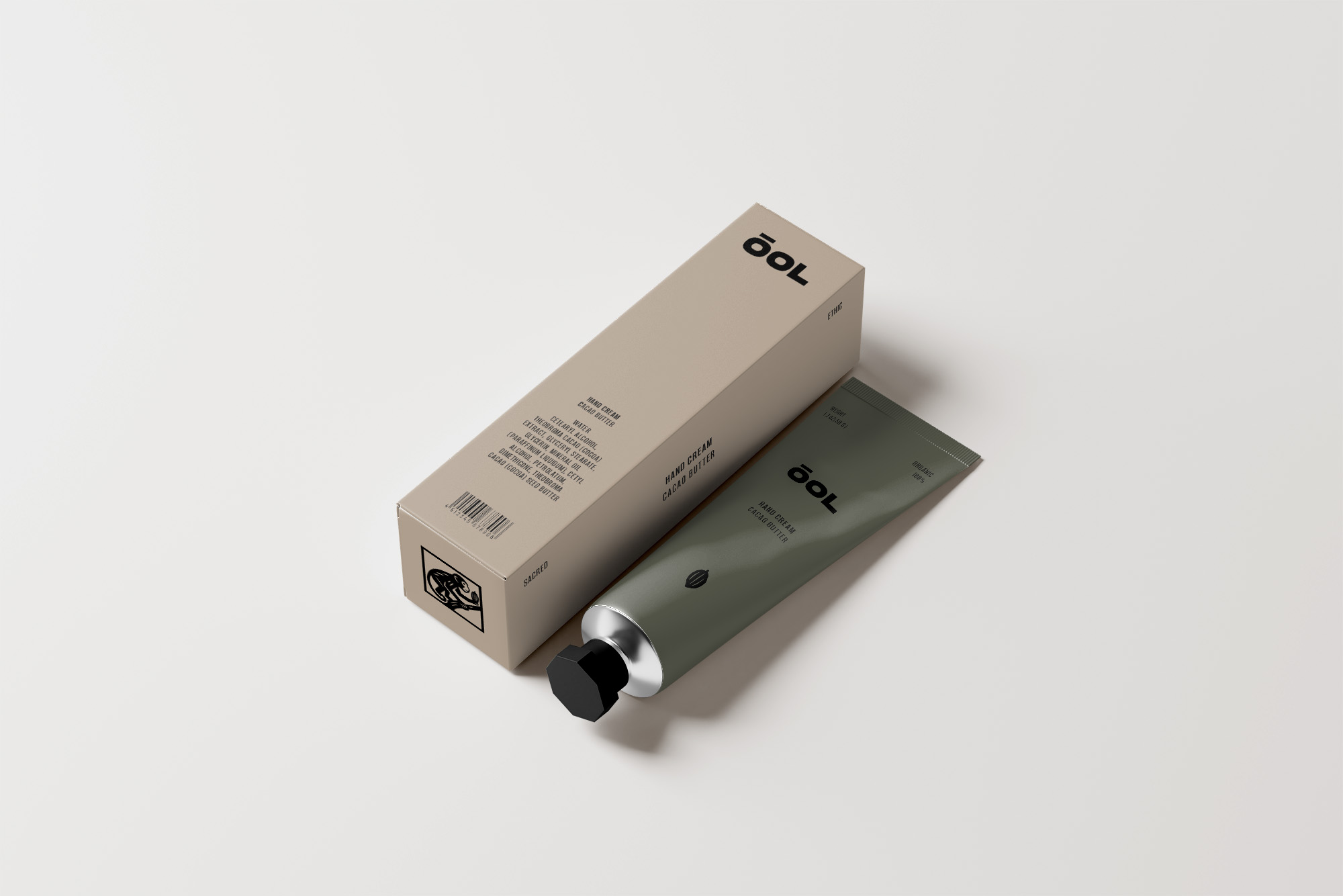
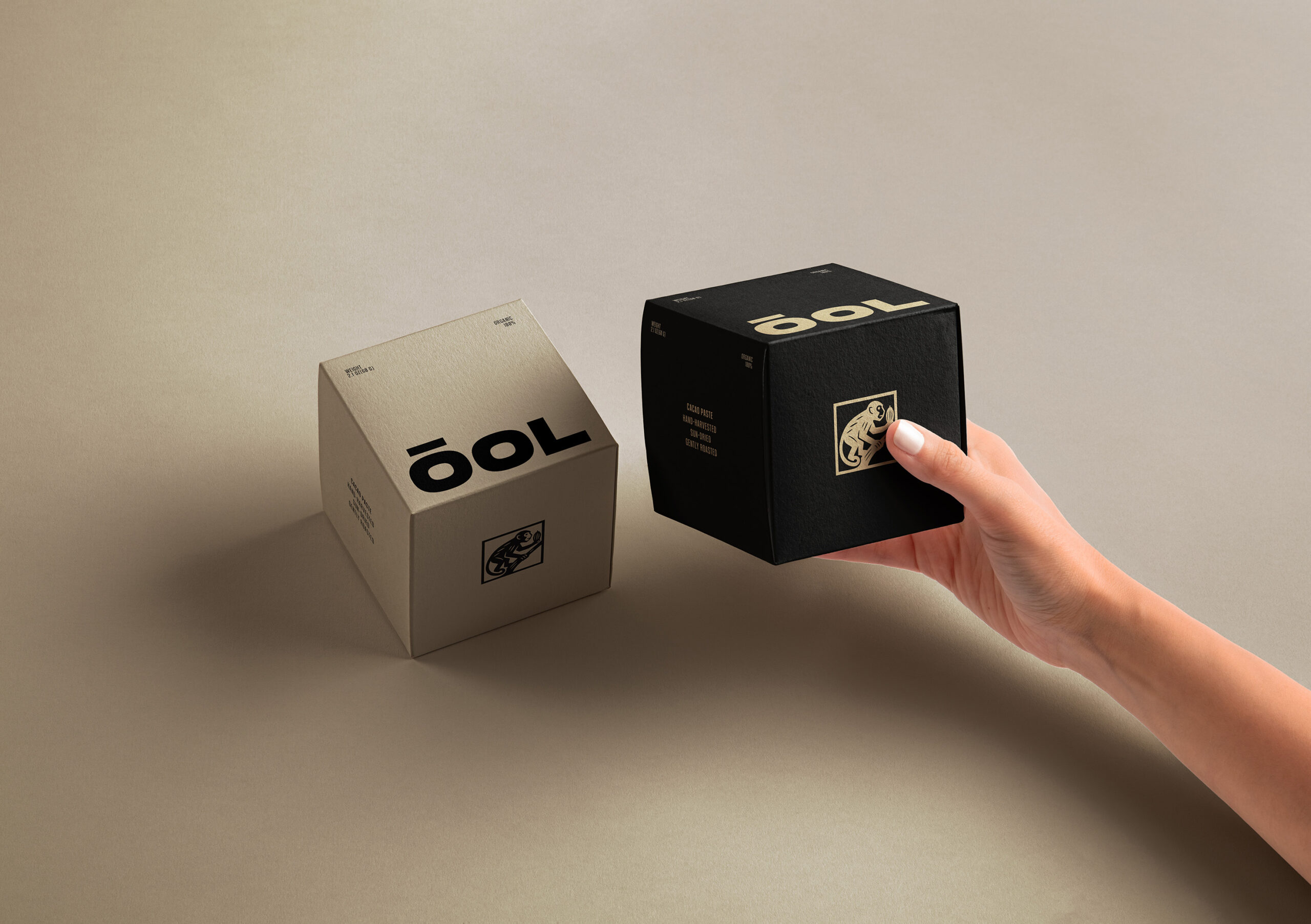
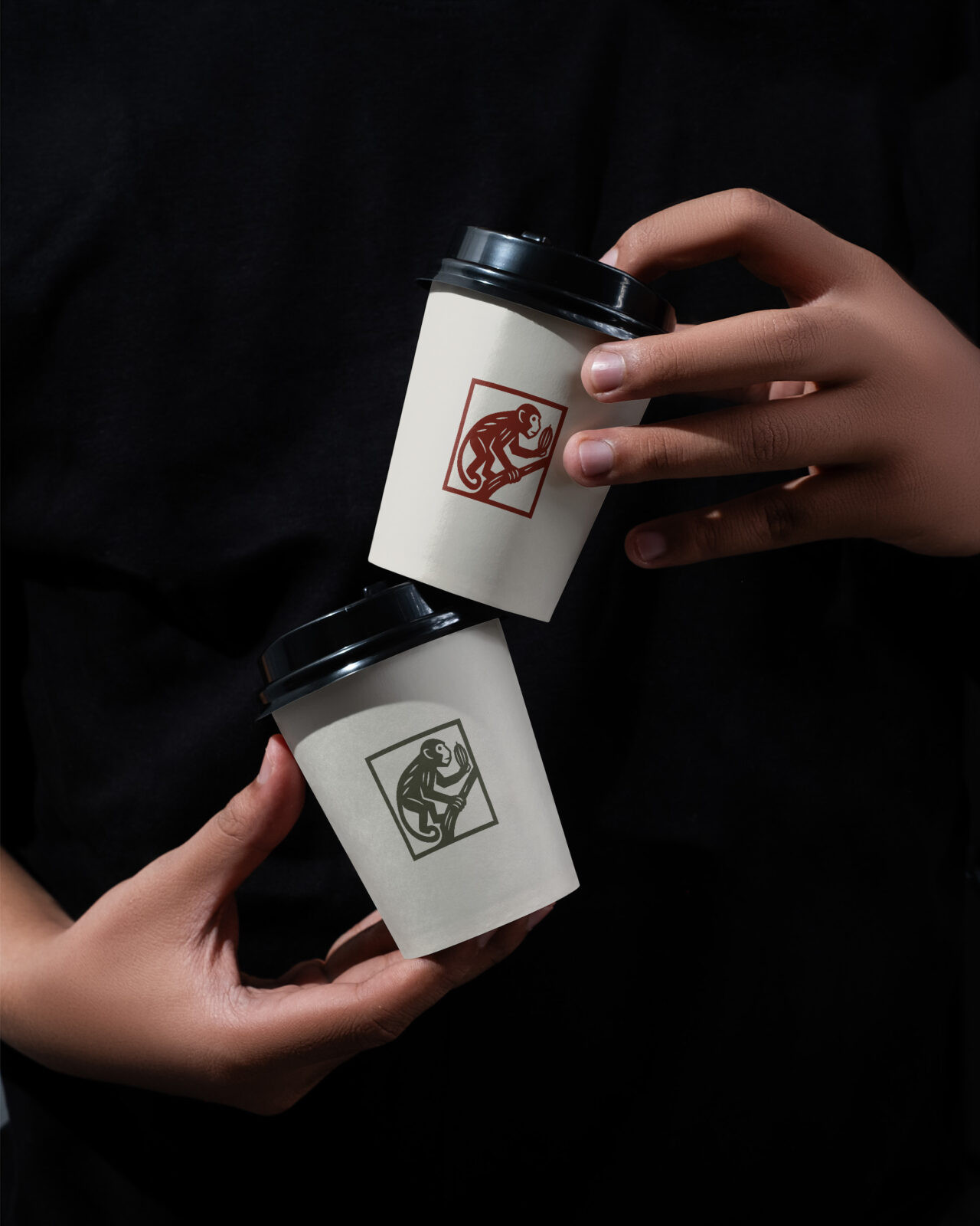
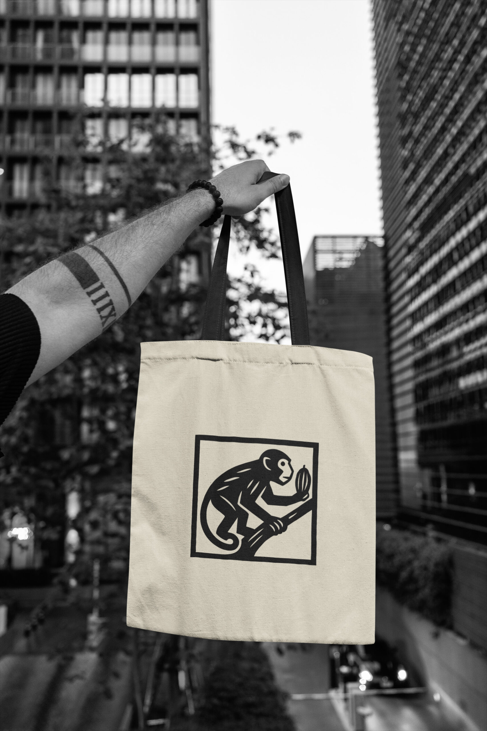
At the core of ÓOL’s identity is the figure of the capuchin monkey, illustrated through linocut engraving—a technique chosen for its historical connection to artisanal practices across Mesoamerica. This graphic gesture anchors a broader visual system that extends into packaging, signage, menus, and communication touchpoints. The modularity of the system allows for coherence across the project while evoking both memory and modernity.
The spatial journey unfolds as a sequence of stations: retail displays designed as curated “altars” for cacao products, clear transactional points that prioritize flow, and contemplative areas where visitors can connect with the cultural story of cacao. This layered design strategy positions ÓOL as more than a café: it is a cultural hub, a place of learning, and a site for collective experience.
In a city defined by acceleration, ÓOL proposes a rare pause—an architecture of slowness and intention. It bridges Latin American heritage with New York’s contemporary landscape, translating history, craft, and ritual into a living brand and spatial identity. ÓOL is not only a destination, but a design system that honors the past while shaping a thoughtful, communal future.
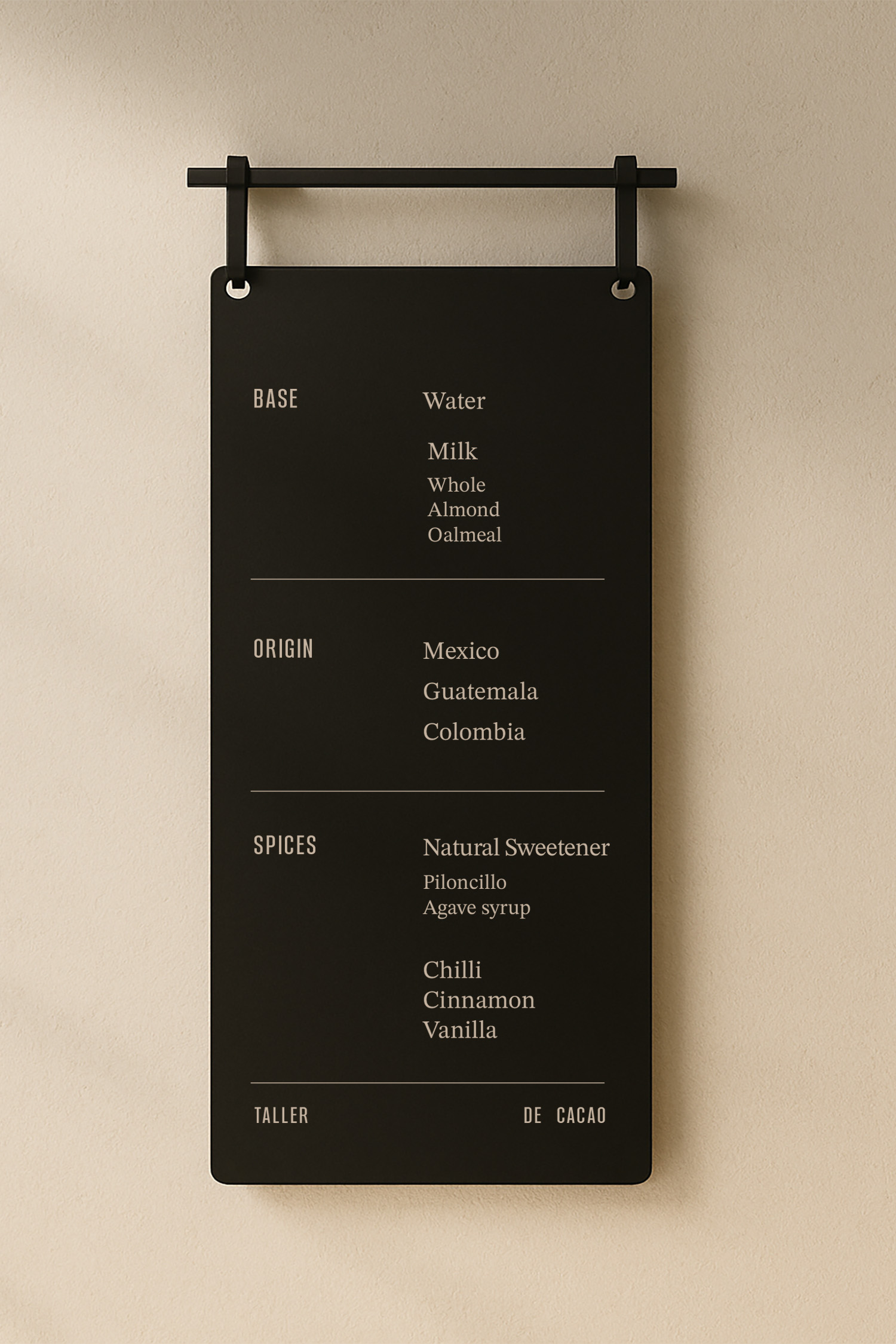
DESIGN APPROACH
Core Principles
Sensory and warm: earthy tones, tactile materials, and a slow visual rhythm
Spatial coherence: aligned with the architectural and environmental design
Versatile: scalable and adaptable without losing identity
Contemporary and conscious: clean aesthetics with soul
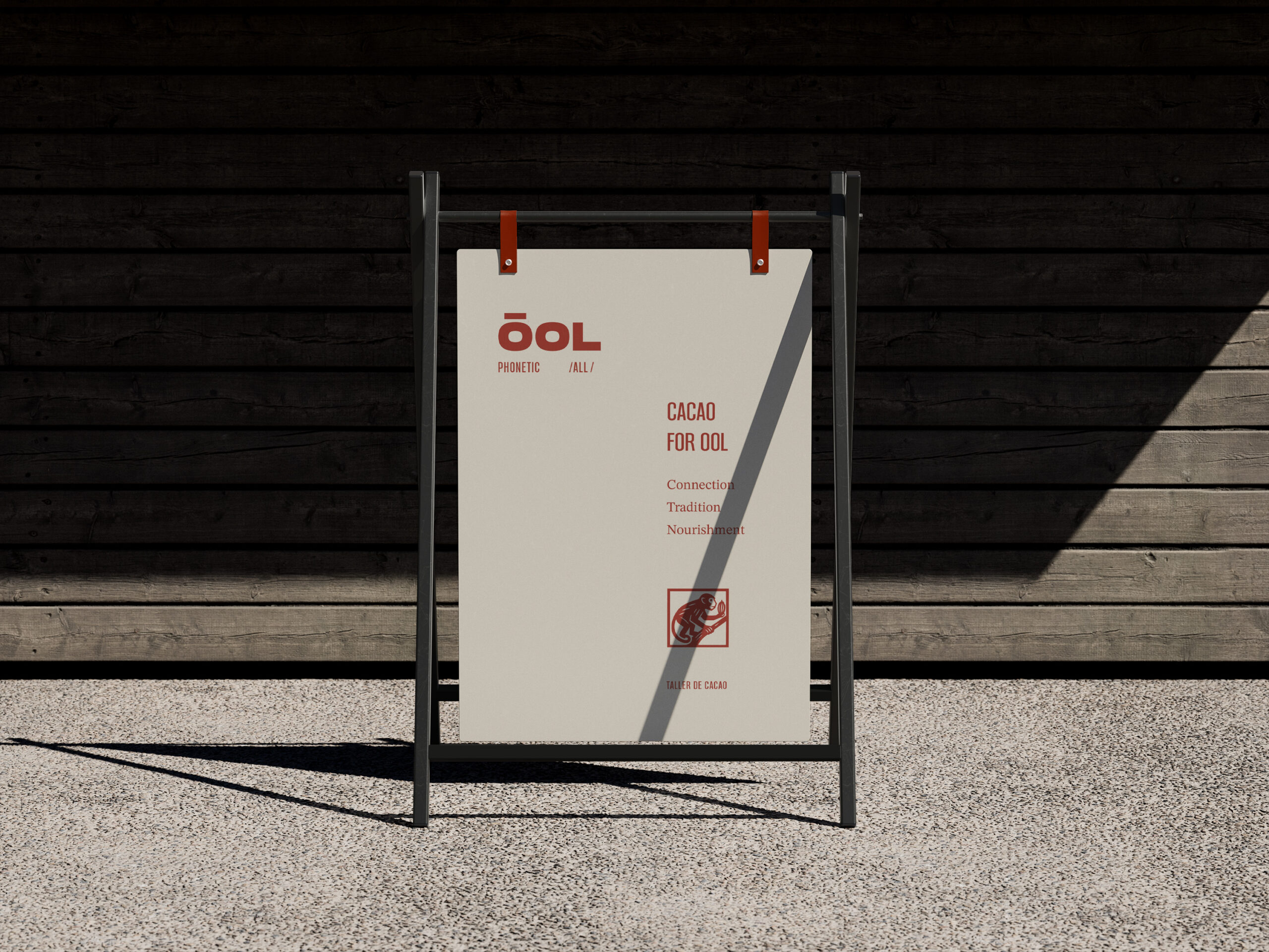
The logo is composed of a bold, heavy, and minimalist typeface that evokes the ancient visual language of Mayan and Olmec civilizations. Its geometric, weighty forms recall the strength and monumentality of ancestral design. Subtle adjustments were made to the typography—such as the accent on the “Ó”—to create a distinctive mark that carries its own identity while honoring its historical inspiration.
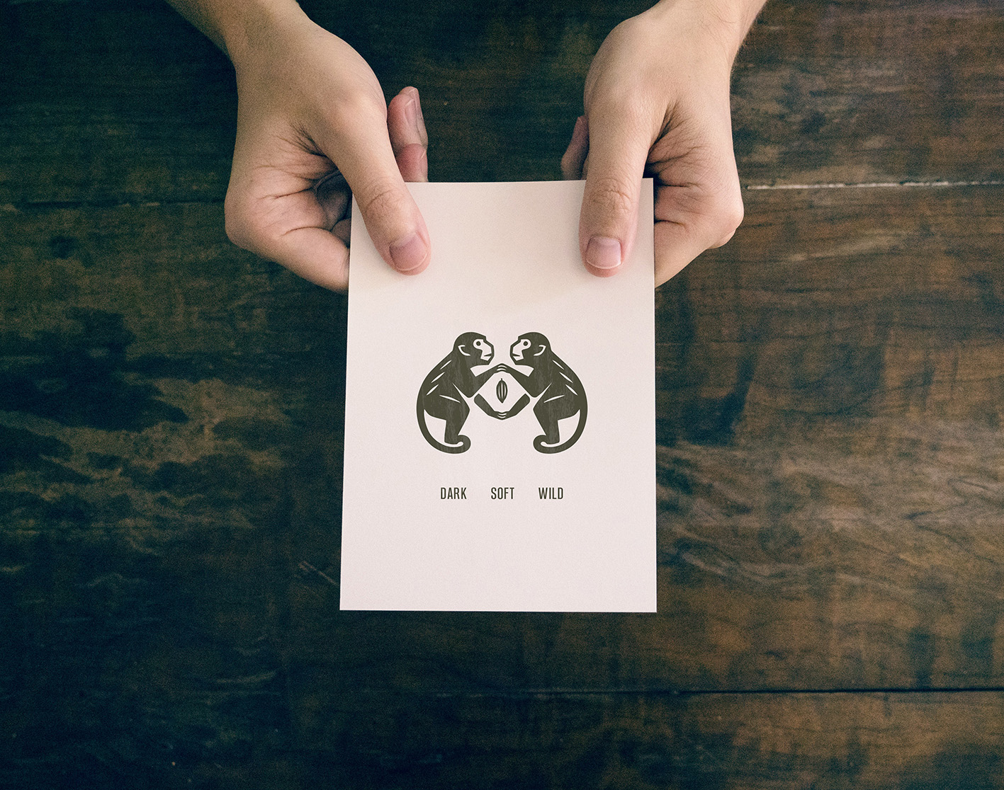
The main character is a capuchin monkey, portrayed in a real and direct way to reflect how monkeys act as natural cacao tasters in the communities where it is grown and harvested. Guided by instinct and highly developed senses, they select the finest cacao beans. People trust and follow their choices completely, relying on the monkey’s natural expertise to determine the best seeds.
The monkey is depicted through the timeless technique of linocut engraving—an ancient craft once deeply rooted in the visual traditions of Mesoamerican communities. By adopting this style, the project seeks to awaken a sense of nostalgia, transporting the viewer back to the origins of cacao and to the lands where its cultivation first intertwined with human culture. The rough textures, imperfect lines, and tactile quality of the engraving echo both the artisanal processes of cacao and the heritage of the people who nurtured it.

CREDIT
- Agency/Creative: Cantera Estudio
- Article Title: Cantera Estudio Creates ÓOL as an Architectural and Brand System Rooted in Cacao Culture
- Organisation/Entity: Agency
- Project Status: Non Published
- Agency/Creative Country: Mexico
- Agency/Creative City: Mexico City
- Market Region: New York City
- Project Deliverables: Art Direction, Brand Architecture, Brand Creation, Brand Design, Brand Experience, Brand Guidelines, Brand Identity, Brand Tone of Voice, Branding, Character Design, Creative Direction, Design, Drawing, Editorial Design, Environmental Graphics, Graphic Design, Identity System, Illustration, Infographic, Label Design, Logo Design, Packaging Design, Packaging Guidelines, Poster Design, T-Shirt Design, Tone of Voice, Typography, User Experience, Web Design
- Industry: Food/Beverage
- Keywords: WBDS Agency Design Awards 2025/26 , Ethic Heritage Clean Reverence Community Education Sensorial Ceremony Contemporary Experiential
-
Credits:
Head of Design: Karol Rosales
Senior Designer: Cori Caso
Designer: Isabel Acedo
Partner / Design Direction: Samuel Alazraki
Partner: Eduardo Castro


