


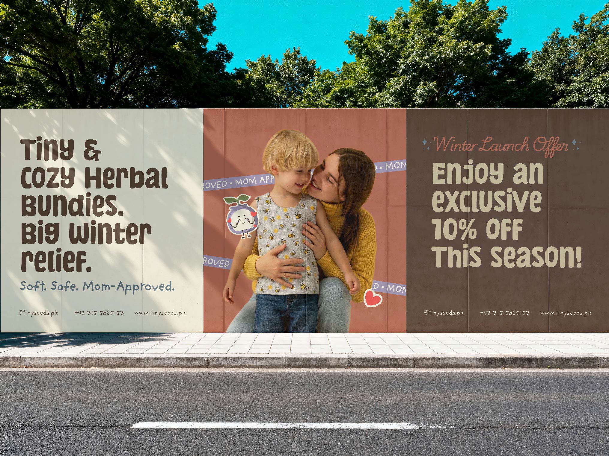
Designing Tiny Seeds was one of those rare briefs that instantly clicked—the kind where, from the very first read, you can almost feel the brand before you even begin sketching. It was a baby herbal-wear brand rooted in comfort, warmth, and natural relief, and the intention behind it was clear from the start: to create something that genuinely supports babies during those delicate early months, especially through congestion, discomfort, and winter unease. The challenge wasn’t just to make it look good—it was to translate softness, care, and healing into a visual identity that parents could immediately trust.
From the very beginning, I knew this brand needed to feel gentle but confident, calming but not dull, and cute without being overwhelming. Baby brands walk a fine line too playful and they lose credibility, too minimal and they lose warmth. Tiny Seeds needed a balance that felt intentional, breathable, and emotionally reassuring. Every decision had to answer one simple question: Would this make a parent feel safe choosing this for their baby?
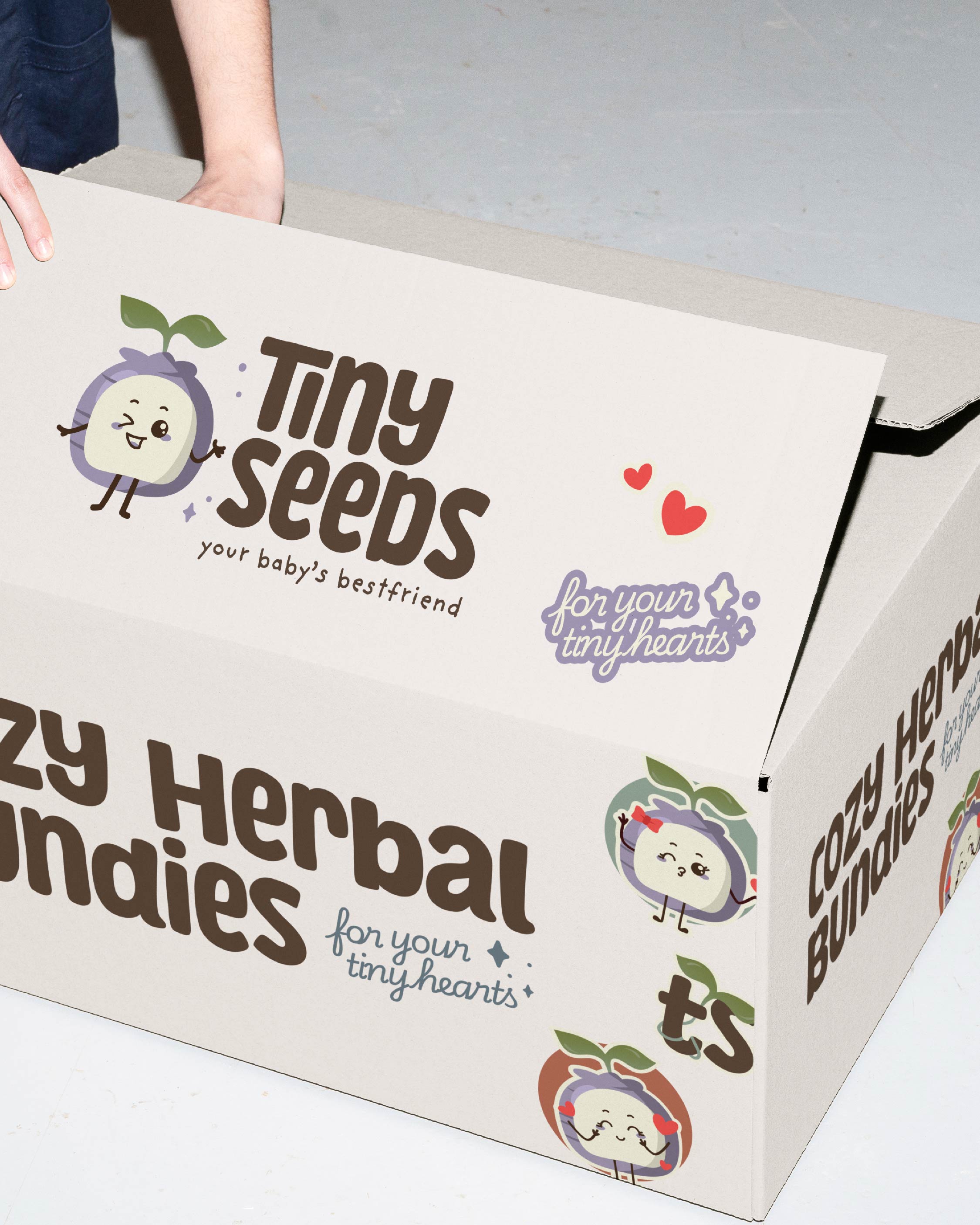
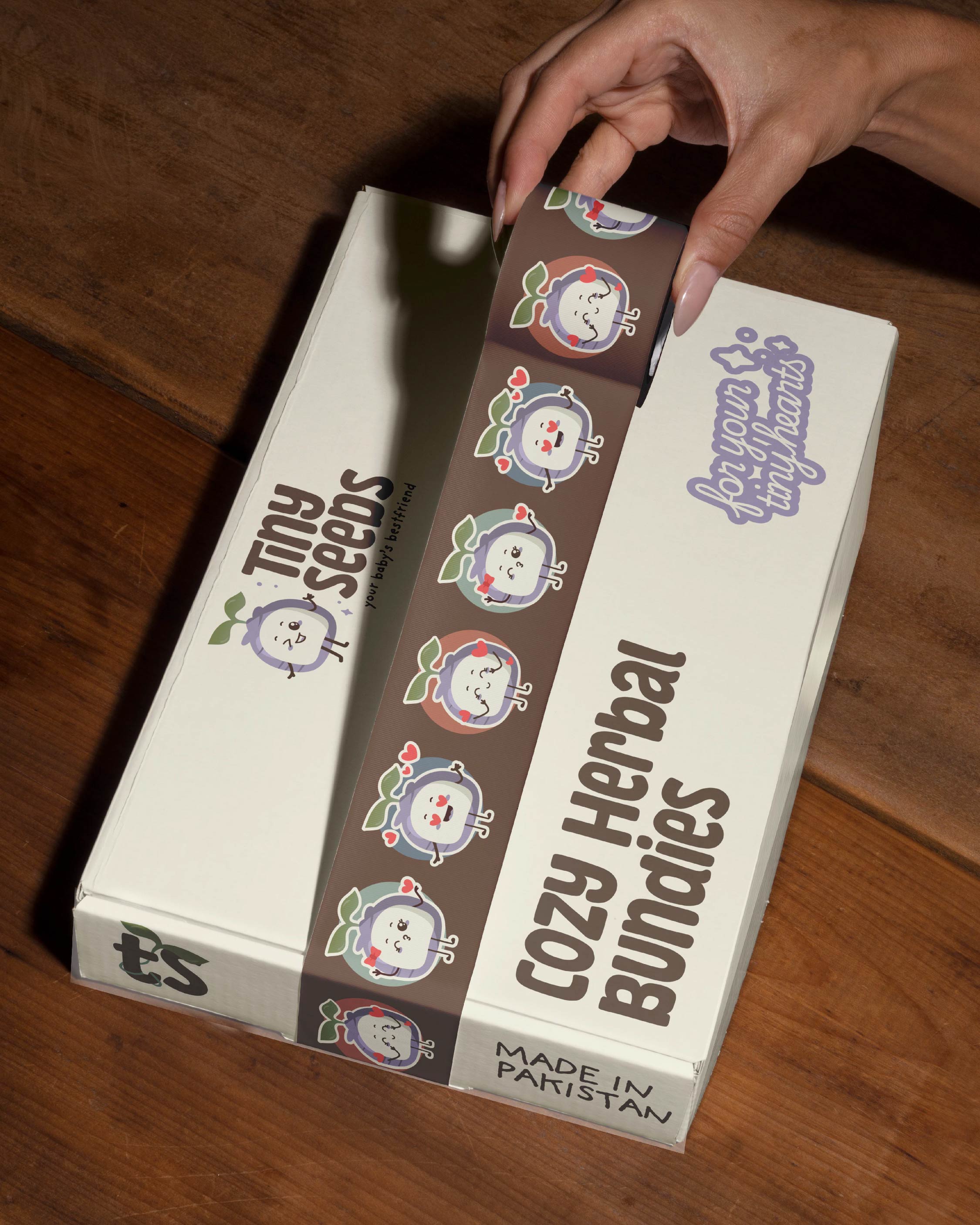
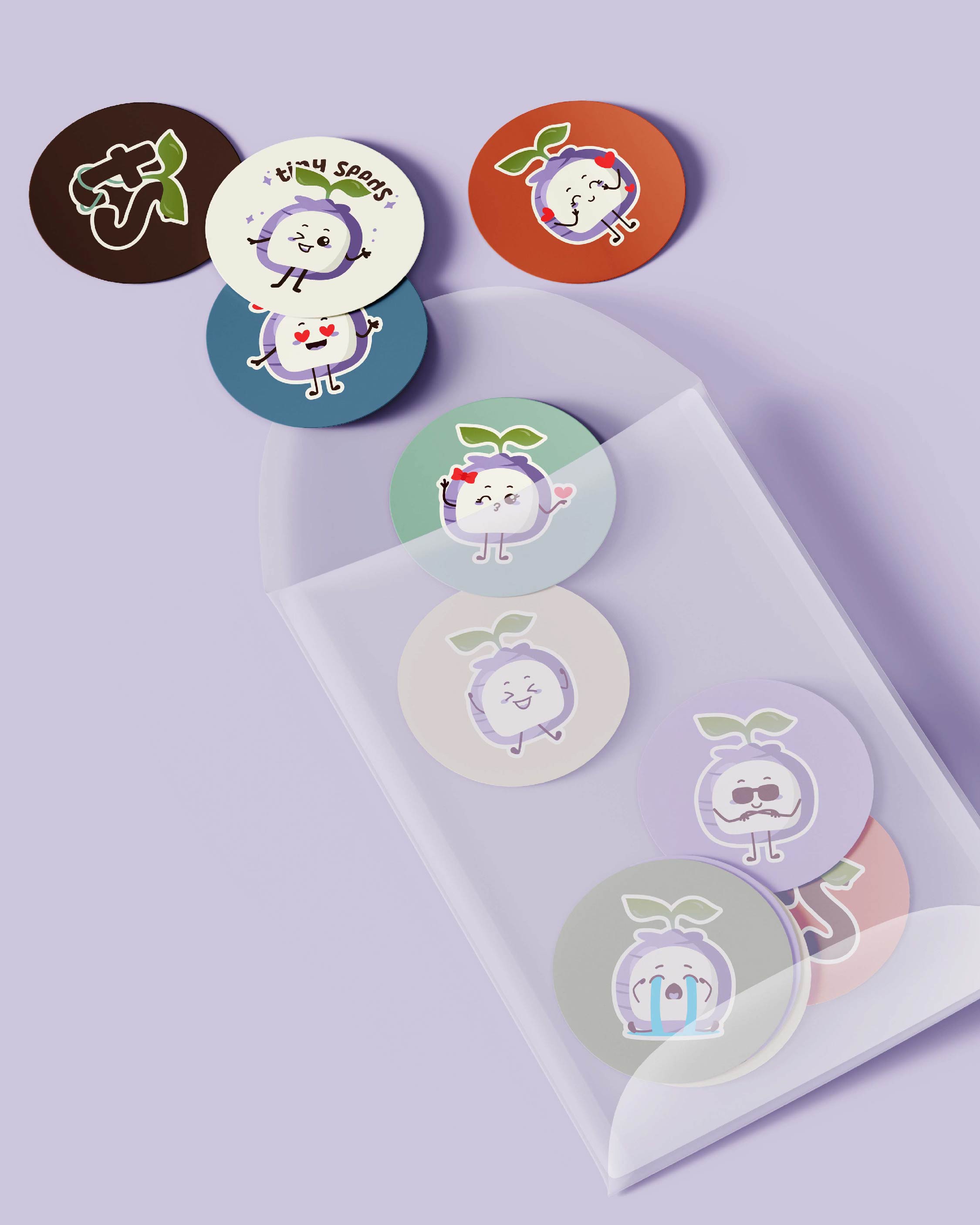
The heart of Tiny Seeds lies in nature, so the design process began there. Herbal relief is all about trust, purity, and subtle effectiveness—nothing harsh, nothing artificial. That naturally led to the development of a herb-inspired colour palette. Soft greens, muted earthy tones, and warm neutrals were carefully selected to signal calm, care, and natural healing. These colours weren’t chosen just because they look pretty together; they were chosen because they feel soothing. Green is often associated with health and balance, while warm undertones bring in comfort and emotional warmth—exactly what a baby wellness brand should communicate at first glance.
Beyond colour, shape language played a huge role in shaping Tiny Seeds’ identity. Babies instinctively respond better to rounded forms—they feel safer, softer, and more approachable. Sharp edges or harsh lines would’ve felt completely out of place. So I leaned heavily into rounded, baby-safe shapes throughout the branding. From logo elements to icons and packaging details, everything was designed to feel smooth, gentle, and unintimidating. These forms subtly communicate protection and care, reinforcing the idea that Tiny Seeds is designed with babies’ comfort at its core.
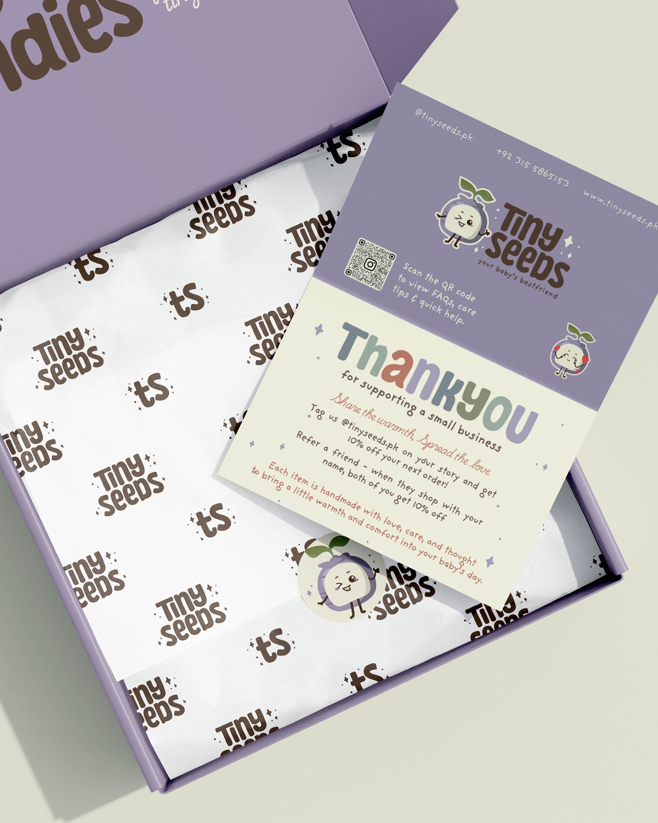
To further build trust and emotional connection, I introduced cute character stickers and playful illustrations. These weren’t added just for decoration—they serve a deeper purpose. Friendly characters help humanize the brand, making it feel nurturing and warm rather than clinical. For parents, these small details create reassurance. For babies (and even toddlers), they add familiarity and comfort. Every character was designed to feel soft, expressive, and kind—never loud or overstimulating.
At the same time, it was important that the brand didn’t feel cluttered or overwhelming. Babies need space—both physically and visually—and that philosophy guided the layout design. I focused on light, breathable compositions with generous white space, allowing each element to exist calmly without competing for attention. This design approach mirrors the brand’s promise of easier breathing and gentle relief. The layouts don’t rush you; they let you breathe, just like the product itself aims to do.
Typography was chosen with equal care. The type needed to be readable, friendly, and soft—nothing rigid or overly stylized. Rounded letterforms and clean spacing helped maintain clarity while still feeling approachable. In a baby brand, readability isn’t optional—it’s essential. Parents should be able to absorb information quickly and confidently, especially when they’re tired, stressed, or worried about their child’s comfort.
What truly made this project special, though, wasn’t just the design process—it was the collaboration. From the start, the client trusted me fully with the creative direction. She understood the value of design and gave me the freedom to explore, refine, and elevate the brand beyond surface-level aesthetics. That trust created space for creativity to flow naturally. There was no fear of experimentation, no constant second-guessing—just a shared goal of building something meaningful and thoughtful.
Honestly, the reason this project flowed as smoothly as it did is because the client was genuinely the sweetest. She believed in the process, respected the expertise, and trusted every step from concept to execution. That kind of collaboration changes everything. When a client trusts their designer, the work transforms. Ideas become stronger, decisions become clearer, and the final result feels cohesive rather than forced.
Tiny Seeds is living proof that clients who trust their designers always end up with the strongest results. When designers are given space to think deeply, design intentionally, and align visuals with purpose, the brand doesn’t just look good—it feels right. And that’s exactly what Tiny Seeds represents: warmth, care, softness, and thoughtful design rooted in genuine intention.
This project reminded me why I love designing for purpose-driven brands. It’s not just about colours, shapes, or layouts—it’s about storytelling, empathy, and creating experiences that resonate emotionally. Tiny Seeds isn’t just a baby herbal-wear brand; it’s a reflection of comfort, trust, and gentle care, brought to life through intentional design.
Looking back, this wasn’t just another branding project—it was a reminder that when the right brief meets the right trust, the result speaks for itself. And Tiny Seeds? It speaks softly, warmly, and beautifully.
CREDIT
- Agency/Creative: Designs by Maria
- Article Title: Tiny Seeds Baby Herbal-Wear Brand Identity by Designs by Maria
- Organisation/Entity: Freelance
- Project Type: Identity
- Project Status: Published
- Agency/Creative Country: Pakistan
- Agency/Creative City: Karachi
- Market Region: Global
- Project Deliverables: Brand Design, Brand Identity, Character Design, Graphic Design
- Industry: Fashion
- Keywords: Branding, baby herbal wear, baby wear, fashion, brand identity, character design
-
Credits:
Brand Identity Designer: Maria Saifuddin


