


Ersie — The Rebirth of Heritage Through Design
Introduction – Origins and Context
Ersie was born from a simple yet powerful question: How can heritage evolve without being consumed by nostalgia?
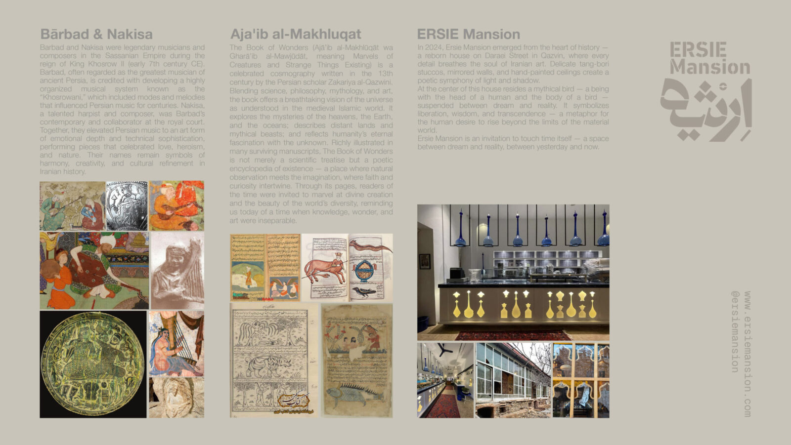
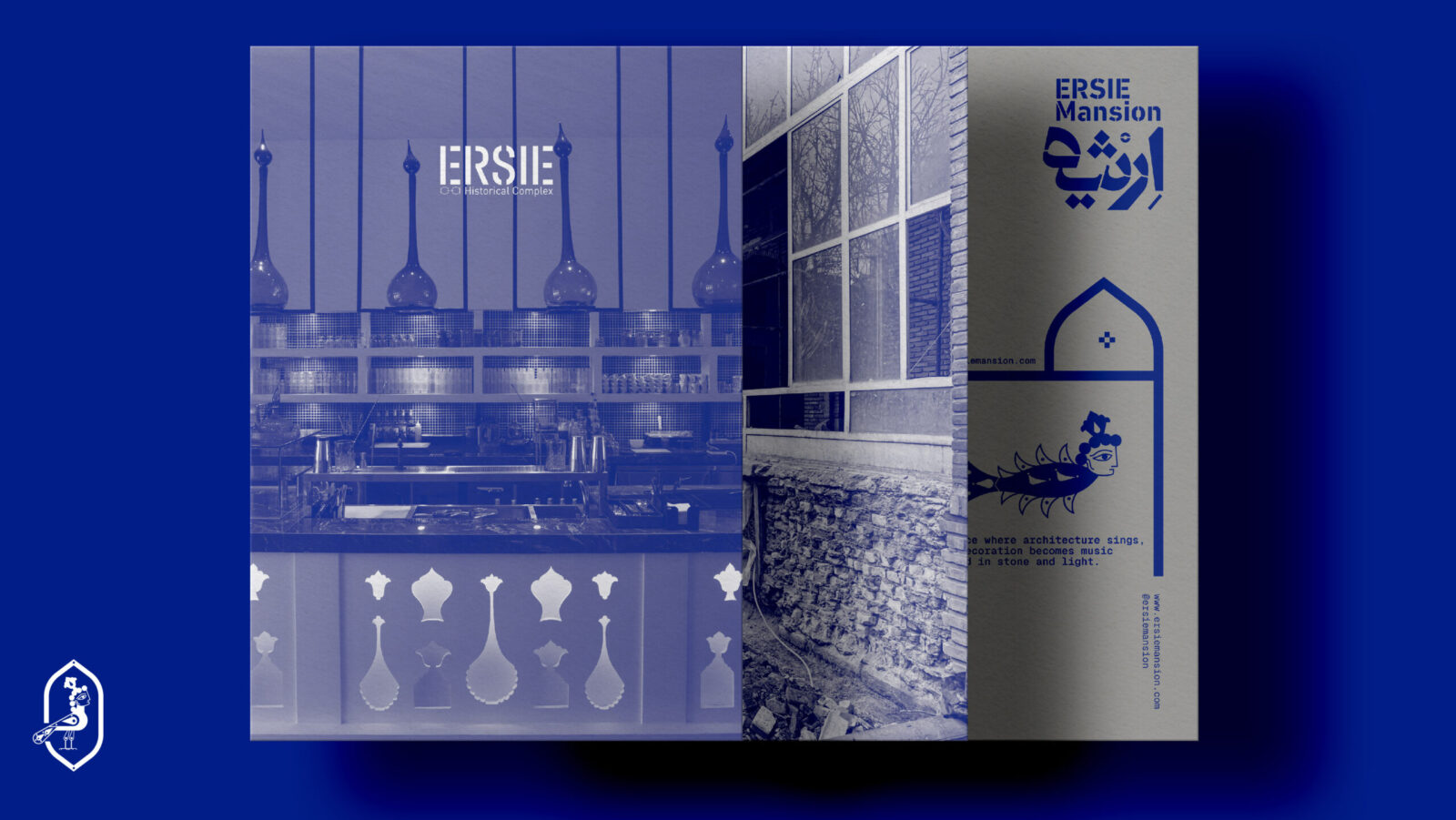
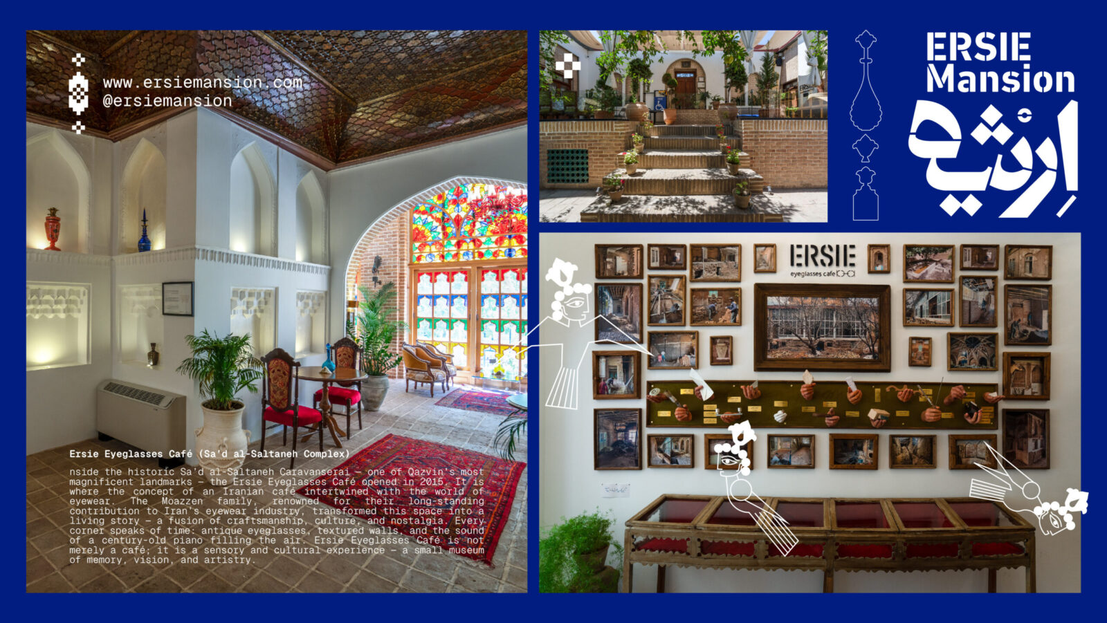
Located in the historic city of Qazvin, Iran, Ersie represents a dialogue between memory and modernity, between inherited culture and contemporary design. The project began in 2015 with the Ersie Eyeglasses Café, established inside the Sa’d al-Saltaneh Caravanserai — a 19th-century complex once owned by Haj Ismaeel Moazzen, a figure deeply tied to Qazvin’s commercial and cultural past. The Moazzen family, known for their decades-long contribution to Iran’s eyewear industry, envisioned a space that merged craftsmanship with everyday culture — a café that was both social and symbolic, a living museum of vision and time.
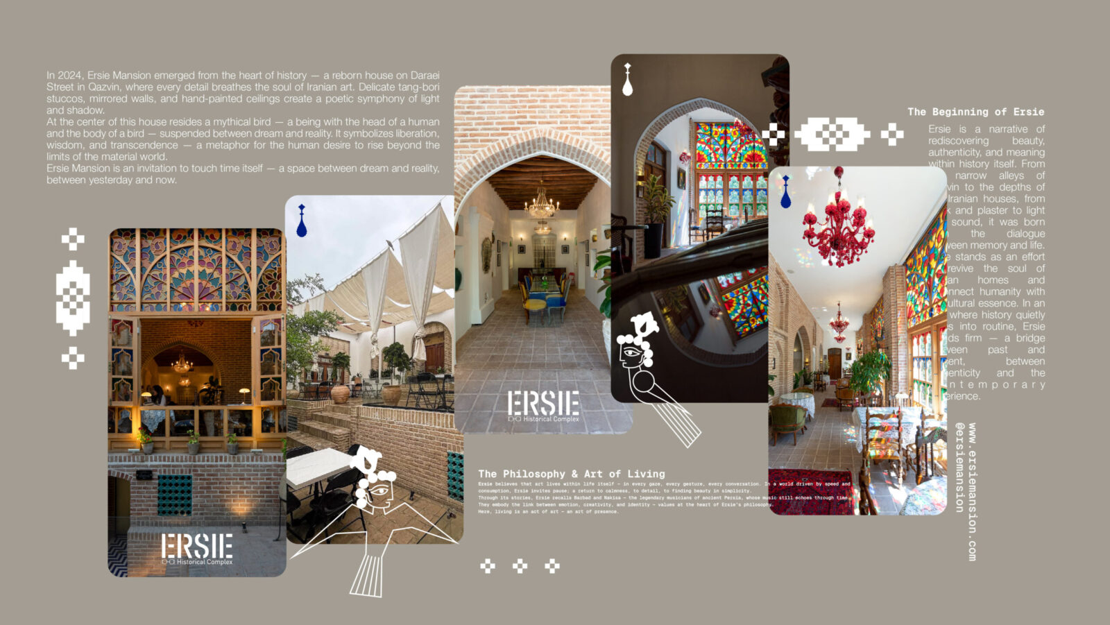
In 2024, Ersie expanded into its second chapter: Ersie Mansion, a reborn residence on Daraei Street. This new space reimagines the domestic language of Iranian architecture — its courtyards, stucco carvings (tang-bori), mirrorwork, and ornamentation — through a contemporary lens. It is not merely a place of leisure, but an exploration of how design can translate collective memory into form, light, and experience.
Together, these two sites — the café and the mansion — form the dual identity of Ersie: one grounded in commerce and craft, the other in culture and contemplation. Both are united by a single mission — to reinterpret Iranian heritage through the methodology of design.
Concept Development – The Philosophy of Ersie
At its core, Ersie is not a brand or a building; it is a philosophy of presence. It stems from the belief that art exists not in objects, but in the act of living itself.
Ersie approaches heritage not as a fixed monument but as an evolving conversation. It invites people to pause, reflect, and reimagine their connection with the spaces they inhabit. The project positions design as a language capable of carrying emotional, historical, and sensory meaning — a bridge between the tangible and the imagined.
The conceptual DNA of Ersie was built around three guiding ideas:
Heritage as living narrative – culture is not preserved through replication, but through reinterpretation.
Imagination as cultural memory – myths and archetypes are not relics; they are tools for creative renewal.
Design as translation – contemporary design must translate timeless ideas into modern experiences.
In both its spatial and visual expressions, Ersie aims to awaken what might be called “the cultural subconscious” — the shared imagery, colors, and geometries that have defined Iranian aesthetics for centuries.
Design Process – From Myth to Form
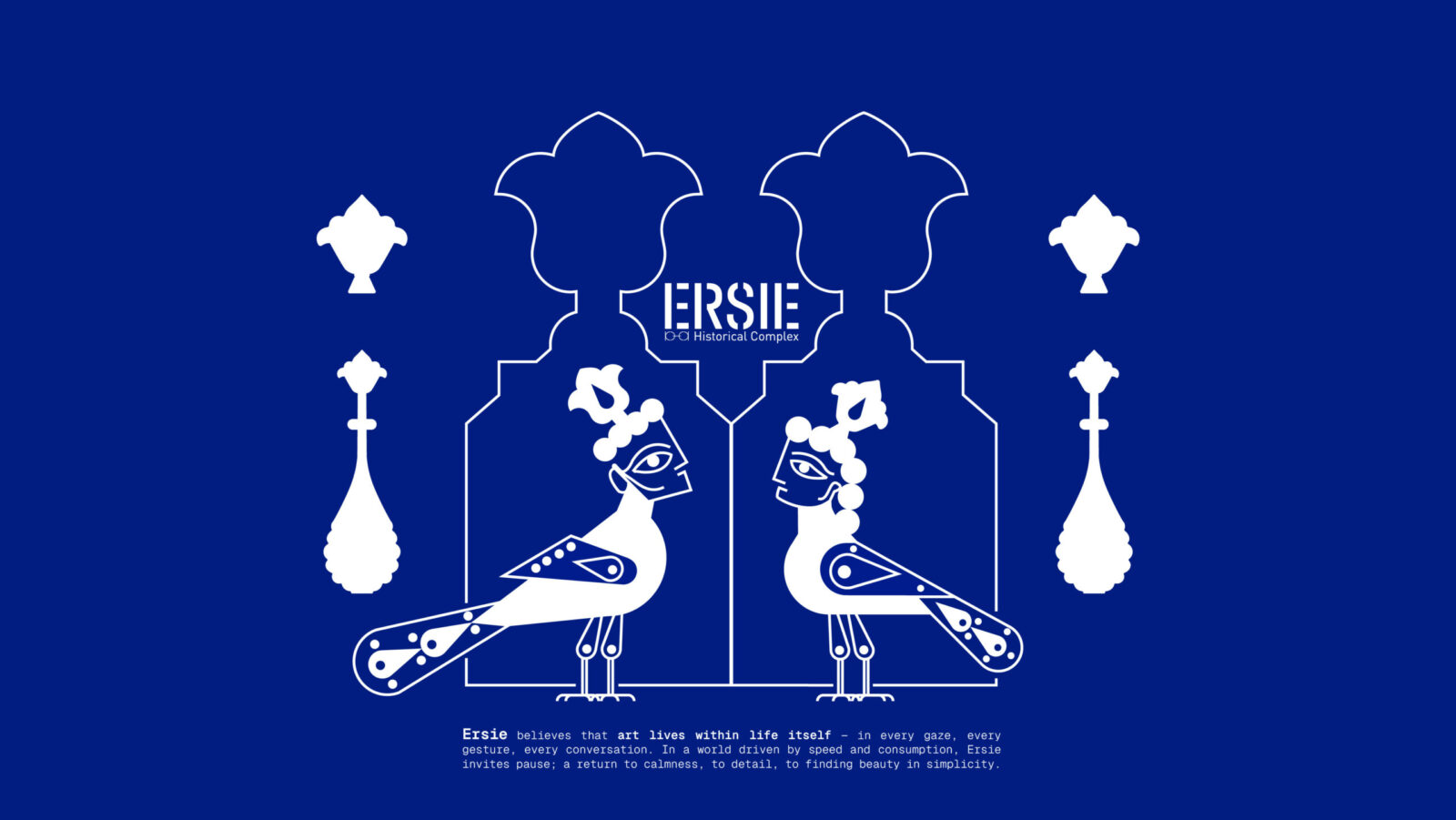
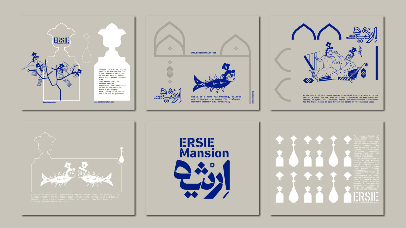
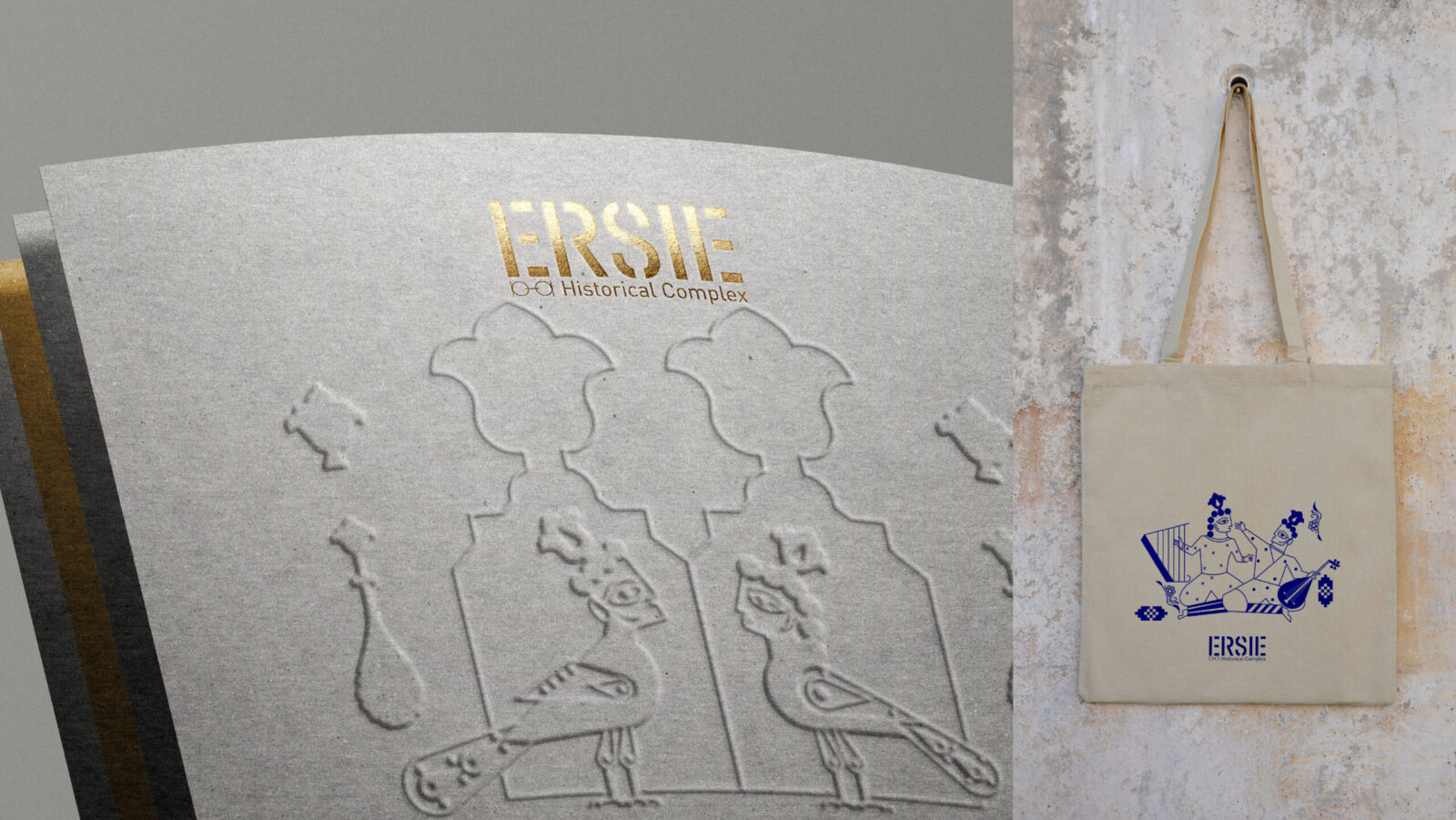
The design journey of Ersie began with the study of ancient Persian mythologies and visual archetypes. Among the many symbolic figures that populate Iranian art, one image stood out: the Bird of Imagination — a mythical creature with the head of a human and the body of a bird.
This hybrid being, present in pre-Islamic reliefs, illuminated manuscripts, and oral legends, became the central metaphor of Ersie’s design identity. It represents the eternal human desire to transcend, to look beyond the material world toward imagination and freedom.
The design team explored how this archetype could evolve into a contemporary design language. The challenge was to express spirituality without nostalgia — to preserve cultural resonance while achieving modern simplicity.
Sketches, pattern explorations, and 3D studies of the bird’s geometry led to an abstracted emblem — not a literal creature, but a composition of curves, lines, and light forms that evoke flight, vision, and balance. This abstract metaphor became the nucleus of Ersie’s identity — influencing the brand mark, the spatial motifs, and even the rhythm of the typography.
The process was iterative and research-driven: historical references were cross-examined with architectural geometries, while the sensory qualities of materials — texture, reflection, tactility — informed the final design solutions.
Spatial Experience and Materiality
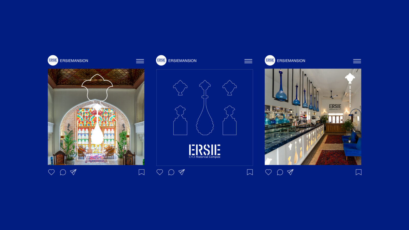
In both of Ersie’s spaces, design acts as a storyteller. At the Eyeglasses Café, brick textures, soft plaster walls, and aged materials coexist with modern fixtures — allowing heritage to breathe through a contemporary vocabulary. Visitors encounter objects of memory — old lenses, carved mirrors, fragments of architectural ornament — yet the composition remains minimal, human, and inviting.
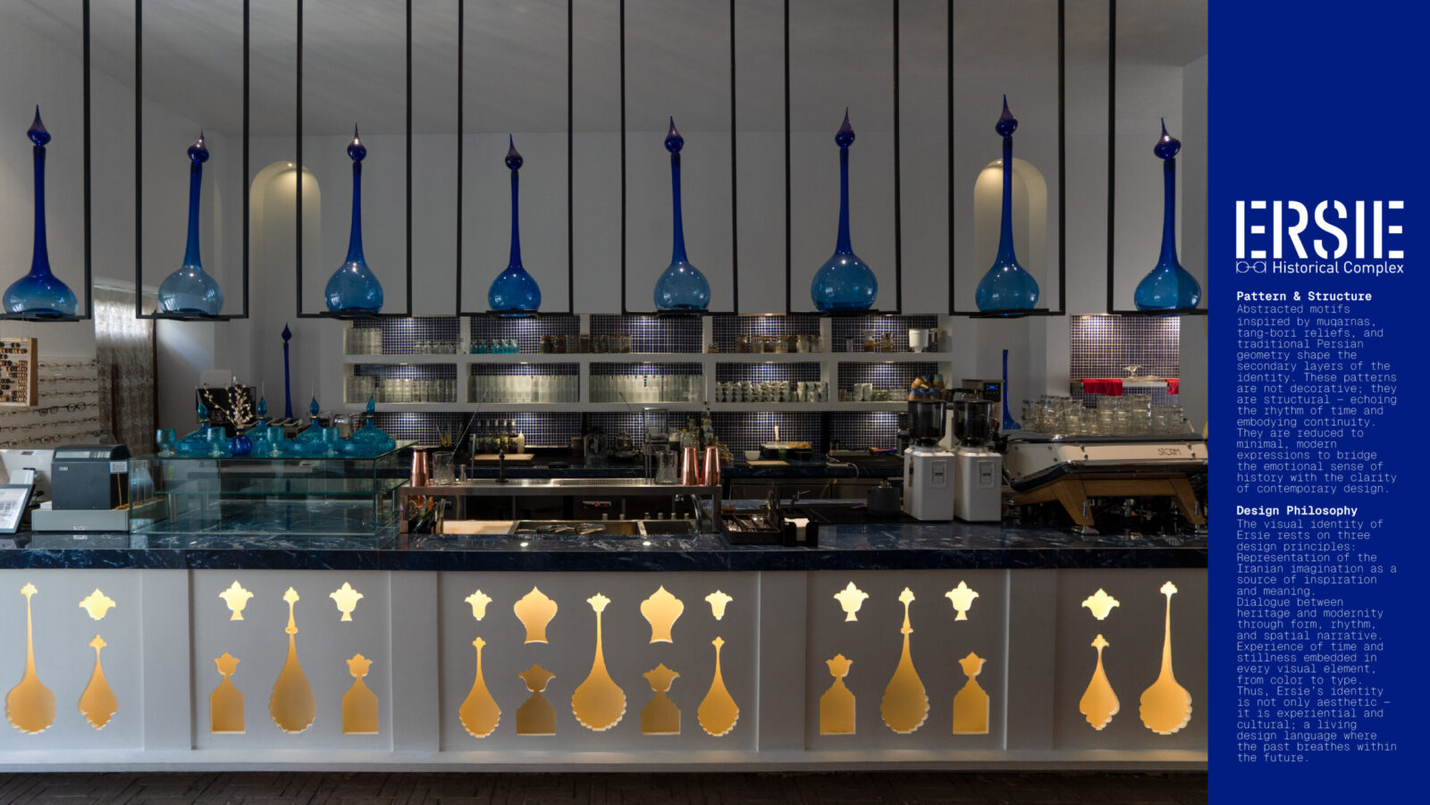
At the Mansion, spatial composition becomes almost theatrical. Light filters through mirror fragments, bouncing off stucco surfaces and ceiling paintings to create an atmosphere suspended between dream and reality. The architectural restoration retained original elements of tang-bori and muqarnas while integrating modern interventions: concealed lighting, neutral color palettes, and minimalist furnishings that frame — rather than compete with — historical details.
Every material was chosen for its duality: tactile yet symbolic, traditional yet abstractable. Brick, plaster, mirror, and gold were reinterpreted not as decoration but as mediums of emotion. The result is a choreography of sensory experiences — where space, color, and silence compose a unified narrative of time.
Visual Identity System
The visual identity of Ersie operates as the graphic reflection of this spatial philosophy. It translates the brand’s conceptual triad — heritage, imagination, and design — into a cohesive system of symbols, colors, and forms.
Symbol and Logo
At the center stands the emblem of the Mythical Bird of Imagination. Rather than depicting a literal figure, the logo captures its essence through fluid geometry: an upward curve suggesting ascent, an inner loop symbolizing introspection, and balanced proportions echoing architectural rhythm. This structure follows the golden ratio found in Persian geometry — creating harmony between emotional symbolism and mathematical logic.
Typography
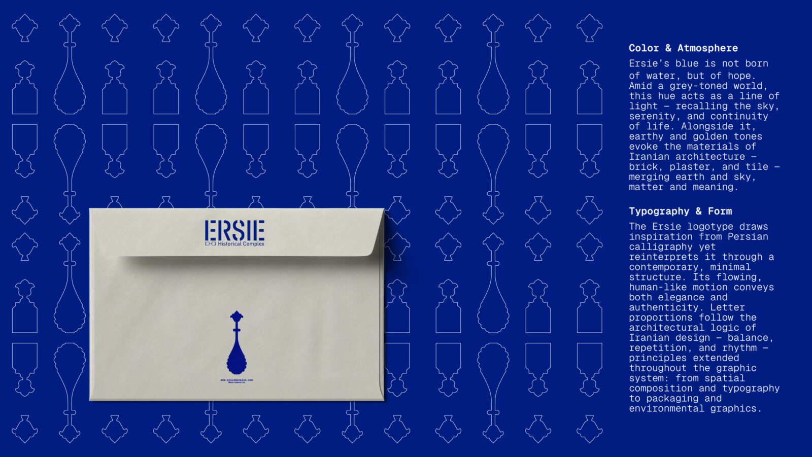
The logotype draws from Persian calligraphy, specifically nasta’liq and shekasteh scripts, yet it has been reconstructed within a modern typographic grid. The outcome is a word mark that feels handcrafted and timeless, while maintaining international readability. Letterforms flow organically, imitating the motion of handwriting but grounded in strict proportion — much like the balance between chaos and order in Iranian art.
Color and Atmosphere
Color plays a symbolic role in the identity system. The Ersie Blue — neither sky blue nor turquoise — was developed as a new chromatic signature. It represents hope, continuity, and emotional calm. This hue, paired with earthy terracotta and muted gold, establishes a dialogue between sky and soil, light and matter, dream and memory. Together, these tones create a timeless palette that resonates both culturally and psychologically.
Pattern and Structure
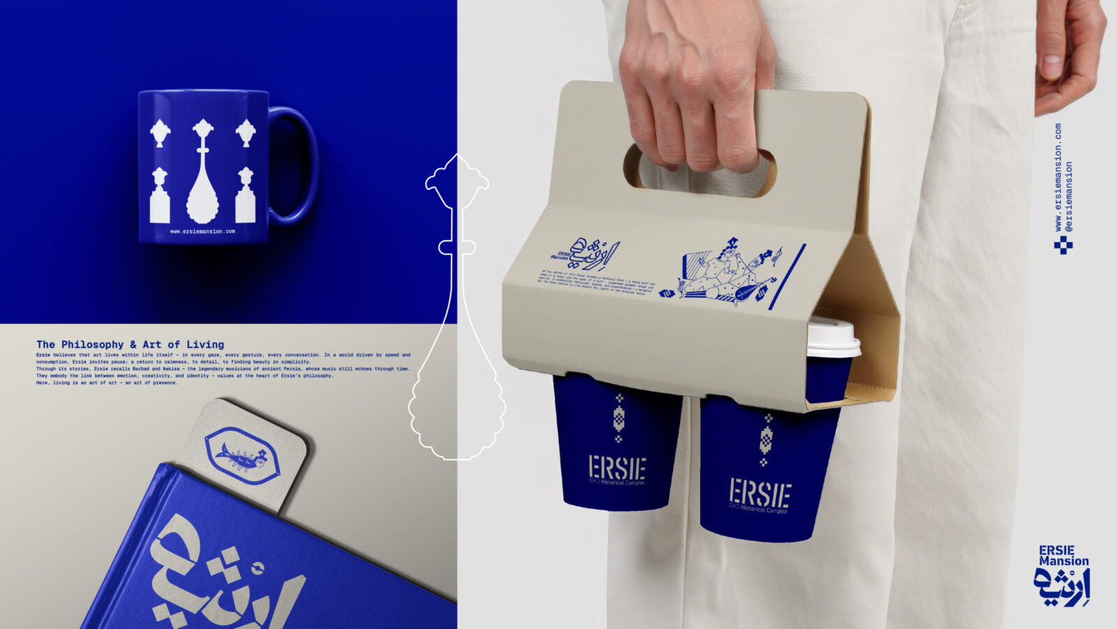
Supporting graphics borrow from the geometry of muqarnas, stucco motifs, and Persian ornamental symmetry. These elements were digitized, deconstructed, and reassembled into abstract layers — used across print materials, packaging, signage, and environmental design. By reducing complex ornamentation into minimalist structures, the identity achieves visual continuity while preserving cultural depth.
System Application
The system is modular and scalable. Whether applied on packaging, spatial graphics, or digital interfaces, the visual language maintains coherence through proportion, texture, and rhythm. Each application becomes an extension of the same story — where design functions as an act of remembrance.
Design Challenges and Resolutions
The greatest challenge was translation — how to convert centuries of artistic and emotional meaning into a design language that feels alive today.
Three key tensions guided the process:
Tradition vs. Modernity – balancing authenticity without imitation.
Complexity vs. Simplicity – preserving depth while ensuring clarity.
Cultural Specificity vs. Global Accessibility – designing for Iranian identity while speaking an international design language.
The design process responded through constant abstraction: reducing visual noise to reveal essential form, extracting symbolic resonance from material, and aligning every decision with Ersie’s conceptual values. In doing so, Ersie transcended mere decoration and became a system of cultural thinking — a model for how design can embody identity.
Cultural and Emotional Impact
Ersie extends beyond the boundaries of architecture or branding. It acts as a cultural interface — reintroducing Iranian aesthetics into contemporary global discourse.
In a time when many traditional spaces are either commodified or abandoned, Ersie demonstrates how design can mediate between preservation and innovation. It revitalizes local craftsmanship, engages younger audiences with heritage, and redefines what “Iranian design” can mean in the 21st century.
Emotionally, Ersie restores a sense of presence. Visitors experience stillness — a luxury in modern life — and through that stillness, they reconnect with meaning. Design here is not only visual but existential: a reminder that beauty, like memory, survives when it is lived.
Ersie has also inspired collaborations among architects, graphic designers, and artisans, acting as a platform for cross-disciplinary dialogue. Its success lies not in its commercial expansion, but in its ability to provoke reflection — to make people see their own culture with new eyes.
Conclusion – A Living Bridge Between Past and Future
Ersie stands as a bridge — between the intimacy of the Iranian home and the universality of contemporary design, between inherited myth and creative imagination.
Through its architecture, materials, and identity system, Ersie redefines how heritage can inhabit the present without losing its soul. It is both local and global, both quiet and expressive — a design that does not shout but resonates.
Ultimately, Ersie is not just a space or a brand. It is an act of cultural continuity — a reminder that imagination is itself a form of heritage, and that design, at its highest purpose, is the art of remembering beautifully.

CREDIT
- Agency/Creative: Nim Studio
- Article Title: Nim Studio Shapes Ersie Into a Living Dialogue Between Memory and Modern Design
- Organisation/Entity: Agency
- Project Status: Published
- Agency/Creative Country: Iran, Islamic Republic of
- Agency/Creative City: Tehran
- Market Region: Iran/ Qazvin
- Project Deliverables: Art Direction, Brand Architecture, Brand Design, Brand Guidelines, Brand Identity, Brand Redesign, Brand Strategy, Brand Tone of Voice, Branding, Character Design, Design, Drawing, Graphic Design, Icon Design, Identity System, Illustration, Label Design, Logo Design, Motion Graphics, Packaging Design, Pattern Design, Set Design, Sketching, Typography
- Industry: Hospitality
- Keywords: WBDS Agency Design Awards 2025/26 , branding, visual identity, cafe, restaurant, hospitality, spatial design, cultural space, Iran, Architecture, Art & Culture
-
Credits:
Art Director: Hesam Matin
Designer: Elham Nouri
Designer: Mahdis Malakooti
Motion Designer: Erfan Sobhani
Brand Strategist: Arefeh Tazari
Brand Owner: Ali Moazzen


