


NYX is a bold, trend-driven drugstore makeup brand with an affordable price point, catering to 15 to 30-year-olds. NYX has always been about fearless self-expression, but their branding needs a refresh to match their high-energy, trendsetting products. This rebrand revitalizes NYX with a cohesive, modern, and flexible design system that captures the brand’s bold personality while creating clarity across every touchpoint.
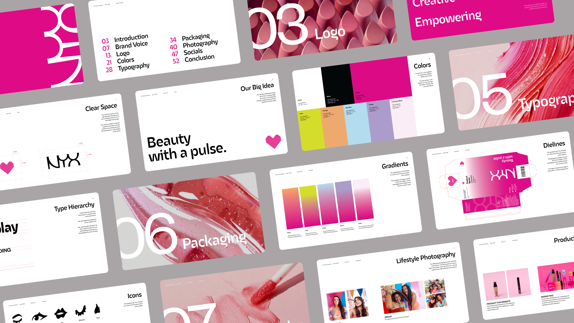
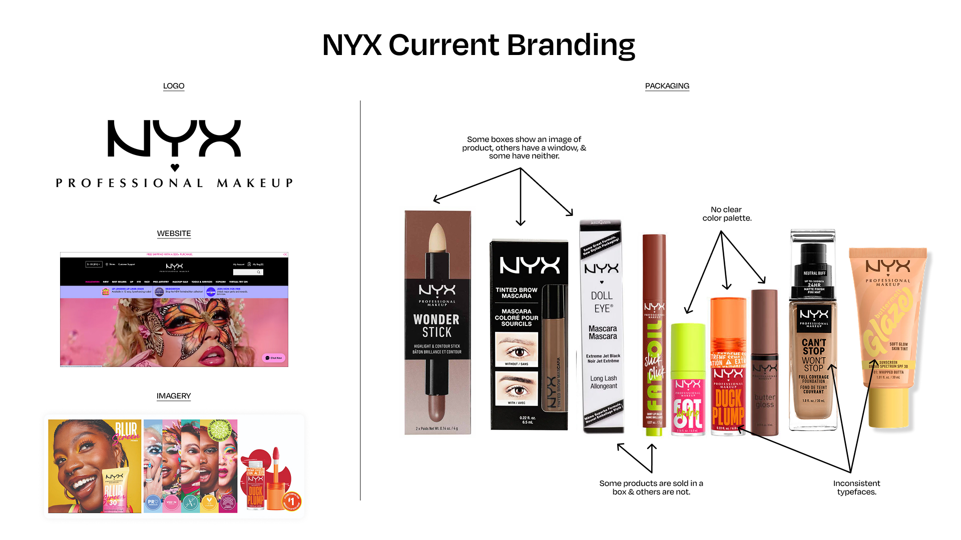
The project began with an in-depth brand analysis, which revealed a lack of cohesion: fonts, colors, and packaging varied widely, and the overall system lacked structure. The solution was clear: build a unified aesthetic that’s instantly recognizable, adaptable across product lines, and reflective of NYX’s fearless spirit.
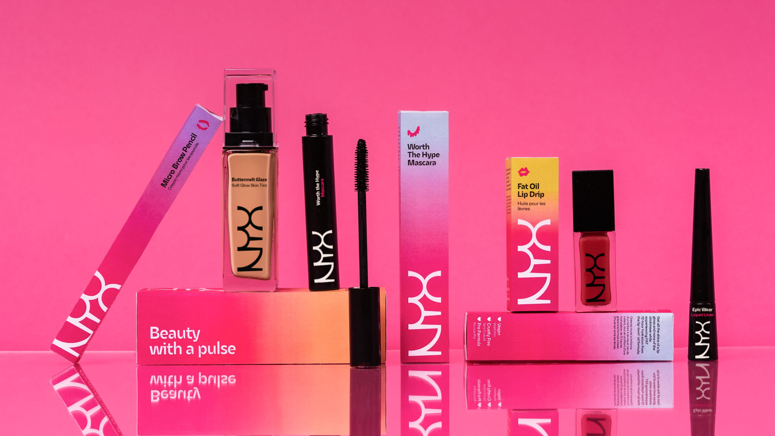
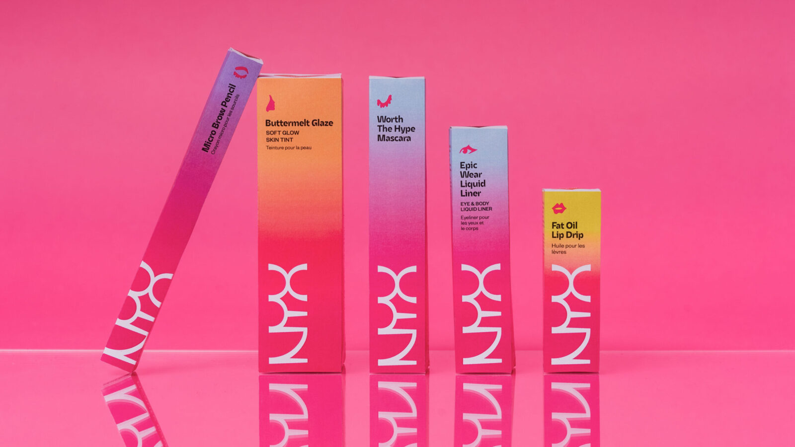
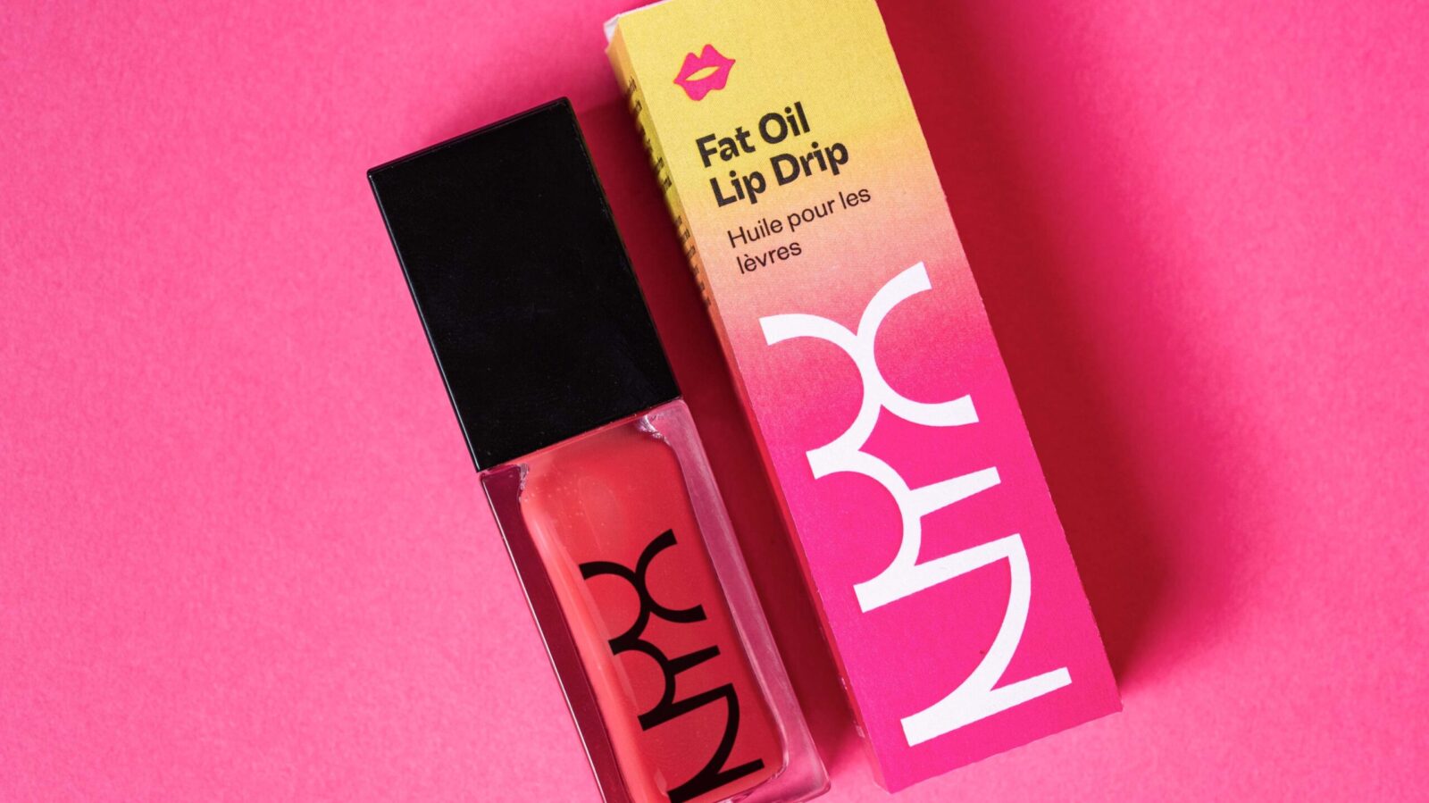
The refreshed identity introduces a modernized logo, refined color palette, and a structured system for colors, typography, photography, and iconography. The result is a clean, dynamic, and flexible visual language that allows NYX to stand out consistently, whether on shelves, online, or in social media feeds.
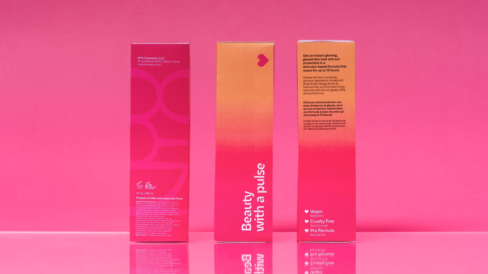
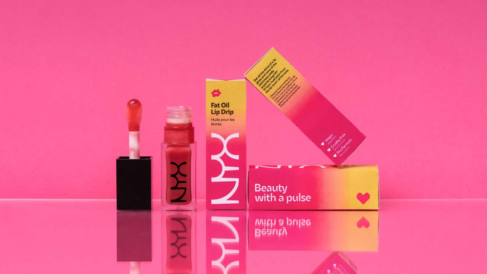
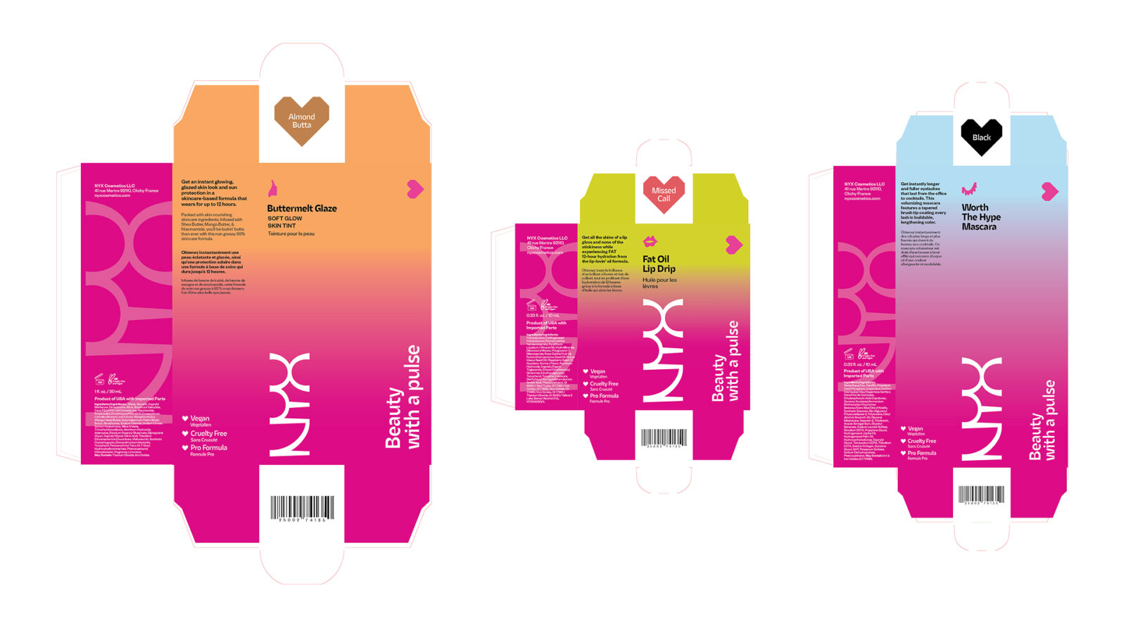
Each packaging design begins with the vertical NYX logo in white on the signature fuchsia background. I developed a set of custom icons and a gradient system that transitions from the brand fuchsia to a secondary color based on category. For example, all eye products (mascara, eyeliner, eyeshadow, etc) go to blue and use the eye icon. A clear typographic hierarchy presents product names in English, followed by French in smaller type, ensuring the design works seamlessly in both U.S. and Canadian markets.
To maintain clarity across applications, I created comprehensive brand guidelines detailing the use of gradients, icons, color, type, photography style, etc, ensuring consistency and cohesion throughout every platform.
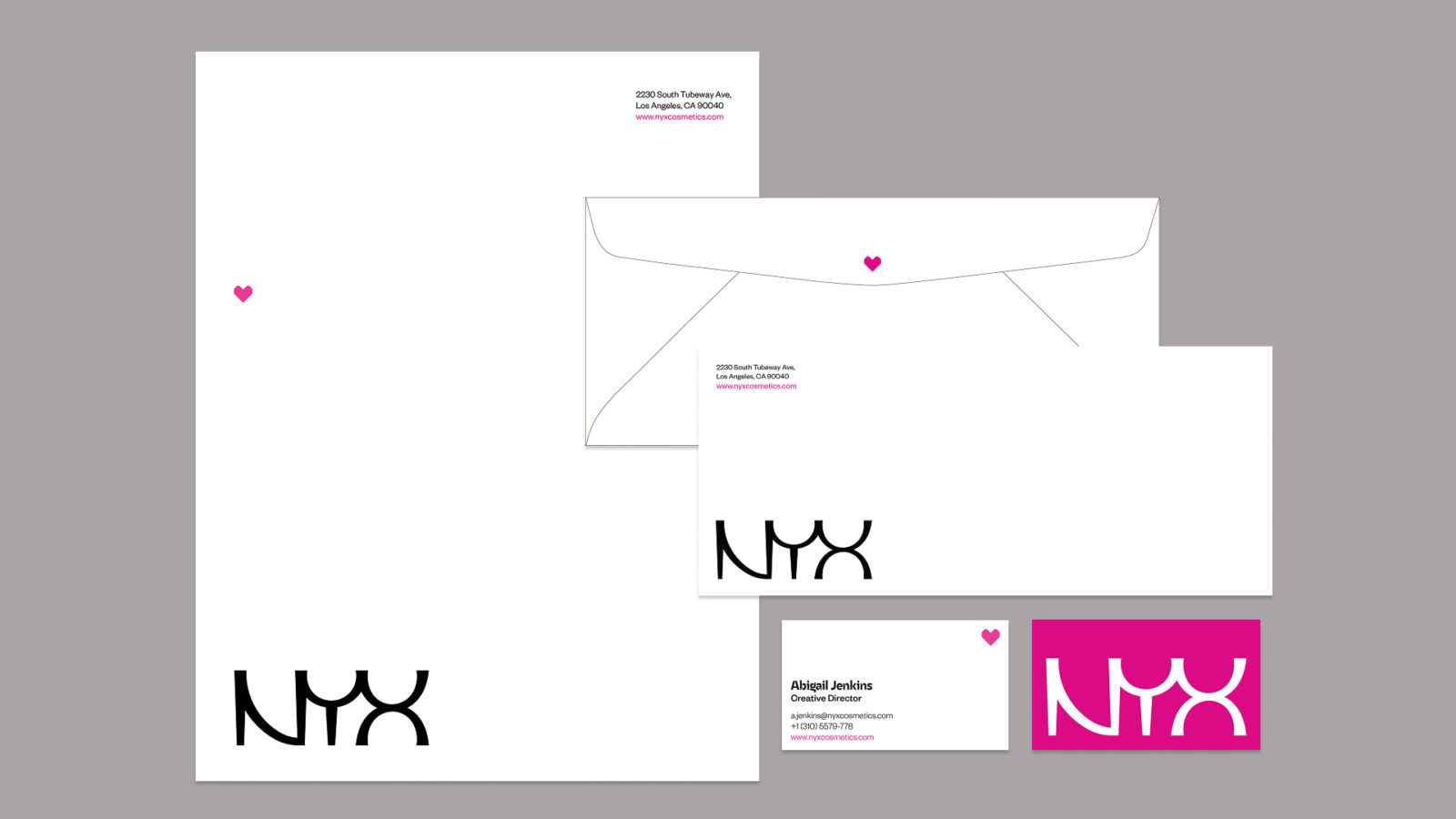
The stationery system balances practicality with expressive color. Each business card comes with different color backs, the letterhead includes a heart icon at the one third mark for precise folding, and the envelope design clearly signals the NYX brand at first glance.
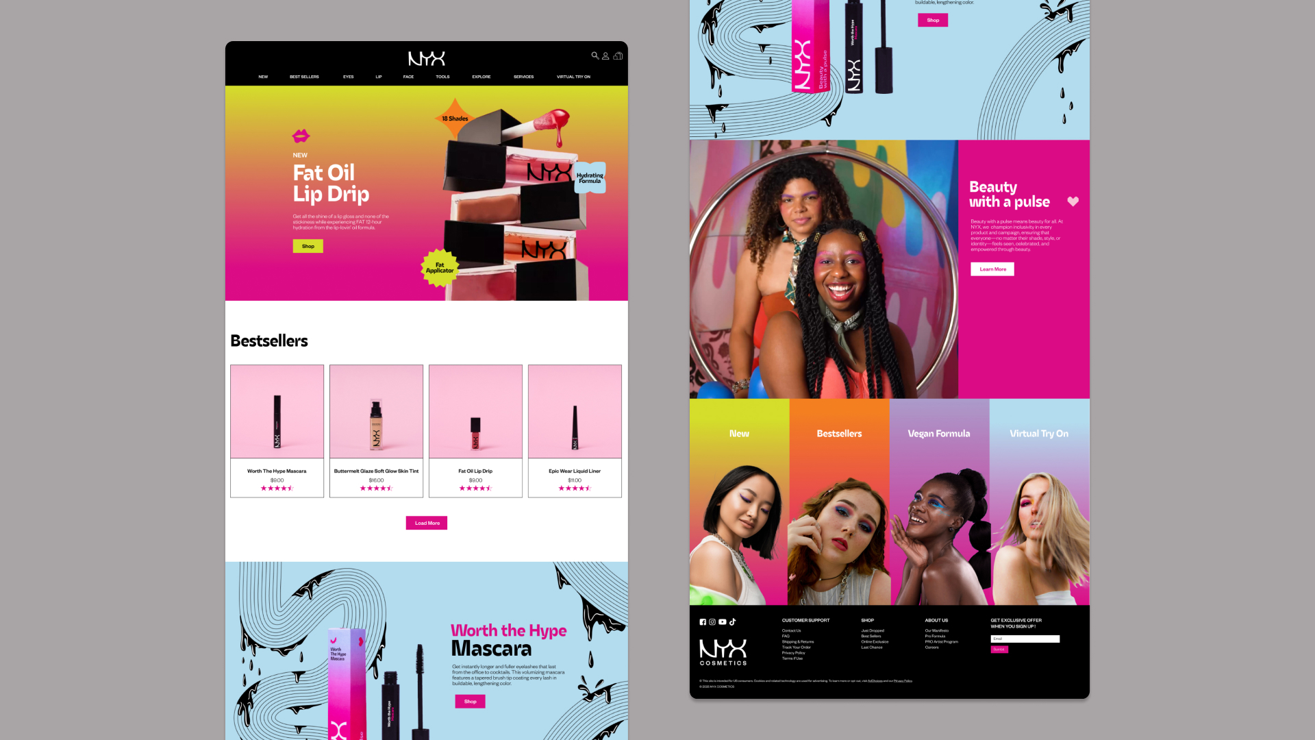
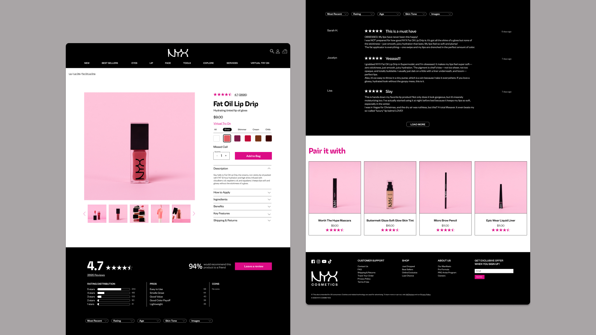
The website also received a makeover. It was designed with a focus on the products and the everyday consumers. The layout was decluttered, made less overwhelming, and designed for easier navigation.
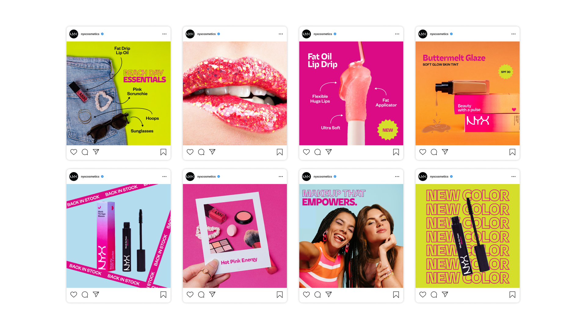
Finally, NYX’s social presence was redesigned to match the energy of its community, which is bold expressive and always on trend. The results is a feed that captivate inspires creativity and solidifies. NYX is leading role in the beauty industry.

CREDIT
- Agency/Creative: Solène Trahand
- Article Title: Student Solène Trahand Introduces a Structured and Expressive Rebrand for NYX Cosmetics
- Organisation/Entity: Student
- Project Status: Non Published
- Agency/Creative Country: United States of America
- Agency/Creative City: San Diego
- Project Deliverables: Beauty Photography, Brand Design, Brand Guidelines, Brand Identity, Brand Redesign, Design, Graphic Design, Icon Design, Identity System, Logo Design, Packaging Design, Rebranding, Web Design
- Industry: Beauty/Cosmetics
- Keywords: WBDS Student Design Awards 2025/26 , rebrand, branding, cosmetics, makeup, beauty, packaging, logo, website, socials


