


Maharani Mahansar Shahi Gulab is a heritage liqueur born from the royal traditions of Rajasthan, crafted with an ambition to preserve centuries-old artistry while offering a contemporary, luxurious experience. The project began with a simple yet profound question—how can the soul of Rajasthan’s legendary rose distillation be translated into a modern premium packaging design that resonates globally? The answer lies in a deeply researched, emotionally driven design approach that captures the fragrance, history, and regal essence of Mahansar Fort, blending them seamlessly into a collectible bottle that celebrates both heritage and innovation.
Shahi Gulab is crafted from the finest Desi Gulab (Rosa Damascena) cultivated in the rose valleys of Pushkar. For generations, rose farmers and distillers in this region have perfected the craft of extracting pure rose essence using traditional copper vessels, a method rooted in ancient perfumery and Ayurvedic traditions. The liqueur itself embodies purity and luxury, and the design needed to reflect that richness with equal reverence. The inspiration for the project came from the visual and cultural identity of Shekhawati—its frescoes, its royal courts, its jewellery, its architectural intricacies, and the deeply emotional connection Rajasthan shares with the rose. This connection is not just aromatic; it is spiritual, ceremonial, and historic, making Shahi Gulab more than a drink—it is a cultural artefact.
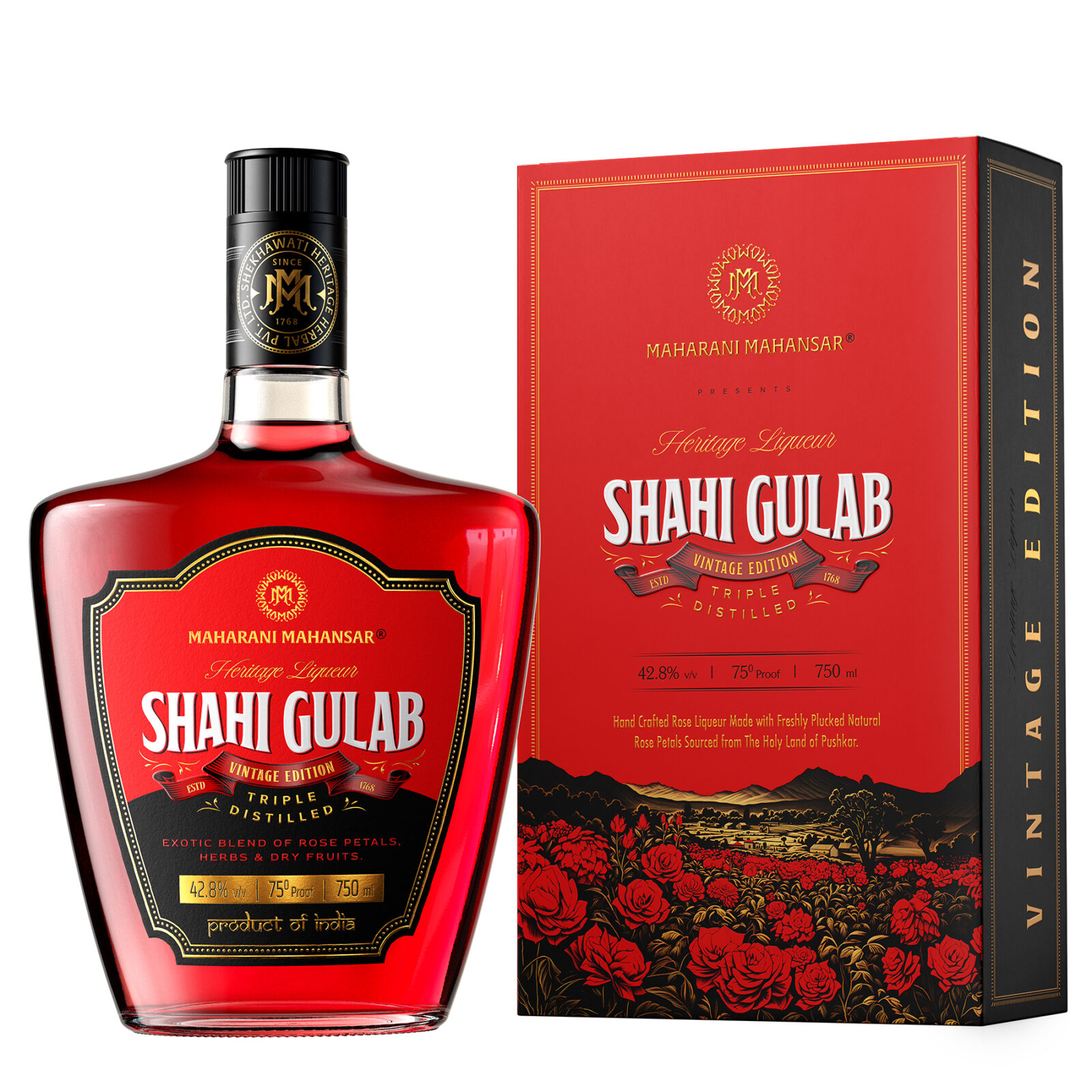
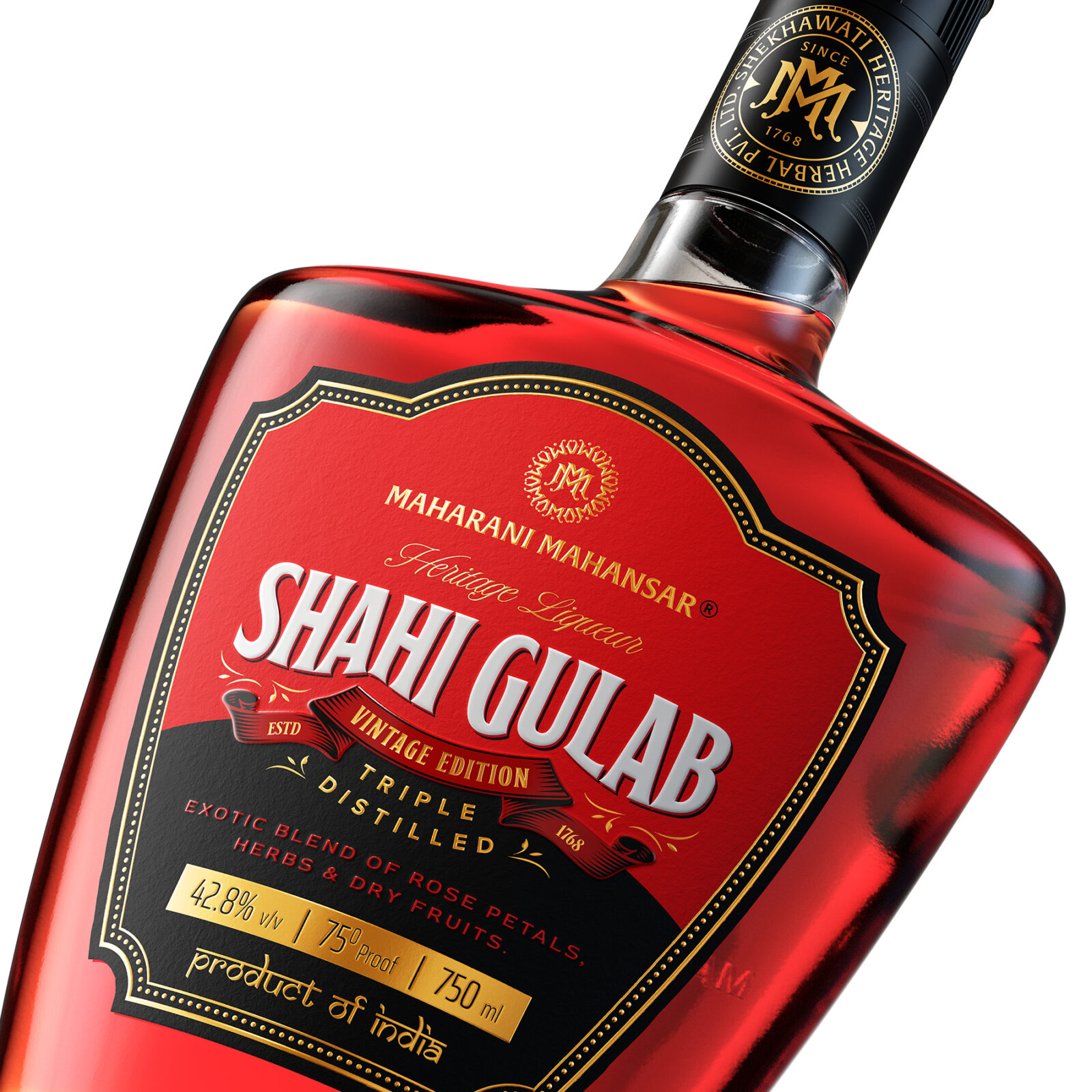
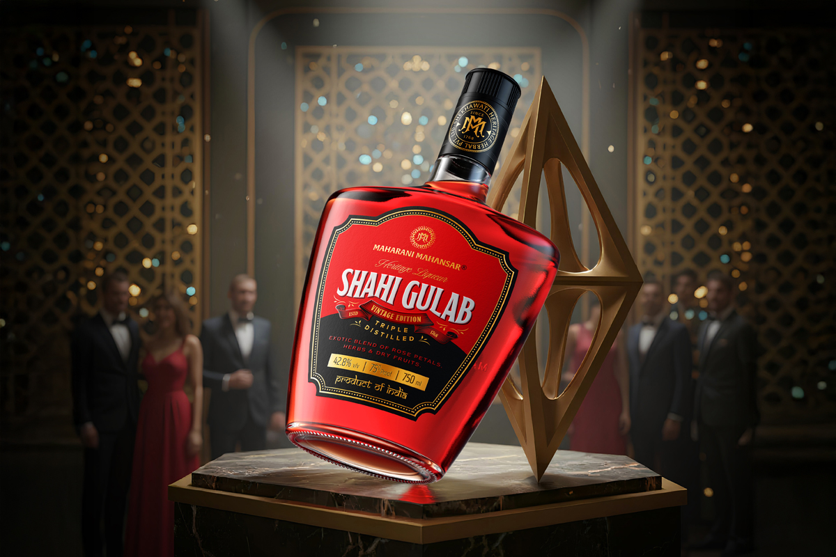
The bottle was designed to express this premium heritage through its bold, matte-black exterior and its rich gold detailing. The bottle carries a royal heaviness—a deliberate choice to make it feel like a treasured object. The matte finish heightens the sensory connection, inviting the user to touch and admire the surface before interacting with the liqueur inside. Matte black was selected not just for aesthetic boldness but also for the symbolism it holds—mystery, depth, and nighttime rose harvesting rituals. The dark surface also protects the liqueur from light, ensuring that the delicate rose notes remain pure over time.
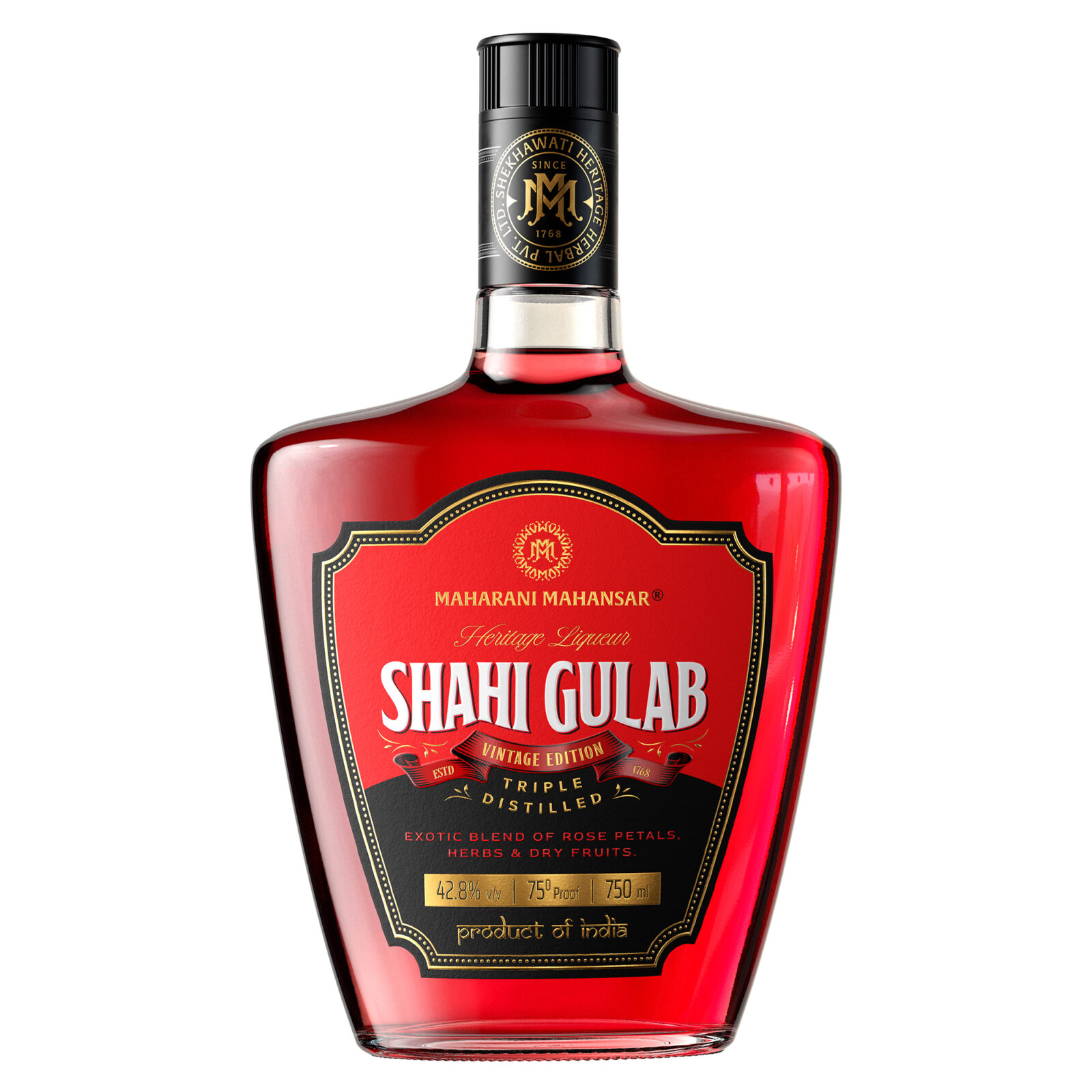
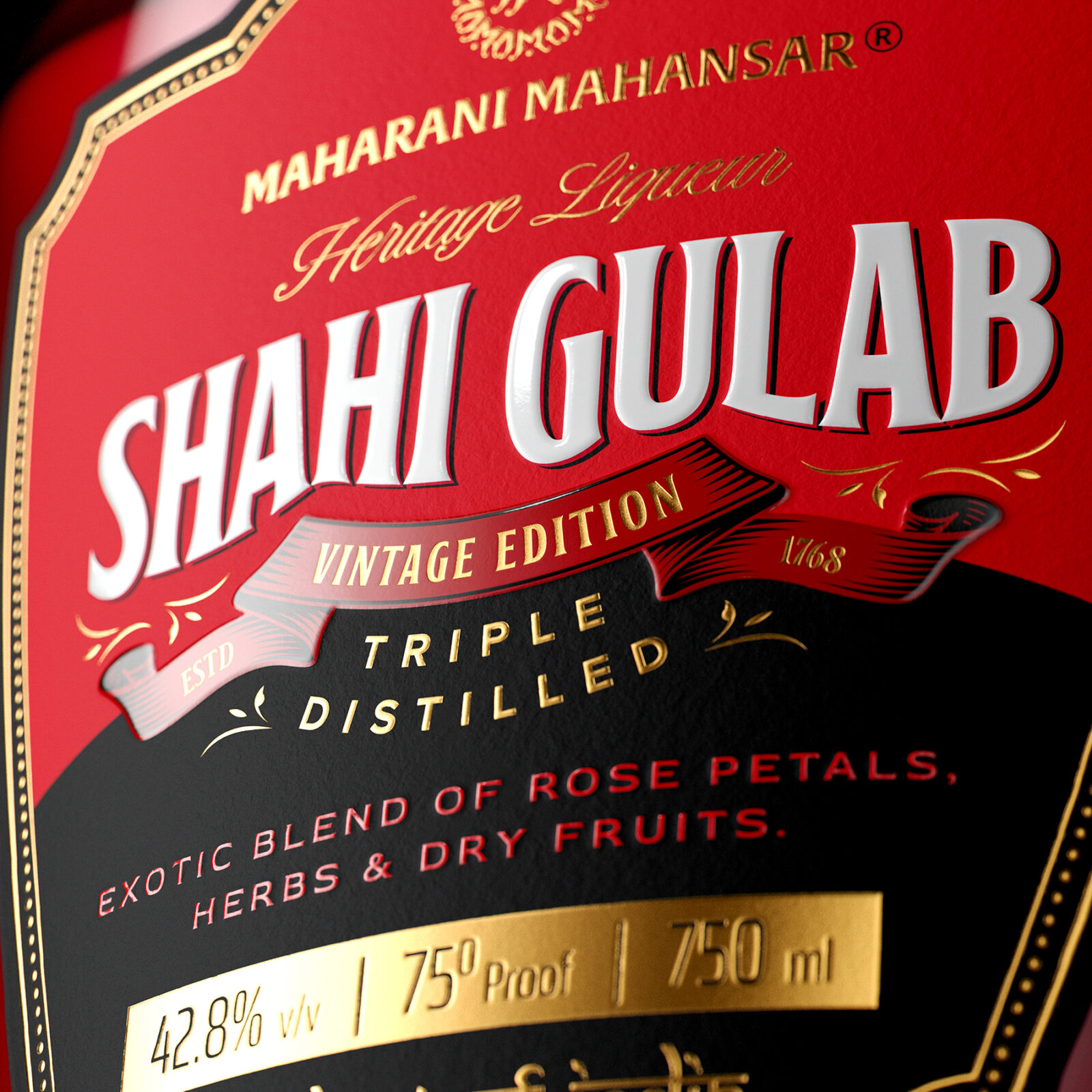
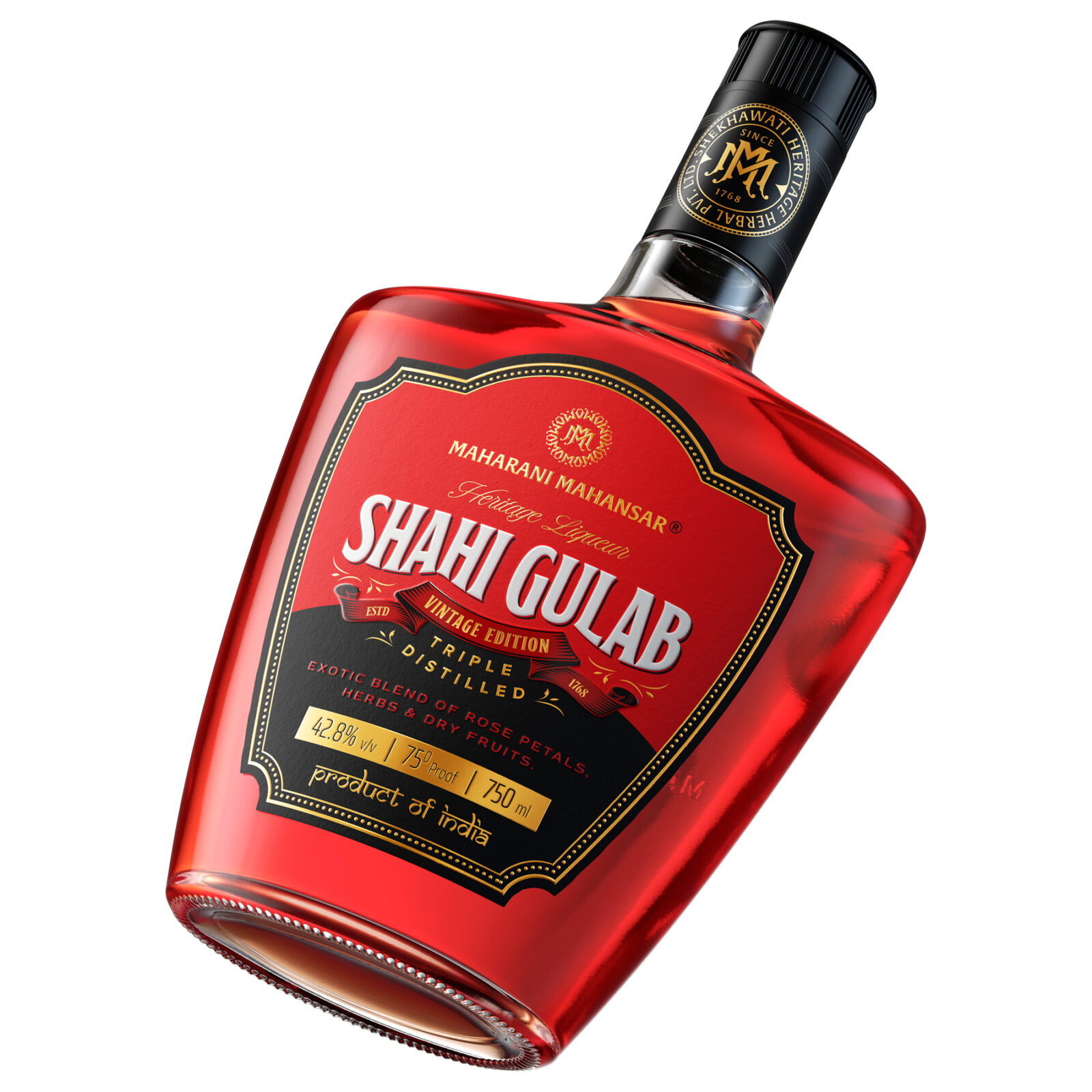
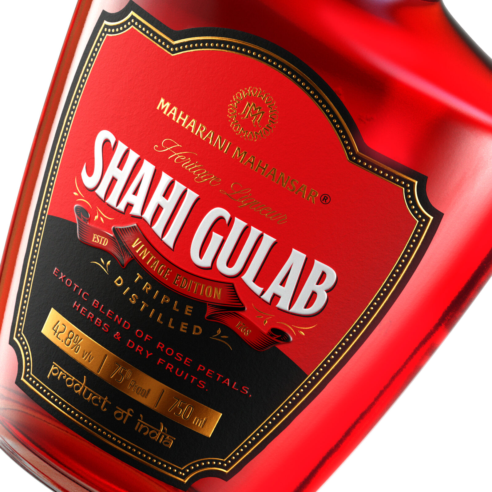
Gold foil detailing on the bottle creates a striking contrast against the black surface. The gold elements are thoughtfully placed to represent royalty, prosperity, and the sacredness associated with Indian rose culture. The central emblem—a royal shield—acts as the visual soul of the brand. Inspired by Rajasthani insignias, this emblem brings together symbols of regality, floral beauty, and protective heritage. The shield motif is reminiscent of the noble clans of Rajasthan, reinforcing the historical lineage of the Mahansar royal family. Within the emblem lies an intricate floral illustration, designed to resemble blooming roses captured in perfect symmetry. This artistry reflects the care, precision, and patience required to create authentic rose liqueur.
Typography also plays a significant role in the visual experience. The name “Shahi Gulab” is set in an elegant serif font, chosen for its timeless ceremonial beauty, while modern sans-serif fonts balance the visual hierarchy. This combination of traditional and modern typography mirrors the core vision of the packaging—honoring the past while catering to the present. Subtle ornamental flourishes, inspired by miniature painting styles, are embossed around the text, adding texture and depth. These flourishes reference the ornamental detailing often found in Shekhawati havelis, tying the design back to its cultural roots.
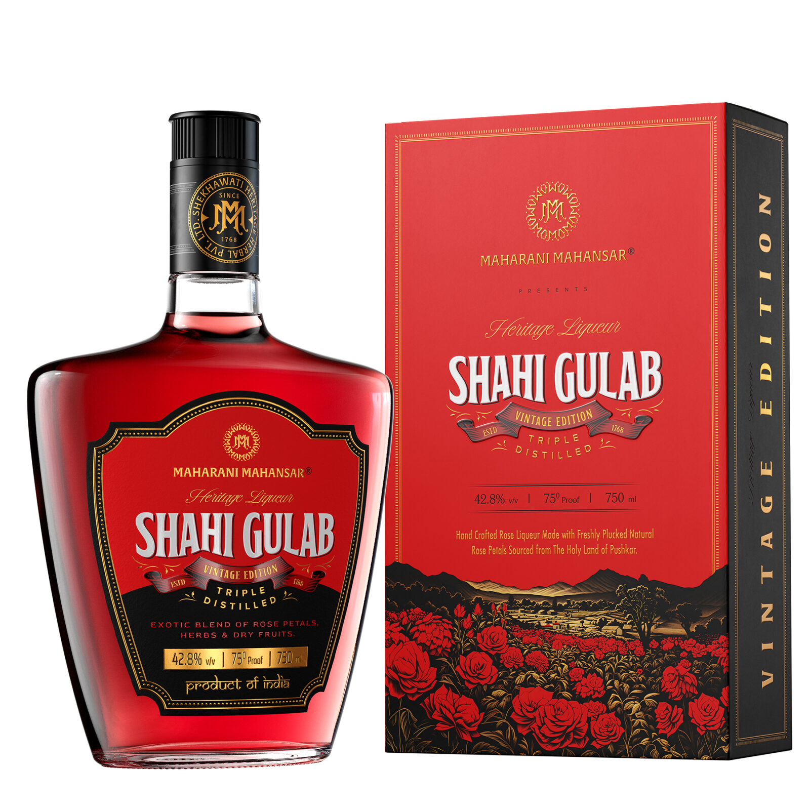
Storytelling is a key part of the Shahi Gulab experience. Rather than using generic product information, the back label features poetic writing crafted to evoke the romanticism of rose distillation. It describes the early-morning harvesting of rose petals, the steam distillation in copper degs, and the transformation of fresh flowers into a fragrant liqueur. This lyrical tone deepens the emotional connection with the user, transporting them into the world where the product originates—a world of fragrance, ritual, and tradition. Because the bottle space is intentionally minimal for visual grace, a refined line is added: “For complete details, kindly refer to the outer box,” ensuring clarity while preserving aesthetics.
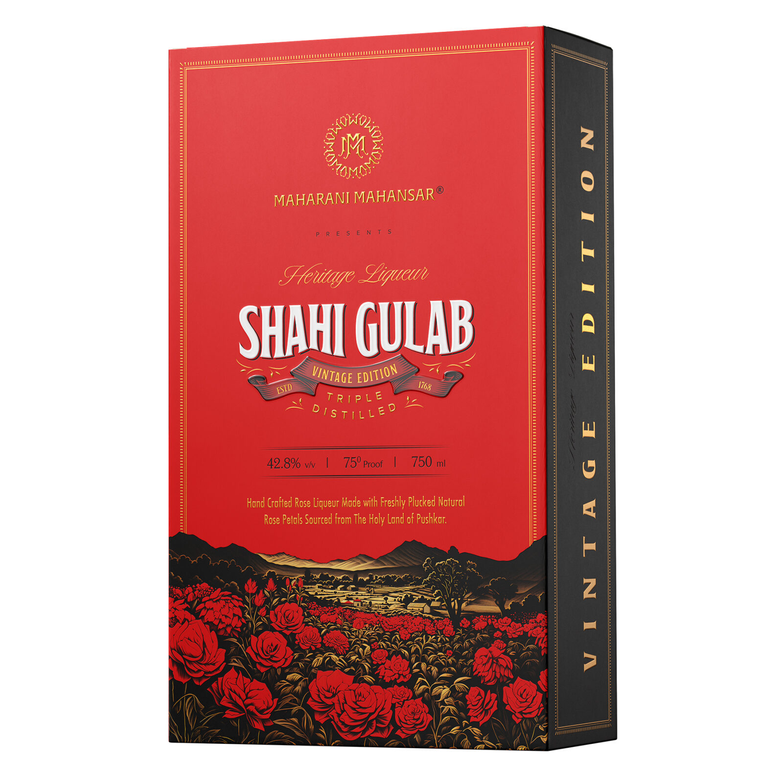
The outer box expands the visual narrative further. Designed to match the bottle’s identity, it uses a deep black base with luxurious gold foil illustrations and soft-touch lamination. The box becomes an extension of the bottle—more ornate, more detailed, and carrying the full story visually. While the bottle remains bold and minimal, the box showcases the complete artistry of the design. Gold rose clusters wrap around the box in an elegant composition, symbolising abundance and celebration, essentials of Rajasthani culture. The texturing on the box is subtle but intentional, creating a tactile impression that feels premium and royal. Sanskrit-inspired motifs, modernized into geometric shapes, are placed strategically to blend heritage with a contemporary luxury appeal.
The colour palette—black, gold, and rose red—was chosen for both meaning and emotion. Black represents depth, elegance, and a timeless premium feel. Gold symbolizes royalty, prosperity, and sacred rituals. Rose red represents the heart of the liqueur—the bloom of the Desi Gulab, rich in aroma, history, and cultural significance. Together, these colours communicate a story of luxury rooted in heritage. They allow the product to sit comfortably in high-end retail spaces, global duty-free environments, craft spirit bars, and luxury gifting contexts.
One of the most important aspects of the project was integrating cultural heritage into a modern, globally relevant design language. Many Indian heritage products tend to lean heavily on traditional motifs, but for Shahi Gulab, the approach was more refined. The cultural references—Shekhawati murals, Rajput shields, copper distillation, rose harvesting, fort architecture—are present, but they are reinterpreted in a sleek, fashionably minimal style. This ensures that the design appeals to an international audience accustomed to high-end packaging standards while maintaining authenticity for Indian consumers who understand the cultural nuances. The dominant philosophy was clear: a luxury product must feel both emotionally grounded and aesthetically universal.
This packaging is designed not only to impress visually but also to create an immersive sensory experience. The moment a user holds the bottle, they feel the matte texture and the raised embossing. When they open the box, the gold detailing reflects light like jewellery. The storytelling on the back label creates an emotional bridge. And finally, the aroma of rose when opened completes the journey. Every interaction is curated—not by chance but by intention—to ensure that the user feels the richness, the history, and the craftsmanship long before tasting the liqueur. The result is packaging that triggers admiration, gifting desire, and a sense of prestige.
Material considerations were equally important. The box uses premium matte stock with high-opacity gold foil, soft-touch lamination, and precise embossing techniques. Spot UV varnish highlights specific elements while giving depth to the design. Labels are made with top-quality adhesive suitable for curved glass surfaces, ensuring long-term durability. Sustainability was also considered—recyclable board for the box, minimal plastic use, and a bottle intentionally designed for reuse. Consumers often repurpose the bottle as a decorative object because of its sculptural beauty, extending its lifecycle and reducing waste.
The custom rose illustration stands as a centrepiece of the design. Instead of using a standard floral pattern, a bespoke botanical-style illustration was created. This rose design is balanced between vintage botanical drawings and modern line precision. It symbolises purity, fragrance, and emotional connection. Roses have always carried symbolic weight—love, devotion, ritual, celebration—and this illustration embodies those values. It also visually represents the aroma of the liqueur, giving the viewer a sense of what they are about to experience through the product itself.
From the very beginning, Shahi Gulab was envisioned as a collector’s edition. The design ensures that users feel compelled to keep the bottle long after finishing the liqueur. This ensures extended brand presence in homes, bars, and personal spaces. Many consumers describe the bottle as “too beautiful to throw away,” a testament to the success of the design strategy. In a world where packaging often becomes waste, creating a product that transforms into a display object is both emotionally and environmentally meaningful.
Shahi Gulab’s design also reflects the strategic vision of positioning Maharani Mahansar as a global luxury brand. The packaging competes effortlessly with international boutique liqueurs and craft spirits, fulfilling the growing global demand for authentic, culturally rich, premium products. Consumers today look for narrative-driven brands—products with stories, emotions, and heritage. Shahi Gulab delivers on all fronts, offering a unique identity rooted deeply in Rajasthan’s royal traditions while presenting a contemporary sophistication that appeals worldwide.
Ultimately, Maharani Mahansar Shahi Gulab is a celebration of Rajasthan’s rose culture, distilled heritage, and artistic legacy. It blends the poetry of tradition with the finesse of modern design. This project reflects how packaging can become a medium of storytelling—an experience that begins with the eyes, continues with the hands, and culminates in the senses. It demonstrates how a bottle can hold not just liquid but history, fragrance, emotion, and artistry. Shahi Gulab stands as a testament to how design, when thoughtfully executed, can elevate a regional specialty into a globally admired luxury product, inspiring pride in Indian craftsmanship and leaving a lasting impression on consumers worldwide.

CREDIT
- Agency/Creative: Dheeraj Bangur
- Article Title: Dheeraj Bangur Creates a Collectible Packaging Identity for Maharani Mahansar Shahi Gulab
- Organisation/Entity: Creative
- Project Status: Published
- Agency/Creative Country: India
- Agency/Creative City: Jaipur
- Project Deliverables: 2D Design, 3D Design, 3D Modelling, Art Direction, Brand Creation, Brand Design, Brand Experience, Brand Guidelines, Branding, Creative Direction, Design, Graphic Design, Illustration, Label Design, Logo Design, Packaging Design, Packaging Guidelines
- Industry: Food/Beverage
- Keywords: WBDS Creative Design Awards 2025/26 , Shahi Gulab, Maharani Mahansar, Heritage Liqueur, Heritage Liquor, Rajasthan, India, Royal Liquor, Jaipur, Rajputana,


