


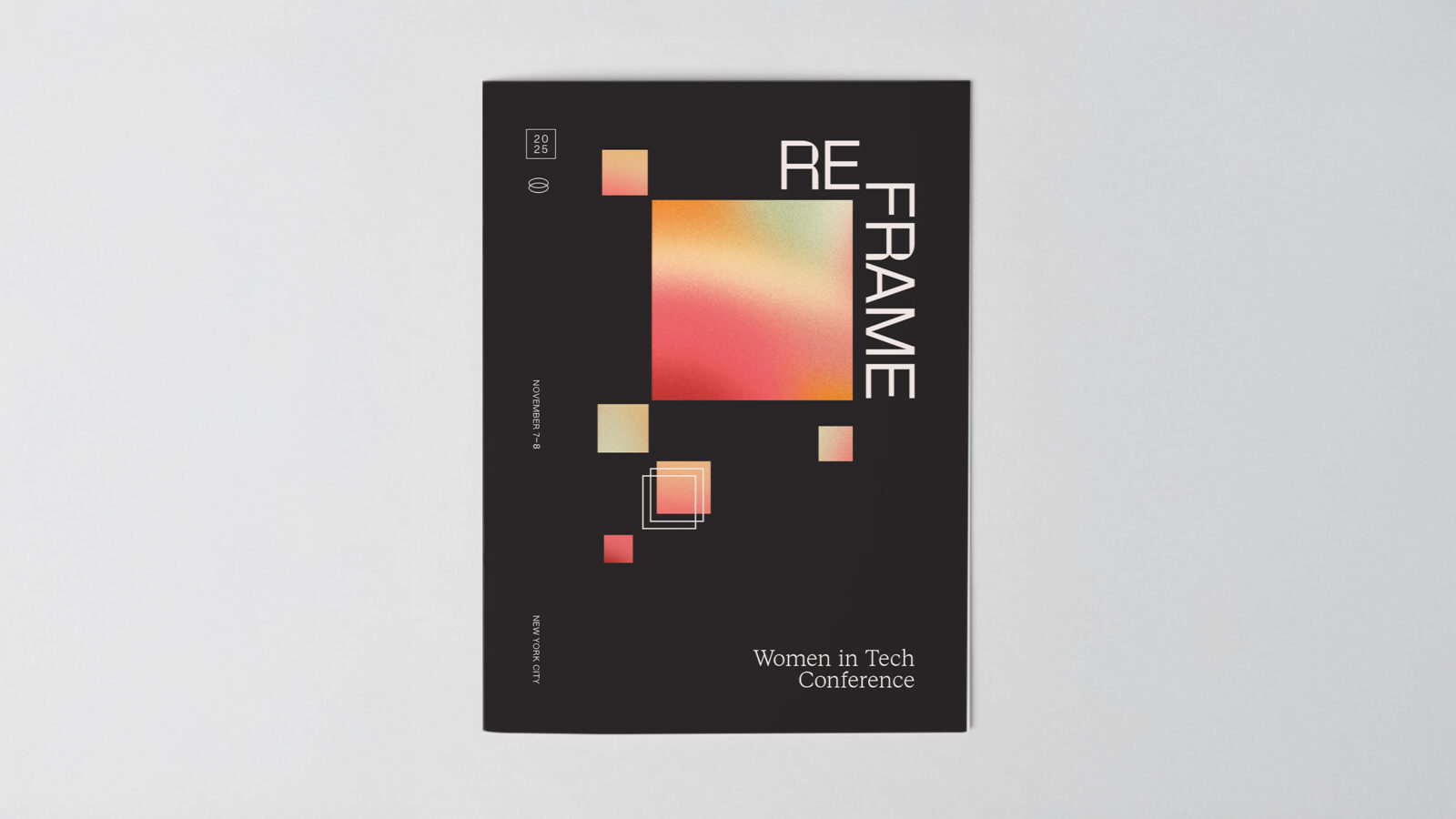
Reframe is a conference for women in tech created to foster authentic connection, amplify underrepresented voices, and accelerate equity in the industry through meaningful dialogue. The goal of the brand was to communicate innovation and forward momentum while maintaining a sense of warmth, approachability, and human connection. Reframe challenges the status quo by inviting attendees to shift their perspective, rethink old structures, and imagine a more inclusive and collaborative future for technology.
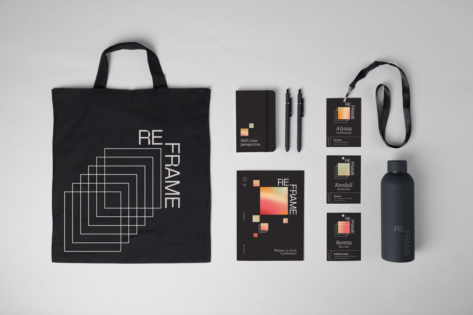
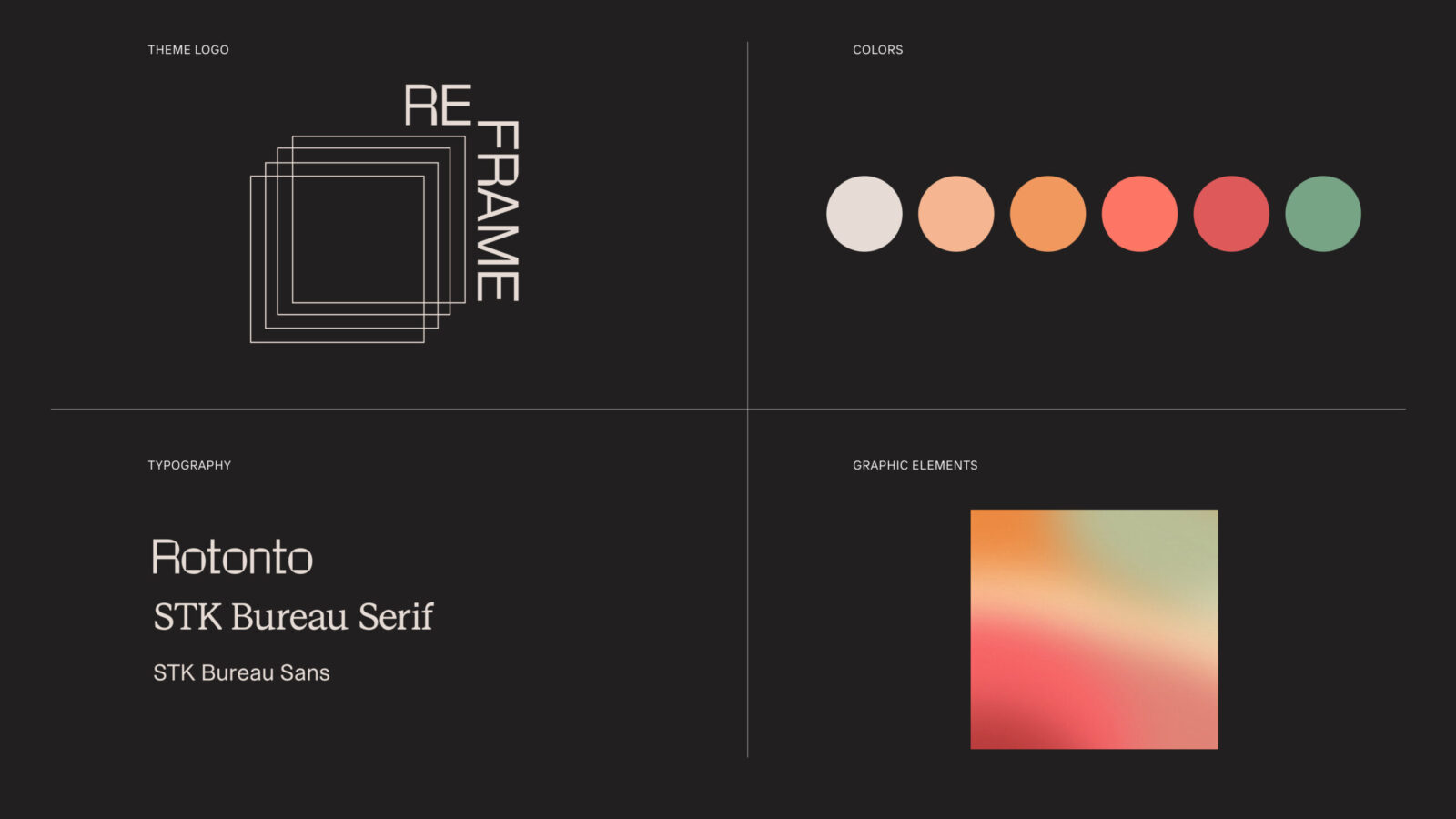
The visual identity centers around gradient squares that function as modular building blocks. These forms represent ideas in motion, collaboration, and the constantly evolving nature of the tech landscape. The gradients bring energy, optimism, and a sense of forward movement, while the square motif reinforces stability and structure. White boxes shift, slide, and overlap to introduce depth and perspective, encouraging viewers to literally and metaphorically “reframe” how they see the world. This interplay of color, form, and movement creates an identity system that feels modern, flexible, and expressive.
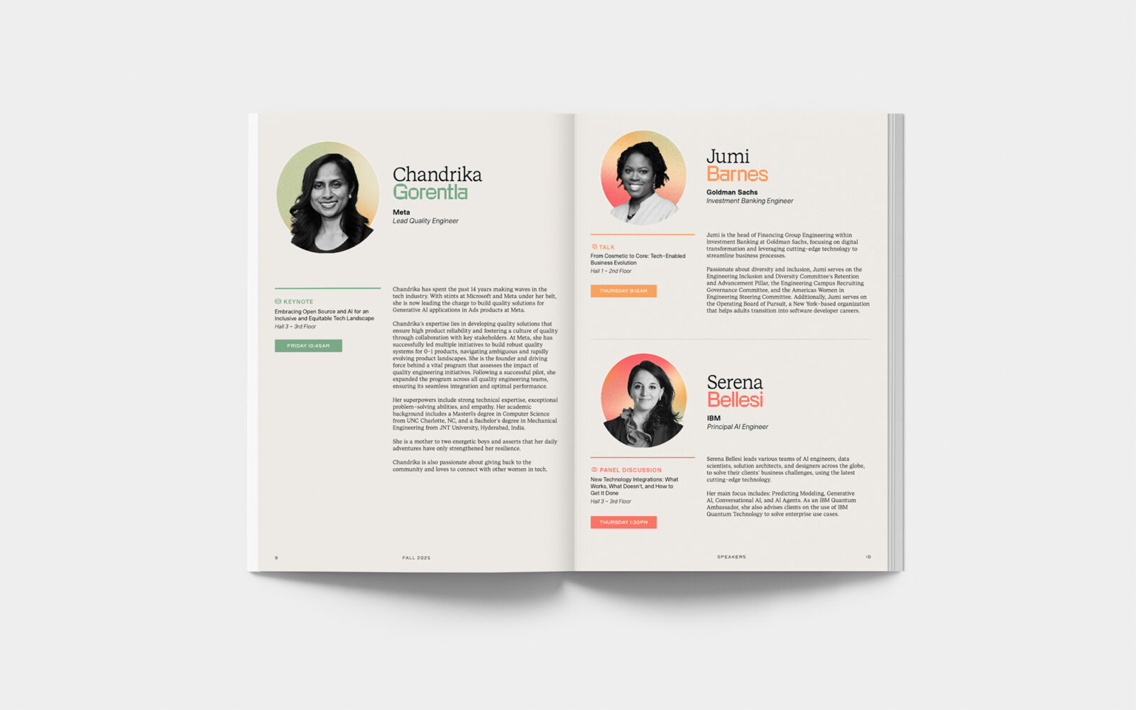
The typographic system is clean and contemporary, balancing the dynamic visual elements with clarity and professionalism. Type scales and spacing choices help organize dense information in a way that is easy to navigate and visually inviting. The design aims to meet attendees where they are by presenting content in a structured yet energizing way that supports focus and accessibility.
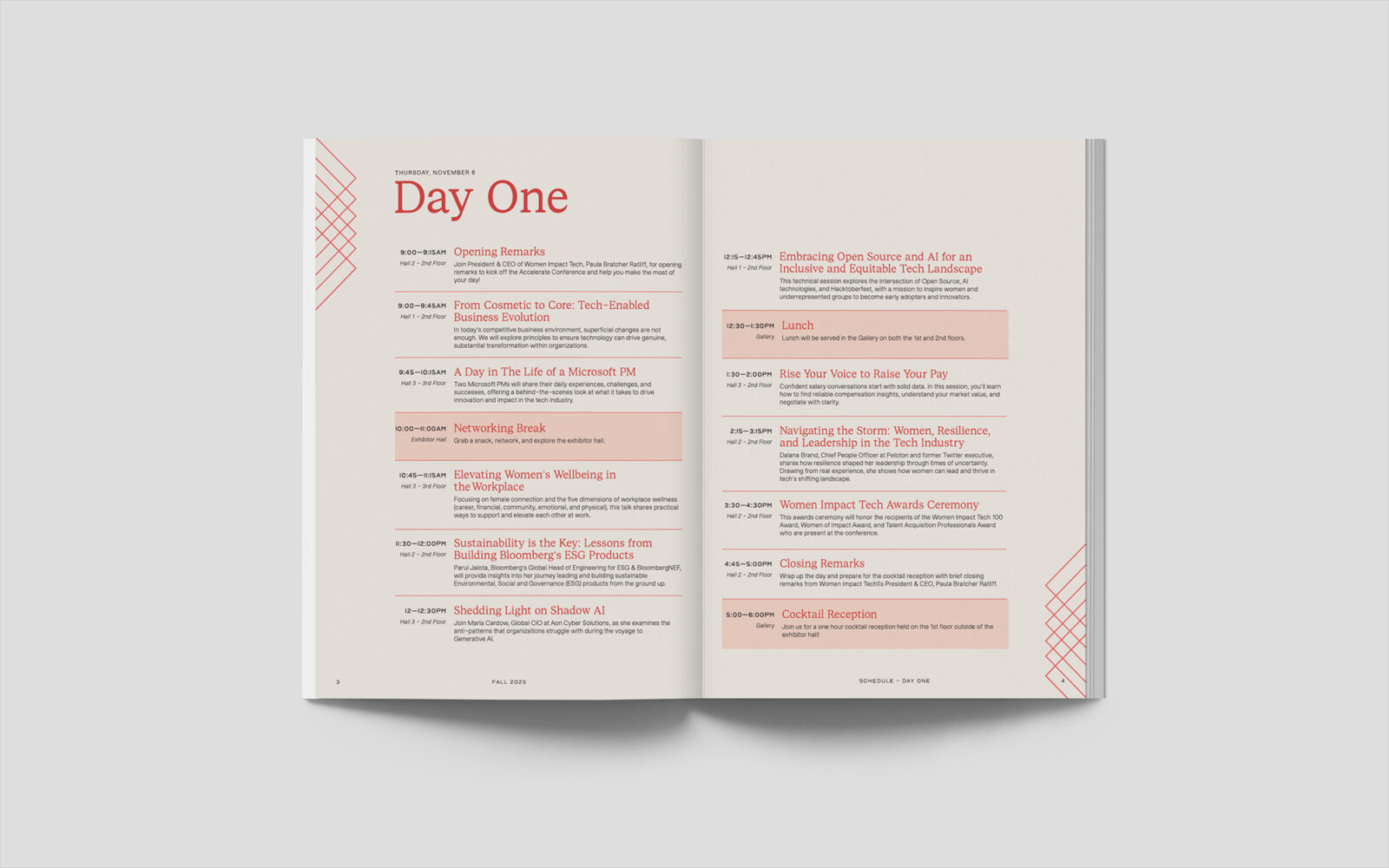
The conference program extends the system into a practical tool for attendees. Clear hierarchy, intuitive visual cues, and well-organized layouts help participants quickly understand the schedule, identify session tracks, and find topics that align with their interests. Additional supporting materials, such as signage and digital assets, follow the same logic, creating a cohesive experience across all touchpoints. The design reinforces the conference’s mission by making the entire experience accessible, intuitive, and inclusive.
Together, these elements create a brand that is bold but welcoming, innovative but grounded. Reframe positions itself as a catalyst for new ideas, connecting women in tech through design that reflects clarity, momentum, and possibility.

CREDIT
- Agency/Creative: Anna Barnett
- Article Title: Anna Barnett Designs Reframe as a Forward-Thinking Conference Brand for Women in Tech
- Organisation/Entity: Student
- Project Status: Non Published
- Agency/Creative Country: United States of America
- Agency/Creative City: San Diego
- Project Deliverables: Brand Design, Brand Identity, Brand Mark, Brand Naming, Brand Tone of Voice, Branding, Creative Direction, Design, Graphic Design, Identity System, Interaction Design, Logo Design, Typography, User Experience, User Interaction, Web Design
- Industry: Technology
- Keywords: WBDS Student Design Awards 2025/26 , technology, conference, women


