


What? Another vegan brand to replace animal products?
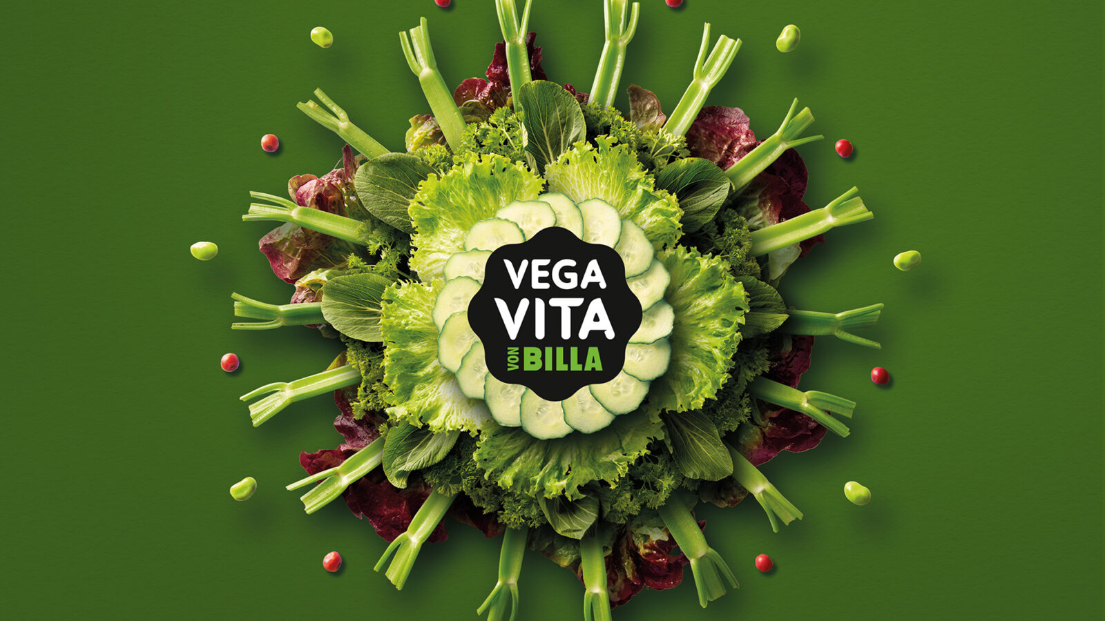
Yes. But why? Because you are what you eat — and Vegavita stands, like no other, for a balanced, joyful, and completely regret-free plant-based lifestyle. Its iconic mandala design captures that spirit instantly.
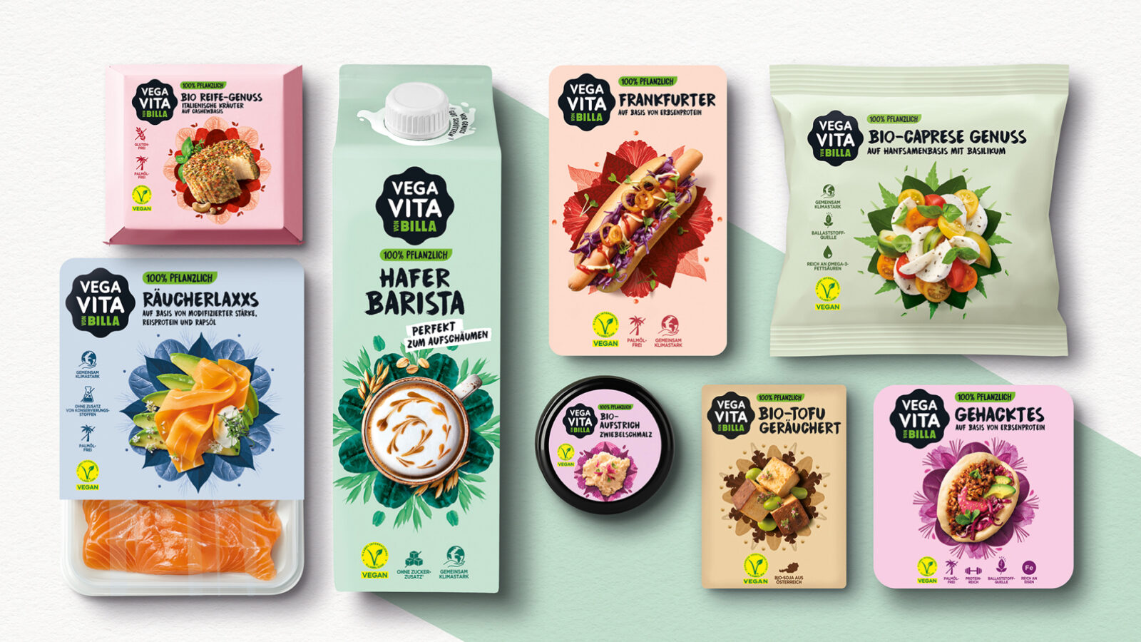
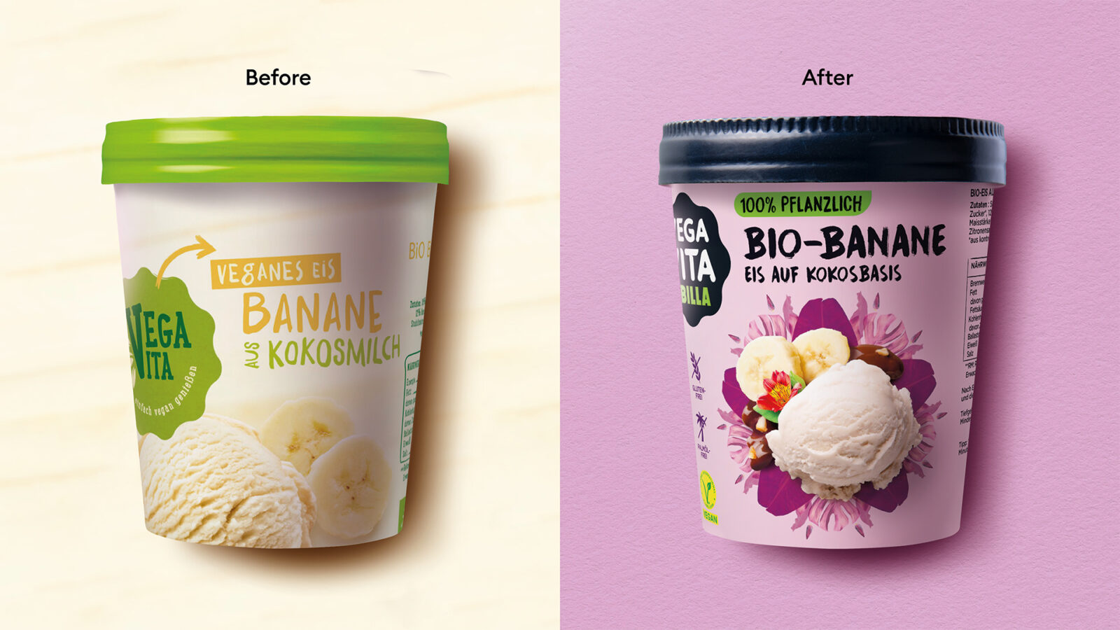
Billa, an Austrian early mover and an uncontested leader in the vegan segment, is represented through its brand Vegavita and a broad, category-spanning product portfolio. With this visual repositioning, a new chapter begins, one that truly sets the brand apart in an increasingly crowded field. The shift marks a deliberate break from the strict, sometimes limiting codes of the old “vegan world” and moves toward a more joyful, balanced, and responsible “plant-based” lifestyle — one that speaks directly to a young, open-minded, flexitarian audience.
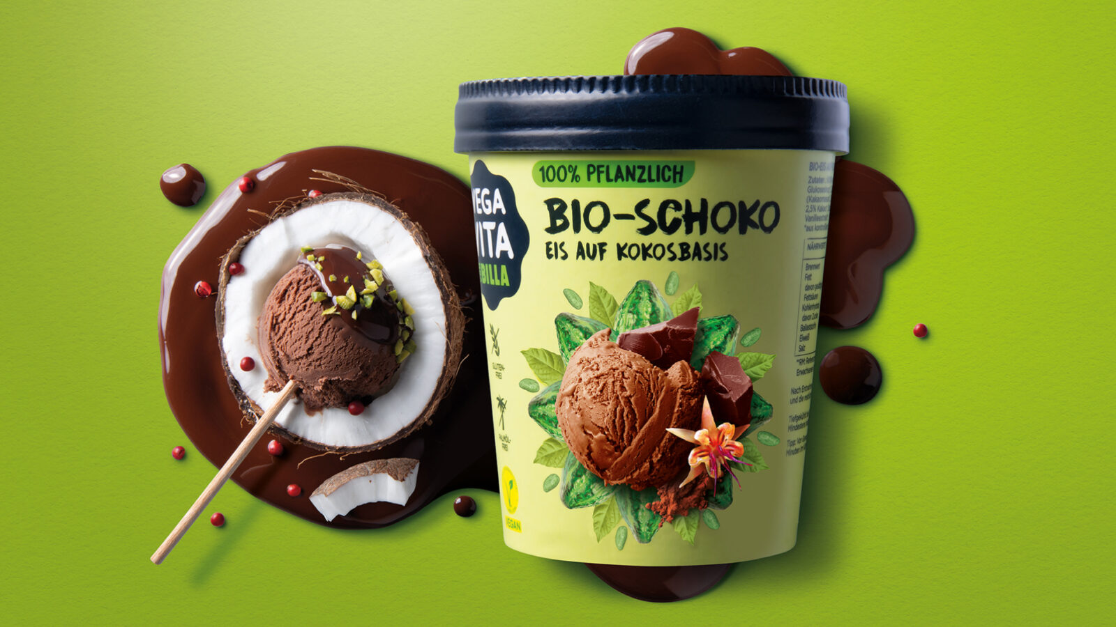
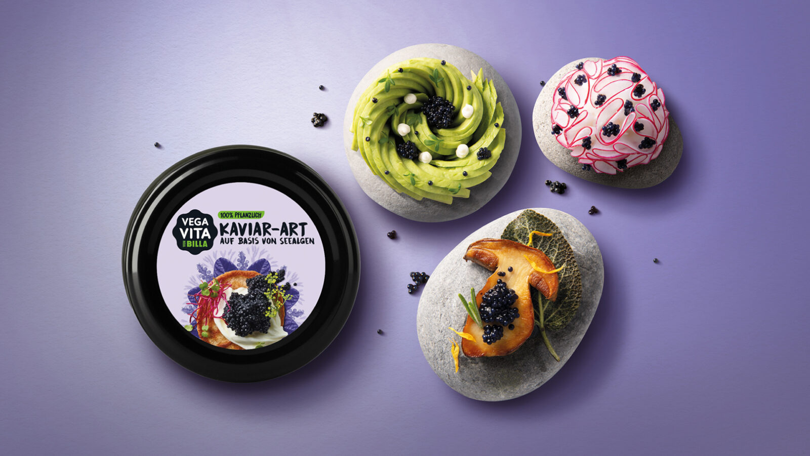
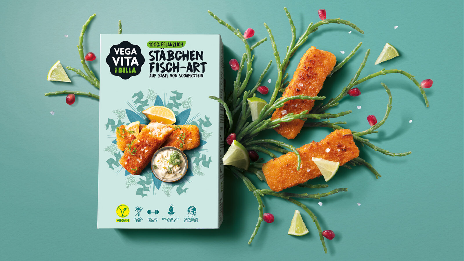
At the core of the brand lies the idea of balance: balance in lifestyle, in eating habits, in mood, in everyday choices. And what symbol represents balance more gracefully than a mandala — perfectly symmetric, harmonious, and artistically rich? The creative concept builds each mandala from carefully selected plant elements, arranged with precision and beauty, instantly communicating 100% plant-based. It’s both a symbol and a storytelling tool.
Placed prominently at the center of each pack, the detailed, colourful mandala expresses calm, positivity, and a zest for life while making every product visually unique. Each plant featured in the mandala is an actual ingredient of the respective product. This guarantees diversity within the range and strong shelf standout across categories.
To elevate appetite appeal, we leveraged our expertise in high-end culinary photography and placed a mouth-watering shot of the prepared dish at the heart of the mandala. With each mandala composed in complementary colours, the food visuals gain even more vibrancy and desirability.
The design language is rounded off with bold black typography, youthful energy, storytelling elements on the back of the packaging, and a strong logo whose signature flower shape helps long-time customers immediately recognise the refreshed brand.

CREDIT
- Agency/Creative: ARD Design Agency
- Article Title: Vegavita: New Era for Plant-based Products Full of Taste and Joy – and No Regrets! by ARD Design Agency
- Organisation/Entity: Agency
- Project Status: Published
- Agency/Creative Country: United Kingdom
- Agency/Creative City: London
- Project Deliverables: Art Direction, Brand Architecture, Brand Redesign, Brand Rejuvenation, Brand Strategy, Brand Tone of Voice, Branding, Food Photography, Food Styling, Graphic Design, Identity System, Illustration, Packaging Design, Photography, Photography Styling, Product Photography, Rebranding, Retouching, Set Design
- Industry: Food/Beverage
- Keywords: WBDS Agency Design Awards 2025/26 , vegan packaging design, plant-based branding, mandala identity, colourful FMCG design, category refresh, flexitarian audience, bold typography, culinary photography, ingredient-driven design, shelf standout, sustainable branding, food packaging, visual storytelling, brand rejuvenation
-
Credits:
Creative Director: Stève Pierrehumbert
Strategy Director: Silvija Graf Coric
Graphic Designer: Matenia Chatzigeorgiou


