


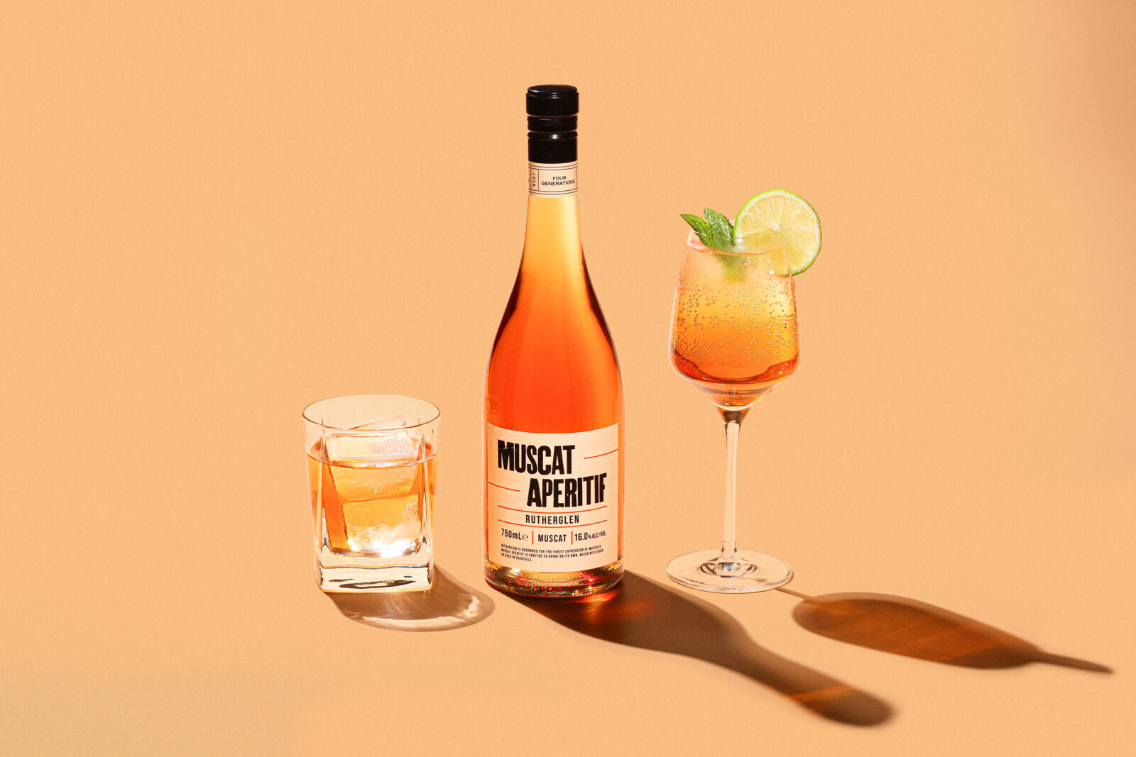
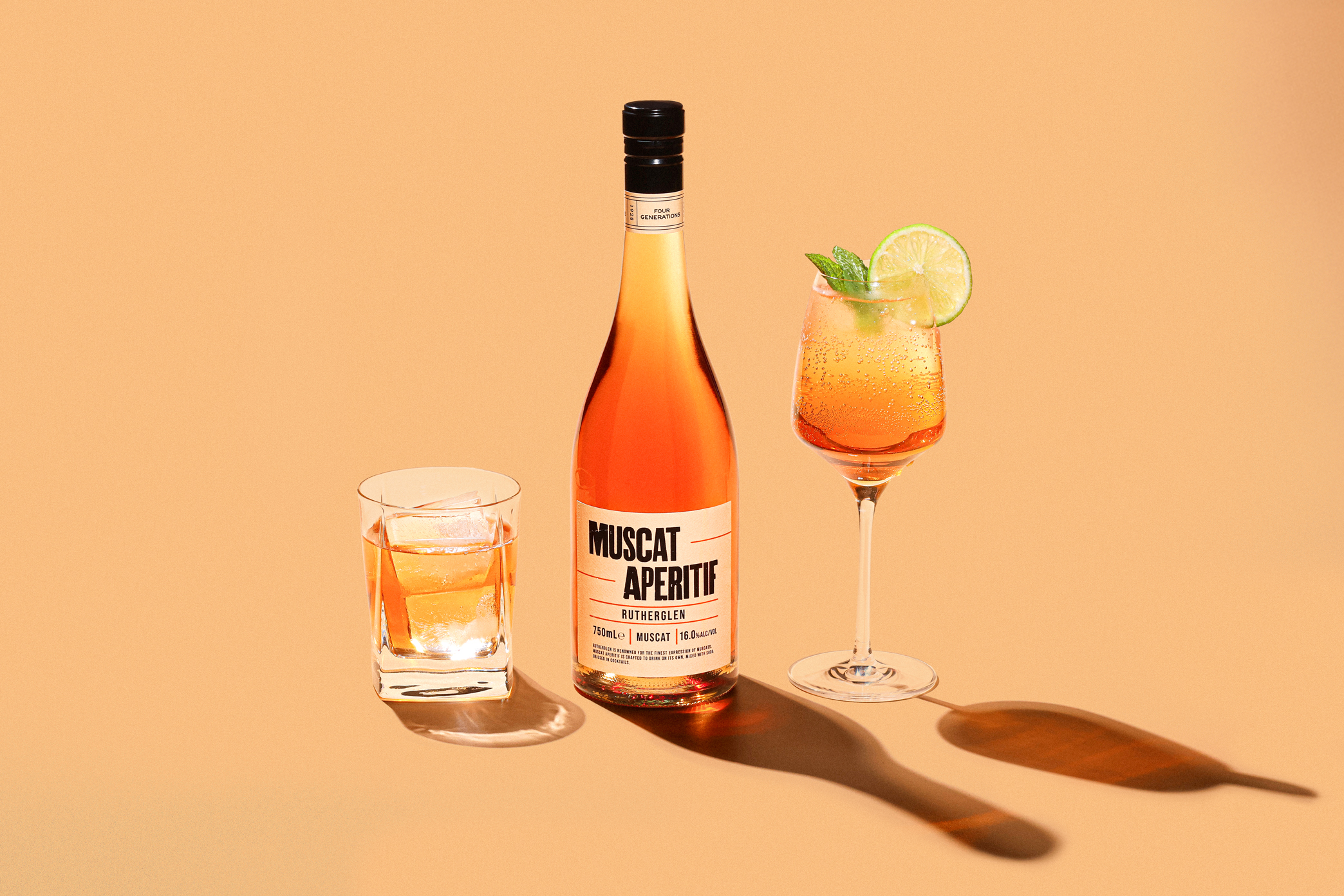
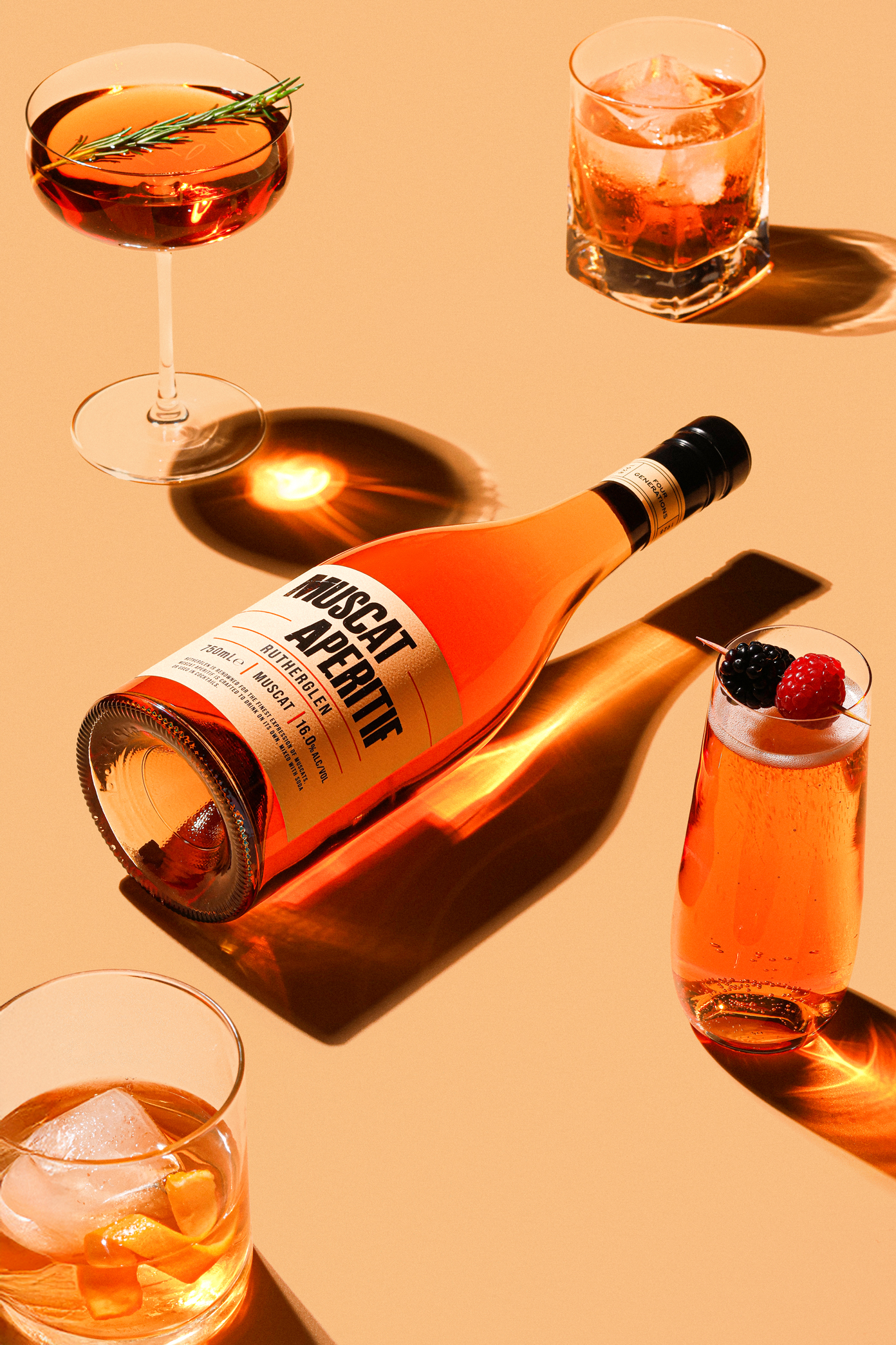
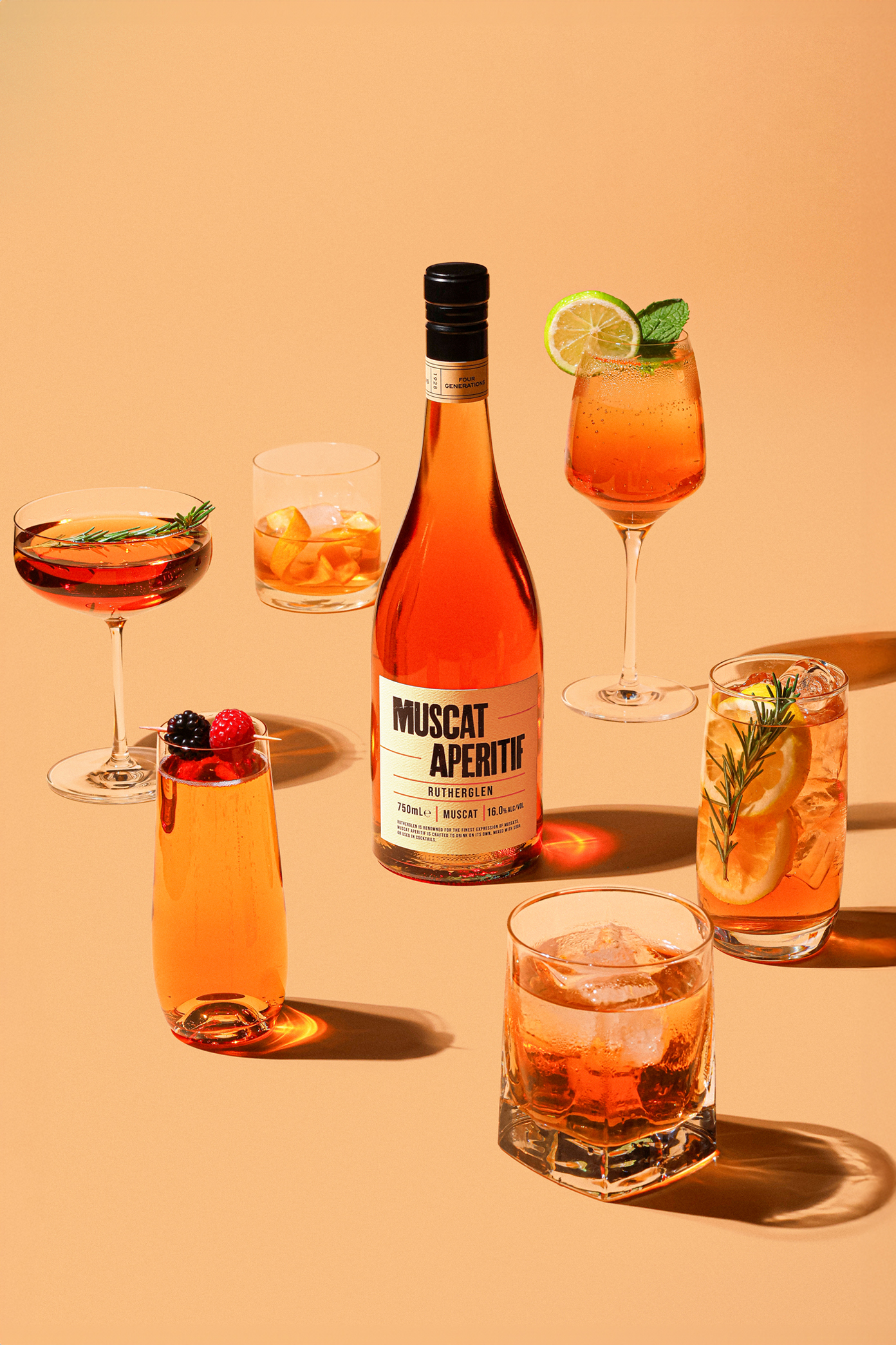
De Bortoli Muscat Aperitif
De Bortoli’s Muscat Aperitif Rutherglen is a modern expression of one of Australia’s most celebrated wine regions. For more than 150 years, Rutherglen has been renowned for producing exceptional Muscats, with the region’s unique terroir delivering depth, complexity, and distinctive character. Drawing on its long-standing history in Rutherglen, De Bortoli Wines has crafted the Muscat Aperitif to celebrate this heritage while presenting it in a versatile and approachable style for contemporary drinkers. The Muscat Aperitif demonstrates De Bortoli’s understanding of the evolving ways people enjoy wine and its commitment to innovation while respecting tradition. Honouring the classic Muscat style, it is designed to be enjoyed chilled, at room temperature, or in cocktails, offering a fresh, approachable expression that retains the depth, complexity, and distinctive character Rutherglen is renowned for. In this way, the wine bridges the region’s rich history with contemporary drinking occasions, embodying De Bortoli’s philosophy of crafting wines that honour tradition while remaining relevant for today’s audience.
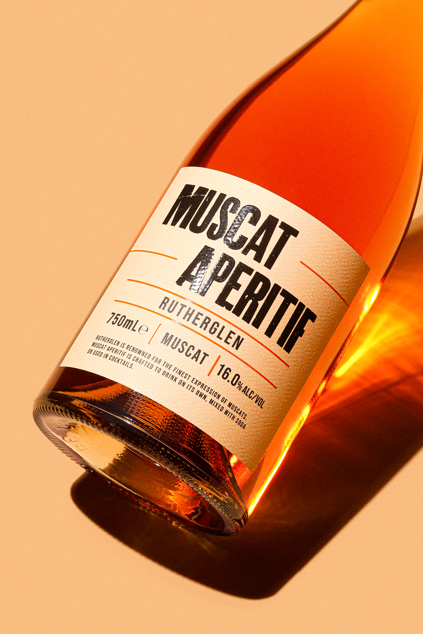
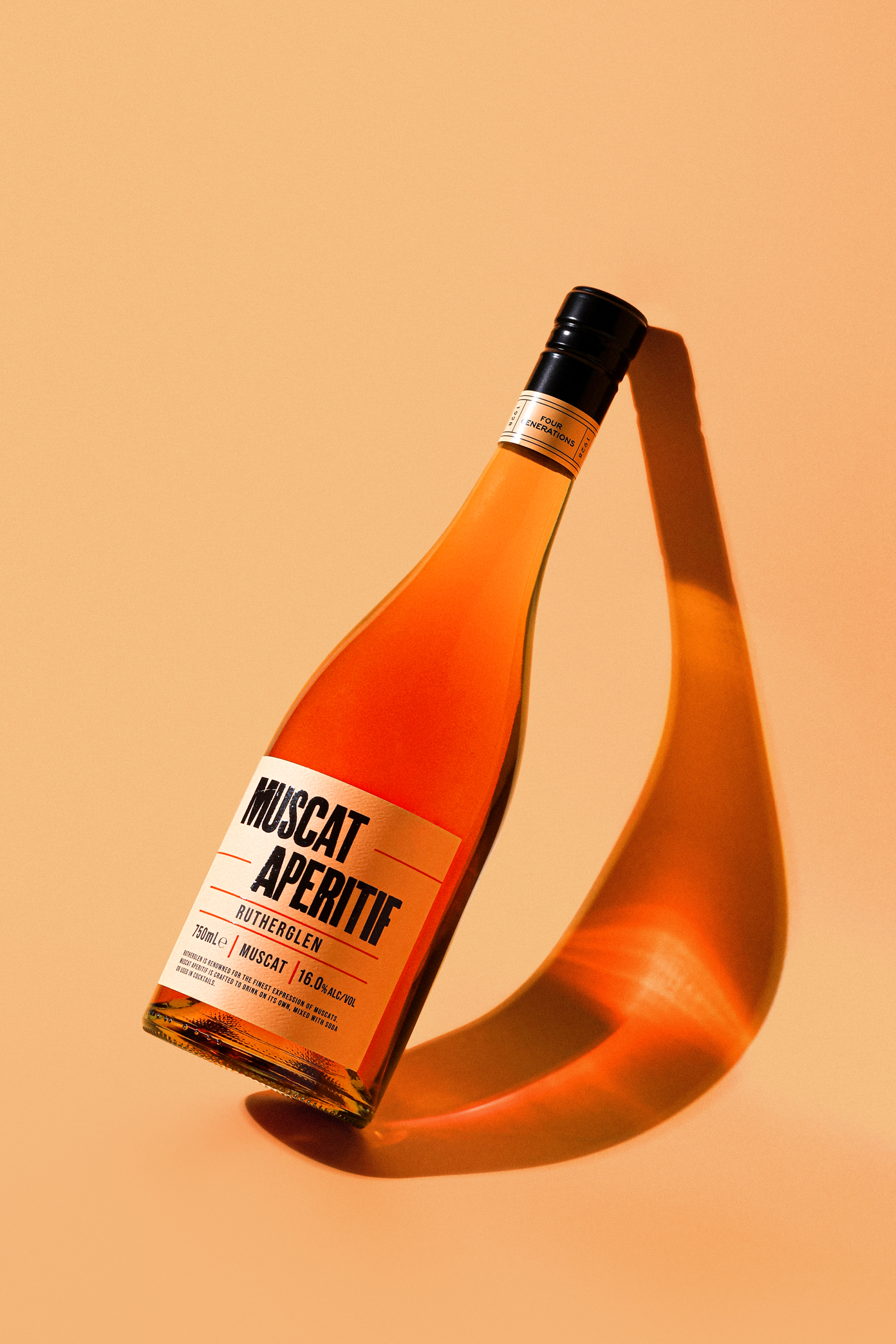
The label was created by the De Bortoli Wines in-house design team and the design approach balances heritage and modern simplicity, a look that appeals to contemporary drinkers who appreciate authenticity, craftsmanship, and design clarity. The modern minimalist design approach combines a bold san serif typographic hierarchy with clean minimalist spacing and restrained colour use to convey confidence and heritage without looking overly traditional. The font used to highlight Muscat Aperitif is a heavy, condensed sans-serif typeface, giving it a crafted, artisanal feel while remaining bold and legible. The colour palette is warm and understated, matching the amber hue of the wine colour. The orange lines on the label are closely associated with the colour cues for Muscat, enhancing cohesion between the label and the wine. Overall the clean label edges give a refined and confident aesthetic.
CREDIT
- Agency/Creative: De Bortoli Wines
- Article Title: De Bortoli Muscat Aperitif Presents a Modern Take on Australia’s Iconic Rutherglen Style
- Organisation/Entity: In-House
- Project Status: Published
- Agency/Creative Country: Australia
- Agency/Creative City: Melbourne
- Market Region: Australia
- Project Deliverables: Advertising, Advertising Photography, Art, Art Direction, Brand Creation, Brand Design, Brand Experience, Brand Identity, Brand Mark, Brand Naming, Branding, Creative Direction, Design, Graphic Design, Label Design, Lettering, Logo Design, Packaging Design, Photography, Photography Styling, Product Design, Product Naming, Product Photography, Retouching, Typography
- Industry: Food/Beverage
- Keywords: WBDS In-House Design Awards 2025/26 , Wine, Graphic Design, In-house, De Bortoli, Australia, Label Design, Packaging, Branding, Design, Muscat, Rutherglen


