Background
Froliq is an inclusive and modern childcare destination determined to lead the industry with a research-based approach to early learning. Founders Imran and Omar approached Rivyl with a vision to reject the “cookie-cutter” model typical of the sector. Their goal was to cultivate a nurturing environment where children’s growth is fostered through joy, discovery, and limitless imagination. The challenge was to architect a brand foundation that reflected this high standard of care while feeling accessible, magical, and distinct to both children and parents.
The Brief
The childcare market is saturated with generic messaging and predictable visual tropes. Froliq’s brief was to disrupt this category and establish a distinct market position. The objective was to build a comprehensive “world” rather than just a logo. We wanted to create a place where children could sing, tell stories, and return home excited every day. The client required a full-service brand creation. This included naming, brand strategy, visual identity, and environmental application that would capture the imagination and communicate a sense of adventure.
Strategy
Our strategic entry point was to define a “Froliqsome” brand voice. We wanted it to be vibrant, energetic, and sophisticated enough to instill confidence in parents while remaining whimsical enough to captivate children. We identified that the brand needed to live at the intersection of education and play. The strategy focused on “World Building” to ensure that every touchpoint, from the name to the walls, contributed to a cohesive narrative of exploration.
Design Process
The design process was a collaborative effort between our design and copywriting teams to ensure the visual assets and the brand narrative were inseparable.
Naming Strategy: We coined the name “Froliq” as a purposeful portmanteau of “frolicking” and “IQ.” This hybrid effectively bridges the gap between joyous, active play and intelligent, research-based learning. It signals to parents that fun and education are not mutually exclusive.
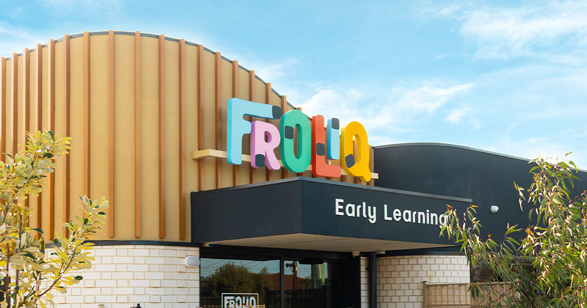
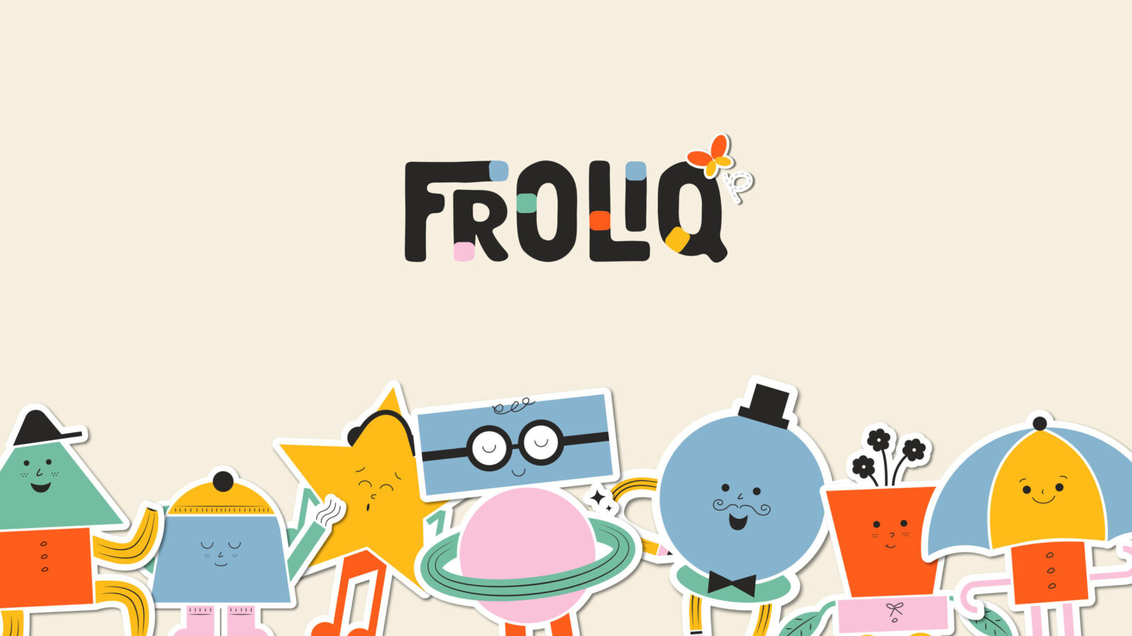
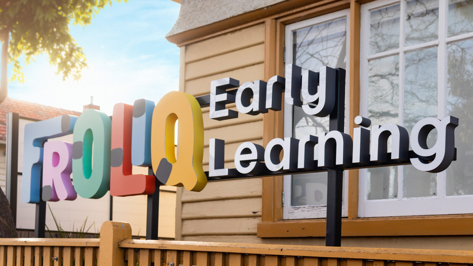
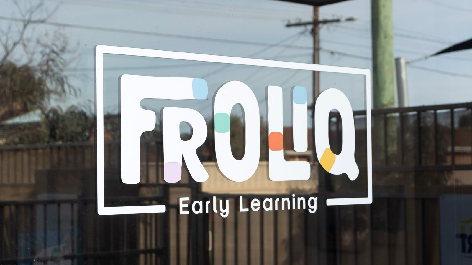
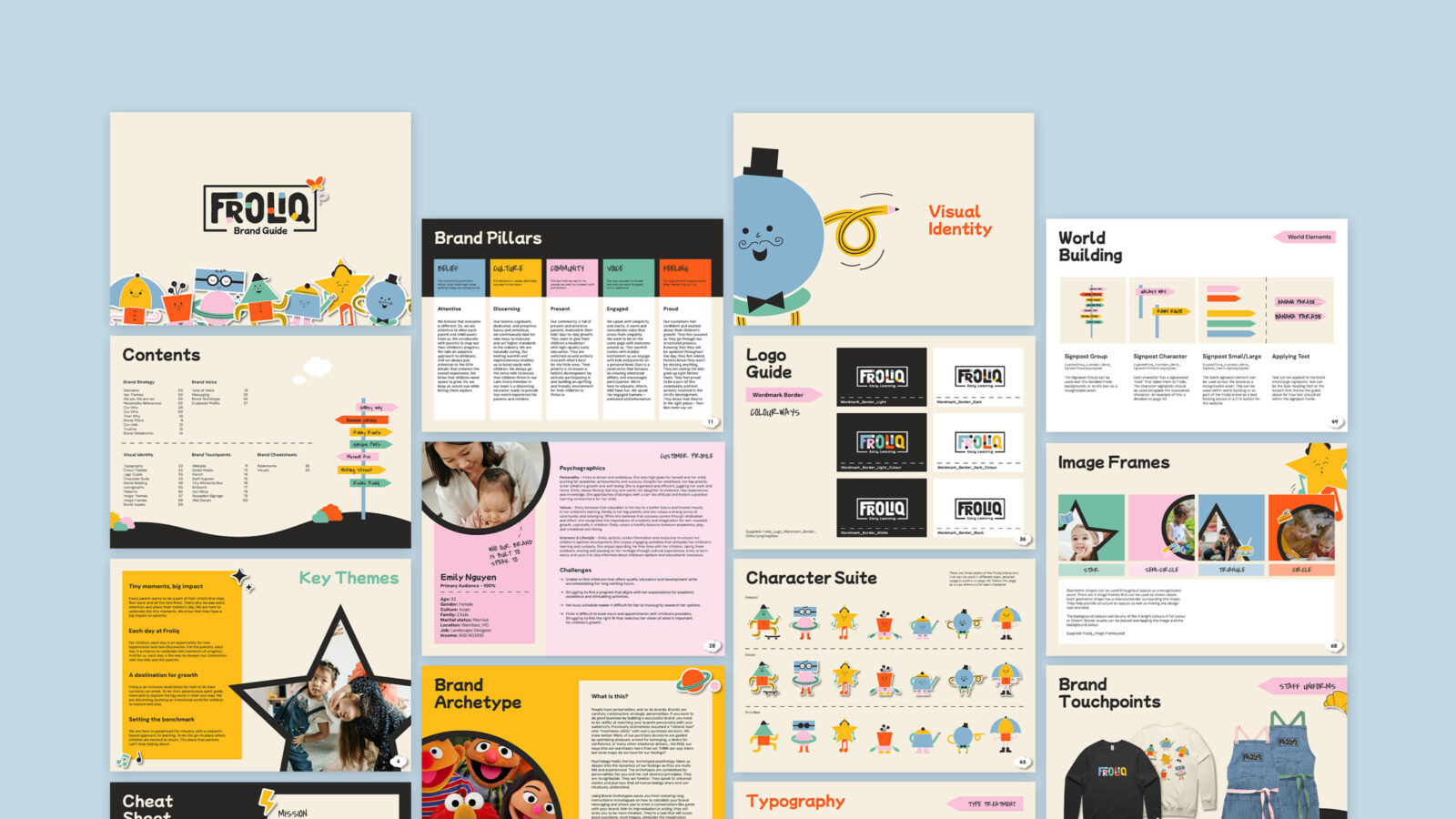
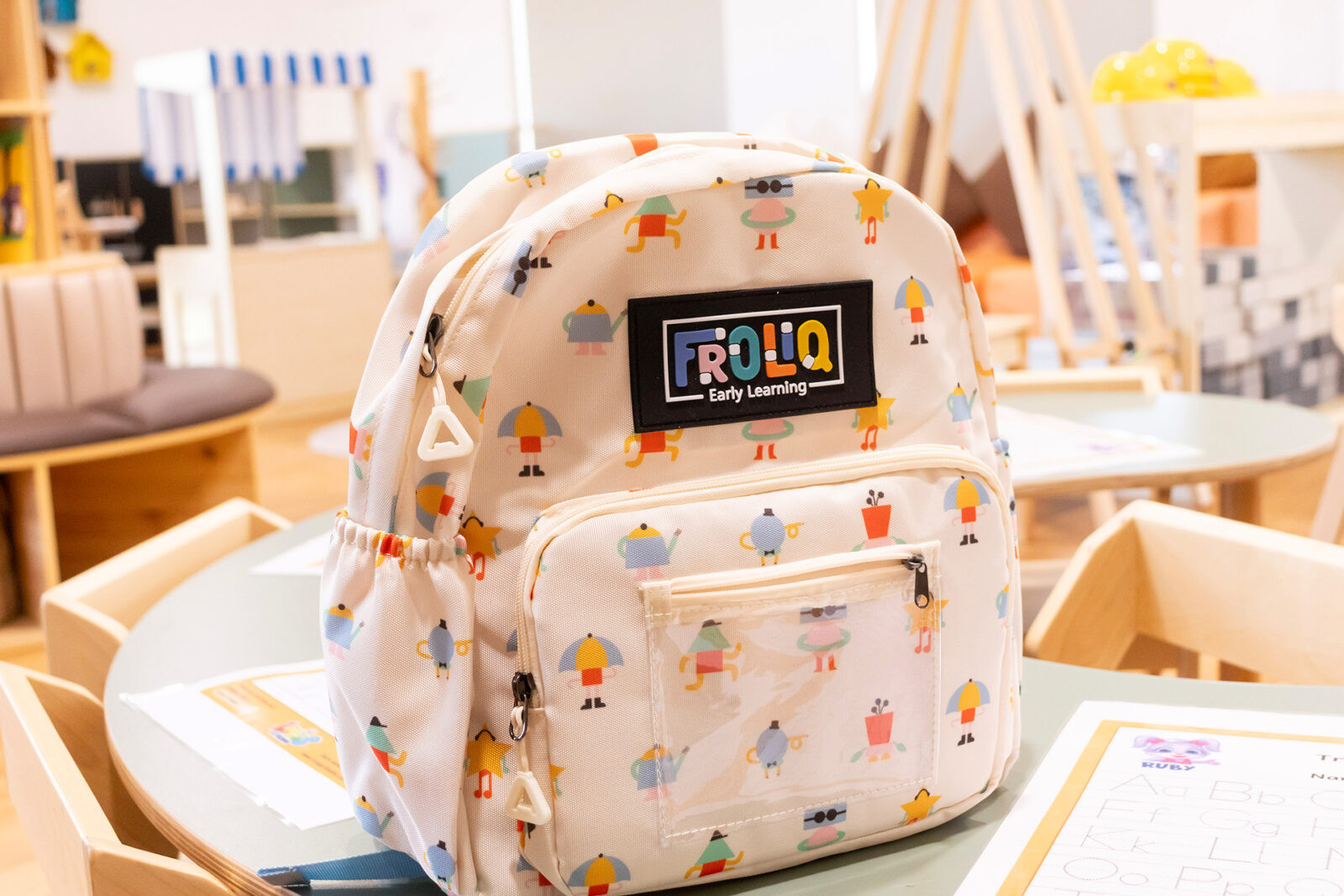
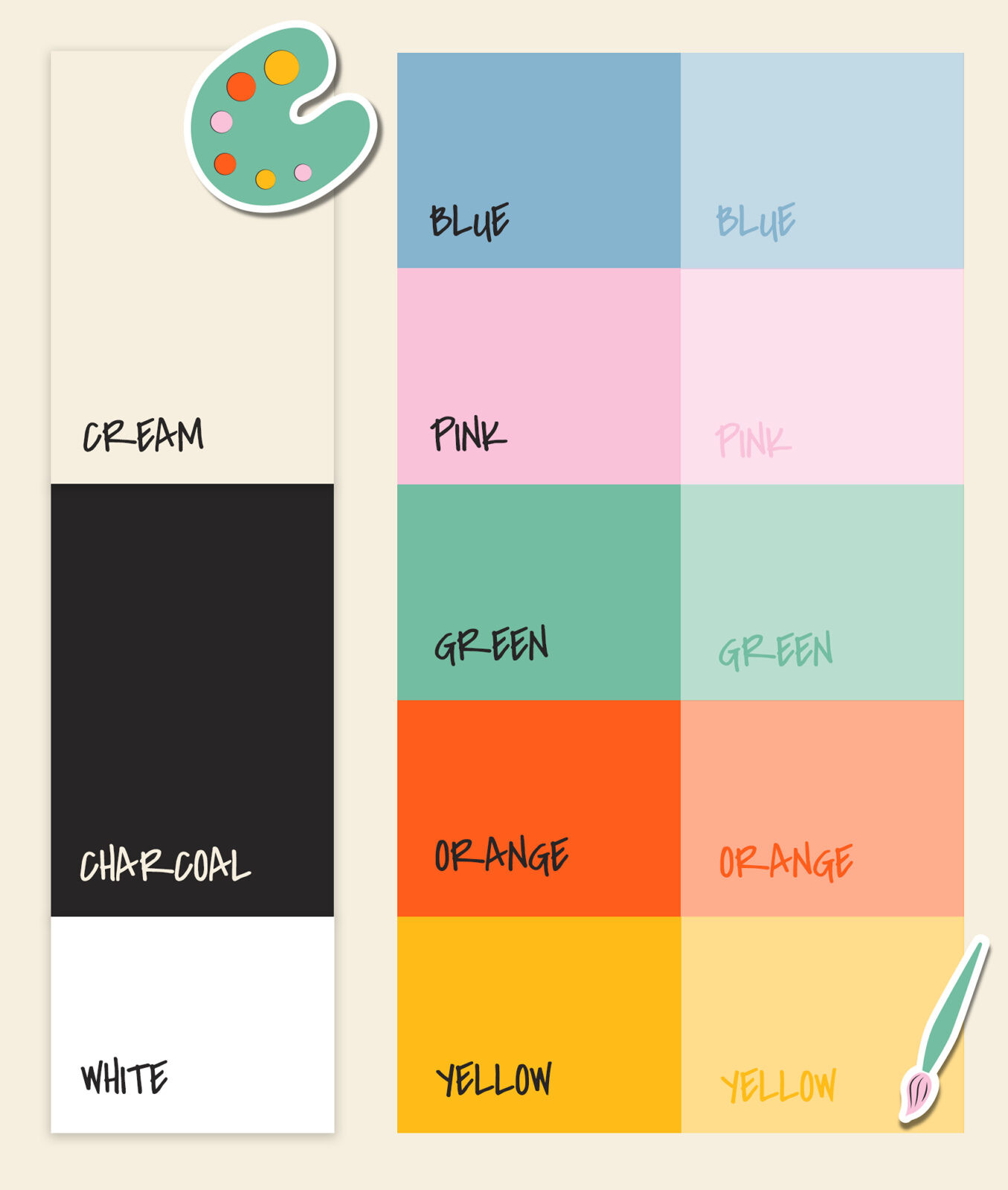
Visual Identity: We created a bespoke, organic wordmark featuring custom clustered letters. The typography was crafted to exude a sense of whimsy while maintaining the modern sophistication required to appeal to a contemporary parent demographic.
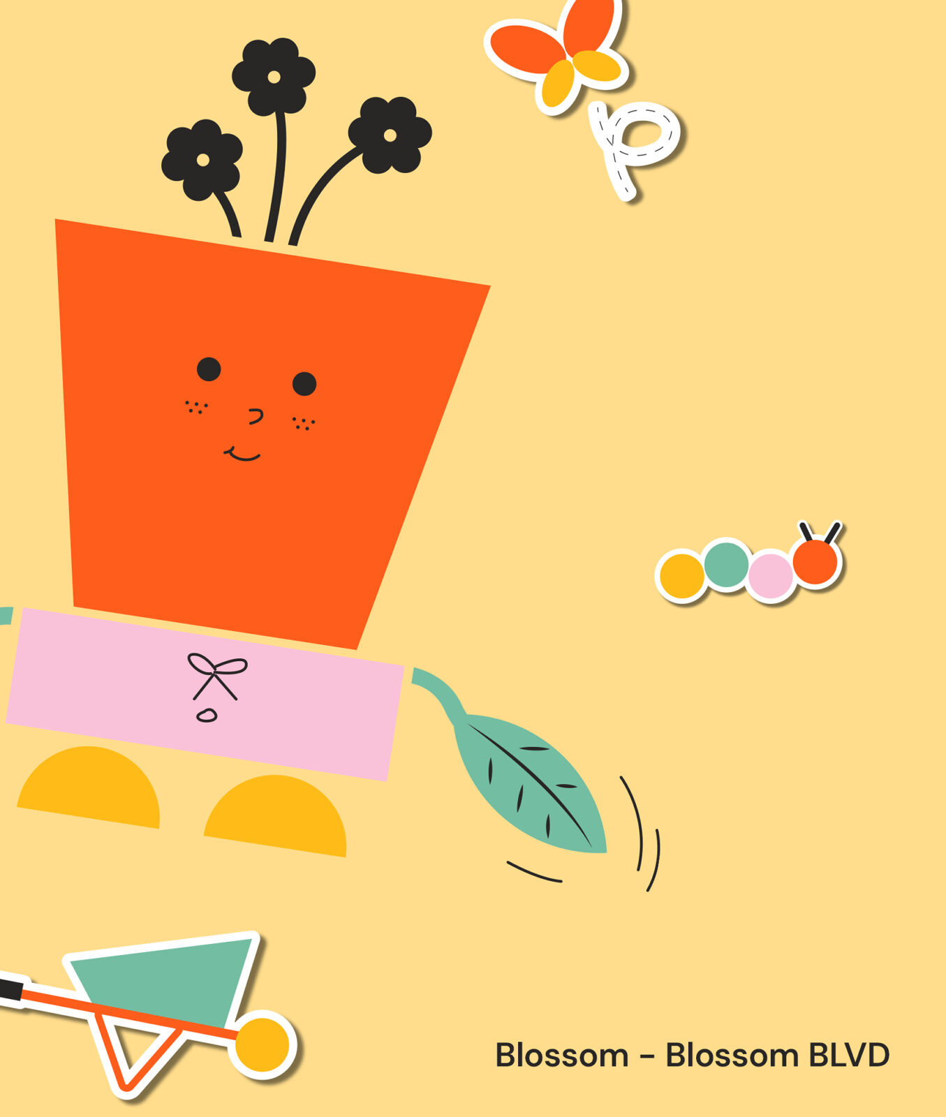
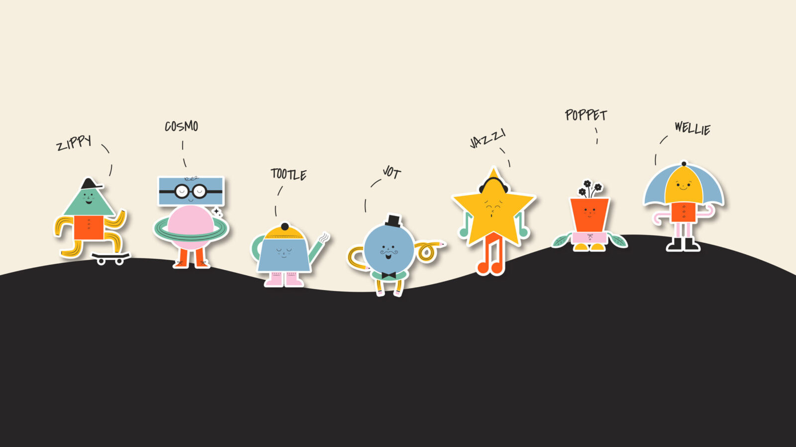
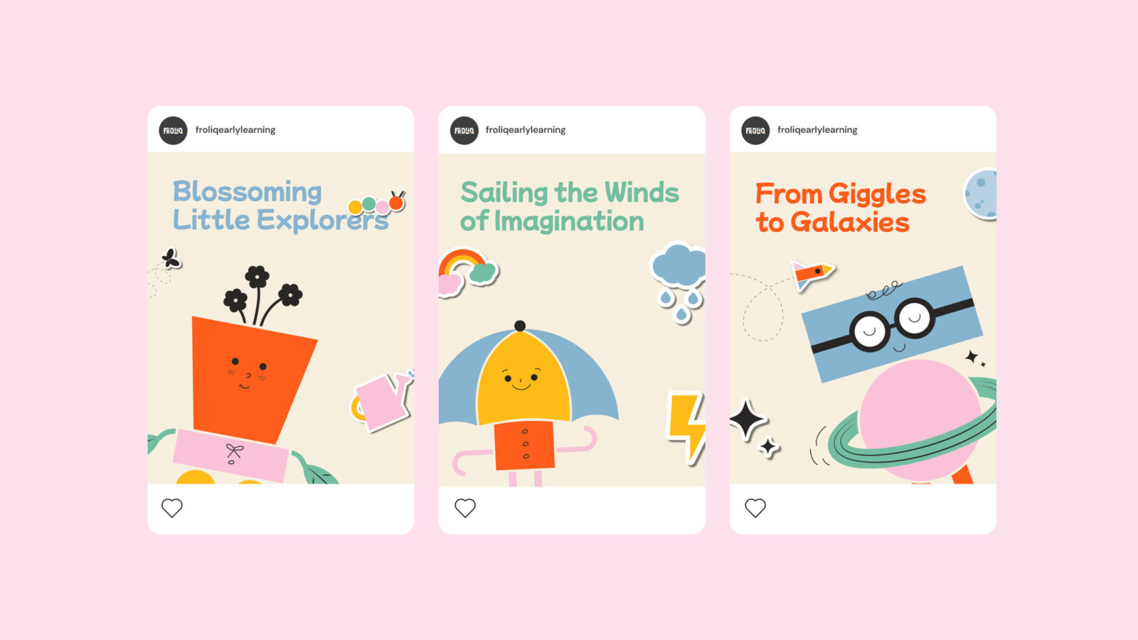
Character Design & World Building: We developed a cast of unique characters. Each has their own backstory and specific role within the “Froliq world.” These were designed not as static mascots but as active participants in the brand story to guide children through their daily activities.
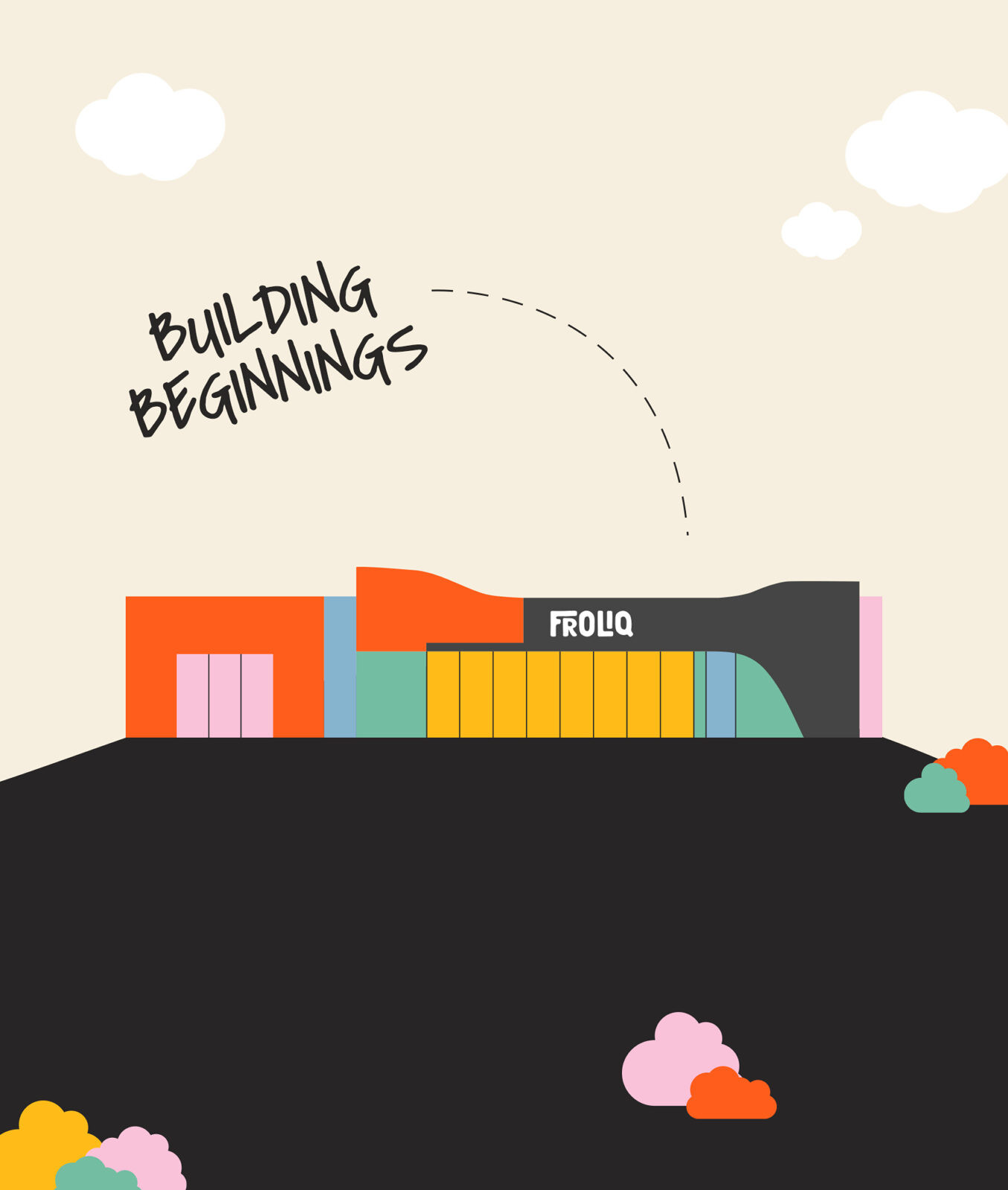
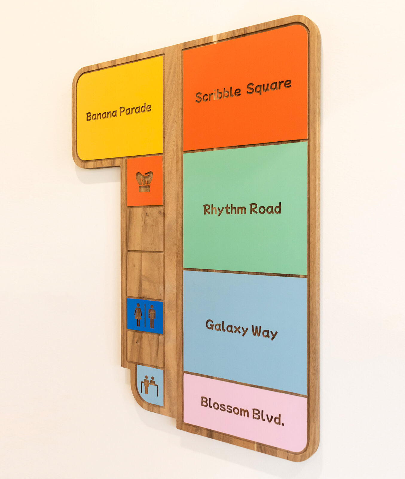
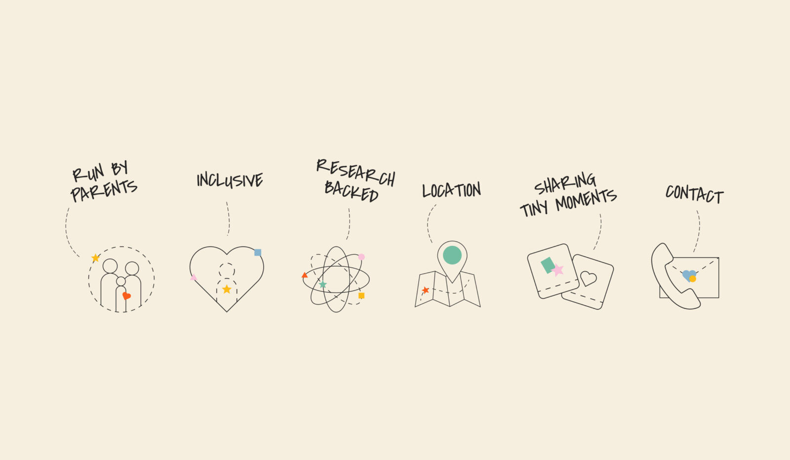
Environmental Graphics: To translate the brand into the physical space, we designed a collection of custom stickers and wall assets. We utilized dashed lines and scribbles to create “map-like” features which symbolize the journey of exploration and discovery that children embark on daily.
Results & Impact
The result is a robust and unparalleled brand identity that successfully differentiates Froliq from traditional competitors. By rejecting standard childcare aesthetics and embracing a story-driven approach, we provided Froliq with a powerful tool for community engagement. The new identity has thrilled the founders and set a new benchmark for what a modern childcare brand can look like. It effectively transforms a service provider into a true destination of wonder.


CREDIT
- Agency/Creative: Rivyl
- Article Title: Rivyl Builds Froliq as a Story-Driven Childcare Brand Rooted in Play and Learning
- Organisation/Entity: Agency
- Project Status: Published
- Agency/Creative Country: Australia
- Agency/Creative City: North Sydney
- Project Deliverables: 2D Design, 3D Art, Art Direction, Brand Architecture, Brand Creation, Brand Design, Brand Guidelines, Brand Identity, Brand Mark, Brand Naming, Brand Strategy, Brand Tone of Voice, Branding, Character Design, Copywriting, Creative Direction, Design, Graphic Design, Icon Design, Identity System, Illustration, Logo Design, Tone of Voice, Typography
- Industry: Education
- Keywords: WBDS Agency Design Awards 2025/26 , Brand Creation, Childcare Identity, Playful Learning, Character Design, Visual Storytelling, Whimsical, Naming Strategy, Environmental Graphics, Discovery, Modern Education
-
Credits:
Strategy Director: Emma Feekings
Copywriter: Pujan Pun
Designer: Esther Ayres
Designer: Alicia D'Amicis


