


Overview
WINIX is one of Korea’s leading home appliance companies, built on a philosophy of “Customer Obsession” mind. Based on this philosophy, WINIX decided to move beyond the traditional supplier-oriented airline business model and launched an airline business with a clear vision: to create a truly customer-obsession airline grounded in sincerity.
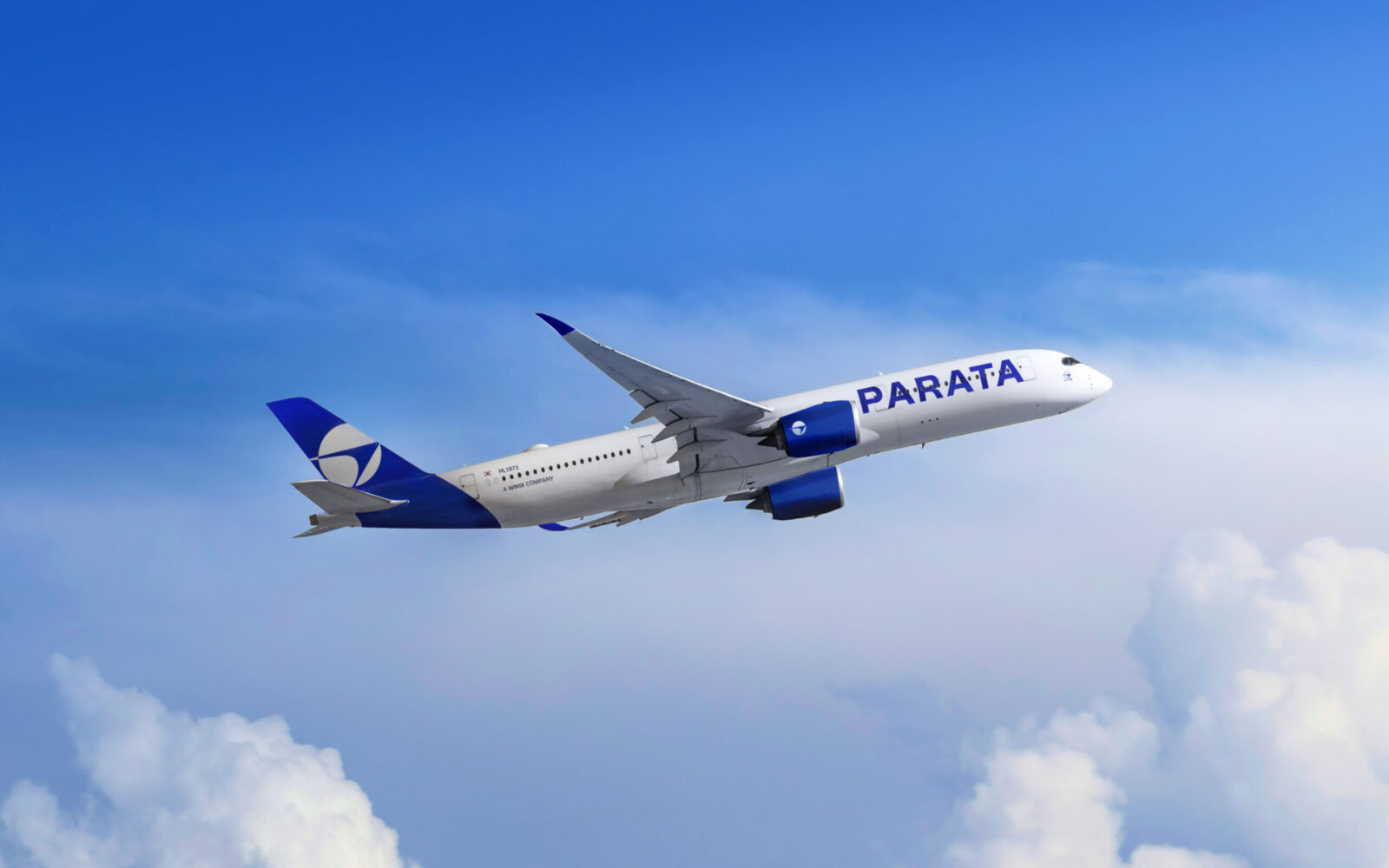
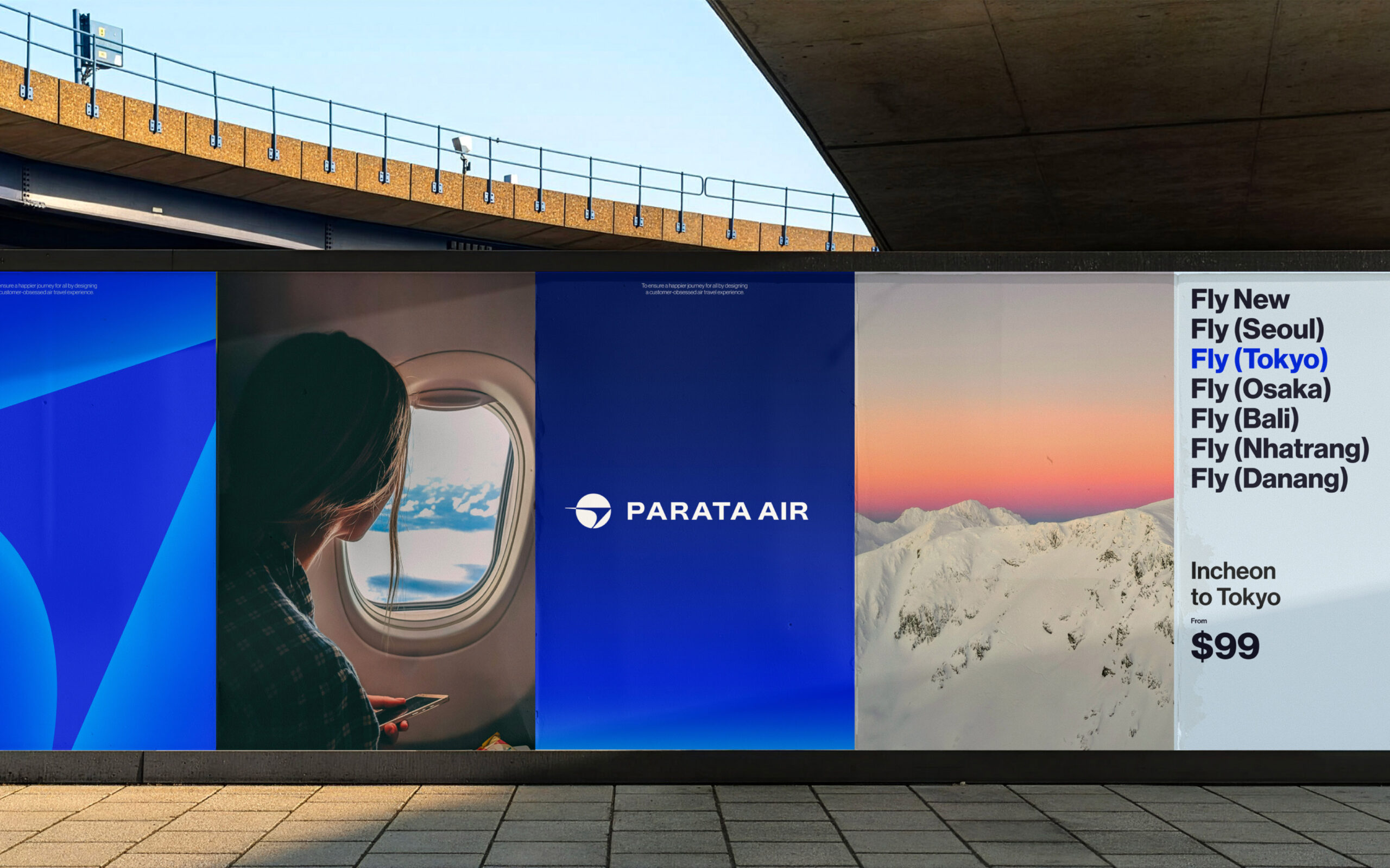
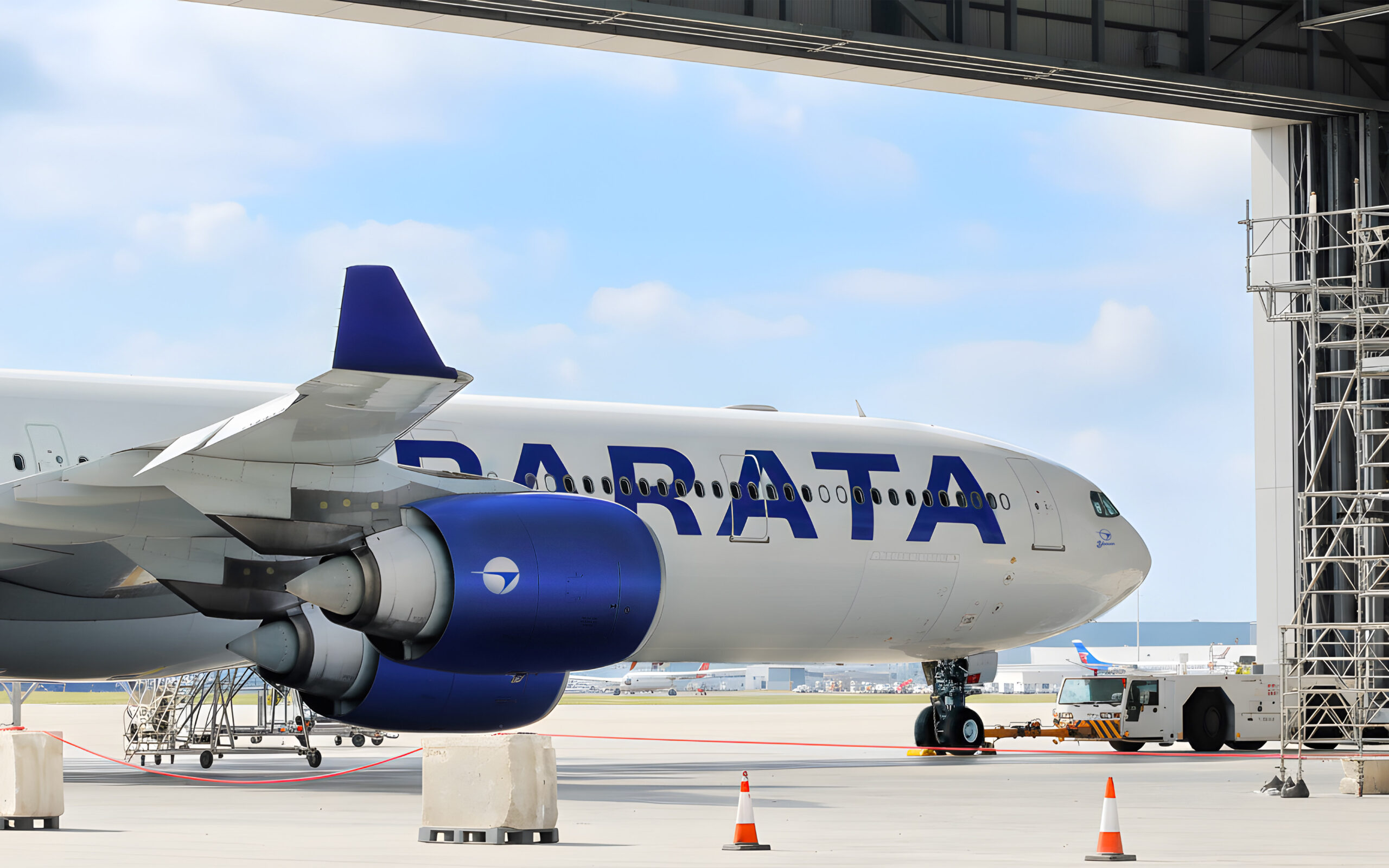
The new airline is named “PARATA AIR.” The name comes from the Korean word “파랗다” /parata/, which means “blue” as in the color of the clear sky, transliterated into English. It embodies the will to become a pleasant, and happy travel partner for every customer.
PARATA AIR currently operates domestic routes from Incheon, Gimpo, Jeju, and Yangyang, and international routes to Japan and Vietnam. It plans to expand its network to the United States, Canada, and beyond. And now it strives to innovate the industry as it moves toward delivering a happier journey to its customers.
Brand Conception
The core philosophy of PARATA AIR is “Customer Obsession.” Building on this philosophy, we set out to redesign the entire air travel experience from the ground up.
While we referenced the global HSC (Hybrid Service Carrier) model, our goal went beyond simply allowing customers to pick and pay for optional services in a rational way. Instead, we focused on designing a truly customer-obsessed air travel experience—one that starts from fundamentals such as generous seat pitch, sincere and warm service, and safety-first operational expertise.
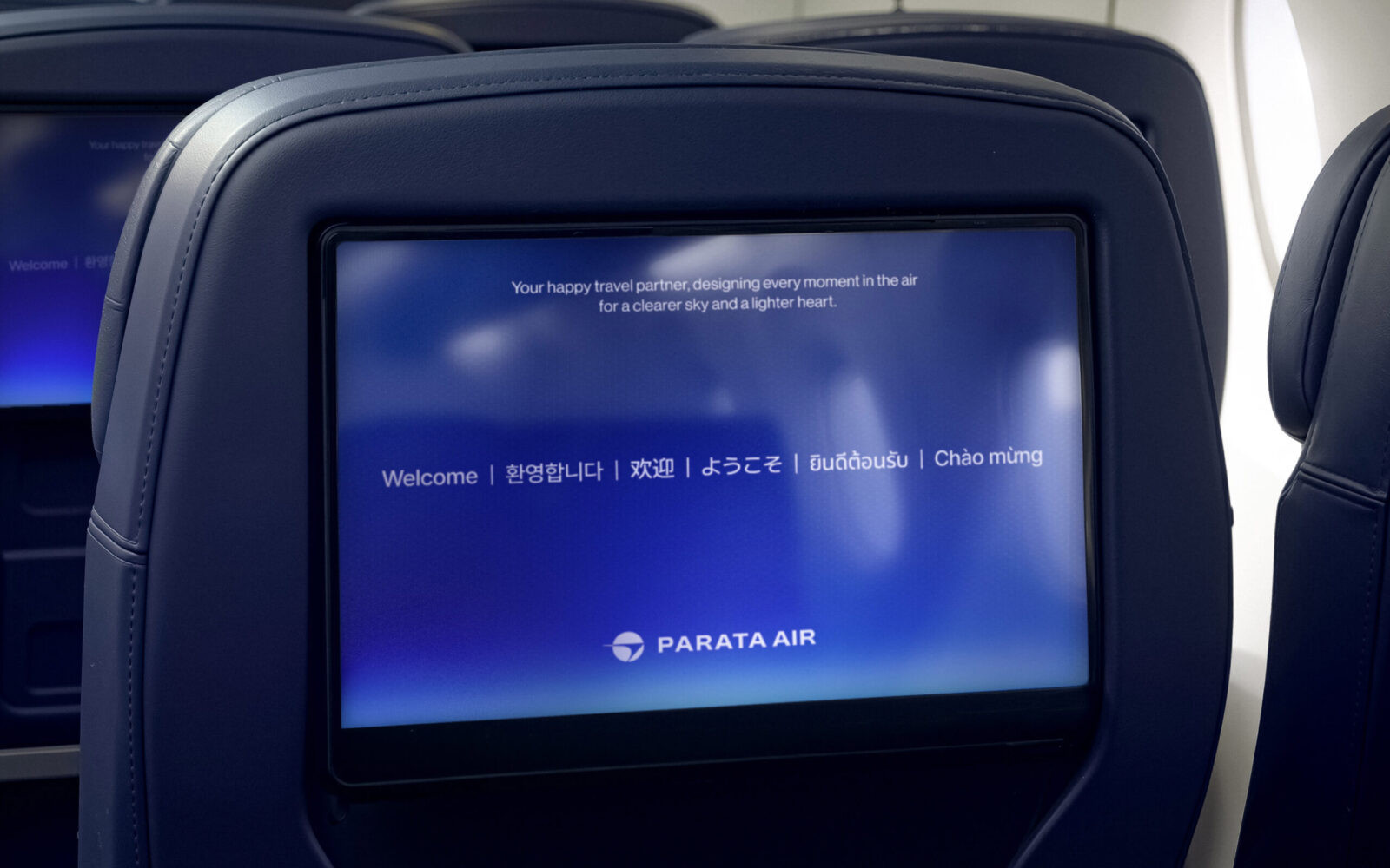
We defined the brand essence as “The Happier Journey.” This expresses the airline’s commitment to becoming a happy travel partner that supports every traveler’s feelings of excitement, joy, and anticipation from the beginning to the end of their journey.
Brand Name Creation
Until now, most Korean carriers have used familiar naming patterns—nation-based names like Korean Air, place-based names like Jeju Air or Asiana Airlines, and company-derived names like T’way (from Tomato Mutual Savings Bank).
In this context, lmntcompany created the brand name “PARATA”—a name that carries a distinctly Korean sensibility while remaining easy to use and understand in global markets.
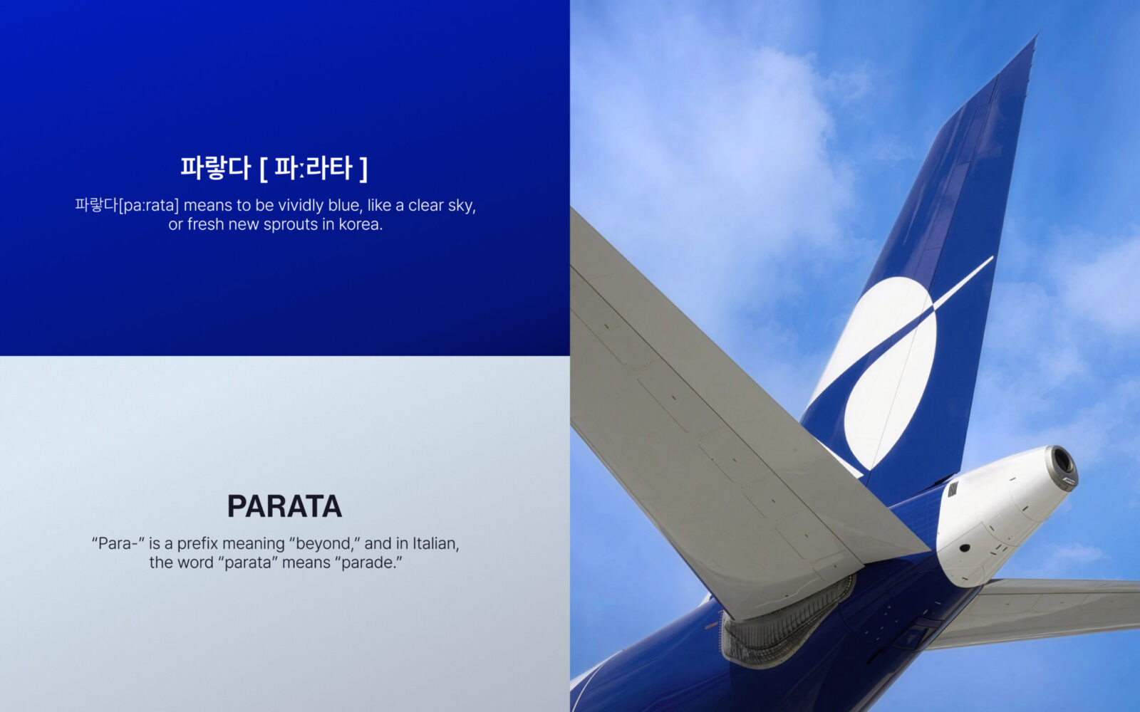
In Korean, “파랗다”’ not only describes the color blue, clarity, and brightness, but is also used to express something that feels new, fresh, and just beginning. In everyday language, Koreans often say “하늘 참 파랗다” (“the sky is really blue today”) when the weather is clear and beautiful—an expression that naturally gives the listener a sense that it will be a good, positive day.
We wanted to preserve the emotional tone and imagery carried by this natural Korean word while also ensuring registrability as a trademark. To do this, we used the phonetic notation of 파랗다—[파ː라타], [paːrata]—as the basis for the brand name PARATA. As a result, the name PARATA, on its own, evokes clear and pleasant skies, the thrill of travel, and a happy state of mind.
From a phonetic and morphological perspective, PARATA has a simple CV–CV–CV pattern, with the bright, open vowel “a” repeated throughout. This makes the name easy to pronounce in many languages around the world.
The prefix “PARA-” in PARATA also recalls the meaning of “beyond”, aligning naturally with the brand philosophy of creating a new paradigm in customer-obsessed air travel experience. In addition, the Italian word “parata” means “parade,” which allowed us to embed the idea that “just like a joyful parade, we want every customer’s journey to feel festive and enjoyable.”
Results
PARATA AIR symbolizes a brand promise: to transform the paradigm of air travel around a truly customer-centric experience. For travelers, it will be remembered as a brand that promises a happier journey and a more pleasant, comfortable flight.

CREDIT
- Agency/Creative: lmntcompany
- Article Title: lmntcompany Launches PARATA AIR With a Customer-Obsessed Airline Brand Experience
- Organisation/Entity: Agency
- Project Status: Published
- Agency/Creative Country: Korea, Republic of
- Agency/Creative City: Seoul
- Market Region: Global
- Project Deliverables: Brand Creation, Brand Design, Brand Identity, Brand Naming, Brand Strategy, Branding
- Industry: Transport
- Keywords: WBDS Agency Design Awards 2025/26 , brand naming, brand concept, brand identity
-
Credits:
Creative Director: Choe jangsoon
BX Director: Han Hyungmin
Brand Lead Strategist: Yu Moonsun
Brand Strategist: Lee Jiho
Brand Strategist: Kim Sohyun
Brand Lead Designer: Hwang Euiseong
Brand Designer: Hong Sungmin
Brand Designer: Kim Youngjae
Client-Side Branding PM: Lee Hotak
Client-Side PM: Nam Inhye


