


Love Struck: a deliciously fresh glow-up
Background & Brief
Richard built up Love Smoothies from a stall at Borough Market into a thriving business supplying gyms, cafes and hotels worldwide with his pre-prepped ‘frozen to fresh’ smoothie mixes.
When we started working with the team back in 2020, the business was primarily B2B and marketing was very functional and product-focused. Richard saw a growth opportunity and approached us to help create a consumer brand with a clear sense of purpose that he could be proud of.
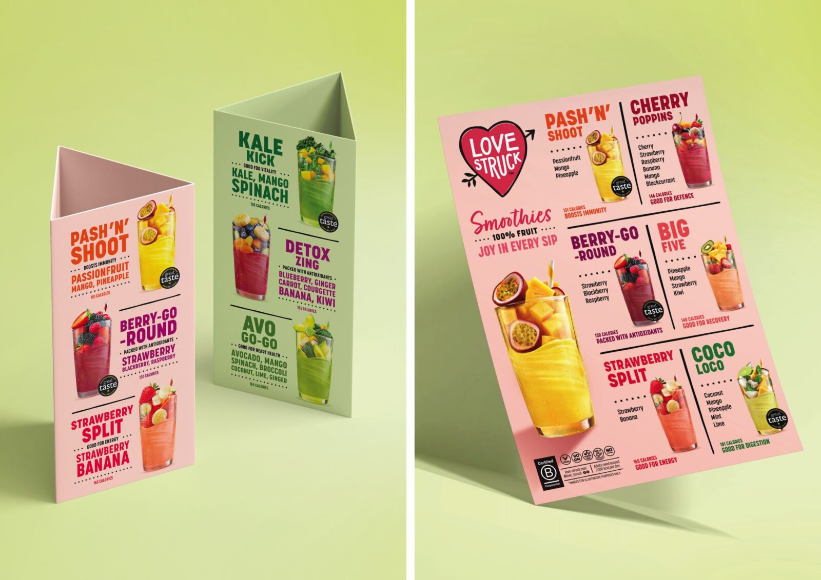
With its lip-smackingly good, Michelin-star-chef recipes and naturally healthy convenience credentials, we created a positioning that would speak to the optimisers of this world – those who live well and have an appetite for life. We played up the mood-boosting, sensory experience of the products and helped position the brand as the joyful taste-maker of the category. We also heralded in a new fun and friendly identity and a new name: Love Struck.
Five years later, with impressive multi-channel sales growth, a successful DTC offer and expansion into the U.S., the brand strategy is still on point. The identity less so. It was starting to feel dated and twee which was particularly apparent in retail.
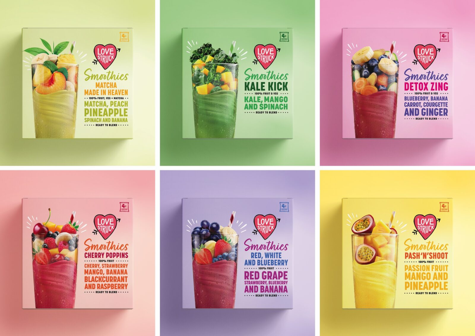
Aesthetically, packaging needed a refresh but functionally it was also missing the mark, especially in the vast, highly competitive freezer aisles of U.S. grocery stores. Whilst the bright, cheerful cartons had strong shelf-impact they failed to communicate what the product is and how it’s used. Too much copy and illustrative fruits meant shoppers didn’t understand that there were individual sachets of real whole fruits and veggies inside and that they needed to add liquid and blend. What’s more, the imagery didn’t convey the refreshing, deliciousness of the product.
Our brief was to breathe new life into the brand world and identity (excluding the logo), starting with packaging – to make it more contemporary, easier to understand, fresher and above all, more delicious and compelling.
Packaging specifically needed to:
• Simplify messaging and create a clearer hierarchy
• Make it very apparent that Love Struck smoothies are made with nothing but real fruit and veg – they’re not ultra-processed powders or purées
• Make the sachet format and quantity more prominent – shoppers found it hard to work out how many serves they got
• Retain the bright bold colours and shelf-impact
• Despite all the functional requirements, ensure packaging still feels distinctly Love Struck with a joyful, uplifting personality
Solution
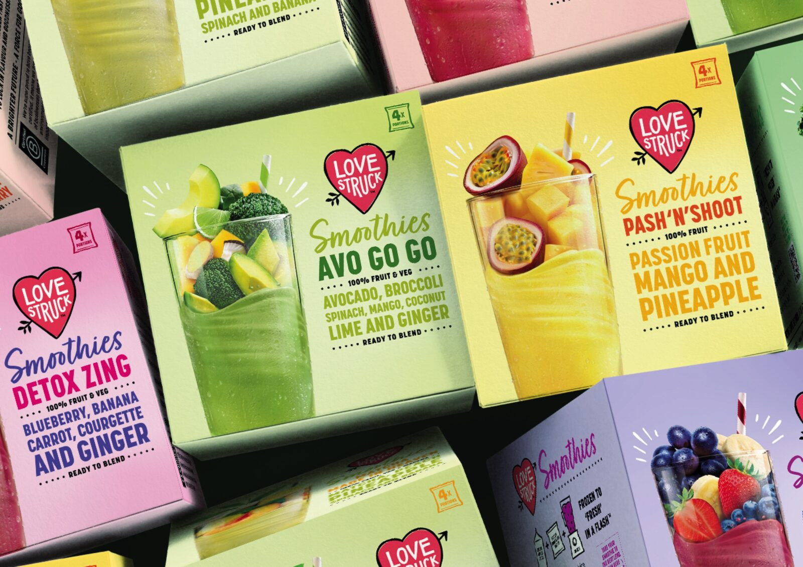
Except for Daily Harvest in the US and Pack’d in the UK, the smoothie mix category is old-fashioned and generic. It features piles of hyper-real photographic fruit and veg or chopped pieces falling into glasses. Brands (and own-label) are bland and lack personality.
In contrast, we wanted to bring modernity, energy and something much more distinctive. With a relatively small canvas and lots to communicate, our biggest challenge was finding a delicious way to play-up real whole fruits and veggies without looking clichéd.
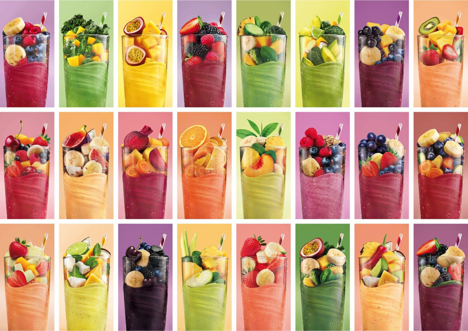
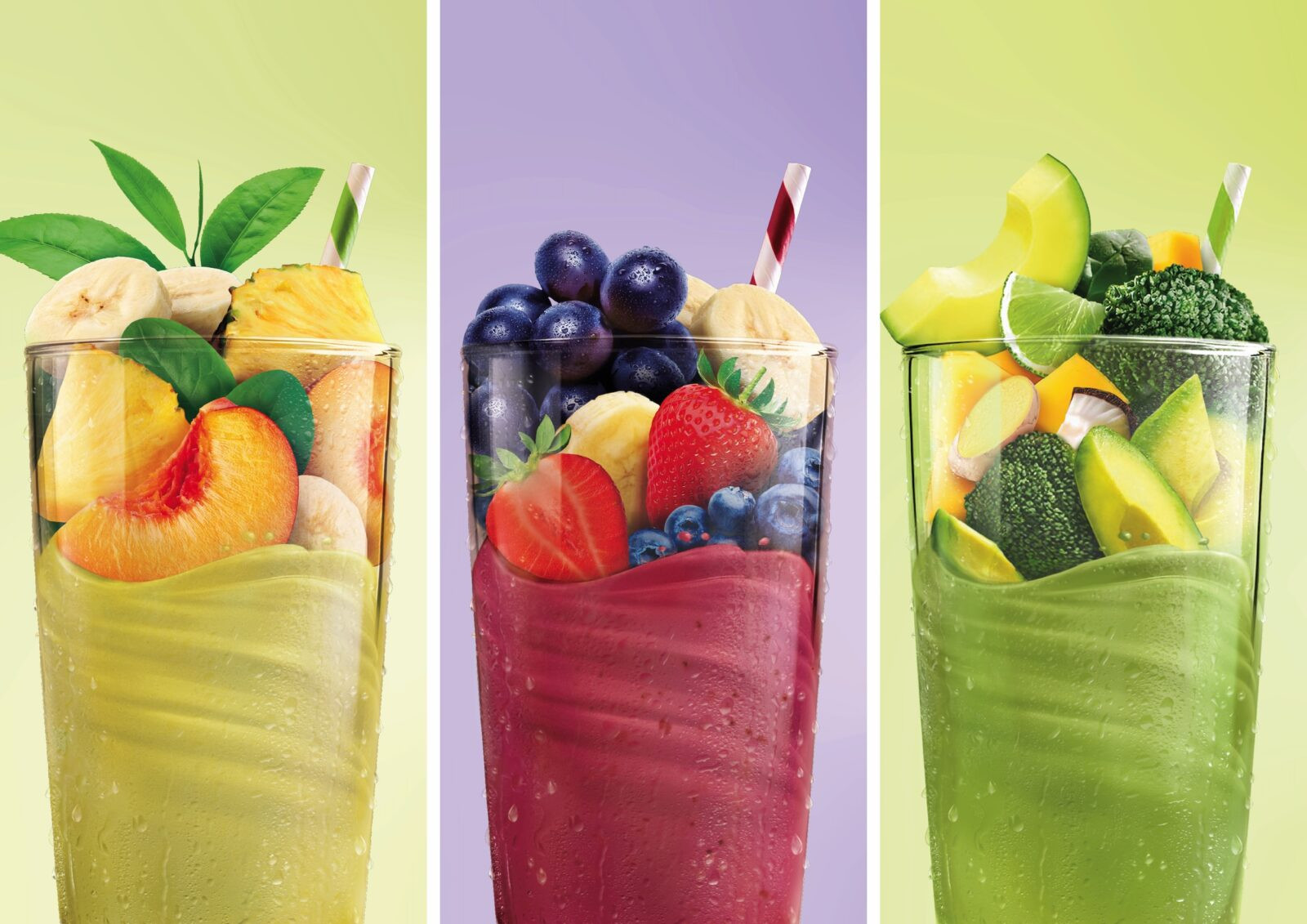
Understanding that our brains are hardwired to process visuals far quicker than words, we came up with a concept featuring an enticing image as a focal point with an abundance of fruit and veg blending into the finished smoothie. It was the perfect idea to convey what the product is, but we knew it would be almost impossible to photograph to achieve range consistency across six different retail products. What’s more, our client loved the concept so much they wanted to roll-it out across the entire brand world and trade POS, meaning there were 24 products to consider!
Our solution was to turn to a combination of AI generated imagery and visualising.
As a starting point, we used Firefly to create the initial glass and product compositions, as well as the swirl of the smoothie in the glass. But there were limitations – fruit and veg quality varied from plump, juicy and real looking, to fake and plastic, or old, damaged and lacking in detail. Consistency of the form and silhouette across different flavours was also problematic.
Overall, retouching and visualising was vital to improve the clarity of the fruit and veg pieces. It also needed to ensure a sense of perfect ripeness and make the drink look utterly refreshing and delicious.
Using some AI-generated individual elements, but primarily isolated royalty free stock imagery, we painstakingly built up the fruit and veg composition piece by piece. Every product needed a different solution – some are more AI-dominated, others use more stock photography. We also needed to dial-up the beads of condensation on the side of the glass and ensure everything looks fresh and glossy.
Results
The final result is a stunning and consistent range of product images. They’re delicious, eye-catching and have big impact.
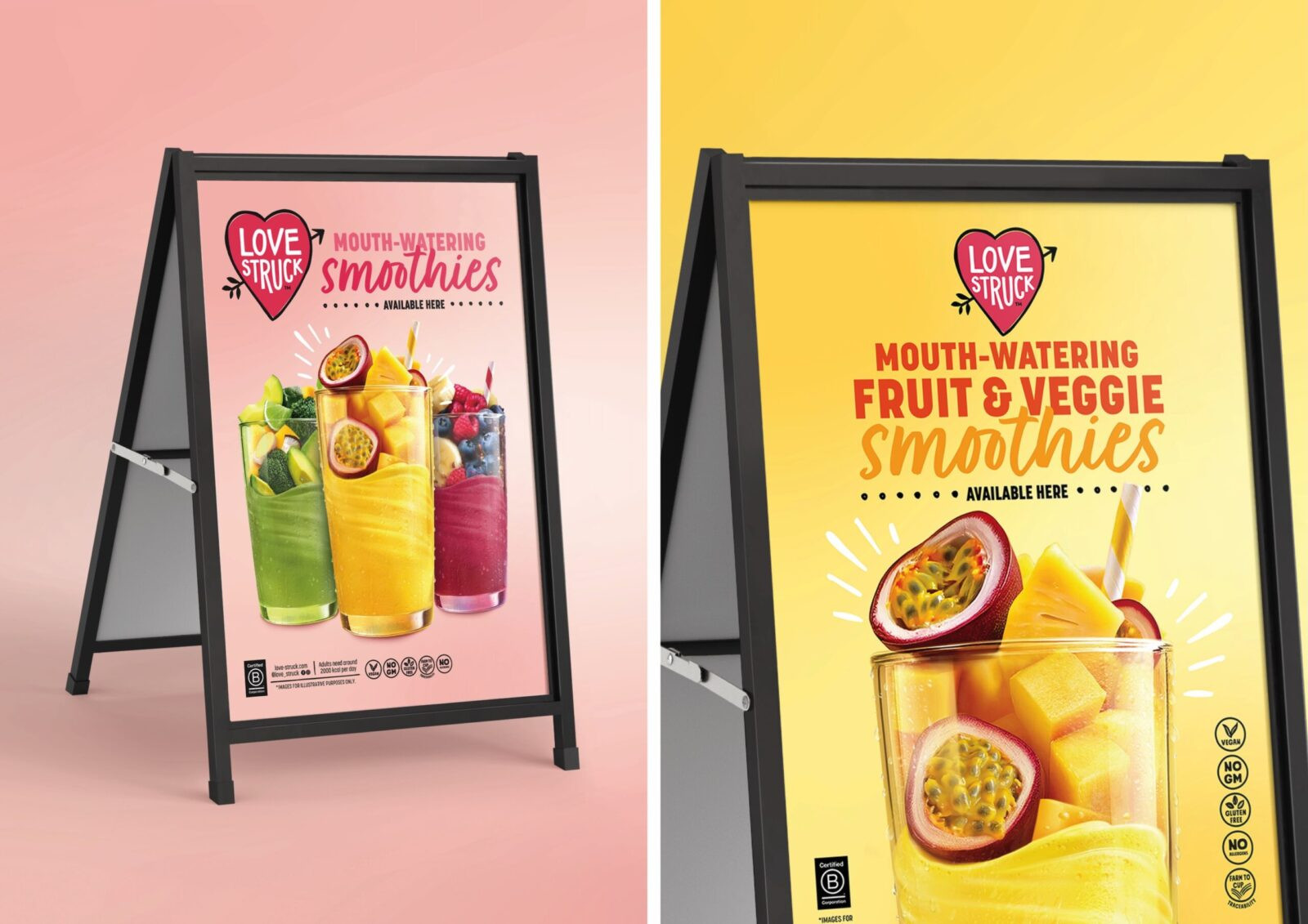
On packaging, the image immediately communicates the product proposition. Off-pack it also does much of the heavy-lifting. POS is enticing, joyful and grabs attention.
Overall, Love Struck’s contemporary glow-up, with visualised imagery at its core, now looks as mouth-wateringly delicious as the smoothies actually are to drink.
“The anecdotal response we’ve had to the redesign has been overwhelmingly positive from both retailers and end-user customers. All have remarked that it is a vast improvement on our previous carton design both in terms of the visual appearance, but also the clarity in conveying what the product is and how it’s used.”
Paul Longega, Managing Director
CREDIT
- Agency/Creative: The Collaborators
- Article Title: The Collaborators Refresh Love Struck With a Contemporary Smoothie Packaging Redesign
- Organisation/Entity: Agency
- Project Status: Published
- Agency/Creative Country: United Kingdom
- Agency/Creative City: Bristol
- Market Region: United Kingdom and United States of America
- Project Deliverables: 2D Design, Art Direction, Brand Design, Brand Identity, Brand Redesign, Brand Strategy, Brand Tone of Voice, Brand World, Branding, Copywriting, Creative Direction, Design, Digital Art, Graphic Design, Identity System, Packaging Design, Rebranding, Retouching, Tone of Voice, Typography, Visualisation
- Industry: Food/Beverage
- Keywords: WBDS Agency Design Awards 2025/26 , Packaging Design, Food & Beverage, Smoothies, Cartons
-
Credits:
Creative Director: Mary Lewis
Design Director: Ben Shrubsole
Business & Strategy Director: Alex Ririe
Visualiser: Christopher Dale
Artwork: Christopher Ellis


