


GROLA — A Contemporary Icon Reborn
Packaging Redesign for Allegrini Winery
(Primary & Secondary Packaging)
The redesign of Grola, one of the most emblematic wines of Allegrini, is a project rooted in the idea of elegant essentiality—a contemporary expression of Valpolicella’s heritage distilled into a bottle. Our task was to reinterpret a historic label for today’s global wine landscape, elevating its narrative and aesthetic while preserving its soul.
The result is a packaging system that speaks the language of purity, precision, and timeless Italian craftsmanship, using form and texture to articulate a renewed identity: confident, territorial, and unmistakably modern.
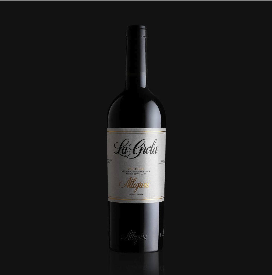
From Tradition to Contemporary Clarity
The previous La Grola packaging, as seen in the provided reference image, presented a highly classical aesthetic: ornate typography, multiple decorative lines, gold embellishments, and a dense composition. While deeply rooted in tradition, the design no longer reflected the stylistic evolution of the wine or the brand’s intention to highlight a more refined, terroir-driven interpretation.
Our redesign begins with a decisive shift toward visual clarity. The new label is spacious, balanced, and architecturally proportioned. Every element has been intentionally reduced, curated, or re-aligned to allow the wine—and its place of origin—to take center stage. Even the name of the wine has been adapted, from “La Grola” to “Grola”.
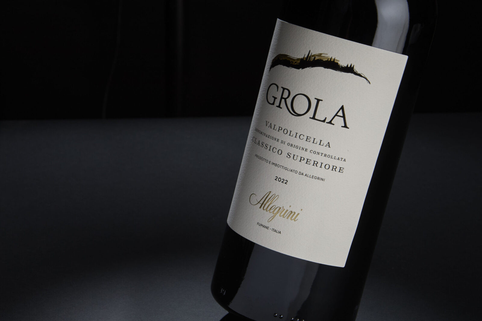
The Label
The primary label is printed on Cotton Extra White.
This material choice delivers multiple aesthetic values:
– a natural, tactile surface that feels artisanal yet refined,
– a warm matte finish that gently absorbs light,
– a luxurious perception consistent with fine wine craft.
The ample negative space invites the consumer to experience the label through touch as much as through sight.
The Hill line
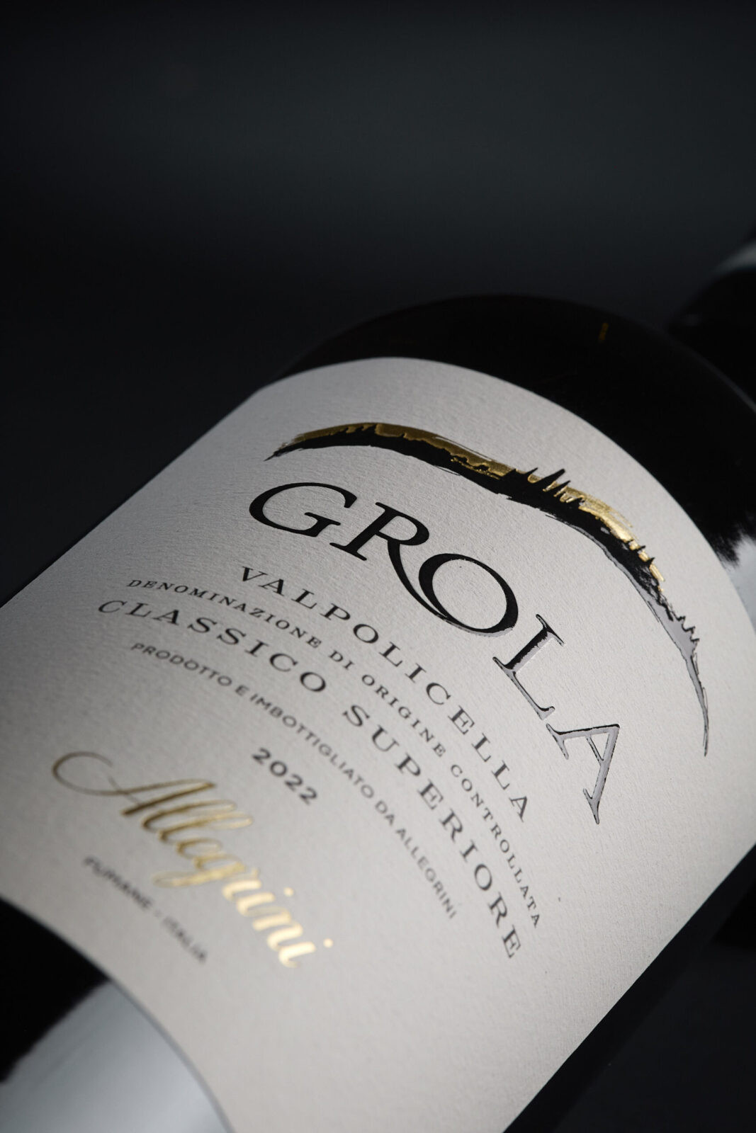
At the heart of the redesign stands a single graphic gesture: a stylized silhouette of the Grola hill, a unique terroir in the heart of Valpolicella.
Delicately embossed and enriched with gold hot-foil accents, the emblem conveys the geographical identity of the wine with a contemporary visual logic—minimal yet expressive, symbolic yet topographically rooted.
On the bottle, this icon becomes the visual hinge between heritage and innovation. It anchors the label horizontally while allowing the typography beneath it to breathe.
Placed against a neutral, textured field, the hill line evolves into a signature element of the new product identity, appearing across both primary and secondary packaging with absolute consistency.
Typography
The wordmark GROLA has been re-drawn to achieve a classic yet bold presence. Its serif structure references Italian inscriptional tradition while the slender curves and controlled spacing speak to modern editorial design.
The typographic hierarchy below it—designation, denomination, vintage, and signature—follows a strictly rational grid. Fine lines, restrained weights, and deliberate vertical spacing avoid superfluous decoration while prioritizing clarity.
Every piece of information is treated as part of a typographic architecture, not as a multitude of competing elements. The final impression is one of purity, intention, and craft.
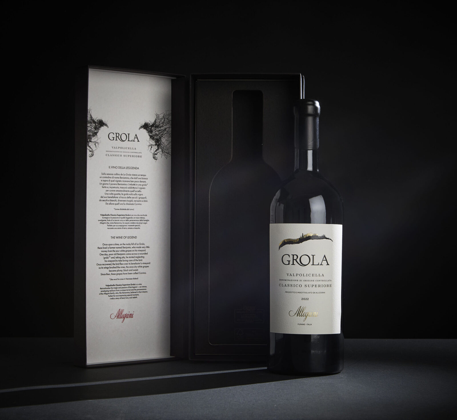
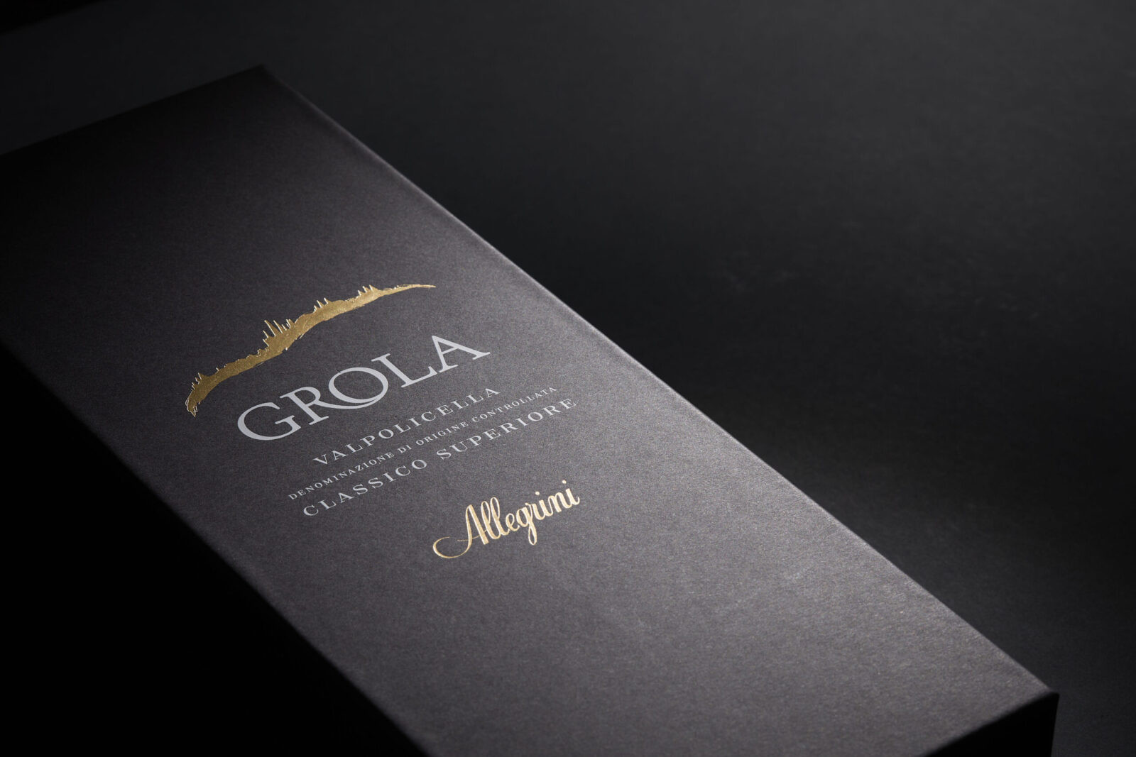
Secondary Packaging
The secondary packaging system elevates Grola into an object of ritual and gifting. The rigid black carton, produced with FSC-certified paper , features a vertical format with precise edges and a soft-touch matte finish. The design is intentionally monolithic: a solid block of black interrupted only by the gold-foiled hill ine and the GROLA wordmark.
Opening the box reveals a dramatic contrast: a bright inner panel printed on textured paper, featuring the origin story of the vineyard and the full hill silhouette. The interior functions as an editorial moment, guiding the consumer into the world of Grola through refined typographic storytelling.
The interplay between a shadow-like exterior and a luminous interior creates a ceremonial unboxing experience, reinforcing the value of the product while maintaining strict design discipline.
A Packaging System Built on Harmony
The power of the Grola redesign lies in its coherence.
Bottle, label, capsule, and box speak a single visual language—one built on minimalist elegance, territorial authenticity and material refinement.
A New Chapter for a Historic Wine
The Grola packaging redesign is ultimately a study in how heritage can be distilled into modern form. By stripping away the superfluous and refining the essential, the new design transforms the bottle into a beacon of territorial pride and understated luxury.
For Allegrini, this marks the beginning of a renewed relationship between product and identity.
For consumers around the world, it offers an experience of Italian wine culture that is immediate, tactile, and profoundly elegant.

CREDIT
- Agency/Creative: Hangar Design Group
- Article Title: Hangar Design Group Redesigns Grola Bottle for Contemporary Clarity and Timeless Appeal
- Organisation/Entity: Agency
- Project Status: Published
- Agency/Creative Country: Italy
- Agency/Creative City: Mogliano Veneto (TV)
- Project Deliverables: Label Design, Packaging Design
- Industry: Food/Beverage
- Keywords: WBDS Agency Design Awards 2025/26 Labelling Design, Packaging Design, Wine, Heritage, Contemporary reinterpretation


