


Recollection Spirits Hiker’s Hut Gin
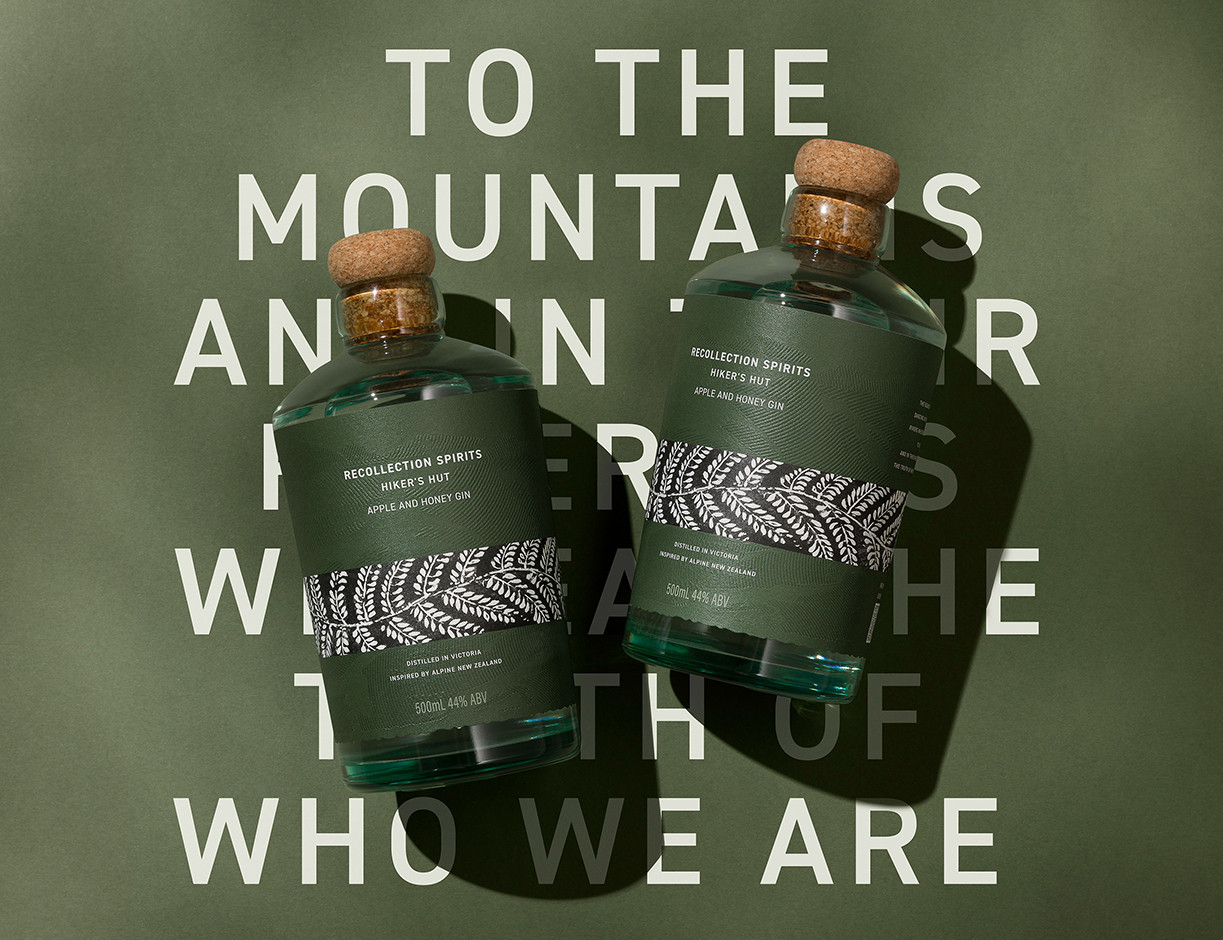
Hikers Hut Gin is the first release from Recollection Spirits, a brand centred on the idea that the places we move through shape the drinks we remember. This inaugural expression draws from New Zealand’s alpine landscape, defined by its ridgelines, braided riverbeds and the quiet, restorative stillness found at elevation. It is a world shaped by geology, weather and memory, and that sense of place sits at the heart of the design. The founders describe themselves as collectors of memories, and the spirit reflects the moments that stayed with them in the high country.
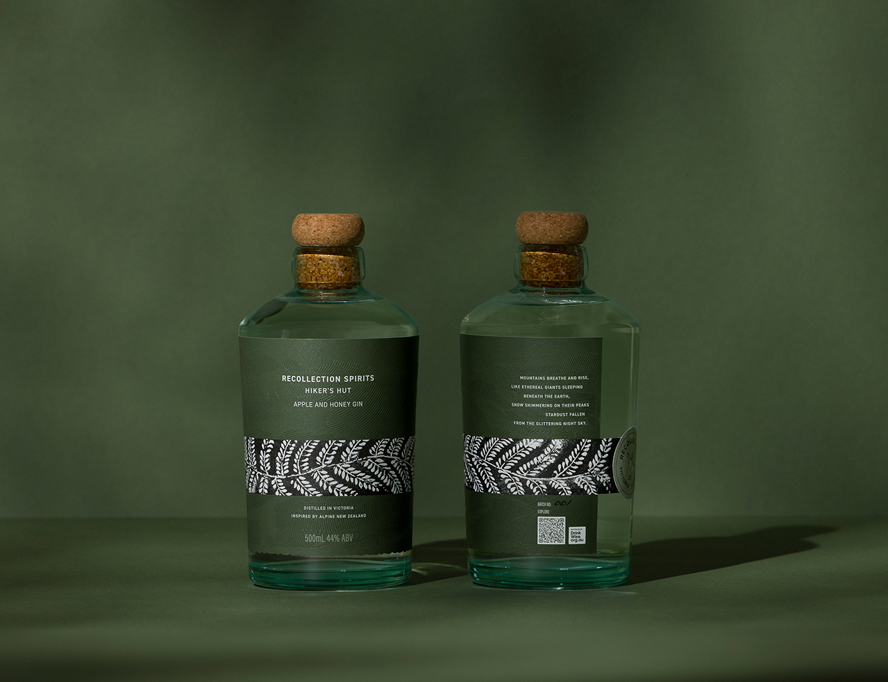
Unlike the typical botanical led visual language that dominates the gin category, this pack intentionally moves against the grain. Instead of leaning on colourful illustration heavy cues or ornate storytelling, it prioritises sensory memory. The founders’ experiences in the high country were not about gathering botanicals. They were about texture, cold air, rough timber huts, open horizons and the quiet clarity that comes with elevation. The design needed to honour that, not through literal interpretation, but through deliberate material expression. Restraint was a conscious choice, allowing authenticity and tactility to carry the narrative.
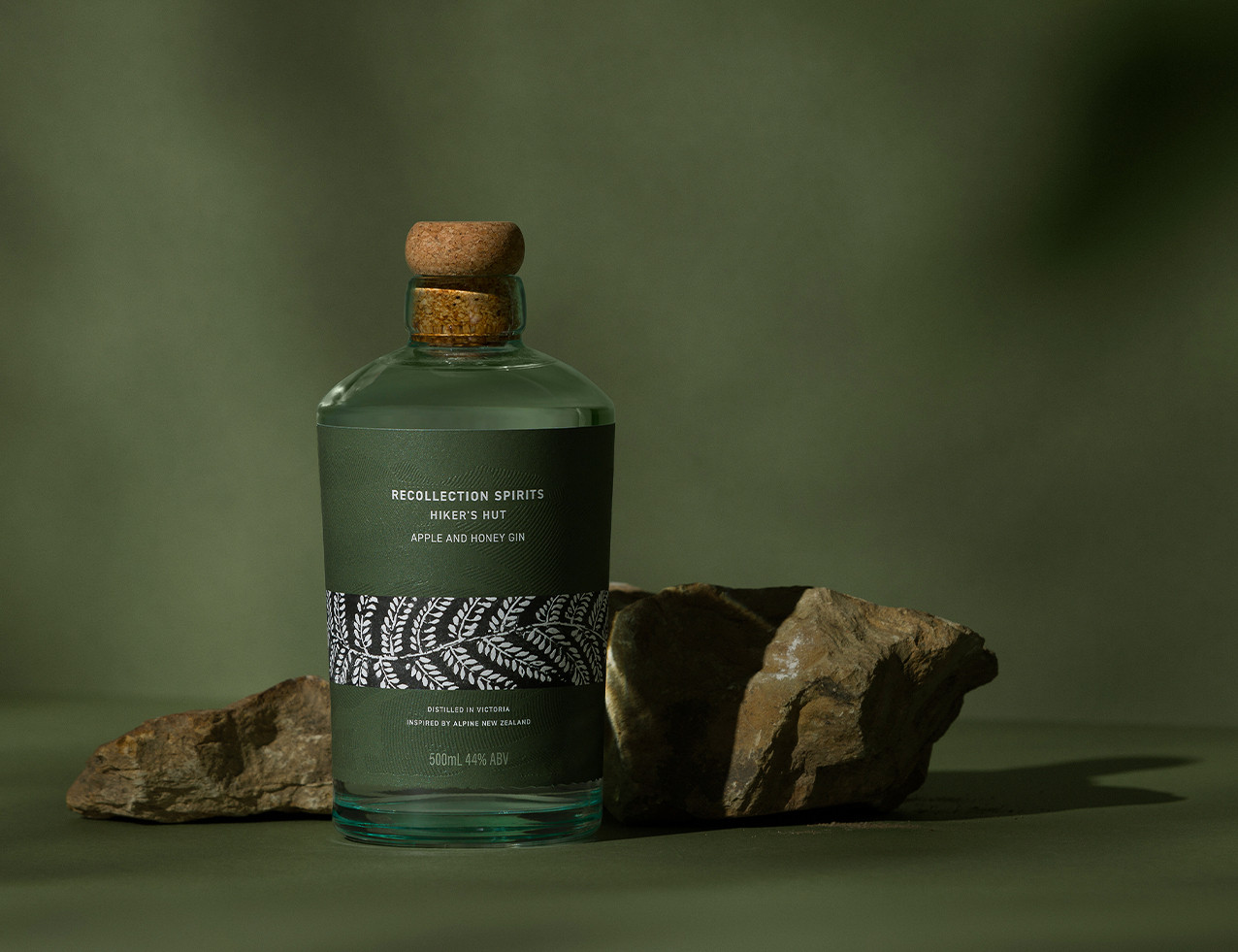
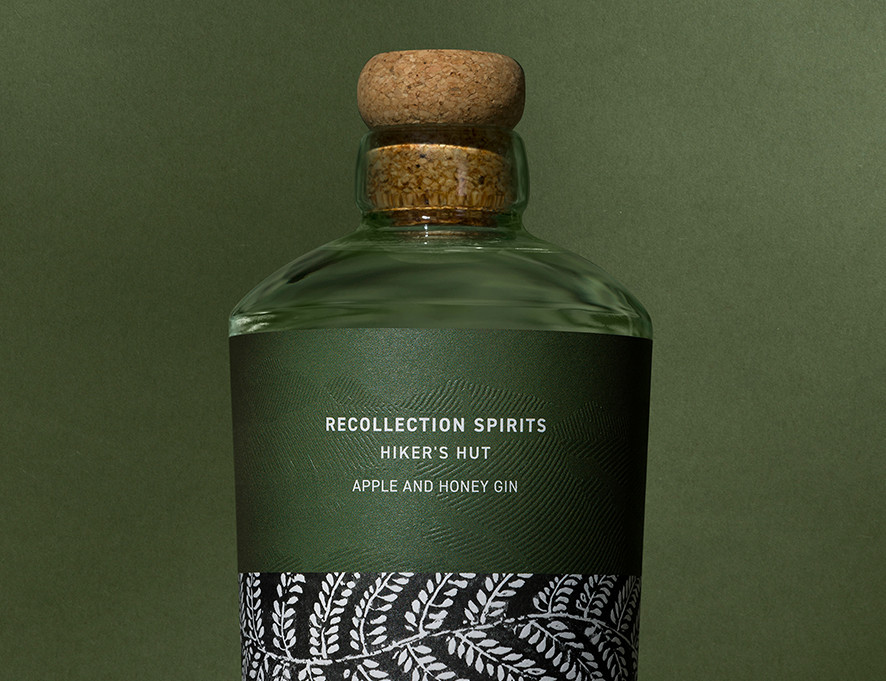
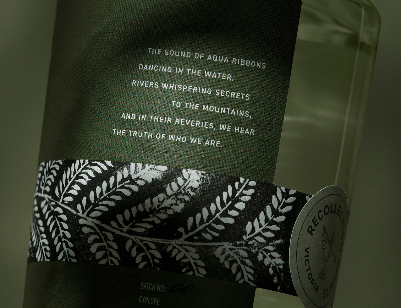
A fully embossed label forms the foundation of the pack, its sculpted surface mapping ridgelines from New Zealand’s alpine regions. Running a hand across it recalls the rough, weathered terrain that inspired the gin and creates a direct, topographic connection to place. Each label also carries a small poem, discovered only on closer inspection, guiding the drinker into the same alpine world that shaped the founders’ memories. The bottle’s subtly irregular glass and raw natural cork continue this honesty of material, echoing the imperfect qualities of the outdoors and reinforcing that this is a gin built from experience rather than ornament.
An illustrative band wraps the bottle, produced in a style informed by Kiwi printmaking traditions. The band is sealed with the brand mark on the reverse, acting as a subtle moment of orientation within the composition.
The natural palette of muted cream, warm white and deep black supports the gin’s grounded character and reflects the simplicity of high country environments. The result is a design that rejects category clichés and instead translates the alpine world into form, texture and memory, creating a contemporary and quietly confident expression of place.
CREDIT
- Agency/Creative: Clay Andrews
- Article Title: Recollection Spirits Hiker’s Hut Gin by Clay Andrews Translates Landscape Memory Into Packaging Design
- Organisation/Entity: Creative
- Project Status: Published
- Agency/Creative Country: Australia
- Agency/Creative City: Sydney
- Market Region: Australia
- Project Deliverables: Packaging Design
- Industry: Food/Beverage
- Keywords: WBDS Creative Design Awards 2025/26 , Gin Design, Spirits Design, Packaging Design, Drinks Design, Brand Identity, NPD


