


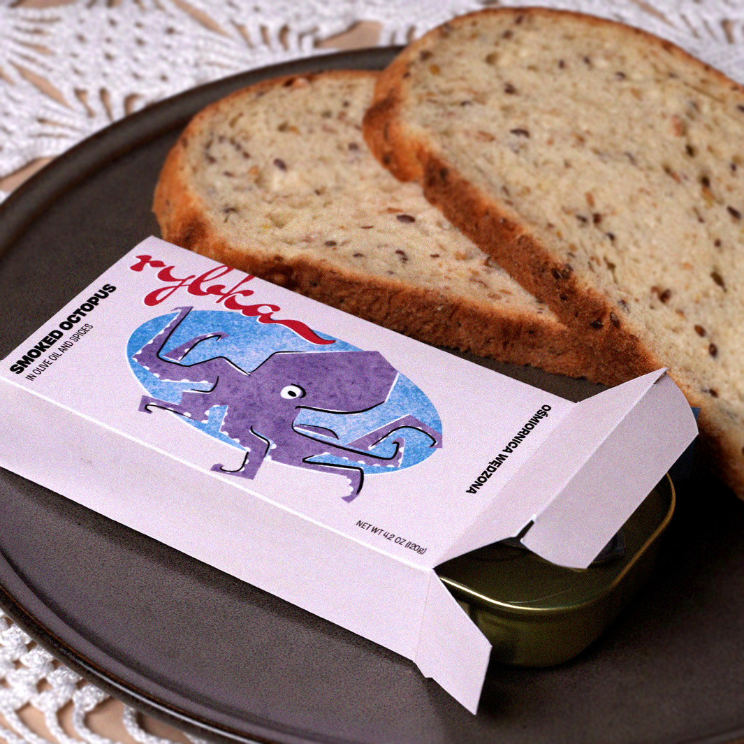
Rybka is a premium tinned fish brand shaped by the history, character, and quiet beauty of the Baltic region. The project began with the intention to honor a food tradition that’s often treated as humble or utilitarian, and instead elevate it into something storied, crafted, and culturally rich. Each box holds the nostalgia of hours spent speaking Polish around the kitchen table, passing dishes, clinking glasses, and living life the way it’s meant to be enjoyed.
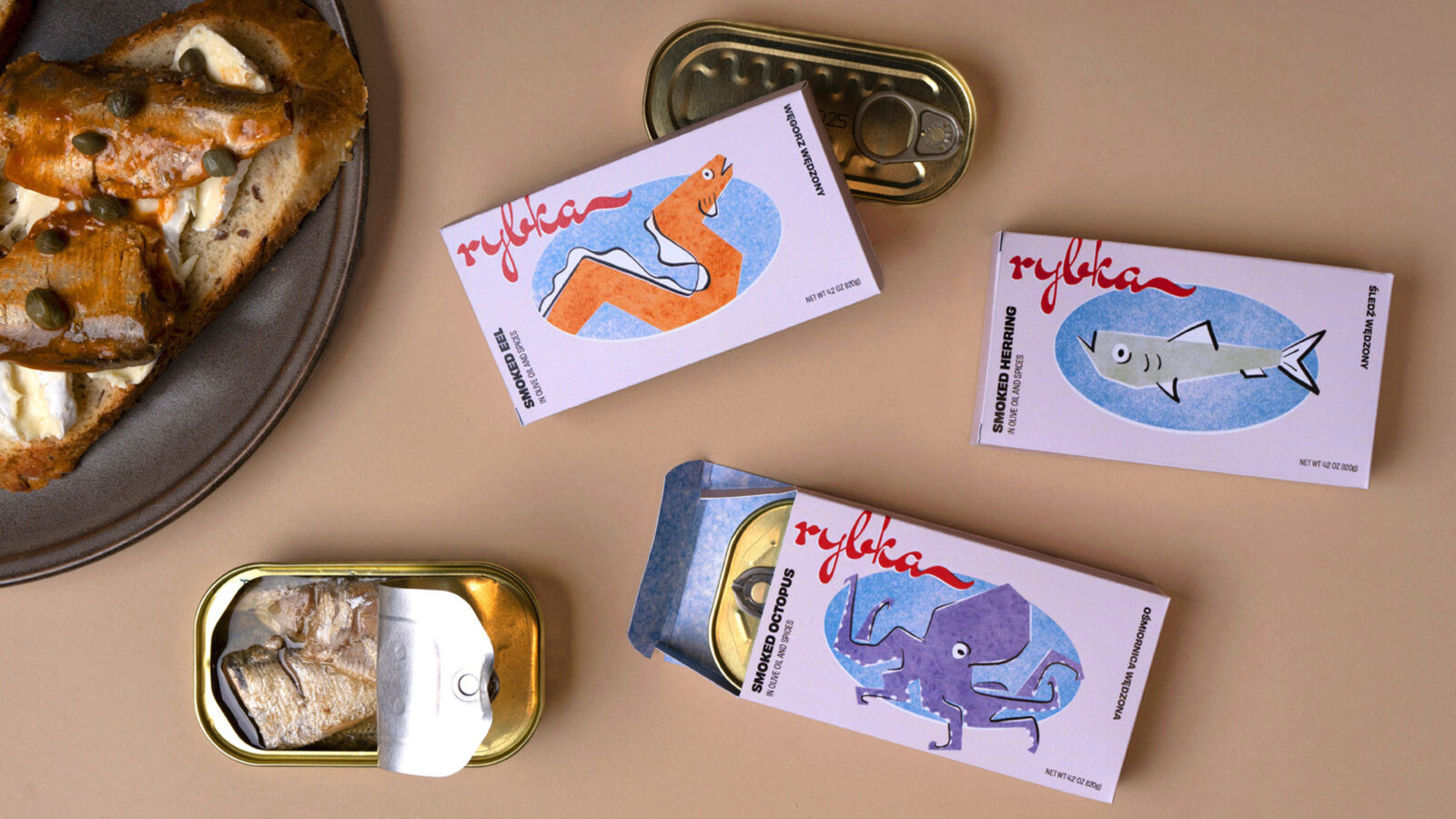
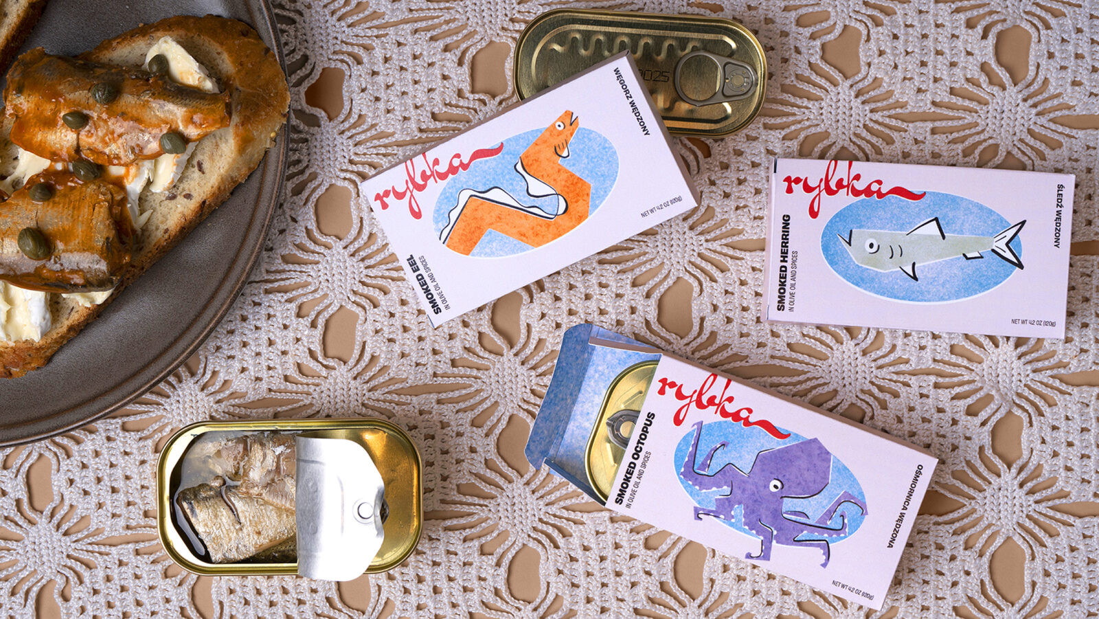
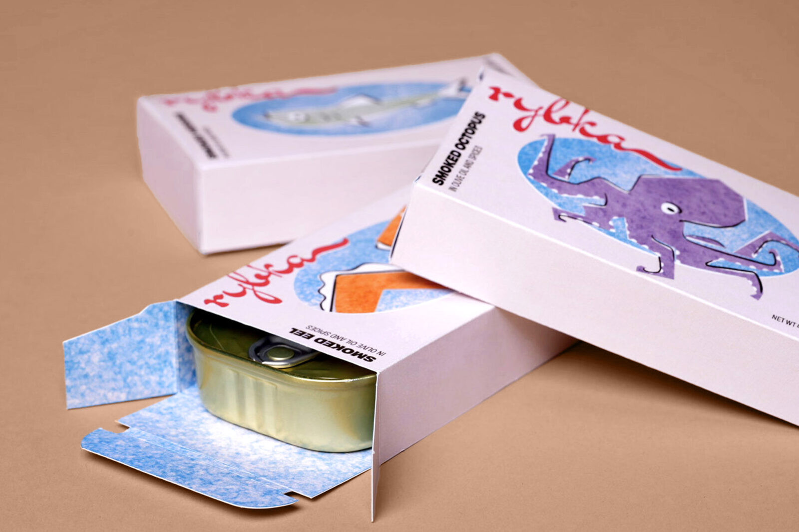
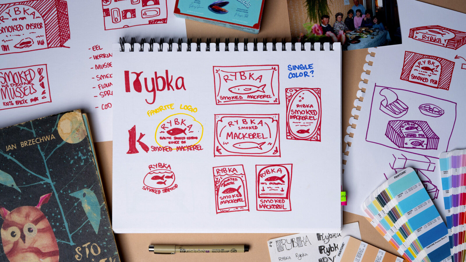
To bring that vision to life, the visual system leans heavily on original illustration, each piece part of a system that exudes the specific charm found in midcentury Eastern European illustrated works. These illustrations aren’t decorative; they carry the warmth, whimsy, and humor of old-world storytelling. Each texture and element was painstakingly hand-rendered to echo handed-down tales, analogue media, and the distinct charm of the region’s craft traditions. The intention was to create a brand world that feels collected rather than manufactured—something you could imagine discovering in a coastal market, or in your Babcia’s pantry.
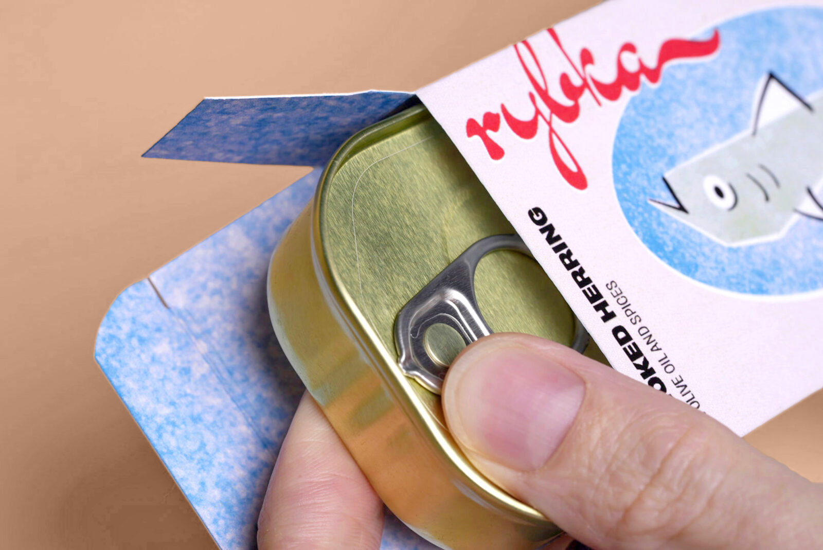
Supporting this illustrative foundation is an English/Polish bilingual typographic system crafted for clarity, legibility, and quiet refinement. The type balances simplicity with a premium sensibility, ensuring the brand feels modern without losing its groundedness. The interplay between languages mirrors the cultural blending inherent to a heart that straddles two cultures, reinforcing the idea that Rybka lives at the intersection of tradition and contemporary design.
Every design decision was made to elevate the tinned fish category through authenticity, craftsmanship, and trust. The color palette nods to coastal landscapes and watercolor pigments; the packaging structure highlights quality while maintaining approachability; the visual hierarchy maintains a sense of order without sacrificing charm. Each component works together to give the product a sense of dignity: premium, but never pretentious. Artisanal, yet familial.
Ultimately, Rybka is a celebration of heritage made tangible. It transforms a simple pantry staple into a cultural ambassador, grounding the brand in lived experience while inviting a broad audience to appreciate the richness of Baltic tradition.

CREDIT
- Agency/Creative: Emma Gulij
- Article Title: Student Emma Gulij Introduces Rybka as a Heritage-Led Premium Tinned Fish Brand
- Organisation/Entity: Student
- Project Status: Non Published
- Agency/Creative Country: United States of America
- Agency/Creative City: San Diego
- Project Deliverables: 3D Design, Brand Creation, Brand Design, Brand Experience, Brand Mark, Brand Naming, Brand Refinement, Brand Strategy, Brand Tone of Voice, Brand World, Branding, Copywriting, Design, Digital Art, Digital Painting, Drawing, Food Photography, Food Styling, Graphic Design, Identity System, Illustration, Label Design, Logo Design, Packaging Design, Photography, Photography Styling, Product Design, Product Naming, Product Photography, Sketching, Tone of Voice, Typography
- Industry: Food/Beverage
- Keywords: WBDS Student Design Awards 2025/26 , Packaging, tinned fish, food, canned food, polish, european, baltic, illustration, fish


