


Project Overview: Baskin Bread Packaging Design
Baskin is a distinctive company specializing in bread and wheat-based bakery products. The company is focused on delivering high-quality, safe, and reliable bread products to the market. Bread is among the most widely consumed breakfast foods, and with wheat farming being a key economic activity in Kenya, Baskin positions itself as a brand deeply rooted in local agriculture and daily consumer needs.
Client Brief
Baskin approached our team with a request to develop a unique and eye-catching bread packaging design. While the company plans to expand into other bakery products such as cakes, buns, mandazi, and brown bread, they chose to begin with white bread as a pilot product to test market response.
Our primary objective was to create a visually striking package that would clearly differentiate Baskin from existing competitors on supermarket shelves. In today’s competitive market, standing out requires creativity, clarity, and a strong brand presence—and that was the core focus of this project.
Design Approach & Strategy
Brand Identity
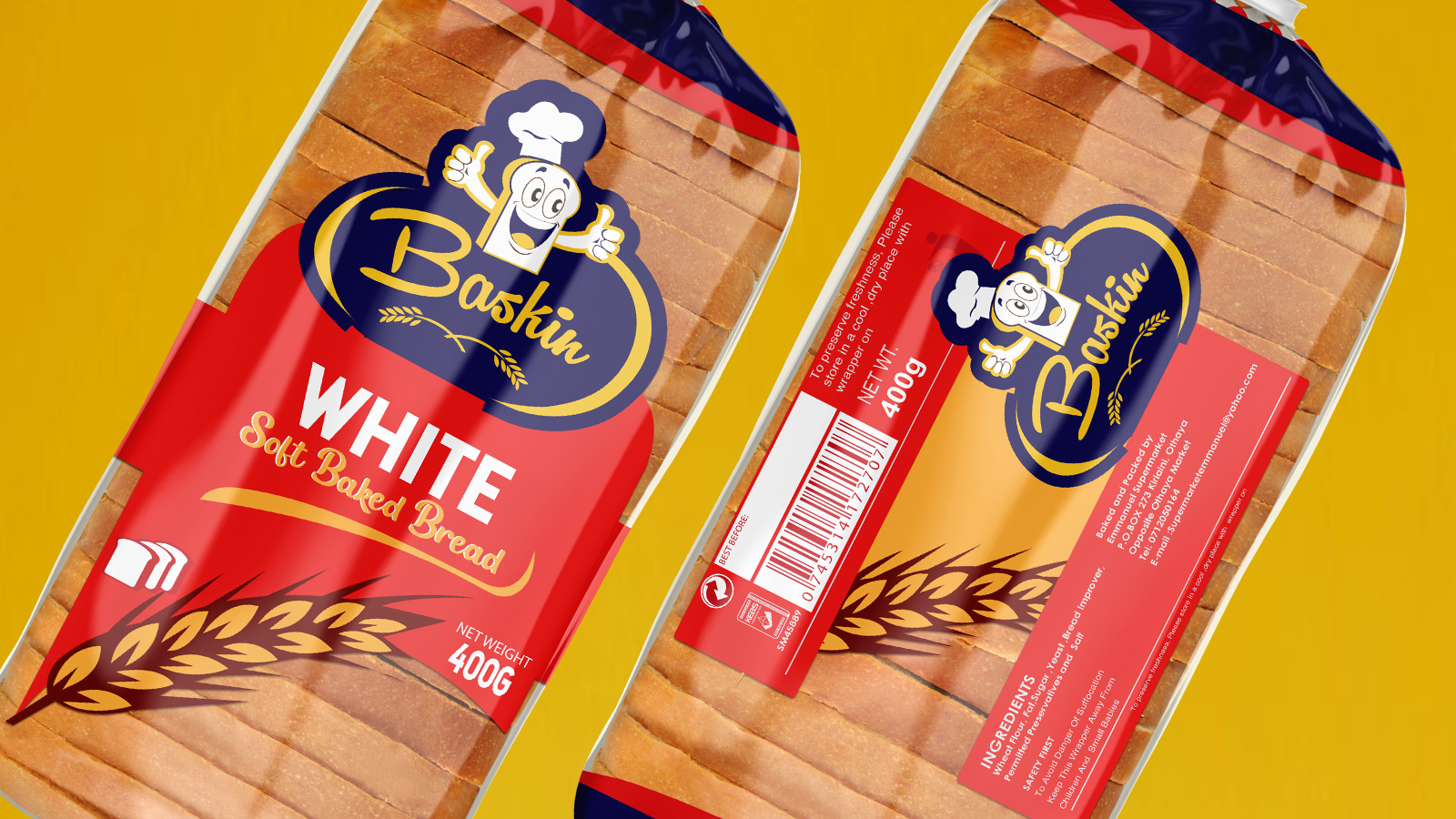
We began by developing a distinctive brand logo using script-style typography paired with a cheerful cartoon illustration giving a thumbs-up, symbolizing enjoyment and satisfaction. To reinforce authenticity and quality, we incorporated a wheat illustration, representing the natural source of the flour used in the bread.
The logo color palette consisted of spot orange and reflex dark blue, creating a bold yet friendly identity. This combination gave the brand a strong visual dominance while clearly communicating its bread-focused theme.
Packaging Design
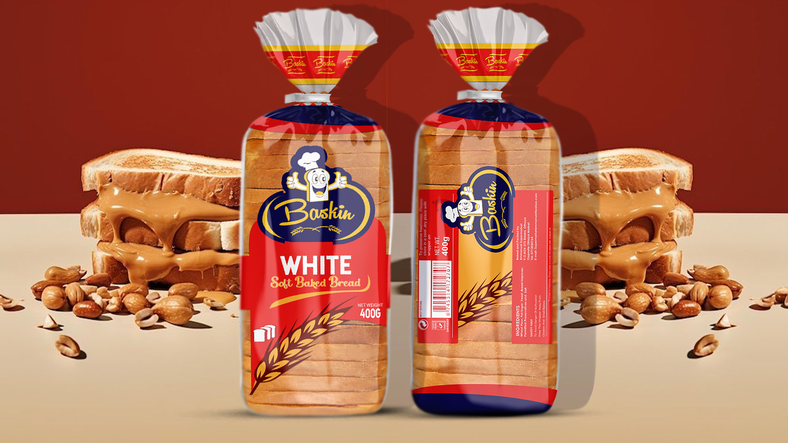
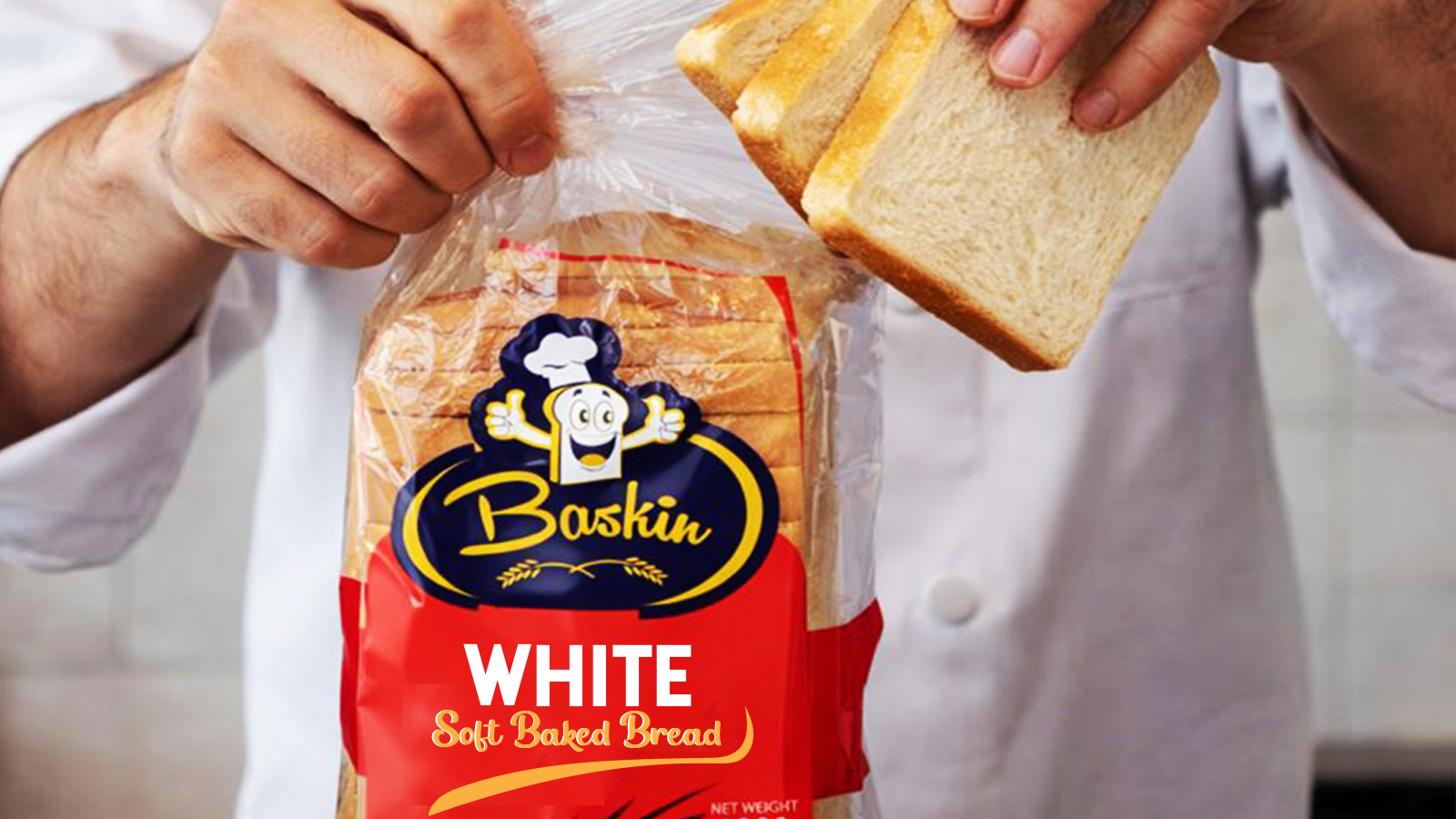
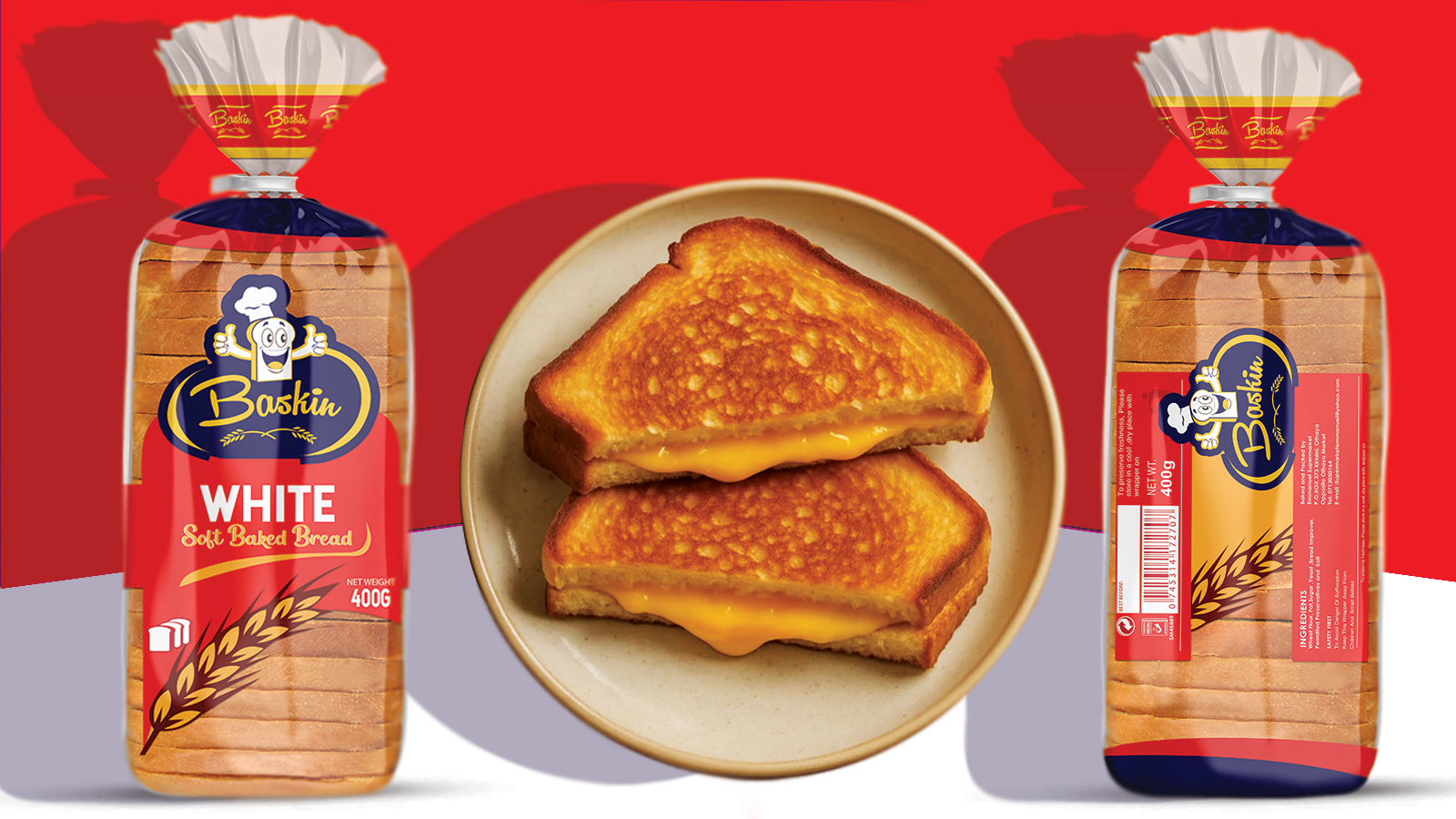
The next phase involved designing the bread packaging itself. We adopted a clean and simple layout, ensuring that approximately 70% of the bread is visible through the package. This transparency allows consumers to easily see the product, building trust and increasing purchase confidence when displayed on supermarket shelves.
The layout features a stylish curved design at the bottom, with the wheat illustration following the same flow. This approach adds movement, elegance, and reinforces wheat as a key ingredient in the product.
The Baskin logo was positioned prominently at the top of the package to command attention, while the product name White Bread appears just below it, acting as a clear selling point.
Typography & Visual Style
We carefully selected elegant script and modern fonts to give the packaging a stylish and unique appearance. The realistic presentation of the product helps communicate exactly what is being offered, while also appealing visually to potential buyers.
Color & Printing Considerations
The color scheme—red, reflex blue, and orange—was intentionally limited to spot colors to reduce printing costs while maintaining strong visual impact. This strategic choice helped balance aesthetics with production efficiency.
Product visibility was further enhanced through exposed areas in the package, allowing customers to clearly see the bread inside.
Back-of-Pack Design
To break away from conventional layouts, we designed the back information in a slanted orientation, creating a distinctive look compared to competing brands.
The back panel includes:
Ingredients
Storage conditions
Barcode
KEBS number
Disposal instructions issued by NEMA
All information was structured clearly and thoughtfully, ensuring both compliance and readability.
Additional Brand Details
On the folding top section of the package, we introduced a subtle repeating pattern of the word “Baskin”, further strengthening brand recall and identity.
Target Audience
The primary target market for Baskin bread is the middle-class consumer, particularly individuals and families who shop in supermarkets during the evening and prefer convenient, ready-to-eat breakfast options for the following morning. The design appeals to consumers who value quality, cleanliness, visibility, and modern branding.
Project Outcome
The final design was well received and successfully achieved its goal of standing out in a competitive market. It effectively communicates the brand’s values while appealing to its intended audience.
Deprint Kenya is a young and growing creative design firm committed to delivering impactful designs that leave a strong impression and elevate brands within their markets.
CREDIT
- Agency/Creative: Deprint Kenya
- Article Title: Baskin Bread Packaging Design by Deprint Kenya
- Organisation/Entity: Agency
- Project Type: Packaging
- Project Status: Non Published
- Agency/Creative Country: Kenya
- Agency/Creative City: Nairobi Kenya
- Market Region: Africa
- Project Deliverables: Logo Design, Packaging Design
- Format: Bag, Pouch
- Industry: Food/Beverage
- Keywords: Bread Package Designing
-
Credits:
Graphic designer: Ghanimah Njeri


