


Tiny Botanist is an innovative children’s brand designed to create an educational and enjoyable space where children can reconnect with nature within the context of modern urban life. In a reality where children are becoming increasingly disconnected from nature and screen-based activities are intensifying, Tiny Botanist offers parents a natural, sustainable, and educational alternative for their children. The brand aims to build a play-based world where children can connect with plants, experience responsibility, and enjoy the process of producing, even within the limited spaces of city life. Within this project, Tiny Botanist is positioned not merely as a product brand, but as a holistic experiential world where children learn through exploration, nurture their imagination, and develop awareness toward nature.
The starting point of the brand is the weakening bond between children and nature caused by urban living. Tiny Botanist provides children with a safe space where they can reintroduce nature into their lives through small yet meaningful interactions. For parents, it offers a reliable, educational, and sustainable brand alternative through which they can introduce their children to the natural world. At the core of the brand strategy lie learning through play, forming an emotional connection with nature, and fostering a sense of sustainable living. Tiny Botanist does not see children merely as consumers, but as little explorers of nature, and its entire communication language is built upon this perspective.
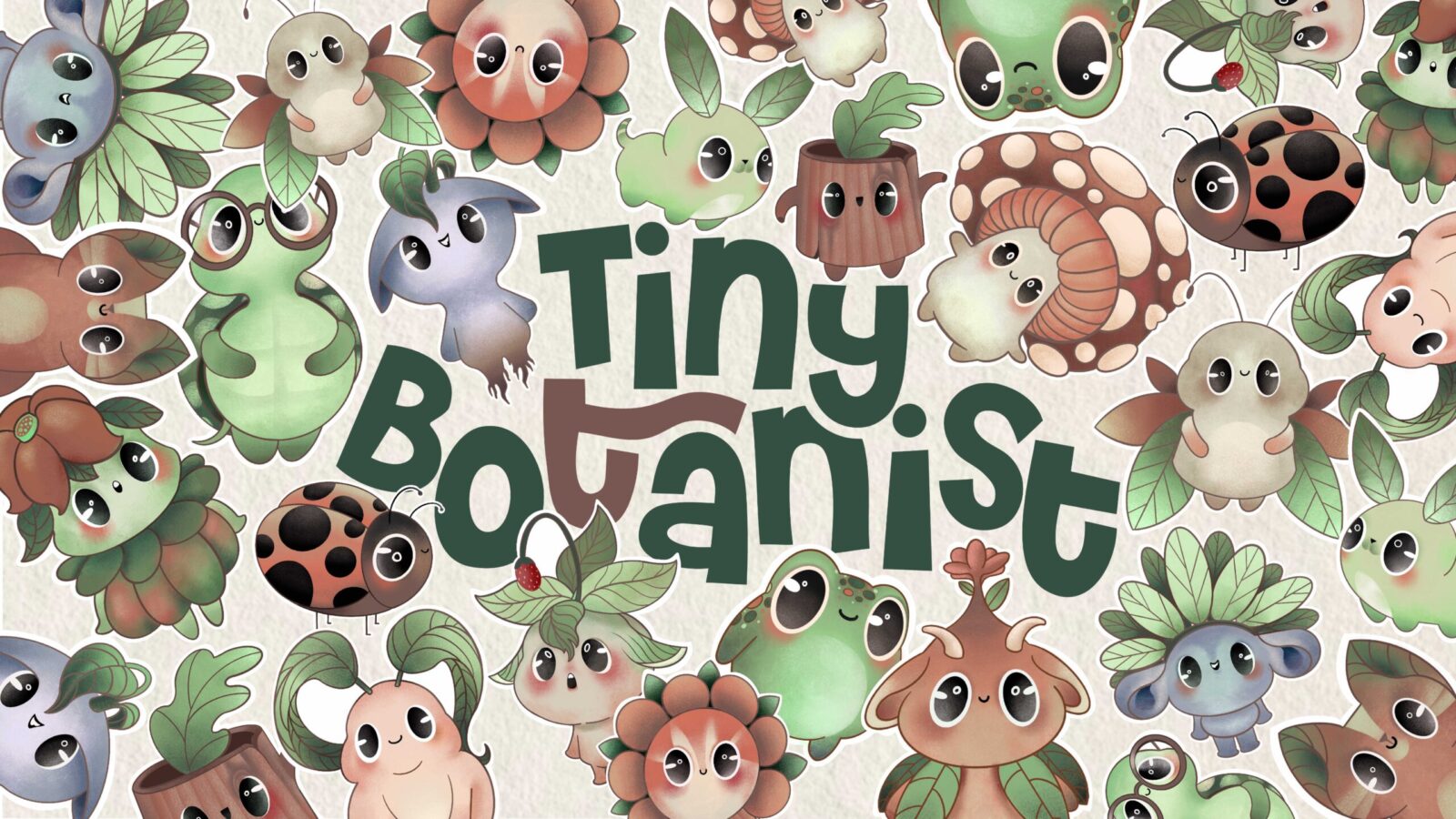
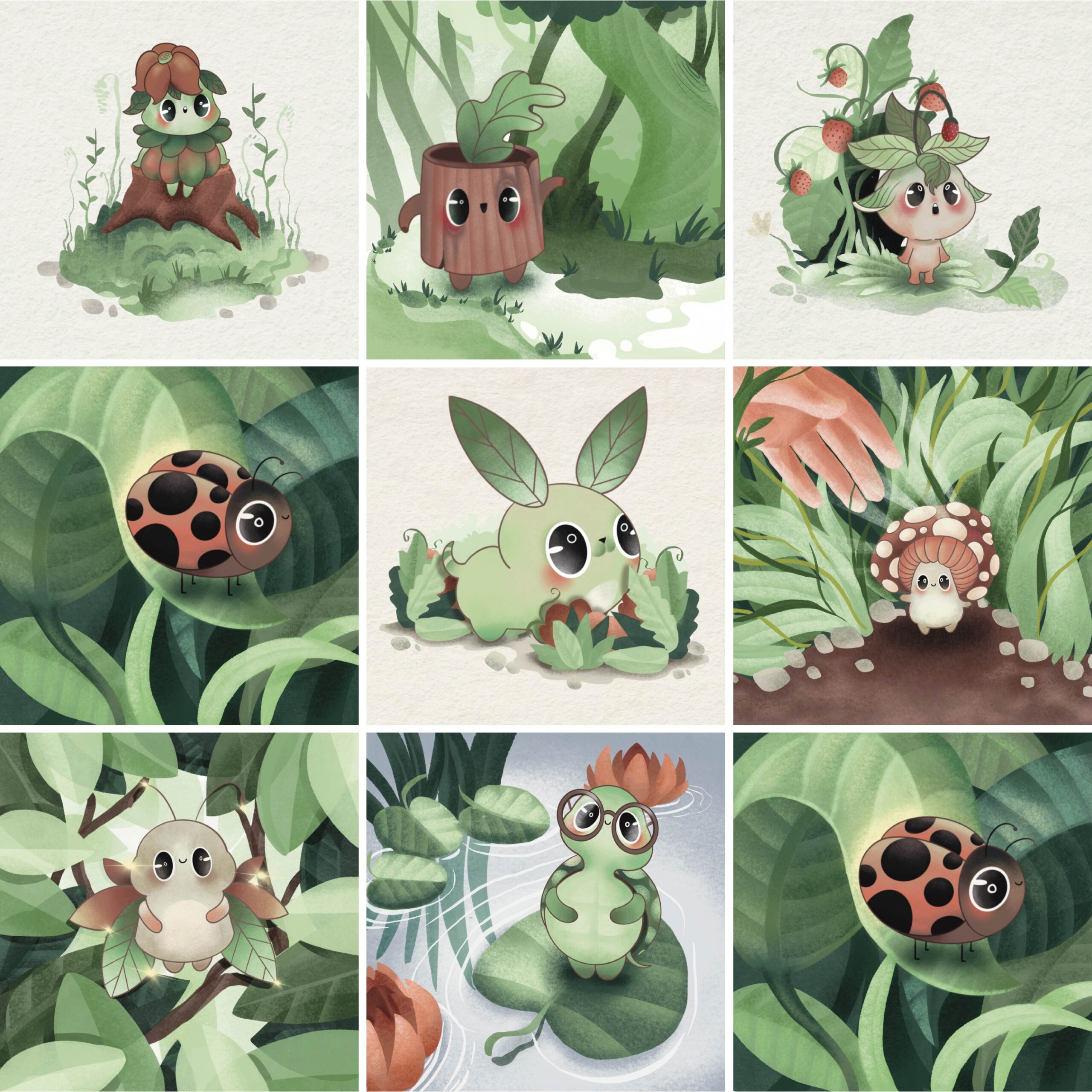
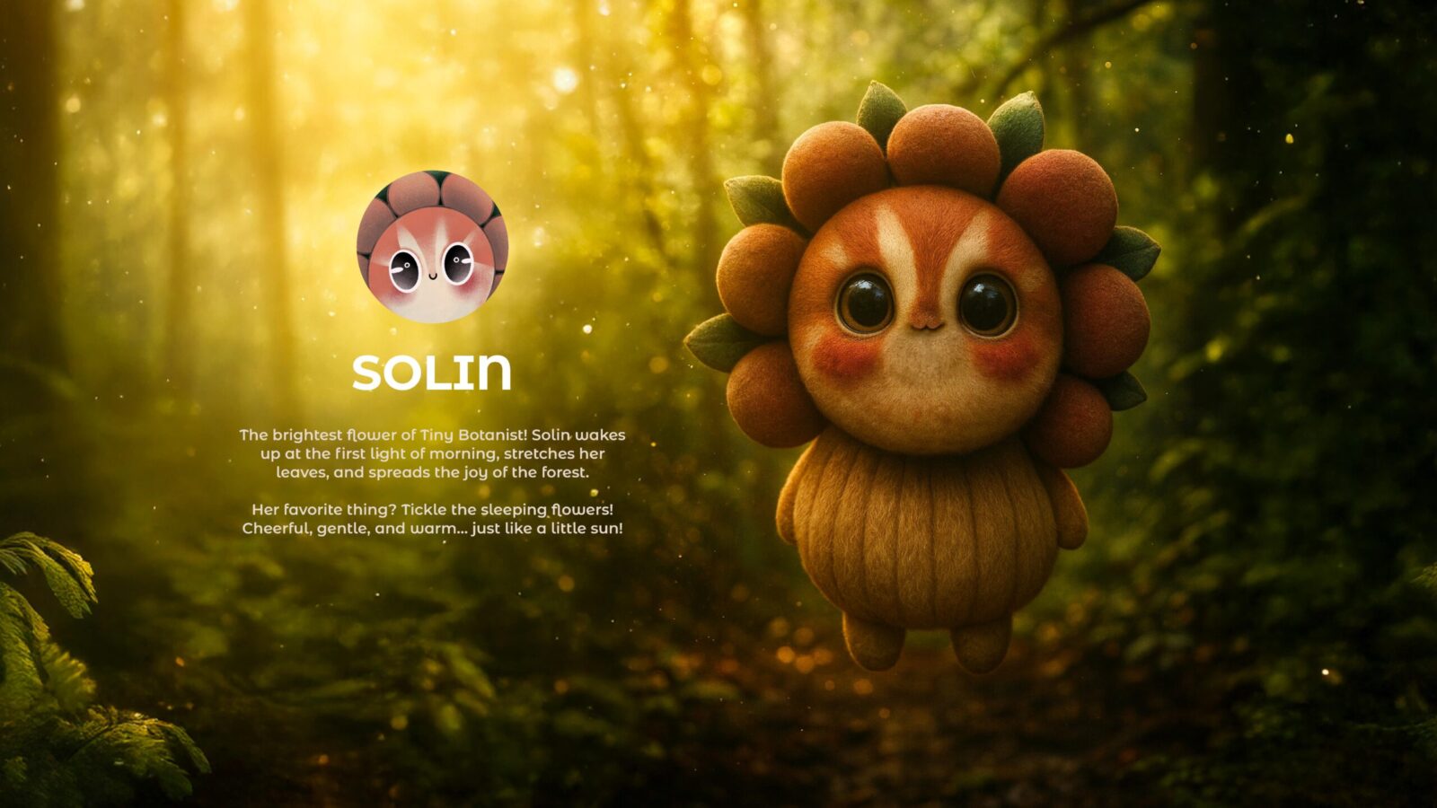
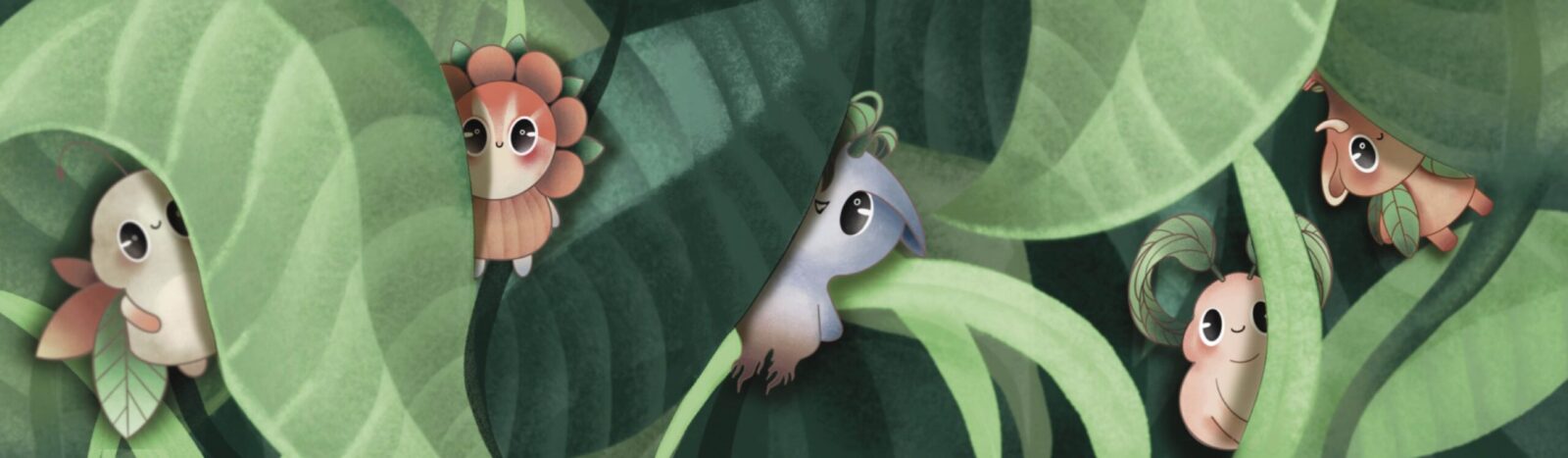
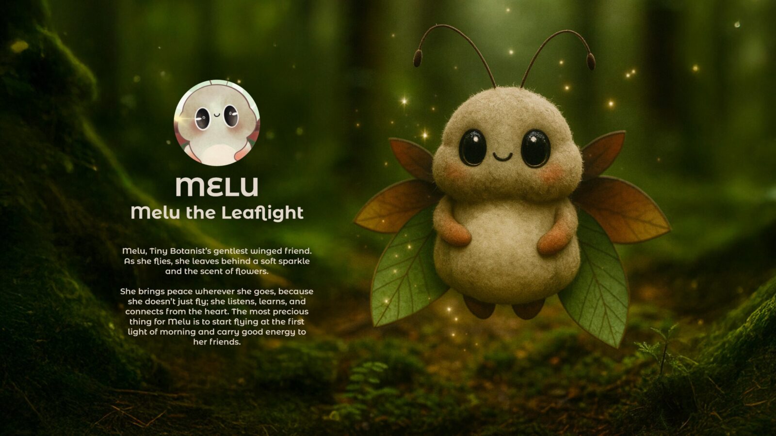
The story of Tiny Botanist is inspired by an imaginary forest hidden within modern city life. This forest represents a special world shaped by children’s imagination, inhabited by small yet powerful representatives of nature. The entire visual universe of the brand is built upon this imaginary forest narrative. The characters designed as the secret guardians of this forest form the strongest storytelling elements of the Tiny Botanist world. Each character represents a different personality, a different value, and a different message. Through these characters, children can choose a figure they feel close to, build a bond with it, and develop an emotional relationship with the brand. This approach allows Tiny Botanist to gain a strong brand identity not only visually, but also narratively.
Each character symbolizes a motto that serves the brand’s vision. Concepts such as patience, curiosity, sharing, respect for nature, productivity, and discovery are conveyed through the personalities of the characters. In this way, children internalize these values not as directly taught concepts, but by experiencing them through play and storytelling. With this approach, Tiny Botanist is positioned not only as an aesthetic brand, but also as a pedagogically grounded structure. The warm, childlike, and sincere design of the characters strengthens the brand’s sense of trust while helping children feel as if they are truly a part of this world.
The target audience of the brand consists of parents who wish to provide their children with natural, safe, and development-oriented activities within modern urban life. While Tiny Botanist places children at the center with its warm and playful visual language that directly appeals to young users, it simultaneously adopts a brand tone that instills sustainability and a sense of trust in parents. The brand language is structured to be warm, fun, educational, reliable, and sensitive to nature. While a communication style that belongs to the children’s world is established, a reassuring balance for parents is carefully maintained.
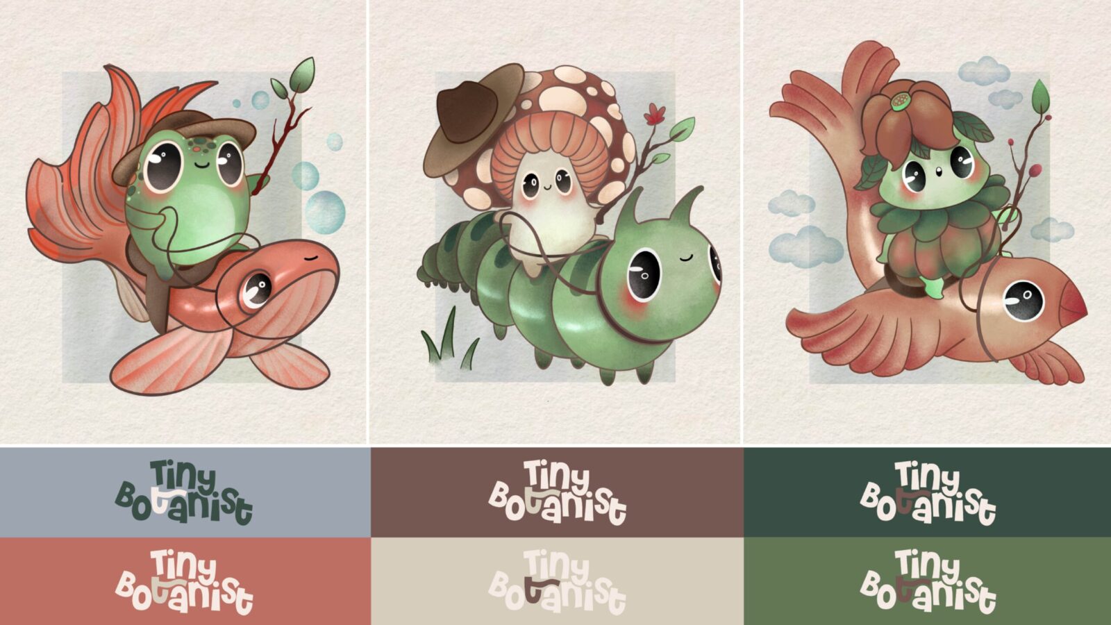
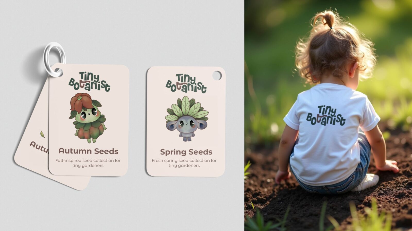
One of the most important building blocks of the visual identity is the logo design. The logo is constructed to reflect the playful and dynamic character of the brand. A classical and rigid structure was deliberately avoided, and instead a lively, playful, and dynamic letter composition was preferred. In this way, the logo becomes not only a signature, but a living form that captures children’s attention and belongs to their world. In typographic choices, rounded, soft, and fluid forms were used to strengthen the childlike and sincere aspect of the brand identity. By avoiding sharp and rigid structures, a visual tone that children can easily adopt has been created.
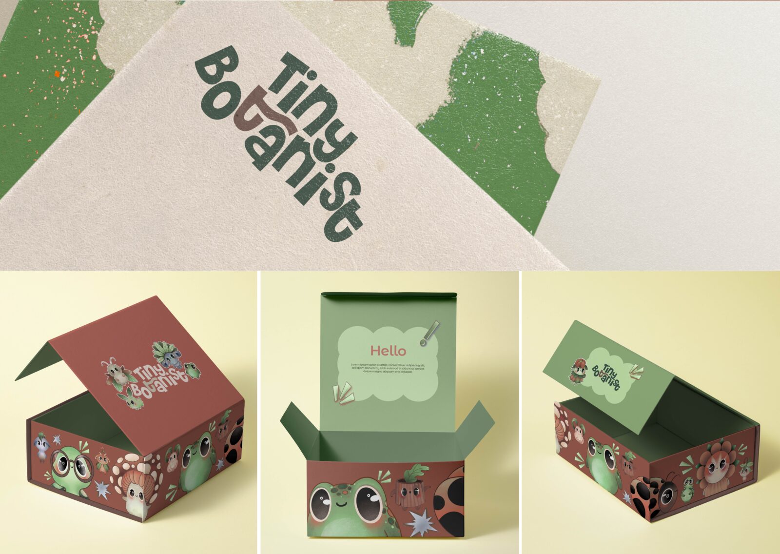
The color palette was formed with inspiration drawn from nature. Earth tones, various shades of green, and pastel supporting colors were used together to create both a natural and energetic atmosphere. Through this color language, the brand represents sustainability and naturalness on one hand, while preserving a lively appeal for children on the other. All components of the visual identity come together to form a holistic design language that supports children’s imagination and enables them to establish a warm bond with the brand.
One of the most distinctive aspects of the Tiny Botanist identity is the character universe that has been created. These characters, conceived as the hidden guardians of the imaginary forest, provide the brand with a powerful narrative dimension. Through this narrative language, the brand gains a structure that is educational without being boring, entertaining yet guiding, imaginative yet rooted in nature. Through the characters, children adopt the Tiny Botanist world, find a space that belongs to them within it, and establish a long-term bond with the brand.
Tiny Botanist is designed as a holistic brand that aims to make children love nature while offering parents a reliable and educational alternative. The brand identity created within the project presents a consistent integrity with its narrative foundation, target audience-appropriate tone, character-driven universe, and play-based approach. Tiny Botanist aims not only to teach children how to grow plants, but also to instill responsibility, patience, productivity, and respect for nature. By creating a small yet meaningful natural space for children within modern urban life, it reconnects them with

CREDIT
- Agency/Creative: Holl Graphic
- Article Title: Holl Graphic Creates a Playful Nature Led Brand World for Tiny Botanist
- Organisation/Entity: Agency
- Project Status: Published
- Agency/Creative Country: Türkiye
- Agency/Creative City: İzmir
- Project Deliverables: Brand Design, Character Design, Illustration
- Industry: Manufacturing
- Keywords: WBDS Agency Design Awards 2025/26 , Branding, Characterdesign, Warm, Fun, Playful, Educational, Reliable, Illustration
-
Credits:
graphic designer and illustrator: Duygu Ayvalı
art director and graphic designer: Simge Hasakioğulları
motion designer: Akın Yeşilyurt


