


Innocent Super Smoothies – Keep it simple, smoothie fans
Summary
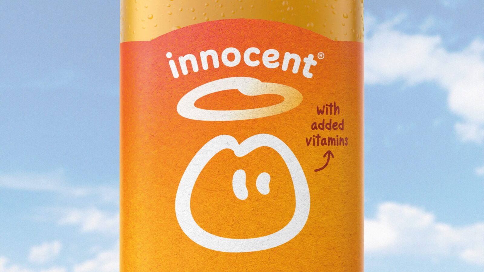
The refreshed Super Smoothies identity restores innocent’s iconic simplicity. A redrawn Dude, softened wordmark and stripped back system reinforce clarity, flavour appeal and brand recognition. Vibrant textured backgrounds hero natural goodness, creating a confident platform for growth. Simple by design, powerful in impact.
1. Background
Innocent has long defined the fruit drink category through clarity, personality and purpose. As the brand expanded, competing messages and visual layers diluted its simple and iconic design language. The Super Smoothies range offered the perfect moment to rebuild that confidence and restore what made innocent great while strengthening flavour and wellbeing cues.
2. Business Challenge
(exactly as provided)
Since innocent rocketed onto the scene in 1999, they have been defining the fruit drink category – crafting a well loved brand with fresh design and game changing advertising – all the while honouring their commitment to leave things better than they found them.
Over time, the single minded confidence of the original packaging designs have been gradually buried under a clutter of messaging and disparate styling.
How can design help a brand reclaim its former glory?
3. Creative Solution
(exactly as provided)
The design strategy was deceptively simple – go back to first principles and elevate ‘the dude’, as our symbol of goodness, to the stature he always should have had.
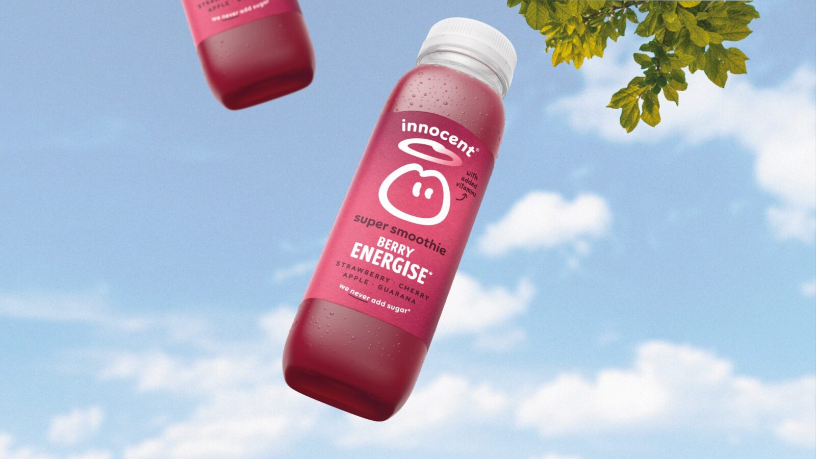
To that end, we began by redrawing the dude himself, smoothing out his italicised form, allowing him to occupy maximum space in every composition and lock up with the newly softened and arched innocent wordmark.
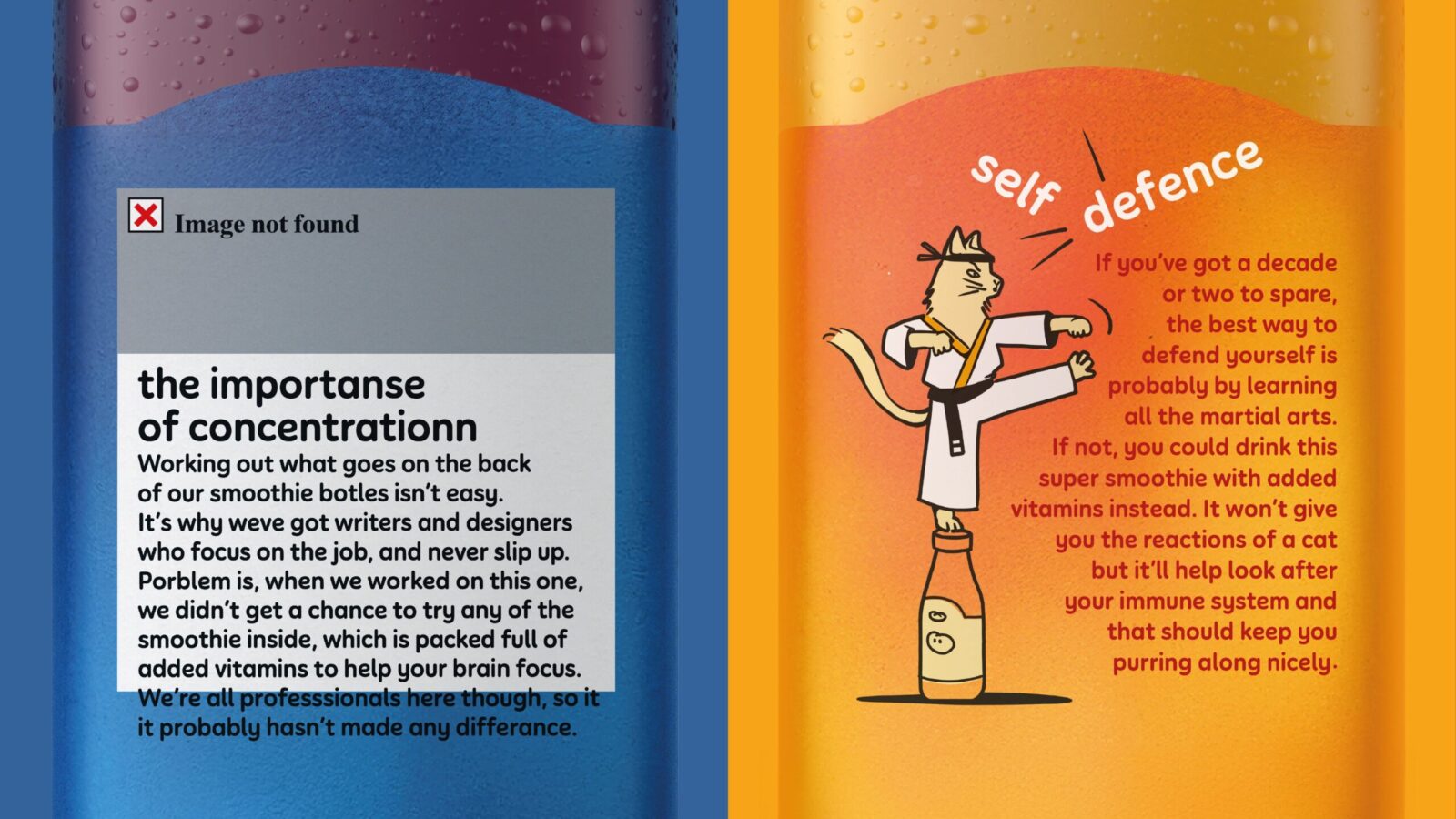
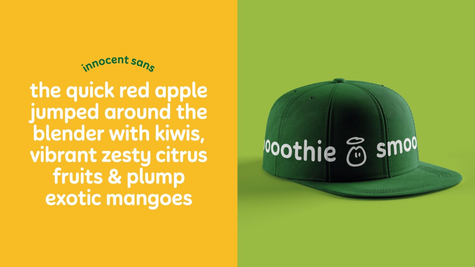
We then stripped back the chaotic variety of every other element, crafting a new set of key assets including bespoke typography and illustrations, built into a strong but flexible system.
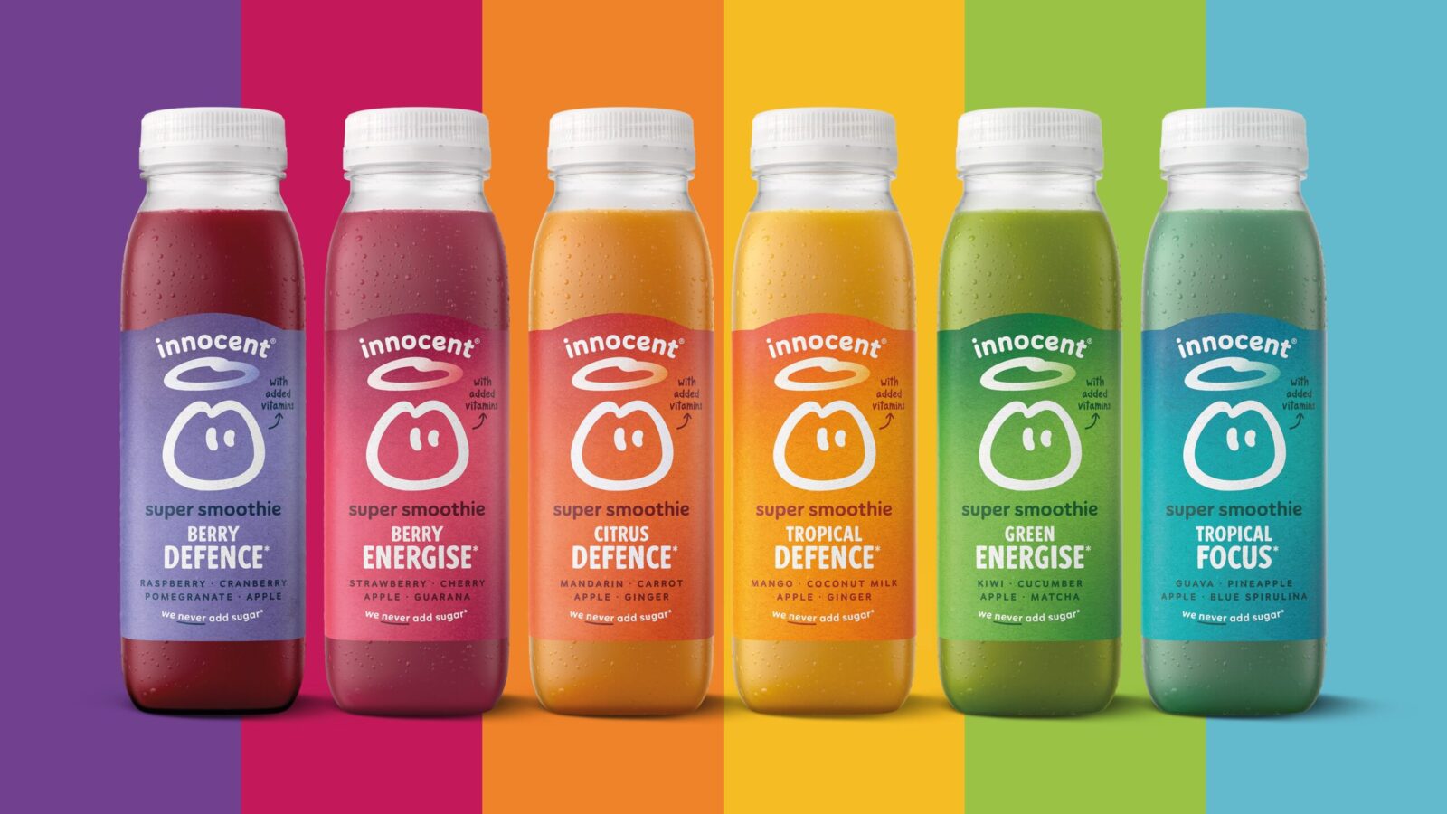
The Super Smoothie range adds a rainbow of vibrant, subtly textured backgrounds to this mix – evoking the richness of flavour and natural benefits of the ingredients.
Keep it simple, smoothie fans!
4. Strategic Insight
Innocent’s equity lies in clarity and charm. Simplifying the identity strengthens both shelf standout and emotional connection, proving that confidence often comes from doing less, brilliantly.
5. Design Execution
• Redrawn Dude with increased presence
• Softened arched wordmark with improved lockup
• Bespoke typography and refined illustration
• Simplified hierarchy and reduced noise
• Vibrant textured backgrounds on Super Smoothies to cue richness and health
6. Outcome and Impact
• Stronger brand recall through a confident masterbrand
• Cleaner communication that restores the original innocent personality
• A more flexible system for future innovation
• Enhanced flavour and wellbeing perception for Super Smoothies
A design that gets out of the way and lets the goodness shine.
CREDIT
- Agency/Creative: Derek&Eric
- Article Title: Innocent Super Smoothies Redesign by Derek&Eric
- Organisation/Entity: Agency
- Project Status: Published
- Agency/Creative Country: United Kingdom
- Agency/Creative City: Derek&Eric & Innocent Creative
- Market Region: Europe
- Project Deliverables: Packaging Design, Packaging Guidelines
- Industry: Food/Beverage
- Keywords: WBDS Agency Design Awards 2025/26 , Packaging Redei
-
Credits:
Managing Director: Jon Gibbs


