


Kilde – Branding a Real Source of Energy
Branding, visual identity and packaging for Kilde Protein Water — a uniquely Norwegian product designed for active people on the move. Kilde, meaning “source” in Norwegian, captures the essence of the brand: a clean, refreshing and stylish source of natural energy.
Kilde is a protein-infused water designed for a new generation of health-conscious consumers seeking a lighter, fresher alternative to sugary exercise drinks and conventional bottled waters. It is part of the global boom in protein supplements — but expressed through a Scandinavian design language and a more refined, lifestyle-driven approach.
Working closely with the client, we shaped a brand built around young, style-conscious and health-focused consumers — people who value physical wellbeing, modern aesthetics, and functional benefits. At the same time, Kilde maintains strong crossover appeal to anyone who simply wants a great-tasting, energising drink with added protein.
Identity: A Continuous Source of Energy
Kilde is quite literally a source — a source of protein, hydration and clean energy. Protein water offers a rapid, light and easily absorbed dose of protein, ideal for recovery and sustained energy throughout the day.
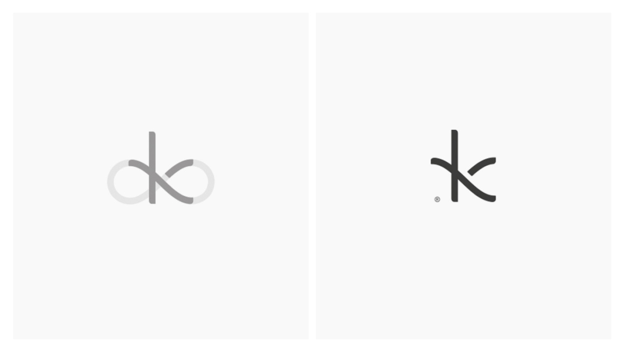
The logotype and the K-symbol are built from the shape of an infinity loop, representing continuous flow, replenishment and movement — a visual metaphor for ongoing energy. It suggests endurance without pressure, performance without aggression, and an effortless rhythm aligned with an active lifestyle.
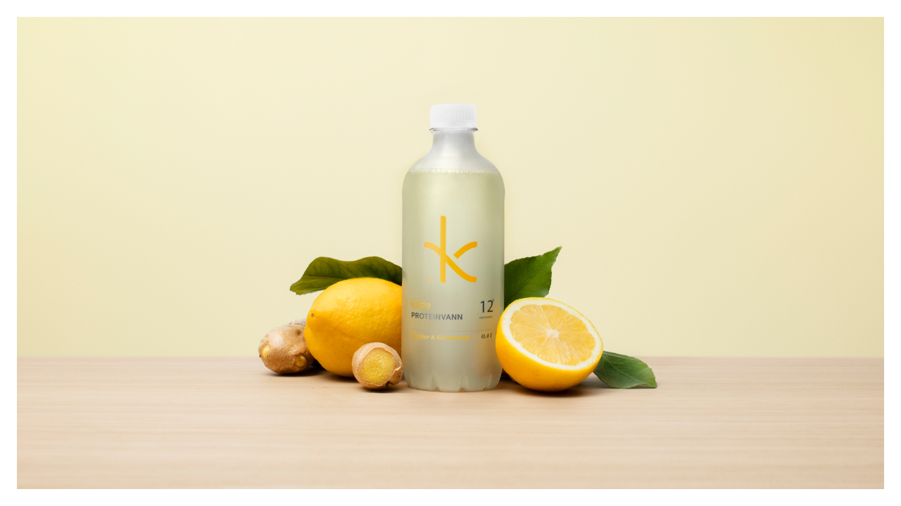
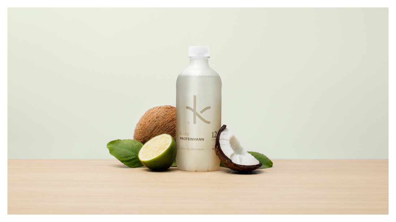
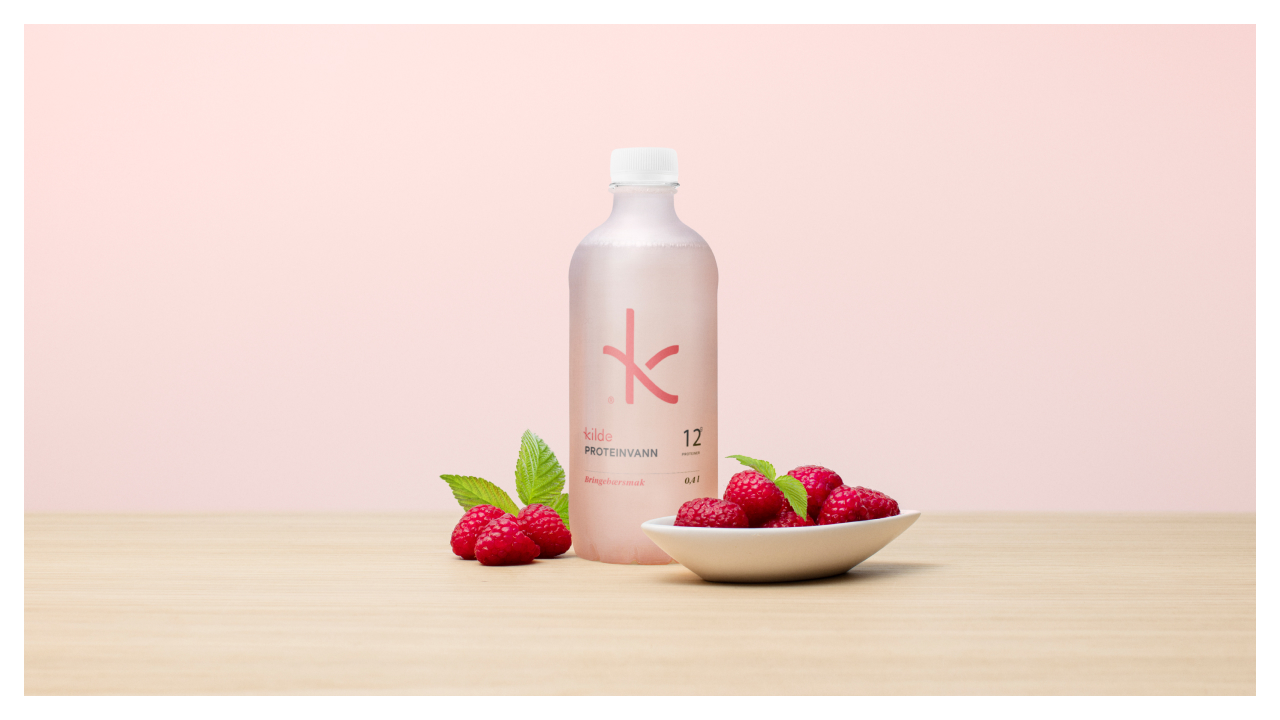
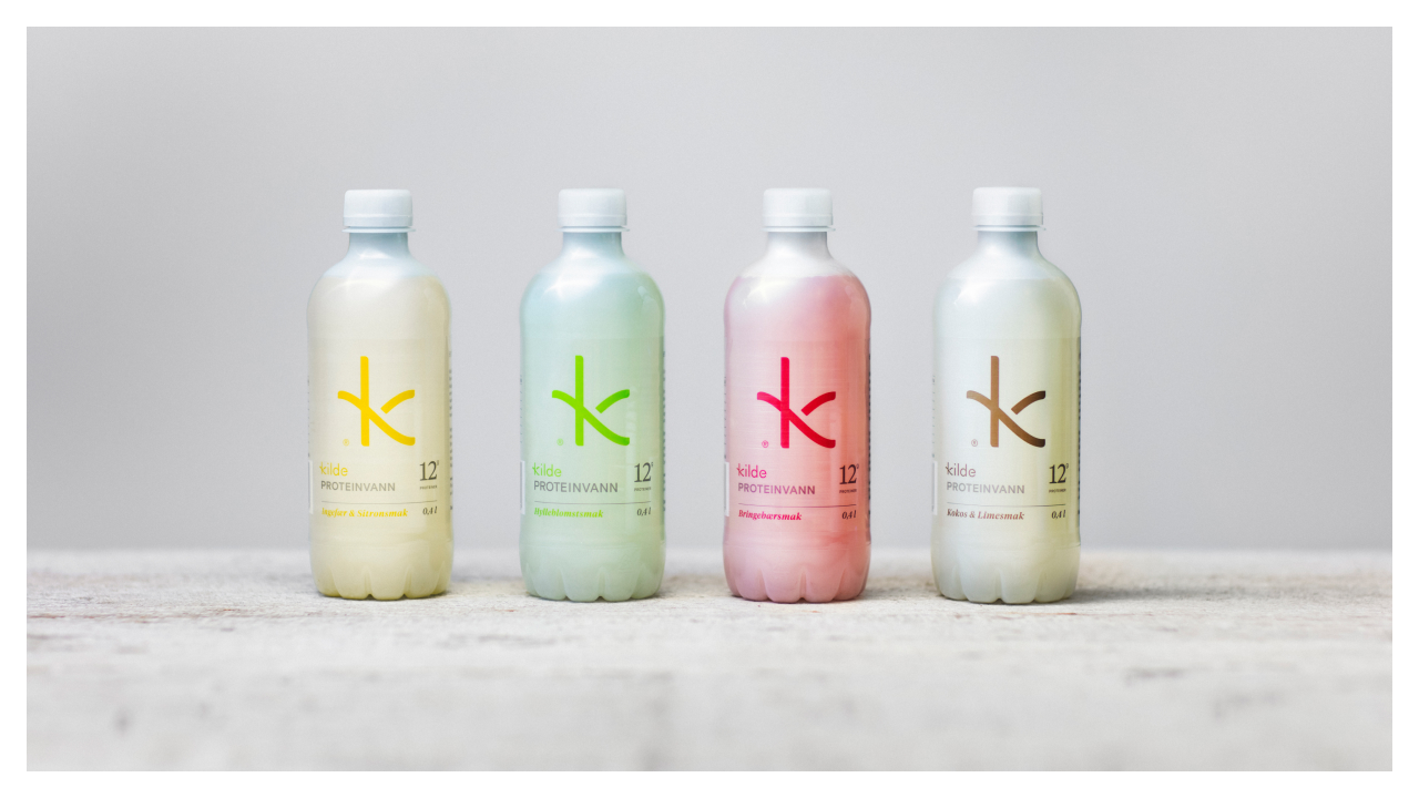
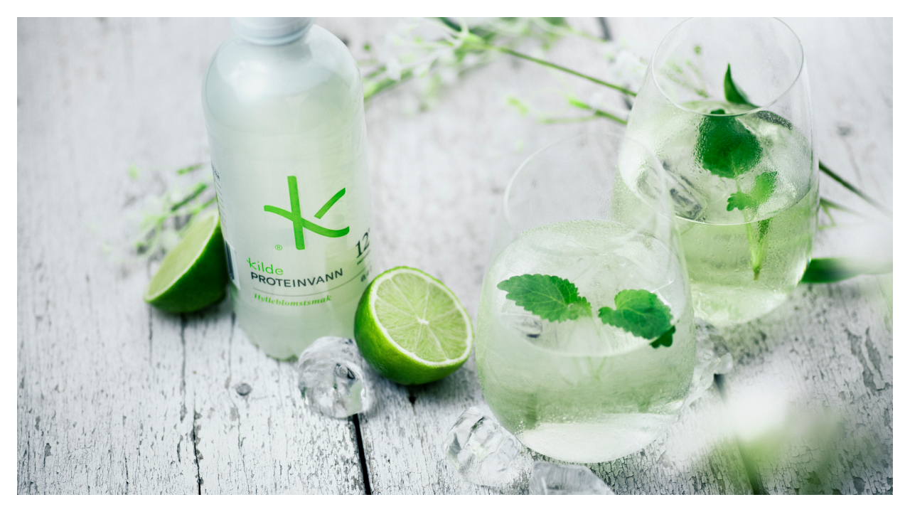
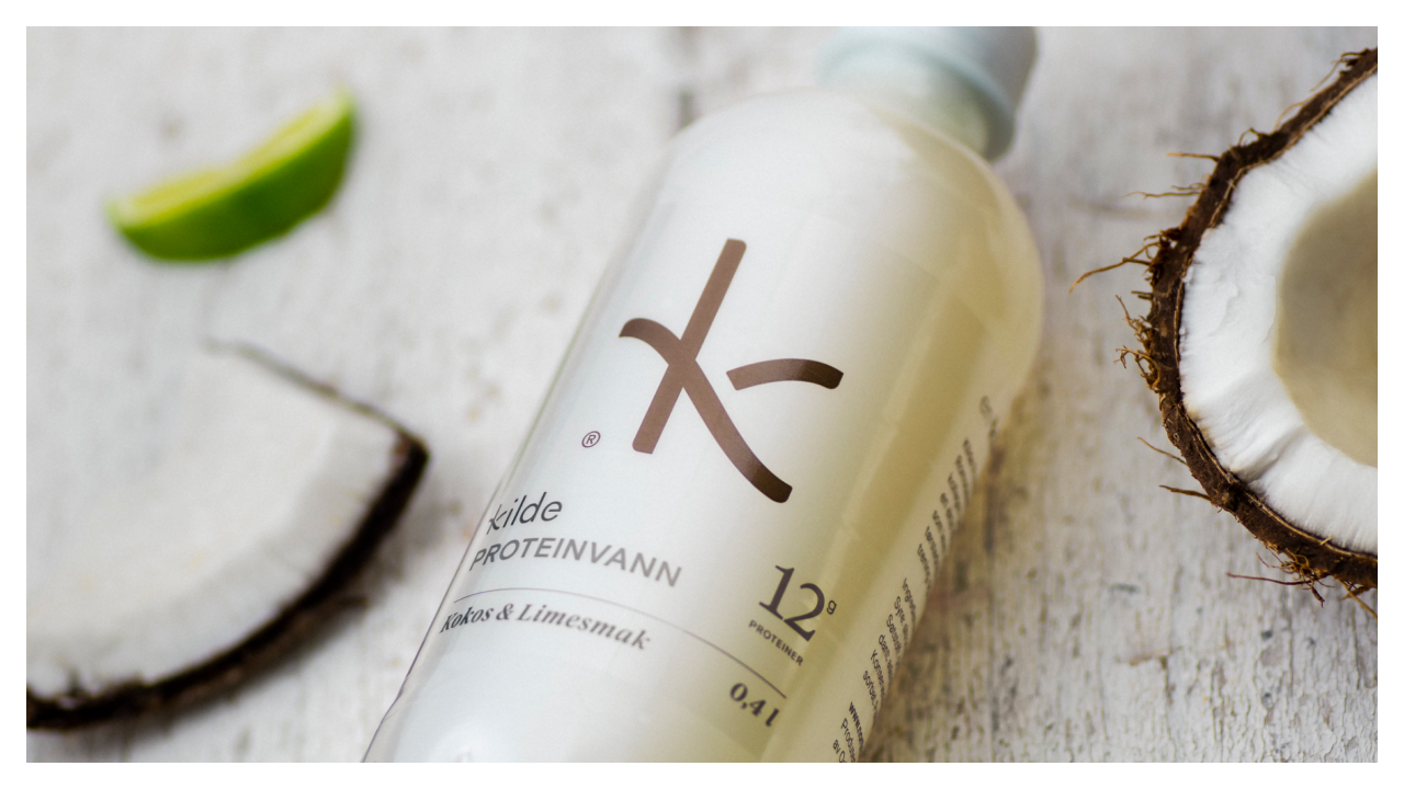
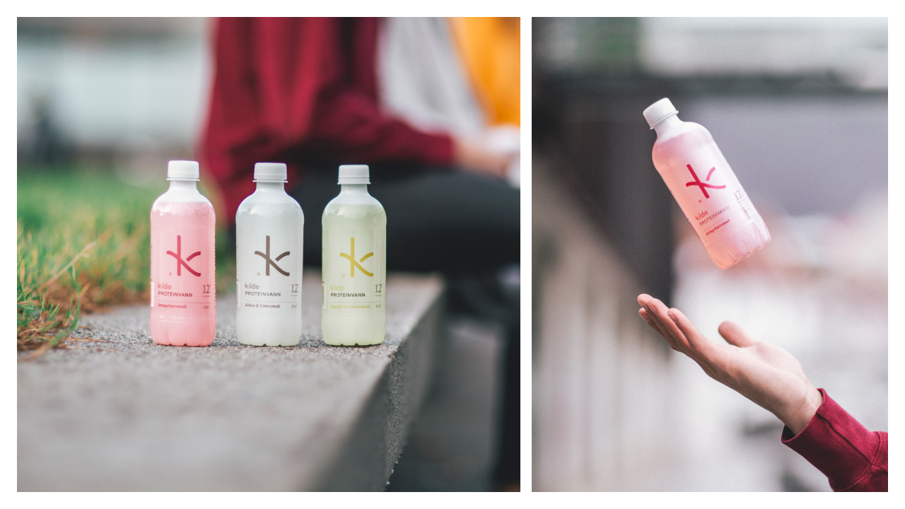
The colour palette draws from the flavours themselves: lemon, raspberry, coconut, citrus and berry variations. Each flavour combines desaturated and saturated tones to create a tone-on-tone universe that is both refreshing and sophisticated. The palette feels natural, vibrant, and clean — just like the drink.
Packaging: Freshness, Clarity, Simplicity
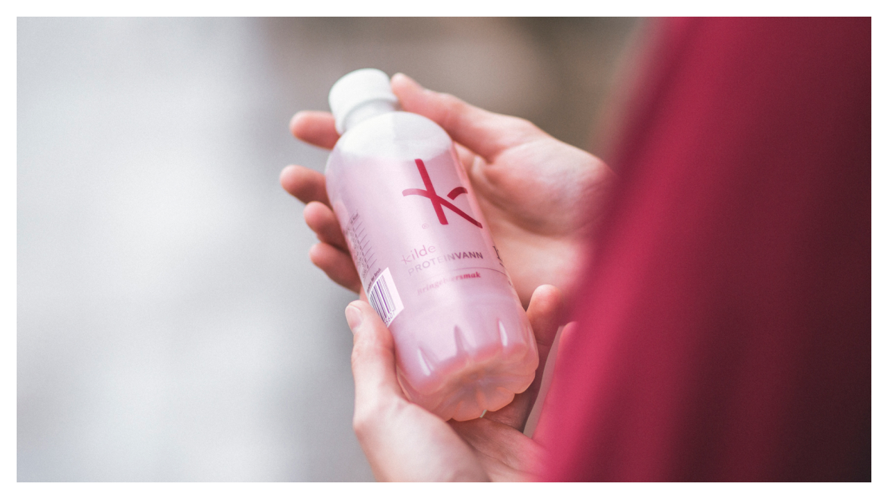
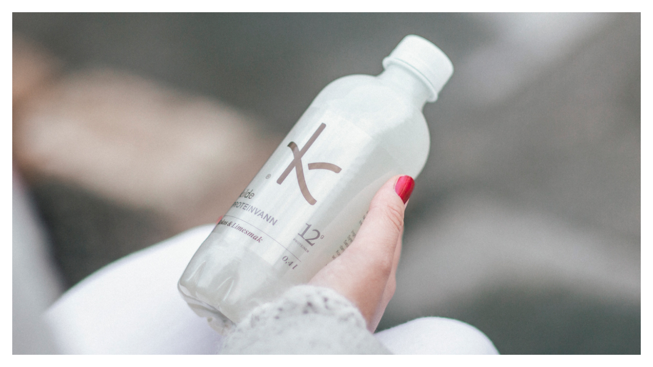
The bottles feature a frosted finish, giving them a cool, refreshing look reminiscent of cold mountain water. Labels are labelless-printed directly onto the surface, creating the appearance of delicate silkscreen ink rather than a traditional label, resulting in a clean, minimal, almost elemental look.
The interplay between the frosted bottle, clear-coloured accents, and the bold K-icon makes Kilde instantly recognisable. It is visually cold, crisp and pure — everything you expect from a Scandinavian functional beverage.
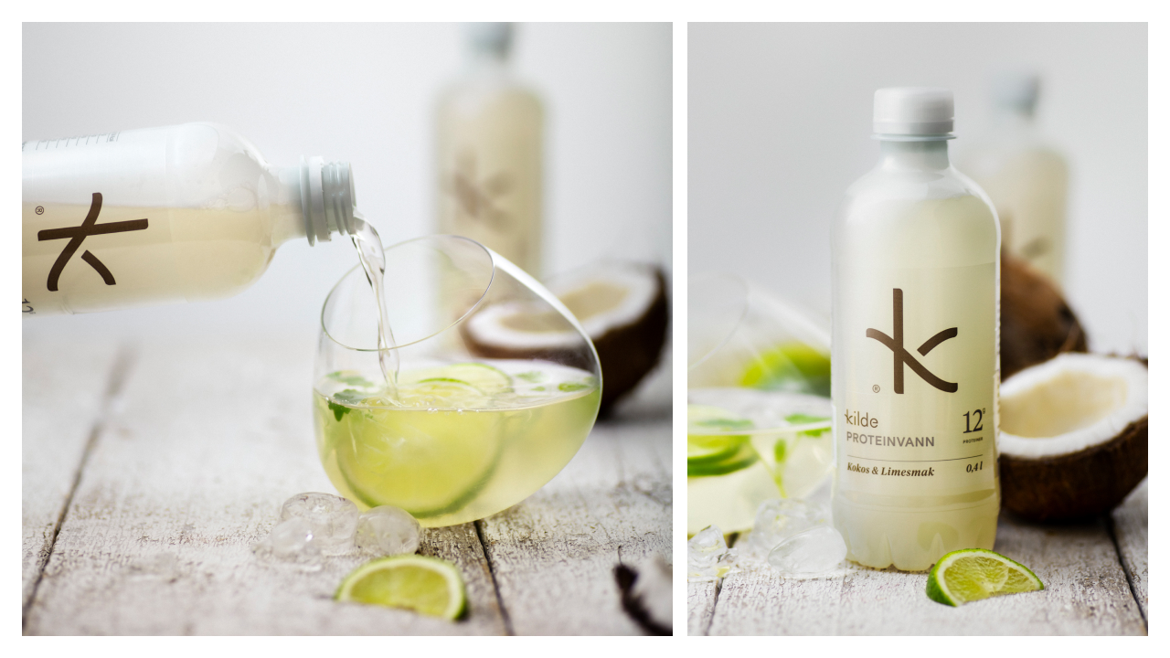
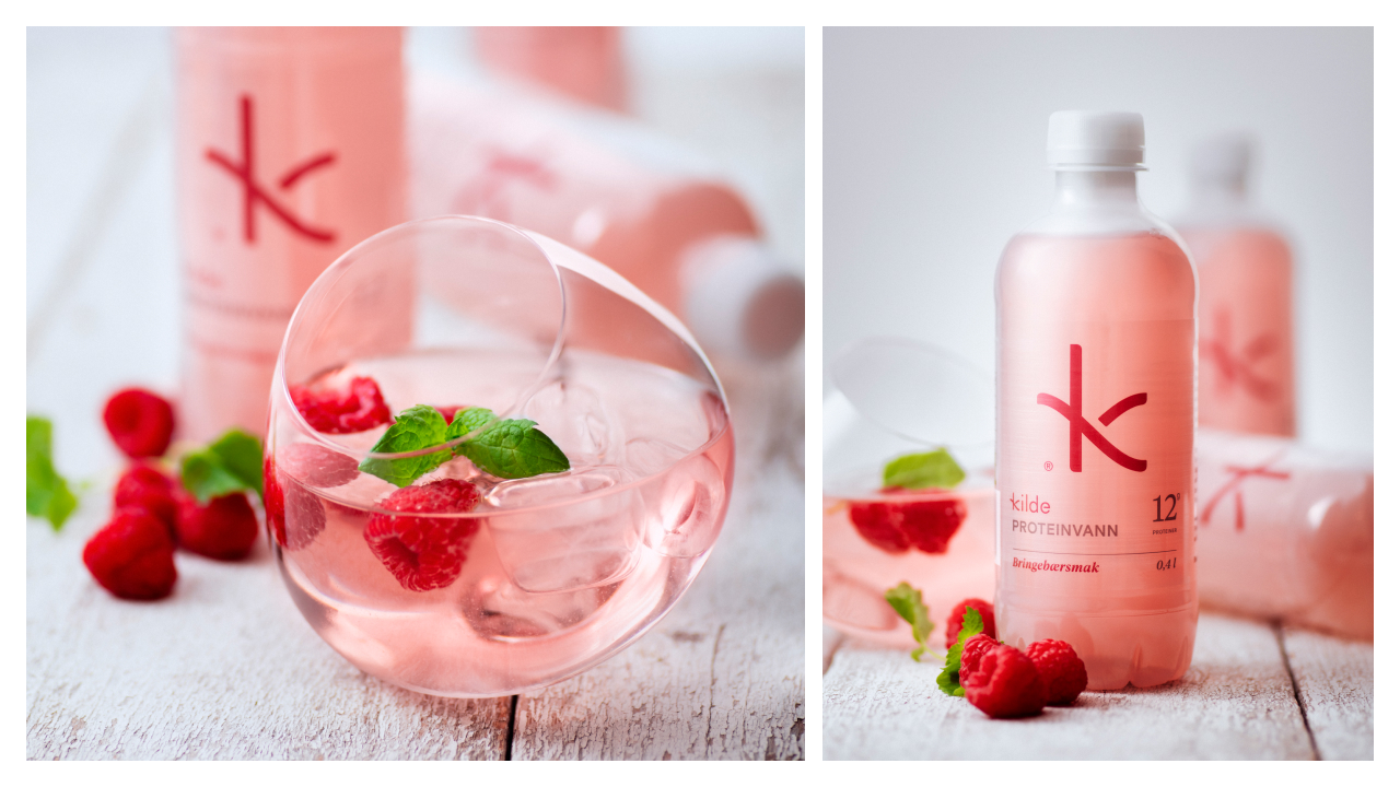
Photography: Effortless Energy and Fresh Colour
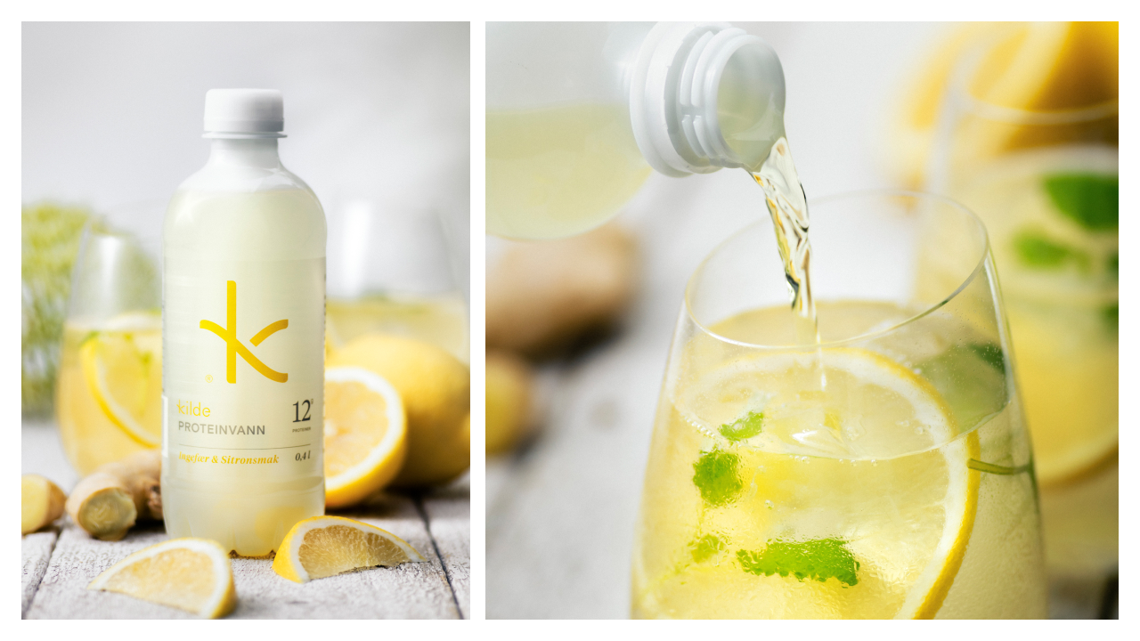
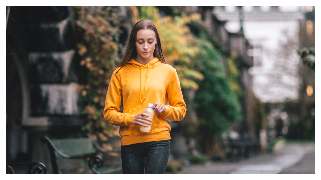
The photographic style focuses on young, active consumers in clean compositions that emphasise balance, wellbeing and modernity. The product photography is bright, fresh and colour-driven, accentuating the refreshing flavour profiles and the sensory experience behind each variant.
The colours are more than aesthetic — they trigger associations of cool citrus, juicy berries, natural hydration and invigorating freshness. Every image reinforces a sense of clarity, vitality and Scandinavian purity.
A Source That Feels Like a Lifestyle
Kilde is a lifestyle signal — a representation of health, lightness and movement. The identity, photography and packaging all work together to communicate one message with precision:
Energy should feel clean.
Hydration should feel effortless.
And good design should feel refreshing.
Kilde is exactly that —
A real source of energy.

CREDIT
- Agency/Creative: KIND (Conceptual Branding AS)
- Article Title: KIND Defines Scandinavian Energy With the Clean, Functional Design of Kilde Protein Water
- Organisation/Entity: Agency
- Project Status: Published
- Agency/Creative Country: Norway
- Agency/Creative City: Bergen
- Market Region: protein, water
- Project Deliverables: Logo Design, Packaging Design
- Industry: Food/Beverage
- Keywords: WBDS Agency Design Awards 2025/26 water, protein
-
Credits:
CEO, Creative Director: Tom Emil Olsen
Design Director: Knut Harald Longva
Senior Designer: Emil Olsen
Director of Photography: Christoffer Meyer
Photographer & Cinematographer: Isak Norum
Project Manager: Laure Mediavilla
Strategic Brand Director: Thomas Danielsen
COO, Key Account Manager: Beate Myren Romslo
Strategic Brand Consultant: Brede Lie Reime


