Sant – Redefining Refreshment through Smart Drinking
The beverage industry has long been dominated by two extremes: on one side, traditional soft drinks that deliver taste and familiarity but offer little to no nutritional value; on the other, functional health products that often lack emotional appeal, creativity, or the pleasure factor consumers expect from a drink. In this space of tension, Sant emerges as a Mediterranean prebiotic soda that challenges conventions and builds a new category in Spain: the Smart Drink.
Sant is more than a beverage. It is a brand with a mission: to transform the refreshment market by offering a product that is as enjoyable and sociable as a soda, yet as beneficial for the body as a wellness supplement.
A Changing Market. Over the last decade, global consumers have become increasingly conscious of what they put into their bodies. Sugar-free trends, functional ingredients, and probiotic or prebiotic innovations have paved the way for alternatives that aim to deliver both taste and health benefits. Yet, most functional drinks remain niche, confined to fitness shelves or wellness aisles, lacking the mass appeal of established soda brands.
In Spain, the opportunity was clear: while the market for health-oriented refreshments was expanding, there was no mainstream brand capable of uniting Mediterranean lifestyle values with real nutritional innovation. Sant was conceived to answer this unmet need.
The Mediterranean has always represented a culture of balance, social life, and natural richness. Bringing this heritage into a drink was a natural step: a refreshing product that embodies flavor, community, and health, all in one.
The challenge was twofold:
Strategic – How to position Sant as a true alternative to sodas, not just another niche health drink? How to claim leadership in a new category instead of being perceived as a follower in an existing one?– and Creative – How to design a brand identity that communicates both scientific credibility (prebiotic benefits, wellness) and emotional warmth (pleasure, Mediterranean lifestyle)?–.
The ambition was clear: “Establish the category of Smart Drink in Spain.” The idea of Smart Drinking became the core of Sant’s positioning.
A smart drink is one that: Nourishes the body while refreshing the spirit. Balances pleasure with purpose.
Celebrates culture while innovating for the future. Breaks conventions of what a soda should be, without sacrificing taste or fun. This philosophy guided every design decision, from naming to packaging to communication.
An Identity Warm and Disruptive. In the world of functional beverages, many brands rely on clinical, sterile, or overly “scientific” aesthetics. Sant deliberately chose a different path.
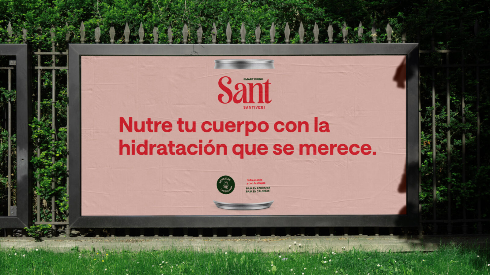
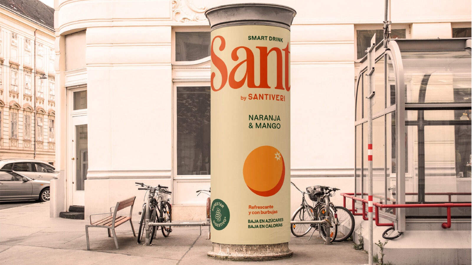
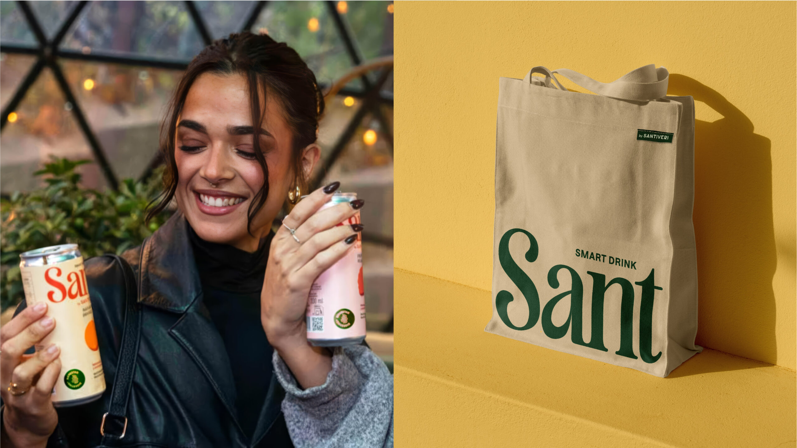
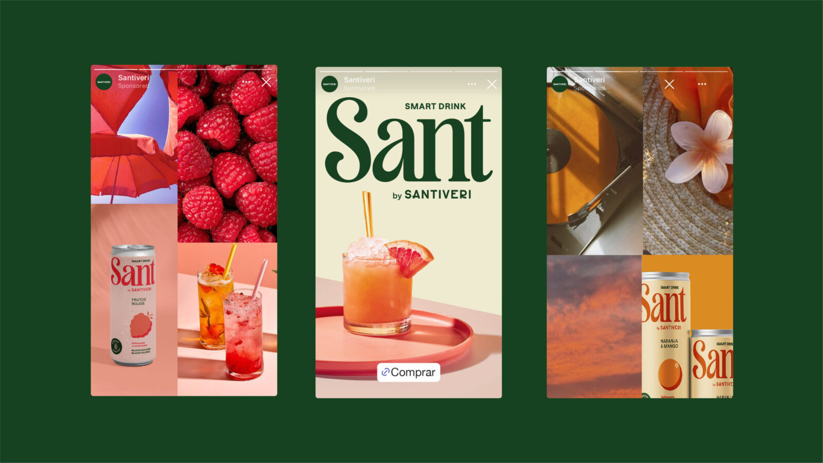
The visual identity embraces friendly illustrations, soft organic forms, and a bright, approachable color palette. Instead of appearing as a medicine or supplement, Sant presents itself as an invitation to joy, sociability, and lifestyle.
The result is a brand that feels alive, optimistic, and human, perfectly aligned with its mission to connect wellness with enjoyment.
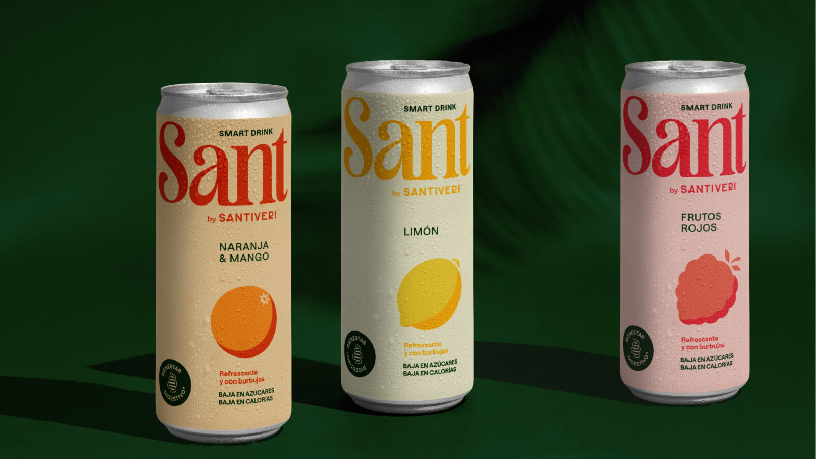
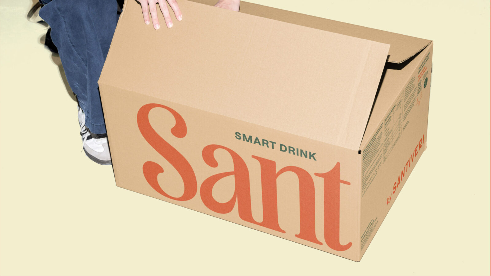
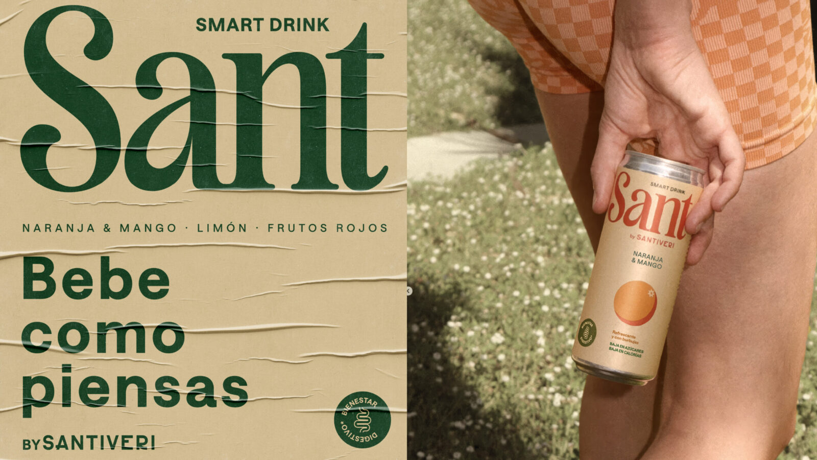
Sant’s packaging is the consumer’s first encounter with the idea of Smart Drinking. It was crucial that the pack communicates both innovation and warmth.
Key elements of the packaging include:
Illustrations that represent ingredients and benefits in a stylized, playful way, reinforcing approachability.
Typography that is bold yet rounded, ensuring readability while reflecting friendliness.
Color coding that differentiates flavors while maintaining a cohesive family look.
Transparent communication of prebiotic benefits, building trust and clarity with the consumer.
By striking a balance between scientific reassurance and emotional connection, the packaging itself becomes a conversation starter, positioning Sant as the face of a new category.
Conclusion
Sant is not just a new product launch; it is a cultural shift. It reimagines what a soda can be, merges science with lifestyle, and positions itself as a pioneer of the Smart Drink category in Spain.
Through a carefully balanced identity; friendly, Mediterranean, and disruptive. Sant answers the fundamental question:
“What makes a drink smart?”
The answer lies in a brand that is healthy yet fun, credible yet warm, innovative yet rooted in tradition.
A brand that dares to be different and inspires others to rethink refreshment.
Sant is not only a drink.
Sant is the future of Smart Drinking.




CREDIT
- Agency/Creative: Morillas
- Article Title: Morillas Positions Sant as the Future of Smart Drinking in Spain
- Organisation/Entity: Agency
- Project Status: Published
- Agency/Creative Country: Spain
- Agency/Creative City: Barcelona
- Project Deliverables: Brand Identity, Creative Direction, Label Design, Logo Design, Packaging Design
- Industry: Food/Beverage
- Keywords: WBDS Agency Design Awards 2025/26 , Product identity, Logotype, Graphic Design, Smart drink, typography, packaging design, label design


