


Background:
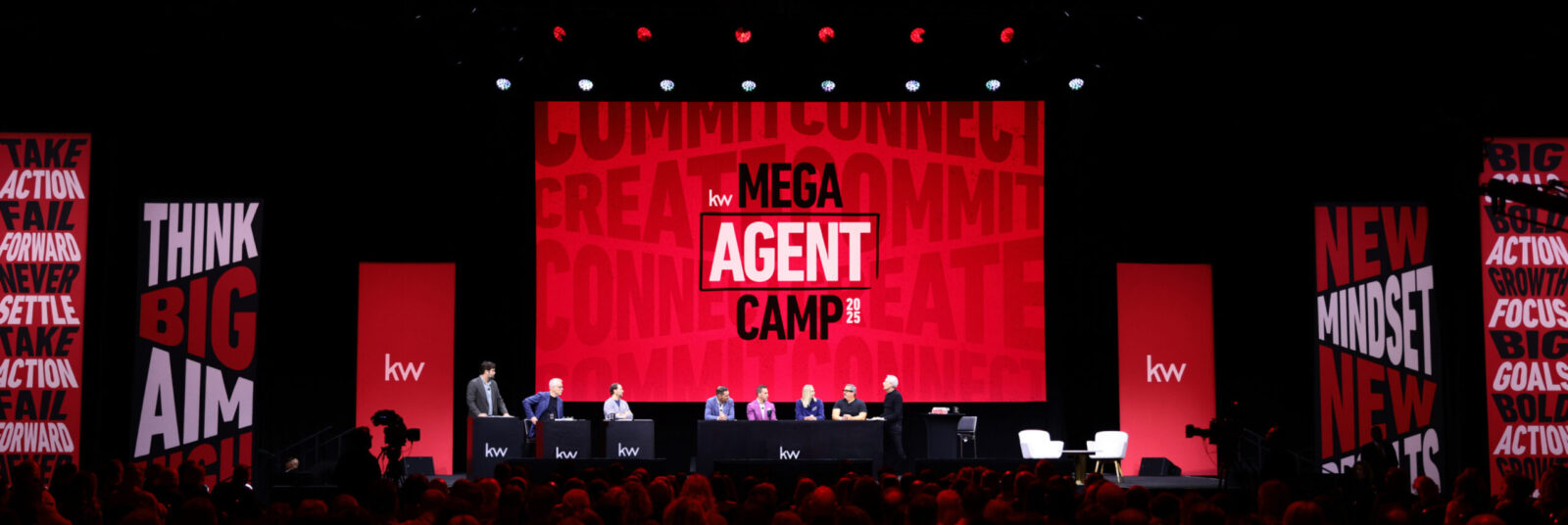
Mega Agent Camp is Keller Williams’ premier educational conference – a celebration of culture and education where thousands of real estate professionals gather to learn and connect. The event centers on main stage panel discussions with KW leaders and top-producing agents – sharing the stories, systems, and best practices behind their success in building and growing successful real estate businesses.
Brief:
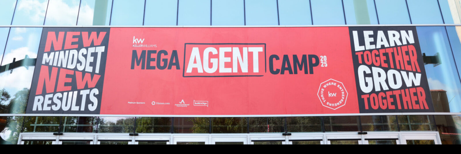
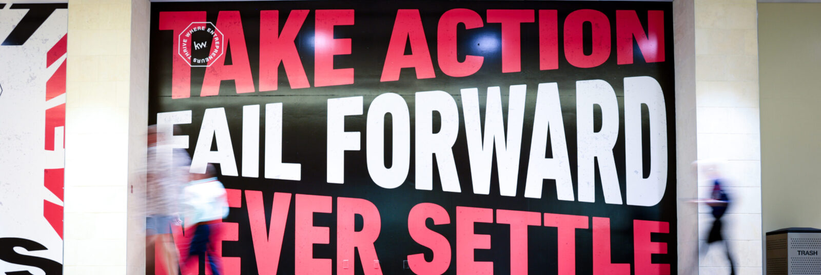
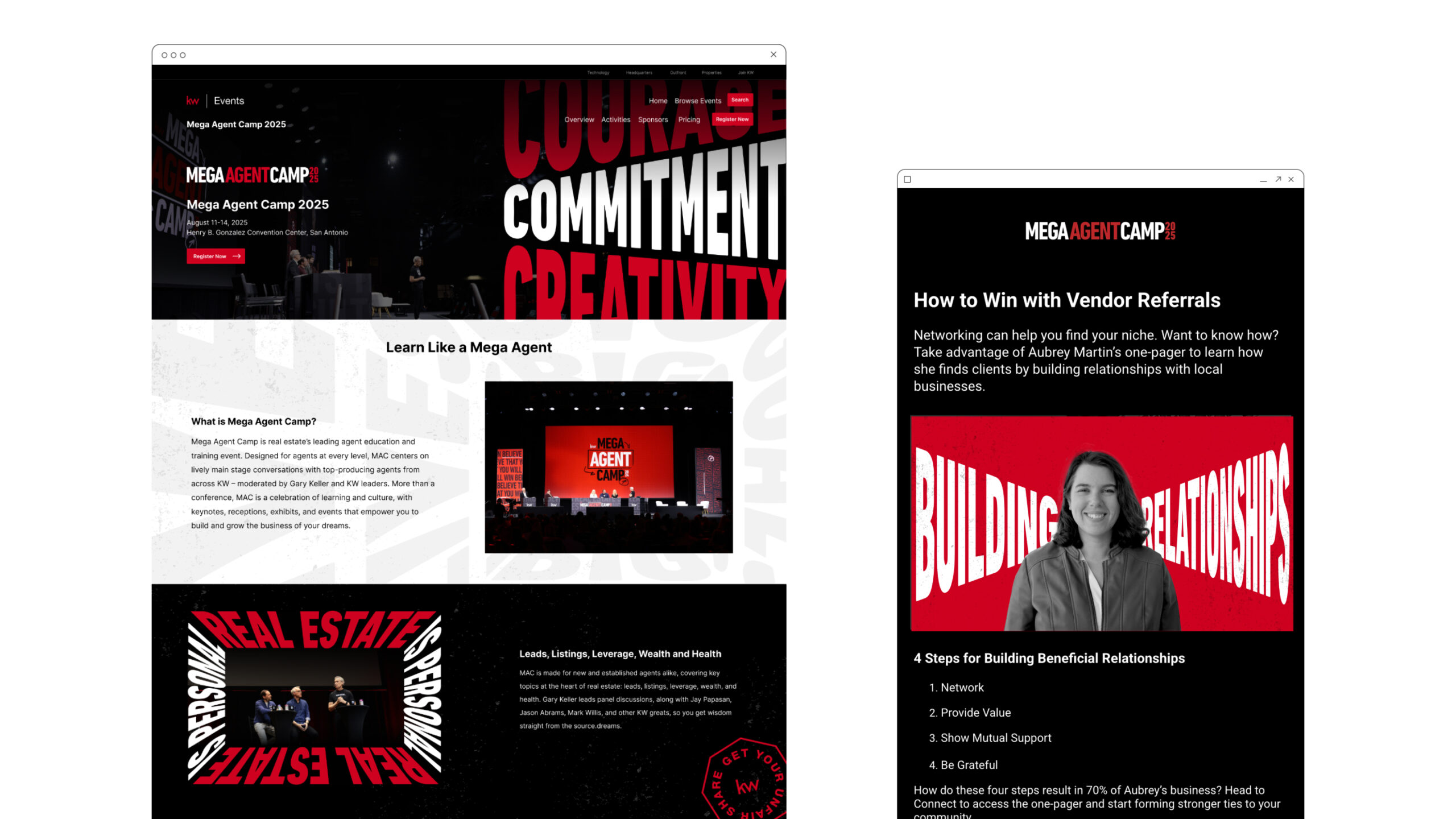
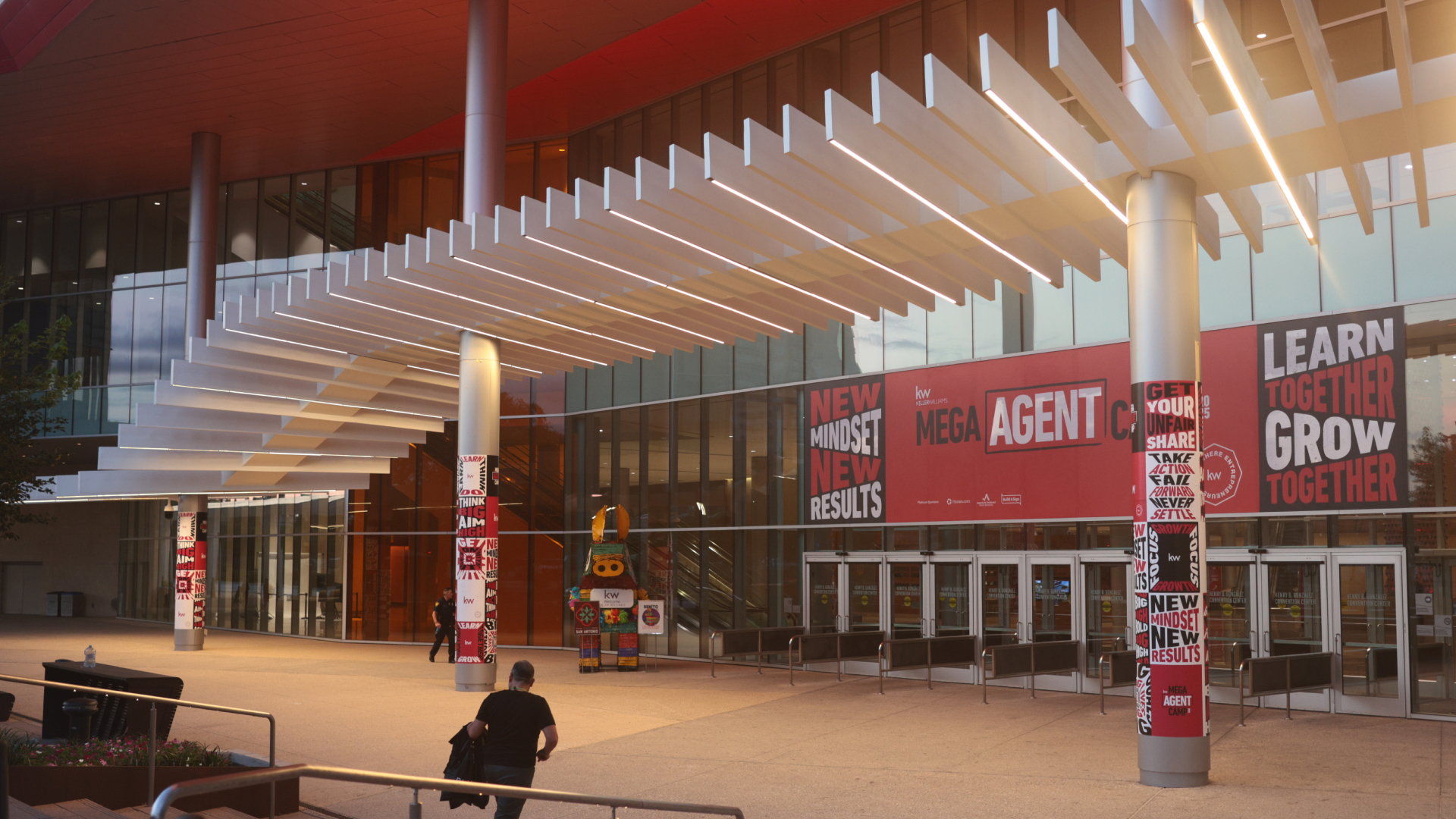
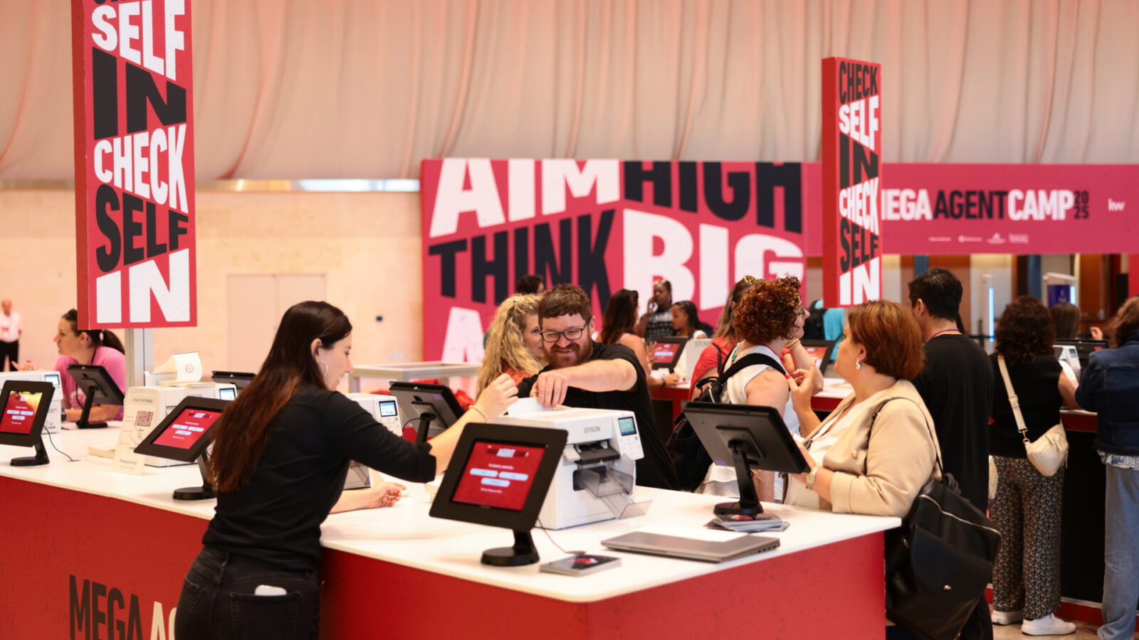
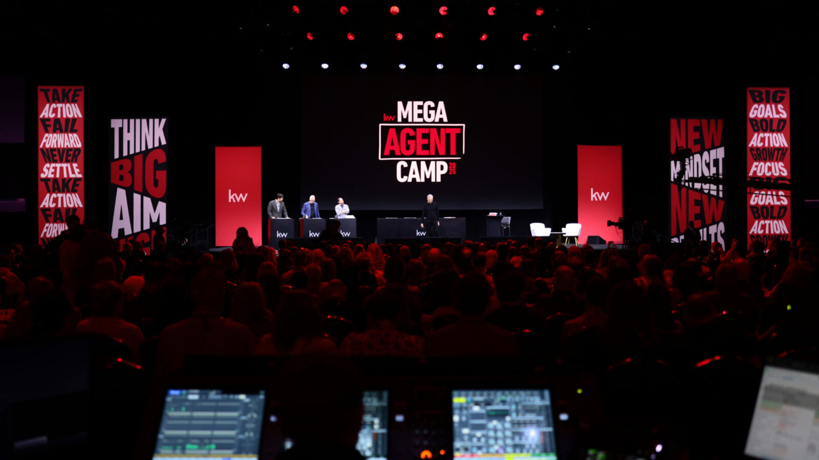
The brief was to develop the show theme and design system for Mega Agent Camp 2025. The system needed to anchor all promotional marketing communications, on-site environmental graphics, and digital design – from promotional emails to a main stage design for almost 10,000 attendees. The look needed to be both educational and inspirational, as well as the flexibility to work across multiple sizes, formats, and mediums. Consistency was required to strengthen the brand recognition and integrity, while KW wanted to create a brand that felt fresh, exciting, and motivational – to inject some energy and inspiration into what was otherwise an extremely flat and challenging real estate market. The brand needed to balance innovative boundary pushing with reassuring trust and solidity.
Strategy:
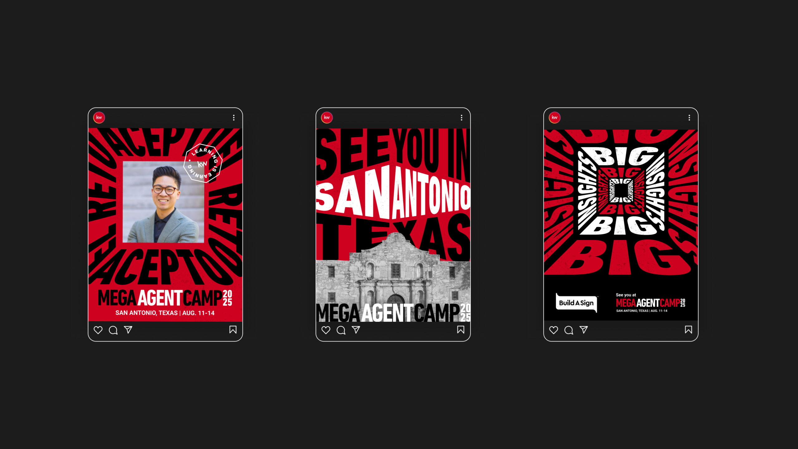
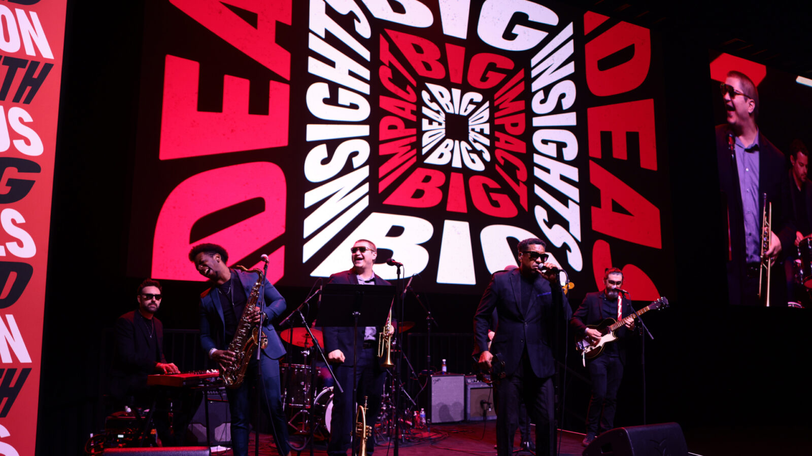
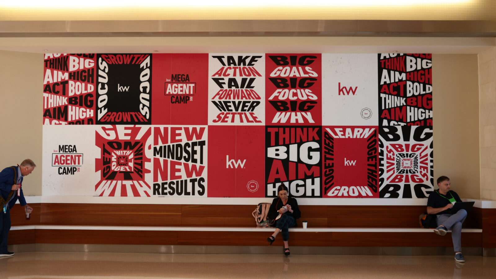
The approach centered on a single idea derived from a recurring theme of the exploratory research – that a new mindset = new results. It proved true that the most successful agents believe they’re going to be successful. It’s a simple attitudinal shift that yields the most positive and measurable results, and the visual identity reflects this change in perspective – with bold, angled layouts, warped frames, and dynamic compositions challenging convention with a fresh and unexpected energy. The perpetually shifting industry landscape became visual – as did KW’s rallying call of the need for continual learning and innovation. Typography became the primary driver of the brand – presenting messages and mantras that are educational, encouraging, and action oriented, while supporting elements such as stamps, textures, and color brought a human touch, added a sense of legitimacy, and anchored the show look to the parent KW brand.
Design Process:
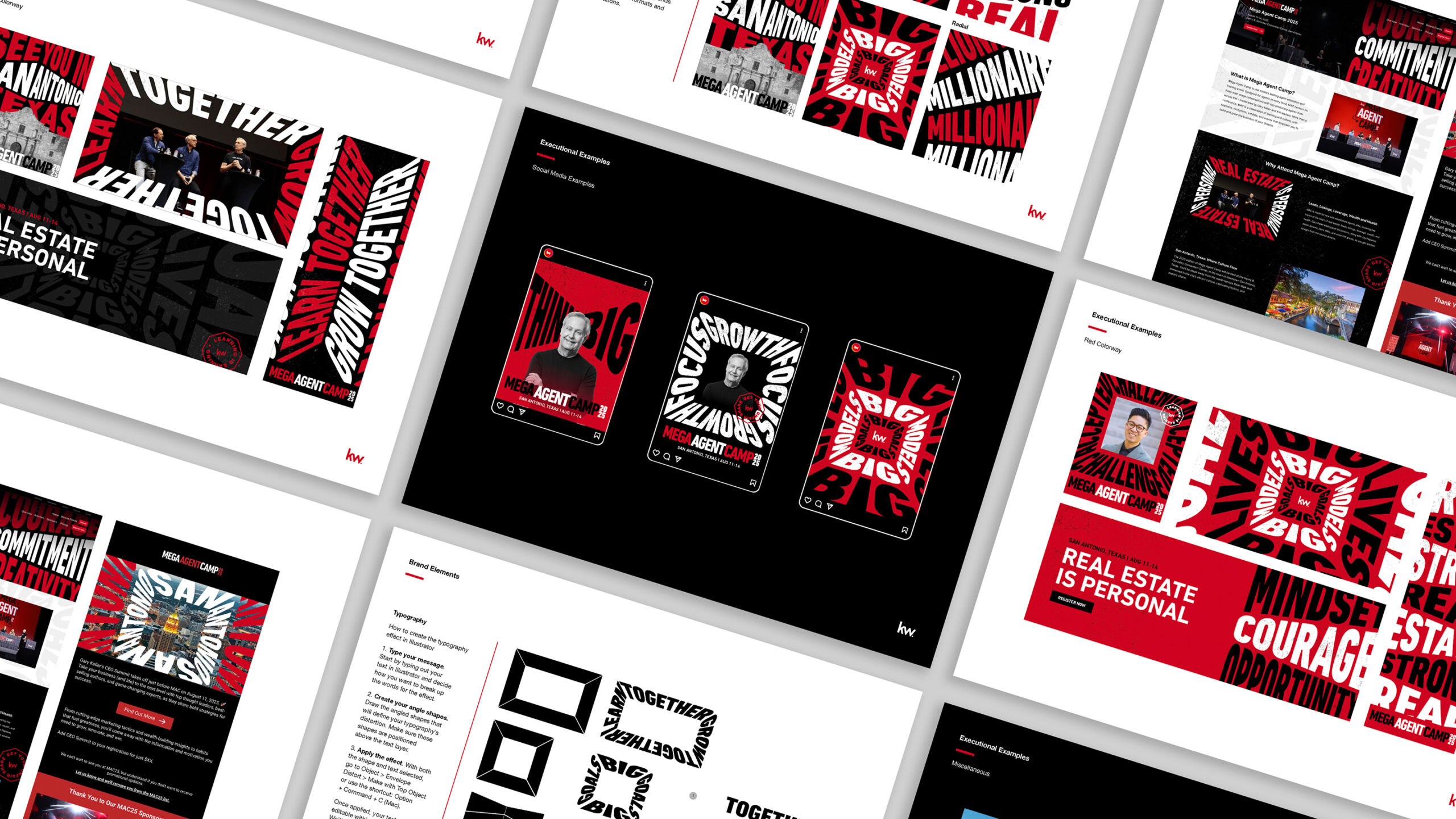
The design process began by exploring multiple type-driven systems that could push the boundaries of Keller Williams’ visual language. After testing radial, accordion, warped, and framed typography styles, the team landed on a set of flexible treatments that could adapt to various applications without losing cohesion.
-Typography was used at scale to carry the theme, delivering bold, striking visuals.
-Color leaned on Keller Williams’ primary palette with black, white, and red, ensuring brand recognition while leveraging high-contrast impact.
-Photography balanced full color and black-and-white treatments to capture energy, authenticity, and the spirit of San Antonio, the host city.
-Stamps and textures were introduced to add a feeling of human imperfection, brand legitimacy, and visual balance.
Collaboration across internal teams and external vendors ensured that the design system was translated consistently across stage design, environmental graphics, and digital touchpoints.
Results & Impact:
The new show look delivered a unified, high-energy identity that elevated the attendee experience at every touchpoint – proved by onsite and post-event surveying. From the moment guests entered the venue, the angled typography and bold compositions created impact and excitement. The system proved highly adaptable, working across large-scale stage graphics, signage, marketing assets, and digital communications.
Beyond aesthetics, the show look successfully reinforced Keller Williams’ values of growth, adaptability, and community. Attendees experienced a brand that felt both familiar and refreshed, rooted in its core identity but unafraid to innovate. The visual system not only strengthened brand recognition but also instilled pride and sparked engagement among agents, partners, and leaders—underscoring the impact of effective design in shaping a strong collective experience.
CREDIT
- Agency/Creative: Keller Williams Realty, LLC
- Article Title: Keller Williams Realty Sets a New Visual Direction for Mega Agent Camp 2025
- Organisation/Entity: In-House
- Project Status: Published
- Agency/Creative Country: United States of America
- Agency/Creative City: Austin, Texas, USA
- Project Deliverables: 2D Design, 3D Motion, Art Direction, Brand Experience, Brand Guidelines, Brand Identity, Brand Strategy, Branding, Copywriting, Design, Environmental Graphics, GIF Animation
- Industry: Real Estate
- Keywords: WBDS In-House Design Awards 2025/26 ,KellerWilliams, Branding, Event Identity, Environmental Design, Typography, Exhibit Hall Design, Art Direction, Show look, Motion Design
-
Credits:
Senior Art Director: Analilia Morales Diaz
Creative Director: Adam Dudd
Art Director: Karla Teceno
Owen Gibbs: Senior Graphic Designer
Sr. Content Writer: Christia Madacsi
Sr. Mgr, Proc & Post Prod: Randall Smith
Sr. Manager, Media: Elizabeth Dannheim
Sr. Marketing Strategist: Chelsea Eppler
Social Media Manager: Meagan Sanders
Sr. Manager, Social Media: Kylee Orlando
Logan Roush: Web Developer
Caroline Penca: Email Marketing Strategist
Peyton Greaney: Email Marketing Strategist
Sr. Mgr, Marketing Technology: Avery Thomas
Marketing Project Manager: Fiona Griffin
Sr. Mgr, Marketing Strategy: Sarah Stotz
Sr. Marketing Data Analyst: Brandon Obregon
Director, PR & Media Relations: Darryl Frost
Sr. Public Relations Spec: Aditi Khemka
Internal Comm Specialist: Taylor Guerra
Sr. Director, Marketing: Michael Balistreri


