


Logo Redesign ContourGlobal – The Right Power Forward
This entry presents the comprehensive rebranding of ContourGlobal — realized through the creative work of superhumans — as a design project that embodies clarity, transformation, and forward-looking identity for a global energy company. Under the concept “The Right Power Forward”, the project reconstructs ContourGlobal’s visual identity, communication system, and stylistic language to reflect its renewed strategic vision and values.
Background: ContourGlobal, active in energy generation and increasingly focused on renewables and battery energy storage, decided to reimagine its brand identity to match its evolution and ambitions in a rapidly changing energy sector. The challenge was to capture both technical sophistication and a human-centered, forward-thinking spirit. Through this rebranding, ContourGlobal sought a design system capable of conveying confidence, clarity, and dynamism — qualities essential for a company operating in complex, sensitive energy processes.
The purpose of the project was not merely aesthetic — it was strategic. The rebranding needed to communicate reliability, innovation, and sustainability, supporting ContourGlobal’s mission to deliver clean power responsibly, while signaling a modern identity aligned with global energy transitions.
Design Approach: the design process began with collaborative workshops involving the full team — combining both group and individual creative sessions — to align objectives, define values, and break new ground in identity thinking. This internal co-creative path allowed deep understanding of the company’s mission, culture, and aspirations, ensuring that the resulting identity would not just look good but actually reflect the company from within.
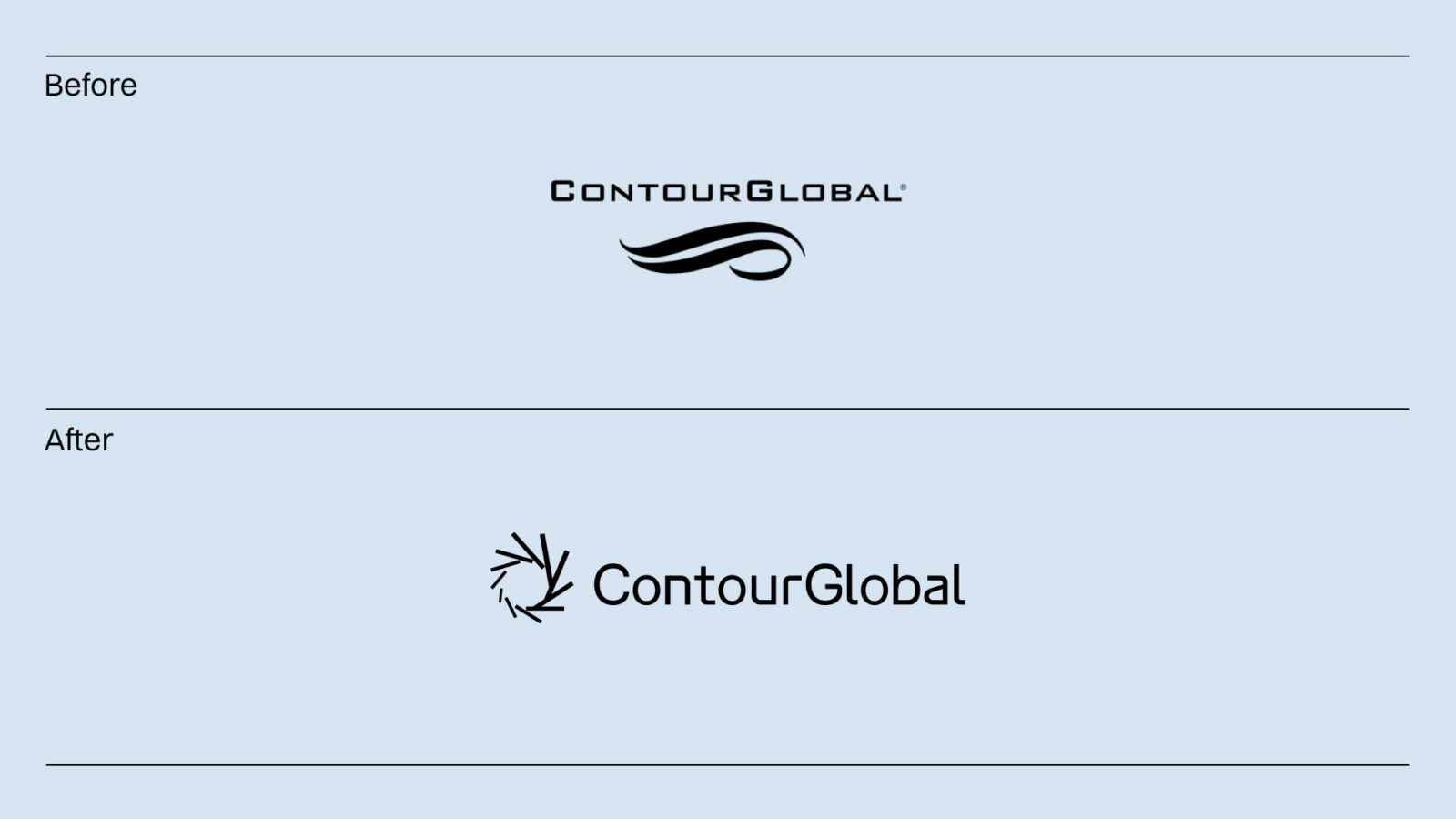
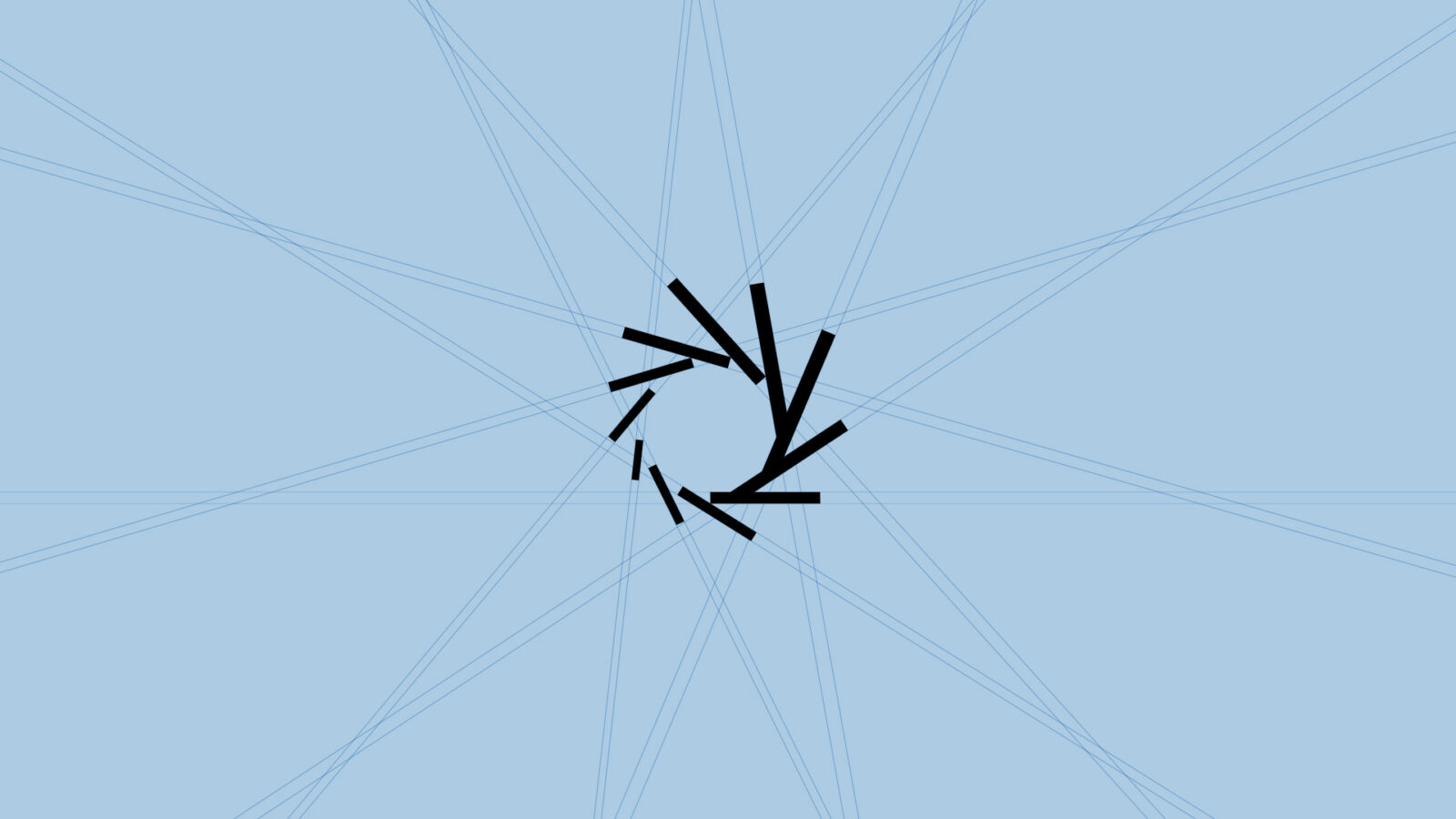
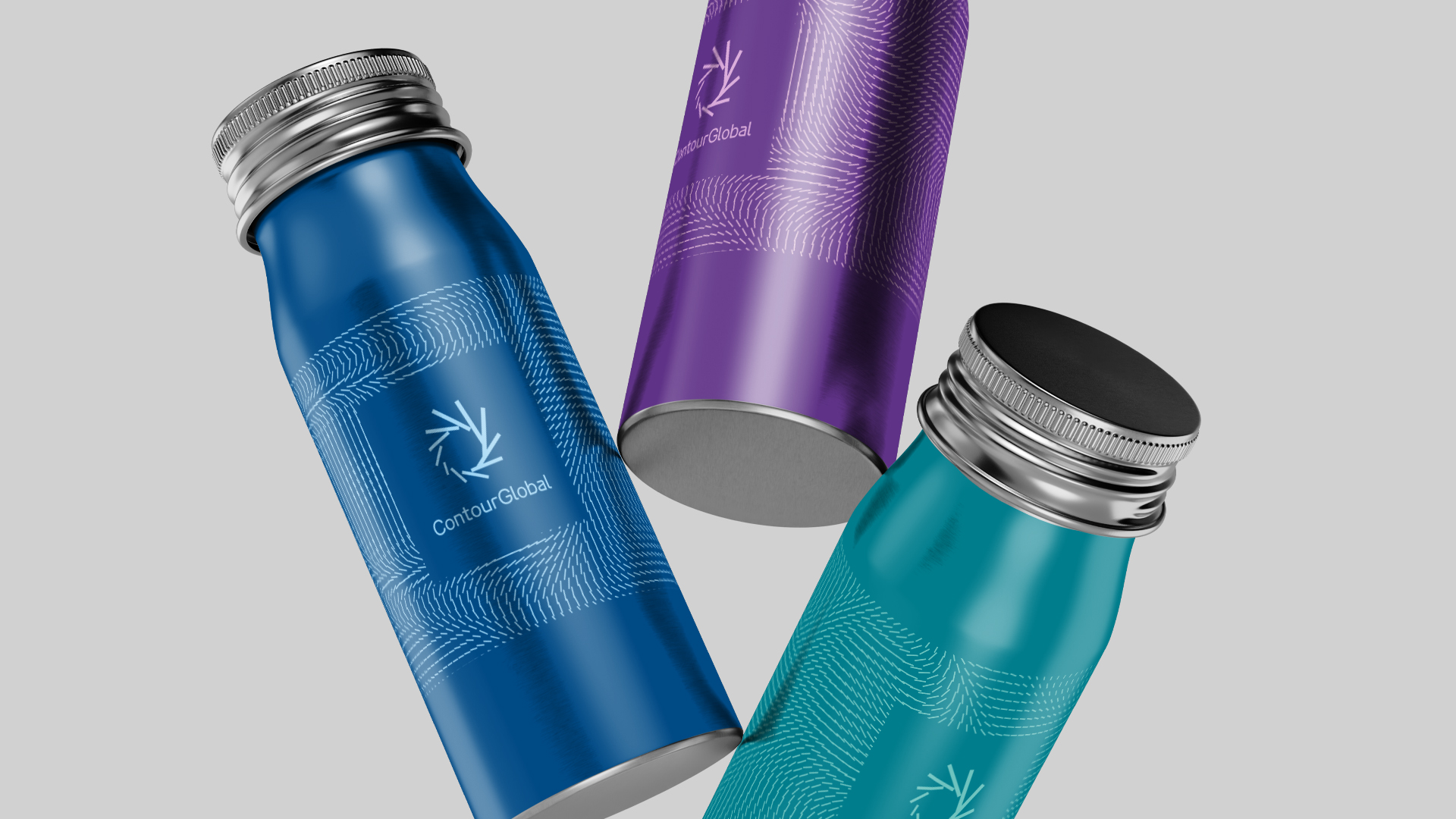
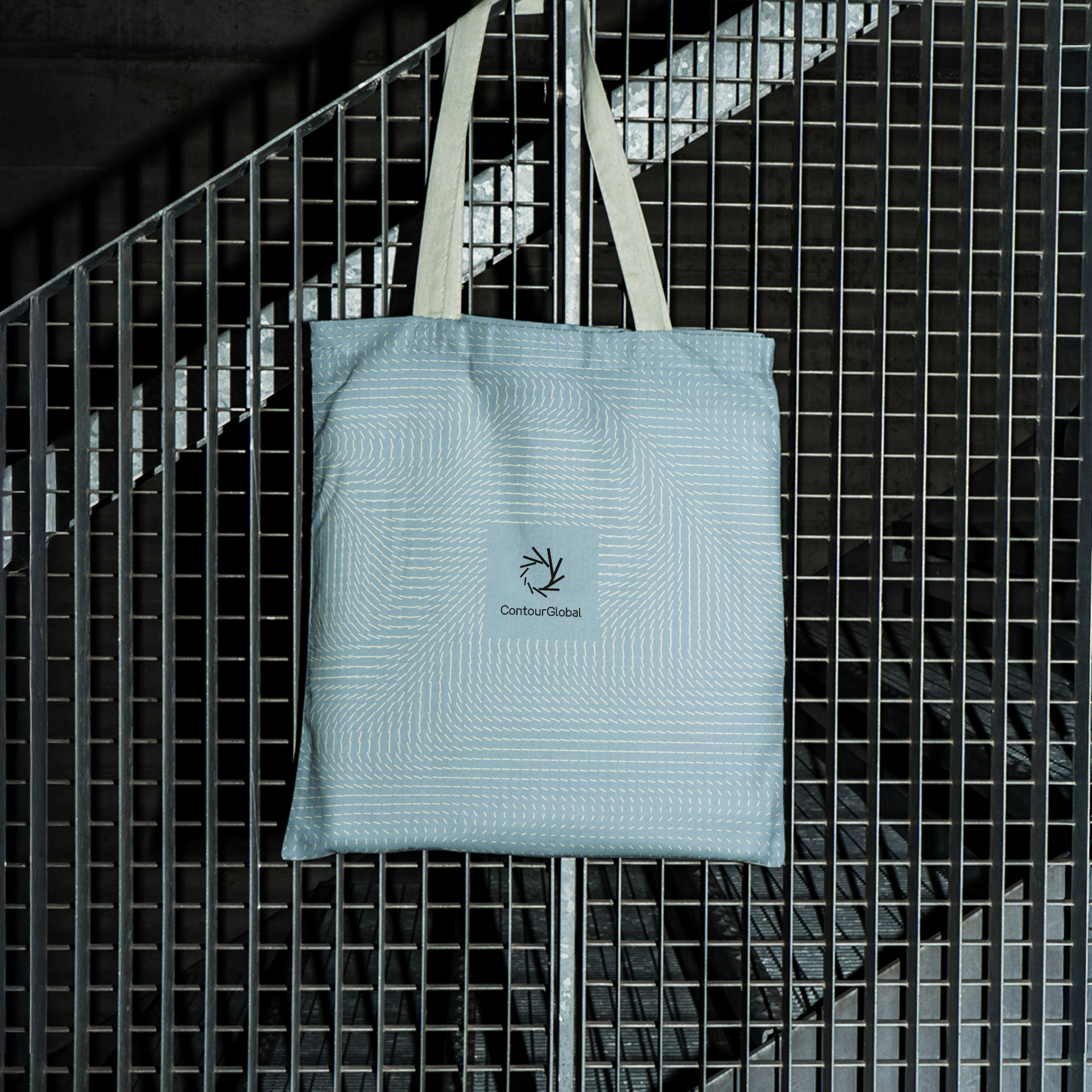
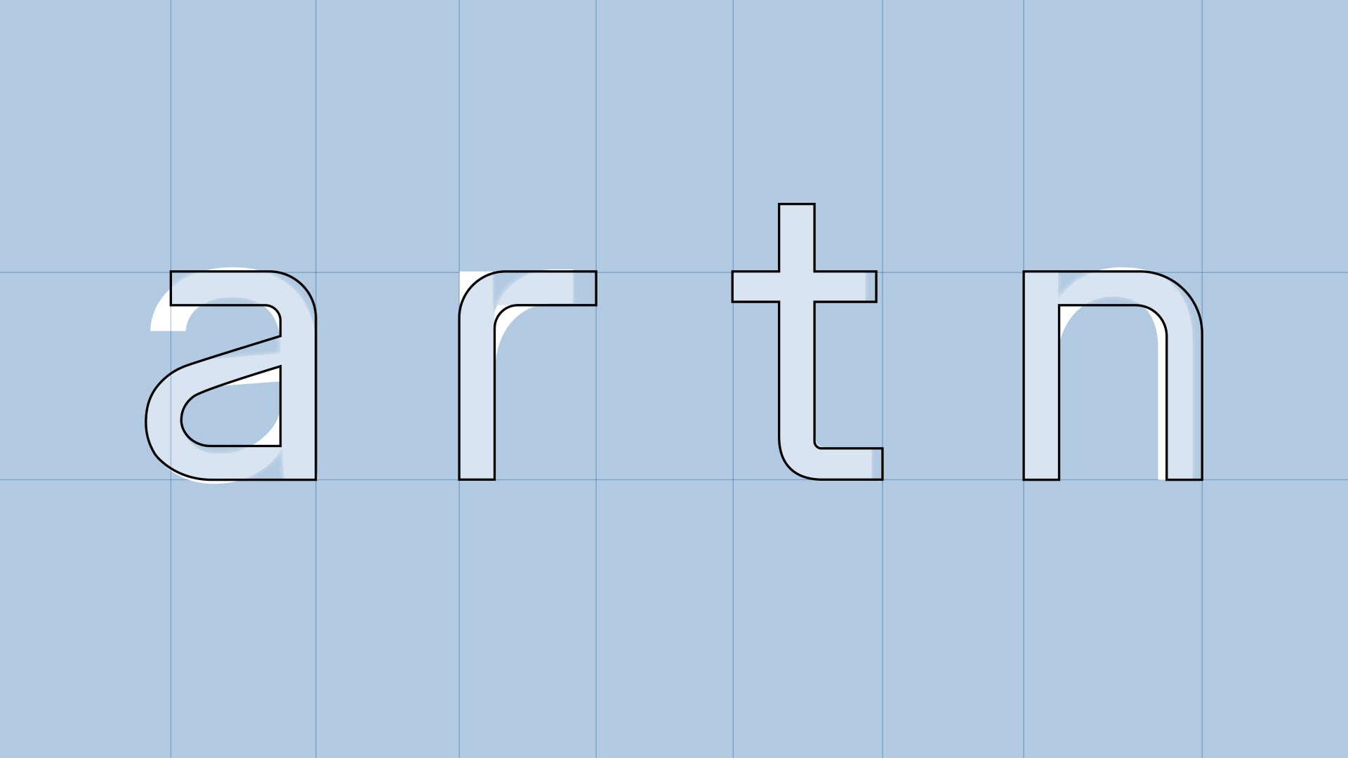
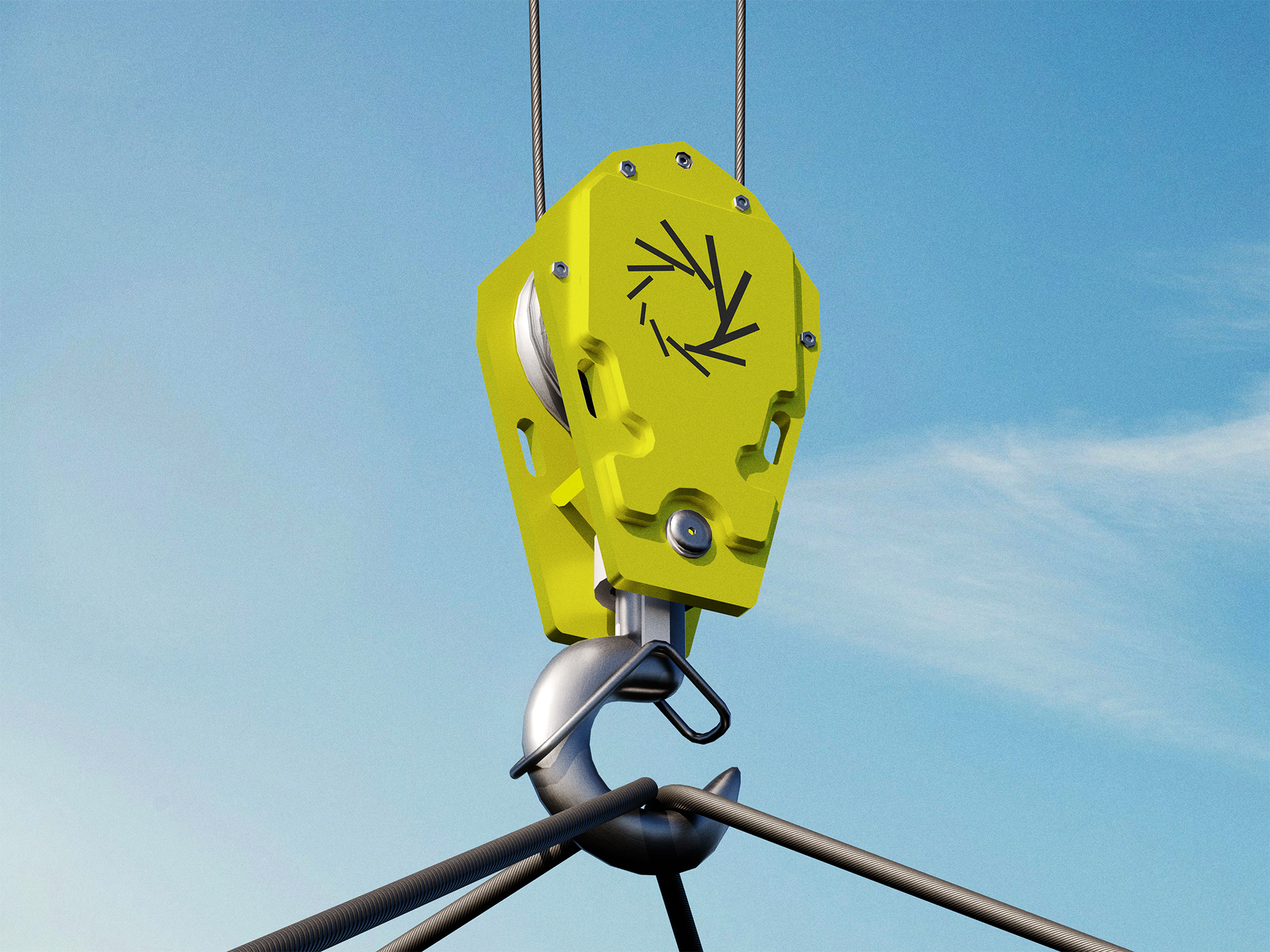
From there, the design team established a set of contrasting parameters — structure vs fluidity, complexity vs clarity, heritage vs innovation — to guide the new visual language. The core component became a grid system: a robust framework representing order, structure, and stability — essential qualities for managing complexity in energy systems. Through the grid, the identity achieves coherence, modularity, and clarity, enabling consistent application across multiple touchpoints and media.
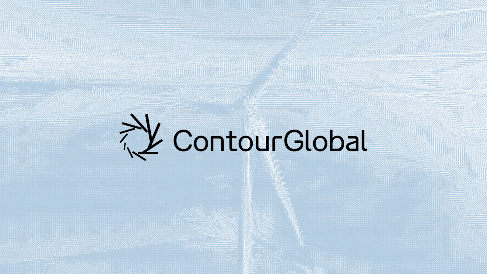
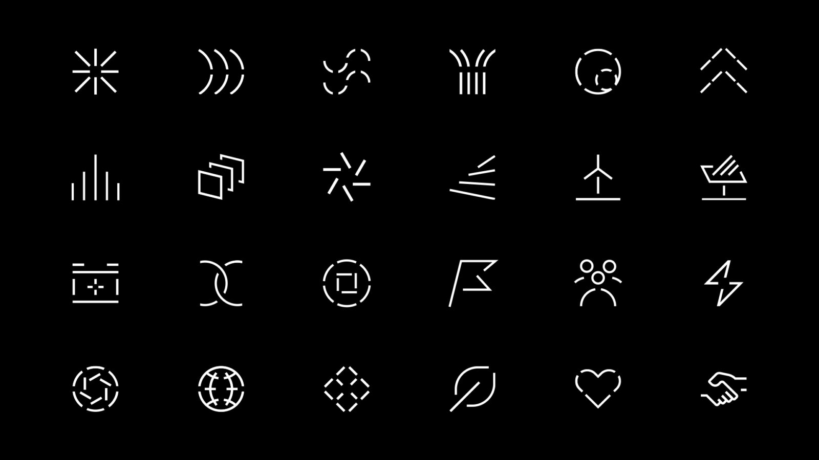
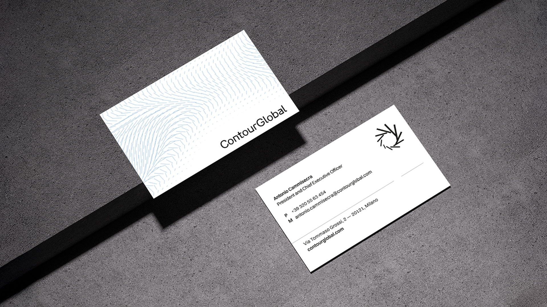
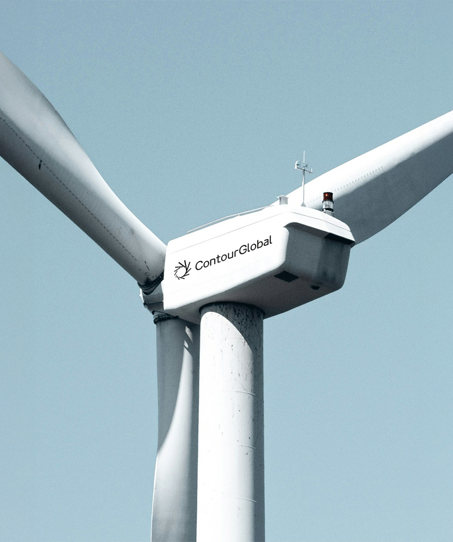
Simultaneously, the concept of “energy in motion” was translated into motion principles and dynamic graphic elements — lines, flows and transitions that suggest transformation, progress, and the behavior of energy itself. This dual system — of structure (grid) and motion (flow/lines) — gives the brand both stability and vitality, combining rationality with optimism.
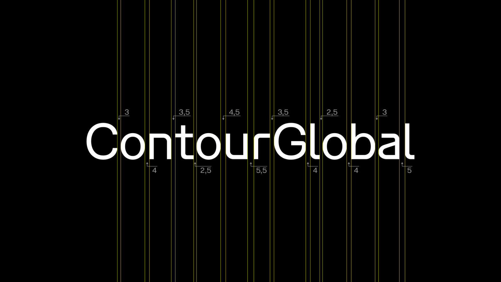
Color palettes, typography, iconography, and tone of voice were harmonized under unified guidelines, aligned with the brand’s communication pillars. The final result is a design identity that feels coherent, professional, contemporary — yet expressive and adaptive.
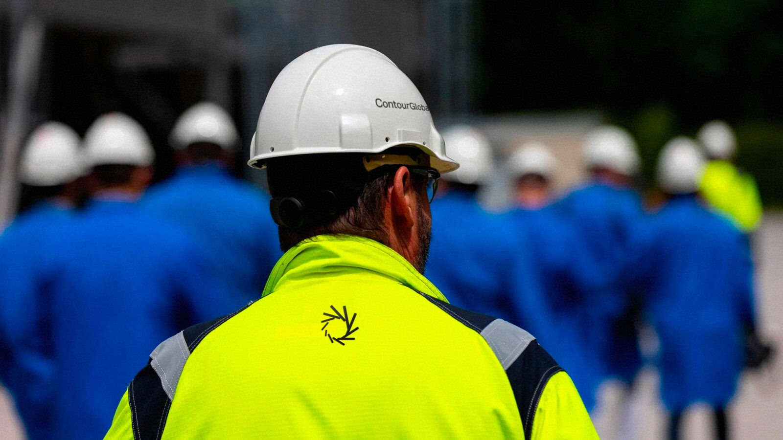
The rebranding substantially elevated ContourGlobal’s external and internal image. Externally, the new identity communicates trust and future readiness to stakeholders — clients, partners, investors — positioning ContourGlobal as a leading force in clean energy, renewables, and storage solutions. The design’s clarity helps translate complex energy processes into an accessible, human-friendly brand narrative. Internally, the rebranding unifies teams around a shared vision and identity, fostering pride, coherence, and renewed purpose.
Moreover, by embedding motion and flow into the brand visuals, the design evokes dynamism and transformation — a symbolic representation of energy transition and ContourGlobal’s commitment to innovation. The project thus becomes more than a facelift: it is a strategic tool, shaping perception, enabling expansion, and supporting the company’s evolution in a fast-changing sector.
Finally, this design project stands as an example of how identity design can work at the intersection of corporate strategy, visual storytelling, and human experience — demonstrating that a thoughtful branding process can meaningfully influence business direction, stakeholder relationships, and corporate culture.
In a nutshell: The rebranding of ContourGlobal under “The Right Power Forward” is a design project that transcends superficial aesthetics. Through structured methodology, strategic thinking, and creative vision, the project delivers a new identity that embodies clarity, strength, and progress — essential attributes for a company operating in the energy sector. By combining a stable grid-based system with dynamic, flow-driven elements, the design mirrors the dual nature of energy itself: both structured and alive.
This project proves that design is not just decoration, but a powerful vehicle for change: shaping how a company is perceived, how it communicates, and how it aligns itself with future challenges. As such, this rebranding deserves to be recognized as a meaningful contribution to corporate design, branding, and the broader discourse on sustainable and responsible identity design.
CREDIT
- Agency/Creative: superhumans
- Article Title: superhumans Repositions ContourGlobal With a Clear and Dynamic Energy Brand Identity
- Organisation/Entity: Agency
- Project Status: Published
- Agency/Creative Country: Italy
- Agency/Creative City: Rome
- Market Region: Worldwide
- Project Deliverables: Animation, Brand Architecture, Brand Design, Brand Guidelines, Brand Identity, Brand Mark, Brand Redesign, Branding, Design, Graphic Design, Rebranding, Typography, User Experience, Web Design
- Industry: Energy
- Keywords: WBDS Agency Design Awards 2025/26 , Clean Energy; Renewable Energy; Energy Storage; Transformation; Power Generation; Sustainability; Brand Identity; Rebranding; Dynamic Identity; Visual Language; Strategic Design; Innovation; Future-Ready; Zero-Carbon Transition; Corporate Communication; Power Plant; Energy Infrastructure; Technology
-
Credits:
Head of Design: Andrea Fiori
Designer: Lorenzo Cortese
Account Supervisor: Marzia Minnucci
Junior Account: Francesco Savo
Digital Account: Riccardo Setth
UX/UI Designer: Rosa Maria Pignatiello
Motion Designer: Jeyanthan Jeyaseelan
Web Developer: Manfredi Annibaldis (Iride)
Executive Creative Director: Francesco Taddeucci
Executive Creative Director: Luca Albanese


